Pages

Tuesday, January 31, 2017

Variations on Sympathy

It's always fun to take a basic idea and experiment with variations. That's what happened with these three sympathy cards.

Basic idea: little butterflies from Papertrey's Beautiful Butterflies set for sympathy cards.

Variation #1

Papertrey Beautiful Butterflies, Technique Tuesday
One of a Kind, and Gina K Elegant Florals

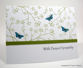
Here we have a trio of little butterflies in a hedge of greenery...soothing, soft, and pretty. I wanted to put a metallic line across the division of stamped background and bottom white space, but the gold was too meh, the silver too bright, and neither worked. After looking for ribbon (no good colors), I decided on a bold strip of StampinUp old olive to provide an anchor and support for the design. It was a compromise that works for me. Sort of.

This variation isn't bad, but it doesn't really feel like a sympathy card to me. It might work better as a get-well card or thinking-of-you card with the current colors. If the colors were brighter (hot pink and orange, or pinks and purples), it might even work as a birthday card.

But it doesn't feel like a sympathy card to me.

Variation #2 (With Bonus Variation...Two-fer!)


Beautiful Butterflies again, with sentiment
from on of Uniko's Flower Power sets

My reaction to the dissatisfaction of Variation #1 was to strip everything to bare minimums except the idea of three butterflies. As you might imagine, these two monochromatic and super-CAS cards make me the happiest: clean and simple in the extreme, with a fabulously soft gradient to add to the upward movement. The curlicues on the butterfly wings work well with the Uniko sentiment.

Yep. These are better.


Variation #3

Same stamps as first card.

Finally, I tried to strike a balance between the busyness of Variation #1 and the minimalism of Variation #2. The third card uses the same elements as #1 but stripped and simplified. The sentiment makes sense quite literally at the bottom of a vertical card, and the branch rises up from the sentiment to send off the upwardly mobile butterfly. Sweet. Sad. Sincere.

Also crisp and clean.

And that's all I have to say about that.

My critique of these three cards is, of course, simply my opinion. What's yours? Does one variation appeal to you more? Do you like any of them? What works for you and what doesn't?

Inquiring minds, and all that....

Supplies
ink: various 
paper: Papertrey white
accessories: craft foam, rhinestones, glue

Monday, January 30, 2017

IC582 Aquatic Rainbow Cards

This week's Inspiration Challenge at Splitcoast is hosted by SmilynStef and is to get inspired by the website Threadless. I chose THIS SHIRT as my inspiration and had tons of fun with one of my Kaleidacolor ink pads! The oceanic theme of the shirt, the strong colors, and the layout all inspired my cards.

The stamps come from an old A Muse set called Keep Swimmin', and I arranged them in a "random" layout inspired by the t-shirt art. (Y'all know there's nothing random about random designs...that took about ten minutes of fussing to get right. Notice the outline images move diagonally from upper left to lower right, with the heaviest part of the design in the lower center and lower left to anchor everything. Yeah, "random.")

The multi-colored bling added sparkle and shine to the design and enhanced the spectrum effect.


Given that perfectly Dory sentiment, I wanted the card to feel encouraging and energizing, and the colors of the Calypso Kaleidacolor pad plus all the movement certainly achieve that.


Now, you might have noticed that the first card has a shocking lack of white space for something made by me, so I decided to cut down on the number of images and try a slightly different layout that allowed for more white space. The inspiration shirt is certainly more solid and has a strong focal point with the turtle. The results of my second effort are not nearly as satisfying as the first card, though. Truly, the whimsy and fun of the first card are lost in the second design.


This design has a strong focal point but the kelp isn't the point of the sentiment, so it just feels off. Also, all the images are solid, with no outlines for lightness, so while the colors are certainly accented nicely, the whole design feels heavy.

"It was a good idea that shouldna' seen the light o' day."

Say that quotation in a long, slow southern drawl. Yeah.

Anyway, the Inspiration Challenge is a blast, and it was SO MUCH FUN to go outside my normal comfort zone and fill space up with so many happy images, colors, and rhinestones.

If you feel so moved, click on over and play along! SmilynStef landed a good one!

Supplies
stamps: A Muse Keep Swimming
ink: Kaleidacolor Calypso
paper: Papertrey white 
accessories: rhinestones, craft foam, corner rounder, glue

Sunday, January 29, 2017

Playing with Something New

My visit with mom and my aunt was lovely, and now it's time to get back to some sort of routine...or at least what passes for routine in our crazy world.

While poking around at Barnes & Noble earlier today, I found a set of brush pens that begged to be bought for $12.95. (Surely you've had a similar experience.) The plan was to use them for coloring in a coloring book, quickly and without really bothering with shading...just putting down bright, happy colors. Coloring books, for me, are waaaay more relaxing if I don't fret about shading.


The colors turned out to be even better than I'd hoped! They won't blend well at all for me (I tried, just to be thorough, but more experienced colorers might meet with greater success).  While the flat color will serve its purpose well in a coloring book, I wondered if it would look good on a card.

It does.


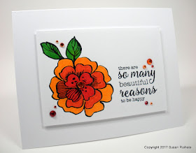
These fabulously warm shades of red, orange, and gold glow off the white paper. Adding a bunch of bling helped to liven up the flat, bold color with the shiny illusion of movement.


So glad to have experimented!

Have you tried any new product lately? How did it work for you?

Supplies
stamps: Altenew Botanical Garden, Simon Says Stamp Uplifting Thoughts
ink: Archival black
paper: Papertrey white
accessories: Brilliant Brush markers, rhinestones, craft foam, glue

Thursday, January 26, 2017

Here's What's Shakin'

Posting will be sporadic for the next week as I'm joyfully spending time with my mother and aunt who are visiting.

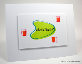
In the meantime, enjoy a retro-style card with fun colors and stamps from Simon Says Stamp (Retro Thanks):


I love that this set looks great stamped askew...no need to line things up perfectly. It's also a great set to play around with fun, retro colors that are bright and happy. Hard not to smile with such colors popping cheerfully off the white card stock!

Mercy, grace, peace, and love,
Susan

Supplies
stamps: Simon Says Stamp Retro Thanks
ink: various pigments inks...mostly Impress Fresh Ink and Memento Luxe
paper: Papertrey white
accessories: craft foam, glue 

Tuesday, January 24, 2017

Red Velvet Love

In grad school, a male professor who loved discussing sex in literature assigned a poem for us to explicate. The short poem described a young man on a lunch break in a warehouse looking at a picture in a naughty magazine. I remember nothing else about the poem except there were red velvet curtains in the magazine picture.

How cliche.

This professor was not my favorite. Not because I'm a prude, mind you (pears!), but because he was rigid in his thinking. There was only one way to explicate that poem: his way. He wanted all our papers to regurgitate his ideas. 

While intellectual rigor is necessary and good, rigid thinking hampers any intellectual activity. Literary critics, if they are good, play with ideas and interpretations, test them, see if they hold up, look at literary works in fresh and different ways, seek meaning and acknowledge ambiguity, engage in constructive debate and read other scholars' interpretations with open minds and curiosity. It really is quite a lot of fun, if done properly.

We stampers should not be rigid in our thinking, either. We benefit from experiment, play, mistakes, curiosity, stretching our skills and supplies, interacting with other stampers and debating the merits of, say, pigment inks and dye inks, or visual triangles. 

Red velvet ribbon, for instance, is a delight to play with, especially on a card for Valentine's Day. Even poets and naughty magazines know that nothing says true love like red velvet. 


The ribbon is attached with Scor-Tape and trimmed flush with the edges of the card. The architectural letters were punched out and attached over the very thick ribbon with dimensionals placed top and bottom (the ribbon runs through the gap between the dimensionals). While I loved the contrast of the soft velvet and the crisp letters, the design still looked a little blah, so of course I added bling. It's a shiny, velvety card that might appeal to a man...not too romantic or girly.

Please share something that you have played or experimented with lately. I'd love to get some fresh ideas!

Mercy, grace, peace, and love,
Susan

Supplies
stamps: Hampton Arts (really old!)
paper: Papertrey white
ink: Archival red geranium
accessories: red velvet ribbon, dimensionals, rhinestones


Monday, January 23, 2017

With Deepest Sympathy Inspired by Chrissie Tobas

This card by Chrissie Tobas on Pinterest, practically pinned itself to my Cards board and quickly became a wonderful source of inspiration. I love how Chrissie stamped over a tiny raised tree for her festive "just a note" card, but Karen's Card Shop at my church needed sympathy cards, so I took Chrissie's idea in a more somber direction.


The butterfly was punched from a scrap of cardstock that was colored using Distress inks on an acrylic block. This is by FAR the easiest way to get a pretty watercolor effect. Rub the distress pads on the block, spritz with water, press the block onto paper. It almost always turns out lovely. The soft blue and green of this panel is perfectly suited to a sympathy card, and Karen, my friend who inspired the card shop with her enthusiastic card ministry, loved butterflies. Everyone at church knows this, and as a result, butterfly cards are our best sellers for pretty much all occasions.

Many thanks to Chrissie for her fabulous inspiration!


I spent time last week making a batch of different sympathy cards for the shop, and those will be interspersed this week with Valentine's Day cards because while death is an inevitable part of life, so is love. And I encourage you to make some Valentine's Day cards, especially if you don't usually, and send them out this year. We can all spread more love!

Mercy, grace, peace, and love,
Susan

Supplies
stamps: Gina K Designs
ink: Distress inks, Memento Luxe black
paper: Papertrey white
accessories: dimensionals, Martha Stewart butterfly punch

Sunday, January 22, 2017

IC581: Invitation to Smile, and a Special Thank You to Janet

As always, Audrie came up with wonderful inspiration again this week at the SplitcoastStampers Inspiration Challenge! This week's challenge is to find inspiration at the Oh So Beautiful Paper. My card was inspired by this invitation here.


I made three changes to the inspiration piece: smaller panel mounted on a white base, horizontal rather than vertical orientation, and gray sentiment rather than pink. Oh, I also changed the shade of green to a peppier celery rather than serene sage to better suit my sentiment. Otherwise, this is a pretty literal interpretation of the original, and I LOVE IT! Two reasons: 1) it let me use a little-used Hero Arts set in a very satisfying way, and 2) it highlights that wonderful, wonderful sentiment from Simon Says.

And that's all I have to say about that. Play along with the IC581 Challenge if you have time and are so inclined. It's truly a fun one!

Now for the thank you. Reader Janet E. sent me a card that...well, words can't express the depth to which it encouraged me. Seriously. This past week has been one of silence for me on the news, even to the point of not posting here on my stamping blog when I normally would and for no other reason than it just didn't feel right. I didn't even comment on my sister's long and picture-heavy group text on her experience marching in DC on Saturday with my niece and nephew, except to say, "Nice pictures."

I have no idea why, unless I'm just processing and trying VERY HARD not to react, not to put knee-jerk words out there that I might regret later. I'm very aware of how politicians on both sides have been lying and misleading and inciting division and anger and resentment for their own partisan purposes. I've watched in sadness as people react badly to this provocation and blatant manipulation. I'm trying very hard to understand all the perspectives in this so as to generate words that unite, that heal, that lead my small corner of a very big Internet to feel hope and inspiration and a sense of real, honest, deep compassion moving forward. That's my ministry. That's what I feel called to promote.

Because there is hope. There is. For ALL of us. Things are not nearly as bad as the media might lead us to believe, nor are they rosy and good. We have work to do, the work of humanity and not of political divides, the work of justice and not of privilege or bullying, the work of kindness and not of insults, the work of bridge building and not of trench digging.

We can do this.

Janet's card was salve to my silence. The article she included with her beautiful card is a counter-cultural tour-de-force of unity and hope. And I share them with you in hope that you, too, might be inspired.

Beautiful!

Hope and love. You can also see the shimmer
of the ink Janet used. So lovely.


Oh, and when I was at Barnes & Noble today, I saw a volume of Emily Dickinson's poetry, thought of Janet's card, and bought it. Perhaps dipping a little deeper into 19th century poetry might offer some further inspiration. Emily was pretty amazing with words, after all.

Thank you, Janet. Thank you.

Mercy, grace, peace, love, and hope,
Susan

Supplies
stamps: Hero Arts Flower Garden, Simon Says Uplifting Thoughts
ink: various Impress Fresh Ink and Memento Luxe
paper: Papertrey white
accessories: craft foam, glue

Thursday, January 19, 2017

Paired Up


Some readers: "Tee, hee! She said, 'Paired.' Sounds like 'pear.' I know what that means!" [insert juvenile laughter]

Other readers: "English majors [insert disgusted eye roll]. Sometimes a cigar is just a cigar."

Me: "No, a cigar is never just a cigar. And neither is a pear, especially if it's up."

Junior high is now adjourned. Let's move on. No pears to see here.


Clearly Besotted has a lovely set called Paired Up (which I will forgive it for because it clearly wasn't named by an English major), and here's a cute Valentine's Day card I made with it.


Pink, red, and gray make a crisp and sweet love-bird card, don't you think? The branch is gray because it was light enough that it wouldn't show through the red birds when they were stamped over it. No masking needed...practical and pretty!

The design looked a bit flat until the flowers got their red centers, and the little pair of flowers by the sentiment were added to unify the two parts of the design.

And that's all I have to say about that!

Begging forgiveness for inappropriate pear jokes,
Susan

Supplies
stamps: Clearly Besotted Paired Up
ink: Archival pink peony, red geranium, black; Memento London fog
paper: Papertrey white
accessories: Memento marker (for flower centers)


Wednesday, January 18, 2017

Sending Hearts

Trying to use new stamps, including the Hero Arts set called You Are my Happy. It's all sentiments (with a few small heart images). Many of the sentiments are quite large enough to "embellish" and carry a whole design, so I tried it with two of them in two different ways, one much more successful than the other.

First up, I created a tightly connected design (surrounded, of course, by lots of white space) by offsetting the sentiment to the left and placing a heart with an arrow through it nestled into the sentiment on the right. That looked fine by itself, but the design still needed something so a trio of tiny hearts added some movement. Finished! Yay! I love this!


Heart pierced by arrow courtesy of a well-placed
strip from a post-it note.

Looking at it on my screen, I think I'd move the third tiny heart to the bottom left side of the larger heart. Where it is now draws the eye to the arrow and heart rather than the sentiment. But this is, to my eye, a quibble.

After making the above card, I decided to work with another sentiment paired with a wonderful dimensional heart stickers Given the meaning of the sentiment, a single heart was most appropriate. Unfortunately, the resulting design is nowhere near as interesting or fun as the first card I made. It lacks movement; that heart just sits there. (The stickers are prettier in real life than in pictures...the epoxy or whatever it is interferes with the color, which is a lovely bright red.)


Nice try. Thanks for playing. Meh.

This is the design process for me. Some things work while other things that seem like good ideas flop. Until I make something, I have no idea if it will work. This is awesome because when things do work, I'm surprised, bouncy, and happy. It's also awesome because when things don't work, I've simply learned what NOT to do.

So it's all good.

Please share your design process. Do you "see" in your mind what will happen and then make it happen, or are you more experiential in design, like me, feeling your way toward something good with trial and error?

Mercy, grace, peace, and love,
Susan


Supplies for Truly, Madly, Deeply
stamps: Hero Arts You Are my Happy, Borders and Arrows; Papertrey Heart Prints
ink: Archival red geranium, black
paper: Papertrey white
accessories: none

Supplies for Meh
stamps: Hero Arts You Are my Happy
ink: Archival black
paper: Papertrey white
accessories: dimensional heart sticker

Tuesday, January 17, 2017

A Blue and Brown Sort of Day

Before we get to blue and brown, thanks for the emails and comments about Valentine's Day cards. I made a bunch (and will share them over the next few days) and put them in Karen's Card Shop at church last week.

When I checked on Sunday, they were almost all gone, as are the batch of birthday cards I set out. I suspect I'm going to get sick of making birthday cards, but there it is. Our little shop has now made well over $400 for our church. Not bad for a little 2-bit operation! Thanks to Lisa I. and Eva for their contributions, which have been so well received!

Anyway, today's cards were made weeks ago, so I can't remember exactly which of the brown and blue pins on my Color My World board on Pinterest I used (might have been this one), but I love both the cards and how using very different stamps and mostly the same colors can yield very different results.

Snowflake Serenade (Papertrey)
and sentiment (unknown wood mounted rubber)

Gracious Vases and Keep It Simple sentiment (Papertrey)


The different feel of random lacey snowflakes falling down the card versus lined-up, solid block vases is amazing. One card is loose and free, and the other is very formal and intentional. When I'm sick, I'd sure love to return to everything feeling neat and tidy, you know?

I did add a few more shades of brown to the second card, which lightens it up and adds variety to the vase arrangement, making it much more interesting in its static order.

And now I'm off to bed.

Mercy, grace, peace, and love,
Susan

Monday, January 16, 2017

Fluttering Fun

Valentine's Day is coming up, so of course I had to make a bunch of pink and red cards for Karen's Card Shop at church. Here's one that set my heart aflutter!


The Color-Layering Butterflies set from Hero Arts is lots of fun (and easy to line up, unlike some two- or three-step stamps). I started with the sentiment and added the butterflies in a fluttery visual triangle. The pink and red are lovely and vibrant when offset by touches of black.

For a little something to catch the eye, I added a couple of red heart-shaped gemstones to the smallest butterfly. Oh so sweet!


Do you make Valentine's Day cards to send? Do you make them for your children to give in school?

Inquiring minds, and all that.

Mercy, grace, peace, and love,
Susan

Supplies
stamps: Hero Arts Color-Layering Butterflies
paper: Papertrey white
ink: Archival pink peony, red geranium, black
accessories: red heart-shaped rhinestones

Sunday, January 15, 2017

IC580 Altered Diary Challenge

Audrie came up with an outstanding inspiration challenge for this week. It's The Altered Diaries, an Etsy shop full of handmade books and such. I made two projects based on inspiration from the site. Here they are.

First up, a bookmark based on the alphabet on these tags, for which I have the perfect stamp set. Yay!


Hampton Arts stamps, StampinUp black cardstock,
Papertrey white cardstock, Archival black ink,
eyelet, ribbon, square punch

Pretty straightforward inspiration. I went black and white instead of distressed and brown because, well, I'm me. Here's where the eyelet I dug out of the bead box storage went.

Next up, a card made like a Japanese-stab-binding book. This allowed me to use some bark paper that's been languishing in my stash for years. I'm sure you don't have any special papers lying around unused for years, right? Right. Anyway, it's a fun paper that gives tons of texture to a card inspired by this book.

Bark and inclusion papers, embroidery thread, VersaMagic Aegean sea ink,
star punches, awl, beeswax, 


If you've never done a Japanese stab binding, know that they are really pretty easy, but there are some supplies you need to get the job done most efficiently.


My book/card is made from three sheets of paper...bark, inclusion (text-weight paper with bits of plant in it), bark. Each is 4.25" x 5.5". With thicker books, you usually clamp the whole block of paper together, but with just three sheets, I held them together with no problems. Just make sure they don't slip.

Stack all three sheets, and place the quilting ruler 1/2" in from the left edge of the card. Poke holes with the awl at 5/8", 1 5/8", 2 5/8", and 3 5/8" down the side of the card. I do this on a self-healing cutting mat, so the awl doesn't go far through the paper. Lift the card and push the awl through each of the four holes to create a big enough hole for the needle and thread to go through without tearing the paper.

Measure out embroidery thread that is four times as long as the width of the binding. This will give you long enough tails to tie off at the end. If you're really dextrous, you can make do with three times the width of the binding, but I never take that chance.

Run the cut embroidery thread through the beeswax a few times to coat it thoroughly. This will keep it from slipping and make tying the knot at the end really easy.

Thread a needle with a large enough eye to manage the embroidery thread. It need not be too sharp because you've already poked the holes.

Start sewing by going in the back of the top hole, loop around the top edge of the card, and go in through the front. Repeat around the edge of the top hole, then go in through the top side of the second hole. Keep sewing in this pattern until you've looped twice through to bottom hole (once to the side and once around the bottom of the card). Then head back up. It's harder to explain than to do. Keep your stitches tight, but not so tight you tear the paper. With the beeswax, stitches rarely slip loose once you put them in place.

After heading back up and going through the second hole from the top toward the back, pull the needle off the thread and tie a simple square knot with the two tails so that the knot rests right over the top hole. Trim the loose ends, and you're finished!

I highly recommend stamping the inside BEFORE binding, which I did. Just make sure you take account of the 1/2" of binding when you center your sentiment.

And that's all there is to it. Takes longer to explain than to do, actually.

This challenge was so much fun! Thanks, Audrie, especially for getting me so far out of my comfort zone with the bark paper card!

Click over to the IC580 challenge and play along!

Saturday, January 14, 2017

Part 3 of the Answer to the Silly Question

Thanks so much for the questions some of you have been asking. That makes my posts feel more like a conversation than my blathering on about my stuff. Several of you asked about my sentiment storage bin and whether I break sets apart to organize sentiments.


The answer is messy. Most of these CD cases hold individual sentiment sets, such as Papertrey's Wet Paint or My Favorite Things Label Maker Sentiments. For smaller sets, there might be two per case. BUT I do occasionally break sets apart to move sentiments to this bin. This is usually when I notice that there are particularly useful sentiments in mostly image sets that I keep forgetting about.

For instance, behind the Birthday tab pictured above are three CD cases: 1) Papertrey's Birthday Basics (with a few other random PTI birthday sentiments from other sets because there was room), 2) Papertrey's Birthday Bash Sentiments (plus Polka Dot Basics, another small PTI set), and 3) Simon Says It's Your Birthday (plus a single Gina K birthday wishes sentiment culled from a larger set of flowers). With the three CD cases is a transparency folder of StampinUp's Endless Birthday Wishes.

As you can see, there is a lot of compromising going on with this particular organization.

The tab behind Birthday is labelled All Occasion and contains the bigger mixed sentiment sets like Papertrey's Mega Mixed Messages and Clearly Besotted's A Little Sentimental. I don't ever break those sets up.

Bottom line on sentiments...there are still plenty of them left with the original set and stored on the other side of the room. But all the sets that contain mostly sentiments are on my desk, as are randomly pulled, useful sentiments from sets that are mostly images. If I find that I use a set that contains combinations of sentiments and images primarily for one or the other, I store them accordingly.

For instance, Faux Ribbon has a bunch of sentiments that I almost never use, but I frequently use the faux ribbon stamps; therefore, that set is with my borders and backgrounds rather than with the sentiments. Yet when I finally decided that I was getting tired of the images in Botanical Silhouettes, I moved it to the sentiments bin because I kept forgetting that there are some fabulous sentiments in that set.

I expect that's all as clear as mud, but it works for me. Some people are pathologically attached to keeping sets intact and whole, and I completely understand that. Other people break sets up without a second thought, which seems a tad free-wheeling to me. For practical reasons, I'm somewhere in the middle, leaning toward whole sets.

On a different subject, reader Gaye, noticing my ink pads are stored upright, asked whether storing ink pads upside down will make them last longer. For dye inks, the answer is probably yes; this was certainly the logic behind StampinUp's flip-top ink pads, which keep the pad facing down. Dye ink is very runny, and gravity will keep the ink from sinking through the pad. For pigment and chalk inks, which are very thick, the answer is probably no.

I used to store my dye ink pads upside down, but it was so frustrating to sift through stacks of upside down pads that I flipped them upright and haven't thought about it since.

Now it's time to take a closer look at the right side of my craft space. Here's where almost all my stamps, paper, and less frequently used supplies live.


On the far right, you can see a six-drawer storage unit that holds most of my punches (although the simple shapes--circles, squares, ovals--are in three of the white drawers on the far left, just to make things complicated). On top of the punch storage is a fun little display tree I bought at JoAnn's last fall. It has a bunch of Zentangles tiles hanging from it.

The brush hanging on the wall above the light switch plate (yes, that's Shakespeare!) is a Chinese glue brush used by bookbinders. It's too cool for me to use, so I hang it on the wall. Plus, I'd need to be working on a HUGE book to need a glue brush that big.

The inspiration board displays the cards you've sent me. There have been a few additions since I took the picture (thanks, Janet and Marty!), but all cards sent to me end up here for as long as there's space.


Under the inspiration board is my clear stamp storage. There's also a bin of Christmas stamps on the top right shelf just below this.


The clear stamps are organized into categories: Birds & Bees (animals), Odds & Ends, Graphics (backgrounds, borders, shapes and such), Botany, Food & Drink, Autumn, Faith, Alphabets, Hero Arts Months (12 sets Hero came out with years ago for scrapbooking), Christmas (on the shelf below). As you can see, some sets here are in CD cases, and others are in transparency folders. I know it's crazy, but this doesn't bother me at all.

The short bookshelf contains two shoeboxes. The white one contains Christmas cards I've made, and the teal one contains Thanksgiving Crusade cards. The three white drawers on the top shelf have markers, spare ink pads (duplicates of pads on my desk, mostly gifts), and sponges and stipple brushes. The paisley box contains Christmas stamps, and the binders contain my stamp index that is so out of date as to be pretty much worthless.


The bottom shelf drawers contain scrapbooking markers, a bunch of spare Sharpies, and really rarely used ink pads like StampinUp's white craft ink, StazOn, and Palette pads. The purple folder contains label stickers, and the rest of the shelf holds various notebooks, magazines, and a dictionary because I'm an English major, and we're weird that way.

The tall bookshelf (7') holds lots of stuff. The white shoe boxes on the second and third shelves all contain wood-mounted rubber stamps, organized by theme (Backgrounds, Shadow, Trees, Fauna, Flowers, Spring/Summer/Fall, Winter, Faith, Occasions, Christmas, Alphabets, and so forth).


Because sometimes you need to be told to relax. And yes, there
are a couple of pear stamps on display. Because sometimes you need to laugh.

These pretty blue bins hold my Zentangles supplies and
supplies for mailing cards. The leather cases
hold Prismacolor pencils and watercolor pencils.

Office supplies (rubber bands, post-its, pencils, erasers, extra staples, etc.)
and a bin for completed cards complete the top shelf.

Top Shelf: stapler, baby wipes, a purple box of reinkers and a bin
for random large glue bottles and empty CD cases for new sets.
Next shelf: bead cases of infrequently-used embellishments,
white bin of border punches, box of envelopes, white
shoebox for cards received.

A special note about the bead cases of infrequently-used embellishments, such as buttons, brads, eyelets, and sequins. These bead cases lock, which means it's hard to spill them all over the place, and I highly recommend them for storing small items.

The bead cases used to reside in my embellishment drawers, but last year, when I realized they hardly ever were opened, I moved them out of the drawers and to the bookshelf. They've hardly been touched since (until today when I retrieved a single white eyelet for a project for IC580). I suspect I'll soon be able to move them into my unfinished basement area storage, where supplies go before being sold off, donated, or kept "because I might need them one day." I also suspect these will end up in the last category, especially after today's eyelet incident.

Now we come to the baker's rack, which I love. The top shelf contains pretty glass jars of ribbon that hardly ever gets used these days, but they are pretty so they stay. The green hanging file box behind the Angel of Courage contains specialty papers...rice paper, vellum, papers with bits of flowers or grass in them, glitter paper, wood veneer paper, etc. The mixing bowl (which belonged to my grandmother) holds a bunch of washi tape.


The next shelf contains card-stock storage in Cropper Hopper vertical magazine-style containers. One contains Papertrey colored card stock, another holds what's left of my StampinUp card stock, and the other holds various white card stocks. Next to that is a Cropper Hopper scrap holder for scraps of colored card stock, and a large watercolor block tablet.

Seeing so little white card stock reminds me I need to place a large order from Papertrey. I'm shocked the stash is so low!

The three storage drawers on the left side of that shelf hold cutting tools, including Fiskars ShapeCutter templates and cutter, and Creative Memories circle and oval cutters. The top drawer includes spare Exacto blades, a box cutter and spare blades, my StampinUp piercing tool kit, spare cutting blades and strips for the Fiskars rotary trimmer on my green desk, and so forth.


The twelve drawers on the bottom shelf hold all sorts of stuff, including envelopes (most A2s are in the big box on the bookshelf), clean washcloths for my stamp-cleaning needs, packaging supplies (such as clear boxes to hold card sets, coffee bags for food gifts, small zipper bags for whatever), fabric and book-binding supplies, laminating sheets, and of course circle, oval, and square punches that don't fit with the rest of the punches.


Under the baker's rack are two one-foot squares of good-one-side plywood with pieces of waxed paper between them and dumb-bells. These are for drying wet items that might curl...especially useful for drying book covers and watercolor backgrounds. The boards also come in handy when I stamp a large background stamp that I need to stand on.


And that's it. Wow, if you made it this far, I'm impressed. Even I'm bored now.

But my craft space is awesome, and I feel very lucky to have such a large space and so many drawers and boxes to store stuff in. Having an organized space means I can make a big mess with easy-to-find supplies, quickly clean up, and get back to making another mess.

That's how I work. Feel free to share your alternate methods of working in the comments, or ask any questions you have about any of the above. Tomorrow we will get back to business as usual.

Mercy, grace, peace, and love,
Susan
Wednesday, January 11, 2017

Part 2 of the Answer to the Silly Question

Yesterday's post shared the organization strategy of my craft desk, and Darla asked why I have a butter knife in the frequently-used tool cup on my desk. Well, Darla, that's an excellent question, and one I should have asked myself a long time ago.

You see, the butter knife used to be my preferred tool for scoring paper. The butter knife did an excellent job scoring when paired with a quilting ruler...a much better job than a bone folder did because it was thinner and made a sharper, crisper line. In fact, that butter knife contributed to the creation of every card I made for years.

Until some years ago when I got a gift card to Archiver's for Christmas and decided to buy a Scor-Pal.

The knife, too thin to use on the Scor-Pal, stopped being a frequently-used tool and started simply being a space-taker-upper. There's certainly no longer a need to keep it in a cup full of useful tools, except perhaps for sentimental reasons and deep, sincere appreciation for its long service prior to its job being outsourced--through no fault of its own--to the Scor-Pal.

I'll also sadly note that the Archiver's at which I purchased the Scor-Pal closed a few years ago, its jobs being outsourced presumably to the Internet. In fact, the butter knife and Archiver's would both like to register their disgust and contempt for progress and the part I played in both their demises.

My apologies to the wounded parties. I never meant to hurt either of you.

Now we'll take a look at the small desk and see just how absolutely useful it is to me, not least because it is home to my Scor-Pal, a handy device that contributes to every single card I've made for the past few years and looks to be set for many more years of use...unless something better--and a gift card to buy it--comes along.


The small desk is actually quite ugly, an old wooden desk that is held together by L-brackets and screws because the military-contracted movers who took it apart in 1989 failed to keep the hardware that holds it together, which led me to be insulted by a chauvinistic old man at a furniture store who told me to, and I quote, "just let my husband fix it." There's no rage quite like that of a 22-year-old feminist who would be darned if she'd let some old geezer stand between her and a fully-assembled desk. The Ace Hardware man was much more helpful, but our solution, though entirely functional, wasn't aesthetically pleasing. I settled for functional, being a poor 22-year-old who just really needed a desk.

But I digress.

When I set up in the basement, I realized that a green tablecloth would hide the ugly but useful desk and add a splash of color to the space as well. This way, when you walk down the stairs into the basement, you don't see an ugly desk with lots of stuff under it. You see a green tablecloth that usually looks neat and tidy unless the dog starts nosing around it.

On top of the green-covered desk is my Fiskar's 12" rotary cutter that my husband bought for me about 15 years ago. That magnificent beast is still going strong. I cut all card bases on it as well as any mass-production cutting (the Stephen Ministry ornaments, for example).


Conveniently placed beside the cutter is the Scor-Pal. Note there are two bone folders on it. One is your standard bone folder that isn't made of bone but of plastic because nothing is real anymore. The other folder is made of teflon, which is supercalifragilisticexpialidocious because you can rub paper all day with it and the paper will not get shiny. Isn't that wonderful!

I retired the fake bone folder to the other side of the room when I got the teflon folder, but after repeated use, the teflon folder wore down in an odd way that kept it from scoring crisp lines. Thus, the bone folder was retrieved from exile and now usefully scores each card, after which it is put down so the teflon folder can take over and smooth the fold without shining it up.

This is why the butter knife will never go back to the kitchen (does anyone use butter knives for butter anymore?). Who knows when I'll have a scoring need that neither the fake bone folder nor the teflon folder can meet? Won't I feel silly if I have to go upstairs and rummage around in my silverware drawer for that poor knife? Of course I will.

And this is just one reason why our craft stashes could be used as Exhibit A in our mental-health competency trials.

On the far end of the green-covered table, you'll see a few baskets, a box of tissues, and an electric pencil sharpener. One basket holds new stuff that needs to be used before it can be properly integrated into the stash. (Since I implemented this basket, I've actually used all the stamps I buy, which is pretty sensible.) The other basket contains a bunch of Valentine's Day stuff gathered to make a bunch of Valentine's Day cards for the card shop at church. I fill a similar basket in July with Christmas stuff and another with stuff for the Stephen Ministry ornaments.

Which brings me to a recommendation to use these very inexpensive baskets (found at Target or similar) to organize your larger projects. They do help keep everything tidy.

Now it's time to look under that green tablecloth and see what it's hiding.


The entire left tower contains embellishments sorted by color (neutrals get two drawers, then blue/violet, green, yellow/orange, and pink/red). For example,


These embellishment drawers used to be a lot fuller, but over the past few years, I've simplified a lot and moved less-frequently-used embellishments elsewhere. These drawers now mainly contain rhinestones, pearls, enamel dots, flock, Stickles, Smooch, Sakura stardust pens, twine/floss, and a few other things as needed.

Arranging embellishments by color was first proposed by Stacy Julian of Simple Scrapbooks fame ages ago. It's brilliant, and I won't store them any other way.

The right-hand tower contains, from top to bottom, cheap recycled copy paper (which keeps ink off my stamping mat), metallic embellishments and markers, adhesives (including Scor-Tape, various glues, dimensionals, and glue dots), Brilliance inks (because I ran out of drawers on my desk...I told you I have an ink problem), embossing supplies (gun, ink pad, powders and such), and watercolor crayons/Twinkling H2Os. On top of the towers are my watercolor brushes (in a really cool brush case), a pad of cheap sketch paper, Bounty paper towels (which don't leave lint so they are the best), and a roll of waxed paper.

Not pictured but living to the right of the two towers are several large flat bins full of mat board, Canson paper, large sheets of art paper, etc. They really belong in the unfinished area of the basement. I used them mostly for bookbinding and haven't opened them in over a year.

And now you can clearly see why having an L-shaped desk arrangement might be a very good thing.

To backtrack a bit, Janet asked me to show my inks, which was coyly refraining from doing yesterday because, like I said, I definitely have an ink issue. But why not? Y'all already know I have issues and you're still reading, which means you delight in watching train wrecks or you are, in fact, also a train wreck and would appreciate the validation.

So here you go. The first six pictures show the tower of drawers on the right of my desk. My apologies to the OCD people out there...a few pads are pointing in the wrong direction. It's part of my desensitizing program.


The above drawers contain opaque inks that aren't shimmery. These include pigment inks and VersaColor chalk inks, which to me look exactly the same on paper and work exactly the same, at least as far as I can tell.

Below is my collection of Distress inks and the blending tools and pads that go with them. Under each cube is a depression in the case that stores the pad for that color. It's quite a nice system.


Next, StampinUp inks. At one time, I had lots more of these, but these 15 were the colors that I actually used, so the rest were sold off.


Finally, the bottom drawer on the right tower contains all my Kaleidacolor pads.


Yesterday's post showed the Neutral/Purple drawer of dye inks, but here are the rest of the dye ink colors.


Finally, under the small desk are my Brilliance pearlescent and Delicata inks. These are delightful but don't get quite as much use as the other inks.


One thing I like about storing my inks this way is that the drawers are light and pull out easily. I can stack them on my desk as needed, and slide them back into place when I'm finished. It's also a good way to store different ink pad styles together. It would be very helpful if all ink companies used exactly the same cases for their inks...things would stack so nicely! But alas, they don't think of our storage needs, so these drawers are a not perfect but still mostly satisfactory way of storing them.

Seeing all these photos on my computer screen really does make me feel like a crazy hoarder who is in serious need of an intervention. But I suspect if I go look at my husband's 45 pairs of running shoes, I'll feel pretty normal.

Eh. Normal is over-rated. And aren't all the colors just gorgeous?