Pages

Thursday, August 31, 2017

From Meh to Marvelous

After seeing Sylvia Blum's card on page 20 of Take Ten, I knew I needed to pull out Papertrey's First Fruits and use bling in the gap on the wheat stamp.

Sylvia Blum's Fabulous Card

Using bling instead of twine or some other embellishment or a sentiment (as PTI's stamp is designed to do) is BRILLIANT.
See what I did there? Brilliant? Bling?

And of course, I love Sylvia's use of white-on-white and the clean simplicity of her card.

Anyway, the gap in the PTI wheat is far too wide for small bling, and I don't have a die for a banner and such, so I came up with this drab imitation of Sylvia's lovely card instead.

Meh.

White-on-white looked odd, so I opted for kraft, which looks drab with the brown bling and soft apricot ink. The apricot is not bright enough, and the brown bling and kraft don't provide enough interest or contrast.

I truly felt that I'd not done Sylvia's card justice.

So I changed up the colors and hit on a complementary color scheme that left me giggling with glee.

Marvelous! 
Note how much fresher the complementary color scheme is than the more monochromatic scheme. Archival saffron and StampinUp Baja breeze add interest, zest, energy to the same design. Using more white also pays proper homage to Sylvia's bright design much better than the kraft possibly could. 


I like this so much that I made a coordinating envelope!


So if you're ever looking at a card that feels blah or cliche, consider a change of color scheme. To add energy, choose a complementary color scheme.

Not a bad save, eh? And many thanks to Sylvia for her fabulous inspiration.

Mercy, grace, peace, and love,
Susan

Supplies
stamps: Papertrey First Fruits
ink: Archival saffron, StampinUp Baja breeze, Hero Arts soft apricot
paper: PTI kraft, white
accessories: Copics, clear bling


Wednesday, August 30, 2017

A Highly Determined Christmas

While it can be a fun challenge to use non-holiday stamps on holiday cards, some stamps couldn't really be used for anything other than holiday cards.

The vocabulary word for today is determined. Highly-determined stamps are limited in their meaning...and often not very versatile. Stamps that are less determined can apply to more varied themes and designs.

Polka dots and most alphabet sets, for example, are not very determined. You can use them for all sorts of themes and purposes. Cross, charity ribbon, and leg-lamp stamps, however, are highly determined and automatically generate specific meanings in our minds.

Today's cards use a set from Hero Arts that's highly determined: Greatest Gift.


The main image of the stable and star can't really be used for any other theme than Christmas. It's also a fairly large image that will dominate any card featuring it, making it very difficult to work with (especially for us clean-and-simple stampers). So I challenged myself to use it two different ways.

First up, a red-and-white card.


Block stamps like this can be hard to ink and stamp cleanly, so I used my MISTI and was able to re-ink the stamp several times until the image looked perfect. The simple white matting and single piece of bling on the star keep everything minimalist, and the red unifies the design.

How very satisfying!

Next up, a blast of blue.


Here, the background was made using distress inks (salty ocean and tumbled glass) and inking tools for a gradation of bright blue. The manger scene is in simple black pigment ink (Memento Luxe) for opaque saturation. The popped panel and small bling add interest and keep it clean.
It's hard to make religious holiday cards without highly-determined stamps of the holy family, manger, or wise men. The exception might be a star card. Stars aren't as determined as mangers.

And I'm determined to go to bed now.

Mercy, grace, peace, and love,
Susan

Supplies
stamps: Hero Arts Greatest Gift
ink: Hero Arts red royal; Memento Luxe black; Distress salty ocean and tumbled glass
paper: Papertrey white
accessories: rhinestones, craft foam, glue, Tim Holtz mini inking tools

Tuesday, August 29, 2017

Inspired by Rosemary Dennis

Well, that's a title I've used before. Rosemary Dennis frequently publishes her work in Take Ten, and the latest issue has a fabulous card by her that jumped right off the page and into my imagination.

Take Ten, fall 2017, page 102
If you can get this issue, get it!


Isn't Rosemary's card delightful?!? I love the pinks, the verse, the sequins. What a lovely, balanced layout.

Now, I (of course) took it in a little different direction after examining my stamps and settling on a set from Clearly Besotted called Christmas Poinsettia and Papertrey's Happiest of Holidays. Remember that when you substitute stamps, you might have to tweak the design to make the end product work.


Note that my card retains the tall sentiment and the basic layout of Rosemary's card, but my choice of the holly stamp eliminated the need to create the collage effect of the inspiration piece. That holly is a busy stamp...adding any other layers of background would have created visual chaos.

It's quite busy enough, I should say.

The sentiment, with its combination of a few too many fonts, adds to the busy feel of my card. PTI's Happiest of Holidays seemed like a great purchase at the time, but I've struggled to use it successfully. It certainly works here, though.


To bring some red into the sentiment, I stamped the sentiment in red on a piece of scrap cardstock, cut the banner portion out, and popped it up over the Memento Luxe espresso truffle banner. This brightened the whole card and unified the left and right sides through color...which is often the easiest way to unify a design.

Many, many thanks to Rosemary for giving me the inspiration to make a card a touch out of my comfort zone.

Mercy, grace, peace, and love,
Susan

Supplies
stamps: Clearly Besotted Christmas Poinsettia; PTI Happiest of Holidays, Polka Dot Basics
ink: Archival leaf green; Memento Luxe espresso truffle, love letter
paper: Papertrey white
accessories: scissors, dimensionals

Sunday, August 27, 2017

Winners, and a Card That Proves a Point

Since only two people participated in the challenge, I decided to send BOTH a little treat. Will Marianne and Elsie please email your snail-mail addresses to me (susanraihala at roadrunner dot com) so I can get your treats to you. I hope the rest of you will check out Marianne and Elsie's cards and leave a little love in the form of a comment...their cards are creative and delightfully inspiring!

Also, someone asked if Papertrey sold punches. Back in the days before everyone became die-crazy, Papertrey offered two punches to accompany their set Heart Prints. The punches are no longer on the website. Instead, the stamp set and a small die set are available. This makes me sad, but those of us who are holding out on die cutters just have to accept that we will never be as cool as those with die cut machines, and that's okay. We find other ways. Hearts really aren't that hard to cut out.

Now, today's point. Sometimes, I try to force a card to fit some sort of preconceived idea of what I want. And sometimes this works great. Other times, it takes a day or two of sitting on it for me to realize that I'm making the creative process harder than it needs to be.

Perhaps you can relate?

Anyway, I tried really, really hard to make today's card with three hearts...one large and two smaller...to follow the rule of threes and to create a visual triangle. The three hearts took full advantage of the spectrum on the Kaleidacolor Spectrum pad and the IDEA was so incredibly cool.

In my head.

In reality, the design simply would not come together. Very frustrating, until I decided to simplify. Then, it made perfect sense...from a simplicity point of view.


The large and colorful heart, used without following the rule of threes, combined with a fun black banner, was all the card really needed. I did follow the rule of thirds by placing the heart and sentiment along the imaginary line marking one-third the way down the card, though.


So glad I finally got there.

No new pictures of Cooper, but it's seven days until we pick him up in Toledo. I can't wait!

Mercy, grace, peace, and love,
Susan


Supplies
stamps: Papertrey Heart Prints, Hero Arts, Thank You Messages
paper: Papertrey white
ink: Kaleidacolor spectrum pad, Archival black
accessories: heart punch, dimensionals, scissors

Thursday, August 24, 2017

Big Happy

Clearly Besotted's Happy Days set features the word happy in several display fonts and then accompanying words in a very clean sans serif font. It's a fun and versatile set for many different occasions.

Today, I'm focusing on another anniversary card. The heart background from Simon Says Stamp's Falling Backgrounds set was inked up with Hero Arts ombre pink-to-red pad. The pad is a standard size, and the stamp is almost twice as long, so I inked one end, flipped the stamp, and finished inking it. If you look closely, you'll see the fade from red to pink and back to red on the very bottom heart. Note that the reds form a visual triangle of sorts. Love that!


I must say, those Hero Arts ombre pads are delightful.


And if you're bored of seeing just Cooper, here's a picture of him flanked by his siblings. That's Archie on the left, and Izzy's on the right. Too much cuteness!!!!


Mercy, grace, peace, and love,
Susan

Supplies
stamps: Clearly Besotted Happy Days, Simon Says Stamp Falling Backgrounds
ink: Hero Arts ombre, Memento Luxe love letter and black
paper: Papertrey white
accessories: craft foam, glue

Wednesday, August 23, 2017

Anniversary in Color


Note: Don't forget about the Christmas Challenge from yesterday's post. 

I made some anniversary cards weeks ago and didn't post them to the blog. Thank goodness because time to stamp has been virtually non-existent in the past few weeks. Don't you feel sorry for me? I sure do.

Anyway, today's card takes an unusual color twist for an anniversary card. The inspiration was the retro color combo of red and aqua.  I love how unexpected the aqua is and how it freshens up the stereotypically red anniversary theme.


The hearts are from Papertrey's Heart Prints set, which has to be one of my most used sets of all time. It's delightfully versatile, and the compatible punches mean that even without a die cut machine, I can still get perfect hearts every time.


And here's today's picture of a sleepy Cooper. He can't even hold his head up!


Methinks our pup is a tad on the lazy side. Eleven more days until we get to bring him home!

Mercy, grace, peace, and love,
Susan

Supplies
stamps: Papertrey Heart Prints, Hero Arts sentiment (I think)
paper: Papertrey white
ink: Probably Archival red geranium and forget-me-not
accessories: heart punch, dimensionals

Tuesday, August 22, 2017

A Christmas Challenge, with a Little Give-Away


Here's a challenge for you.

Make a holiday card using stamps that are NOT holiday themed.

Here's mine.


My card uses a map from Concord & 9th's Map Love set and letters from a Hero Arts alphabet set. The colors and the sentiment and the cliche of joy to the world (or in this case, on the world) clearly mark this as holiday.

See what you can come up with. Get outside your happy little box of Christmas or holiday-themed stamps. Play around! Then post your creation somewhere online and share the link in the comments. I'll draw a winner at random and send her/him a sheet of bling. International entries welcome. The deadline is midnight EDST, Friday, August 25th, 2017. Winner will be announced shortly thereafter.

Mercy, grace, peace, love, and unexpected fun,
Susan

Supplies
stamps: Concord & 9th Map Love, Hero Arts clear alphabet
ink: Impress Fresh Ink spruce, Memento Luxe love letter
paper: Papertrey white
accessories: scissors, dimensionals

Monday, August 21, 2017

A Touch of Black

Julie Ebersole is a master of using black on her very clean and white and colorful cards, and Joan B has been inspired by Julie lately. So I decided to dabble my toes in the whole black thing.

And it is just a dabble. I'm going to work my way into this whole black thing.

But doesn't it look great with those fun, bright colors?


These colors were inspired by this pin...or as close to it as I could get. I love that green in particular. It's Ranger dye ink electric lime. LOVE it!!!


And since so many of you want to see little Cooper, who now weighs 11 pounds, here you go.


"I know I'm beautiful!"

"I need a nap."
What a cutie!

Mercy, grace, peace, and love,
Susan

Supplies
stamps: Papertrey Life, Hero Arts Thank You Messages
ink: Archival blue violet, deep purple, black; Ranger dye electric lime; Ancient Page amethyst
paper: Papertrey white
accessories: nothing other than glue and scissors

Sunday, August 20, 2017

Going off in a New Direction

So, sometimes you see an inspiring card and think, "I'm going to do something like that!" And then in the course of creating, you go off in a new direction.

That's what happened with today's card, which was inspired by this pin. I loved the snowflakes and giant bow but knew my bow would need to be smaller because how else was I to mail the thing? Seriously.

I also wanted to make a red-and-white card. Kraft cards look awesome when made by other people, but my own leave me missing my white cardstock.

So this is how my card turned out.


As you can see, the ribbon is no longer quite as impressive. In fact, it's sweeter than it is bold. The red snowflakes on the white background stand out far more than the white-on-kraft snowflakes of the original. Plus, my initial arrangement of the snowflakes left too many holes, requiring me to add some smaller flakes to fill in the gaps.

I also altered the proportions. The ribbon is one third of the way down the card rather than in the middle. This takes advantage of the rule of thirds and gives me more space for the snowflakes. It also made the centered bow look strange, so I followed the rule again and moved it to the right. It looked more balanced that way.

Finally, I converted a one-layer card into a three-layer card, which feels strange given my passion for one-layer cards. But remember, new direction.


And of course I added bling to the three big flakes. Because bling makes everything better.

I've said it before: take your inspiration where you find it, but don't hesitate to go off in a new direction if you need to. You might end up somewhere beautiful!

Mercy, grace, peace, and love,
Susan

Supplies
stamps: Papertrey Snowflake Serenade and Keep It Simple Christmas; Clearly Besotted small snowflake
ink: Hero Arts red royal
paper: Papertrey white
accessories: satin ribbon, glue (to attach bow), rhinestones, ScorTape (to attach flat ribbon)

Saturday, August 19, 2017

Joan's Cards for Karen's Card Shop...and Puppy Has a Name

Joan of Dear Paperlicious fame donated a batch of cards for Karen's Card Shop. Joan's style is clean-and-simple with a certain flair for color and fun that comes straight from her personality. She's also fearless, trying all sorts of techniques and even painting and drawing her own images. I've admired her art for a very long time and am so grateful she's donating to our church.

Like Shannon's cards, Joan's cards will sell very quickly! Allow me to share a few of them.

First up, here's the fun abstract art piece she sent to me. It's already on my inspiration board.

This high-energy card makes me so happy! Plus,
the use of black with bright, happy colors
masterfully anchors the design.

Joan's use of color here is outstanding. Instead of a crisp white
background, she softened the whole effect with a buttery card base.
The blues and greens are so serene, and the sentiment
placement is brilliant design work. 

The softness on this sympathy card's background
provides a comforting setting for a very simple
sentiment accented with two fronds. Love how
the pastel softness contrasts with the crisp, clean font.

Joan made two versions of this card (the other in
soft teal). The gorgeously subtle texture of the
cardstock carries this simply perfect card!

It doesn't get simpler than this...or more beautiful. The die cut is backed
with a lovely mauve. The effect is so feminine and pretty! 

Again with the black! Joan is inspiring me to use more
black in my designs. The loose coloring of whimsical flowers
lends a fabulously happy feel to the card. And there's
shimmer on those flowers! It makes me feel better
just looking at it!


These balloons have a delightful shimmer to them
(perhaps Wink of Stella?) and the rustic twine
bow is just the right foil for all the colorful shine.


Thank you, so much, Joan, for donating your beautiful cards to Karen's Card Shop.


After MUCH debate, our puppy has a name. We finally used Daisy as a tie-breaker. She drew a folded slip of paper from a bowl, and after Nick retrieved the slip from Daisy's mouth, the pup had a name.

Allow me to introduce...Cooper.


And yes, I will call him Super Duper Cooper. Or maybe Bradley. But Cooper he is.

Between Shannon and Joan's generosity toward Karen's Card Shop and that perky pink tongue, I'm a very grateful woman.


Friday, August 18, 2017

Shannon's Donations to Karen's Card Shop

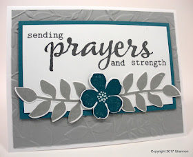
I've received two sets of donations to Karen's Card Shop this week. The first came in from Shannon in Maryland...over 50 cards, mostly sympathy and get well, our fastest sellers.

If you're considering donating to the Card Shop, please know that we truly, desperately need  sympathy and get well cards. Our buyers are mostly the older ladies in the church who mainly want to send sympathy, get well, and birthday cards. Most other themes (except thank you, which are often used by church staff) don't sell well for us.

I especially appreciate all donations of the sympathy and get well cards because I CANNOT keep up with the demand for those. Not even close. They sell really fast!

Many thanks to Shannon for sharing her beautiful work for a good cause. The money we make at Karen's Card Shop goes to three purposes in our church: Cancer: What Now? books for all our church attendees who are diagnosed with cancer, books for Stephen Ministers to use with their care receivers, and the church's general fund. To date, we've made over $840 in a little over a year.

For those interested in setting up their own card shops, you'll find the details of Karen's Card Shop here.

And now, a few of Shannon's many cards.

This bookish beauty was for me! 

Shannon uses a lot of kraft card stock to beautiful effect.

This was my favorite of the lot! White embossing,
a lovely gradation of teal ink, vellum, and sequins.
Perfection!


Gorgeous embossing and use of the diecuts. Plus,
an amazingly soothing color combination.

Another sweet kraft card with just the right touches
of white and an awesome pink heart.

More pressure embossing, great colors, and excellent
placement of diecuts. Love the light feel
of this card.

Butterflies were Karen's favorite...she grew them and released
them with her grandchildren every year. Such a beautiful
card by Shannon with a perfect ribbon, vellum
over dark card stock, and lovely butterflies!

Why not take an idea from one of Shannon's amazing cards and get inspired this weekend?

Mercy, grace, peace, and love,
Susan

Wednesday, August 16, 2017

Christmas Evolution, Part Three

Today, Ellen Hutson's Facebook page asked us to summarize our stamping style in one word.

My word was minimalist.

Today's card makes that point.


All that glorious white space fills my heart with holiday joy!


This card represents the third step in minimalist evolution of an idea. To refresh your mind, here's the original pin; my first card...a rather literal interpretation of the pin; and my second card...a simplified version of the first card. Combine that evolution with the focal point of this pin, and today's card was born.

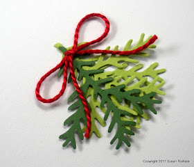
Two shades of green card stock punched with a fern punch replace the three shades of marker on the pine branch stamp of the cards from Christmas Evolution, Part One and Part Two. Punched once in dark green and twice in lime, the ferns are glued with a glue pen. The bottom lime green fern is glued to the card base completely, while the next two ferns are glued only on the top third. I worried this would be too loose, but it's actually pretty sturdy.

Instead of baker's twine or satin ribbon, I went with solid red twine. The bow was glued down at the center with a dot of white glue and weighed down with my cell phone until dry.

The resulting swag says Christmas without any words.

Evolution of an idea can take you to strange and wonderful places. Let it. I had so much fun making all three of these cards!

Mercy, grace, peace, and love,
Susan


Supplies
stamps: none
ink: none
paper: Papertrey white, dark green, lime green
accessories: red twine, glue pen, fern punch

Tuesday, August 15, 2017

Christmas Evolution, Part Two

Yesterday's card was quite satisfying, but the more I looked at it, the more it seemed fussy to my clean-and-simple-loving eye. Inspired by the packaging on this pin, my first card had done its job. But how could I make it less fussy and cleaner and simpler (CASer)?

First, I abandoned the idea of decorative wrapping. Instead, I focused on that fabulous pine branch. Turning the pine branch into a swag eliminated the need for lots of twine because now a simple bow would suffice. Also, no need for a tag! I could let the branch point down directly to a sentiment. This, of course, required a narrower sentiment.

The twine, however, looked oddly light as a bow for the swag...it simply didn't have enough visual weight to balance a red sentiment below the branch. I replaced it with a thin, satin ribbon in solid red and found the right balance.


This design didn't require any additions to the pine branch, a simplification that spared me the post-its.


An advantage to yesterday's card is the sense of movement it offers...from the swing of the large twine bow to the angle of the tag to the angle of the branch. Today's card is compact and linear, with just a little curve in branch. That lack of movement is a weakness, I think, but nevertheless, there's a peace and stability to the CASer version that truly makes me happy.

Mercy, grace, peace, and love,
Susan

Supplies
stamps: Hero Arts
ink: Hero Arts red royal
paper: Papertrey white
accessories: craft foam, glue, Memento markers, water spritzer, red satin ribbon

Monday, August 14, 2017

Christmas Evolution, Part One

I went to my son's special education open house tonight. He's starting ninth grade, and he was very tired. You see, I asked him a week and a half ago to pull weeds. He kept putting it off until yesterday and today. A job that should have taken one hour has taken him about six because, as he is learning, weeds don't pull themselves while you kneel next to them and daydream.

At the open house, he told every teacher we met that he doesn't want to work. Every teacher said he would have to work...but they would make it fun!

Now, I want to go to ninth grade. Jack wants to stay home, watch movies, eat pretzels, and interact with as few people as possible. Except for band. If school consisted only of band, he'd enjoy it.

Of course, practicing his trumpet at home is work, and he doesn't like work.

My head hurts.

Anyway, today we're starting a three-part series on the evolution of clean-and-simple style by examining how I take a relatively simple design and over the course of three cards make the concept increasingly simple, until a few of you will itch at the amount of white space.

Doesn't that sound like fun?

My first inspiration came from the following pin:

Source

Love this! So much goodness here. My first card shows a pretty direct translation of gift wrapping to a card, although I did change the black to red for a more traditional color scheme.


To create some dimension on the pine branch, I inked up the whole stamp with a Memento new sprout marker, then dabbed Memento bamboo and cottage ivy markers over the new sprout in a random way. Finally, a couple of spritzes of water blended the colors, and the resulting image is lovely! (Note that I did add another frond to the branch as it looked a bit skimpy on the stamped panel.)


This card took a shockingly long time to make. Three attempts on the banner (don't ask) and getting the bow just right and adding to the pine branch...not so simple. Check out the accessories list of NINE items. That never happens.

Tomorrow, we'll see how I took that branch and gave it a CASer setting and much smaller accessory list.

Did I just invent a new word? CASer? Wow. Now I'm too lazy to type cleaner-and-simpler. Jack's rubbing off on me.

And since this post is degenerating into acronym abuse, let's end with two pictures of our roly-poly puppy. He's five weeks old and cute beyond words! Labor Day weekend can't come soon enough.

Serious Pup...or Disapproving Pup. Hard to tell.

Happy Pup. Obviously.

Mercy, grace, peace, love, and puppies,
Susan

Supplies
stamps: Hero Arts
ink: Hero Arts red royal
paper: Papertrey white
accessories: dimensional, craft foam, glue, baker's twine, tape runner (to attach twine on back of raised panel...'cause that's easier than getting the twine lined up regularly), Memento markers, water spritzer, post-its to add frond to branch, awl to punch hole in tag because the hole punch mangled the first two tags, which has never happened before and did not amuse me