Monday, March 31, 2014

Square Simplicity

Today's card shows how easy it is to balance a design with two elements on a square. The strong vertical feather and strong horizontal sentiment balance well, but the black draws the eye strongly to the sentiment, which is, after all, the main idea of this card. The feather is support here...pretty support, but support nevertheless.


I adore this sentiment from Emily Dickinson, and it's so useful on a card to send to someone who is struggling. (And who doesn't struggle, at least every now and then!?!)

I chose a simple silver-and-black color scheme, and though the picture doesn't show it well, the silver Brilliance ink is absolutely stunningly shimmery. Rounding the corners of the raised panel definitely enhanced the soft feel of this card.

Is there someone you know who could use a little lift of hope right now? Perhaps you could make them a hopeful card and send it. April is the cruelest month, and the timing might be just right.

Supplies
stamps: Waltzingmouse Fine Feather
ink: Brilliance silver, Memento Luxe black
paper: Papertrey Ink
accessories: dimensionals, corner rounder

Sunday, March 30, 2014

Minimalist Monday

Let's call this a Minimalist Monday post. I'm throwing this one out there to remind you how little you need to make a powerful card.


Isn't all that white space GLORIOUS? Or perhaps you're starting to break out in hives thinking about using so little to say so much? Either way, part of what makes this work is the overall triangle shape of the sentiment and the row of hearts. Also, its placement on the bottom third line works best because the hearts extend higher above the sentiment than below. If I'd placed it on the top third line, it would have looks squished.

Hard to believe anything could look squished with all that white space, right?

Heart-shaped bling. Love it so much!!!

Look for the new One-Layer Simplicity Challenge on Tuesday...and that's no April Fool's joke!

Supplies
stamps: Gina K
ink: Memento
paper: Papertrey white
accessories: heart-shaped rhinestones

Friday, March 28, 2014

Variation on a Sketch and Jonah Update

I lifted the sketch for today's cards straight from Card Creations Vol. 12, which is full of all sorts of good inspiration. Besides, this sketch gave me a chance to play with washi tape again with, as you will see, varied results.

My first take on the sketch followed it exactly.


As you can see, this layout is perfect for using washi tape, and I love how my first card turned out. To make the center of the flower, I put two strips of the narrow orange plaid tape onto a piece of scrap paper and punched a circle from it. Then, I put an epoxy dome sticker over that and glued it to the center of two layered daisy punched shapes. The result is fresh and fun and colorful!

Also note how I used three orange elements: the sentiment, the bottom stripe of tape, and the flower center. That helps unify the whole design, don't you think? I do!

Then, I decided to repeat the sketch with different tape, and that's when things got...wonky.


Try as I might, nothing I used in the place of the flower looked good (including another flower!). I tried punched hearts, larger hearts cut with Fiskars ShapeCutter templates, red hearts, white hearts, single hearts, pairs of hearts. Whatever I tried made the whole design look chaotic and busy. Something black might have worked to draw the eye, but a black heart? Some pretty scary symbolism there, don't you think?

I decided to make the sentiment the focal point by adding bling, but it's not enough to create a strong draw for the eye.

Why the difficulty? These tapes are wider and busier and bolder than the ones on the first card. The fact that they are all red (such a strong color!) creates an overwhelming dominance that takes over the card, and because the red prints are so busy, your eye simply doesn't know where to go. In the first card, the yellow, orange, and teal play nicely together. Here, you're bowled over by red.

Which may not be such a bad thing, considering. Despite the obvious design flaw, I like the red card. It certainly conveys its message of love in a big way, and it feels purposeful and unified.

Which goes to show that not every card you make has to be "perfect" to be successful!

Jonah Update
Jonah is doing well with his treatments, but he recently asked his mom when he will get more cards! It took him a LONG time to open all the Christmas and Valentine cards, and once he'd opened them all, he looked for more. It's so nice to know that the little guy appreciates all the love and card hugs he's received. His fifth birthday is April 12th, and the cards are already starting to come in.

Remember to check the tabbed page at the top of the blog to see if your card has arrived yet. If you want to send a birthday card, please send it to Jonah, c/o Susan Raihala, 7430 Waterway Dr, Waynesville, OH 45068.

To see recent pictures of Jonah and the updates his mother has posted, visit his Facebook page, Jonah Eleison.


Supplies
stamps: Year Round Sentiments (Hero Arts)
ink: Memento
paper: Papertrey white
accessories: assorted washi tape, daisy punch, 3/4" circle punch, epoxy sticker, heart-shaped rhinestones, dimensionals

Thursday, March 27, 2014

Layout Inspired by Heather Stolar

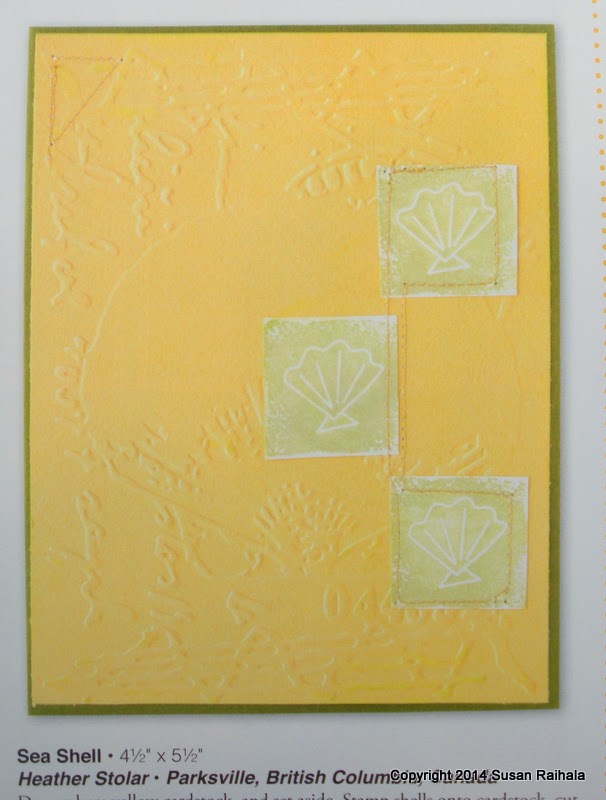
Today's cool layout comes from this colorful card by Heather Stolar published in the spring issue of Take Ten.


Heather used texture very effectively on her card, but what caught my attention were her layout and use of stitching to unify the three squares.

Here is my first card, which sticks pretty much to Heather's layout, although the focal point is shifted slightly down because my squares were a good bit smaller than hers. Pulling everything down gets it in the "sweet spot" of the card, which I felt was important given how much less of the card my three squares take up than Heather's.


My one-layer version of the card uses pops of color on white with gray images and stitching. I chose the images for their curvy nature, as it contrasts so prettily with the straight lines of the squares and stitching.

Also note I added a sentiment because I wanted to do so.

Then, I wondered what would happen if I lined up the squares top and center.


Heather's original layout is much more dynamic, with the triangle of squares lending wonderful movement to the design. My adaptation is linear/static (although the zigzag stitch was chosen to give some movement here), but the static layout allows the color gradation to really stand out.

Which of my two versions do you prefer?

BTW...These inks are all from Hero Arts, and I've had a blast playing around with them!

Supplies
stamps: Hero Arts, Papertrey
ink: Hero Arts
paper: Papertrey
accessories: bling, alcohol markers to color the bling

Tuesday, March 25, 2014

Inspired by Heather Campbell

Heather Campbell published an absolutely adorable card in the recent Card Creations Vol. 12. Isn't it adorable?


Of course it is. It's also beautifully designed, from the subtle ground of hearts behind the not-so-subtle baker's twine to the delightful mix of patterns on the tissue boxes. And the speech bubble with the heart? ADORABLE! And notice how she has three red elements forming a nice triangle (bow, top tissue box, heart). Love how that adds stability and unity to the design.

I recently received an order from Waltzingmouse Stamps with their two feather stamp sets and a freebie because I had to wait so long for the backordered sets (over two months). Thanks, Claire!


I decided to duplicate Heather's layout using a couple of the feathers cut out as Heather did with the tissue boxes. My ground is Text Style from Papertrey and twine (because baker's twine looked busy). Because I lacked the speech bubble (my feathers don't have faces...and their words are the text background anyway), I centered my panel rather than off-setting it as Heather did. Her offset of the mat balances that bubble nicely, but an even mat serves my feathers better.


My card lacks the nice triangle of Heather's card, but the position of the two feathers and the softer colors generate enough unity (in my opinion, at least).

And don't you love how the feathers could have written the text background?

Many thanks to the always inspiring Heather for her card, without which my card would not have been possible!

Supplies
stamps: Waltzingmouse, Papertrey
ink: Hero Arts cornflower blue, soft blue, soft lilac
paper: white 110# card
accessories: dimensions, twine, glue

Monday, March 24, 2014

Cards from Friends

Today, I'm spotlighting three gorgeous cards I've received from friends. Check them out!

Sue sent me this beautiful card and a copy
of the adorable flower stamp,
too!

Sheila sent this fun card. I love the colors
with the kraft base.

Joan sent me her fab card with wonderful gold-pen detailing
and gorgeous soft color!


I am always so grateful when people send me cards! It's happy mail, quite literally. It makes me happy!!!

And if you wonder about your contributions to Operation Write Home...take a look at this video. Amazing what a card--or a card a week--can do to lift a person's spirits.


Sunday, March 23, 2014

IC433--Ruth Bleakley Book Art

This week's IC challenge at Splitcoast is simply delightful! The site for inspiration is Ruth Bleakley's Flickr portfolio.

(And can I say how hard it was to type Flickr without adding the missing e? Annoying how my fingers type without my brain...correctly.)

Ruth's portfolio is filled to the brim with all sorts of inspirational goodness. I made two cards in record time, inspired by two of her books! I'm not sure why my cards are so lacking in color, as Ruth's overall color sense is bright and happy and smart. She makes some amazingly colorful and pretty marbled papers, for instance. But I needed a sympathy card to restock my stash...why does the stash always empty so quickly?!? :(

Anyway, her little gray book proved the inspiration for this sympathy card highlighting stamps from Gina K.


My second card is a masculine birthday card. Can we ever have enough of those? Ruth's banded agate book got me thinking about natural patterns, and this Hero Arts wood grain stamp popped into mind. Add a band, a sentiment (Papertrey Botanical Silhouettes), and some bright blue bling, and you've got proof that bling works on guy cards.


I hope all of you are having a lovely weekend. My own has been nice, although I happily ruined a lot of paper yesterday before I went to the IC and finally found my groove, thanks to Ruth.

So you could say I was figuratively kicking down the cobblestones, looking for fun, and feelin' groovy.

Love that song.