Thursday, April 7, 2016

Cards Received: Eye Candy and Inspiration

In the past few months, I've received a number of cards, both handmade and store-bought, that warmed the cockles of my heart. Here they are. You're bound to find some inspiration in this fabulous collection!


Check out how perfectly Sue drew the lines of the
cross with a metallic marker. Awesome
CAS precision!

I'm proud to be in Lisa's adorable peep pile!
These happy chicks and bright, spring colors
have cheered me on the gloomy gray days
of this Ohio spring. 

Michele found my new favorite Bible verse. I pray every
morning for God to make me a blessing to someone
today. I gotta pay it forward because I'm blessed
beyond measure. Michele's clean, monochromatic design and
great use of negative space are simply beautiful. 


Michele's envelope included four gorgeously CAS postcards from Funky Fresh Supply Company. I could only get good pictures of two of them to share, and the first is incredibly close to my heart.

Quote by Steve Jobs

Quote by Arthur Ashe. 
And now for the store-bought and heart-felt cards.

From my friend Linda L., who wrote from Psalm 59 inside: "I will
sing of your strength, in the morning. I will sing of your love; for you
are my fortress, my refuge in times of trouble." I needed that.

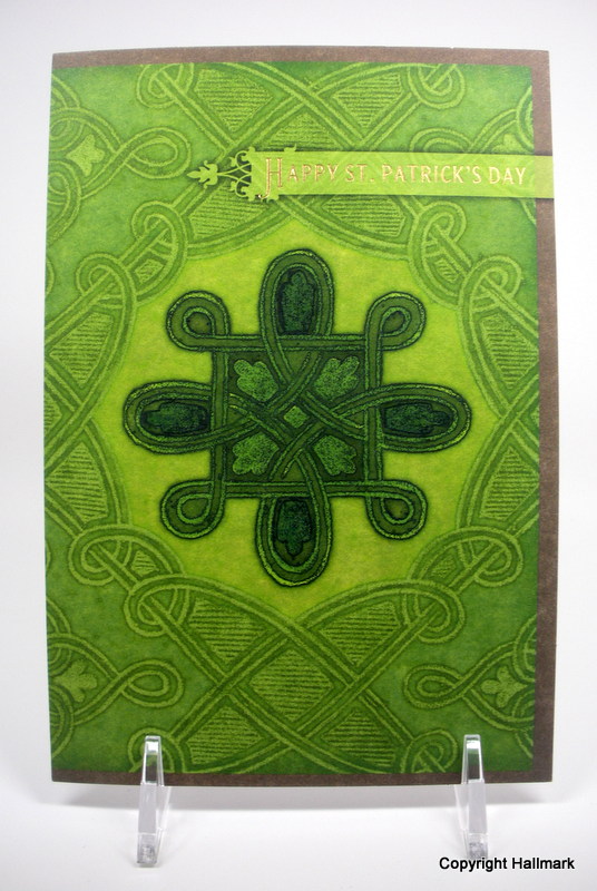
From my friend Anna, who is often the face
of Christ for me.

A card from Linda L. for my whole family!

A glorious burst of color from my graphic design artist friend Liz K.,
who shared Ephesians 3:20 inside. "Now to Him who is able to do
super-abundantly more than all we dare ask or think,
 according to His power that is at work within us."

How blessed I am! Many thanks to all of you for brightening my days and sharing love in paper form. I do so love the love!


Wednesday, April 6, 2016

Lather, Rinse, Repeat

Repetition.

Repetition,

Repetition.

Stamping the same stamp multiple times can yield a lovely design. The repetition can be in a nice straight line, at random, or in some interesting pattern. But repetition can be your friend.

See?


To make this card, I used two different shades of purple and repeatedly stamped the lovely lavender branch from Gina K's Elegant Florals set. The two shades add depth and dimension to the design in a pretty effortless way. Note the unevenness of the repetition...the tops of the lavender go up and down, which creates movement (interest) rather than stasis (boredom).

After trimming the stamped panel down a bit, I stamped the sentiment directly onto it and immediately regretted the decision.

Ugh.

But remember. There are no mistakes in stamping, only opportunities for embellishment*. I stamped the sentiment on a strip of card stock, let it dry, cut it down, and popped it over the original sentiment. Yay!

To add some interest to the design, I used a Wink of Stella pen. You can't tell, can you? Sigh. The idea of the Wink of Stella pen and the reality as one is wielded by me are two very different things. There just doesn't seem to be enough winking. If someone knows what I'm doing wrong, please tell me.

But even without obvious winking, I adore this card. Purple is a color of mourning, or at least it was to Victorians. And I need to stock up on sympathy cards.


Supplies
stamps: Gina K Elegant Florals
ink: Hero Arts passion flower, Memento grape jelly, Memento Luxe tuxedo black
paper: Papertrey white
accessories: Wink of Stella clear pen, craft foam, glue


*This is a lie. There are indeed mistakes, and that's why my trash can fills up so quickly. But you can sometimes recover from mistakes by covering them up as I did here.

Tuesday, April 5, 2016

Feeling Punchy in White

There are times--not often but they do happen--when I experience die envy. Sticking to my simple principles and eschewing the whole Big-Shot-and-million-die money pit can leave me feeling deprived and wanting to punch something.

Paper, that is.

So today I pulled out a bunch of punches and played around. The results (being mostly white) are extremely hard for me to photograph, so I'm not sure how these pictures will look on your computer screen, but I hope you get the idea. In real life, it's so pretty!!!!

I started off with no sentiment and just three little light purple rhinestones, but it did look a bit plainer than I wanted.


So, I added a sentiment to the bowl, and the result looks much more grounded. Weird, huh?


It's okay if you prefer the plainer one, though. I still like it.


The close-up shot really conveys the depth and dimension on this card. It really is beautiful!

To make the bowl, I punched a big circle (the pink Marvy one) and cut it in half. Then, using the StampinUp word window punch, I cut two strips (3/8" high) for the foot and rim of the bowl and glued them on. Then, a strip of adhesive from a tape runner gave me a way to stick the ferns and branches to the back of the bowl. A layer of Scotch tape over the finished product added a bit more security to the fragile design.

Here's a shot of the back of the flower bowl before I covered it in SU dimensionals.


So if you're like me and don't have dies or an electronic cutting machine, pull out your punches and let loose. I feel MUCH better for having punched something, and that green envy monster is back where it belongs...which is to say, not in my craft room.

So there.

Supplies
stamps: Papertrey Gracious Vases sentiment
ink: VersaMagic concord grape
paper: papertrey white
accessories: assorted leaf and flower punches, circle punch, word window punch, tape runner, glue pen, rhinestones, dimensionals


Monday, April 4, 2016

Hi There, in a Sliver


Have you ever thought about the fact that our handmade cards are little slivers of greetings to friends and loved ones. Well, I took that idea literally on this layout.


To create the strip, I used a strip of washi to mark the space, then surrounded it with post its. Then, after removing the washi, I was left with a perfect strip to stipple ink onto. Then, I stamped the flower (Mama Elephant) and the sentiment (Papertrey), removed the post its, added a bit of bling, and Bob's your uncle.

A sliver of greeting.

That's all it takes in my minimalist world.

Supplies
stamps: Papertrey Mega Mixed Messages, Mama Elephant Freestyle Florals
ink: Hero Arts soft pool, pool; Memento Luxe tuxedo black
paper: Papertrey white
accessories: stipple brush, post its, washi, rhinestone


Sunday, April 3, 2016

Inspired by L. Katherine Roberts

The spring issue of Somerset Life magazine has some amazing inspiration in it for us crafty folks. On page 18, we see a really creative tag idea from L. Katherine Roberts. She uses two tags together--one with a name and the other with "enjoy!" These hang from a bag of coffee, artfully decorated in gold and kraft and cream and white. Simply gorgeous packaging...and it's for coffee. Yum.


Somerset Life Spring 2016, p. 18

The direction I took this inspiration piece deviates pretty far from the original, but you can still see the influence. My "tags" are now strips of notebook-stamped paper. There are no holes or eyelets, and everything's oriented horizontally rather than vertically. And of course (it's me, after all) the earthy tones are replaced with crisp white and some happy colors inspired by this pin.


No way would I ever have come up with this layout or concept without having seen Ms. Roberts' pretty packaging!

I hope this demonstrates how inspiration can spark our own creativity and personal style. Don't be afraid to look for inspiration outside your own specific style. Take an idea and run with it. See where it takes you.

Sometimes, the destination is sweet!

Supplies
stamps: Stampin'Up (sentiment), Hero Arts (flowers), Cornish Heritage Farms (notebook paper)
ink: Hero Arts, Memento Luxe tuxedo black
paper: Papertrey white
accessories: rhinestones, craft foam

Friday, April 1, 2016

A Confetti Sermon

Generally speaking, I'm a moderate, or at least try to be...politically, theologically, intellectually, socially, dietarily, physically, emotionally, and so on. The ancient Greeks were on to something when they preached moderation in all things.

Well, not exactly all things.

In Galatians 5, Paul lists the fruits of the spirit: love, joy, peace, forbearance, kindness, goodness, faithfulness, gentleness, and self-control.  It seems to me that moderation in these things would be stingy, tepid, a poor harvest. We want to grow LOTS of the fruits of the spirit, right? I mean, most people, whether they are Christian or Jewish or Buddhist or Muslim or Hindu or Atheist or Other, believe that these fruits are good things. Worthy things. Things we all need more of.

And that's why this sentiment from Hero Arts fills my heart with joy.


How might you throw the spiritual fruit of kindness around like confetti this weekend? Let's be egregious, excessive, immoderate, generous in kindness...and maybe some of the other fruits of the spirit as well.

Heaven knows our world needs more of that sort of extremism.

Supplies
Stamps: Hero Arts Acts of Kindness, My Favorite Things Party Patterns
Ink: Hero Arts, Memento, Memento Luxe black
Paper: Papertrey white
Accessories: rhinestones, corner rounders

I'm Back and Blingy


A reminder: it's almost the first of the month, and a new One-Layer Simplicity Challenge will be posted at midnight. It's something everyone can enjoy, whether they've seen the movie or not. 


My family went to Maryland for the Easter holiday to see my mother and sister and her family. We had such a lovely time, though brief, but getting back to my craft table felt...surreal.

Here's a bit of the stream of consciousness knocking around in my head for the past two days as I tried to dig, climb, even pole-vault over the wall of blocked crafty mojo.

"What am I supposed to do here? Whaaaat?!?!?! I'm confused. Why are all the pretty pictures in my head turning into pretty messes on the paper? Seriously, I did NOT just drop that inked stamp on my card! How did I make a card the shape of a toilet lid? Apparently those two colors do NOT go together after all. Just because something's on Pinterest doesn't make it a good idea. Two-step stamping is diabolical and I'm never buying another set like this again. NEVER. What was I thinking when I bought Copics? Nooooooooo!!!!!!! Even bling can't save this. Maybe Stickles will fix it.... I guess not."

And so on.

Surely you have NO idea what I'm talking about. Right?

Anywho, I finally made something both blog-worthy and LateBlossom-ish. (Y'all would not even believe the busy, busy, busy card I made before making this one. Yikes!)

Card Size: 6.25" x 3.5"

The orange and raspberry together are my new favorite combination. Well, not my absolute favorite, mind you. Color combos for me are a bit like children. You love them all equally because really, they all have their good points. These flowers (from Gina K) look great with the funky font of the PTI sentiment. A tiny orange bling brings the sentiment into relation with the flowers.

I hope you all had a lovely break for Easter and are enjoying allergies, blossoms, and thunderstorms, just like we lucky folks in southwest Ohio. Aaa-choo!

Bless you.

Supplies
stamps: Paptertrey sentiment, Gina K flower
ink: Hero Arts orange soda, raspberry; Memento Luxe black
paper: Papertrey white
accessories: rhinestones