I truly try to give credit where credit is due, but I cannot remember where the idea for these two cards came from. I've searched and searched, and nothing's turning up. I THINK the idea came from a Stampington publication, but like I said, I can't find it. And it's definitely not my own.
If anyone recognizes the source, please let me know so I can give credit.
So here's the idea that I found so appealing: a background on the edge of the card with vintage-y stamps. What a great use of two very old, distress-edged shadow stamps from Hero Arts!
The first card takes advantage of honey yellow for a pop of strong color. The lovely vintage-style StampinUp stamps are tightly focused in one small area of the card for a very strong focal point.
The second card goes soft and serene with a larger blue backdrop and with vintage images spread out a bit more to breathe.
Honestly not sure which I prefer, but they both are satisfying.
Again, if you have any clue what the source of this inspiration might be, please let me know.
Mercy, grace, peace, love, and proper citations,
Susan
Supplies
stamps: StampinUp Nature Walk, Papertrey sentiments, Hero Arts shadow
ink: Archival cornflower, saffron, black
paper: Papertrey white
accessories: not a one
Sunday, July 2, 2017
Saturday, July 1, 2017
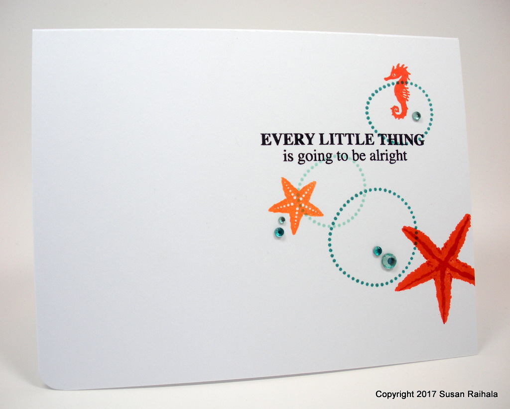
Every Little Thing
Inspiration takes odd turns sometimes.
Consider this scrapbook layout by Shanna Noel, which I came across while perusing last week's Inspiration Challenge:
I love this design (can you say, "White Space and Strong Visual Triangle?), but my attempts to translate it to a card were only moderately successful. I decided to take ideas from the layout and try them on a single area of a card. My first effort was, again, only moderately successful, but the second let me know that "every little thing is going to be alright [sic]":
Instead of three circles spread all over the card, I brought them together as aqua-colored bubbles connecting three orange sea creatures. Then I added bling because...well, you know why.
My thought with the card is that life tends to roll us around like bubbles and critters in a wave, but every little thing is going to be all right anyway.
Mercy, grace, peace, and love,
Susan
Supplies
stamps: My Favorite Things Party Patterns, various Hero Arts ocean sets, Simon Says Stamp Uplifting Thoughts
ink: various dye inks
paper: Papertrey
accessories: rhinestones
Consider this scrapbook layout by Shanna Noel, which I came across while perusing last week's Inspiration Challenge:
![]() |
| Source |
I love this design (can you say, "White Space and Strong Visual Triangle?), but my attempts to translate it to a card were only moderately successful. I decided to take ideas from the layout and try them on a single area of a card. My first effort was, again, only moderately successful, but the second let me know that "every little thing is going to be alright [sic]":
Instead of three circles spread all over the card, I brought them together as aqua-colored bubbles connecting three orange sea creatures. Then I added bling because...well, you know why.
My thought with the card is that life tends to roll us around like bubbles and critters in a wave, but every little thing is going to be all right anyway.
Mercy, grace, peace, and love,
Susan
Supplies
stamps: My Favorite Things Party Patterns, various Hero Arts ocean sets, Simon Says Stamp Uplifting Thoughts
ink: various dye inks
paper: Papertrey
accessories: rhinestones
Thursday, June 29, 2017
Thank You, Marcia!
The very kind and generous Marcia P. (whom I had the pleasure to meet in person last September) sent a batch of birthday cards for Karen's Card Shop at my church. All the cards they sent were lovely, and here are a few of them!
Many, many thanks to Marcia and her friend for sharing so generously of their talent with Karen's Card Shop. If you're interested in learning more about how my church's card store works, please visit the tab on my blog labeled "Karen's Card Shop."
If you're interested in donating some cards, please email me first. We do have quite a stock of some types of cards and are in constant want of others.
Mercy, grace, peace, love, and gratitude,
Susan
| Delightful polka-dots and perfect use of the rule of thirds make this a fun and beautifully designed card. |
| Love the bright dark pink and blue, and the ribbon adds lovely interest as a ground for the vase! |
| Great texture and colors...and very good advice rolled into one awesome card. |
| Daisies are my favorite flower, so this fabulous card makes me smile! The tassel on the tag is absolutely perfect. |
| Great use of delicate yet colorful die cuts on a fabulously white background. |
Many, many thanks to Marcia and her friend for sharing so generously of their talent with Karen's Card Shop. If you're interested in learning more about how my church's card store works, please visit the tab on my blog labeled "Karen's Card Shop."
If you're interested in donating some cards, please email me first. We do have quite a stock of some types of cards and are in constant want of others.
Mercy, grace, peace, love, and gratitude,
Susan
Wednesday, June 28, 2017
Color, Color Everywhere!
No time to chat tonight, but this card doesn't require chat. It's just a lovely expression of a fun color!
A big stamp like this three ferns wood-mounted rubber stamp from Hero Arts can be used on a CAS card...if you limit the space it takes up with a mask. Add a big sentiment, and you're golden.
Or teal, as it were.
Mercy, grace, peace, and love,
Susan
Supplies
stamps: Hero Arts, Papertrey
ink: Hero Arts ocean, intense black
paper: Papertrey white
accessories: silver metallic marker (Prismacolor), ruler, post-its for mask, metallic shimmer enamel dots
A big stamp like this three ferns wood-mounted rubber stamp from Hero Arts can be used on a CAS card...if you limit the space it takes up with a mask. Add a big sentiment, and you're golden.
Or teal, as it were.
Mercy, grace, peace, and love,
Susan
Supplies
stamps: Hero Arts, Papertrey
ink: Hero Arts ocean, intense black
paper: Papertrey white
accessories: silver metallic marker (Prismacolor), ruler, post-its for mask, metallic shimmer enamel dots
Tuesday, June 27, 2017
Butterfly Blues
Ninety-nine percent of the time, my decision to eschew dies and die cutters fills me with minimalist satisfaction, for I know without a doubt my need to have EVERY DIE OUT THERE to justify the cost of whichever die-cut machine I purchased would exceed rational, healthy boundaries.
But one percent of the time, this decision makes me blue.
This one-percent blue was sparked by seeing a number of cards on Pinterest that use dies to cut out a wide range of interesting shapes so a pretty background can show through. While I'm able to achieve the look of this technique with punches, it's neither easy nor entirely satisfying.
Punches just don't give a stamper the range to reach all over a panel...even a small panel like this. The negative of the punched shape must stay near the edge of the panel. Martha Stewart makes some "anywhere" punches, but I've not purchased them because they are a dozen more things to buy.
My blue background was stamped with a variety of splatter stamps in three shades of blue. Those blues do make me so very, very happy.
Tomorrow, I'll have recovered from my moody blues, but today, I'm feeling a tinge of regret for my minimalism.
But the blues sure are pretty in the negative space of that butterfly, aren't they?
And a 99 is still an A+. I'm happy with that grade!
How do you feel about the supplies you've chosen not to buy? Where do you draw the line? Do you draw a line!?!
Mercy, grace, peace, and love,
Susan
Supplies
stamps: Papertrey (sentiment) and various splatter stamps
ink: various dye inks
paper: Papertrey white
accessories: Martha Stewart butterfly punch, square punches, dimensionals
But one percent of the time, this decision makes me blue.
This one-percent blue was sparked by seeing a number of cards on Pinterest that use dies to cut out a wide range of interesting shapes so a pretty background can show through. While I'm able to achieve the look of this technique with punches, it's neither easy nor entirely satisfying.
Punches just don't give a stamper the range to reach all over a panel...even a small panel like this. The negative of the punched shape must stay near the edge of the panel. Martha Stewart makes some "anywhere" punches, but I've not purchased them because they are a dozen more things to buy.
My blue background was stamped with a variety of splatter stamps in three shades of blue. Those blues do make me so very, very happy.
Tomorrow, I'll have recovered from my moody blues, but today, I'm feeling a tinge of regret for my minimalism.
But the blues sure are pretty in the negative space of that butterfly, aren't they?
And a 99 is still an A+. I'm happy with that grade!
How do you feel about the supplies you've chosen not to buy? Where do you draw the line? Do you draw a line!?!
Mercy, grace, peace, and love,
Susan
Supplies
stamps: Papertrey (sentiment) and various splatter stamps
ink: various dye inks
paper: Papertrey white
accessories: Martha Stewart butterfly punch, square punches, dimensionals
Monday, June 26, 2017
We Have Both Kinds of Flowers: Horizontal AND Vertical
Altenew's Extra Special stamp set includes a lovely layered flower...perfect for my MISTI and for one-layer cards in a horizontal or vertical orientation.
Now, the MISTI was given to me by Tina S., who lives in my small town and works in our school district and treats my kids right. She's a wonderful person, generous and kind. As you can see on both of today's cards, the MISTI is extremely helpful with layered stamping, and we can thank Tina for that.
Cheerful yellow with bling for flower centers and as accents...lovely thank you! I like how the sentiment's font mimics the flow of the black outline.
Blissful blue and a bit of black Stickles for flower centers...sister blessings!
The blue and black sentiment enhance the card's unity.
Playing around with colors for layered stamp sets highlights how a simple color change can completely alter the atmosphere of a card. Bright, happy energy or serene beauty...either way, it works!
Supplies
stamps: Altenew Extra Special, Papertrey (sentiment on yellow card)
ink: various dye inks
paper: Papertrey white
accessories: MISTI, rhinestones, Stickles
Now, the MISTI was given to me by Tina S., who lives in my small town and works in our school district and treats my kids right. She's a wonderful person, generous and kind. As you can see on both of today's cards, the MISTI is extremely helpful with layered stamping, and we can thank Tina for that.
Cheerful yellow with bling for flower centers and as accents...lovely thank you! I like how the sentiment's font mimics the flow of the black outline.
Blissful blue and a bit of black Stickles for flower centers...sister blessings!
The blue and black sentiment enhance the card's unity.
Playing around with colors for layered stamp sets highlights how a simple color change can completely alter the atmosphere of a card. Bright, happy energy or serene beauty...either way, it works!
Supplies
stamps: Altenew Extra Special, Papertrey (sentiment on yellow card)
ink: various dye inks
paper: Papertrey white
accessories: MISTI, rhinestones, Stickles
Sunday, June 25, 2017
Bold Color, Bright Bling
Today's card was inspired by a number of cards featuring brightly-colored backgrounds for white die cuts, like this card here by Loll Thompson. Loll used alcohol inks to create her lovely background, but I don't have alcohol inks (a lack I may or may not correct). Using my Tim Holtz Distress Inks, I sponged an ombre backdrop for my white, punched flowers.
I love the way the Distress Inks blend so smoothly with the Tim Holtz mini blending tools. The intensity of the color is wonderful and pops right off the white card base. I added rhinestones to my daisies after coloring them with Sharpies. Because, you know, BLING!
This weekend, we put a downpayment on a new puppy! She's not been born yet, but we have second pick of a litter between two adorable adult golden retrievers. Here are the mom (Annie, left) and dad (Grady, right).
Their previous litter was full of adorable pups!
Around Labor Day, our lives will become very, very chewy and furry. Please say a prayer for Daisy, who will no longer be the only pup. She may not be amused by a little furball.
Mercy, grace, peace, and love,
Susan
Supplies
stamps: My Favorite Things Label Maker Sentiments
ink: Tim Holtz Distress Inks, Memento black
paper: Papertrey white
accessories: flower punch, rhinestones, Sharpie markers
I love the way the Distress Inks blend so smoothly with the Tim Holtz mini blending tools. The intensity of the color is wonderful and pops right off the white card base. I added rhinestones to my daisies after coloring them with Sharpies. Because, you know, BLING!
This weekend, we put a downpayment on a new puppy! She's not been born yet, but we have second pick of a litter between two adorable adult golden retrievers. Here are the mom (Annie, left) and dad (Grady, right).
Their previous litter was full of adorable pups!
Around Labor Day, our lives will become very, very chewy and furry. Please say a prayer for Daisy, who will no longer be the only pup. She may not be amused by a little furball.
Mercy, grace, peace, and love,
Susan
Supplies
stamps: My Favorite Things Label Maker Sentiments
ink: Tim Holtz Distress Inks, Memento black
paper: Papertrey white
accessories: flower punch, rhinestones, Sharpie markers
Subscribe to:
Posts (Atom)