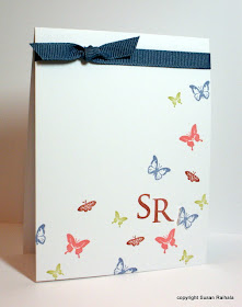
I tried popping the monogram up. Yuck...although to be fair, this might work if you positioned the butterflies specifically to do this. On my card, though, there were too many butterflies crowded under the popped monogram and it looked BAD. I'm just too lazy to try again. Sigh.
I tried using a giant SU monogram (Headline Alphabet) and it definitely made the monogram the center of attention, but it was, alas, too big. Sigh again.
Then I tried a tiny change to the original card, which I think is a little better.
I stamped and cut out a blue butterfly and positioned it a little below the monogram. I think it does draw more attention to the monogram, but I still think there are just too many butterflies. Oh, and I can't take the ribbon off this card because I used the stay-put ribbon technique so there's a big, ugly hole hidden under the knot.
I'm starting to hate this card, which is a shame, because it's really not that bad. Sigh.
Then, I saw Harriet's variation on the card, put her idea together with the gist of Monogram Card #3, and Bob's your uncle:
What does "Bob's your uncle" really mean? I don't know, but it seemed suitable here. I am finally happy with my butterfly monogram card. It's random in the same tidy way as Monogram #3, the monogram stands out sufficiently, and, well, who DOESN'T like bling?
Thanks, Harriet, for the inspiration!


Good MOrning
ReplyDeletewas thinking perhaps 1 blue butterfly ( a maverick!!!)in the upper left corner under the bow would give it more balance. didn't realize it until you expressed your unhappiness with the card but is seems a little heavy on the lower right. Thanks for detailing your work. It helps me anazlyze and solve when I am just stimped. Know something is not right but can't seem to figure out what. You lead me to a new perspective other than the trash can!!!
blessings
patti moffett
Oh and yes I can spell...just typed too fast and didn't proofread!!!!
ReplyDeleteblessings
patti
I love "Bob's your uncle", it's right up there with "Holy Buckets" for me. I never have the nerve to use them though, not being British or from Minnesota. Thanks for letting me live vicariously though you. That goes for fabulous card making too- :)
ReplyDeleteAll the cards are nice! I am picky about Font some fonts just look better with different images...Maybe you would like a different font with it...It took me a while before I found an S I was happy with on my wedding card...and all is was was the letter....Have a great day!
ReplyDeleteOh Susan - I love this one!! This was a lot of fun for me - we have to do this again!! I sure wish I had someone here to stamp with!
ReplyDeleteCute, cute, cute! And now I have to go discover what the "stay-put ribbon technique" is. :P
ReplyDeleteI made a number of these, trying to see if I could do something with the idea, but MAN, it's HARD to randomly space small objects on a white space, so that they still seem not too crowded, but not too sparse, balanced in colour and size. I admire your willingness to put the card out there (I do like it, so I don't think it was too risky!) AND especially your ability to take all the comments in the spirit they were meant. I'm not good with 'feedback' - even (or maybe especially!) when I've asked for it! I think you found a good solution in the end.
ReplyDeleteCan't wait to see what you've got tomorrow!
Love this version ... more balanced. Sorry I didn't get a chance to take up the challenge .... maybe another time!?!?!!?
ReplyDeleteBob's your Uncle ? - mmmmmm I'm British and my Mum used this expression all the time but to this day I do not know what it means or where it came from ... Whats with Minnesota Karin?
Love this revised version! I think part of what makes it work is that that there is more contrast between the size of the letter and the butterflies, all of which are small. Maybe that same switch would help the original swoosh design--larger letter, all small butterflies. Anyway, this is lovely!
ReplyDelete