Pages
Monday, November 30, 2009
Feel Better Soon and Tips on Stamping with Clear Stamps
Leaves and bling, and purple and green. What more could you want?!?! This card is as straightforward as it looks.
Since I really don't have much to say about the card (except that I love it!), let's talk about getting good impressions with clear stamps. This card uses photopolymer stamps from PTI, which are high quality, stamp beautifully, and are very affordable. I love high-quality clear stamps but realize some people are either viscerally opposed to clear stamps or inexperienced and thus afraid to try them.
I fell in the latter group, got over my fear, and placed an order with PTI in August of 2007. Stamping with clear really is different from stamping with rubber, but the differences are easily overcome. For me, four main things affect clear-stamp image quality: ink, paper, stamping surface, and amount of pressure.
When stamping solid photopolymer images, I find some inks work better than others. Thicker inks like VersaColor (pigment inks), VersaMagic (chalk inks), Brilliance (fast-dry pigment inks), and ColorBox/SU craft (slower-drying pigment inks) give the best coverage and are my go-to inks for stamping with clear stamps.
These inks are very thick and sometimes require more frequent reinking than other types of inks, at least in my experience. I've bought pads that didn't work well at all, but once I reinked them, they worked beautifully.
A few other brands also work well with photopolymer, such as Memento and VersaFine and Palette. I use Palette Noir and Dark Chocolate for all outline images, clear or rubber. These work great for coloring in with any medium and don't smear.
Sometimes, SU classic and other thinner inks pool a bit or don't give complete coverage on clear stamps, especially poor-quality ones made of silicon rather than photopolymer. (BTW, I despise silicon stamps and refuse to buy any more of them...talk about visceral reactions!) I've heard you can ink clear stamps with VersaMark ink, then the dye ink, to get a good impression, but I've never needed to try that myself. Generally, SU classic works okay for me with clear stamps, especially with line images. But the thicker inks do give a nicer impression.
Another factor that affects image quality is paper. Cheap paper rarely takes ink well, in my experience. Some people prefer smooth paper like SU's whisper white; some prefer paper with a bit of tooth like PTI's white. I generally go with PTI's white because it's heavier, thus making a nicer one-layer card, and because the thicker inks dry faster on it than on smooth paper.
Basically, I'm too impatient to wait for thick inks to dry on smooth paper and tend to smear them. Grrrr.
Stamping surface also affects image quality. I rubber stamp mostly on a self-healing cutting mat, but for solid-image clear stamps, I stamp on a special pad made for stamping. It's like a giant, extra-thick mouse pad, purchased at JoAnn's years ago. I've read at SCS about people using sheets of craft foam, which would probably work well and cost less. You just need an even surface that has a bit of give to it.
Finally, the amount of pressure you exert with clear stamps is less than what's required with rubber stamps, especially with sentiments or outlined images. This simply takes practice to get right. Just yesterday, I put too much pressure on a clear sentiment and had to cover it up because the lines came out all blurred. Urgh. Solid clear images can take a lot of pressure, but even they will get blurred around the edges if you push too hard.
I hope this post helps those of you who are struggling with clear stamps or are too afraid to give them a try. Rubber and clear both have definite advantages and disadvantages, and everyone's priorities will vary.
Isn't it great we have so many options these days?
Saturday, November 28, 2009
Grateful for You
Here's the next post in my Turning a New Leaf series. Have I mentioned how much I love this set? Yes? Well, not enough yet.
I LOVE THIS SET!!!!!!
Today's card uses the largest leaf branch in the set. Let's stop for a minute and sigh in delight at the graceful curves of it. All together now: Sigh. So pretty.
I stamped the branch in Versacolor khaki ink first. Then I stamped three circles of a very light magnolia ink on a scrap of white paper. I stamped three much smaller circles of topaz ink on the magnolia circles, and then punched the flowers out so the topaz circles were centered in the flower.
I just love how the off-white flowers look with the white background paper!! What a great way to get a punched shape in just the right color you need. Works great if you have a bazillion ink pads like I do.
The sentiment is stamped in topaz and is from Signature Greetings, Dawn McVey's new set at PTI. Let's have another collective, happy sigh, shall we? Sigh.
This color combo was so fresh and fun to play with after what seems like MONTHS of red and green and snowflake blue. Oh, yeah, it HAS been months. But I'm not tired of Christmas. Thank goodness, 'cause I am not done with it yet.
Have a blessed Sunday, folks! If you celebrate Advent, you might enjoy hopping over to Questioning my Intelligence. I'm posting a few Advent devotionals there during the next month.
Supplies
stamps: PTI Signature Greetings, Turning A New Leaf
cardstock: PTI white
ink: VersaColor
accessories: flower punch
Christmas with a Button
Turning a New Leaf...there aren't enough words to express how I feel about this set from PTI. It's TOTALLY AWESOME! But even using all caps doesn't do justice to my feelings. Here's another Christmas card I made with it. Over the next few days, I'll post some non-Christmas cards that use it. Good golly, this set is PERFECT for clean and simple cards.
At first, I tried burgundy and then green strips under the border punch (with matching ribbon in the button). Both colors looked so heavy and unbalanced the card. By putting the white cardstock behind the white and keeping the ribbon white as well, the whole card seems brighter and happier.
I hope all my American readers are enjoying the long holiday weekend! We sure are.
Supplies
stamps: PTI Signature Christmas, Turning a New Leaf
ink: VersaColor burgundy, evergreen
paper: PTI white
accessories: button (PTI), ribbon, Martha Stewart border punch
Friday, November 27, 2009
Warm and Yummy Gift Set
The card (on right above) is a 4.25" square designed to mimic the toppers below. I made the box (on left above and close-up below) specifically to fit the Tazo tea bags, but if boxes aren't your thing, you could use a cello bag and topper.
Simplicity Tip: The easiest way to learn how to make boxes is to get a template off the Internet. There are lots of free ones you can use to figure out the basics. Once you've made a few boxes using templates, you'll see how easy it is to customize them for whatever size you need. Seriously. Easy! And buy a Scor-Pal if you don't already have one. Those things are DA BOMB. You KNOW you deserve one!
The rest of the goodies are packaged in cello bags (the Russian Tea is in small zip bags that hold a single serving each). My friend loves tea and chocolate and shortbread, so this is the perfect set for her.
Clean and simple packaging, plus tasty treats. I love Christmas!
Supplies
stamps: Holiday Treats
cardstock: PTI vintage cream, SU bravo burgundy
ink: SU close to cocoa, bravo burgundy; PTI vintage cream
accessories: cello bags (Hobby Lobby), ribbon, circle punches, scalloped circle punch, dimensionals, staples
Thursday, November 26, 2009
Thank You
I am grateful for all of you who read Simplicity. Thank you for taking time out of your busy schedules to stop by, and special thanks to those who take time to leave a comment. I am amazed daily that people are actually interested in my little corner of the stamping world.
In America, we're formally celebrating gratitude today by eating until we explode. I routinely joke that I don't have enough stamps, but really, I am abundantly blessed, as are all of you who read this on a computer. Amidst our abundance, let's remember those at home and worldwide who do not have enough...enough food, enough shelter, enough peace, enough hope.
I hope our abundance moves us to share, to reach out, to help in whatever way we can, quietly and without fuss wrapping and giving a present to those in need.
Happy Thanksgiving.
Wednesday, November 25, 2009
Favorite Cardstock
The first rule of paper craft supplies is to buy quality product. If you use cheap cardstock, your cards will look cheap. Cheap stamps don't work as well as high-quality stamps. Cheap inks don't stamp as well. Cheap rhinestones won't stick. And so on.
Most of my cards have white or cream bases, so I need a sturdy cardstock. My favorite white/cream/kraft cardstock comes from Papertrey Ink. It's very heavy and has a bit of tooth (not totally smooth like SU's whisper white) that helps inks dry quickly and takes ink beautifully. SU's Read Red classic ink NEVER dries on whisper white, but it's good to go in seconds on PTI's paper.
BTW, Real Red is my all-time favorite red. I've tried about 10 different red inks, and none comes close to the richness of SU's Real Red.
PTI's cardstock, because of its thickness, requires scoring to get good, smooth folds. My Scor-Pal comes in handy for this, but I used to use a ruler and butter knife with good results, too. The thickness also makes it perfect for one-panel notecards that look every bit as nice as Crane's stationery.
For colored cardstock, I use SU and PTI, both of which are equally high quality, IMHO. PTI's might be slightly heavier. I love the coordinated product lines of SU and PTI because they make life so much easier and both are high quality.
I'm certain there are other brands of cardstock every bit as good as PTI's and SU, so please don't take my word as the last word on cardstock. I try to limit my own purchasing to a few companies to keep life simple, but this means I'm slow to pick up on new trends and product that other companies might offer.
Also, the second rule of paper craft supplies is to use the right product for the right purpose. For instance, I've read rave reviews of Gina K's heavy cardstock for use with Copics, but as I don't HAVE Copics (except for the three Susie Berker sent me as blog candy), I haven't tried it. Different types of cardstock yield different results with different techniques. Experiment to find what works best for your needs.
I hope this answers your question, iriseyes, and I invite you all to share your favorite cardstocks in the comments.
Never the Right Sentiment
And no, I'm not going to use my computer. I'd rather whine and keep buying stamps.
This card (a variation on the holly card here) almost totally works for me, but I wish the Joy stamp had a cleaner font that was a just a tiny bit heavier. It's really too light here. Using PTI's Turning a New Leaf is so much fun though. Very simple, very easy. I foresee much easy beauty coming from that set. Nichole Heady is a complete genius. I want to be her when I grow up.
To all my readers in the US, I hope you have a very happy Thanksgiving!
Tuesday, November 24, 2009
Happy Retirement
I rock-and-rolled the leaves with pastel lime and pastel olive chalk inks, then added the ivory primas. The picture makes the big prima look slightly darker than it really is. I put chocolate half-pearls on the primas. The result is a sweet and simple card!
Monday, November 23, 2009
Spread Sunshine
You'd be amazed how lying to yourself works. Give it a try. I really was happier last winter than in any previous winter since we moved here.
As I was perusing photo files trying to decide what to back up, I found this card that never got posted:
Can't you just taste the citrus? When I put on my critic's cap, I know this card isn't perfect (somehow, the black box and sentiment seem totally separate from the citrus slices, but I'll be darned if I can think of how to unify them right now other than drawing the box in yellow, and I'm not sure that would look good either).
When I put on my sunshiny day cap, however, I think this card is SWELL!
I'm wearing my sunshiny day cap today. My critic's cap is buried in a bin in the basement with my summer clothes. It's much easier to be critical when the sun is shining.
It's a beautiful, sunshiny day here in Ohio (at least in my head). I hope this card makes your day sunshiny, too!
Supplies
stamps: PTI Be Fruitful, Hero Arts sentiment
paper: PTI white
ink: darned if I remember
accessories: rhinestones, black Micron pen, ruler
Sunday, November 22, 2009
The Personality of Paper
One of my Christmas projects this year was to make Blessing Books with my Bind-It-All. The idea is that the recipients can write their blessings down in the book over the next year. The covers are made with different papers glued to matte board; the book block is made with high-quality stationery paper.
The first book I'm showing has a very natural, highly textured paper with bits of flower petals and stems embedded in it. The result is perfect for a friend who gardens, don't you think?
The second book is covered in a smooth Florentine paper with a very ornate pattern highlighted with gold metallic ink. The result here is elegant, formal, and pretty.
Structurally, these two books are identical, but their personalities couldn't be more different. Because of the paper.
For those of you with BIAs, the covers are 5 3/4" x 4 3/8", and the book block is 5 1/2" x 4 1/4". The BIA settings are B for the cover, and C for the book block. The books are bound with 3/4" wires and are just over 5/8" thick.
If you are interested in making books beyond the BIA, or in learning to cover boards with paper and PVA glue, I recommend any book by Alisa Golden. There are also lots of tutorials available online. Book binding gives a papercrafter another way to explore the personality of paper.
FYI: Posting on all my blogs will be sporadic over the next week or two. We will have out-of-town guests and lots going on with the kiddos. Have a very happy Thanksgiving!
Saturday, November 21, 2009
Indecision May or May Not Be My Problem
I can't make up my mind. See, the lined-up snowflakes satisfy my AR/OCD. It is also the first time I successfully used not just one but two giant rhinestones without feeling trashy.
But this bag.... Random RED flakes and sentiment stamped directly on the bag. My first time doing that. I was a virgin bag stamper. Scared the heck out of me. After all, what if I ruined it! Then I thought, if I ruin it, I can just COVER IT UP! Yes, I am a genius. And very brave.
But still indecisive.
Friday, November 20, 2009
Christmas Gift-Giving Gift Set
How cool is this!?!?
The genesis of this set began with the tiny little envelopes that have been lurking in my stash for about five years. They are from Hero Arts and only hold a 1" square card.
In the same drawer as the envelopes were some pre-made tags. I used Faux Ribbon, a silver metallic marker (in two nib widths), and various snowflake stamps to make the design, and accented each snowflake with a bit of silver Stickles. A bit of sheer white ribbon tops each tag.
The next element was a bit more involved. Using my Bind-It-All, I made a small book with simple white matte-board covers stamped the same way as the tags. This little book is a great way for my friend who will receive this to keep track of her Christmas shopping.
A final element of the set (that I didn't photograph) was a package of two rolls of blue and silver ribbon for adding to the gift-wrapped packages.
The next step will be to make a coordinating card to accompany the set.
Hope you like it!
Thursday, November 19, 2009
Grady Update on Questioning
More Ornaments...
It took an embarrassing number of attempts to get it right:
Finally! And the result really isn't hard at all. Sigh. Sometimes, I'm a dork and try to make things too complicated. KEEP IT SIMPLE, SUSAN!
And the ornament is fab, isn't it? So sparkly and fun. I punched out a smaller circle from a sheet of adhesive, adhered it to the turquoise scalloped circle, and put turquoise glitter on the top. Then, using glue dots, I adhered the snowflake circle over the glitter. That was it. And I am SO DONE with ornaments for this year.
Maybe.
I made the following red-and-vanilla ornament last year. It's very much in the spirit of my recent bling post, don't you think?
The stamp is from Etruscan, a long-ago retired SU set that I love. It's on very vanilla cardstock, then mounted on real red. The photo fails to capture the sparkle of the gems, but I'm sure you get the idea!
Tomorrow, hopefully, the sun will come out and I can get some decent pictures of my latest gift set. It's not got any ornaments in it. What in the world could it be?!? *wink*
Tuesday, November 17, 2009
Backtracking a Bit
Here's another card that came out of that day of experimenting:
Sorry for the weird lighting. Sunlight is a fickle thing through my window!
After yesterday's bling-fest, this looks shockingly blingless to me. Still, it's a pretty card, with the scallops and curvy font of the sentiment balancing the straight lines of the squares. And the colors just make me happy.
I hope they make you happy, too!
Supplies
stamps: PTI Sign Language, Birthday Basics
ink: Versacolor
paper: taken with teal, PTI white
accessories: square punches, scalloped square punch, dimensionals
Fun with Bling and Border Stamps
I liked it.
Then I stamped Merry Christmas from Peaceful Poinsettias in black.
Lovely.
Then I added blue rhinestones to each snowflake center.
OMG! CAS and BLING! The bling totally makes this card sing!
The Christmas version of this oh so classic and unoriginal layout looked so good, I decided to try the same layout with PTI's Background Basics: Retro. The next card was even easier!
Don't you just love all those tiny purple rhinestones? They are so happy to be ON A CARD instead of in my hoard where they sat, all sad and lonely and useless. Now they have a purpose, a new life. Bless their sparkly purple souls!
The third version uses an ink I learned about from JulieHRR: Brilliance pearlescent beige. Beige does not sound like a great color, but oh, my, trust Julie. It is. These rhinestones are champagne colored and blend perfectly with the pearlescent beige. So simple, so elegant!
If you're anything like me, you hoard bling, thinking that it's too special for everyday cards. Well, I challenge you to USE some. Actually, use A LOT, like I did here. Don't be afraid. Just go right ahead and bling generously. Then, you can buy more bling.
"Bling is good."
Let's call that Simplicity Wisdom. Go forth, Grasshopper, and bling.
Monday, November 16, 2009
Razzleberry Butterfly
This year, I decided to buy StampinUp's multipack of In-Color paper and the pack of markers so I could have all the In Colors as inexpensively as possible. I will not do that again. Basically, markers are GREAT for coloring in stamps with multiple colors (which I only occasionally do), but they are NOT a great replacement for pads (which I use all the time!). I don't even LIKE all the in colors this year, either. Penny wise, pound foolish.
I have felt sad every year before that I couldn't justify spending so much to get all the in-colors, but there have been a few I've regretted purchasing (like True Thyme). Add to all this my frustration that Cool Caribbean and Wild Wasabi are NO LONGER AVAILABLE (whaaaaaaaa!), and the sum of my attitude toward In Colors is ambivalent.
Now that I got all that off my chest, it's time to talk about today's card. The butterfly is from SU's retired Natural Beauty. The sentiment came after the panel was stamped: the butterfly looks lonely, doesn't it? The darker color scheme reinforces the miss you sentiment, and I intend to send this to the troops for their use.
Rich Razzleberry is my favorite of the In Colors this year. Next, I plan on using it on a predominantly white card because it should really pop prettily, don't you think? I tried that with Crushed Curry, and the resulting card is so sad looking that it's getting recycled. Blech.
Have a great Monday, everyone!
Supplies
stamps: Natural Beauty, PTI Simple Little Things
ink: Rich Razzleberry, Soft Suede
paper: Rich Razzleberry, Soft Suede, white
accessories: ribbon, dimensionals
Sunday, November 15, 2009
More Extreme Papercrafting
I remember having fits trying to make books with this patterned paper. I couldn't get the snowflakes to balance out nicely at all, so I kept this one and used other paper for the ones I gave away. But the idea of this book makes me so happy, I thought I'd share anyway.
The book content was created in MS Word using text boxes (I cut each page by hand using a quilting ruler and craft knife just inside the text box line...little wonder my wrists hurt so bad!). This book contains my favorite version of the Christmas story: Luke 2:1-20, King James Version. The text color coordinated with the color of the cover. I read it every year as I decorate the tree to remind me what all the hoopla is all about.
The last book I'll share is really different, as it's a triangular accordion book.
The patterned paper is so pretty, I just had to use it on an ornament. The quotation inside is from Shakespeare, handwritten over a random stamped and stippled background to mimic the paper of the cover. It says, "At Christmas I no more desire a rose / Than wish a snow in May's new-fangled mirth" (Love's Labour Lost).
This was one of the last ornaments in my ornament-making marathon, so its fastener is a band of gold elastic cord, which is much easier than a bow.
I hope you've enjoyed this little trip down Extreme Papercrafting memory lane. Tomorrow, I'm posting a CAS card...cross my heart!
Saturday, November 14, 2009
Extreme Papercrafting
I made reference in my last post to making over 100 ornaments a few years ago (four, I think). Anyway, these were miniature books because, for some crazy reason, I figured people would appreciate little, tiny Christmas books to hang on their trees, handmade by me, the Book Worm. These were actually a gigantic hit with my family, but I was crippled for months afterward with wrist pain and numbness in my hands.
Sometimes, extreme crafting is hazardous to your health.
I kept a sample of each ornament for my own tree. Some are, well, embarrassing. Others are pretty cool, like this one:
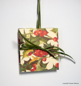
It was the most technical of all the books I made. I used different papers for the covers because what's the point of making them all the same? I loved the swirly green paper and the sparkly sheer ribbon, until I hung it on the green tree and it disappeared. The holly paper below shows up much better.
Inside, these are accordion folded with pockets holding little cards stamped with words like love, hope, manger, star, etc. The idea is to meditate on one word for each day of the 12 days of Christmas. I made these long before the scor-pal was available. They'd be easier now, but not by much.
Having to tie and untie the bow, however, is a pain in the tookus, so on the remote chance I ever do book ornaments again (on a much smaller scale, of course!) I will use other types of closures, like elastic loops.
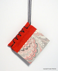
Next are little stab-bound books for collecting each year's Christmas postage stamps. These use scraps of ultrasuede for the binding. The idea comes straight from a book on book binding. Ultrasuede is expensive, but a fabric company my MIL told me about sells bags of random small cut scraps for cheap. I had to match paper to the grab-bag fabric, so some were pretty funky colors for Christmas. I like this orange one, though.
I had a pretty big scrap of black ultrasuede, so I made about five or six like this gold and black one:
Here's the inside, so you can see the point of the book.
Can you believe that we used to pay just 34 cents to mail a first-class letter?
Book binding is fun, but it is much more technical and complicated to learn than card making. The stab binding above requires an awl (danger! danger!), and the gluing of paper on bookboards is tricky and messy. You have to align the grain in the matte board and papers and fabric to keep boards from warping, and everything is glued using PVA glue completely covering the paper, which curls awkwardly when wet. Mitered corners, end papers, needles, and lots of cutting...definitely not clean and simple.
If anyone is interested in giving book binding a try, let me know and I'll post titles of the books that helped me the most. It is both challenging and fun, and once you master the basic techniques, it's really not that hard...if you're a detail-oriented AR/OC type. *wink*
I'll post a couple more of these tomorrow, and then we'll resume CLEAN AND SIMPLE CARDS, because I have a few new cards to share that I hope you'll like!
Friday, November 13, 2009
More Shadowbox Ornaments
Isn't it beautiful! The glitter paper is from Doodlebug (bought at Hobby Lobby) and is the perfect weight--heavy enough for an ornament, but not too heavy for the punch.
The shimmer paper used on the ornament below is also lovely, if not quite so blingy.
Is blingy a word? I need more coffee.
Unfortunately, this particular shimmer paper (don't know the brand) is way too thick for my punches. I almost broke the scalloped punch on it. THAT would be tragic.
At 11:30 last night, I had to admit to myself that I've become a bit obsessed with making variations of these and need to rein myself in. Sheesh. Here are a few thoughts that have come out of making bunches of these.
1. If the top scalloped shape is a radically different color than the base, it bothers AR/OC me. I've made a few red and white ones, but the fact that the white base peeks out behind the real red top layer distracts. If you are not AR/OC, you are soooo lucky.
2. Having Nesties would make this SO much easier. Also, those cool Nestie label shapes would make great ornaments, don't you think? Not having just the right size punches and a fun variety of shapes is frustrating and limits what I've been able to do.
3. Limits are good things.
4. Disregard #3. I'm just trying to comfort myself.
5. Green ornaments don't show up on green trees. Yes, I'm a master of the obvious, but when the tree isn't right in front of you, this truth is easy to forget. Several years ago, I made over 100 ornaments for gifts, and at least half were green. I may not be the brightest bulb on the tree, but I rarely make the same mistake twice. [My husband would disagree. But he's a dude. What does he know?]
6. Just in case you think I've forgotten about cards, consider this very CAS Noel card I made months ago and forgot to post. I used Elegant Eggplant because I had a scalloped oval already punched and begging to be used.
I intended to put gemstones on the dots, but all my purple gems were too big, and my purple Stickles is the wrong shade. What was I saying about limits? The tiny clear gems looked too garish, so I left it alone. You could easily mass-produce these for Christmas thank you notes. I always need tons of those.
Thanks for sticking with this post all the way through. If you make variations on these oranments, I'd love it if you link to them in the comments here. I really do think the sky's the limits with this very basic idea. Adding a transparency layer to make shaker ornaments, varying shapes and colors and focal points, getting creative with the hanger.... The possibilities boggle the mind!
Have a wonderful weekend!
Supplies for Card
stamp: PTI Merry and Bright Additions
ink: elegant eggplant
paper: PTI white, SU elegant eggplant
accessories: SU scalloped and oval punches, dimensionals
Thursday, November 12, 2009
Shadowbox Ornament Tutorial
Isn't sarcasm fun?
What We're Making
Supplies You'll Need
punches:
pink marvy scalloped square
1 1/4" square
holly
paper:
whisper white
textured green
accessories:
red gemstones
glue pen
dimensional tape
waxed paper
white embroidery floss
STEP ONE
Punch a 1 1/4" square in white cardstock. Make sure to punch the square in far enough that the scalloped punch will fit around it.
STEP TWO
Turn the scalloped punch upside down and center the punched square inside the scalloped punch and punch it out. If you punched the straight square too far in from the edge, simply trim the paper slightly until you can get it centered properly. It helps to have good light directly over the punch so there are no shadows, which can cause you to punch off-center. Ask me how I know.
STEP THREE
Punch a scalloped square from white cardstock.
STEP FOUR
To keep the dimensional tape as sticky as possible and make it easier to cut and handle, put a small strip on a piece of waxed paper. Using scissors, cut the strip into four thin strips, and tear each strip off, line it up on the double-punched square and trim to fit, then remove the waxed paper and adhere. Technically, I suppose you don't have to do this, but the tape is much easier to handle this way, and you don't have to be so precise in measuring.
STEP FIVE
Apply each strip to one side of the square with the center punched out. Peel off one strip's backing and adhere the ends of the white floss to the center of the ornament. I used the end of the tweezers to push the floss down into the tape firmly.
STEP SIX
Remove the remaining backing and adhere to the solid scalloped square, making sure to align the scallops.
STEP SEVEN
Punch the holly from green textured cardstock, and using a glue pen, glue it to the solid scalloped square.
STEP EIGHT
Add two small red rhinestones.
STEP NINE
Admire your lovely work!
Variations: The other holly ornament I made had two layers of tape, which I really don't feel is necessary unless your focal point is very, very dimensional. This ornament works with circles as well (though the square looks better with this holly punch...trust me, I tried!). Tomorrow I'll post a snowflake ornament made with circle punches and sparkly paper. Sweet!!!