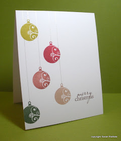
Even if you're a mono- or dichromatic stamper who thinks it's living on the edge to use *gasp* three colors on a card, it's still fun to cut loose and play with lots of colors every now and then. And you can keep the overall look CAS by sticking to one theme in your color choices: warm, cool, bright, pastel. As long as the mind has a way to organize the different colors cleanly, the visual effect is also clean. Also, that clean and simple feeling can be preserved by using repetition of images while varying the color.
The OLW28 Challenge is to use five colors on your card. What got me started on this card was the combo of Brilliance Pearlescent Olive and Pearlescent Poppy inks (the top two ornaments on the final card). The two looked so nice together, so I looked for other warmish colors in my Brilliance ink collection and settled on Coffee Bean, Pearlescent Beige, and Pearlescent Ivy. Instead of using black as my neutral, I used Palette Dark Chocolate because all the ornaments were such warm colors and black would have looked too stark.
The "strings" were drawn with a Sakura Stardust Clear pen, and the shimmer really brings out the pearlescence of the Brilliance ink.
Thanks for the awesome challenge, Jennifer!
Supplies
stamps: Hero Arts
ink: Brilliance, Palette
paper: PTI white
accessories: Sakura Stardust pen, ruler

5 colours? wow! However, the effect is stunning. I love the strings, they 'pull' everything together.
ReplyDeleteThis will be one of my all-time favs. Gorgeous.
ReplyDeleteBeautiful......I agree with Susie this is in my favourite list!!!
ReplyDeleteWow- your card is just gorgeous...I'm floored!
ReplyDeleteBeautiful card!!
ReplyDeletelove the string and really love how all those colors work so well together and yet is still so clean and classy
ReplyDeleteJust gorgeous!
ReplyDeleteAbsolutely love this card!
ReplyDeletePetra
Oh my, what a fabulous card!! Definitely one of my favorites :) tfs
ReplyDeleteWonderful card!
ReplyDeleteOne of my favs as well-beautiful!!
ReplyDeleteOh man, 5 colors ... look at you go!! I get hives just thinking about using 5 colors on one card!! LOL This is lovely!
ReplyDeleteAbsolutely brilliant :o)
ReplyDeleteJackie xx
This is gorgeous
ReplyDeleteOkay - LOVE THIS! Do you have a tutorial (anything from past posts maybe) on HOW you place your stamps so evenly spaced and lined up? I am sure its not an act of congress - but in my stamp room - YES IT IS! Any hints?
ReplyDeletePerfection! I love your colours and layout.
ReplyDeleteFabulous card! Have to try something like this. Thanks for the inspiration once again.
ReplyDeleteLovely card.....it all ties together so nicely!
ReplyDeleteBeautiful card! I love the use of the stardust
ReplyDeletepen for the string.
Wonderful card! Took my breath away... now to plan my own; this year I might not have to add extra postage on my holiday cards, yay!
ReplyDeleteThanks so much for taking the time to share with us. I look forward every day to reading your blog.
Squeeeeeeeeee! This is gorgeous, gorgeous and also? Gorgeous!
ReplyDeleteStraight into my inspiration file.
You are da OLW woman!
Love your card --- love it's cut the long way to give the ornaments the most benefit, love the colors that all go together so well, love that you very slightly offset the last ornament, love that you used brown instead of black for the sentiment. It all came together beautifully........just like all your creations do!
ReplyDeleteWow! This is amazing in every way, LOVE it!!
ReplyDeleteThis is simply stunning! You are amazing and inspiring! Drawing the lines with a Stardust pen is brilliant. LOVE it!
ReplyDeleteLOVE this!!!
ReplyDeleteTHAT is SO pretty.
ReplyDelete*gasp* Gorgeous card, just adore it!
ReplyDeleteBeautiful card. I love the sheen on the 'strings'; the way the ivy ornament is slightly off the page and the placement of the sentiment. Thank you so much for the inspiration you impart week in week out.
ReplyDeleteMary Mac
Ohhhh, I lovelovelove this, just beautiful! Thanks for the inspiration!
ReplyDeleteLOL! Great minds think alike!! I've been out of town and just got in this afternoon. I quickly (ok - not all that quick!) got my card made for the OLW challenge. I struggled with it too. I finally get it posted and then start going through my daily blogs...and low and behold if our cards aren't almost alike! I couldn't believe it!! LOL! Your's is soft and subtle...I love the colors. Mine is a little more glitzy, but the same general principle! Too funny!
ReplyDeleteLove your card!
Hey, Susan, we share the same name, so why not share creative brain cells, LOL!
ReplyDeleteWow, this card, as others have said, is stunning! Five colours, yet soft and elegant.
ReplyDeleteSimple done beautifully! Love it!
ReplyDeleteOoooo...I love this! The colors are perfect and what a fabulous idea to draw the strings with the stardust pen!
ReplyDeleteThose ink colors are must haves, and the stamp too. But most of all I have to know if the ornament placement, which is what I think makes the card feel so peaceful, just happened because it felt right to you, or was it a matter of Design 101 or maybe 501. Some ornaments are off the edge, all are touching another one, yet there doesn't seem to be a distance-pattern between them. (Still searching for key ingredients to making peaceful cards.)
ReplyDeleteThanks for always being here with something wonderful to look at.