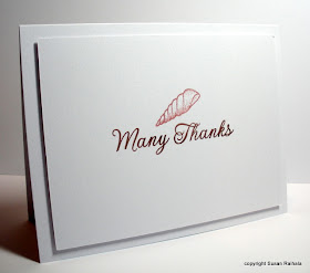
Sometimes, one layer just isn't enough.


Yesterday's post provoked a question about the pink I used on the shell card. It's VersaMagic Malted Mauve...which is sort of a muddy pink that always makes me think about sea shells. I know I've used it before for shell stamps, and I used it above as well.
Don't forget to check out Cheryl's blog for this week's One-Layer Wednesday Challenge!!!!
Supplies
stamps: Hero Arts (Antique Engravings, and some sentiment set whose name I can't remember)
ink: VersaMagic and Brilliance
paper: PTI
accessories: dimensionals
You make CAS look sooooo good.
ReplyDeleteI like when you layer white on white :)
ReplyDeleteYUP - nobody does "white on white" like you do, Susan!!
ReplyDeleteBeautiful Susan!!
ReplyDeleteSimply gorgeous!! Hugs, Ankie
ReplyDeleteSo gorgeous, all of them! Love the raised panels. M x
ReplyDeleteNice cards! I like white panel on the white card base. :)
ReplyDeleteBeautifully simple and simply beautiful. I love the extra layer as well.
ReplyDeleteLove the thank you cards. Someone else said it but I totally echo her statements: you make CAS look so beautiful and easy. When I do it, I have to agonize for hours and the end results make me twitch. Maybe I'm just too muddled for CAS.
ReplyDelete