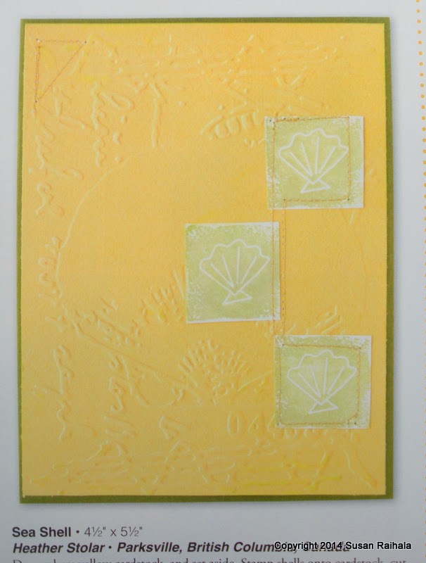
Today's cool layout comes from this colorful card by Heather Stolar published in the spring issue of Take Ten.
Heather used texture very effectively on her card, but what caught my attention were her layout and use of stitching to unify the three squares.
Here is my first card, which sticks pretty much to Heather's layout, although the focal point is shifted slightly down because my squares were a good bit smaller than hers. Pulling everything down gets it in the "sweet spot" of the card, which I felt was important given how much less of the card my three squares take up than Heather's.
My one-layer version of the card uses pops of color on white with gray images and stitching. I chose the images for their curvy nature, as it contrasts so prettily with the straight lines of the squares and stitching.
Also note I added a sentiment because I wanted to do so.
Then, I wondered what would happen if I lined up the squares top and center.
Heather's original layout is much more dynamic, with the triangle of squares lending wonderful movement to the design. My adaptation is linear/static (although the zigzag stitch was chosen to give some movement here), but the static layout allows the color gradation to really stand out.
Which of my two versions do you prefer?
BTW...These inks are all from Hero Arts, and I've had a blast playing around with them!
Supplies
stamps: Hero Arts, Papertrey
ink: Hero Arts
paper: Papertrey
accessories: bling, alcohol markers to color the bling


I like the first one a little better, even though the flower and bling you used in the second one is very sweet.
ReplyDeletePetra
I like the second better, basically because of the colors and the cute little flower in each square. The zig zag stitch provides nice movement. I love the bling and the sentiment. But I definitely like the first card also.
ReplyDeleteI prefer the blue /green better but both lovely x
ReplyDeleteBy all means the green first one. I'm going to go make it soon!
ReplyDeleteI prefer the first a tad, probably because I'm partuial to those colors. I do prefer the flower image on the seond, though.
ReplyDelete