 |
| Lighthouse ornament made by Patti and her husband. Isn't it grand how the grain of the wood acts as a sun in the scene? |
 |
| It's George riding his bike! The blue speckles and streaks remind me of the swim of an Ironman race. |
 |
| It's Daisy running through our yard, again in the sun! |
 |
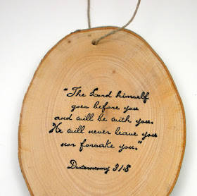
| A wonderful verse on the back of the lighthouse ornament. |
 |
| On the back of the biking ornament. |
 |
| Patti's pretty card that came with the ornaments. The pine branches over the sentiment are darling, and the sweet sheer ribbon draws the eye to the focal-point sentiment. |
 |
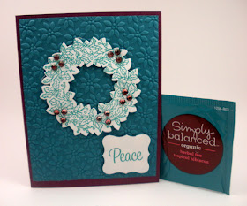
| Joann's fantastically textured card and the tea bag that inspired it! A peace-themed card and herbal tea go so well together, don't they? |
 |
| Darla went one layer, with SUPER texture, happy colors, and lots of fun holiday sparkle. A card to lift even Scrooge's spirits and make him smile! |
 |
| Rachel's patriotic card packs a bold punch of color and excellent layering. Love the texture and combination of patterns here! |
 |
| Joan went super minimalist with high-impact graphic style and color. (I wish I'd made this card.) |
 |
| Karen, from the OLS DT, layered up this simple stunner with super touches of pearls, spatters, and a bold black sentiment. Love, love, love the color here! |
 |
| Ardyth, also from the DT, embossed and sponged this delightfully simple and oh-so-elegant card. Note how balanced the whole design is, and the excellent use of asymmetry! |
 |
| More metallics, only with a silver-mirror shine, from Sue. The silver embossing and perfectly placed bling are so elegant and pretty. Sue's was the first card I received this season! |
 |
| Note that the bling includes two different sizes of rhinestones plus silver nail-heads. Sue mixed the two embellishments seamlessly with an excellent eye for detail. |
 |
| My SU consultant Danielle sent this layered, textured, beautifully designed card. Love that cherry cobbler strip and how it draws out the word "Christmas". |
 |
| Tonilea used high-impact black and white for a simple, lovely holy scene. I love how this card evokes the true meaning of the season with such minimalist clarity and focus. |
 |
| Patti sent another card, this one using beautiful shapes and texture to evoke the great joy of Emmanuel! |
Thank you, all, for thinking of me and taking time to send me a card this season. My cup runneth over. Know that I will take time to pray over each card, as my friend Karen Wenzel used to do. It's a small but powerful way to show my gratitude and lift you up. And they will all be placed on my inspiration board in my craft space to give me joy in the year to come!
I appreciate all of you who support Simplicity with your comments, emails, and cards. I started this blog in March 2009, almost seven years ago, expecting about ten people to read it. Through the various avenues of subscription, there are nearly 2,500 subscribers now. Wow.
May 2016 be a beautiful year for each and every one of us!


You are loved, girl!
ReplyDeleteI'm happy to see you are stamping and posting again. Hope your creative energy will flow and flourish in 2016!
ReplyDeleteSusan, These cards are wonderful as is your blog. I look to you as a role model in learning simplicity.
ReplyDeleteA question. Is there any way to find out the source of the dies that Linda used in the cards she sent you. I would love to purchase the grateful die as I often use that word and the only way I can make a quilted card is with a die.
Thanks.
Mary Jane
Mary Jane, the dies on both cards came from Papertrey Ink. I've never posted links in a comment before, so I don't know if these will work.
DeleteThe word "Grateful" is actually part of the leaf; the name of the die set is "Enclosed: Leaf".
https://www.papertreyink.com/pti-dies/papertrey-ink-enclosed-leaf-die/
The quilt die is "Quilted: Winter"; https://www.papertreyink.com/pti-dies/papertrey-ink-quilted-winter-die/
I meant to add that the quilt die is a series, one for each season, so you might want to check the rest of them out while you're there! (And I notice that the links are not active, but a copy and paste will get you there.)
DeleteSo many gorgeous cards and styles represented. The colors for your Christmas card were definitely picked out with you in mind. You see, we DO pay attention! Here's to a peaceful 2016, but also a year filled with enthusiasm for things yet to come. (And thanks for your kind comments, Ma'am; I feel like I've been blessed by the Queen herself!)
ReplyDelete