.JPG) |
| Before |
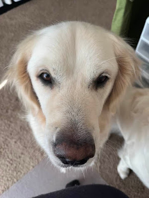 |
| Cooper demanding an apple slice |
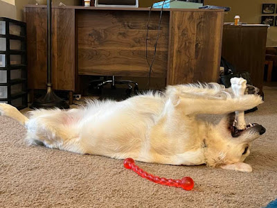 |
| Lily trying to choke herself |
.JPG) |
| Before |
 |
| Cooper demanding an apple slice |
 |
| Lily trying to choke herself |
Well, this post was slowed down by a glitch in my Outlook account. After fixing that (yay, me!), I could get to my email, and download the submission photos.
Thanks to Deborah, Elizabeth, Faye, and Pat for playing along in this challenge! Since only four people played along, I decided to give each of them a $20 gift certificate to Simon Says Stamp! Ladies, please send me an email letting me know the email address you prefer I use for the certificate. Otherwise, I'll send it to the email you used to submit your entries.
Thanks, ladies, for embracing the trifold challenge!
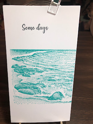 |
| Deborah's card, front panel |
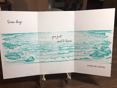 |
| Deborah's card fully open, showing a serene beach scene that completely supports the sentiment and leads the eye to the safe ground of the beach. |
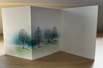 |
| Elizabeth's first entry, sans sentiment. She pointed out that the trifold invites storytelling, and she is keeping her options open for this one. Lovely as a Tree is perfect for this! |
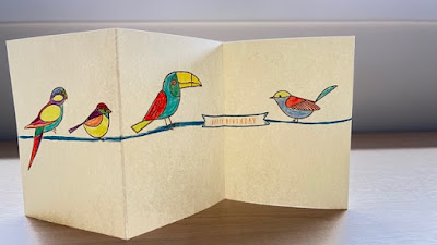 |
| Elizabeth's second entry, which is so colorful and fun! Birds on a high wire...perfect for this layout! |
 |
| Faye's adorably colorful and cheerful entry. Note how she grounded her design so effectively. |
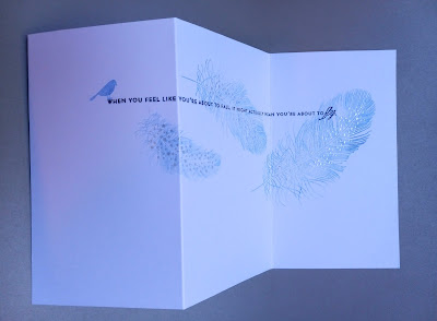 |
| Pat did two color variations of her design, starting with a peaceful blue on white. The dots on the third feather are embossed with satin pearl embossing powder...such a lovely touch! |
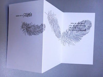 |
| And here's Pat's striking black on cream version, with the same feather set and embossing but a different sentiment. I can't decide which I love most! |
Thanks again to these ladies for sharing their talent and taking time to try something different.
Mercy, grace, peace, and love,
Susan
The Trifold Challenge post will be up in the next few days, and the winner announced! I want to thank all the people who took it on and made such lovely cards. Special thanks to Deborah for sending me her lovely card.
Today's card plays off my love of blues and white...a combination I don't use often enough. The background strip is debossed with the Hero Arts woodgrain plate. The organic feel of the woodgrain, combined with the parsley stamp's abundant detail, contrasts nicely with the clean circles.
Random Dog Picture, for your amusement.
 |
| Lily and the Rose Branch |
Mercy, grace, peace, and love,
Susan
As longtime readers know, I dearly love daisies, and the Gina K set Pretty Posey has a small daisy stamp in addition to the large bouquet. I wondered if it could stand alone as a focal point on a card, and it sure can!
Question: What are your favorite self-care tips? What do you do (other than create) to take care of yourself, center yourself, value yourself?
Recently for me, the answer is yoga. I can't believe how much regular yoga practice has changed my relationship with my body and how at home I feel in it. I use it to connect with God, with myself (God's creation), and my humanity (which bubbles over in laughter when I once again can't get into half moon and cheat with warrior III!).
Mercy, grace, peace, and love,
Susan
As I am a minimalist stamper, the idea of spending ten hours coloring and shading complex images makes me want to break out in hives. I've done it, of course, but was it fun for me? Not really.
Yet I have 88 Copic markers (gathered over the course of four or five years) that are just begging to be used. That's a huge investment of money, and I feel the need to justify that investment. So I got Gina K's Pretty Posey set, which requires just the right amount of coloring to keep me engaged and at the same time satisfy my need for nearly instant creative gratification. Plus...daisies!!!!
My stamping mojo has been gearing back up, mainly because I reorganized and purged some supplies and am making a conscious effort to use supplies that I've neglected. That's exciting!
What supplies have you invested heavily in and then neglected? 'Fess up, people!
Mercy, grace, peace, and love,
Susan
I put on my thinking cap and came up with two more trifold cards. Click HERE for the challenge details.
The first card is smaller than the original post's card, and will fit in a standard A2 envelope with room to spare. I downsized it because the banner of hearts was so tiny. I love this one for its clean, minimalist simplicity! The stamp set is Papertrey's old Heart 2 Heart #11.
So far, I have received one submission for the Trifold Challenge. Thanks, Deborah! I'm going to play around with variations on the design myself and post those in the next few days. If you feel so inclined, play along.
The deadline for submissions is Friday, July 15, 2022, at midnight EDST. The winner (chosen at random) will receive a $20 gift card to Simon Says Stamp. The winner will be announced in the second half of July and the prize awarded in early August. For more details, click on the link above.
If you are so moved, put your creative thinking caps on and see what you can make!
And now for today's card. These two sets, from Papertrey, are some of the few color-layering sets I really like. Called Salt Air: Flora and Salt Air: Fauna, they have these adorable aquatic plants and animals, and they are fairly easy to line up.
How do you feel about color-layering stamp sets? Do they drive you crazy or make you happy or something in between?
Mercy, grace, peace, and love,
Susan
In real life, buzzy beasts with stingers are not my favorite, especially since my husband now carries and epi pen for a nasty yellow jacket allergy and since a wasp flew up my jeans and stung me four times on the thigh.
But I appreciate what bees do for us and thoroughly enjoy using their images on cards. Honeycomb hexagons look amazing, too. So here's an homage to our buzzy pollinators.
We had a nice holiday weekend. Our son Jack played with the Centerville Community Band in a lovely patriotic concert where my husband, an Air Force veteran, had to stand up during the service song medley. He hates being recognized. "That's not why I served," he complains. But I made him stand anyway.
I hope those of you who celebrated Independence Day had a safe and fun-filled time!
Mercy, grace, peace, and love,
Susan
I've been inspired by THIS PIN before, and it was so fun, I did it again!
.JPG) |
The card is 10.5" x 6.25" total, with scores at 3.5" and 7". I scored (but did not fold) before stamping so the first word would be on the first panel and flowers would be on the fold...inviting the card to be opened to see the full effect of the design.
The card fits into a standard regular business mailing envelope, #6 3/4, size 3 5/8" x 6 1/2". I buy mine at Marco's Paper. It's becoming a favorite card size for me.
This layout is incredibly versatile and can be artsy and beautiful (like the inspiration piece) or cute and fun (like my version). I'd love to see what styles you all can create with this design!
You'll have two options for submitting to the challenge:
The deadline is two weeks from today: July 15, 2022, at midnight EDST.
The winner (chosen at random) will receive a $20 gift card to Simon Says Stamp. The winner will be announced in the second half of July and the prize awarded in early August.
If you are so moved, put your creative thinking caps on and see what you can make!
NOTE: This is my personal challenge. Marco's and Simon are not sponsoring anything here. I just really appreciate their service!
Mercy, grace, peace, and love,
Susan