Pages
Sunday, January 31, 2010
Blog Award
This is the second post today...please scroll down to see Sunday's card!
TrishG of Encourage Joy was kind enough to give me a blog award! Thanks so much, Trish, for thinking of Simplicity. You're supposed to pass it along but I dislike playing favorites. Last time I did, it felt sort of weird. Instead, I'm inviting all of you to participate!
So here are 10 random things that make me happy. Please share something that makes YOU happy in the comments. It's amazing how uplifting it is to read about other people's happy things. Happiness is contagious and a disease I love catching!
1. Feeling the Lord at work in my life.
2. Books. Real paper books. None of that Kindle or Nook stuff for me.
3. Mochas. Because I'm drinking one right now and it's all that's keeping me upright.
4. My husband's cooking and sense of humor.
5. My children's hugs and the funny things they say.
6. Fountain pens.
7. Our gas fireplace.
8. My friends' hugs...even when they come through cyberspace because my friends are all over the world. How lucky am I to be blessed with so many friends?!?!
9. The people who help my children learn and grow.
10. Quality stamps.
Oh, man. I could go on and on. But now it's your turn. Please share something that makes you happy and share the joy!
When Mom Asks for Birthday Cards...
My mother called last week asking for birthday cards to send to her former coworkers. She retired as a dental hygienist last fall and moved out of state, so she wants to do something nice to stay connected with her friends. Here's the first card I made for her...very different from my usual style, but very appropriate for the southern ladies who will receive it.
Here's the inside. Dark cards really do need a liner.
Working outside my usual style every now and then is so much fun, especially when I know that I'm not sending the card. I adore these Anna Griffin stamps, which work so well on this style of card, but I need to challenge myself to use them on a more "LateBlossom" style card. Even so, this card is pretty simple (note the only embellishment is ribbon and the layout is pretty clean), and I really do like how blush blossom and bravo burgundy look together.
I tied the bow with my new Bow Easy, courtesy of Bahb. It's a great little tool, and it didn't take me long to figure it out.
Supplies:
stamps: Anna Griffin, PTI (sentiments)
ink: bravo burgundy, PTI vintage cream
paper: SU bravo burgundy, blush blossom, PTI vintage cream
accessories: ribbon, Bow Easy, MS lattice border punch
Saturday, January 30, 2010
Fishy Love
I had to search my stash for three solid hearts in stackable sizes, but one advantage to
Ann (you know which Ann you are), these colors are for you.
Supplies
stamps: PTI, Hero Arts, Clear and Simple Stamps
ink: SU passion pink
paper: PTI white
accessories: MS fish embossing punch, dimensionals, black half-pearls, ribbon
Friday, January 29, 2010
CSS and Pocket Silhouettes...a Match Made in Heaven
I needed to make some thank you cards, so I pulled out Pocket Silhouettes (one of my very favorite SU sets EVER!) and the "you are too kind" stamp from CSS. Using the Gina K paper that Bahb sent me, I made a color-varied set of 4.25" square cards that had me giggling with glee at midnight!
My colors were based on what tiny gemstones I had on hand. These are an amber color, so I used Brilliance beige for the flowers and Palette dark chocolate for the sentiment. Warm and wonderful, don't you think?
These hot-pink gemstones worked well with Brilliance orchid and Palette Noir ink.
Brilliance lavender ink got clear gemstones...all my purple gemstones are too red to go with lavender.
Brilliance ice blue and pale blue gemstones make this the most subtle of the set.
Then I went with Brilliance Mediteranean blue and dark blue gemstones for a bolder look.
And of course, Brilliance rocket red with red gemstones really stands out.
Can I just say that having lots and lots of gemstones in lots and lots of sizes is a major blessing? My life would be so dull without bling....
Supplies
stamps: SU Pocket Silhouettes, CSS Thank You
ink: Brilliance, Palette
paper: Gina K white
accessories: lots and lots of tiny, tiny self-adhesive gemstones
Thursday, January 28, 2010
A Birthday Choo Choo and Many Thanks to Bahb
This choo choo sold the Boys set for me because I have a son obsessed with Thomas the Tank Engine (if you don't know who Thomas is, don't ask...you're better off not knowing). Thomas is blue, but I made his friend James, who is red "with shiny new paint."* A stamper can get fab inspiration from her children's obsessions.
You can't tell from the photo, but I used Gina K Luxe paper rather than PTI paper for today's card. There's a funny story behind this.
A month or so ago, I put Gina's white and off white paper and a bow easy in my cart. When I realized the stamp set I wanted was out of stock, I chose to wait and place the order later. A week or so later, I received a package from Gina K Designs.
Huh? In the box were the three items I'd placed in my cart and a note of thanks signed by a name I'd never seen. It was all very confusing, but I figured I must have had a brain fart and placed the order after all and the note was simply from Gina's customer service department.
Last weekend, I received a lovely email from Bahb, who kindly comments here frequently. She asked if I'd received the package from Gina K she had sent, and she signed her real name to the email. It was the same name as the one on the note in the box.
Mystery solved! I am not going crazy, and Bahb is a total sweetheart! Thank you, Bahb, SO VERY MUCH for sending me three things I absolutely wanted from Gina K! I'm having so much fun playing with them, and will show results of that play here on Simplicity.
I've wanted to try Gina K's paper for ever so long, and after years of using PTI white, wow, is it strange to try something new. Gina's paper is very, very smooth, so using Bic mark-its or sharpies feels totally different and is taking a bit of practice to get used to. But the huge advantage of it over PTI is that there is no bleed-through, meaning you can color on one-layer cards and not have an unsightly mess inside! How totally cool is that?!?! OLCs coming soon....
Supplies
stamps: Clear and Simple Stamps, PTI
ink: Palette noir
paper: Gina K luxe white; SU real red
accessories: various markers, ribbon, dimensionals
*Will I ever purge these snippets of movie lines about Thomas and his friends from my mind? Or will I be the annoying old lady in the nursing home singing "Thomas the tank engine, rolling along, doo doo doo doo, doo doo doo doo" off key and in a fake British accent at two o'clock in the morning? Sigh.
Wednesday, January 27, 2010
Through the Trees Sympathy Card: Opposites Create Harmony
This three-tree image from PTI's new Through the Trees set is beautiful. It's also a bit big and busy, making it a bit harder for me to use cleanly. I challenged myself to use Brilliance pearlescent olive ink, which usually reminds me of a color I've only ever seen in diapers and on goose droppings, on the hope that even ugly colors can be beautiful if used properly. Pairing it with a StampinUp old olive card base and brown matte helps take the poo edge off nicely, I thought. But I still regret buying this color. Sigh.
The dark card base, rustic twine, and button add warmth to the card. I was worried they would clash with the slight shimmer of the ink, but they actually work nicely together. This would be a perfect sympathy card for a man.
Hope you like it and find some inspiration to fill out your stash of sympathy cards. These are so hard to make, but it's worse when you HAVE to make them on short notice.
If you've never experienced this for yourself: trust me. Go make some sympathy cards today for your stash. You won't regret it.
Tuesday, January 26, 2010
CAS51 Use DP on a Card...Total Protonic Reversal
Egon: Don't cross the streams.
Peter: Why?
Egon: It would be bad.
Peter: I'm fuzzy on the whole good/bad thing. What do you mean "bad"?
Egon: Try to imagine all life as you know it stopping instantaneously and every molecule in your body exploding at the speed of light.
Raymond: Total protonic reversal.
Peter: That's bad. Okay. Alright, important safety tip, thanks Egon.
At the risk of total protonic reversal, I started the challenge using PTI's bitty polka dot paper on kraft. Isn't the punch of pink fun? And the twine bow? Okay, I don't feel like I'm embarrassing myself with this one, nor did life as I know it end. Whew.
Hmm. This second one I'm not so sure about. Something is off. The button needs to be bigger, I think. And maybe white. But I'm showing you anyway so you can see for yourself the full challenge of this challenge on me. It was a struggle, I tell ya, and by the end of this card I was terrified beyond the capacity for rational thought.
And then...well, then a miracle occurred, I toasted the Sta-Puff Marshmallow Man, and there was peace and harmony in my world!!!!
If you want to know the thought process behind this card, keep reading. Otherwise, have a lovely day and if you get a chance, please play along with this challenge. And if you've never seen the first Ghostbusters movie, please do. Then this whole post will make sense. Or not.
Back to the card. There is a sheet of coordinating die cuts that goes with the paper on the second card above. I buy these things and never use them. I just look at them and admire them and put them back in my stash. But this time, I pulled off the rectangle with the definition of summer.
Gee, the sponging around the edges looked weak, so I added some VersaMagic Aloe Vera ink to give it a little definition. Oh, that's better. What goes with summer? Why butterflies, of course! What color might go with the aloe? Hmm, let's look in my DP scrap holder. Yellow? I punched a few, and they didn't quite work. Purple? Only one scrap in that slot, a soft suede-looking purple.
THAT'S IT!!!!!!! OH MY GOSH!
I tried a bazillion different arrangements of the butterflies and definition, but something was missing. Then I remembered this little grass stamp I picked up at Hobby Lobby a century ago and never used. YES! It softens the whole thing and anchors the design, too. A few rhinestones* added for bling, and Bob's your uncle. Whatever that means.
The lesson here is pretty cool. You should take a chance once in a while and cross the streams. Sometimes, you may end up with a bunch of stuff that isn't stellar, but sometimes you may make a miracle. The first card is fine, the second not so much, but the third, well.... I don't have a word spectacular enough for it yet, but when I do, I'll let you know.
Now, go watch Ghostbusters. 'Cause it's funny.
*The rhinestones are actually a soft green similar to the aloe ink, but they photographed darker than they are.
Monday, January 25, 2010
Rainbow Wishes on Monday Morning!
While it's a fine card, the red, orange, and yellow are a tad ominous, aren't they? I was aiming for warm and happy and got Danger! Construction Cone! and Caution! Hmmm.
I decided to go with three different colors: blue, green, and yellow AND I blinged it up with glitter. The results are much friendlier, I think!
Unfortunately, the troops don't want glittery cards, so I need to make up a bunch without the glitter. I think I'll send this one to my nephew in May!
I hope your Monday is a cheerful blue-green-yellow sort of day and not an ominous red-orange-yellow sort of day.
PS Thanks so much for all the kind comments about Jack's progress. We really are so happy to see clear and unmistakable evidence that the hard work of the last 3.5 years is paying off.
Sunday, January 24, 2010
The Bird Punch Card Goes to ...
Stunning! I love the white on white!
This week I was happy to have a good catch up on the phone with my stamping buddy, Kate! We met through blogging but she's now a fabulous real-life friend too! Just goes to show how wonderful this community is!
x
Congratulations, Amy, and happy stamping!
LateBlossom Does a Technique!
FYI, when I first started doing papercrafts ten years ago, I tried every technique available to me at the time. I made paste papers with all sorts of stuff, did real leaf impressions (using a hammer, honestly!), used bubble wrap to make patterned paper, carved stamps from potatoes, stamped on canvas floor cloths, yadda, yadda. Some techniques worked pretty well but the results didn't make me very happy, and others didn't work for me at all and made me use dirty language, especially a variation on paper marbling using bubbles (add paint and dish detergent to a large flat pan of water, use a straw to blow bubbles, lay paper on top of bubbles, get--in my case--not much of anything but a reason to cuss).
When I discovered stamps, heat embossing, and ink, however, I knew I'd found a lovely, straightforward way to make art that made me happy. Clean and simple art. Art that had actual white space. Sometimes I wish I were an artsy, collage-type crafter, but mostly I focus on pretty, pretty white space. Which is why you come here, right?
Every now and then, though, those old techniques I tried just work for clean and simple, too. Gold leaf is one of them. See what I mean:
I rarely do techniques, much less ones that require glue drying overnight. Patience in artistic endeavor isn't my forte. But as soon as I saw PTI's new Through the Trees set, I knew I'd simply have to break out the gold leaf. It takes shiny to a new level, don't you think?
Real gold leaf comes packaged in really, really thin sheets attached to backing paper. You can buy loose sheets of gold leaf, but it's much easier and less frustrating to work with if you have the attached type. Like this.
Here's what an untouched sheet looks like:
Isn't that pretty?
To put gold leaf on paper, you need some sort of size like gesso or glue for it to stick to. I used The Essential Glue Pad and let it dry overnight. I've never gotten glue pads to hold glitter or much of anything else on a card, but gold leaf only needs a slightly tacky surface to stick.
Note for those adventurous enough to try this. Last time I used gold leaf, I didn't let the glue dry completely and made a total botch job of it.
Learn from my mistakes, Grasshopper.
Once the glue is dry, just put the gold leaf shiny side down on the paper and use a burnisher to get the leaf to stick nicely. A bone folder will work, but an agate burnisher is the real deal. You can even use it directly on the gold leaf and it won't stick. Not sure about the bone folder, which might be textured enough to rub the gold off if used directly on it.
Once the gold is attached, remove the backing sheet and brush off the excess gold with a clean and dry, firm-bristled brush. Experts know how to save the gold for future use, but I've never been able to pull that off.
And you're done. It's not hard to do, and other than the glue drying time, it's quick. This is an expensive technique (it is real gold leaf, after all, and the agate burnishers are not cheap either), but the effect is lovely, don't you think?
Saturday, January 23, 2010
Hero Arts: Sky's the Limit Card 1
I love it when I'm right!
*squeal*
Using these adorable images very simply, in a classic layout, has been totally fun. In this case, I used a sentiment from PTI's Scattered Showers. This is going in my DH's lunch box next week 'cause we've had a lot of precipitation and very little shine in Ohio lately, and it's getting him down. Poor triathlete!
Many thanks to all who left comments on my last post. It's been so uplifting to read all the many different things that have made you happy this past week, from the small stuff (tomatoes ripening, phone calls, serendipitious finds, great haircuts, sunshine) to big stuff (safe travels, health successes, hope, family closeness). If you haven't read all the comments, I highly recommend it. What a positive way to go into the weekend!
Personal stuff, if you're interested....I have another huge happiness to add after yesterday. My son Jack was diagnosed with atypical autism 3.5 years ago. Since then, he has received speech, physical, and occupational therapy and special education services throught the schools. A week ago, his private PT told me she will probably discontinue PT services for him in March after his re-eval because his coordination and strength have reached age-appropriate levels. Tuesday, his speech therapist told me he has made huge progress (I already knew this, but it was cool to have it confirmed by a professional!)
Yesterday, the OT told me she thinks Jack can drop down to every other week sessions because of his progress. Last summer, at his OT re-eval, he tested almost four years delayed (he's only 7) in some areas of fine motor control and overall about two years delayed. I expected weekly OT to continue for YEARS!
AND, his autism teacher told me yesterday that he now knows all the Dolch sight words for all of first grade. Jack is in first grade, folks. Last year, his kindergarten intervention specialist acted like he would never read and set his sight-word goals really low for first grade. I can't tell you how happy I am that he is proving her wrong! Doin' the happy dance!
Supplies
stamps: Hero Arts, PTI
ink: night of navy, palette noir
paper: PTI white
accessories: dimensionals, Bic Mark-It marker, Stickles
Friday, January 22, 2010
A Punchy All-White Card
My all-white two-step bird punch card looks much better in real life, so I decided I'll send it to a random commenter on this post. That way, at least one of you will get to see how pretty it really is!
Just tell me something that made you happy in the last week. The deadline will be 12:00 noon eastern standard time (USA) on Saturday, January 23, 2010.
I'll go first. It made me very happy to have three girlfriends come over for coffee Wednesday. The whipped cream on my mocha was that their coming made me mop my 5,000 square feet* of wood floor, which was embarrassingly dirty because I spend too much time stamping and blogging and not enough time cleaning my house. Whew. I feel so happy for that confession!
Have a great weekend, everyone!
Supplies
stamps: NONE
ink: none
paper: PTI white
accessories: SU two-step punch, Martha Steward border punch, dimensionals, half pearl
*Gross exaggeration for comic effect. It just FEELS that big.
Thursday, January 21, 2010
More Off-The-Edge Stamping, with a Second Layer
SU's Thoughts and Prayers set is beautiful, and after making several cards with the whole tree, I decided to try something a little different. I stamped just the leafy top of the tree on one edge of a square panel.
The finished card is a 4.25-inch square. Accenting the branches with pearls flowed naturally after yesterday's card, and I think it works nicely here, too.
What do you think?
Supplies
stamps: Thoughts and Prayers (SU); Mega Mixed Messages (PTI)
ink: VersaMagic tea leaves, VersaColor brown
paper: PTI white
accessories: dimensionals, half pearls
Wednesday, January 20, 2010
Hero Arts Three Ferns
My first attempt with it stayed super simple--not even a sentiment. This card is 5.5-inch square, and the ferns, stamped in SU's certainly celery on PTI's white cardstock, are accented with soft green half pearls. (The pearl placement idea came from last year's Hero Arts catalog, I think.)
Nice and peaceful, but a bit boring. As with the big cup of coffee, a good option with the big fern stamp is to stamp it off the edge of the card, creating a more interesting asymmetry, as well as a good place to put a sentiment.
See what I mean? The sentiment is in one of the sweet spots on a card. If you imagine two horizontal lines and two vertical lines dividing the card into a grid of nine rectangles, the two sweet spots are the upper left and lower right intersections. Our eye likes those two places, probably because that's how we read...starting in upper left, finishing in lower right. Sentiments placed in the lower right just feel right somehow.
I wonder if it's different for people who read other languages differently, say, top to bottom or right to left. Anyone who knows, please chime in!
By keeping most of the stamping in the lower portion of the card, there's a sense of stability and calm in the design, so I turned it into a sympathy card with a PTI Mega Mixed Messages sentiment. (Sadly, I have needed five sympathy cards in the last week. This one is going to my uncle, whose mother passed Monday.) I also changed the pearls from soft green to white, for just a bit more subtle contrast, and made the sentiment a soft brown.
The third card I made with this stamp went off in a completely different direction, so I'll save it for another post.
And please, if you can, hug, call, or email your loved ones today. Even when they are blessed with long life, they leave us too soon.
Supplies
Stamps: Hero Arts three ferns, PTI mega mixed messages
ink: SU certainly celery, VersaColor brown
cardstock: PTI white
accessories: pearls
Tuesday, January 19, 2010
CAS50 Teal!
First up, I used the new SU two-step bird punch, which I knew I HAD to have the first time I laid eyes on it. It doesn't get any cooler than this punch, folks...for those of us who don't have die cut systems, at least.
I punched the bird and branch in white and put them on a scalloped teal panel with the quotation from Emily Dickinson on the white card base in black ink. Isn't that quotation THE BEST! I just love ol' Emily; she had quite the way with words.
Anyway, the scallops are accented with small half pearls, which were also used for the bird's eye. Putting a big, clunky quotation on the front of the card like that is a design challenge, but I like how the black-on-white balances the almost equally sized bird and branch on the solid teal, and adding the pearls made a huge difference, softening the division between the heavy teal and bright white.
At least that's my take on it.
Next up is a card that practically made itself. The Echoes of Kindness set is an unusual one for me, but I absolutely adore it. The artwork is so loose yet so elegant. I have NEVER satisfactorily colored an image like this, so I don't even try anymore. Just stamp it in a single color and work it, baby. So much easier for us artistically challenged stampers.
The top border is punched with a Martha Stewart punch that reminds me a bit of fancy garden lattice. The white satin ribbon softens the dark teal nicely and the knot balances on the left balances the image on the right.
BTW, I used Ancient Page Deep Harbor instead of SU's taken with teal, which stamps really, really dark for me. The deep harbor is actually a better match for the paper than SU's ink. I've noticed a similar darkness in bravo burgundy ink.
This was a great challenge, and if you haven't played along yet, give it a try. Teal is such a versatile color. It can go cute or elegant, soft or strong.
Supplies
stamps: SU, PTI (thank you)
ink: Ancient Page Deep Harbor, Palette noir
cardstock: PTI white, SU taken with teal
accessories: two-step bird punch, border punches, half pearls, dimensionals, ribbon
Monday, January 18, 2010
Big Coffee Stamp
I couldn't hurt its feelings, could I?
Problem is, this stamp is HUGE! I made an okay card with the whole image (might show that some other time, but really, it's nowhere near as cool as this card!). Then, the idea popped in my head to stamp it off the side and use the large coffee sentiment from PTI's Warm Happiness set.
The band on the cup is pieced with SU mellow moss cardstock, and I stamped the word "coffee" in mellow moss as well. I cut out the whole band, attached it to the card, then cut off the excess with long scissors. Otherwise, this card is as simple as it looks.
I think I need a cup of coffee.
Supplies
stamps: Hero Arts, Papertrey Warm Happiness
ink: Palette dark chocolate, SU mellow moss
paper: PTI white, SU mellow moss
accessories: scissors, glue
Sunday, January 17, 2010
Delight In Life Birthday Card
My original plan was to put Stickles in the centers of the flowers, but when I got this far I stopped. It's so soft and pretty just as it is!
Saturday, January 16, 2010
Stamping Word Nerd Has Fun
I love Christmas. And my relatives.
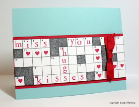
Anyway, I'm madly trying to play with it all at once, which, as you can imagine, doesn't work very well. Today, let's take a look at the damage I did with the new Hero Arts crossword puzzle background:
The new crossword puzzle stamp had to be MINE, not for artistic reasons but simply because I am a highly-trained word nerd. It's only logical I own it AND PUT WORDS ON IT.
Sorry about the shouting. I'm just a tad geeked out here.
The stamp is huge, just shy of 5.5 x 4.25 inches. Using the whole thing in black on a standard card is, shall we say, not visually attractive. There's just no place for the eye to rest, especially since the stamp leaves no border. I need to try it on a 5 x 7 card, but for now, I've experimented with cutting the image down. I like the result.
The alphabet here is Hero Arts Bird Branch Alphabet. I have about a dozen aphas that will fit this puzzle, but it would look really cool to use a pencil and fill in the squares by hand. Except I hate my handwriting. Does anyone other than Dawn McVey and Becky Higgins like their own handwiting?
This card is going to the troops, so I turned it into a Miss You/Love You card. But can you see the possibilities? Any words you want!!!! (I'm trying not to shout, but it's coming out italics.) Filling in empty spaces with tiny shape stamps allows you to balance out the design. OH MY GOSH!
Sorry.
I need to practice with arranging the words and filler images to make a pleasing composition. There's a bit of trapped white space under the word you, and you would look better right under miss. But this isn't bad for a first effort!
CAS Design Tip: Trapped white space is essentially a hole in the design. See how that 3x3 grid under the word you is completely enclosed by words and hearts and a solid square? It's even got a black square in the center to reinforce the idea of a hole! That's a design no-no. White space needs to have an escape off the page.
And now for a comment about the cool caribbean card base. I tried putting this on a white base, and blech. So blah and unappealing. The cool caribbean makes the red pop prettily and makes the whole card more fun.
Wow! Thanks if you made it this far, and have a great weekend!
Friday, January 15, 2010
Inspired by Joan B
......
......
Welcome back! Here's my version of Joan's fabulously creative and masculine valentine, which, once it got processed through my brain, isn't so masculine anymore. Masculine is just so hard.
So to speak.
Hope you like it! And thanks, Joan, for the inspiration!
Supplies
stamps: PTI Mega Mixed Messages and Polka Dot Basics
ink: real red, Palette Noir
paper: PTI white, SU real red
accessories: ribbon, flower punch, small circle punch, dimensionals
Thursday, January 14, 2010
And the Winner Is...
I'm really grateful for so many things. But today, I'm grateful for the fact that the weatherman called for snow and we didn't get any. After the 2' feet we've received recently, we needed a break :-) Thanks for the opportunity to win this set. I love trees. And lately I've been loving PTI. I just purchased three new sets from them.
January 12, 2010 6:50 PM
Susan, email me your snail-mail address, and I'll send you your very own Through the Trees!
Punch-A-Tree
I bought a punch of a tree trunk and bare branches a few months ago and finally pulled it out Tuesday night to make something. My first two cards did not go so well. Trust me. Bleck.
And on a side note, methinks I need a tutorial on using Flower Soft. I own five jars of the stuff and haven't made ANYTHING with it that I would show you, even for comic effect. Just sayin'.
Then, I got the bright idea of punching the tree and flowers and making a spring tree. YES!
The tree trunk is punched out of brown Bazzill cardstock, and the flowers are punched from SU's pretty in pink and regal rose. I put a small half pearl in the center of each flower, using my craft knife to lift and place each one. I can't believe I used so many pearls on one card, but OH MY GOSH...it was so totally worth it.
Still, I do think the tree looks like a 1950s flowery bathing cap on a hat stand. Am I alone here?
Supplies
stamps: PTI Mixed Messages
ink: Palette dark chocolate
paper: Bazzill brown; SU pretty in pink, regal rose; PTI white
accessories: punches, glue pen, self-adhesive half pearls
Wednesday, January 13, 2010
Rescuing a Card
See. This image was going to look like the last card on this post. Only I stamped it crooked.
NO PROBLEM!
I cut it out straight using a clear quilting ruler and craft knife and used it on this card. It needed a little something, so I used the twine from PTI, which is a dream to use and lends a natural touch to all that white cardstock.
Next time you think you messed up your card, remember you can almost always rescue it by cutting an image out or by covering up the mistake with an embellishment or layer.
There are no mistakes in stamping...only opportunities for creativity!
Supplies
stamps: Hero Arts (Woodland Leaves and Grasses), PTI (Out on a Limb)
ink: Versacolor Atlantic
paper: PTI white
accessories: watercolor crayons, dimensionals, twine
Tuesday, January 12, 2010
CAS49, Inspired by Krystie Lee
CAS49 is Cut It Out! The challenge is to make a card with a cut-out element. The new A Muse release really caught my eye when Krystie Lee started posting her sneak peeks on her blog, especially here and here, and I knew I had to play with her ideas 'cause, you know, she's a genius. Here are the results:
Krystie got all subtly artsy with her coloring, but since I'm not artsy and don't have copics (except red which totally would ruin the soothing vibe here) I left my shells plain and simple. I cut them out with my Cutterbee scissors, which are truly amazing.
The top card's shadow is one-fourth of a whole stamp, which consists of four different sized blocks. I just masked three of the blocks so only the rectangle that best fit the shell was inked. The simple square shadow stamp I used on the other two cards looked weird as the backdrop for the oblong shell.
The two shells and shadow stamps are from Hero Arts, the sentiments are from PTI's Simple Little Things, and the sand dollar has no marks (given to me by a friend). The colors are so softly nautical. I'd love to have a bedroom decorated in these soothing colors!
Supplies
stamps: Hero Arts, Papertrey, unknown
ink: VersaMagic Sea Breeze, SU sahara sand
paper: PTI whiteaccessories: dimensionals
Monday, January 11, 2010
Oh.My.Gosh!!! And a Give-Away
HAVE YOU SEEN IT?!?!!? Nichole's done it again. I'm swooning here. TREES!!!! THUD!
Introducing Through the Trees
I'm so glad I have gift certificates to Papertrey right now.
I'm going to order two of these and send one to a random commenter on this post to celebrate the goodness of this set and my reaching 60,000 hits. The deadline for the drawing is Thursday, January 14, 2010, at 9:00 PM Eastern Standard Time. Just tell me something you're grateful for today. One entry per person, please!
Birthday Raccoon
When I was in sixth grade, I read the book Rascal by Sterling North and fell in love with the idea of having a pet raccoon. The whole point behind Rascal is that the raccoon is a wild animal and must be released back into the wild. By the way, this makes it a much better story than either the movie Ring of Bright Water or the book/movie Old Yeller. My sixth-grade self couldn't handle either of those stories.
Neither can my 43-year-old self. I actually cried watching the commercial for Dog Town the other night. The spaniel with both front legs in green casts totally wiped me out.
But even in sixth grade, I was smart enough to realize that wild animals are, indeed, wild animals and shouldn't be caged or kept for my personal entertainment. Instead, I pretended I had a pet raccoon, and really, my Rascal was an outstanding pet who didn't eat or poop or tear up my bedroom.
As you might imagine, every time I see a raccoon now, I think of that library book I checked out in sixth grade. I bought this set from Hero Arts just for the raccoon. Isn't he adorable? I colored him with prisma pencils, a fact I noted on my calendar seeing as it's such a rare event.
I'm not sure about the black thread in the button. Af first, it had orange floss, but the orange wasn't an exact match for the rick-rack, and it looked funny. In changing it to black, I was hoping for a visual triangle of black, but now, I look first at the button, not the raccoon, and it feels distracting. I may change it to white and see what happens. What do you think?
Supplies
stamps: Hero Arts
ink: Palette Noir
cardstock: SU cool caribbean, PTI white
accessories: rick-rack, button, floss, dimensionals, prisma pencils
Sunday, January 10, 2010
Thank You
Today, I am very thankful that my hit count has now exceeded 60,000. So this card is for all of you who made this possible. Thank you for inspiring me to keep going!
Supplies
stamps: Hero Arts, Papertrey
ink: Palette Noir, SU celery
cardstock: SU celery, PTI white
accessories: none
Saturday, January 9, 2010
"Let's Work Together..."
For the orange card, I used PTI's twine and vintage button to accent the scallop punched strip of SU pumpkin pie cardstock. The Baroque Motif swirl is stamped in SU's apricot and the sentiment is close to cocoa.
For the purple card, I used gingham ribbon and a crocheted flower with a rhinestone brad for its center. The inks are SU's almost amethyst and Palette Noir.
Design 101: For me, it's hugely exciting to take a ready-made layout and vary it with different colors and product to produce multiple cards, each with a different "feel." For those who copy cards exactly or those who are just beginning to stamp, try mixing supplies up, using just what you have on hand to vary an existing design. You'll surprise yourself with how creative you can be and how much you'll learn about design in the process!
Friday, January 8, 2010
More Squares
This card varies the theme of yesterday's cards by adding three squares in graduated shades of ochre (Colorbox chalk inks) to the scored card base. The sentiment is stamped in brown chalk ink. I accented the flowers with little dots of brown Stickles, and it's much blingier in real life. Today's sentiment is from PTI's Mega Mixed Messages.
I'm taking a break with this set now until I feel mentally capable of facing Christmas/winter theme cards for the remaining stamps. Also, I did use the actual sign stamp but decided I just don't like it. So I never have to use it again. Whew. What a relief!
Thursday, January 7, 2010
Word of the Year and Crafting Resolutions
If you are interested in joining the Word of the Year Project, please visit my other blog, Questioning my Intelligence. I've announced my word for the year and am asking readers to post their words in the comments on that blog.
Now for my crafting resolutions for 2010:
1. Scrapbook. (Yes, that's a verb.)
2. Continue plugging away at 2009's resolution to use all my image stamps.
3. Use more variety from my stash, especially tools and techniques that have languished lately. It was so refreshing to pull out the watercolor crayons last week!
4. Have FUN!
What are your crafting resolutions? Please post those in the comments here!
What Would Happen If...?
Something like this, perhaps?
Aww, shucks. I embossed the lines too high and had to cut off a bit of the bottom to get it balanced, but so what? Still quite pretty. What would happen if I tried a Valentine's card?
Sweet! (Even if I do like the scale of the shortened card better....) But what would happen if I rotated it from portrait to landscape? Oh, and switched a stamped and punched heart for the square heart?
Happy sigh.
"What would happen if...?" It's my favorite question when crafting. Sometimes, what happens is a disaster, in which case I shrug it off and try something else. (It took me YEARS to get to this healthy mental state.) Sometimes, what happens is fine, in which case I either leave well enough alone or keep pushing. Sometimes, what happens is totally fabulous, in which case I share it with you!
Well, I think they're fabulous.
Supplies
stamps: Papertrey Sign Language, Paper Tray, Heart Prints
ink: Versacolor
paper: PTI white
accessories: ScorPal, dimensionals, square punch (3/4"), small heart punch
Wednesday, January 6, 2010
Work It, Baby!
Oh, yeah! Do it again!
And again!
Oh my gosh, STOP IT!!!
Get OUT! Can she do it again? YES, SHE CAN!
WORK IT, sister!
Whew. That was exhausting.
Supplies
stamps: PTI Sign Language, Paper Tray
cardstock: PTI white
ink: various VersaColor
accessories: 3/4" square punch, dimensionals