Pages

Tuesday, January 31, 2012

February Is the Month of Love

And so I'm starting it off with a Valentine that uses a totally cool embellishment Audrie sent me...the tiny key charm!


The heart with the key hole is from a Martha Stewart punch, and the text heart stamp is from StampinUp. I layered the punched heart using tiny dimensionals. The key is attached with a couple of small glue dots. I used a craft knife to tuck the edges of the glue dots under the key, so they barely show.

OLW77
Jennifer will be posting the OLW for this week. Thank goodness she's back and I don't have to do the odd numbers anymore! I will comment on all the cards for OLW75 and OLW76. Sorry it's taking so long.

Grab Bag Update
All but one of the large papercrafting grab bags are gone. All the scrapbooking bags are still available. Don't think that just because they have a small album or two that you have to use all the stuff for scrapbooking. There are plenty of stamps, card stock, ink, and embellishments in those boxes as well! For instructions on ordering, please go to the For Sale tab.

Use-My-Stamps Resolution and a New Inventory Plan
As I announced in January, my new crafting resolution is to use every image stamp I own. Again. Someone asked how I was going to keep track of which stamps I had used, and I realized that I didn't have a good answer for that. The first time around, I simply checked the stamps off in my stamp inventory, but as that inventory is hopelessly out of date and completely useless now, I didn't know how to track everything.

Soooo, now that I've purged a whole bunch of stamps, I decided it was time to do a new inventory, this one based on how I organize my stamps. I'll do a post soon with photographs of the new stamp storage categories and an explanation of the process for doing the inventory WITHOUT giving myself stamper's elbow. It'll be slow but methodical!


Supplies
stamps: SU (not sure of the set, though...I broke it up!)
ink: SU real red
paper: SU real red, PTI white
accessories: Corner Chomper, key charm (thanks, Audrie!), Martha Stewart punch

Monday, January 30, 2012

Let Your Trim Shine!

As I held the fabby pink pom-pom trim sent to me by Audrie, I thought, "Wouldn't it be cool to let it be the only color on the card?" While searching through my drawers for a stamp to pair it with, I found the Hero Arts old phone set and inspiration struck.


The trim is attached with a strip of 1/8" of ScorTape on the bottom of the popped panel, which allows a bit more space for the thicker trim. Not a card to plop in a regular envelope and mail (I'll include it in a package or put it in a padded mailer), but definitely fun!!!

What are your favorite trims to use on cards? Lace, beads, rickrack, ruffles, twill? Or are you a flat purist?

Source for Gridded Blocks?

Kristen asked what brand of gridded block I used on the precise stamping tutorial. It's from Papertrey. I would link to it, but it's been unavailable for over a year, so I'm not sure what happened to PTI's supplier on this, and a quick google search turned up nothing but out-of-stock notices. If anyone knows another source for the same block that is in stock, please link in the comments!

I have a large gridded block from Martha Stewart (bought at Michael's) that is nice, but it's too big and heavy for sentiments. The PTI one is 2.5" x 6", which is a very useful size for aligning things on cards. Perhaps Martha has one in a more appropriate size. Anyone know?

Sunday, January 29, 2012

No Fear

Some people are afraid that when they stamp, they will stamp crooked or off-center images, or that images won't line up precisely.

That's a valid fear. We stamp by hand, and anything done by hand is likely to be a little off. I encourage you use my Two-Step Method of Overcoming Stamp Fear:

Step One
Say, in a loud and firm voice, "IT'S ONLY PAPER!!!!" Repeat until you believe it.

Step Two
Use your gridded acrylic block with confidence.

This tutorial will point out how to do Step Two. For Step One, you're on your own. I don't do videos and it would be really boring anyway.

So.

Here's what I started with: ink, stamps, a card base, and an acrylic block with grid lines. The stamps are from Papertrey's Simple Little Things set (an anniversary set from years ago...awesome sentiments!).


1. Put the sentiment stamp on the block carefully, making sure it is perfectly centered and aligned on the grid.

When I mounted the happy birthday stamp on the block, I made sure the sentiment fit with the exact middle of the block and straight over the central line. You'll notice that there is the same amount of space between the left edge of the sentiment and the nearest vertical line on the block as there is between the right edge of the sentiment and the nearest vertical line. Don't let the flashing of the stamp fool you, either...there's more flashing on the right than the left, which makes the stamp look slightly too far right to be centered. Focus your attention on the actual image, not the flashing. It helps if your stamp is stained...clean, new stamps are a pain in the tookus to line up because they are so hard to see.

(Flashing, in case the term is new to you, is the part of the stamp that isn't supposed to stamp, in other words the stuff that sticks to the block, not the stuff that touches the paper.)


2. Start stamping at the top of the card.

Notice that there are grid lines in all the tutorial photos about an eighth of an inch inside the edges of the card. Both lines are parallel to the edge of the card and evenly centered on the card. When you want to center something precisely on the card without measuring and drawing pencil lines, just use the grid lines!
3. Use the first stamped sentiment to place your second one.

Notice how the horizontal line on the grid above the sentiment lines up exactly under the first stamped sentiment. You can even check the vertical lines that pass through the sentiment letters to see if you're lined up properly. And ALWAYS check the lines on the edge of the card, too. THEN stamp your next image.


4. Repeat five times down the card.

When you make a mistake, remember Step One of Overcoming Fear. It is entirely normal to screw up, drop the block in the wrong place, smudge a letter, drop an ink pad on your card, or any number of other mistakes. We are humans, not machines. Screwing up is annoying, but IT'S ONLY PAPER. Cut another card base and try again. You'll get there.


5. The centering works just as well with images as it does with sentiments.

Asymmetrical images like the flowers below can be a tad awkward, but close enough works here as precision with the asymmetry isn't quite as critical.


And that's it for precise placement. Practice makes perfect. I made lots more mistakes and ruined lots more paper when I first started trying. Now, it's rare that I screw up. But it does still happen. And I yell darn it and start over again.

Because IT'S ONLY PAPER!!!!!

To finish this card, I embellished the flowers with pink bling and orange Smooch. It seemed like the right thing to do.


Then I rounded the corners of the bottom of the card and snapped a formal picture.


Thursday, January 26, 2012

More Fun with Watercolor Crayons

Hmmm, watercolor crayons are BOSS, as my 12-year-old would say.

It may not be deeply creative to make a sun of my big Hero Arts starburst stamp, but it makes me deeply happy anyway.


I used three different shades of yellow-to-yellow-orange crayons to make my sun and then plugged the hole in the middle with the biggest yellow bling I had. The sentiment (also Hero Arts) is stamped in SU's More Mustard because black and brown didn't seem sunny enough. The bottom corners are rounded to add a little extra something.

A little chit-chat...

The grab boxes are packed and almost ready to go. I'll post details on purchasing them on my For Sale tab page some time Friday, I hope...but it might not be until Monday. I'm sorry to limit sales to the United States, but filling out customs forms and such for boxes with so much different stuff in them makes my brain hurt.


When I come back on Monday, I'll have a tutorial on precise placement for those of you who asked for it!

Wednesday, January 25, 2012

Shabby or Chic?

Using the large Hero Arts starburst flower...same layout, different looks!

First up, shabby. It's loose, it's organic, it's unpredictable!


To get this effect, I colored the stamp with light and dark blue watercolor crayons, spritzed with water, and stamped. I used a somewhat spiky sentiment (discontinued Hero Arts) with serifs and script combined.

Next up, chic. It's crisp, it's clean, it's fun!


The gray and four different shades of orange and yellow bling give this a fresh, modern feel, which is reinforced by the graphic sentiment.

You can probably guess which version I prefer, but the watercolor one made me happier than I thought it would. I just think it's unbearably cool that this stamp can look so different.
Which version do you prefer?

Tuesday, January 24, 2012

One-Layer Wednesday 76: Color in Winter

Winter's dominant color scheme is gray and white (at least in Ohio), but every now and then, a pop of color reminds us that spring and summer WILL come. I've seen pops of red (cardinals) and blue (blue birds) out my windows this month.

This week's OLW is to make a one-layer card that uses white, gray, with a pop of one bright color of your choice. (If you must, you may use black for the sentiment.)


Think of the card's colors as a recipe: use a gallon of white (or gray), a quart of gray (or white), and an ounce of a bright color. Feel free to use gray paper and white embossing!

OLW76 Rules

1. A one-layer card is defined as a single layer of card stock folded in half. No other layers allowed.

2. Use white, gray, and a pop of bright color. (Black is allowed for sentiments if necessary.) Remember to keep embellishments to a minimum.

3. Upload your card somewhere online.

4. Link to your card on the sidebar of Simplicity. If you're linking to your blog, make sure you link to the post, not to your blog's main page.

5. The most important rule of all...have FUN!!!!


Supplies
stamps: Hero Arts
ink: Memento London Fog
paper: PTI white
accessories: rhinestones

Monday, January 23, 2012

A Colored Card Base and Starbursts

The first card I made with my new Starbursts stamp from Hero Arts has a colored card base. Go figure!


I love the starburst flowers. Their graphic style and fun lines make me happy. You'll be seeing more of these. I feel like I've just scratched the surface of possibilities with them!

No chatting tonight. Too tired. There will be a new OLW on Wednesday. Y'all sure are getting jiggy with the last one! I hope to comment on them all soon.

Supplies
stamps: Hero Arts (Starbursts), Papertrey (Birthday Basics)
ink: Brilliance lavender, Memento black
paper: almost amethyst, basic black (SU), white (PTI)
accessories: black gemstones (Hero Arts)

Sunday, January 22, 2012

Orange and Turquoise

Today's card uses the To/From Petals set from Hero Arts and a fun, retro color combination, courtesy of the fab turquoise button from Audrie!


I've made a lot more cards this weekend but haven't had a chance to photograph them yet. Donelda, you'll finally get to see what I've done with the starburst stamps this week!


Update on the Grab Boxes

The grab boxes will be ready to ship by the end of this week. Once I have them packed, I will post a list of them...how many, what sizes, cost, etc. I will accept payments through PayPal. Most will contain general stamping supplies (card stock, ink, stamps, embellishments), but a few will focus on scrapbooking (small albums, 12 x12 paper, stamps more suited to scrapping).

I've had so much fun culling supplies! Some of what I'm getting rid of is simply over-stock. When you buy a spool of 18 yards of ribbon, you might use 3 yards of it (if you're me). Getting rid of the 15 extra yards is very exciting. I still get some to use, but don't feel like "ohmygoshIhavetouse18yardsofribbon!" There's lots of StampinUp stuff, including stamps, ink, reinkers, markers, and paper. There are even a few Papertrey sets!


Saturday, January 21, 2012

Bracket the Definitions

We've framed the definition in words and embellished the definition, so now it's time to bracket the definition!


Black text, a bright color, fun shapes...I'm lovin' them!!!!

Supplies
stamps: Hero Arts (definition), unknown (photo corner, brackets, quoations)
paper: PTI white
ink: Memento
accessories: none

Friday, January 20, 2012

Embellish the Definition

Hero Arts' Greeting Definitions intrigued me. What can you do with a block of text on a card? Yesterday's card showed how you can create a word frame around the text block, and today's two cards offer up some options for embellishing.

First up, a vellum flower and fun button!


The black and white simplicity here makes me sooooo happy. And that fab button was in the stash of stuff Audrie gave me for Christmas. Woo-hoo!

Next, butterflies and bling...these sort of work pretty much everywhere.


The card stock I used for the butterflies is shimmery and so very lovely. If you click on the photo, you should see a larger image and can pick up the shimmer on the large butterfly. I positioned the large one to draw attention to the word happy, and then the three butterflies form a scalene triangle.

Aren't you impressed? I used isosceles the other day and scalene today. A scalene triangle has no equal sides and in this design provides a pleasingly organic contrast to all the regular parallel lines of the text block.

Didn't know stamping could be so geeky, did you?

Have a wonderful weekend. I sure am. My hubby is back from ten days on the other side of the world. Of course, he's crashed from jet lag, but still. We're glad he's home!

Supplies
stamps: Hero Arts Greeting Definitions
ink: Memento
paper: white PTI card stock; shimmer card stock; vellum
accessories: flower punch and button; Martha Stewart butterfly punches, rhinestones; glue dots

Thursday, January 19, 2012

Words, Words, Words

I'm a word nerd, so the Greeting Definition set from Hero Arts has been calling my name for a long time. I now own it, and maybe this card is a bit carried away with words, but I love it shamelessly!


To make this, I stamped the thank definition in black and then used a limited edition set from Clear and Simple Stamps called Thank You to create a thank you frame! This was so fun!

I am trying to make time to put together a quick tutorial on precision stamping, and will post it as soon as I can. Unfortunately, real life is intruding with some unwanted stress this week, which is slowing me down.

Now, I'll send a pack of bling to the first person who can correctly identify the Shakespearean character whom I quoted for the title of this post.

supplies
stamps: Hero Arts Greeting Definitions, Clear and Simple Stamps Thank You
ink: Memento
paper: Papertrey Ink
accessories: that marvelous gridded acrylic block!

Heavy Hearts, Indeed

Cole Dieckman, the little boy with leukemia, passed away on Tuesday night. He received more than 2,500 cards for his birthday, and his family appreciates the outpouring of love and support from strangers all over the world. I thank those of my readers who participated in showering him with cards. My heart hurts for this family.

If you are interested in sending cards to Cole's family or making a donation to a memorial fund in his name, please visit his aunt's blog post here for information.

Wednesday, January 18, 2012

On Good Intentions, Precise Placement, and Another Punchy Color Combo

Fact #1: I have an obscene number of ink pads, so I decided to purge a bunch of them. I've pulled my two distress ink pads (bought in a moment of weakness when I thought, gee, you can distress!), almost all my Colorbox pigment inks (seven petal point packs, each with 8 pads...HELLO!), some SU pads (some discontinued, others just not my style, like plum), and a whole bunch of Memories and Ancient Page inks (why did I have 14 shades of brown waterproof dye ink pads?). Oh the joy of moderation! I still have plenty of inks to choose from, and yet I feel so much lighter and happier!

Fact #2: This morning, I received an email from Hero Arts announcing their new mid-tone ink pads.

Conclusion: Oh, bother.

************

Several people commented that my precise placement of the happy birthday sentiment on the OLW75 card is beyond their abilities. Pish posh. Unless you have a tremor, you just need a gridded acrylic block. Being obsessive compulsive helps, but it isn't necessary.

And yes, I occasionally ruin a card with a crooked sentiment via a hand slip or loss of concentration, but if you center the sentiment on the block and on a line, you'll get it right most of the time. I often pre-stamp on the edge of scrap paper to make sure the sentiment is perfectly straight on the block line. If you're feeling nervous, practice on copy paper cut to card size, but after a few successes, you'll seriously wonder how in the world you ever felt intimidated.

A gridded acrylic block is your best friend! Use it and be straight!

Well, you know what I mean.

If you don't believe me, I can do a tutorial. Just let me know.

And if you do have a tremor, use your computer and an ergonomic mouse pad with a hump to support your wrist. You can do it, too. It's all in the tools.


*************

And now for some more precise stamping, this time of a triangular nature.


Polka dots and triangles represent the Design Truth that angles love curves. Or curves love angles. Either way, the round dots and the isosceles triangles love each other. They're happy together.

And so are hot pink and orange.

I'm shivering right now, but looking at this card makes my heart all warm and cozy.

THAT'S a great color combo on this cold winter's night!

Tuesday, January 17, 2012

One-Layer Wednesday 75: Odd Birthday

This week's One-Layer Wednesday is to make a birthday card for a guy. I figured since this week's challenge is an odd number (insert delicate shudder here), we might as well make cards for those odd humans with an aversion to flowers and a fondness for tractors and beer.

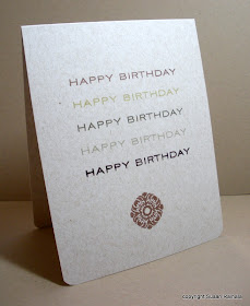
Guys are so hard to make cards for, and so I look for inspiration wherever I can find it. I found mine in a fab congratulations card by the amazing Carly Robertson. (I think it was published in Papercrafts but can't find it now!!!!) Her card repeats the congratulations sentiment five times in five colors, and then she tied a ribbon around the bottom. I immediately saw how versatile the repeated sentiment could be.

Here's my version:


Carly's card was on white card stock with bright colors, but I went for guy tones on a flax card base. The guy I made this card for isn't exactly a ribbon guy, so I went with the medallion from PTI's fall set from a few years ago.

And Carly's pretty idea becomes a card perfectly suitable for a guy!

You may take your own inspiration from wherever you wish, but definitely file away Carly's idea for future reference. Seriously versatile and easy, people!!!

OLW75 Rules

1. A one-layer card is defined as a single layer of card stock folded in half. No other layers allowed.

2. Make a one-layer birthday card for a guy. Remember to keep embellishments to a minimum.

3. Upload your card somewhere on the interwebs, and then link back to it using the InLinkz button on the sidebar of Simplicity.

4. The most important rule of all: HAVE FUN!


Re: OLW74

I tried to comment on every single entry in OLW74, but a few blogs simply weren't working. I tried several times, so if you didn't get a comment, I'm so sorry!!!!

And the Winner of the Cuttlebug Folders Is...

Carol Lucas!!!!! Congratulations, Carol! Send me your snail mail address and I'll send out your Cuttlebug folders ASAP!

Thanks to everyone who commented!

The Power of Punchy Color Combinations

Yesterday's Sharpie-colored banner cards showed the value of bright, punchy colors on a white card base. Bright, happy colors make bright, happy cards...color definitely affects the mood of a card, perhaps more powerfully than any other design element, and in these cold, gray days of Ohio winter, I find myself drawn to brighter colors more than usual!

Sharpies are extremely vivid, but so are some of the Memento inks...and it's certainly quicker to stamp in color than to color in stamped images. Hero Arts' banner set gives you options for coloring in (as yesterday's cards showed) or for stamping images in color.


To keep this high-contrast color combination from being too cluttered or visually confusing, I used one strongly-patterned banner stamp repeatedly. Mixing and matching patterns with these colors would have been jarring, indeed.

Also note that the banner is small enough that a repetition of five fits perfectly on the standard card base in a landscape orientation...where yesterday's portrait cards fit three. Odd numbers really do work best--generally speaking--especially with clean-and-simple designs.

Happy Tuesday!


Monday, January 16, 2012

Sharpie-Colored Banners and Crafty Chit-Chat

It's been a while since I colored anything, and I decided the Hero Arts banner set needed some bright color to pop off a white background. So I made this little set. So much fun!!!!


I'm a little late on the banner bandwagon, but these certainly are fun, not to mention easy to cut out! Obviously, I didn't bother with shading much (the orange happy birthday flag was a feeble attempt at using a colorless blender, with less than satisfying results).

To attach the string, I used 1/8" scor-tape. Then, I placed the dimensional close to the tape so the top edge wouldn't stick down to the card.

A Note on New Year's Resolutions and Purging and Grab Bags

My crafting resolution this year (and probably for next year, too) is to use all my image stamps again. This idea just wouldn't leave my brain, so there it is. Here are some of the advantages to using every image stamp in your hoard collection.

1. You get your money's worth out of stamps, and it alleviates the guilt of all that money you spent.
2. You stretch your creativity working with older images trying to make them fresh.
3. You find out what stamps work for you and your style...and what stamps don't. This makes future purchases wiser and allows you to purge the useless from your collection, freeing up space for those future purchases.

I've done this once (it took 2.5 years) and am so thrilled with the results that I want to do it again. Feel free to join me if you want!

Speaking of purging.... I was lamenting the possibility of ever getting my craft room satisfactorily organized out loud on Facebook when my online friend V-Grrrl told me what an artist friend of hers did when her art studio became oppressively overcrowded. She boxed  up stuff and sold it on her website as grab-bags!

I am all over this and spent two hours yesterday sorting through stuff...and I'm not finished! These grab bags (or more properly boxes) will go on sale on Simplicity soon (probably next week). Among the items I'm including are ink pads and reinkers (SU, Memories, Ancient Page, Colorbox, VersaMagic), SU markers, cardstock (SU, Mark's Finest, DCWV, even a little Papertrey), punches, a 12-pack set of watercolor crayons, and embellishments like hardware (SU Hodgepodge Hardware, random brads, paper clips, photo turns, etc.), DMC and craft floss, ribbon, buttons, Perfect Pearls, flock, doilies, googlie eyes and such.

A lot of these are items I use but come packaged in absurd quantities.

Will I use 100 googlie eyes in my lifetime? No. Will I use 20? Certainly.

Others are perfectly lovely products that I have a huge selection or duplicates of...such as the watercolor crayons and ink pads. I have over 500 ink pads. This is a ridiculous quantity for a Clean-and-Simple Stamper, not to mention hard to store. Shedding some will give others a chance to try inks they haven't tried. Don't like it? Toss it. Love it? Go buy more!

Finally, each box will contain as many stamps as I can stuff in them. Almost all of these are high-quality brands such as Hero Arts, Northwoods, StampinUp, Memory Box, Papertrey, and such. Yes, I'm getting rid of a few Papertrey sets.

I'm thinking of pricing boxes at $30 (for medium priority flat-rate shipping box through USPS, domestic only) and $40 (includes large priority flat-rate shipping $14.95, domestic only), but each box will contain as much stuff as I can stick in it. You'll definitely get your money's worth!

Now, I know lots of you are like me...you have more stuff than you know what to do with and don't need someone else's excess stuff. BUT there are plenty of people who

a. are just starting out and would love a chance to get a lot of stuff at a huge bargain, or
b. are in a rut and want to jump-start their creativity with random stuff bought so cheap that if it doesn't work for them, they won't feel bad at all, or
c. are Ebay experts who want to repackage the stuff for profit.

I hope y'all have fun with these!

Saturday, January 14, 2012

More With Hero Arts

Here's another card with the Hero Arts set To/From Petals, and the fab button is another from Audrie. It has "stitches" around the edge of the button, which adds fun texture that works great with the stamped image.


I used a glue dot in the center of the cut flower, then used tiny dimensionals to pop up each of the petals...an easy way to add interest. I originally intended to add a sentiment, but there just wasn't room.

I hope you all have a lovely weekend. Don't forget about the Cuttlebug folder give-away on this post.

Friday, January 13, 2012

Email Hacked

My email account got hacked. If you received a weird, forwarded email from me containing a link, please delete it!

New Stuff, a Card, an Excuse, and a Give-Away

The new Hero Arts Catalog just arrived at my house, along with the following goodies:


Then, yesterday, I just HAD to go to Marco's Paper to pick up more white envelopes, and while I was there, the following items jumped into my basket.


When I got home, I deeply regretted not spending $15 on the ScorMat thingie. May go back next week and get it and the soft green Smooch I put back because buying five bottles of Smooch at once seemed undisciplined. Only buying four is sooooo much better....


On top of the above goodness, blogger Audrie sent me a package of goodness in December. Check out that adorable SU punch, the cherry cobbler ribbon and pompom trim, and the sheer quantity of perfectly tiny and wonderful embellishments!


As if a new house and new craft space weren't enough blessing. All this goodness to play with, too! I decided to try to use at least some of Audrie's package right away, and the gorgeously rustic wood buttons she sent seemed a natural first choice.


Now for the excuse. A surprising number of you have asked for pictures of my craft space. It's still a mess, although at least I can work in it. But showing it to you in its current state would feel like showing you my dirty laundry. Ewww. Soon, I will have it worked out and will share.

And now for the give-away. You may have noticed that Audrie sent me some Cuttlebug border folders. Since I am standing firm on my "no expensive machines that require lots of accessories" resolution, I can't use them. If you would like them, please leave a comment saying so. I will choose one random person who's commented by Sunday night, midnight EST to receive them.

Of course, you may still comment if you DON'T want the folders. I love comments. They are like a mug of hot chocolate on a cold, windy, snowy day, such as we're having right now. They make me feel all warm inside. Please know that I truly, deeply appreciate your comments, emails, and readership of my blogs.

Supply
stamps: Hero Arts To/From Petals
ink: various
paper: PTI natural
accessories: buttons, twine

Thursday, January 12, 2012

Staggering Images in a Triangle

If you've been reading Simplicity for a while, you know about the rule of threes and visual triangles. Three things are more interesting, generally, than two, and if you can arrange those three things in a triangle, boy howdy you've got something. But how do you balance the triangle?

Try something like this.


These heart stamps come from a very old Stampin'Up set. The tallest is in the middle (slightly to the left of center on the card) and was stamped first. Then, the left heart was stamped slightly below the midline of the background area so it spills outside the background slightly. Finally, the third smallest heart goes even lower down the background, which leaves the perfect space for the sentiment and adds some visual weight to the right to balance the fat heart on the left.

The leaves on the stems are arranged with the same placement, with the largest leaf in the middle and the two smaller leaves lower down. There is a LOT of pattern happening on this card, and the very stable arrangement of images surrounded by a crisp, white frame, keeps it from looking chaotic.

Yesterday, I received my first order of the year from Hero Arts. I used Creative Play, and let me tell you, my package arrived in record time after they called to confirm my address since it's new construction and their PO program didn't have the address listed. They even included a free Sakura stardust pen! I'll get a chance this afternoon to unwind in my craft room with the new goodies after two potentially stressful meetings today. New goodies!!! Yee-ha!!!!!

Supplies
stamps: Hero Arts (background), SU (hearts, discontinued), Papertrey (sentiment Love Birds)
ink: Memento Angel Pink, Tuxedo Black; SU Real Red
paper: Papertrey
accessories: none

Tuesday, January 10, 2012

One-Layer Wednesday 74: Red and Pink

This week's One-Layer Wednesday challenge is to use red and pink...and ONLY red and pink...on a white card base.

Like this:


Any shades of red and pink will do, so feel free to use Bravo Burgundy or another dark red as a substitute for black or brown (as I did on yesterday's card).

Also, your card need NOT be a Valentine's Day card. Some people don't like Valentine's Day. I get that.

OLW74 Rules

1. A one-layer card is defined as a single piece of card stock folded in half. No other layers allowed.

2. Use any shades of red and pink ink. No other colors allowed.

3. Wow. I sound like a dictator.

4. Upload your creation somewhere online, and then link back to it using the InLinkz button on the sidebar of Simplicity.

5. Most importantly, HAVE FUN!!!

Supplies
stamps: Inkadinkado (birds), Papertrey (Love Birds, hearts)
ink: SU real red, regal rose
paper: PTI white
accessories: half pearls, Corner Chomper

Using Stuff

What is it about the new year that leads us to make resolutions to improve ourselves? I try to stick to choosing a Word for the Year, but resolutions sneak in, and one of mine is to start over again using every stamp I own (excluding sentiments, of course). This idea snuck into my brain as I was organizing my new craft room and won't go away. Guess I'm stuck with it.

At least it's a happier resolution than using all my colored card stock. GACK!

One storage drawer that's particularly full is my large background drawer. I love large backgrounds but don't use them enough at all. So here goes.


I first tried to use a StampinUp pretty in pink card base, but the pretty in pink ink looked so dark on it and the resulting base looked a mess. Does anyone else have this problem? I've noticed that bashful blue ink is also getting darker with the years. I remember when these pastels were, well, pastel. Now, they look mid-range to me. Is it just my eyes?

Anyway, I flexed to Memento Angel Pink and a white base, and got a nice, subtle pink woodgrain never found in nature but still quite light and lovely. I stamped the lovebirds in SU real red (the best red EVER) and the sentiment in Bravo Burgundy. I'd made another card with pink and red and a black sentiment, and the black looked harsh, for some reason. Bravo Burgundy is so dark it can easily substitute for black but softens the harshness with its monochromatic effect.

Now for an informal challenge...what do you have in your stash that you need to use? Do you have jars full of buttons or ribbon? Spindles of baker's twine? Drawers full of little-used stamps? Shelves stacked with card stock? Have you resolved to use stuff this year?

Supplies
stamps: Hero Arts (woodgrain background), Papertrey (sentiment, Love Birds), Inkadinkado (love birds)
ink: Memento, SU
paper: PTI white, SU real red
accessories: dimensionals

Monday, January 9, 2012

The New Normal

I have no idea what the New Normal is, but at least I got to make a few cards this weekend, which feels normal to me. I will resume the One-Layer Wednesday this week, too, making one more step toward the New Normal.

Sadly, I had to make a sympathy card yesterday. Patrick Haikal, who was married to one of George's cousins, died this weekend of cancer. He was just 38 years old. I really hate cancer.

The first version of this card is simplicity itself. The background shadow stamp uses VersaColor Atlantic ink, and the flowers and sentiment use Ocean Depths (I think) from VersaMagic. Blues seem to fit the mood of a sympathy card, don't you think? I masked the bottom of the shadow stamp to stamp the flowers.


After photographing this, I decided to add a few pearls.


Can't decide which I prefer. I think I like them both equally. Which do you prefer?

Supplies
stamps: Hero Arts (shadow), SU
paper: PTI white
ink: Versamagic, Versacolor
accessories: pearls

Saturday, January 7, 2012

A Special Birthday--Edited

A few days ago, Vgrrrl posted a request on FB for people to send birthday cards to a very special little boy named Cole. Cole has A.L.L., the same aggressive cancer that took little Lincoln Hammett from my church family. Cole's family discontinued treatment in October, and doctors expected he would be in heaven by Christmas. Yet he is looking forward to his 5th birthday on January 9th. I love it when the doctors are wrong.

So I sent Cole this card, my first card made in my new, completely unorganized craft room. I was so happy to find anything at all as I worked! Minimalism has its advantages at times like this.

Kid cards always intimidate me. I originally planned to put the stamped panel on a brilliant blue card base but just couldn't bring myself to do it. Baker's twine, to me, is just so gosh-darn happy.


I hope Cole's birthday is the best ever. It's already given his parents a wonderful gift of time.

If you want to send a quick card, too, here's the address.

Cole Dieckman

PO Box 9
Joy, IL 61260

Edited to add...Here's a link to Cole's story.


Supplies
stamps: A Muse
ink: memento
paper: SU real red, PIT white
accessories: baker's twine, dimensionals, memento red marker

Wednesday, January 4, 2012

I'm Back!

We had our cable/internet connected this evening, and I'm in heaven. It's been over a week since I indulged in Pinterest. Can you imagine the hardship?

My craft room got all moved today, and I hope, hope, hope to make something tomorrow. There's still some cleaning at the old house and phone calls to plumbers to make and rugs to buy. In the meantime, I give you my last card made with the Modern Basics set...for the time being, of course. This set is my new favorite. And that's saying something.


4.25" square


This bit of simplicity became an entire set in different colors...because it's just so darn cute and square!

Happy New Year, and thank you so much for your good wishes and patience. Y'all are the best!

Someone asked if moving ten minutes away was easier than moving far away. The answer is, in my experience, sort of. But my muscles are a LOT more sore than when the military moved us, that's for sure. When we moved cross country, the packers put everything in boxes and when we got to the new place, we had to unpack all that stuff. This time, we're moving whole drawers full of stuff. My craft room took four trips in my station wagon and about an hour to arrange.  I just shifted whole drawer units without worrying about anything. That was WAY easier than having to unpack every bottle of reinker from its zip baggy, get all my punches unwrapped and reorganized, etc.

Oh, and I have too many books. Now I understand why the military movers always hated us. When we moved to our last house, we had 109 boxes of books. Now, we have more. Dang, those things are heavy. We've used about 50 banker's boxes to haul the first batch over, and will empty them and re-use them until all the books are moved. So glad we're not in a hurry!