Oh. My.
I just had to run to my chaotic and extremely unsatisfactory craft space and make something.
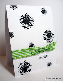
Something like this.
 |
| Old Hero Arts woodblock flowers are so pretty!!!! |
Now, the above card was perfectly satisfying, but I decided to experiment with some different stamps and orientations. The second card I made was appallingly ugly.
Do you want to see it?
Of course you do. You want to mock it just like I do.
Here you go.
 |
| Do NOT try this at home! |
I had run out of the lighter green ribbon and thought, hey, the PTI flowers are ugly in black anyway, so maybe bright green gingham might
Sadly, it did not work.
Of course I couldn't let those ugly black blobs be the last word on this fab challenge, so I tried the whimsical outline flower and butterfly stamps in the Hero Arts clear set from whence the hello stamp comes, and created a fun, blinged card that made me very happy.
So, thank you, GinnyB for kindly thinking of me when you saw that dress. It's beautiful and a wonderful inspiration piece!
Supplies
stamps: discontinued Hero Arts, except for the black blobs, which are from PTI's Beautiful Blooms
ink: Memento
paper: PTI white
accessories: various ribbon, rhinestones

That dress is lovely as well as being inspirational. Your first and last cards are indeed gorgeous, especially the bit of bling on the last one.
ReplyDeleteThanks for sharing the experiment which did not appeal; we all have those!
Actually I like the 'ugly' card as well as I like the others, and I like them a lot.
ReplyDeleteI love them all! I like your style!! I stopped putting ribbon on mine cause it increased the postage. Do you have a trick to keep the postage down? What kind of envelope do you use? Thanks for sharing.
ReplyDeleteThat dress is very inspirational! Your first card is my favorite - it's so beautiful, then the last one - love the blings, and the middle ... no comment :)
ReplyDeleteI like the "ugly card." If I changed out anything on it, it would be to make the ribbon red -- but then that's because I love black/white/red combo. The third card is probably my fav of the set.
ReplyDeleteDon't you wish we could bling everything in life to make it better? I love the dress and it is a terrific inspiration.
ReplyDeleteThe middle card isn't terrible; it's just not quite right.
Well, I actually like the second card best-if I was to change anything I would use a black ribbon or a strip of black or red scalloped cardstock. Just shows we all see things a bit differently-no right or wrong to me in cardmaking!
ReplyDeleteI just love that first card. The elegance of the stamp, the simplicity of the card, and the splash of green all go together beautifully. As for the second one? You should have quit when you were ahead! And WOW! - do I ever like that dress!!!
ReplyDeleteWhat an amazing difference the change in stamp made between the second and third card - the third card is so light and fresh, compared to the heaviness of the second card.
ReplyDeleteBut as much as I like the third card, the first card leaves it in the dust - I just love the old-fashioned botanical look of the flowers and the paler green ribbon.
I'm sorry to hear your craft space is still chaotic. When you say "extremely unsatisfactory", do you mean that the new space in the family room doesn't work?
Lovely inspiration and thanks for showing the progression. I'm sure the second would work with green buttons (or faux stamped green buttons if you don't like the bulk) to cover some of that black. Delightful cards. 3rd is favourite. So light!
ReplyDeleteI do like the first one best, but I do like all of them. You did good!
ReplyDeleteI just wanted to say your site makes me happy because I don't have to jump through hoops and prove I'm not a "robot".
ReplyDeleteYour first card is my favorite. I don't like the 3rd nearly as much. As for the 2nd, I do not like the black flowers at all. Thanks again for sharing.
ReplyDelete