Pages

Thursday, July 30, 2015

Another Triptych Card...and a Tip for Heat Embossing

Remember my triptych cards inspired by Sharon Schuman? Well, here's another one:

Folded size: standard 5.5" x 4.25"


The washi and embossing are gold, and that monochromatic scheme really unifies this card. To put it in the card, I'll zig-zag fold it with the angel on top.


Problems with Warped Paper from a Heat Gun?
Have you ever noticed how heat embossing tends to warp the paper. You might imagine the effect his has on my mildly obsessive mind. When I finished making this card, it was all buckled and warped from the heat gun, which made adding the tape difficult. Ugh. So I put waxed paper between the folds (to keep the gold embossing from sticking...although I don't know that it would stick...better safe than sorry!) and put the card and waxed paper between two squares of plywood. Two five-pound dumb-bells went on top, and then, honestly, I forgot about it until today, when I noticed the cheapo press in the corner of my craft nook. The card is now flat and perfect.

Next time, I'll press the panels before putting on the tape. That will be MUCH easier!

Supplies
stamps: PSX angel and joy sentiment; Papertrey Keep It Simple Merry Christmas
ink: VersaMark
paper: Papertrey white
accessories: extra-fine gold embossing powder, heat gun, gold washi tape, plywood-and-dumb-bell press


Wednesday, July 29, 2015

I Got Happy Mail!!!!

Some days, you go to the mailbox and it's full of bills, catalogs, credit card applications, coupons you don't need, and a bunch of wasps.

Okay, maybe that last one is just me. We've really had a wasp problem this year, and after about 50 nests were taken off our house, the little stingers moved into the mailbox. I know they are God's creatures, but they don't belong in my mailbox. Spiders in my craft nook and wasps in my mailbox. Two more words for you: chemical warfare.

Anyway, yesterday, I got the happiest mail I've received in a quite a while. The package came on just the perfect day to give me a much-needed boost, and it came all the way from the Netherlands!

EEEEEEEEP!

I just had to share Brechtje's beautiful package with you. First up, she sent a lovely thank-you card...so crisp and clean and pretty!


In the card, she also explained that she's started making her own paper and is incorporating really cool napkins into the paper for artwork. She gifted me with a set of four cards made from her handmade paper! These blew. my. mind. So incredibly tactile and beautiful!!! The soft texture, the gorgeous rough deckled edges, and the bright colors make my CAS-lovin' heart go pitter-patter!


I wish you could feel the edges of this paper. Oh, my!


The colors glow, don't they?

In this photo, you can really see the texture of the paper.

These boxes almost look embroidered. So cool!

The drop shadow on the leaves adds dimension.

See?

Brechtje included blue tulips to honor her home town of Delft.

So pretty!

All this goodness was enclosed in a fabulous envelope made of what feels
like wallpaper, stitched on two sides and sealed with washi tape.
*happy sigh*

Thank you so much, Brechtje. So much!!

The thoughtfulness of Brechtje's words and the beauty of her art touched me and inspired me. I hope they inspired you, too!
 

Tuesday, July 28, 2015

Another Tree Set

In my most recent order, I picked up a set from Simon Says called Giving Thanks...which has a tree in it. Have I mentioned lately how much trees appeal to me? Well, they do. A lot.


Isn't that a neat-looking tree? Sure it is! Now, if you click on the link above and take a look at the set, you'll see that there's a single stamp that has all the leaves the tree needs, as well as several individual or small groups of leaves. To make this card, I stamped the large foliage stamp first in Memento tangelo ink, and then, using Memento Morocco ink, I over-stamped random leaves with the individual leaf stamp. The variations in color look so pretty!

To make the hill, I masked the tree trunk, inked part of the long sentiment in the set after putting it on the acrylic block in the curved shape, and stamped. Adding a few random fallen leaves draws attention to the sentiment. Yay!

And of course bling. The curve of the hill is echoed in the single curved corner of the raised panel and highlighted by a little arch of bling.

Some people hate autumn and might find this card depressing. I love autumn...really love it deep in my bones. It's the season of pumpkin-spice everything, cool days, bright blue skies, multi-colored leaves, apple pies, and Thanksgiving. Given the hot, humid days we've been having in Ohio, thoughts of fall are a happy meditation!

And that's all I have to say about that.

Supplies
stamps: Simon Says Giving Thanks
ink: Memento
paper: Papertrey white
accessories: rhinestones, corner rounder, dimensionals

Monday, July 27, 2015

Getting Punchy for Christmas

Some people like making lots of cards in a single design. I am not one of those people. Making multiples makes me itchy and irritable. But when I finished this particularly punchy Christmas card, I quickly made four more while the colored card stock was still out on my desk.


Those two shades of green and two different punches set off with a festive red bow quietly represent Christmas in all that glorious white space! Design-wise, I especially like the asymmetry of this ensemble...such a small arrangement, yet so interesting and balanced.

To attach the bow, I put a dot of liquid glue on the top of the leaves, laid the knot of the bow on the dot, and held it down with an acrylic block until it dried completely. That should (hopefully) hold the thing together.

Supplies
stamps: Clearly Besotted
ink: SU real red
paper: SU garden green, unknown lime, Papertrey white
accessories: red embroidery floss, glue pen, fern punch, leaf punch


Sunday, July 26, 2015

Happy Happy Birthday

For some reason, yesterday's stamping session resulted in a lot of botched efforts at lining up stamps from Clearly Besotted's Geometric Style. I couldn't stamp straight to save my life. So when one thing's not working, try something else!


The triangles were stamped on a scrap of white card stock, cut out after the Memento Luxe black ink dried, and popped up on dimensionals. The bling went under the corners of the triangles, which were spaced close but not touching.

The sentiment is from Papertrey...one of their big sentiment sets from a few years back. It's so easy to ink it with two separate colors at once.

And on a creepy note, I just killed about eight cellar spiders in my craft nook. Ewwww. Now I feel like their relatives are crawling on me. Must redirect my thoughts away from the eight-legged nightmares!

Supplies
stamps: Clearly Besotted Geometric Style, Papertrey sentiment, Hero Arts alphabet
paper: Papertrey white
ink: Hero Arts soft pool, orange soda; Memento Luxe black
accessories: scissors, dimensionals, orange rhinestones

Friday, July 24, 2015

Points and Curves


Just a Reminder...You can like Simplicity by LateBlossom on Facebook and get links to new posts in your Facebook Feed!

Today's card exploits one of the principles of design: angles love curves. This stamp, from Clearly Besotted's Geometric Style set, gets repeated in shades of blue for a curvy, angled birthday card!


I hope you have a great weekend!

Supplies
stamps: Clearly Besotted Geometric Style, Papertrey Birthday Basics
ink: Memento summer sky, Danube blue; Hero Arts corn flower
paper: Papertrey white
accessories: dimensionals, Corner Chomper

Wednesday, July 22, 2015

The Process of Tweaking a Design

After yesterday's card, I wanted to make another version inspired by that wonderful "tag with two shapes and a sentiment" on Linda's gorgeously embellished card, but I wanted my second card to look and feel completely different.

It does.


The layout had to be tweaked, though. Here's yesterday's card again for comparison....


The sentiment strip on the pink card is much shorter than on the blue card, and putting it in the same place made the tag look EXTREMELY top-heavy. Note that the vine background is very organic and open, while the text background on yesterday's card was dense and linear. Those open vines just couldn't bear the weight of the hot pink flowers and high-up sentiment.

So I spread out the elements by moving the sentiment to the bottom of the tag. Unfortunately, the pink ink of the sentiment wasn't quite strong enough to draw the eye from the two large flowers, so a third, small flower gets the job done.

I love both of these cards for different reasons. The pink one is light and fresh and full of movement. The blue one is sparkly and text-y and crisp.

Inspiration as lovely as Linda's can take you places that you never would have gone on your own...and sometimes even to places that are significantly different from the inspiration itself.

Creativity can be such a delightful and satisfying journey.

Supplies for Pink Card
stamps: Papertrey Turning a New Leaf, Clearly Besotted A Little Sentimental
ink: Memento Luxe rose bud, Impress Fresh Ink basil
paper: Papertrey white, unknown shimmery hot pink card stock
accessories: flower punches, half pearls, dimensionals, corner rounder

Tuesday, July 21, 2015

Dissecting Inspiration

Several people have commented recently about my ability to pull inspiration from places they would never have seen as inspirational. This got me thinking about how inspiration works for me and how I might share my process. Here goes.

When I look at a card for inspiration, my first instinct isn't to judge it. I don't think, "Oooo, I love this!" or "Ewww, yuck!"

I ask a much more neutral question: "What's going on here?"

If the inspiration piece is clean and simple, I generally focus on the layout. Is it something I've seen before? Does the artist make a "standard" layout look fresh? Where is my eye moving? Does the movement make sense? Is the color scheme successful? How do all the elements work together to create unity? This is what I did with yesterday's inspiration cards. Their artsy, textile style isn't at all mine, but the layout...where things are placed...is perfectly clean and simple. I lifted that and went to town with it, even varying the layout when the shape of my sentiment changed.

If an inspiration piece is not clean and simple, I look at the details. Is there some part of this complex design that would look good surrounded by white space? Is there a clever use of color, line, pattern, or balance that would work in a CAS environment? Did the artist use a technique or embellishment that looks really cool? Basically, I dissect the design and treat each part as potentially useful for me.

When you dissect a good design, no matter what style it reflects, you learn something you can apply to your own artistic expression. Today's card is a perfect example of borrowing only a part of a more complex inspiration piece. First, here's my card, which made me so very, very happy!


Isn't this fun?!?! I love the crisp, clean colors; the sparkle of the bright blue glitter paper; the placement of everything. It works wonderfully well, and I doubt I could ever have come up with the layout on my own.

When you see the inspiration for this, it might take you a minute to find exactly what I pulled out.

From The Stampers' Sampler magazine, Summer 2015

Talk about over-the-top layered and embellished! Linda Abadie's lush use of ribbon, hat pins, layers, chipboard, and color is absolutely gorgeous...and the exact opposite of clean and simple. This card would never fit in an envelope; putting it in one would, in fact, be a crime! With all that's going on, it's a perfect candidate for dissection. Take a look at this close-up, and you'll see exactly what I lifted from her design:


She used two glitter hearts to embellish a tag and placed the sentiment on a white panel across patterned paper so the hearts and red grid draw your eye to it. Brilliant! I pulled just this element off her card and created my snowflake card.

I generally think in threes, but two hearts (or snowflakes) work perfectly here. The background text is very linear, so I went with a nice, curvy "Joy" in the sentiment.

And the results are so very clean and simple!

This sort of inspiration makes my heart go pitter-patter. It stretches me and gives me new ideas, and then I can modify and adapt the design for my own purposes. I love finding a layout and then varying it to see what else I can milk out of the idea. Tomorrow's card will show how a single change in placement in this tag's design will affect how all the pieces need to fit together. Stay tuned!

Supplies
stamps: background unknown, sentiment Papertrey Signature Christmas
ink: Memento Danube blue
paper: Papertrey white, Michael's blue glitter paper
accessories: snowflake punch (Martha Stewart), dimensionals, corner rounder

Monday, July 20, 2015

Fabric Inspiration

Here's a shot of my recent order from Simon Says Stamps!


Can't wait to play around with these fun-looking sets. Now, will someone please send me some spare time? 'Cause, seriously, I need some time. So. Much. Need.

Today's cards came together pretty quickly with some CAS inspiration from an artsy source. Vickie Kammerer published a trio of fabulous cards in The Stampers' Sampler. She used some dyed fabric and stitching in a very simple treatment that's oh so colorful!


Now, I don't have a sewing machine and prefer working on paper to using fabric anyway, so I sponged  to achieve a colorful background for my heart cards inspired by Vickie.


To start, I took a large scrap of white card stock and sponged it rather carelessly with shades of hot pink and purple, making no effort to blend the colors. After I cut out the hearts using the Fiskar's ShapeCutter heart template and cutting device (so delightfully primitive!) and tested them against the white card base, I felt a little let down. Without the stitching on the inspiration cards, the heart didn't seem right, somehow.

Since stitching wasn't an option and my experiments with faux stitching generally look like a kindergartner did them, I chose to add extra dark purple ink to the edges, which gave just the effect needed to make the hearts stand out better.

The same layout as Vickie's cards, with a one-word
sentiment.


Layout modified to accommodate a long, narrow sentiment.


The sentiment stamps come from an old set from October Afternoon. The sentiment panels looked odd with square corners, so I rounded them ever so slightly with scallop scissors.

These cards were so much fun to make! Thank you, Vickie, for using fabric so effectively and for inspiring me to do something I don't normally do with ink!

Supplies
stamps: October Afternoon
ink: Memento
paper: Papertrey white
accessories: make-up sponges, dimensionals, Fiskar's Shape Cutter with Heart template, scallop scissors

Sunday, July 19, 2015

The End of an Era and a Really Cool Layout...with Washi Tape

First up, last week saw the joyful and sad ending to an era in my craft room: my last shipment to Operation Write Home. So glad the troops are coming home (for the most part); so sad this great organization is closing up shop.


*sigh*

And now for today's card....

Stamper Janice Long published a great, artsy card in The Stampers' Sampler that caught my eye because it's so clean and simple.


Card by Janice Long, published in The
Stampers' Sampler, summer 2015
For my first take on Janice's warm card, I stuck with stars but went with a cool color scheme of silver and white.


Silver washi tape, silver glitter paper, Brilliance silver ink...this card is so crisp and shiny and sparkly in real life and so very hard to capture in a photograph!

The second card I made has a completely different energy with bright orange to "happy" things up!


This was my second attempt at the orange card. On the first version, I stamped too many of the orange flowers on the card base, and it looked busy. This version has a more pleasing balance. I also love how the dots on the washi, the enamel dot, the white centers of the orange flowers, and the round centers of some of the letters in the sentiment create a dotty unity. With all that round stuff, the straight line of the washi works great to balance it out.

Many thanks to Janice for showing me a layout using washi that is super fun and extremely versatile!

Supplies
stamps: Hero Arts Shoot for the Moon, Papertrey Beautiful Blooms II, Clearly Besotted A Little Sentimental
ink: Memento black, cantaloupe; Brilliance silver
paper: Papertrey Ink white
accessories: washi tape, dimensionals, enamel dots, flower punch, glue pen

Friday, July 17, 2015

Another Holiday Triptych

Today's holiday triptych-style card shows how to overcome one consequence of using washi tape to bind the triptych: strongly dividing the three panels. On yesterday's card, the white tape blends in with the white card stock, providing no boundaries to the eye as it moves across the three panels. Today's card creates a continuous scene while using colored washi tape.


This card uses a really old, discontinued set from Hero Arts that uses polka dots as a design element I could exploit to create unity even with the pink tape separating the panels.

First, I repeatedly stamped the two rows of dots in pink, changing the curve as I went, to create a landscape that is continuous across the three panels.

Then, I stamped the snowmen and tree, colored them with Copics, and added Sakura stardust pink pen over random dots of the snowy ground and topping the tree. The Memento angel pink looked too light given the brightness of the coloring on the tree and snowman, so I wanted to bring out the pink dots more.

I also love the Sakura stardust pens because their ink is opaque, so you can cover up black reasonably well, as here for the three dots over the tree.

Adhering the washi tape to both sides completed the card.

Oh, my. I'm so loving this three-panel idea!

Supplies
stamps: Hero Arts discontinued
ink: Memento black, angel pink
paper: Gina K white in 120#
accessories: Copic markers, washi tape, pink Sakura Stardust pen

Thursday, July 16, 2015

A New Use for Washi Tape, Thanks to Sharon Schuman

While perusing the latest issue of Stampington and Company's The Stampers' Sampler, I came across an idea that rocked my world, courtesy of Sharon Schuman. She taped three ATCs together with washi tape to create a triptych, and I thought, "My gosh! This will work for a standard card, too!!!!"

And so it does!

How it will be folded to go into the envelope

Display


I LOVE this format! With three panels of 5.5" x 4.25", there's room to spread out. That means larger stamp images don't feel crowded to me...with lots of extra white space. YAY!

Now, I have to admit that this isn't washi tape. I'm having a hard time finding white washi, and for this particular design, a color would not look as good as it does on the card design I'll share tomorrow. So I searched my medicine cabinet, found paper tape for dressing wounds, and used that instead.

Feel free to call me genius. I won't mind.

This is so exciting for me!!! I had an email conversation recently with another stamper (Hi, Gay!) about how easy it is to get a bit bored doing CAS cards. Discovering a great idea like Sharon's with the ATCs and adapting it to my style is like a shot of adrenalin.  Expect to see more of this fun idea in the days to come!

To make this card, I stamped the three panels and then lined them up on my cutting mat with a smidge of space between each. (You need a smidge of space for the hinge of tape to work right.) Then, I carefully taped the two front seams, flipped the whole thing over, taped the back seams, and then trimmed the excess tape from the top and bottom edges with scissors.

BTW, I would like to link to Sharon's blog but couldn't find it. If anyone knows her, please send me a link. I'd love to send traffic her way! Here's a shot of one of her foldable ATC cards from the magazine. So beautifully artsy, yet also CAS.


Supplies
stamps: Papertrey Holly and Mistletoe
ink: Impress Fresh Ink mojito, VersaMagic rocket red
paper: Papertrey white
accessories: paper tape from the first aid kit

Wednesday, July 15, 2015

What to Stamp First

Today's cards are quite simple but there's a neat ink tip in them. (Well, I think it's neat, and it'll keep beginners from swearing in frustration!)

Let's look at the cards first.


These two very simple sympathy cards were made by stamping the butterfly first (in VersaMagic Sage for the top card, Impress Sicilian Blue for the bottom), and then the sentiment (in VersaMagic Hint of Pesto on the top card, Memento Espresso Truffle on the bottom).

This order of stamping is VERY IMPORTANT when using thick pigment inks. Even very light colors will distort or subdue black or very dark ink if they are stamped over the darker color. It looks a bit like soapy residue.

Not a good look for a card, generally speaking, and especially not good for a clean-and-simple card where every little detail matters.

So. Neat, eh?

Supplies
stamps: Papertrey Beautiful Butterfly
ink: various
paper: Papertrey white
accessories: none


Tuesday, July 14, 2015

Sympathy Cards and Troubleshooting Malfunctioning Stamps

Recently I needed several sympathy cards and had once again run out. As I've repeatedly stated here, my rule with sympathy cards is "the simpler, the better."


The color scheme was inspired by this pin of greys and blues.

I thought about adding a third butterfly, but visual triangles will not be forced, and besides, we can think of this as the "missing man" formation from aerial flyovers. BTW, those always break my Air-Force-loving heart.

Also, a reader recently asked me for advice with a solid stamp image that wasn't stamping well for her. This is a common problem, so I thought I'd share my advice to her here.


1.       Take a white eraser and rub the stamp pretty hard to remove residue from the manufacturing process. Then clean the stamp thoroughly and see if it takes ink better. This usually works.

2.      Switch the acrylic block mount. I have one acrylic block that seems to have a bit of a dip on one side, so if a solid stamp like a whale or elephant won’t stamp cleanly, I flip the block over to the other side, which seems flatter, or I use another acrylic block entirely. Minor variations in the surface of the block might not cause problems with outline stamps but can really mess up solid images!

3.       Look at the table surface you’re stamping on. Is it entirely flat? I use a large stamping mat (thick foam) I bought at JoAnn’s years ago to put under the paper, but you could use a firm mouse pad or phone book and get the same results.

4.       If you try all these things and the stamp still won’t work, it may be defective. Contact the manufacturer and explain the situation, all the things you’ve done to fix it, and see what they do. In my experience, companies generally do want to make it right.

 
So there you are. Step by step troubleshooting for solid stamps that won't give a good impression. I'll add that if you're having trouble stamping a large solid background stamp, standing on it is often the best way to get a good impression.

By the way, the reader's problem was with a Clearly Besotted stamp. She did contact the company, which sent her a replacement stamp. High five to Clearly Besotted!

Supplies
stamps: Papertrey Beautiful Butterflies
ink: Memento Luxe espresso truffle, Hero Arts pool and soft granite
paper: Papertrey white
accessories: none

Monday, July 13, 2015

Shades of Love


Today's card was inspired by a number of shabby chic, vintage, collage-style cards that line up bits of ephemera and stitch them to paper.

See? Proof that you CAN get inspiration from a completely different style and make it your own!!!!

'Cause there isn't anything collage-y, vintage, or shabby chic about this crisp, CAS, clean card!


Hearts punched from four different shades of vellum (white, light pink, bright pink, and red) are glued with a single line of glue down the middle to a white base. Then, I stamped the stitch line in soft granite and added the word "love" in four shades from Memento Angel Pink to Hero Arts Red Royal.

Hearts stitched together by love.

*happy sigh*

Supplies
stamps: SU everyday expressions (?), Papertrey Faux Ribbon
ink: Hero Arts soft granite, soft blossom, red royal; Memento angel pink and rose bud
paper: Papertrey white, various vellums
accessories: heart punch, glue pen, stamp positioner (to get that wood-mounted love stamp straight every time!)


Sunday, July 12, 2015

OLS18 Again: Sparkle and Shine

Don't forget about the OLS challenge for July: Sparkle and Shine! It's a perfect opportunity to get a start (if you haven't already) on Christmas/winter holiday cards. After all, sparkle and shine are a huge part of what decking the halls is all about!

I love the simplicity of this card. No sentiment needed, and the star is so very sparkly with Brilliance Galaxy Gold.


Have you started your holiday cards yet? Are you upset that I even brought them up? Come on, now, don't be a Scrooge! Holiday cards are such a meaningful way to say share the love and let people know you're thinking of them.

Supplies
stamps: Clearly Besotted Modern Christmas
ink: SU cherry cobbler, Brilliance galaxy gold
paper: Papertrey white
accessories: not a blessed one!

Saturday, July 11, 2015

Presenting...Humble Deco Scissors

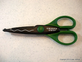
For those of us doing the Use-Your-Hoard Challenge, old and out-of-style tools and supplies need to be dusted off and used. For today's post, we're taking a fresh look at a pair of humble (and very old) deco scissors.


Back in the day, deco scissors used to be all the rage and a necessity for every paper crafter's hoard. These days, you hardly see them used at all. We have border punches, dies, and electronic cutting machines to give us decorative edges. Who needs the old scissors? I mean, they're plastic, cheap, and sometimes hard to line up properly.

Well, those of us who don't have die cut machines and electronic cutters have to use what we can to get those edges looking cool.

During a purge a few years ago, I kept only about five of the ten or so scissors I'd collected: the stamp edge, deckle edge, mini and regular scallop edge, and these wavy ones. The stamp-edge pair made these cards possible, and the regular scallop scissors are handy for giving corners a very slight rounding.

The wavy ones are perfect for ocean-themed cards like this one. Duh.


The Clearly Besotted set Whale Done is adorable and punny and so easy to work with. And the deco scissors work much better than the Fiskars ocean wave border punch I have. That punch makes pretty waves, but they are a bit too curvy and busy looking to be paired with this clean-and-simple whale. Believe me. I tried.

But the old-fashioned and super simple wavy scissors worked perfectly.

They're a keeper, for sure!

Supplies
stamps: Clearly Besotted Whale Done, unknown sun
paper: Papertrey light blue, white
ink: Memento Luxe
accessories: Stickles, dimensionals, wavy deco scissors