Pages

Tuesday, May 31, 2016

On Trend and Dippy Things

Note: I haven't been able to play along yet with the OLS Challenge for this month, hosted by Karen, but you'll definitely want to check it out after it goes live at midnight tonight (Tuesday). It's going to be a fun one, and I can't wait to carve out some time in my craft room to make something for it!


Gold-dipped feathers are all the rage (or they were a few months ago, so I'm totally counting this as on trend).


My feathers are not exactly "dipped" so much as "sponged" because "dipped" looked so very "dippy" (read artificial) to me. But that gorgeous Delicata gold ink shimmers and shines perfectly! Add a few silver half beads, and you've really got something.


The feather punch is from Fiskars, and the faux shaft running down the feather was made with an embossing stylus free-hand.

I want credit for that, too. Because crafting is all about keeping score.

Right?

No?

Well, alrighty then.

Speaking of "dippy," my grandfather, David Lee Willis, was the inspiration for this B-24 nose art during WWII.

Click on Image To Go Back To Crew Picture
Source

He was the pilot of this plane, which went down over the Himalayas when it ran out of gas...as many B-24s flying "the Hump" did. Those were some terrifically long missions. Nearly 1,000 men and 600 planes were lost flying the Hump during the China-Burma-India campaign. Years ago, The National Museum of the United States Air Force had an outstanding--and deeply moving--exhibit on the Hump, with photos of all the men lost. I still remember it vividly.

Papa made sure his entire crew got out before he jumped. All the men survived that mission. Papa kept a piece of his parachute. It was the only time he ever jumped out of a plane. He said he didn't want to practice something he could only do once. Smart man.

Guess he wasn't so dippy after all.

Supplies
stamps: Papertrey Birthday Basics
ink: Delicata golden glitz
paper: Papertrey white
accessories: sponge, dimensionals, embossing stylus, Fiskars feather punch, silver half beads

Sunday, May 29, 2016

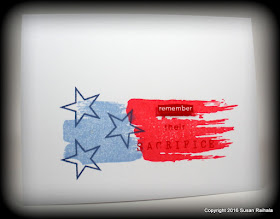
Memorial Day: Remember


For those of us in the United States, it's Memorial Day weekend...a three-day weekend signaling for most people the start of summer, the opening of pools, and (roughly) the end of school. The purpose of this holiday, however, is somber: to remember those who have died in service to our country.

Today, I post in memory of all the men and women who served with their life's blood, but most especially, I post in memory of Major Gregory "Linus" Stone, USAF. He died after one of our own Air Force sergeants tossed a grenade in a tent. Linus had flown with my husband in the 34th Bomb Squadron (Thunderbirds) and later deployed with the Air National Guard for Iraqi Freedom.

May we always remember the price of our freedom, our liberty, our honor. May we be worthy of their sacrifice.


Supplies
stamps: Hero Arts, StampinUp, My Favorite Things, Papertrey
ink: Hero Arts
paper: Papertrey
accessories: dimensionals

Friday, May 27, 2016

When Does Crafting Cross the Line into Crazy?

When does crafting cross the line into crazy? This question swims around in my subconscious mind but peeked its snout above the waves recently and squeaked at me like a dolphin laughing. Have I, indeed, crossed the line?

Dave Barry says that hobby is just another word for mental illness. Perhaps he's right.

In the past six months or so, these three sets jumped into my carts for three different orders. A sensible person might ask why this would happen.

Hero Arts Color Layering Butterflies; Clearly Besotted
Everything Changes and A Better You

Given my recent renouncing of layered stamping, my ownership of these three sets is particularly perplexing. All three are intended for layered use. All three contain butterfly images, for a total of 22 butterflies or layers thereof.

Who needs this many butterflies?

Apparently I do. It may or may not have anything to do with my friend who passed away in November. Karen loved butterflies, and she sent lots of Hallmark cards. We're starting a card shop at church soon full of handmade cards (proceeds going to the church, of course) in Karen's memory. It seems I'm subconsciously stocking up on butterflies with the idea of making cards for church.

Oh, that makes my crazy sound relatively sane, doesn't it!

Here's my rationalization for buying each of these sets. The Hero Arts set was the first color-layering set I ordered from Hero Arts. It's actually fairly easy to line up two layers...it's adding the third that makes me lose my mind. I also love that the butterfly bodies are separate from the wings. Why don't all butterfly stamp sets do this? It's a mystery.

Everything Changes called to me NOT for layering possibilities but for those delightful outlines combined with solid images. That feature has appealed to me lately because it increases the design versatility of sets so very much. Stamp designers take note.

Finally, A Better You appealed because I suspected that stamping the line layers on the block layers would be relatively easy (it is) and because I wanted to embellish the dickens out of those dots on the lines.

Is this crazy? You be the judge.

Let's face it: we're all a bit mad around here.

In A Better You, the line images need not be stamped with the block images...if you combine them with the butterfly bodies from Hero Arts, which is what happened for today's two cards.


The dots are embellished with Sakura Stardust pens, which are extremely shimmery and oh so easy to use. The ink is opaque, so you can layer different colors...here, I used the green Sakura pen and Memento Bahama blue ink.

The second card uses a tone-on-tone effect, with Hero Arts dark quartz ink under dots of Sakura Stardust red, which to my eye leans toward orange-red rather than violet-red. The ribbon matched perfectly and was a free gift with an order from Ellen Hutson.


Crazy or not, I sure am having fun with all the butterflies! What images are you enjoying these days? Please share! You might give the rest of us some ideas for our next obsession order.

Supplies
stamps: Hero Arts, Clearly Besotted
ink: various
paper: Papertrey white
accessories: Sakura Stardust pens, ribbon

Wednesday, May 25, 2016

Two Tidbits and a Season

First, the book update. A while back, I mentioned working on a stamping book. Well, the introduction and a couple of chapters are in draft form, but the realities of publishing have caught up with me. Turns out that publishing an e-book with lots of photos isn't technologically feasible at this time. The other options are a) I lay out gobs of money to a vanity press for a 1,000 print run and hope they all sell for a good price, or b) I create a print-on-demand book that costs you, the reader, gobs of money per copy.

Neither of these options sounds workable. So I'm tabling my stamping book until e-book technology catches up. Then, I can price it reasonably so you want to buy it and not have a huge expense eating into my son's college fund. Everyone will be happy. In the meantime, I'll try to write writerly posts occasionally here.

For free.

Free is good!

Second, many of you mentioned the MISTI as an option for layered stamping. That's great for those who want to invest in one, but for now, I'm going to pass, reserving the right to change my mind at any time. However, I did download Evernote today and began indexing stamps on my iPad. That was free. And not too annoying.

Third, a season. I've always liked the passage from Ecclesiastes about seasons and particularly enjoy the musical version of it by the Byrds. A friend is currently experiencing a season that doesn't make sense to her, a season that doesn't feel fair. It isn't fair, actually. But as we are both women of faith, this passage reminds us that every season--no matter how much it sucks--gets turned to His purpose. So I wanted to share it with her, courtesy of this stamp from Papertrey's Beautiful Blessings.


I hope the card encourages her to trust and endure. Seasons change. This, too, shall pass.

Supplies
stamps: Papertrey Beautiful Blessings, Concord & 9th Wild Flowers, Hero Arts small flower
ink: various dye inks, Memento Luxe black
paper: Papertrey white
accessories: silver metallic marker, craft foam, silver half bead

Tuesday, May 24, 2016

What Has Been Seen Cannot Be Unseen

Years ago, when I worked for a major international corporation in the marketing communications department, an incredibly talented graphic design artist brought a booklet cover she was working on for my opinion.

I looked at it, and my English-major mind, which sees Christ figures and phallic symbols everywhere, burst out laughing. It wasn't Christ I was seeing on that cover. Some arrow-shaped designs are, shall we say, unfortunate. The artist blushed bright red and said, "Obviously, you see it."

What has been seen cannot be unseen.

She completely redesigned the cover.

This memory came to mind last weekend as I was trying to grab a little inspiration from this picture on Pinterest.

Source

Perhaps you see the issue? I didn't, until I made my card, and immediately, I saw a breast...a breast with a heart-shaped pasty. All that's missing is the tassel.


Perhaps it's the pink. Perhaps it's the English-major mind that can't look at pears without giggling. But truly, how can I send this card to anyone now? Seriously. "Here I am, sending you a loving boob card! Enjoy!"


Hey! Another thought just popped into my head. Perhaps the card shows a breast pressed in the mammography machine, with one of those little nipple stickers made fun by light-hearted mammography techs. Maybe I could send it to my sister to remind her to get her girls squished! Love your ta-tas!

Or not.

*sigh*

Supplies
stamps: My Favorite Things Party Patterns, Clearly Besotted A Little Sentimental
ink: Hero Arts
paper: Papertrey white, unknown pink (maybe StampinUp pomegranate), StampinUp black
accessories: large circle punch, heart punch, dimensional 

Monday, May 23, 2016

See What You Can Do with Colored Pencils

Reader Beth kindly reminded me this morning that I haven't yet fulfilled my promise to talk about layered stamps and their difficulties. By shocking coincidence, today's post provides a possible solution to the problem of layered stamps.

Oh, my. They are a problem.

I realized long ago that two-step stamps present a huge challenge to the uber-CAS stamper. Mainly, we need to be incredibly precise, and I often found that, despite being afflicted with steady hands and a discerning eye for precision, I failed spectacularly at making two-step stamping work. Lining up the second stamp perfectly, with no gaps or crookedness, proved far more difficult than expected...even with clear stamps or a stamp positioner.

Add a third layer, as many current sets do, and I'm D. O. N. E. Done.

In the past year, I have purchased several three-step stamp sets from Hero Arts (these are enormously popular right now and available from a number of companies...Altenew has some particularly beautiful ones) as well as a set from Papertrey that includes three different birds with two-step stamps. After rigorous and repeated attempts to make all these work, I've essentially given up.

Yep. Given. Up.

Life's too short to spend your craft time swearing and throwing photopolymer across the room.

Not that I lose my cool like that, but you know....

Stampers like Jennifer McGuire make these stamp sets look easy, but I struggle. And it's simply no longer worth it.

Fortunately, you can achieve a similar effect with block stamps and colored pencils, as today's card shows. The rose stamp, from Hero Arts Flower Garden, looked extremely flat when stamped in Impress Fresh Ink melon. I loved the layout of the card, but the flatness of it wasn't doing the design any favors.

So I broke out the PrismaColor Pencils and went to work.


Check out the shading made possible with colored pencils. I took a shade darker (nectar) and a shade lighter (light peach) and created some depth over the melon ink. A few strokes of the clear blender pencil over the shading, and it's finished. The results are quite gratifying. A bit of chartreuse added to the leaves, and YAY! Depth and dimension, and no multi-step stamping involved.


Note that I only use PrismaColor pencils because my fine-artist mother said they were the ones I should use. Always listen to your mother.

Adam Savage of Mythbusters says that failure is always an option. Fortunately, my failure with layered stamping doesn't keep me from creating some dimension in my stamping. There's usually a work-around somewhere, if you are determined. I'm certainly determined.

And that's all I have to say about that.

Supplies
stamps: Simon Says Stamp It's Your Birthday, Hero Arts Flower Garden
ink: Impress Fresh Ink melon and grass, Memento Luxe espresso truffle
paper: Papertrey white
accessories: corner rounder, PrismaColor pencils

Sunday, May 22, 2016

Clean and Simple ROCKS!

My past few forays in the craft room have been a tad frustrating. One amusing product of the frustration will make it on the blog for a laugh later this week, but sadly, my recycle box filled quickly the past few days.

Then, I made this. Whew. What a relief.


That sentiment font is so very pretty. Take a closer look.


So pretty it doesn't need any embellishment...just a simple and subtle frame and a rich, beautiful color.


The sentiment is from Simon Says Stamp's It's Your Birthday. The envelope stamps are also from SSS, Envelope Sentiments. The card size is 3.5" x 6.25".

Today's post shows how very little you need to make a pretty, high-impact card. Ink. White card stock. Pretty stamps.

And it made me happy. So very happy!

What have you made lately that makes you happy?

Supplies
Stamps: Simon Says Stamp Envelope Sentiments, It's Your Birthday
Ink: Hero Arts raspberry
Paper: Papertrey Ink white
Accessories: envelope

Thursday, May 19, 2016

Sunshine on my Mind

Not sure why I've been on a sunshine kick lately, except that we've had one of the longest, chilliest, grayest springs I can remember. Please understand that I'm not complaining at all. Rain makes things grow, we're not having floods, and I much prefer moderate temperatures over too hot or too cold.

I have Baby Bear weather preferences.

Anyway, sunshiny stamp sets keep leaping into my cart this spring, it seems.


These stamps are from Hero Arts, a set called Sun Showers. The gray rain and cloud add some tension to the design, I think. This card seems to be saying that, yes, bad things are going on, but you remind me that there's still sunshine.

Which is a pretty awesome thing to be grateful for, don't you supose?

Supplies
stamps: Hero Arts Sun Showers
ink: Memento
paper: Papertrey
accessories: markers (Memento), scissors, dimensionals

Wednesday, May 18, 2016

More Delicata Sunshine

Who can resist Delicata Golden Glitz ink? Not me, that's who.


Love, love, love the shimmery golden goodness--and the simplicity--of this gorgeous ink.

The card is pretty straightforward, taking advantage of the large sun image and the fabulous inverted pyramid effect of the sentiment. Both stamps are from Simon Says Stamp's My Sunshine set. The popped panel adds interest and creates a stronger line between the two elements, grounding that rising sun nicely.

We had sunshine today in southwest Ohio. It was good. I hope you enjoyed your weather today!


Supplies
stamps: Simon Says Stamp My Sunshine
ink: Delicata golden glitz
paper: Papertrey white
accessories: craft foam, glue

Tuesday, May 17, 2016

Clean Christmas

Doodlebug's darling dimensional holly stickers and a fun-fonted sentiment: that's all you need for a clean Christmas card.

Card size 6.25" x 3.5"

And yes, I participled a noun because it was jolly good fun to do so. (I also verbed a participle. Ha! I could do this all night, but I'll stop now. You're welcome.)

When I showed this card to my son, he was taken aback. "I'm surprised you're making a Christmas card," he said. "It's not Christmas time!"

Oh, my son. If only you knew the power of new Christmas stamps. Resistance is futile.

Besides, trying to make a hundred-plus Christmas cards during Christmas time...well, that's just crazy talk.

Can I hear an amen?

Supplies
stamps: Simon Says Stamp For To Us
ink: Memento Luxe love letter
paper: Papertrey white
accessories: Doodlebug holly stickers

Monday, May 16, 2016

Strange Bedfellows

This fabulous Celtic manuscript background met up with a couple of funky red feathers, and a strange, quite possibly illegal marriage took place.


Really, this is truly strange, but I like it. Perhaps it's the crisp black and white with the splash of red that does it for me, or maybe it's the unusual textures of the torn paper, feathery feathers, metallic silver cord, and all that gloriously smooth white space. Whatever. It's dramatic, don't you think?


I can neither confirm nor deny the rumors of a tantrum pitched when this card was assembled. Those feathers are slippery little things and may or may not have caused a certain individual to lose her patience and stomp her feet.

*whistling innocently*


Supplies
stamps: Judikins background
ink: Memento black
paper: textured card stock, Papertrey white 
accessories: feathers (from a sprig in the floral department at Hobby Lobby), silver metallic cord, dimensionals, glue, brush (for wetting the torn card stock)

Sunday, May 15, 2016

Make a Card for Yourself

Most of the time, we make cards to send to others, but it's fun--and therapeutic--to make a card just for yourself every now and then.

As I was playing around with Simon Says Stamp's My Sunshine set, this card happened. It's exactly what I need to hear right now. May is always crazy with end-of-school activities and summer preparations. So here's a card just for me!


Both the stamps were inked with the lighter color and then the darker color ink was rocked and rolled up from the bottom of stamp. The gradation adds interest, but with the dark colors on bottom, the whole impression is of sinking into relaxation. Well, that's how I take it.

What message do you need to hear right now? Make a card for yourself and put it on your mantle or inspiration board just like you would a card from someone else. Don't we need to take good care of ourselves so we can take good care of others?

I think so.

Supplies
stamps: Simon Says Stamp My Sunshine
ink: Impress Fresh Ink, Memento Luxe, VersaMagic
paper: Papertrey white
accessories: nothing whatsoever

Friday, May 13, 2016

Cheerful Blessings

My last order contained My Favorite Things Cheerful Blessings set. Here's the first card I made with it. (Well, I think it was the first, but my mind hasn't been as sharp as it should be lately. Sleep really would be nice, don't you think?)


This is the first time I've used ribbon since Galileo said the earth revolved around the sun, or at least it feels that way. First, I glued the sentiment panel to the polkadot panel, then punched two holes with a leather punch and mallet, pushed each end of the ribbon through from front to back so both tails were hanging out the back of the panel. Then, I took one tail and ran it back up through the opposite hole, repeated with the second tail, and trimmed the ends evenly.

And yes, this is the second ribbon attempt because the first ribbon kept getting cut unevenly until I'd "evened it up" to nothing.

Life is all about determination. Or love. Or obsession. Or something like that.

Supplies
stamps: My Favorite Things Cheerful Blessings, Tim Holtz background
ink: Memento black (on background), Memento Luxe black (on sentiment)
paper: Papertrey white
accessories: satin ribbon, dimensional tape, leather hole punch and mallet

Wednesday, May 11, 2016

IC544: Three Different Cards

So, when we think of clean-and-simple design, it's easy for me to forget the range of styles you can achieve.  My personal style tends to be super clean and simple. But when I played with the IC544 Challenge on Splitcoast, I found several different inspiration pieces that absolutely yielded wildly different results...at least to my eyes.

First, a watercolor sparkly pop of color in bright, autumnal shades.

Inspiration Source Here


Next, my favorite of the bunch, a crisp, clean, and ever-so-basic card.


Inspiration Source Here


Finally, a grunge style resist in blues and greens.


Inspired by several pins here


Soft. Crisp. Loose. Whichever style you prefer, they are all one layer, ink, and paper.

Which DO you prefer?


Supplies
Will edit to add later...no time to look them all up right now. I'm turning into a pumpkin! 


Tuesday, May 10, 2016

More Delicata Goodness and the Power of Doughnuts

I want to publicly thank two of my readers today for being so awesome. Sue C. sent me a bunch of Swarovski crystals in gorgeous colors just because she's so nice, and Joyce M. sent me stamped samples of PTI's terracotta ink, which allowed me to see that it's a perfect replacement for my obsolete Ancient Page henna. Thank you, ladies!

Now for today's card.


Do you remember color-blocking? I don't see it much these days, but I have always adored the crisp, clean lines of rectangles arranged pleasingly on a white backdrop. When I found myself with a smallish scrap of the Delicata gold-stamped background, I decided a color-blocked card would be in order.

Two rectangles. One sentiment. Clean and simple.


Something to note: the shorter block is approximately half the height of the taller one. Conforming to the rule of thirds rarely steers you wrong. The sentiment is placed asymmetrically, on purpose. The "thank you" sentiment I considered first only covered half the width and looked really weird. The "thinking of you" sentiment occupies approximately two-thirds of the width of the panel, with one-third of it left blank. This forces the eye to move around a bit and adds interest. Rule of thirds. It rocks.

Once again, I will say if you don't have the Delicata gold ink pad, get it. Please. It will make you happy.

And who doesn't need a little happiness in her life right now?

Speaking of happiness, today our church's regular Bible study had extra doughnuts. We always have extra treats (we're Methodists so not having extra would be unnatural), and the extras usually go to the preschool teachers. Well, as it's teacher appreciation week, the church's conference room has been converted to a lunch room, and mounds of food were already there. The teachers didn't want or need the doughnuts.

I took the doughnuts. Hold that thought.

When my car was totalled in February, we replaced it with a new one and ordered new plates. The state of Ohio requires plates on the front and the rear bumpers, but when my plates came, I realized that there were no holes in the front bumper prepared for a license plate. For weeks, now, I have been driving around in violation of the law, stymied by the lack of skillz needed to attach the plates.

This morning, as I dropped my son off at the high school, a story on NPR reported that someone had been pulled over for missing a front license plate. No idea what the story was about, because as soon as I heard that, it occurred to me that I might need to do something about my own missing plate.

After Bible study, with a box of doughnuts on my front passenger seat, I drove straight to the Mazda dealership and into the service bay.  In my most helpless, little old gray-haired lady voice, asked the gentlemen to attach my license plate. Of course the answer was yes, so I said, "Would you all like some doughnuts?"

Stupid question.

Everyone was happy. The Bible study class plus a bunch of hard-working mechanics got doughnuts. I'm driving legally now. The teachers feel appreciated.

I'm so happy to be a Methodist.

Supplies
stamps: Tim Holtz (background), Clearly Besotted Clearly Sentimental
ink: Delicata gold, Memento Luxe black
paper: Papertrey white
accessories: craft foam

Monday, May 9, 2016

Five Layers...Oh, My!


I have no idea where this card idea came from, except that I was thumbing through a Somerset Life magazine, admiring the shabby chic, vintage feel of so many pictures, and this just popped into my head. It turned out even better than planned!


To make the torn layer (3.5" x 2.25"), I painted water lines on scored card stock with a watercolor brush, soaking it really well, and then tearing it. The score lines showed me where to tear to get the size right. Not sure why one edge ended up so straight, though; they were all scored! Anyway, to glue the torn layer to the card, there's just glue at the very center of the piece. I wanted the edges to stay loose and detached.

The next layer (3" x 1.75") is clean-cut card stock stamped with a gorgeous Celtic manuscript stamp. This layer is popped up with dimensionals. The ink is Color Box Chalk light brown, which I thought would be light enough, but it was a tad too dark and competed with the cross. So a layer of vellum softened it just enough.

Finally, the cross, stamped in pistachio ink from Memento Luxe, is cut out and popped up. Cutting isn't my strong suit, but this turned out pretty well!

Despite its five layers (counting the base) and the torn edges, this card still feels very clean to me. The large white border, the slightly off-white textured card stock, the crisp edges...this just works for me.

What do you think?

Supplies
Stamps: JudiKins Celtic background, PSX Celtic cross
Ink: Colorbox Chalk, Memento Luxe
Paper: Papertrey white, vellum, unknown textured
Accessories: watercolor paint brush (large round), glue, dimensionals

Sunday, May 8, 2016

Happy Mother's Day

In the past year, several friends of mine have lost their mothers, which gives this Mother's Day a definite sadness amidst a great deal of joy. My mother is alive and well in another state, and I am, as always, grateful for being her daughter and sorry we don't live closer. She's strong and sweet and motherly and kind and loving and basically everything a mother is supposed to be. I try to be as good a mother to my two boys as she is to me. So far, they seem to appreciate it, but they are teenagers, so who knows.

I certainly appreciate them and how they've changed me, challenged me, taught me.

For those of you who are children missing your mothers or who are mothers missing a child, please know I and many others are praying comfort and peace for you. I hope you are surrounded with caring, understanding loved ones who bring their A-game to supporting you as you grieve in whatever way you need to grieve. We are all in this together, and when we cover each other in love and kindness, grace and prayer, we are doing what mothers do best.

So Happy Mother's Day and blessings to us all.


Supplies
stamps: Hero Arts (discontinued); Simon Says Stamp Envelope Sentiments
ink: Memento black; Hero Arts red royal
paper: Papertrey white
accessories: envelope, Copic markers, silver metallic marker, ruler

Thursday, May 5, 2016

My Inner Smaug

Okay, so I don't really identify with the wicked dragon who killed all those dwarves over a giant mound of gold and the Arkenstone. My jewelry box is, in fact, quite unimpressive.

BUT gorgeous Delicata Golden Glitz Ink deserves to be used abundantly.

Oh, my.


See? It's pure shimmery, sparkly, beautiful, golden goodness.


As Woody the Cowboy says, "If you don't have one, get one!"

Supplies
stamps: Tim Holtz (background), Papertrey (sentiment, Scripted)
ink: Delicata golden glitz, Brilliance pearlescent crimson (for a bit of contrast)
paper: Papertrey white
accessories: none

Wednesday, May 4, 2016

Some Cool Organizational Tips

For some great responses to my request for tips and tricks regarding purging, storage, organization, and managing our hoards, please read the comments on this post. Some readers sent me personal emails with responses, so I've added them below for your edification.

1. To create a flexible sentiment index, reader Darla uses a recipe box with dividers. She cross-references where to find each sentiment on the lined side of the card, while the images are stamped on the unlined side. This setup would be very easy to keep updated!

2. To keep track of sets, reader Patti has a word file with each name and its location in her hoard collection. She also has a photocopy of each set in 3-ring binders labeled with the location. Her sets are stored in plastic VHS boxes (along with coordinating dies) and stored in a giant DVD storage unit she found at Goodwill. She's currently indexing her sentiments in a spiral binder. Patti is extremely organized. And she has a LOT of stamp sets. But I promised I wouldn't say anything about that. Shhh!

3.  To keep your desk clean, try a "put it away" box like Darla uses.


Isn't that a gorgeous--and practical--solution for keeping things tidy?

4. Advice for purging from Patti: Stay strong. Once you put your supplies in the "purge box," don't look at them again!

5. Put card stock in a filing cabinet in hanging file folders like Patti does. I use the Cropper Hopper plastic storage for card stock, and even though it's out of direct sunlight, there is fading along the edges of some colors. Putting colored card stock in black-out conditions, as in a filing cabinet, will prevent this.

6. Indexing: Many readers recommend Evernote for indexing stamps. Electronic indexing makes a lot of sense. Tracey Jean pointed out that you can add pictures of matching dies to stamp-set entries, which would be an excellent way of remembering which sets' coordinating dies you have.

7. "Use-It Bin": I have a "use it" bin that all my new stamps go into. My rule is that I cannot put new stamps away in my stash until I've used them. Reader Laura has a little different take on the "use-it bin." Whenever she comes across supplies in her stash that she wants to use soon, she puts them into her use-it bin. That way, she doesn't forget her plans to use her hoard.

I hope these tips help you as they have helped me.

Now, after that post requesting general tips and tricks, I posted two very specific questions. Lots of you left suggestions in the comments for that post.

The first question was about organizing sentiment sets. Some people have broken up sets and combined their sentiments by theme (all "thank you" stamps together, all "thinking of you" stamps together, etc.). I'm not prepared to do that, even though it's a great idea. Here's what I ended up doing.


This CD storage bin sits on my desk,
just in reach, at all times.

Note there's a blank tab in the back, simply because I figured it would be a good idea in case I decide to break down the all-occasion sets somehow. So far, this is helping. A lot. And yes, I re-made the tab for All-Occasion sets because I realized, when looked at the photo on my computer screen, that I'd misspelled occasion. Yikes!

The second question I asked was whether to do a new index or not. As stated above, Evernote was the most highly recommended indexing software/app. The jury is still out for me on this one. If I ever do another index, I will likely choose Evernote--and ask my 16-year-old son to help me set it up on my iPad because he's an Apple geek. Other electronic options mentioned were Picasa and Pinterest (set up on a private board)...both great ideas.

Many, many thanks to all who contributed ideas in the comments of both posts and who emailed me with additional suggestions. Also, thanks for your patience in my getting this post out! I hope it's helpful to you in some small way.

Blessings!

Tuesday, May 3, 2016

Altenew Invisible Alphabet

A while back, I purchased the Altenew Invisible Alphabet set. It's really cool, and today's cards show lots of basic CAS options with it.

First, the light-ink option. This creates a ghost word of sorts, subtle and pretty. It was so subtle, I had to add a darker image...and bling. Because, well...no reason needed. I like the subtlety of the sentiment "spoken" by the butterfly.


And now, the multicolor option. I played around with a color combo on Pinterest for this colorful card that needs no image to enhance it. But now I wish it had bling. Not sure where I'd put it, though.


Here's a monochromatic portrait of "hi" in a rich deep ocean color.


Next, an ombre triple "hi" in shades of green.


And finally, a bit of square Christmas joy.


See? I told you Altenew's Invisible Alphabet is cool! I'm going to keep experimenting with it. I think it could be extraordinarily pretty with resist techniques, stamped in metallics or black over a watercolor wash or stamped background, white embossed on colored cardstock...and so on, and so on, and so on.

So many options. Not enough time.

Supplies
stamps: Altenew Invisible Alphabet
inks: various
paper: Papertrey white
accessories: none

Monday, May 2, 2016

Getting Cute and Busy

Sometimes, I need to make something with less white, more busy. But it's rare that the results of my busy experiments don't end up in the trash. Also, most of my efforts at make a "cute" card flop.

Today's card is the rare exception that's both busy and cute and still makes me smile.


This card was inspired by a business card on Pinterest that I can no longer locate. It was really cool, but I didn't have a "cute" set that had small enough images for a business-card size panel. I just blew up the stamped panel to fit the stamps.

Less white space, but all sorts of cute for a young girl's birthday card!

Supplies
stamps: Papertrey Springtime Doodles, Birthday Bash Sentiments
ink: StampinUp white craft ink, Hero Arts soft granite
paper: Papertrey white, StampinUp turqoise
accessories: white embossing powder, rhinestones

Sunday, May 1, 2016

The Business of Getting Well

I hope everyone had a great weekend! Mine was crazy busy, putting together 64 card kits of four different designs for a thing at church next weekend. Got it all finished. Yay, me! Every single card uses patterned paper. Very NOT me, but they will be easy for people who've never made cards to put together.

So today's card for the blog is simple and quick and loosely based on a Pinterest business card pin.


The card uses two new products from my last order: Hero Arts deep ocean ink (a new hybrid) and Falling Backgrounds from Simon Says Stamp. I love them both.


Being sick is a bit like living through rainy days, but the envelope shows that the sun will shine again.

The organizational post will get done this week. Promise!

Supplies
Stamps: Simon Says Stamp Falling Backgrounds, Papertrey Faux Ribbon, Not sure about the sun
Ink: Hero Arts deep ocean and tangerine, Memento Luxe black
Paper: Papertrey white
Accessories: craft foam, envelope