Showing posts with label For Christmas. Show all posts

Saturday, December 3, 2011

Swirly Snowflakes

The winner of this week's little give-away will be announced on Monday.

This Christmas card challenge has been fun, although I seriously need to pick up the pace. I've already received three cards (one from a fellow crafter...thanks, Sue C.!), and I vaguely recall having a contest that involved my sending some uber-simple cards to some of you readers. At the rate I'm going, you might get them in 2012. Or 2013. But I promise, you WILL get them.

Today's cards are from Snow Swirled and use the snowflakes from that set. I intended to make just two cards, but after I finished them, I craved something cleaner and simpler, and so I added the third. I like them all. Purple on Christmas cards isn't so radical (especially on snowflake cards) but it is different and interesting.

Besides, all these cards gave me an excuse to use my neglected purple bling, which is a good thing.

Random with a Ribbon Ground


Pure Random


Pure Simplicity


Personal Story: The middle card reminds me of a ski trip to Sun Valley. I am a terrible skier...I do mean terrible. (In fact, I resolved after my last ski trip to McCall, Idaho, on New Year's Day 1999, I would never ski again.) That day at Sun Valley, great puffy flakes were falling onto several feet of beautiful puffy powder. I was on a blue slope--where I had no business whatsoever being, seeing as green slopes kicked my butt--when I crashed spectacularly. Imagine a cartoon crash...limbs flailing, one ski flying yards away from me, a scream piercing the peace of the snowy afternoon. That was me.

After becoming completely airborn, I landed, conveniently enough, on my back in the puffy powder and sank into it so that foot-high walls of snow surrounded me. I lay there assessing the situation. Nothing hurt inordinantly, and I could still feel everything, including my right leg, ski still attached, twisted oddly but not painfully. I figured I hadn't broken my neck or back.

Once I assured myself that nothing terrible had happened, I lay there, watching the big, puffy flakes fall onto my goggles. It was so peaceful, and I was still warm from my exertions. I appreciated the beauty and tranquility of the situation for several minutes before it occurred to me that if I didn't move, someone might ski right over me because no way would they see me lying there with one ski God only knew where, the other flat on the ground, and my entire body under the surface of the snow. I sat up, found my ski, went to the lodge, ordered a hot chocolate, and thanked God I was still alive.

Lying there in the snow, with nothing in my sight but peaceful sky and gentle puffy flakes falling on my face....that's what the second card means to me.

On another note, as I've worked on this self-imposed Christmas Card Challenge, it occurred to me that it would be a great resource for future Christmases, so I'm going back and labeling all these posts with Christmas Card Challenge 2011. You'll be able to find them all quite easily in the future using the labels on the sidebar.

Have a lovely weekend!

Wednesday, August 24, 2011

Royal Christmas and a Question

I'm exhausted.

Early wake-up for the 6th-grade bus. First day of school. Son's birthday. For which I did all the shopping and wrapping today. For which I redecorated his room today. For which I am eternally grateful because he's one awesome little kid who deserves an awesome room.

And I'm exhausted.

Today's card takes its color scheme from the color of royalty--purple--to portray the King of King's birth in a very humble stable. There's a bit of bling on the star that's hard to see in the photo, but it totally makes this card.


Now, for the question. Someone emailed me about the mistaken placement of the wise men at the nativity. Technically, yes, the wise men didn't visit Jesus until much later. But this anachronism never bothers me because the symbolism trumps the facts for this English major. Kings and shepherds bowed down to worship a baby born in a manger. I like the balance in that iconic imagery, mainly because it speaks to the spirit of the occasion perfectly.

So here's today's question: Are you bothered by inaccuracies in holiday images, such as wise men at the manger or 8-pointed snowflakes? Why or why not?

Supplies
stamps: Hero Arts Greatest Gift
ink: Memento
paper: PTI white
accessories: dimensionals, purple rhinestone

Monday, August 22, 2011

One-Layer Christmas

Hero Arts' new set Greatest Gift is awesomely easy to use and perfect for the clean-and-simple stamper who wants to make explicitly Christian Christmas cards. The sentiments are all faith-based, and the images are silhouettes of the nativity.


My first instinct with this set is to emboss it in gold or silver, but for some reason, when I contemplated making this layout, black and white came to mind. It just feels right, somehow. And those three clear gemstones make me so very happy. It's rather bold, don't you think?

This would be an easy one to mass produce, if you go for that sort of thing, LOL!

Have you started your Christmas cards yet? Would you even consider using black and white for Christmas?

Tuesday, August 16, 2011

The Last Christmas Card for a While

Today's Christmas card should be the last for a while. I'm itching to try to some other themes, and should have time Wednesday to create something new. Coming back from vacation a week before school starts feels a bit like drowning in details, if you know what I mean.

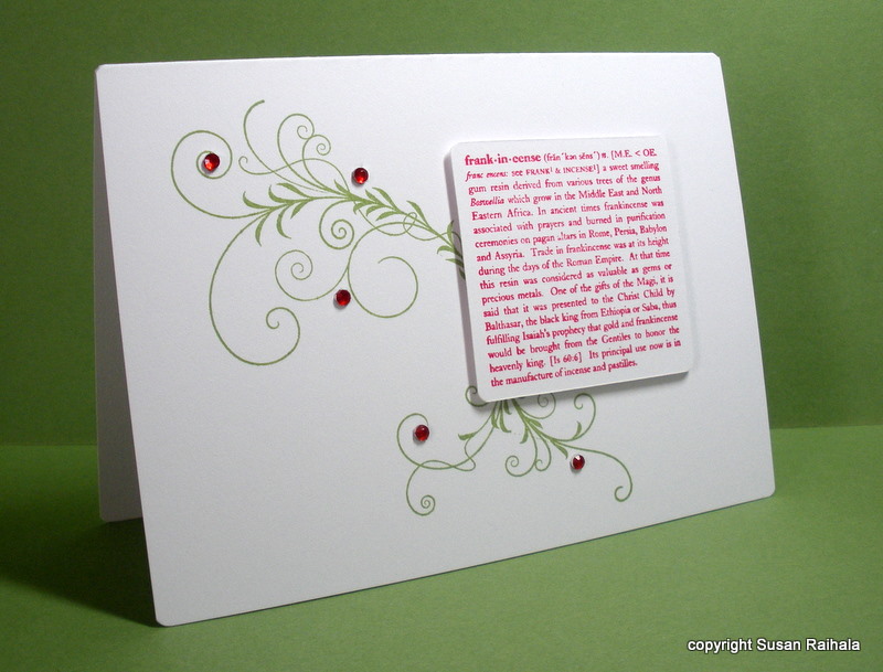
Today's card demonstrates the principle that lines love curves. The frankincense definition is very linear and block-ish, and the flourish from Papertrey's Silent Night balances that blockiness (is that a word?) nicely. The bling, of course, needs no reason, although I deliberately used an odd number of them as odd numbers generally look better than even numbers. Generally.


I have no idea who made the definition stamp. It was on a cube with three other Christmas definitions (gold, myrrh, and Christmas). I unmounted them because the cube was hard to store and hard to stamp. Ah, the hazards of trying to store a hoard of stamps most effectively!

FOR SALE NOTE:
And speaking of my hoard of stamps, the For Sale Page should have everything I have for sale at this time posted on it Wednesday morning. It's a tab page on the blog website, so if you read Simplicity in email, click over to the blog and check out the tabs, which don't show up in your emails.

I'm giving DARLA one more chance for the $20 SU paper stack. Darla, your email address was undeliverable, so I need you to send another email with a correct email address if I'm to sell you the paper. I need to hear from you by Thursday at midnight Eastern time, or I will have to post the stack for sale again on Friday.

Monday, August 15, 2011

Simplicity Is the Key to My Artistic Happiness

What fun reading all of your responses to yesterday's questions! Thanks so much to each and every one of you who took time to respond. I love how this hobby fills so many different needs and how we all figure out what works for us--both in technique and attitude--as we go along the path of creative self-expression.

The responses got me thinking about how we all have different values. My sister-in-law mentioned how the women in her level of management (she's high up in hospital administration) get bigger diamonds every few years. My SIL doesn't understand the desire for ever-bigger bling, and neither do I. But it makes these women happy to spend loads of money on shiny rocks, just as it makes me (and you, if you're reading this) happy to spend just $50 on stamps. I got giddy yesterday, although I did spend slightly more than $50. But not much. Honestly.

Some of us stamp to please others, some of us stamp to please ourselves, and most of us are somewhere in between. Today's card was totally made to make me happy.


I love how the curvy letters and curvy corners mimic the dotty circles on the tree and how they contrast so well with the angles and points of the three tree segments and trunk. I love how clean the whole thing is, how white and crisp and totally focused it is. I love how simple it is. Just popping the tree segments was enough to add interest. Nothing else was needed.

Cards like this are why I stamp. I value simplicity.

You, however, are free to value whatever you want in stamping. Jump in, revel in it, be yourself. There's a cool song that says, "Be who you are; that's a part of the plan."
This might just be my new motto.

So what is the key to your artistic happiness? And please come up with something other than the ever-present "I like to make other people happy" key to happiness. That's important but not the point of this post. No, tell us what satisfies your need to express yourself with paper and ink and whatever embellishments you choose.

Supplies
stamps: Papertrey Merry and Bright
ink: not sure
paper: PTI white
accessories: dimensionals, corner rounder

Sunday, August 14, 2011

A Personal Note; Design Discussion; A Question; More Questions; A Shockingly Long Post

A Personal Note

Happy Monday (or Sunday night, depending on when you read this). We're home safe and sound and will get our Furry Golden Sunshine out of the kennel Monday afternoon. I can't imagine the wagging and whimpering and shedding and licking that's about to happen to us. She's never been separated from us for this long.


Design Discussion
 Let's discuss the concept of unity. It's Monday, and I have two cards that illustrate the idea pretty well, so why the heck not?

First, I made a white-based card, with a white stamped layer and a cherry cobbler scallop border. My idea was to play with two sides of a card space...image on one side, sentiment on the other...to achieve balance.


Sadly, it was a good idea that shouldn't have seen the light of day, mainly because the resulting card lacks unity. Unity is what brings a whole card together. Unity comes from all the parts relating to each other in a pleasing way. Unity is vital to clean and simple design.

Unity is the same as a happy marriage; everyone relates, everyone gets along, everyone sleeps in one big bed. On the above card, there's a big strip of duct tape running down the bed.

This is not unity.

So I used the same basic layout but brought the image and sentiment together on a single panel, or bed, if you will. Also, using the colored card base helps tighten the focus on the image and sentiment. Please note that the green ink matches the card base much better in real life...for some reason, the camera or editing software makes it look much darker than it is.


Another thing I like about this card is how the scallops make more sense, echoing the dots of the tree much better than the swirls on the tree in the first card. That echo enhances the sense of unity, too. A more graphic font on the sentiment might have worked better, but I really like Papertrey's Signature Christmas, and this little Noel fit. Plus, I like the curvy contrast to the graphic dots of the tree.

My marriage is a little eclectic. But we get along surprisingly well.

So here's an informal challenge for you: make over a card you've already made to enhance the sense of unity. It's fun!

Reader Question

Some of you have told me you opt for mass production of a single card design for your holiday cards because you would spend too much time deciding who got which card. I, on the other hand, would go certifiably bonkers making more than about five of any single design, so I end up with about 120 unique cards to mail.

Cassandra asked if the amount of bling on a card affects my choice of recipient. Well, Cassandra, the short answer is no. In fact, I have no system for who gets what cards because it would take a ridiculous amount of time to fret over it, and I prefer my holidays to be as fret-free as possible.

Sometimes bulky cards with big bows or knots or lots of bling go to people who are also receiving packages from me, or they are hand-delivered to local friends and neighbors to prevent damage in the mail.

For some recipients (very close family and friends), I do pick a Christmas card that I think they would appreciate...one that might be special for them or that, as soon as I finished, made me think, "Gee, Liz would love this card!" Often, these are the simpler cards because so many of my artsy friends and family have said they love my simpler designs. But I truly don't worry about how much money or product goes into a single card destined for any particular person. For me, every handmade card I send is special.

Once Christmas cards leave my hands, their fate is decided by the recipient. I don't worry about it. Some people keep them forever, most probably pitch them as soon as Christmas is over. My sister actually frames my cards and uses them as Christmas decorations. That's pretty cool, but she's my sister. She HAS to love me. I seriously wonder if I would have a different attitude if a single Christmas card took three hours to make. As it is, the CAS style means that I rarely have more than an hour in a single card (and most are WAY quicker).

I keep all the handmade Christmas cards I receive, posting them on my inspiration board in my craft room for a time and then putting them in photo boxes to keep.

My Questions

Do you consider the amount of time/money/product you put into a Christmas/holiday card when you make one for a specific person? How do you feel about your cards' fates at the hands of recipients? What do you do with handmade cards you receive?

Saturday, August 13, 2011

When Inspiration Strikes

I was reading some random craft or home decor magazine, or maybe a blog, I really can't remember. Well, now that I think about it, it was probably a blog. Anyway, someone took gold paint and painted individual petals of flowers (fake, I think, but maybe real) with gold paint. So while I was staring at this Christmas tree stamp, I decided to paint parts of swirls with gold Smooch. Click on the pic and see it better.


Of course, then I had to add the pearls, which are sort of brownish, shimmery goldish. Just a few wouldn't do. I used a bunch. As you can see.

We're heading home now after a positively wonderful vacation. I can't wait to get back into my craft room though, and also can't wait to pick up my golden retriever at the kennel. We miss our furry golden sunshine!

Friday, August 12, 2011

Shimmery Gold Cardstock and a Swoop

Let me begin by apologizing to everyone who insists on traditional Christmas colors for Christmas cards. Gold, brown, and cream may not be traditional, but I really like them on this particular card. You could make this card with red and green if you wanted, even though somehow I think it would look a bit odd. But that's just me. ;)

I love this set from StampinUp (sadly, I am on vacation and can't remember the name, but it's in the current catalog), but the image is just a little too big...if it were a little smaller or even a little bigger, it would be much easier to design with.

At least that's my excuse for having trouble with it.


This gold cardstock was a lovely surprise gift from my friend Lisa. It's so pretty and makes a fab base for this image and the punched star. I cut the swoop on the PTI vintage cream stamped panel, and popped the panel with dimensionals.

Wednesday, August 10, 2011

CAS Collage Strikes Again

Using yesterday's Twinkling H2Os technique, I made a background that simply screamed for a collage-style Christmas card.

So that's what I made.


I couldn't get a picture of yesterday's card that showed the pretty shimmer, but for today, I do have a close-up. The colors are a bit off from real life (not so pink, more of a red), but you at least can see the shimmery effect.


The card is 5" square that will fit some ready-made square envelopes I have.  The words are taken from various sets, including Mark's Finest and Ali Edwards (Technique Tuesday). The snowflakes and tree are from Hero Arts.

If you're looking for an unofficial challenge this week, consider making a similar collage card yourself. It's fun to play around with a different look every now and then, and you can still challenge yourself to keep it simple with limited layers and no embellishments, as I've done here.

Must say I'm enjoying my vacation. Just wish I could get some decent pictures of the many bald eagles flying around the lake. It's so wonderful to see them soaring over the cabin and teaching a juvenile to fish. If you're at all interested, I'm posting a few vacation pics on my other blog.

Monday, August 8, 2011

Of Pear Tart and Bad Memory

Memento's Pear Tart looks so festive and modern with SU's Real Red, doesn't it?


This card resembles others I've made using solid and outline images off-set from each other. To the best of my memory (which is notoriously bad, by the way), the idea came from one of Jennifer's OLW challenges using a line of greeting cards for inspiration. If fact, it wouldn't surprise me in the least if I made an almost identical card last year as part of that challenge.

I'd look it up except I am on vacation and feeling rather lazy. Whether I've done it before or not doesn't change the fact that I love this card immoderately. Fresh colors, classic white-on-white layout, sentiment in the "sweet spot" of the upper right corner...happy sigh!

Amy K. thought of me when she came across the following quotation, and I'm so glad she took the time to share it with me. It's wonderful, and it now resides in the subtitle of this blog because it really speaks to my philosophy of design.

"Style is a very simple way of saying complicated things." --Jean Cocteau


Sunday, August 7, 2011

A Stamp Too Far

First, you should know that this card came out of a mistake. I stamped a sentiment in the upper right sweet spot (where the horizontal and vertical lines dividing the card into thirds intersect), and pressed a little too hard. The blurry letters that resulted frustrated me, so I set aside the card base and redid the original card, which I will show you, tomorrow maybe, because it turned out pretty cool.

This card base has that blurred sentiment under the stamped panel. You wouldn't know if I didn't tell you, which is part of what's brilliant about this hobby. Mistakes create opportunities for embellishment.

So, I stamped the snowflake stamp from Papertrey's Merry and Bright set repeatedly on a narrow white panel. I matted it by stamping the wide ribbon from Papertrey's Faux Ribbon on the base so the mat would perfectly match the shimmer of the Brilliance sky ink used on the snowflakes. Then, I went a little crazy adding bling. The sentiment came next, and I thought, hey, wouldn't it be cool if I added the little single snowflake next to the sentiment?

A stamp too far.


I really loved the card before I stamped that little flake, which might have made me happier if I had placed it a bit closer to the sentiment, but probably not. Since I added SO MUCH BLING to this card, no way was I pitching it. Perhaps you will like the little snowflake.

Or not.

And that's all I have to say about that.

For those who pray...Please keep Janelle in your prayers as she battles brain cancer. She's an amazing stamper and an amazing human being.

supplies
stamps: Papertrey Merry and Bright
ink: Brilliance sky, Memento Black
paper: PTI white, SU bashful blue
accessories: Hero Arts rhinestones

Tuesday, August 2, 2011

For Those Who Prefer Red and Green Christmas Cards...

The subject of colors and Christmas is always interesting. Some people get all excited when they see non-traditional colors used on a Christmas project. Other people lock onto red and green and cannot stand to see Christmas polluted by any other colors...or even non-traditional shades of red and green.

As I make so many different cards for Christmas, I feel a certain nudge to vary the colors. If all my 120+ cards were red and green, I'd go crazy. So my apologies in advance to the purists. You'll be seeing some wacky color combos in the coming months. But today, I'm here for you.


What are your preferences for Christmas card colors? Do you get creative or play it traditional or are you somewhere in the middle?

Supplies
stamp: unknown...there's a logo on the stamp, but it's so badly designed I can't read it
ink: Memento
paper: Mark's Finest 120lb white
accessories: red ribbon, dimensionals

Monday, August 1, 2011

Freaking Out in August

I hate August.

First of all, it's hot. As if July wasn't bad enough this year.

Second, the mad rush of back-to-school creates total chaos in our house. September is always so much calmer. So much more peaceful. So much quieter. And September is the prelude to my favorite season of the year: autumn. Oh how I love autumn! Pumpkins! Mums! Turning leaves! Crisp blue sky! Cool breezes! Corn mazes! Apple fritters from Hidden Valley Farm! 

August, however, does not deserve so many exclamation points.

Where was I?

Oh, yes. Third, it's August 1st, and I have only made 10 Christmas cards. Last year by now I had probably 100 cards. I need at least 120.

I'm  FREAKING OUT, people!

So expect to start seeing a number of Christmas cards here on my blog. I don't do mass production, and I have a ton of Christmas stamps, so I can get all sorts of jiggy with Christmas cards. Of course my favorites are the simplest ones. Like this.


Uh, huh. Oh yeah. Blue, baby.

So do tell. How many Christmas/Holiday/Solstice/Whateveryouwanttocallthem cards have you made for this December? How many do you need? Do you mass produce, make small batches, or make one-of-a-kind cards?

Supplies
stamps: Hero Arts Swirl Christmas, Papertrey Ink Signature Christmas
ink: Memento Blue Danube
paper: PTI white
accessories: rhinestones, because bling is good  

Friday, July 8, 2011

Christmas Tags in July

Can I confess something? I ordered the Mehndi Medallions set from Papertrey for one reason and one reason only: to make Christmas tags.


These tags are old, old, old from StampinUp. Remember when SU had the tag sets? You know, 12x12 pages of die cut shapes (tags, library pockets, slides, etc.) that you could punch out and use? Yeah, sounded like a great idea, but mine just sat, largely unused. I eventually threw a bunch of them away in frustration, but I kept these fairly standard tags with the expectation of using them for the holidays but just never got around to it. Until now.

This weekend, see if there's something lying around your craft room unused...just waiting to be given a purpose. Then use it. Use it up. The world won't end, and you just might get a head start on your Christmas gift packaging!

Don't forget to check out the sets I've already posted for sale. And Darla, please send me an email with a valid address.

Supplies
stamps: Papertrey mehndi medallions; Hero Arts sentiment
ink: Memento
paper: SU die cuts
accessories: DMC floss

Wednesday, June 1, 2011

Variations on a Set: A Wreath for All Seasons, Part 3 and Some Mindless Blathering Thrown in for Free

Thursday is the last day of school.

I'm scared.

Very scared.

The noise.

You have no idea.

Unless you have or had small, loud boys living with you.

Then, you have an idea.

Pray for me.

Please.

At least this card is quiet. And pretty. And makes me happy.

Those three statements in the previous paragraph, however, do not make me happy. They are not grammatically parallel, thus rendering the use of the two fragments rhetorically ineffective rather than casually cute. More properly, the three statements should be combined and punctuated as follows: "At least this card is quiet and pretty, and makes me happy."

Now that I think about it, the corrected sentence might provoke scholarly debate over the comma. Some experts prefer the comma in such situations, but others avoid commas like split infinitives. Both groups of experts have a point, but I like the comma. Truly uptight grammarians might insist I add an it before makes. I used to be an uptight grammarian.

I have recovered.

I think.

I'll shut up now about grammar and get back to the card. First, it uses Memento's Pear Tart and SU's Real Red. Then, it uses some little flat red metallic nail heads (Hobby Lobby) as berries on the wreath, which means it's super flat and easy to mail. Finally, it has rounded corners, accomplished using my new corner-rounder thingy that Marty sent to me because she's the nicest person ever.


Supplies
stamps: PTI A Wreath for All Seasons, Signature Christmas
ink: Memento and SU
paper: white
accessories: nail heads, corner rounder

Sunday, May 22, 2011

Inspired Goodness...and a Way to Use Ribbon Scraps!

Today's post contains four cards of my own making and one card--the one that inspired my four--from Card Creations magazine. Like I've said before, this issue of Card Creations is stellar, superb, out of this world! *squeal*

I can't contain my glee. Especially when such super-cool ideas as the one Vera Yates shares in this card send me into spasms of creativity.


You see, just the day before I saw Vera's card, I looked at my very full jar of ribbon scraps and thought, "Huh. You need to do something with those."

Then Vera's card then led me to do this:


HELLO!!!!

I used my Fiskar's Shapecutter system to cut the heart and Scor-Tape to adhere the ribbon to the card base. The stamp is from October Afternoon. The only two tips I have are 1) make sure your ribbons don't extend beyond the popped-up mat and 2) put plenty of dimensional tape around the opening in the mat so it doesn't sag. Also, if you want to do the faux stitching or tie a ribbon around the mat, do these things BEFORE adhering the mat to your card with dimensionals.

Just sayin'.

Since I had the Fiskar's out, I tried a couple more shapes. This leaf has a lovely curve that allows the sentiment to nestle in so nicely, don't you think? The sentiment is from Papertrey's First Fruits.


And what comes after Thanksgiving? Christmas, of course! I did Vera's faux stitching on this card and really like the effect with this much larger image, which required a 5" x 7" card. It looks sort of country-ish and warm because of the stitching.


Finally, I decided to try a punched shape, but found the restrictions of punches (that you can't punch anywhere on the paper...just on the edges) a bit frustrating. This 4.25" square card uses a big flower punch from StampinUp and button from Papertrey.


If you're looking at a huge pile of ribbon scraps, give this a try! Obviously, if you have a die cut machine and some interesting dies, you'll have more options than I have. If you have a Fiskars, you can certainly have fun. Punches are a bit harder just because of the narrow margins, but they still work.

But please, if you have a pear die, don't go there. Just don't. *wink*

Thursday, December 16, 2010

One Last Christmas Card Blow-Out

One of the sets I ordered for my birthday in November was Papertrey's Holly Jolly. It seemed like a very appealling CAS set...and it IS!

First up, I used the bracket border punch (Fiskars) to edge the card. The curves and points of the brackets are not exactly like holly, but they are similar enough. The sentiment is from PTI's Signature Christmas. I popped one of the holly leaves (stamped with Always Artichoke) and used some of my big bling in dark red that matches the Cherry Cobbler of the sentiment.


Next, I used another sentiment from Signature Christmas and the tiny holly stamp from Holly Jolly. The corners of the popped panel were punched with an SU ticket punch.


Holly Jolly comes with two border stamps. Here's the "positive" stamp, stamped in Memento Cottage Ivy and accented with red Stickles. The sentiment comes with the set and is stamped in SU Real Red.


Finally, the "negative" border stamp. I used yet another sentiment from Signature Christmas and blinged just three tiny holly berries.


Hopefully, I'll now be able to move on to something OTHER than Christmas cards. Ooops, almost forgot to post the coffee bags I decorated to hold Russian Tea gifts this year.


I made 18 of these for teachers and neighbors. The punch is SU's bird and branch, done in Real Red and a random gray I had in my stash. These were matched up with the gray and red cards I made HERE. Not bad, eh?

I love Christmas and feel very Christmas-y right now, but I think I'll let loose a primal scream if I post another Christmas card before March. Maybe April. So good-bye for now, Christmas cards. I love ya, but I need a break.

Note About In-Linkz: Apparently, they changed the default settings or I screwed up something when I set up this collection. To fix the problem, I'd have to delete and recreate the collection, which means everyone who's already posted would have to re-link. I'll just make sure next time I enable the photos to show. Sorry for the inconvenience!

Wednesday, December 15, 2010

Easy Christmas Cards with A Wreath for All Seasons

Note: I'm not sure what's going on with the InLinkz button. The photos are not showing, just names. I've emailed InLinkz for an explanation, and hopefully we can get that fixed.

Part of my birthday order from Papertrey Ink included A Wreath for All Seasons. I thought it would make awesome one-layer Christmas cards, and I was right.

Instead of getting creative with layout or embellishments, I chose to play around with color, moving outside the traditional red and green to some other playful options for the first three cards, and putting a new spin on red for the fourth card.

First up, Green Galore and Tempting Turquoise. How happy and fun is this!?!?


And Marina Mist and Baja Breeze, for a much cooler and more peaceful feel.


And more of the gray and red I've used so much this season. Yes, I blinged this one up...because I could.


The final card, which uses the other holiday wreath in the set, has two shades of red: Real Red and Bravo Burgundy.


If you're in a rush to get some cards made, something like this can really come together quickly and easily...and by varying colors, it might not be quite so boring to mass-produce, either!

Supplies
stamps: PTI A Wreath for All Seasons, Signature Christmas
ink: SU, except Memento London Fog
paper: PTI white
accessories: red rhinestones, scallop scissors to round the corners

Monday, December 13, 2010

Fun Gifts for Lots of Kids

Okay, what do you give all the little kids who hang with your kids, who live on your street, who are important to you but for whom you cannot or should not buy expensive gifts?

Candy, of course.

And you can make that candy festive and special by packaging it in fun ways. Here are two cool ideas for small packages of holiday candy for the kids in your life.

Idea #1: Tiny Stockings

These adorably small stockings came from Hobby Lobby and were on sale for cheap, cheap, cheap. But they are soft and fuzzy, red and white, and beyond cute.


Side Note: The white plastic basket is one of several I use to organize my projects in the craft room. They are also cheap, cheap, cheap at Target. If you're AR/OC, too, go get some. They're quite handy.

Idea #2: Small Paper Sacks

If you're feeling a little crafty (but not too much), here's an idea. I bought these white paper bags with a coupon at Michael's in the cake/candy section, I think. They are small...just tall enough to hold a standard candy cane. I stamped this PSX Merry Christmas on them, punched two holes in the tops and threaded ribbon through them.


These two tips are amazingly easy and quick. Just grab a few bags of holiday candy on your trip at the grocery, and in a few easy steps, you can hand out little pressies (as my family calls them) to all the little ones in your world.

In the comments, feel free to share your super-easy, inexpensive packaging tips for store-bought, wrapped candy.

Friday, December 10, 2010

Christmas Inspiration, Part 2

NOTE: I'll select a winner for Monday's give-away on Sunday, so get your comment in before midnight Saturday! The comments have been absolutely amazing...so many ideas!


For part 1 of this series, please click here.

Since it's been a while since Part 1, here's the picture of the inspiration from Better Homes and Gardens Special Interest Christmas Ideas magazine:


Today, we're focusing on the polka dot wrapping paper. I reversed the colors (from white dots on green paper to green dots on white paper), and loved the fun results!


The sentiment is from Mark's Finest Papers' set Greetings of the Season. The dots are PTI's Polka Dot background set (the first one, since I don't have the second!). The floss is dark brown and matches the ink of the sentiment much better IRL than in the picture.

Next up, I wanted to play off the pine boughs of the tree, but all the pine bough stamps I own are too realistic...I wanted a stylized look like the poinsettias and reindeer on the mantle in the inspiration picture. Of course, I recently bought the Martha Stewart pine border punch on sale with some birthday money, and it was PERFECT for getting the natural appeal of the inspiration with a clean and simple style!


That sentiment is from Swirl Christmas, a Hero Arts set. Its rustic yet festive font struck just the right tone for the inspiration.

Finally, I used a single white poinsettia on kraft to capture the soft and natural atmosphere of the inspiration stocking...the fuzzy flower soft was perfect to soften the crisp white since I don't have felt for the flower.


I hope this has showed how you can focus your attention of little details of an inspiration and run with them on a card.

Up next week...emergency quick Christmas card and gift ideas for crafters in a time crunch! Also, some cards that have

NOTHING

WHATSOEVER

TO DO

WITH

CHRISTMAS!

Your're welcome. *wink*