Showing posts with label Stamps by Papertrey. Show all posts

Tuesday, September 27, 2011

One-Layer Wednesday #66: Get Inspired by Janelle

This week's One-Layer Wednesday Challenge is to get inspired by blogger Janelle!

This is an easy one, folks!

Janelle and her blog came to my attention a few months ago. She lives in my hometown, not far from the very house in which I lived, so I feel like she's family. We Southerners are that way, you know. Shortly after I added her blog to my reader, however, she was diagnosed with a brain tumor. Now, in addition to being a source of inspiration through her crafting, she's become an inspiration for how she lives her life and faces this challenge as well.

This week's challenge is to poke around her blog and find inspiration however you wish. She includes photos from her life as well as her crafting, so absolutely everything on her blog is fair game for inspiration. You can choose to copy a layout, CASify one of her more layered creations, play off a color scheme, pick up a theme (she loves cupcakes), or use a technique/product/style she spotlights.

I have two cards to share. The first is based on one of her many one-layer cards:


I took her idea of the 3/4 border across the card used as a ground for an image. My book was a bit too large for the scale of the card (much bigger than the bird she used), so I scooted it off the side and added just a touch of color with a Memento Pear Tart marker. Then I added a sentiment where she did. LOVE how the elements relate to each other here. (Stamps by Papertrey)

I giggled when I finished this card. It makes me so happy...and I never would have thought of this arrangement without seeing Janelle's card. That sort of inspiration ALWAYS makes me giggle with glee.


My second card is based on a photo from her trip to the Museum of Modern Art (scroll down to see the picture of a couple of Mondrian's paintings).


4.25" square

I couldn't even add a sentiment to it. It's just so much fun and doesn't need to say anything at all. I've been inspired by Andy Warhol and Picasso in the past, but I can't remember ever channeling my inner Mondrian. I created this with Papertrey's Faux Ribbon set, a couple of post-it notes for masks, and Memento markers.

So now it's your turn to let the amazing Janelle inspire you to create something wonderful!

OLW66 Rules

1. A one-layer card is defined as a single sheet of cardstock folded in half. No other layers are allowed.

2. Be inspired by Janelle's blog...anything on her blog, from her blog banner to her family photos, from her one-layer cards to her more elaborate creations. Doesn't matter.

3. Post your card online and link back to Janelle's post that inspired you. Then add your link to the InLinkz button on the sidebar of Simplicity.

4. Most importantly, HAVE FUN!


Sunday, September 25, 2011

Maple Leaves

All my Canadian friends seem to appreciate the maple leaves I've been punching lately. This one's for y'all.


DH and I spent our 20th wedding anniversary on Pender Island in British Columbia. It was an amazing vacation full of killer whales, bald eagles, seals, blood stars, kayaking, hiking, wine, food, and fun. I will always remember the maple leaves. Down south where I come from, maple leaves are about the size of my hand. Up there in Canada, y'all got maple leaves that could be dinner plates. No, not dinner plates. Chargers under dinner plates.

What I'm saying is that you Canadians do maples right. These piddly little punches don't hold a candle to yours. But then, yours wouldn't fit on a standard A2 size card, either, so I guess it's all good.

Happy Monday.


Sunday, September 11, 2011

Paint with Smooch

Before we get started, I wanted to mention that I've updated my Favorite Products tab, if you're interested in what I have to say about card stock. Also, there are still stamps and SU paper for sale on my For Sale tab. Please buy my stuff so I can turn around and buy more stuff. Thank you. 


Smooch has quickly become one of my favorite products. It's an ink, but it works like paint, too, and you use it just like shimmery watercolor.

How-To Tips: First, I placed small dots of Smooch on a plastic palette. Using a damp, wide, flat brush, I painted some big squares of Smooch wash in kiwi and carrot on an Arches watercolor paper block (which helps keep the paper flat...you cut the paper off with a butter knife when it's dry). I made sure there were subtle gradations of color...not just a solid block of even color. When the ink was dry, I punched 3/4" squares out of the paper and created these three cards. I wish my photography captured the shimmer better. At least I tried!


The only difference with the second card is monochromatic color.I can'd decide which I like best, but then, I don't want to hurt either of my card's feelings.

The third card changes the orientation. I just wanted to see how it would look. Again, it's different, but not substantially so, and I love it just like I love the other two, no matter its orientation.


The half pearls on each card balance the off-set sentiment so nicely. And of course this layout is incredibly versatile. You could use it for any theme and with any small outline stamps. Solid stamps would look weird, I think.

But I could be wrong.

It's been known to happen before.

Often.

The end.

P.S. Happy Monday.

supplies
stamps: Papertrey
ink: Memento
paper: Arches 90lb hot press watercolor paper block, PTI white card stock
accessories: Smooch (kiwi and carrot), flat wash brush, paint palette

Saturday, September 10, 2011

Thanks, Scalloped Punch

I have quite a few sizes of scalloped punches...circles and squares. I find I rarely use them these days, but this scalloped square mat was the perfect something extra for this simple card.


Happy Sunday!

Supplies
stamps: Papertrey
ink: Memento
paper: PTI white, SU chocolate chip
accessories: square scalloped punch, dimensionals

Friday, September 9, 2011

Remember the Crimper?

The fall issue of Take Ten includes a spread of colorful, highly embellished cards that use corrugated cardboard. Seeing them made me want to break out my paper crimper and see what I could do with it.

You could say that I went in a COMPLETELY different direction than the inspiration cards.

You would be right.


To make this card, I ran a piece of Papertrey white through the crimper multiple times, rotating it 90 degrees each time. This repeat crimpling breaks down the paper fibers and gives you a pretty soft piece of paper. There won't be problems mailing this. The small leaf is from Martha Stewart, the larger leaf punch is either EK or Marvy. Not sure. Everything is glued. No dimensionals needed.

All-white cards need texture. And yes, texture plates and expensive machines are more stylish and versatile than the old-fashioned crimper, but I don't have texture plates and expensive machines.

I have a crimper.

And I'm not afraid to use it.

What are your favorite "old-fashioned" stamping tools?

Supplies
stamps: Papertrey
ink: Memories Soft Silver
paper: Papertrey white
accessories: Fiskar's Paper Crimper, leaf punches

Saturday, September 3, 2011

Grateful for Friends

Tomorrow's post will start a week of Halloween cards (because I have five children to make Halloween cards for), and then I'm done with Halloween because, really. Just really. For those who, like me, would rather Halloween be like it was when we were kids (fun, not over-commercialized, with homemade costumes, yadda, yadda), I've got some fun ideas for quick and easy cards. If you don't do Halloween at all, you could just change the theme and use the ideas anyway.

While Halloween might be overdone (IMHO), gratitude cannot be overdone, so here's another Thanksgiving/Gratitude Collection card.


Burlap is big this year, if the magazines are any indication. It's a very cool way to add some fabulous texture to a card. I used 1/4" ScorTape to attach this, but it's still not terribly sturdy. Sewing is the only truly sturdy way to attach burlap to paper, and, alas, I don't sew unless someone holds a gun to my head...which would be a silly reason to hold a gun to someone's head, don't you think? This card will, therefore, be hand-delivered.

BTW, if you CASE this card, please use dark red floss in the button instead of a string from the burlap. I'm sure it would look even better that way.

I hope you're enjoying your weekend!

Supplies
stamps: Papertrey First Fruits
ink: SU cherry cobbler
paper: PTI vintage cream
accessories: punches, burlap, button, glue dots

Friday, September 2, 2011

Ginkgo Gets Framed

A few large post-it notes to mask, a scattering of pearls, and Bob's your uncle.


What does that mean, exactly?

Nevermind. Or never mind.

Whatever. Or what ever.

Take your pick.

For those of us in the U.S. and Canada, it's Labor Day weekend, and I'm never in my right mind on a holiday weekend, especially when it's so blazingly hot all I can think about is an ice cold Mike's Hard Lemonade.

Be safe. Have fun. Peace be with you.

And if you want to shop this weekend, Mark's Finest Papers is having a nice sale on stamps, paper, and ribbon. So is Coffees of Hawaii, only their sale is on, well, coffee (20% off, plus free shipping on orders over $80 after the discount).  I get nothing for telling you these, by the way. Just trying to enable be helpful.

Supplies
stamps: Framed, Harvest Berries, Mega Mixed Messages (all Papertrey sets)
ink: Memento
paper: Papertrey
accessories: large gridded acrylic block, light brown half pearls

Thursday, September 1, 2011

Color

My recent Papertrey order included Think Big #7 because, really, can you have too many big sentiments? Of course not, especially when they are just $5. I needed a few get well/thinking of you cards, so I pulled out a floral silhouette stamp from Clear and Simple Stamps and played with color.

First up: Monochromatic


The soft purple here is so soothing and calm. This would be a great card for someone who's going through a really stressful time, especially if there's no quick fix for it, don't you think?


Next: Happy Colors


This card, in contrast, has a lot of energy in the colors. Bahama Blue and Pear Tart are perk-me-up colors, and seem to imply that the illness is short-term and easily overcome.
I once received a sympathy card, handmade by a friend, that really should have been a birthday card. It's cheerful, perky colors shocked me in my grief and felt inappropriate. The friend's expression of sympathy in person was very appropriate, but I still remember that card.

Do colors affect you emotionally, beyond just a personal preference? Do you think about the effect of color and how it relates to the message of your cards, or is that too obsessive-compulsive for you?

Supplies
stamps: CSS, Papertrey
ink: Memento
paper: PTI
accessories: Corner Chomper

Wednesday, August 31, 2011

Horizontal Sketch by Lucy Abrams

I love figuring out how to make sketches work with just one layer. Jessica Witty's sketch on Monday was just one example. Today's sketch by Lucy Abrams in the new Papercrafts Card Ideas magazine made me put on my thinking cap and do some problem solving.

The sketch calls for a layered border treatment on the front right side of the card, with the sentiment in the sweet spot (lower right third). All the sample cards in the magazine use multiple layers and embellishments like ribbon and lace.

To eliminate layers, I punched the front flap of the card with my bracket border punch, stamped two different strips from Papertrey's Faux Ribbon set to create the border, and added the sentiment from Define Your Life, a cool SU definition set.

Several things were wrong with my first card, which I didn't photograph. Sorry about that. The white punched edge didn't stand out enough against the white inside of the card. Plus, the left side of the sentiment looked nekkid and unbalanced. I tried adding the bracket in blue, but stamped it a bit too close to the sentiment. Then, I added a strip of brilliant blue cardstock to the inside of the card. The cardstock was so solid and dense looking, but the stamped strip definitely looked, well, stamped. The contrast was visually jarring. Not exactly what I was going for.

On the corrected card, I masked a 1" strip on the inside flap of the card and sponged the Danube Blue ink on it. It looks just like the stamped strip now...a perfect match and it keeps the card a full-up ONE LAYER!

Here's the corrected card, lying flat on the table to show the contrast between the white punched border and the sponged inside flap..


Here's a top view, so you can see the inside strip of blue.


So even a sketch that appears to require multiple layers can be adapted to a single layer!

Supplies
stamps: Papertrey Faux Ribbon, SU Define Your Life
ink: Memento baby blue, tuxedo black, Danube blue
paper: PTI white
accessories: Fiskars bracket border punch, stamp positioner, post-it, sponge

Tuesday, August 30, 2011

Simplicity Is Easy Sometimes

In case you hadn't noticed, the name of this blog is Simplicity. Simplicity means...well, it means keeping cardmaking clean and crisp in a back-to-basics, ya-don't-need-much-to-look-good sort of way.

Some stamps lend themselves to pure simplicity. Others take a little more imagination to get there. Two recent releases from Papertrey definitely fall in the first category. These are Harvest Berries and Beautiful Blessings. The ginko branches in Harvest Berries have a fabulous shape and several sizes, and the font of the sentiments and verses in Beautiful Blessings couldn't be cleaner, simpler.

Put the two sets together, and cards practically make themselves.

See what I mean?


That sentiment is my new mantra. "In every ordinary day there are a thousand miracles." Indeed.

And why not do the same with a Bible verse from the set?


And what if your verse is a bit larger? Just use the big ginko branch. It works.


A lot of the time, making a simple card isn't simple and definitely isn't easy. But this time, it's a walk in the ginko park.

Thank you, Papertrey, for such wonderful stamps!

What are your EASY stamps to work with?
Supplies
stamps: Papertrey
ink: Memento New Sprout, Rich Cocoa
paper: PTI
accessories: not a blessed one

Monday, August 29, 2011

Vertical Sketch by Jessica Witty

FINALLY, I had a chance to try some of the sketches in the magazine Papercrafts Card Ideas for Paper Crafters. The one by Jessica Witty on page 134 caught my eye, and I made a simple, one-layer card intended for a friend who is battling cancer.

The rainbow was created with a long-neglected shadow stamp from Hero Arts (discontinued), and the sentiment is from Papertrey's Beautiful Blessings. Inside, I stamped the verse "I can do all things through Christ who strengthens me." (BTW, the orange isn't quite so bright in real life; it's Memento Canteloupe...darn Picasa!)


I love the image of the rainbow as an image of hope and God's faithfulness. What images do you enjoy using on cards for people battling illness? Do you stick with flowers or trees, or do you make the cards with images that the recipient will find funny, cute, serene...depending on the situation?

Sunday, August 28, 2011

Stuff, Things, and a Card

First, let me remind you that I have stamps for sale, as well as a stack of random sheets of StampinUp cardstock (current and discontinued). Just go to this page to see what's there. Many thanks to those of you who have already purchased stamps from me.

Second, a few words of explanation about my Thanksgiving cards. You noticed that yesterday's card...my first official Thanksgiving card...was baby blue and black and didn't have the word Thanksgiving anywhere on it. My purpose for sending out Thanksgiving cards is to tell friends and family how much I love them and how grateful I am to have them in my life. This frees me up artistically a bit from sticking with fall colors or motifs, and makes thank you, thinking of you, blessings, etc. all very appropriate for the occasion. So I'm labelling these posts Gratitude Collection. Some will be more traditional Thanksgiving/harvest-themed cards, and some will not.

Third, I challenge you to create your own Gratitude Collection. Make a certain number of cards and send them out before Thanksgiving (which means you Canadians need to get crackin'!) to your own loved ones. It makes no difference if you live in a country that doesn't celebrate Thanksgiving; gratitude doesn't have to be an official holiday to take root in your heart. Think of Thanksgiving as a state of mind rather than a turkey-and-stuffing federal holiday. Have I preached enough? Are you converted? Are you going to share your love?

I'll shut up about Thanksgiving now.

Today's card uses two colors that have long been favorites of mine: Papertrey's Aqua Mist and Memento Pear Tart. The clean design suggested itself because of the tall, skinny sentiment from Beautiful Blessings, which contains all sorts of wonderfully inspiring Bible verses and inspirational sayings in a crisp, CAS font. As simple as this is, it took two failed attempts to get everything just right.


Isn't it lovely how the ginko branch descends from above just like our blessings?

In the comments, please feel free to share a blessing you're experiencing today. For me, right now, it's a wonderful dinner prepared by my honey-bunny.

Supplies
stamps: Papertrey Beautiful Blessings, Harvest Berries
ink: Memento
paper: PTI white, aqua mist
accessories: dimensionals

Saturday, August 27, 2011

Harvest Berries and Thanksgiving

My Papertrey order this month included the set Harvest Berries, which is fabulous...and fabulously easy to work with.


Here's the first installment of my celebration of Thanksgiving. Some of you may already know my irritation with the fact that Thanksgiving gets lost between the hyper-commercialism of Halloween and Christmas. That's why I send so many Thanksgiving cards...so people know how grateful I am to have them in my life.

So expect to see a lot of cards with this theme.

Supplies
stamps: Papertrey
ink: Memento
paper: SU bashful blue, black; PTI white
accessories: dimensionals

Thursday, August 25, 2011

Pet Sympathy and Tips on Stamping Solid Block Stamps

Some people are not pet people. When my husband's boss--a perfectly nice person in all other respects--found out we had to pay big bucks to get Daisy's knees fixed, he asked why we didn't just get another dog.

Like I said, some people are not pet people. This card is not for those people. In fact, it's for my aunt and uncle, two pet people if there ever were any, who recently had to put two elderly dogs to sleep within two weeks of each other.

*sob*


For those of you who have followed my other blog for a while, you know how devastated we were when our golden retriever Hoover passed away from cancer last year. I remember how comforting it was to receive cards from so many of you, and even though I've sent pet sympathy cards before, this time I truly know how comforting and appreciated they can be.

These stamps are from a mini set from Papertrey Ink. That single paw print says it all, I think.

Stamping Solid Block Stamps

Several people have asked how I got such a good image of the silhouette stamps from Hero Arts' Greatest Gift set on yesterday's card. Here are some tips for getting good images with solid stamps.

1. Experiment when the stamps are new. Sometimes, clear and rubber stamps have a residue on their surface that makes even thicker inks like Memento bead on their surface. A simple white eraser can remove the residue and make the surface accept the ink better. Rub vigorously with the white eraser; then clean the stamp well. Rubber stamps generally will work nicely with any quality-brand ink after conditioning.

2. On the other hand, some inks just won't work well with clear stamps, no matter how you condition the stamp. Clear stamps work best with thicker inks: Brilliance, VersaColor, VersaMagic, VersaFine, Colorbox pigment, and SU craft ink all work well with clear stamps, although I don't like the blacks for any of those brands. (My favorite blacks are Palette noir and Memento tuxedo black. The Palette stains, though, which isn't a problem for me but some people don't like that. Lots of people like VersaFine black as well, but it has not become my go-to black.)

3. If you're having trouble with SU classic ink beading on stamps, ink the stamp in VersaMark ink (which is clear) and then SU ink. It works great!

4. If you stamp a block image in black ink, and it's blotchy, you can take a black marker and fill it in. I had to do that with the shepherds on the left of this card because I didn't condition the stamp before using it, and as that was the last thing I stamped on that scene, I was pretty miffed at myself for not having checked the stamp first. But I pulled out a black marker, filled in the blotches, and no one is the wiser.

Or no one was.

Until I just told the entire internet.

This filling-in tip hasn't worked with other colors, even when I have the matching brand marker. Not sure why, but for me the corrected image always looks doctored in any color other than black.

5. Don't underestimate the ickiness of a poorly inked pad. If you're not getting good results, the problem may very well be the pad. Pads can be over-inked or under-inked, either of which can cause problems. If a pad is over-inked, take a clean paper towel (Bounty is best because it doesn't leave lint) and blot the pad until it works well. If the pad is under-inked, either buy a reinker and add ink, or buy a new pad.

6. If you're still having issues, the problem may be the paper. Which leads me to harp on the fact that buying quality paper is critical if you want to make quality cards. The cheap stuff from Michael's or Hobby Lobby or JoAnn's is, well, cheap. There are LOTS of high-quality cardstocks out there, and if you want to know my preferences, I'll be adding my findings to my Favorite Products tab in the next week or two.

And that's all I know about stamping solid block images.

BTW, I thought I'd already posted my musings on paper on the Favorite Products tab, but apparently not. Where is my head? I've forgotten where I put it. Anyway, I did a search and found an old post from 2009 on cardstock that is out of date for my paper-use habits, which have evolved a bit since then. I have some to add to the list, so don't take that old post as the Cardstock Policy According to LateBlossom.

I don't have a Cardstock Policy unless is it to try what looks good, keep what does, and collect as much as possible before I die so I win.

I imagine a lot of you can relate.

Also, thank you all for your comments on my question about holiday stamps. It was a very interesting discussion!

Sorry this post is so long.

Shutting up now. 

Supplies
stamps: Papertrey Ink
paper: PTI kraft and white, SU chocolate chip
ink: Memento 
accessories: dimensionals

Sunday, August 21, 2011

Light Blue and Cantaloupe Make an Awesome Pair

Yes, pair. Most assuredly NOT pear.

*wink*

We're continuing the idea of solid block flowers with this Hero Arts sentiment which, by the way, is an old, wood-mounted stamp that was discontinued long ago. Sorry about that.

These flowers are also from Papertrey's Beautiful Blooms. See, Sue. You really do need this set.


The flowers are arranged in a visual triangle, very much on purpose. The triangle keeps the focus on the sentiment while adding balance and unity to the design. The sentiment is stamped in SU Pumpkin Pie (oh how I love that color!), the flowers in Memento Baby Blue, and their centers in Memento Cantaloupe. In retrospect, I wish I'd layered the white panel in a thin mat of Pumpkin Pie, but when retrospect occurs after adhering the panel, it must stay in retrospect.

All aspects of retrospect leave the prospects looking suspect.

That makes no sense, but it was fun to type.

Tomorrow we're back to Christmas. That Hero Arts clear set I got last week totally captured my attention. LOVE it!

Saturday, August 20, 2011

Determined to Persevere

Okay, so as I showed yesterday, that big Hero Arts sentiment was a challenge. I knew I had to make a decent card with it or how else could I look at myself in the mirror?

Yeah. I'm weird that way.

I realized that outline flower stamps wouldn't work (at least for me...feel free to prove me wrong), so I started looking at my block flower stamps. My favorite flower stamp set ever is Papertrey's Beautiful Blooms. If I could only have one flower set, this would be it. Maybe. Well. Sort of. Wouldn't it be horrible if we could only have one? What would be the point?

Where was I?

Oh, yes. I pulled out Beautiful Blooms and made this:


That's much better than yesterday's painful-to-look-at efforts. I tried to mount the stamped panel on an apricot appeal base, but it just didn't work. Tomorrow, I'll show you a similar card with a colored card base that works beautifully because it's a complementary color scheme.

Awww, I'm such a tease.

Happy Sunday.

Supplies
stamps: Hero Arts, Papertrey
ink: Memento
paper: white
accessories: dimensionals, button, DMC floss, glue dot

Wednesday, August 17, 2011

In Memory of my Vacation

The first (and only!) card I've made since returning from vacation was inspired by that vacation, which was to northern Minnesota. A resort on Lake Vermilion, to be precise.

Before I show the card, however, take a look at my order from Creative Play. I ordered on Monday, and it arrived today, with a bit of Flowersoft Silk Ribbon thrown in gratis. How fun! Quick service and a little pressie!

It seemed appropriate to use one of the stamps for my vacation card. Obviously the Christmas set wouldn't quite work, so I used the woodgrain background (Hero Arts) to simulate...


water.


Yep. Have you ever noticed that woodgrain looks like ripples on a pond or lake? Mother Nature is amazing, isn't she? And I saw first-hand this effect while kayaking early one morning as escort to my insane husband who swam across the bay, around an island, and back to the resort...about 1.5 miles. In a wetsuit. He could have been run over by a boat, hence the kayak escort.

I definitely had the better gig.

Anyway, back to the card. The water is represented by the woodgrain stamp, the relaxation of the vacation by the flip-flops, and the sentiment because it's true. The punched label is curvy and reminds me of hearts for some reason, and I hearted my vacation.

As for the woodgrain stamp, it works like a dream. I tried it on my stamp pad (sort of like a giant, extra-thick mouse pad) and it worked great with just pressure! Most big backgrounds require me to stand on them to get a good image. Have I ever showed you how I do that? Basically, I have a 1-foot square piece of good-one-side plywood, protected by copy paper. Ugly, but useful. And cheap. It slides under the baker's rack next to my desk so I can pull it out as needed.


But I didn't need it this time because that woodgrain background stamps beautifully!

Remember to check the For Sale Tab to see what stamps I have for sale.

Supplies
stamps: Hero Arts (background), Papertrey (Day at the Beach)
ink: Memento
paper: PTI kraft, SU bashful blue, MFP white
accessories: dimensionals, label punch, rhinestones

Tuesday, August 16, 2011

The Last Christmas Card for a While

Today's Christmas card should be the last for a while. I'm itching to try to some other themes, and should have time Wednesday to create something new. Coming back from vacation a week before school starts feels a bit like drowning in details, if you know what I mean.

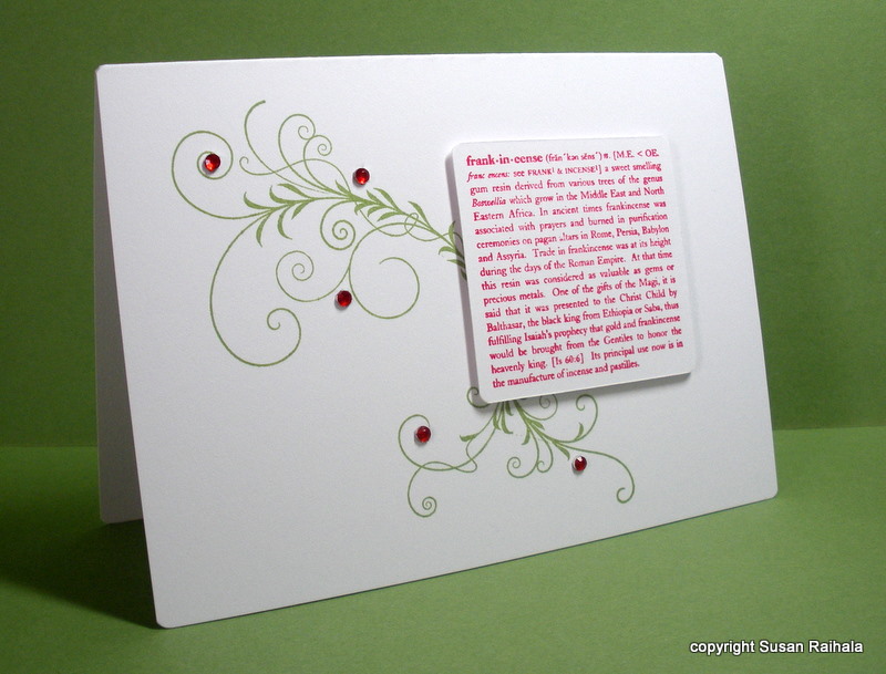
Today's card demonstrates the principle that lines love curves. The frankincense definition is very linear and block-ish, and the flourish from Papertrey's Silent Night balances that blockiness (is that a word?) nicely. The bling, of course, needs no reason, although I deliberately used an odd number of them as odd numbers generally look better than even numbers. Generally.


I have no idea who made the definition stamp. It was on a cube with three other Christmas definitions (gold, myrrh, and Christmas). I unmounted them because the cube was hard to store and hard to stamp. Ah, the hazards of trying to store a hoard of stamps most effectively!

FOR SALE NOTE:
And speaking of my hoard of stamps, the For Sale Page should have everything I have for sale at this time posted on it Wednesday morning. It's a tab page on the blog website, so if you read Simplicity in email, click over to the blog and check out the tabs, which don't show up in your emails.

I'm giving DARLA one more chance for the $20 SU paper stack. Darla, your email address was undeliverable, so I need you to send another email with a correct email address if I'm to sell you the paper. I need to hear from you by Thursday at midnight Eastern time, or I will have to post the stack for sale again on Friday.

Monday, August 15, 2011

Simplicity Is the Key to My Artistic Happiness

What fun reading all of your responses to yesterday's questions! Thanks so much to each and every one of you who took time to respond. I love how this hobby fills so many different needs and how we all figure out what works for us--both in technique and attitude--as we go along the path of creative self-expression.

The responses got me thinking about how we all have different values. My sister-in-law mentioned how the women in her level of management (she's high up in hospital administration) get bigger diamonds every few years. My SIL doesn't understand the desire for ever-bigger bling, and neither do I. But it makes these women happy to spend loads of money on shiny rocks, just as it makes me (and you, if you're reading this) happy to spend just $50 on stamps. I got giddy yesterday, although I did spend slightly more than $50. But not much. Honestly.

Some of us stamp to please others, some of us stamp to please ourselves, and most of us are somewhere in between. Today's card was totally made to make me happy.


I love how the curvy letters and curvy corners mimic the dotty circles on the tree and how they contrast so well with the angles and points of the three tree segments and trunk. I love how clean the whole thing is, how white and crisp and totally focused it is. I love how simple it is. Just popping the tree segments was enough to add interest. Nothing else was needed.

Cards like this are why I stamp. I value simplicity.

You, however, are free to value whatever you want in stamping. Jump in, revel in it, be yourself. There's a cool song that says, "Be who you are; that's a part of the plan."
This might just be my new motto.

So what is the key to your artistic happiness? And please come up with something other than the ever-present "I like to make other people happy" key to happiness. That's important but not the point of this post. No, tell us what satisfies your need to express yourself with paper and ink and whatever embellishments you choose.

Supplies
stamps: Papertrey Merry and Bright
ink: not sure
paper: PTI white
accessories: dimensionals, corner rounder

Thursday, August 11, 2011

A Cup of Good Wishes

Playing around with my coffee set from A Muse, I decided to do a one-layer card colored with Copics/Bics/Sharpies, executed on Gina K Deluxe cardstock, which will not let the markers bleed through. Can't remember which colors I used, but I love how the cup and saucer turned out.

I'm no coloring expert, but I think that cup is, as we say in our house, good enough for government work.


The gingham background (from Papertrey) was stamped over the masked cup with turquoise gem VersaMagic ink.

Design Discussion: This card is decidedly bottom-heavy (a little like me, actually). I first tried to put the red ribbon on the top of the card, the idea being to balance the design more. But that looked...odd. When I moved it to the bottom, it looked less odd., so there it stayed. Despite the uneven balance, I still really like this card, mainly because the colors make me happy.

Supplies
stamps: A Muse, Papertrey
ink: Versamagic, Memento
paper: Gina K deluxe cardstock
accessories: post-it (mask), ribbon, rhinestones, markers