Thursday, December 31, 2009

They Have It ALL WRONG!--Edited

Edited to add: The Hero Arts set used for these cards is called Woodland Leaves and Grasses. It is discontinued.

In line at Barnes and Noble cafe last week, I saw a magazine with the headline "From Simple to Spectacular."

As you might imagine, this sentiment frosted my shorts. I exclaimed angrily, "Simple IS spectacular!" in my outside voice, and the cafe employee asked, "Excuse me?"

"Oh, nothing," I replied, realizing this nice coffee man would think I was completely bonkers if I gave way to a rant about simplicity and might start shorting the espresso in my mocha (he already knows my usual order by heart). Clearly this strange woman talking to herself in public must have already had enough caffeine....

Anyway, I've been stewing over this headline ever since. Simplicity IS spectacular, and I knew you all would understand, seeing as you voluntarily visit a blog called Simplicity in the first place. Thank you for being my friends.

Today's cards are a very deliberate, in-their-face, so-there! comment on the idea that simple is anything other than spectacular. I know those complicated snobs are quivering in their boots now.


Today's simply spectacular cards are brought to you courtesy of a happy marriage between Hero Arts and Papertrey. I used every stamp in the Hero leaf set (one more set down in the USE MY STAMPS resolution), and the Out on a Limb sentiments were the perfect accompaniment.

I also pulled out my watercolor crayons and water spritzer, neither of which has seen use in AGES. I used an olive green and blue that's close to not quite navy. Each image is delightfully unpredictable, but that's the charm of watercolor crayons. Watercolor crayons are perfect for simple stamping because the color variations and softness they give to an image create a strong focal point for a one-layer card.

While these crayons tend to work best on more solid images, especially ones that are somewhat distressed like these leaves, you can also use them on outline images for interesting effect as well.

Simplicity Tip: Use watercolor crayons to color directly on the rubber, blending multiple colors if you want. Spritz with water and let sit for a bit while the pigment dissolves. Then, stamp on heavy paper. You can spritz and stamp again, or dry the stamp and add more color. No two images will turn out the same, and you just never know what you'll get. Mostly, the images will be perfectly imperfect. Embrace the variations, play with different shading and colors, become one with the crayons.... Uh, sorry. I got carried away. Just have fun.


Supplies
stamps: Hero Arts (Woodland Leaves and Grasses), Papertrey (out on a limb)
ink: various shades of VersaColor to coordinate with whatever color came out of the crayons
paper: PTI white
accessories: watercolor crayons (I bought my big set at Dick Blick), water spritzer

Wednesday, December 30, 2009

Cards for Dudes

One of my favorite cards ever has just three rectangles of different shades of blue cardstock on a white card base. On the bottom rectangle, I stamped, "Feeling blue?"

As I was contemplating guy birthday cards, I went looking through my scrapbooking paper (not coordinated with inks) and found a stack of 6x6 square metallic, shimmery cardstock I bought in a sample pack on sale from Marco's. I'd done a few things with it, but basically, metallic cardstock baffles me. Everything I make with it looks artificial and forced, if that makes sense.

Not Monday, though.

As soon as I saw the bronze, gold, and copper cardstocks laid out together, I thought, "DUDE!" Here's the first card I made.


It has issues. The bars are a bit too narrow. The stamped sentiment is a bit too hard to see. The base should be cream rather than white. But the overall effect screams sophisticated guy, don't you think? And isn't that art deco sentiment da bomb? It's from an old My Sentiments Exactly set that has more cutsy images for birthdays that I don't like. But the sentiments are really good!

So I played with the idea and borrowed (again) this sketch from wiggydl (aka Donelda), changing the base to PTI vintage cream and stamping the sentiment in Brilliance Galaxy Gold to match the gold square.


Yes! And then I went with larger rectangles and stamping the sentiment on the cream background above them in a copper Colorbox Pigment ink to match the bottom block.


Sigh. I ran out of gold cardstock after making 5 cards. But what an easy and sophisticated way to let the shimmery cardstock speak for itself.

Thanks to everyone who made suggestions for stamp sets for kids. I have some promising leads and will make a decision soon. Don't you just love getting cash for Christmas? Yeah....

Tuesday, December 29, 2009

Children's Birthday Cards

Months ago, when I asked what you would like to see on Simplicity, several people requested cards for children and dudes. Ack! These are the hardest for me to make, mainly because I lost touch with my inner child as a teenager, and although I live in a testosterone-filled home, I've never understood dudes. Even the little ones who make pew-pew-pew noises all day long and drive me crazy.

There, I said it.

But the troops need cards to send their children, too. My general philosophy for kid cards is to use lots of bright color, cute images, and something punchy, like bling.

So I tried using the Cupcake set from Hero Arts and ended up wondering why the heck I bought the set. The loose line art doesn't fit my style at all. Ultimately, I must admit that the pressure of seeing hundreds of cupcake cards at SCS a few years ago broke me down. Anyway, the largest cupcake in the set has the cleanest design, so I made a bunch of easy, colorful cards and had fun with frosting.

This first uses white liquid applique for the frosting. This stuff rocks. Squeeze it where you want it, let it dry, then heat gently with a heat gun. Poof!


The next cupcake has coconut icing, also known as polar Flower Soft. Yummy!


Now, I'm on the lookout for a kid birthday set that is really clean and simple. Hero Arts doesn't have any I want, so if you have suggestions, please let me know. I'm going to spend some time with my SU catalog today to see if there's something I've overlooked there. I've wanted Bitty Birthday for a while. What do you suggest?

Supplies
stamps: Hero Arts
ink: Palette noir
paper: gable green, orchid opulence, basic black, PTI white
accessories: Bic and Sharpie markers, Hero Arts rhinestones, liquid applique, Flower Soft, glue

Monday, December 28, 2009

For the Troops

These are more cards for deployed troops to send to their loved ones at home. Continuing with the Valentine's theme, here are some hearts on strings...or ribbon, as it were. You've seen this layout before. I repeat it because I love it. These cards are easy to mail, easy to make, use up four inch scraps of ribbon, and, well, if you can think of something bad about them, keep it to yourself because I don't want to hear it. I heart them.


This last little scrap of SU striped ribbon was perfect for this polka dot heart. Some people like to send Valentines to friends and moms and children and such, so a non-red valentine shows love without the romance. Sort of like this one:


Wouldn't this cinnamon one be perfect for a mom or sister? I thought so. But of course, we need red ones for wives and girlfriends and husbands and boyfriends. Having been the wife of a deployed spouse on three occasions, I would have loved getting a card like this.


Instead, I got emails telling me he was still alive after he flew missions. I really appreciated those, and the fact he could send them to me. He had lovely, hand-stamped stationery during Operation Iraqi Freedom, but stationery is intimidating...so much writing to do! Cards aren't so intimidating. If he'd had them, he would have sent them.

If you live in a country that has troops deployed, please remember that those troops deserve all the support we can give them. So do their families. 'Cause I'm here to tell you, they struggle. It's hard, in more ways than civilians can imagine: the fear, the uncertainty, the stress, the absence, the difficult readjustment period after those happy homecomings, the times when there are no happy homecomings. And they rarely complain outside the military community because that's simply life as a military family.

For those who would like to send cards to the American troops, I recommend Operation Write Home. Their deadline for Valentine's cards is January 6. I also have another person I ship cards to, but I need to verify with her that it's okay to share her contact information here.

If you live in another country with deployed personnel, please share contact information for similar organizations in the comments.

Supplies
stamps: Papertrey Heart Prints
ink: various
paper: PTI white
accessories: ribbon, dimensionals

Sunday, December 27, 2009

Heart Flower


This heart stamp from PTI's Heart Prints baffled me at first. What are you supposed to do with these hearts nested in each other? I tried coloring it in (not so much), and then thought, hey, make a flower! The black and white flower with a single large red rhinestone makes me happy in my heart.

It's sort of shamrock-ish, but I tried five petals and it looked crowded. Those petals need to breath. Plus, there's no green. Do you think that works for Valentines? I may do one in green cardstock for St. Patrick's Day.

Saturday, December 26, 2009

Pieces Parts

I hope you all had a very merry Christmas...other than a non-functional Wii, ours was magical!

Today's card shows how abstract images like this swirly backgound can be cut into pieces and make a wonderful focal point. (Cutting up images of people or animals is dicier...no pun intended. Mostly, though not always, it just looks weird.)

Cut and popped, these swirls gain visual interest, even if the act of cutting them really has little to do with the image or the sentiment. Using red on white heightens the visual interest and also provides a link between the image and the theme of the sentiment, which ultimately unifies this card for me.


I made this card on a standard size card for an A2 envelope, but had to trim the bottom off to balance it...there was just too much white space on the bottom; I think because the image itself is heavy, it needed less space below it to ground it. I'm not even sure what the final measure was...I just kept trimming a bit until it balanced better. Next time I do this, I'll try to get before and after shots to show why I sometimes chop bottoms off cards.

Off to brave the crowds at Best Buy to exchange the non-functional Wii that totally disappointed my children yesterday. Sigh. Wish me luck.

Thursday, December 24, 2009

Some Love for StampinUp and Discussion of The Different

Given my recent Hero Arts kick (OMG, the new catalog!), I decided to post a StampinUp card today. We can't have all my SU sets feeling all sad, neglected, and sorry for themselves at Christmas.

As part of my resolution to use all my stamp images, I recently pulled out Stay Tuned, an old set of 50s television and radio images. I bought it at the same time I bought Mix and Mingle (toaster, upright mixer, blender, etc.). The only reason these two sets got added to my stash was that they were DIFFERENT. I eventually learned to wait a few months to order stamps that are just DIFFERENT to make sure I really, really wanted them and would use them. Hence all the sticky notes in my new catalog. If I still want some of them in a few months, I'll buy them. I do the same thing with the SU catalog in July.

Here's the best card I made with Stay Tuned.


It's actually a bit better IRL because the radio is embossed in clear EP, so it's shiny, like the old bakelite radios. The radio was stamped on a scrap of white and cut out. I used a craft knife to cut the antenna out first, then used CutterBee scissors for the rest. The oval is my first AMuse stamp ever (I also got the small oval). Those two stamps are SUPER for grounding images.

Back to the idea of buying stamps because they are different. When you have as many stamps as I have, you may start to feel like everything you see is old hat. "Oh, I have a flower set similar to that one.... I could substitute this leaf/cupcake/greeting/Christmas tree I already have and make a card that looks just like this one with the latest and greatest from Acme Stamps."

When this is your mentality, you're vulnerable to exploitation by The Different. Stay Tuned and Mix and Mingle are not exactly my style. They were just different from everything else I had. I find them hard to use. Now that I've used the images in Stay Tuned, I'll probably put it in the basement for 6 months, not use it, and then take it to the ebay store to sell. So sad.

Simplicity Wisdom: Sometimes, The Different is wonderful. Sometimes, The Different is just, well, different. Learn to tell the difference, and you can save yourself money, time, and energy.

And now for something different. Merry Christmas Eve! The best gift I've received all year is the gift of your support for this blog. Thank you ever so much!

Supplies
stamps: SU Stay Tuned, Amuse oval
ink: SU only orange; Palette noir; Colorbox turquoise pigment
cardstock: PTI white, SU turquoise
accessories: dimensionals, black half-beads, clear embossing powder

Wednesday, December 23, 2009

Review: New Hero Arts Catalog

Mid-December is always a happy time, and not just because of Christmas. The annual Hero Arts catalog is out! Be still, my heart. This year's catalog is a beauty.

The first thing I noticed is that it's bound on the short side, in a ledger format, without the spiral binding they've used for the last two years. I miss the spiral binding, but the horizontal orientation works well, in my opinion.


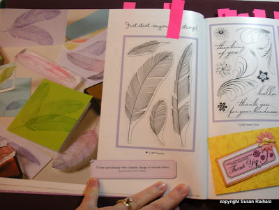
Notice all the post-its sticking out the top? I put them on pages that showed stamps I want from my initial thumb-through. I'm in trouble. Serious trouble. Over time, some of the post-its will go away, as the newness of the images wears off and I decide I can, indeed, live without them. And new post-its will be added. Trouble, I say.

These feathers probably will lose their post-it. I already have several feather stamps that rarely get used. But these are so pretty, so coordinated, so "I WANT THEM."


And check out this wine/grape set. I love wine, and this set is so pretty and elegant and appealing! Notice that they are outline images. Sigh. For those of you who love coloring, this catalog is a gold mine. Seriously. It's loaded with fab outline images.


How often do I use background stamps? Not often. But this cloud background MUST BE MINE. I want to give whoever designed this stamp a great big hug of thanks. I have no idea what I will do with it or how it will integrate into my style, but by golly, I'll think of something.


A very impressive part of the catalog is at the end. Hero Arts is jumping on the coordinated-product-line bandwagon in a big way. They now offer cards, envelopes, and 8.5x11 paper in these colors, divided into color families called Hero Hues. Each color has three shades. The paper is two-sided: one white, one colored.


Hero is also organizing its embellishments (flowers, half-pearls, gemstones, metallic decor, and buttons) into Hero Hues. Inks are packaged in Hero Arts packaging now, rather than Memories and ColorBox. Tim Holtz distress inks are coordinated into the line as well.

This is brilliant, but I probably won't be buying the papers (already have a lot of the inks, actually). You've seen the pictures of my paper storage. You know how bad it is. And by bad, I mean "obsessively overstocked."

Sigh.

Other random observations:

1. Lots of clear stamps, still a healthy dose of wood mounted, and some unmounted clings give great variety for buyers. As I said above, those who prefer line art over block stamps will be very, very happy. We block stamp folks still have good selection, though.

2. The sample cards are wonderful, and I look forward to studying them closely for design tips. Lots of inspiration in this catalog.

3. Some of the new stamps look like stamps I've seen from other companies, though in most instances, there's a noticeable difference. In some cases, the Hero versions are better (or at least more useful for me) than other companies' versions. For instance, there is a clear set called Mi Casa of outline images of two houses, a mail box, a tree and some sentiments. I've not bought PTI's house or mailbox sets because they look too complicated for me. Hero's version is, I think, more useable by lazy simple stampers me. The line art is not as formal as PTI's (I do love PTI's formality, though), but the looser Hero-style art is way less intimidating to me.

4. There still isn't a baby set I want. Too much cutsy. I'm still waiting for a baby set to love. It'll happen. Eventually.

In closing, let me say that I've been buying Hero Catalogs for six years now. This one is much fresher than the last one, without losing the signature Hero Arts style. Bravo, Hero Arts!

[Note: I buy all my Hero Arts stuff from Stampin' Treasures. If you want to check them out, click on the link in my sidebar. Great company...and no, I don't work for them or get paid to promote them in any way. I just appreciate six years of great customer service! I'm also not paid by Hero Arts, though I really think they should! *wink*]

Tuesday, December 22, 2009

Love Knot


These adorable love birds from Inkadinkado needed something to look at, so I gave them a love knot. How fun! I stamped the birds in red on scrap vintage cream cardstock, cut them out and mounted them over the same image stamped in olive on a 4.25" square vintage cream card. This is an easy way to get a two-toned image...as long as what you're cutting out has clean lines. Tedious cutting does not take place in my craft room. No, sir-ee!

The scalloped panel is old olive and is popped up on dimensionals. (It appears I can't get away from red and green completely yet.) I made a tag to hang from the knot but decided not to use it. I have no good reason other than it looked fussy. If someone else did it, I'd think it was fabulous and squeal in delight. But from me, well, take my word for it: it just looked fussy.

It's weird posting all these Valentine's cards the week of Christmas, and I hope you don't mind. They have to get done in time to ship off to the troops so the troops have time to send them home. Tomorrow, I will try to post a review of the new Hero Arts catalog, which upon initial perusal appears to be TOTALLY AWESOME!

Monday, December 21, 2009

More Happy Hearts

Using all the hearts in SU's Happy Hearts set has been fun. For CAS treatment, I found that using multiple patterned hearts on one card got busy-looking really fast, so I paired the solid heart with a patterned one, and added a self-adhesive heart accent from Hero Arts just because I could. The sentiment is from Hero Arts.


Then I decided to use some colored card bases. The next card's colors match better IRL...the shades of ink are much closer than they appear.

There's a joke in that last line, but I haven't had enough coffee yet to find it. Sorry. It's Monday. I'm full of excuses.


Saving my favorite for last...TA DA!


Look at all that white space that's pink but still called white space. Look at how well the border punch coordinates with the patterned heart. Look at the focal point (how can you not when the colors, the placement, and the visual triangle created by the two hearts and the sentiment magnetically attract your eye?).

Hope you enjoyed my variations on a two-heart theme! My heart is filled with joy this week. Christmas is definitely my favorite time of the year. Click over to Questioning my Intelligence if you want to read the last of my Advent devotionals. Scroll down to the Dec 20 post titled "Balancing Act." On the way, if you have time, share what you're grateful for this week on the "Gratitude Journal" post. And have a great Monday!


Supplies for Card 1
stamps: SU Happy Hearts, Hero Arts sentiment
ink: various Versacolor pinks and red
paper: PTI vintage cream
accessories: dimensionals, Hero Arts heart
size: 4.25" square


Supplies for Card 2
stamps: SU
ink: various VersaColor
paper: rose red, bravo burgundy, white
accessories: ribbon, dimensionals

Supplies for Card 3
stamps: SU Happy Hearts, PTI
ink: real red
paper: pretty in pink, real red
accessories: dimensionals, border punch

Sunday, December 20, 2009

2009 New Year's Resolution

In January, I decided to use every stamp in my stash--except sentiments because some are just too darn weird. Because I have a ridiculous number of stamps, I know better than to try to use all of them in one year, so there is no time limit on this resolution. After almost 12 months, I've used every image stamp in 87 sets of stamps. The breakdown is thus:

18 PTI sets
27 Hero Arts sets
42 StampinUp sets

This isn't all my stamp sets (do ya think I'm obsessed?), but it's a healthy percentage, definitely more than half of all the sets I have with images (i.e., not alphabet sets or sentiment sets). GO ME!

Today's card uses SU's Happy Hearts, a set which I haven't used in, oh, forever. I'm trying to make some Valentine's cards for the troops, and this particular heart has never appealed to me...until now.


I combined it with a fun sentiment (not sure from whom, but I think it's Inkadinkado) and cut out most of the inner heart to flutter. I know I can't possibly be the only person to have done this, but golly, I feel clever anyway!

Supplies
stamps: SU, Inkadinkado (?)
ink: Palette dark chocolate, SU real red
paper: PTI vintage cream
accessories: dimensionals, red gemstone
size: 4.25" square

Saturday, December 19, 2009

Spotlight: Orange

In a desperate bid to make a card that didn't have green or red on it, I pulled out my orange sharpie and made a happy owl card:


Three spots of orange and a happy owl. It's so delightfully NOT a Christmas card.

Can you tell I mailed the last of my Christmas cards yesterday? Happy dance!

Simplicity Wisdom: I read at SCS that grosgrain ribbon is so yesterday. Hmm. Simplicity begs to disagree. You can use ANY supply you have in your stash TODAY, no matter how old it is. And use it proudly, by golly, because most of the people who receive our cards DON'T KNOW that grosgrain is trending out or that all the cool kids are using Nesties. If anyone tries to bully you on this, tell them to take it up with me.

So there.

Supplies
stamps: Hero Arts, PTI sentiment
paper: PTI vintage cream
ink: Palette noir, VersaColor orange
accessories: sharpie, ribbon, dimensionals

Friday, December 18, 2009

Bossy Sentiments

While I appreciate that the intent of most sentiments is not to be bossy, some can't help but come off sounding that way. Get well soon is a good example. Like, what are you going to do if someone doesn't get well soon? Beat them up? I know it's sort of silly, but I think about these rhetorical conundrums, word nerd that I am.

And this sentiment, which I really love, from Papertrey is also a tad bossy: Enjoy the moment.


Of course, with a box of chocolates on a pretty red table cloth, how could you NOT enjoy the moment?

Seriously.

Supplies
stamps: Hero Arts, Papertrey
ink: Palette dark chocolate, SU real red
paper: PTI vintage cream, SU real red
accessories: Bic Mark-Its and Sharpie markers, MS border punch, stickles, red rhinestones, dimensionals

Thursday, December 17, 2009

Hero Arts, I Love Ya! [edited]

When a stamper has Crafting Attention Deficit Disorder, or CADD, she must artificially limit her selection of stamps. This keeps her focused and prevents a secondary condition known as Stamp Overload. Stamp Overload, or SO, is a condition characterized by two main symptoms:

1. A million stamps, none of which coordinates with any other
2. Brain freeze from TOO MANY CHOICES.

Four years ago, I suffered this terrible affliction of CADD with SO. Still have the CADD, but the SO is now cured because I made an executive decision to buy stamps from only two companies: Hero Arts and StampinUp (still refusing to use the egregious exclamation point). Both companies have large product lines with lots of selection; both make deeply-etched, wood-mounted rubber stamps; and both have fab designs. Eventually, I caved and started buying Papertrey Ink's clear stamps because, well, I want to be Nichole when I grow up and PTI's style dovetails nicely with mine.

Limiting myself to these three companies, I've managed to overcome both symptoms of SO. My stamps coordinate easily now, and I rarely sit and stare and wonder where to start.

Thus my new set from Hero Arts put all sorts of ideas in my head, despite the fact that it's full of large outline images. Here's the first blog-worthy card to come out of it.


I'm giving this one to my DH, the chef. George loves to cook, and lately, I've been picking on him on my Questioning blog. (Read all about it here.) I'm going to sign this cute card and put it in his lunchbox tomorrow. He'll appreciate it.

Outline stamps always intimidate me, but this one provides the perfect opportunity to use spots of color, rather than coloring in the whole blasted thing. I rounded two opposite corners for the whimsy of it.

FYI! Bonnie over at The Craftiblog recreated the look of the Hero Arts shadow stamp I used on this card using a stencil. See how she did it...it's amazingly creative and clever and will solve the problem for those looking for that discontinued stamp!

Lueyes asked for the name of the Hero Arts set, so I added it and a link to Hero Arts' website in the supply list.

Supplies
stamps: Hero Arts What's the Scoop
ink: Palette dark chocolate
paper: PTI white
accessories: Bic Mark-It marker in rambunctious red, corner rounder

Wednesday, December 16, 2009

Christmas Card Consciousness

[Note: this is my second post today. Be sure not to miss my wavy stamp cards!]

As you may have noticed, I do not mass-produce Christmas cards...I make lots of one-of-a-kind cards and then have to decide who, among the 90 or so recipients, gets which card. Here's a sample of my stream of consciousness as I signed and addressed Christmas cards this year:

Oh, I remember making this card last winter. Do I still like it? Hmm. Perhaps I'll send it to X. He doesn't care anyway; he throws them away. This one is perfect for Y...her favorite color is blue! Will Z appreciate the work that went into cutting out this stocking? Does it matter if Z appreciates it? Not really. I love Z. Will A think I'm being cheap because she's getting a one-layer card...even though I like it best of all I made? Should I give her something a bit more elaborate? With pearls, perhaps? Darn her, she's getting this and better like it! Oh, Mom would love this, but I already addressed hers. Can I send her two cards? Is that weird? Dang, here's another square card. Where oh where did I put those square envelopes? B makes cards. Is this one good enough for her? Don't want to look bad to another crafter. C is old, so maybe I should send a card with a large sentiment so he can read it easily. But this one looks more masculine, and I bet he'd like it better. Why didn't I stamp a sentiment inside this card? Will D show E her card and will E think D's card is better and I love her more? Did I use this same stamp set for F last year? Will she notice if I did? If she notices, will she care? If she cares, will I care that she cares? Of course I will. I'm overthinking this. Stupid. Oh, man! This one would be perfect for G, but it needs a bubble envelope. Shouldn't I give this to H down the street, or is that being cheap? Scrooge! Get the bubble envelope. G's gonna love this. H is so religious, do I have any madonna and child cards left? Darn, maybe I should make another one. Oh, here's the embossed scripture card. Yeah, that'll be perfect....

Next year, I'm buying cards, ten boxes of all the same. It's not worth this headache.*

*(And if you believe that, I've got some expensive swamp land to show you....*wink*)

CAS45 The Perfect Curvy Stamps Plus a Little Something

The CAS45 Challenge I've Got Curves was perfect for me because I actually own lots of curvy stamps. Hero Arts has had many sets of border stamps with curves, and I've bought a few of them over the years. They are wonderful for making fast, easy cards using a very classic and no-brainer, one-layer card layout.


See what I mean? Easy peasy. To take this simple layout and make it something special, simply add a little "sumthin' sumthin'" to it. Here, I used some Hero Arts hearts to accent my simple border. Below, I used pink rhinestones. Let your imagination take off, though. Glitter, brads, ribbon, embossed lines, charms, ephemera, chipboard pieces, Jolee's dimensional stickers (are you reading, Cookie?), buttons, French knots (are you reading, Maile?), stitching, and so on.

Simplicity Tip: Rather than reinventing designs each time, why not use a standard layout, and spend your time playing with simple embellishments to dress it up.


Supplies
stamps: Hero Arts, PTI Signature Greetings
ink: Colorbox chalk lipstick red, Palette noir; VersaColor orchid, brown
paper: PTI white
accessories: Hero Arts self-adhesive hearts, rhinestones

Tuesday, December 15, 2009

CAS45 Variations on a Theme

Recently, I've seen lots of cards with lots of buttons, on blogs and in SCS's gallery and in magazines. Buttons annoy me. They are lumpy, bumpy, and hard to mail. On the other hand, they are a fantastic way to kick a clean and simple card design from boring to beautiful. Plus, I have a ton of PTI's vintage buttons sitting, largely unused, in my craft room.

As soon as I saw the CAS challenge Sunday night, I knew I needed to do something with buttons.


The sentiment is from a Hero Arts clear set called Friendship Messages. I curved it on the acrylic block, stamped it in Palette dark chocolate, and attached the buttons with glue dots after tying the floss knots on each one.

Can you just imagine mailing this thing? Bubble envelope for sure. I plan on giving it to a real-life friend. One who lives down the street. One I can HAND IT TO!

But it makes me happy anyway. Who says we have to be pracical all the time? Not me.

After applying the final button, I wondered if I could make a totally flat, practical version of the same card that would be as satisfying.


Not quite as satisfying as the button version, but infinitely more practical for mailing. I used SU's Little Pieces, a stamp positioner, and VersaMagic's sea breeze ink. The little dots of Stickles kick it up a notch without adding bulk.

Practical can be nice, too!

Monday, December 14, 2009

CAS45 I've Got [Unusual] Curves

OMG, this week's CAS challenge totally inspired me. I've already made four cards, and it's only 7:00 Monday morning! Needless to say, I didn't get a lot of sleep last night. [For those who are new to the CAS challenges at SCS, new challenges are posted late Sunday night. Come play with us!]

Today, I'm posting my favorite of last night's creative binge. It's a totally wow card for me...an unusual design, sort of modern and graphic, and yet soft, incredibly fast, and with just a bit of bling.


First of all, this was intended to be a one-layer card, but I stamped the sentiment crooked, even using a stamp positioner. I'm a dork, but in this case, it was fortuitous. The original design looked odd because the card was too tall for the Hero Arts curvy shadow stamp. Cutting it out and mounting it white-on-white was the perfect fix to make the card balanced.

FYI, I did test it on a cool caribbean card base, but it looked much more "LateBlossom" on white. At this rate, it's gonna take me the rest of my life to use all the colored cardstock I've collected.

I'm not complaining. Just making an observation.

Anyway, my thoughts on this unusual card. The sentiment implies growth, upward movement, and the curve that gets bigger as it goes up reinforces that. The colors are soft and dreamy (Versamagic sea breeze and persimmon), as is the font combination of the sentiment. The two gemstones are actually a bit paler in real life. They help move the eye up the card and give a sense of completeness that was missing in the design before I added them.

Not bad for 1:00 in the morning, eh?

Supplies
stamps: SU HAppy Harmony, Hero Arts curvy shadow stamp
ink: VersaMagic sea breeze, persimmon
paper: PTI white
accessories: dimensionals, gemstones (Hero Arts)

Sunday, December 13, 2009

One Last Topper for the Season


Wish I'd thought of this one before now. Using Silent Night from PTI, I created a flourish backdrop for punched poinsettias (two punches per flower) with gold half-pearl centers. The Merry Christmas stamp is from PSX (one of the first stamps I ever bought...isn't it pretty?!?) Here's a closeup of the topper:


This SHOULD be the last thing I have to make for Christmas. The caramels are for my MIL, and the Cajun peanut mix is for my FIL. Whew.

Now, if I can just get all my Christmas cards signed and addressed, stamped and mailed. Oh, and everything wrapped.

It feels good to be at this point with 12 days to go. I don't think I've ever been this prepared for Christmas, which means I'm finally figuring it out. Given the fact that I'm 43, I have to say I'm a darn slow learner. *wink*

Supplies
stamps: PTI Silent Night, PSX sentiment
ink: bravo burgundy, close to cocoa
paper: SU bravo burgundy, PTI vintage cream
accessories: flower punches, half-pearls, staples, caramels, peanut mix

size: 2 x 6.75, finished (4 x 6.75 cut)

Friday, December 11, 2009

It's a Major Award!

I feel just like the dad in The Christmas Story who wins a "major award," only mine is much, much better than a leg lamp. (I LOVE that movie, btw).

Nancy (Phantom at SCS) over at Shady Tree Studio nominated me for the Kreativ Blogger Award! She's so sweet to think of me in the same company as six other bloggers who are all way more talented than I. Nancy herself is an amazing stamper whose coloring skills outstrip mine by a country mile.

Here's what you need to do after you are nominated for this award:

1. Thank the person who nominated you.
2. Copy the logo and place it on your blog.
3. Link to the person who nominated you for this award.
4. Name 7 things about yourself that people might find interesting.
5. Nominate 7 kreativ bloggers.
6. Post links to the 7 blogs you nominate.
7. Leave a comment on each of the blogs, letting them know they have been nominated.

You all already know the most interesting thing about me (that I'm obsessed with Clean and Simple stamping) because that's why you come here, right? But here are some other tidbits that are either interesting or pathetic, depending on your perspective:

1. I used to be a hopelessly obnoxious intellectual snob. I started to get over it in, of all places, graduate school because that's when I stopped taking myself so seriously. If you can laugh at yourself, you never run out of reasons to be amused.
2. My first job out of college was writing copy for on-hold messages. My last paid job was as a writer/editor for a computer memory manufacturer. My favorite job was teaching college English.
3. George and I own too many books to count. For our last move with the military six years ago, there were 108 boxes of books on the inventory. There are even more now.
4. I run the meal ministry at our church, coordinating meals for families in stressful situations (illness, deaths, new babies--happy but stressful). I also cook and deliver meals often, yet ordinarily, I hate to cook. Ironic how cooking as ministry holds so much appeal when cooking for myself and my own family is too often a tedious chore.
5. No one (including myself!) ever thought I'd be a stay-at-home mom OR crafty, yet here I am, happy as a june bug, staying at home and blogging daily about papercrafts. Life is full of surprises.
6. I am not particularly funny in real life. I mainly only write funny. (Does this mean I'm a more interesting person in print than real life? Hmmm.) Whenever I make a truly funny comment, George always acts surprised.
7. My blog Questioning my Intelligence got started partly because I wanted to write regularly again and partly because I wanted to find myself. The first post explains my thinking, almost 1.5 years ago. BTW, I now only have to say "hands out of pants" occasionally. Ah, don't you love progress?

Now for my seven nominees, who were randomly chosen from the roughly 60 papercrafting blogs I visit regularly. Picking favorites has never been a habit of mind with me, and random selection seems so much more fair since I love them all!

1. Rebecca, There Is a Stamp for That
2. Cindy, Stamps, Paper, and Ink
3. Maile, Simply Stamped
4. Susie, Sharing What I Love
5. Leslie, Running with Scissors
6. Michelle, Pigment of My Imagination
7. Susan, Inky Fingers

Happy clicking!

Thanks, Nancy. It really is an honor for someone to recognize what we do as worthy of notice. What a wonderful warm fuzzy, and, like I said, much better than a leg lamp.

Thursday, December 10, 2009

Mass Production [edited]

Let's just say that mass production isn't my favorite. Making more than four of anything is mentally painful for me, and yet when you're making stuff for lots of people, as at Christmas, mass production is the only way to go. Consider this:


I made 150 of these in the last month to give to my children's teachers, aides, and therapists. They are now neatly packaged in sets of ten with ten envelopes in PTI's clear boxes. See.


I'm so glad these are finished and ready to wrap. Each side is lined with a gold prismacolor marker, meaning I lined 600 sides total. Each card has three dots of glitter glue on it, which means I applied 450 dots of gold Stickles. Not that I'm counting or anything.

There aren't words for the boredom of this project. THERE AREN'T WORDS!!!

Then, there are these:

They are filled with Russian Tea mix and have little Avery labels on the back with instructions. There are only twelve, so not so bad, I suppose. But I had to punch 36 snowflakes for them. And another 36 for these:


I didn't have enough gemstones for all twelve of these, so I used red Stickles instead. Sigh.

The one fun mass-production project of the season has been a tradition in our family for three years now. Jack LOVES to make these Sugar Plums, and this year the elderly ten-year-old deigned to help, too:

This is just a half-batch and we still need to make the other half. Using pipe cleaners and jingle bells is brilliant (my idea!) to tie the bags over the sugar plums. In years past, I used red rafia or curly ribbon, tied into bows. WAY too time consuming and tedious. Pipe cleaners are easier and quicker, and the jingle bells are so festive, don't you think? These go to the neighborhood children, bus drivers and bus aides, and school friends.

Yesterday, my latest order from Stampin'Treasures arrived. It included THIS SET from Hero Arts. I know, I know. It's full of outline images, but aren't they cute? I've got so many ideas for these. After weeks of mind-numbing mass production, I'm looking forward to playing this afternoon.

Feel free to link in the comments to your own mass production projects this year. I'd love to see what you're making, too!

Wednesday, December 9, 2009

CAS44 Happy Anniversary: Go for It!

Kind Thoughts is such a pretty set from SU, and I adore the delicate line images. Using them, however, has been a challenge. Until now.


How EASY is this?!?!? Okay, the bow was a pain in the tush and I'm really craving that bow thingy Sharon Johnson sells. As usual, I'm behind the trend on this. I tried a knot, but it just didn't look right...a card this elegant demands a bow.

This card really sings for me, mainly because of the visual triangle of red: bow, gem, sentiment. Who knew a single small gemstone could carry so much weight on a card? Not me. When I put it there, I fully expected to be disappointed. Shows how much I know.

The lesson for me here is GO FOR IT! Sometimes, my idea will be totally perfect. Sometimes, it will be at least adequate. Sometimes, it will make me snort in derision and roll my eyes at my own stupidity.

BUT IT'S ONLY CARDSTOCK!!!

And this time, isn't it pretty cardstock?

Supplies
stamps: SU Kind Thoughts, PTI Mega Mixed Messages
ink: creamy caramel, real red
paper: PTI vintage cream
accessories: ribbon, gemstone
card size: 4.25" square

Tuesday, December 8, 2009

CAS44 Red and Brown Color Challenge: White Space Isn't Scary

I have been really bad about keeping up with the CAS challenges lately. Several times, I tried to come up with something and just had too much Christmas on my mind.

This week, though, I couldn't resist because the red and brown color combo called to me like the Sirens luring Odysseus to a watery grave. Oh, wait. That simile doesn't work. Let's see. CAS44 called to me like a great big steamy mocha in my brand new Marjolein Bastin cardinal mug my friend Liz* sent me for my birthday. Yeah, that's much more appropriate.


As soon as I saw the challenge posted late Sunday night, my mind went to work, and by midmorning on Monday, about forty ideas floated around in my extremely overactive mind. Here's the first to reach fruition:


Remember this SU tag set? Well, I don't. Anyone who knows the name please shout out in the comments, 'cause I ditched all but this stamp from the set. The rubber is blue; does that mean something? Was it a hostess set or a Sale-a-bration set?

And I want to go on record--in print or whatever you call what I'm doing right now--as saying I despise the name Sale-a-Bration. SU (without the exlamation point!), are you listening to the English snob here? Blech! I feel better now. Thanks for permitting that little excoriation of cutsy marketing techniques.

Wow, where did that grouchiness come from? Shake it off, Susan! Other than its tendency to use annoying cutsy names, I love SU.

Anyway, my first CAS44 card makes me happy. This tag stamp hasn't seen ink in ages and simply screamed to be used in brown and red. The little red bow took a ridiculous amount of time to make, but I got there in the end.

Since I've brought up marketing, a field in which I worked for many years, let's address the issue of scary white space. For those who find this much white space disturbing, I implore you to spend some time looking at GAP print advertisements. When a visual item isn't cluttered up with a billion things (think the weekly Michael's ad...shudder!), you can easily notice what is important.

Don't get me wrong. Skillful and talented artists can and do create a strong focal point on cards without leaving much white space, but good grief, we've established that I am NOT one of them.

No, I trend toward keeping my card canvas simple and uncluttered, balanced and clean. That way, a lovely image and perfect colors and a single little embellishment can really shine.

Either that, or I'm pathologically lazy. You decide.


Supplies
stamp: SU edited to add: Too Terrific Tags
ink: Palette dark chocolate
paper: PTI vintage cream
accessories: SU marker (real red, creamy caramel), dimensionals, ribbon


*Liz is a graphic design artist whom I worked with in the late 1990s. She's a genius of clean-and-simple design in marketing and crafting, and I want to be her when I grow up. She took really boring charts and words I wrote about computer memory chips and made them stunningly easy to read and beautiful, too. I can't top that. Ever.

Monday, December 7, 2009

Simple Christmas

A quick comment about my last post. Thanks so much for the suggestions on how to handle my last card. The overwhelming consensus is to leave as is. A few people (including JulieHRR herself!) offered suggestions for adding ribbon or tags or popping a larger snowflake...all of which are great ideas and don't alter the card irrevocably. I'll try them and post the results when I get a chance later this week.


No bling, no fuss, no ribbon. Just ink and paper and a few dimensionals. Simple Christmas, indeed.

Note: For those interested in reading my weekly Advent devotionals, a new one is up on Questioning my Intelligence.


Supplies
stamps: PTI Merry and Bright, Peaceful Poinsettia
ink: SU certainly celery, real red
paper: SU celery and red, PTI white
accessories: dimensionals

Saturday, December 5, 2009

What Should I Do?

Should I risk adding a sentiment or not?


This card demonstrates the beauty that is a stamp positioner because no WAY could those SU woodmounted snowflakes be all lined up so perfectly without one. But now I'm afraid to stamp a sentiment on it because I stupidly assembled the card (the white panel is up on dimensionals and each snowflake has a gemstone). What if I ruin it? I suppose I could lift the panel off and use it on another card, but it'll proably get wrinkled and not look as pristine if I do.

Indecision, once again, may or may not be my problem.

What do you think? Would a nice Christmas sentiment inside the card suffice? Or does the front need a focal point, which a sentiment would provide? I just can't tell.

BTW, today's card reminds me of Nordic sweaters, which do not have sentiments. Three quarters of DH's ancestry comes from Finland, Norway, and Sweden, so I want to send it to someone in his family.

Thanks in advance for your help.

Supplies
stamps: SU Snowflake Spot
ink: real red
paper: SU real red, PTI white
accessories: gemstones, dimensionals

Friday, December 4, 2009

CASification Inspired by Colette Copeland

Every time I buy the Stamper's Sampler, Take Ten, I swear it will be the last one I buy. Each issue seems to showcase mainly cards with a collage-y, artsy, brown appeal. While these are lovely cards, few of them can be reproduced in ten minutes (as the name of the magazine implies). Very few are what could be called "clean and simple."

But I keep buying the magazine, like a gambler putting one more nickle in the slots, eternally hopeful that this will be the ONE that pays off big. And with a little CAS ingenuity, each one does, which explains why I keep buying them.

Consider this card from Colette Copeland. What a pretty, alliterative name! Anyway, her card really is CAS from the start, but the style is very vintage artsy, just like her other lovely cards showcased in the article "Scraphappy," which starts on page 84 of the Winter 2010 issue of Take Ten.


The idea of a shape with a sentiment strip placed over it struck me as VERY useful, in a CAS sort of way. First, I knew I'd have to change the scale of the image, seeing as I am lazy and don't like cutting shapes by hand (as Colette did here) and don't have Nesties or other dies. Sorting through my punches, I found this sun punch and paired it with a tiny sentiment from Sign Language. When I reached for cardstock, SU's In Color Crushed Curry raised its hand and said, "Pick me!" The result: my first card with a current In Color that I truly, absolutely love:


Immediately, I saw huge potential in this idea. How often do you wonder what the heck to do with all those tiny little sentiments that get lost on a 4.25" x 5.5" canvas? Giving them opportunity to state their sentiment boldly is tough because they are so small. But gosh darn it, they're cute. Here is a perfect formula for making these tiny stamps say what they have to say with gusto!


Come on, you knew there had to be a Christmas card in this idea, didn't you? And how about looking forward to spring?


And here's a heart, smaller than Colette's and plain, but oh so CAS.

What do you think?

Supplies
stamps: PTI Sign Language
ink: Palette dark chocolate
paper: PTI white, SU crushed curry, bashful blue, almost amethyst, regal rose
accessories: dimensional tape, assorted punches

Design Note: The sentiment strips are just a quarter inch high. I cut them with a quilting ruler and craft knife for precision.