Wednesday, March 31, 2010
Birthday Buttons and Guilt
This card uses PTI's Turning a New Leaf, PTI's buttons, PTI's white cardstock, and PTI's Paper Tray sentiment set. The white embroidery thread in the buttons, the Memento ink, the corner rounder, and the glue dots that hold the buttons to the card are not from PTI. But that's not my fault. I love PTI. And this monochromatic card makes me happy. Very happy. I sure hope it makes you happy, too.
Someone was asking about visual triangles. The buttons are arranged in a visual triangle. If you connect them with lines, they form a triangle, right? That gives the whole design a sense of balance and harmony. I did that on purpose. GO ME!
Now for the bad news. I'm feeling so very strapped for time right now. My commenting on other people's blogs and in the gallery at SCS has slipped to next to nothing. In the last two days, I've read about 180 blog posts that had backed up in my Google reader. Needless to say, very few got comments. I am consumed with guilt over this. Epic guilt. So many of you leave such nice comments on my blogs and in my gallery, and I'm not returning the favor. It isn't that I don't love you, or your art, or that I'm not looking. It's just that life is really, really busy right now.
For all of you who visit Simplicity and don't comment (there are HUNDREDS of you every single day *giggle*), I want you to know I understand. Truly. The fact that you came at all means a lot to me.
For those who do comment...you bless me in so many ways you'll never know and that I can't even articulate without requesting that you all take insulin first. My articulation would be that sappy and sugary and sweet. Just know that you're the reason I post pretty much every single day. You keep me going when things are tough.
Now, I'm off to stamp something to share with you tomorrow. Because right now, I got nothin'. But I sketched several ideas from other blogs yesterday that I just have to try....
Have a lovely, creative day!
Monday, March 29, 2010
Mother's Day...Soft and Scalloped
My favorite purple in all of SU's color families is Almost Amethyst. It's so spring-y and soft and pretty. I used markers to color the stamp, pearls to accent it, and ribbon to anchor the flowers on the card. Note that the ribbon is attached using the one-hole technique explained by LeAnne Pugliese.
After hemming and hawwing for about ten minutes, I decided to put the sentiment inside. Every placement option on the front just seemed wrong. How I wish I were decisive and confident about these things, or at least had, you know, a good reason other than "just seemed wrong" to put the sentiment inside. Instead, I confess I really liked this card as it was and was scared I'd ruin it. It's just so girly and delicate and soft.
And don't you just LOVE that border punch? Martha did it again.
Personal Note: It ended up being too cold yesterday to sit on my concrete garage floor and de-mold the dresser, so I went to my craft room and made five cards...two of them good. Sigh. Anyway, when the dresser is finished, I'll definitely post some pictures of it and the rest of the bedroom set that belonged to my great-grandparents, as well as the grandfather clock built by my grandfather.
Supplies
stamps: Hero Arts
ink: SU almost amethyst, mellow moss
paper: PTI white, SU almost amethyst
accessories: MS border punch, sheer ribbon, half-pearls
Super-Simple Gift Idea
Using nothing but a Martha Stewart border punch, I made notecards and packaged them with envelopes in a PTI clear box. I did have to trim each piece a bit to get the scallops all even, but it was worth it. Especially since the whole project took about ten minutes and would be PERFECT for those times when you need a very quick gift that looks lovely!
To make a super-simple card set like this work, you really do need high-quality, interesting cardstock, though. The texture on this one has lots of right angles, so using a dotty, lacy, curvy punch provides some subtle contrast that adds interest. Plus, the weight of this cardstock is lighter than PTI's white and so punches easier with the detailed lacy punch than PTI's does.
Does this give you an excuse to go buy a few sheets of interesting white cardstock? And a package of PTI clear boxes? I sure hope so!
Needless to say, I'm back from my trip safe and sound. Many, many thanks to all who said a prayer for me as I traveled through wind, snow, rain, and fog to retrieve some family heirloom furniture from Charlotte. Right now, I'm drinking coffee and psyching myself up for a very busy day of rental truck returns, Jack's developmental pediatric appointment, and de-molding the antique dresser. Wooo-hooo! I hope I can make time to stamp something or tomorrow's post will be mighty boring!
Edited to add: Holy cannoli, Batman! Simplicity passed 100,000 hits while I was gone! Thank you all! I'm speechless!
Friday, March 26, 2010
A Blessing for You
I liked the black-and-white New York card I made on Monday and decided to try it with another rather awkwardly shaped stamp, this one from Stampendous. Boy, is it old. The copyright date on it is 1994! Well, that's an old stamp for me because it was made about 8 years before I even knew stamping was a hobby, much less that I would
This blessing is for you, my kind and generous readers, to keep you until next week. I will be without internet this weekend, and Monday is hugely busy, so I may not be able to post again until Tuesday.
It feels weird to know that I won't be sharing with you for the next few days, but rest assured, as soon as life settles down again (and my seriously long and fast road trip is behind me), I'll be back. Please say a prayer for me as I travel, if you get a chance!
Supplies
stamps: Stampendous
ink: Palette Noir
paper: PTI white
accessories: dimensionals, ribbon
Thursday, March 25, 2010
Copying Joan B...Again
I loved how Joan used the white embossing on pink and the pink and brown stamping on white. The card is so fresh and well-balanced and spoke to me on many levels. I changed the color and stamps (none of my script sentiments looked good with Delight in Life's big flower...go figure...so I went with PTI's classic set Paper Tray instead) and embellishment, but it's basically the same as her card.
Thanks, Joan, for the ongoing inspiration you give us on Paperlicious! And for the laughs!
Supplies
stamps: SU Delight in Life, PTI Paper Tray
ink: white craft ink, cool caribbean classic; Palette dark chocolate
paper: SU cool caribbean, PTI white
accessories: white embossing powder, gemstone flower, dimensionals, corner rounder
Wednesday, March 24, 2010
Cutting Up Images...Just Not Sure
The brown Stickles in the centers of the flowers doesn't show up in the photo, but they add a nice bit of sparkle to the card. The coloring was done with Bic Mark-Its. And doesn't the font on the PTI sentiment go PERFECTLY with this fabulous branch from Hero Arts? I just adore it when products from different manufacturers match so well.
I'm just not sure about the tile effect and would love to hear your opinion not only on this particular card but on the idea of cutting up images like this in general.
Tuesday, March 23, 2010
CAS59: New York, New York
I can't think of New York, however, without remembering the morning of September 11, 2001. George was taking a week of leave from work as a B-1 Weapon Systems Officer, and as we watched the towers fall and the fire burn at the Pentagon, he pulled on his flight suit and went back to work. This card is in memory of that day, its loss, and its heroism.
On a much lighter note, my favorite place in New York City is the Cloisters. It's a wonderful museum that houses the Metropolitan Museum of Art's medieval collection. (For deets on my love affair with all things medieval, please read this essay. It's funny. I promise.)
Unfortunately, for clean and simple card inspiration, medieval art is a bit too not clean and simple. So I poked around on the Metropolitan's website and found an image of the little metal buttons you get on admission. I immediately thought of my Hampton Arts Da Vinci alphabet and this card happened.
I hope you'll play along with CAS59. New York is simply loaded with inspiration!
Supplies
stamps: Stampabilities (9-11 stamp); Hampton Arts (alphabet)
ink: palette noir; SU white craft
paper: PTI white; ballet blue
accessories: ribbon, dimensionals; white embossing powder, dimensionals
Monday, March 22, 2010
For My Mother
So I made this:
And I'm so much happier with the assignment now. In fact, I feel like singing. But you don't want to hear that. Really. My voice is the stuff of nightmares. It will make you wince and wish for earplugs. So just enjoy the card and then go listen to this.
BTW (and veering wildly off topic), don't you miss the Mike Douglas Show? And early 70s unisex hair? Okay, maybe not the hair. Doesn't the poor sound quality of the video link remind you of old 8-track tapes? Warped record albums? Ah, the good ol' days...when I was seven and wore embroidered bell-bottom jeans and beaded headbands and watched Sigmund the Sea Monster and didn't understand the phrase "mystic crystal revelations" in the song Aquarius. Well, I'm still not sure exactly what "mystic crystal revelations" are because I was a good girl and didn't do drugs. But you gotta love the styrofoam balls.
There's card inspiration in these two videos, don't you think? Have at it, if you feel the urge. Then show us what you did.
Supplies
stamps: Hero Arts, Papertrey (Birds of a Feather)
ink: Palette dark chocolate, SU markers (pixie pink, green galore, almost amethyst)
paper: PTI white
accessories: ribbon, dimensional
Sunday, March 21, 2010
LateBlossom CAN Use Patterned Paper!
Hee, hee! This is my favorite card I've ever made with patterned paper. Except maybe the third one on this post. But I love how the flower is made of punched and inked hearts, and the leaves are punched and inked country hearts. That button (PTI vintage) totally rocks, too.
The inside is lined with the kindergarten writing paper because the card is ruby red cardstock, too dark to write on easily. I added a heart punch inside, too, just for fun.
Personal Stuff: If you don't read my other blog, Questioning my Intelligence, and love wildlife, you might scoot over to this post and read all about our experience releasing an owl back into the wild. Pictures, too!
Supplies
stamps: PTI Signature Greetings, Green Thumb (stem)
ink: Palette chocolate chip, some green ink I can't remember
paper: ruby red and various patterened papers
accessories: heart punches, button, DMC floss
Saturday, March 20, 2010
Alphabits...Rethinking the Great Purge
I played around with one of the alphabets, punching out individual letters to spell various greetings. It was fun, and I liked the results.
Both cards use bold brights and flower images from The Little Paper Shop. On the card above, I glued the punched circles down and blinged the flower, and on the card below, I popped the circles...and blinged the flower. Of course.
Which do you like best? Why? I'm leaning toward the second one because I really like how the flower stem rises out of the "l." But I just don't know.
Friday, March 19, 2010
Three-Layer Cards
The tree is colored with Bic Mark-It markers, accented with lavender bling, and simply layered on a gable green matte and lovely lilac card base.
The feel of the second card is completely different from the first, with a matte ink finish, more subdued colors (khaki and atlantic blue), and a completely flat profile for easy mailing.
The layout for the tree card is pretty straightforward, but for the bird, certain factors influence placement. First of all, the bird needs to be grounded on something so he's not just floating around in empty space, and the flourish does the job prettily. Second, the bird must be on the bottom right side of the card, looking into the card, because the direction of his gaze guides your eye on the card. If he were on the left, he'd take your eye off the card. Instead, his gaze takes your eye straight to the sentiment.
Personal Stuff: Check out the pictures of Baby Grady on this post of Questioning my Intelligence. Isn't he just the cutest baby?!?
Thursday, March 18, 2010
Subtle Doesn't Photograph Well
This card looks FABULOUS in real life.
You'll just have to trust me on this and give it a try yourself. You won't regret it.
Simplicity Tip: When you stamp something this simple, the images must be perfect. This was my third try. There is simply no place to hide a flaw...it will glare out at you reproachfully. To help with placement, use a grid of some sort under the card to allow you to line things up well. The grid can be simple graph paper, SU's grid pad, a cutting mat, whatever. With clear sentiments, use an acrylic block that has lines. With rubber, use a stamp positioner. Even with these assists, you'll screw it up sometimes. IT DOES NOT MATTER BECAUSE IT'S ONLY PAPER! My two failed cards have been cut up for scraps. It's the most satisfying way to get the card back for glaring at you reproachfully. Tomorrow, I'll show two cards that use those scraps. Revenge is sweet.
Supplies
stamps: Hero Arts
paper: PTI white
ink: VersaMagic sahara sand, Versacolor bamboo
accessories: Nada
Wednesday, March 17, 2010
New Year's Resolution Revisited
One of the results of that happy play time is this totally flat one-layer card I just adore:
Aren't those colors yummy? The images are stamped in Palette dark chocolate and colored with Sharpies. No shading or anything, you know, technique-y. Plain ol' ink and paper. I thought about bling or rounding the bottom corners and just couldn't bring myself to mess with it.
Restraint can totally pay off sometimes. *squeal*
Over the next few days, I'll show some other cards I made with this set, and two of them even have THREE layers and colored card bases. Oh. My. Gosh. What is the world coming to?
Lincoln Update: For those of you praying for little Lincoln Hammett, there is a new Caring Bridge update. He's in remission at the moment, but they may or may not be able to do the transplant. He's one very sick baby.
Family Visit: I'll be posting about it on Questioning my Intelligence in the next day or two. What a lovely, lovely visit!
Supplies
stamps: Hero Arts
paper: PTI
ink: Palette
accessories: sharpies
Tuesday, March 16, 2010
Little Butterflies
I've got a baby in my house, so days can't be gray. My sis has taken some amazing pictures that I still need to download to my computer, but here's one I took of Jack and his new favorite cousin:
Monday, March 15, 2010
Inspiration from Heather Petry
I love Heather's card, with its beautiful blue wash and coordinating ribbon. Happy sigh. Unfortunately, I have nothing even close to this ribbon in any color. Also, my tree is much less dense than hers (can you believe I don't have that Hero Arts set?), so I went with a lighter, smaller sentiment and put it in black to give it some umph. Besides, all pink looked sort of flat on the plain white background. And of course I blinged. Or is it blanged? (I really have to decide what the proper past tense of to bling is.)
A Bit of Personal News: Happy Monday morning to you! I'm enjoying a visit with my mom, sister, niece, and two nephews. Yep. Baby Grady is cooing and giggling and generously bestowing baby spit on one and all in my home. Pictures soon.
And you should all know that my sister absolutely believes that the reason Grady is here and happy and healthy is through the kind prayers of all my blog readers. Thank you so very much! As my friend Patti would say,
"May the blessings of the Lord chase you down and overtake you and tickle you until you are crying with joy."
Supplies
stamps: Hero Arts
paper: PTI white
ink: VersaColor opera pink, Palette noir
accessories: ribbon, gemstones
Sunday, March 14, 2010
Using Craft Floss on a CAS Card
That little mushroom is from a clear Hero Arts set and is just too cute. This simple 4.25-inch card demonstrates an easy way to use outline images quickly and easily...without coloring.
In the comments for the last post, Harriet asked if I ever submit my cards for publication. Not yet. I'm thinking about it, though.
Supplies
stamps: Hero Arts
ink: Versamagic persimmon, sahara sand
cardstock: PTI white
accessories: craft floss, dimensionals
Saturday, March 13, 2010
Text Style Goes Cute
Take Ten is published by Stampington and Company, which sells stamps, so of course some of their stamps are spotlighted in each issue. Here's a photo of a page from the new issue showing some really fun and easy cards.
The stamps are not exactly my style (a bit too loose for my AR/OC tendencies), but the "Quick and Easy" headline caught my eye, and when I studied the cards, a lightbulb flicked on in my head. The cards are already beautifully simple, but they could be cleaner in style. I had to make this idea over!
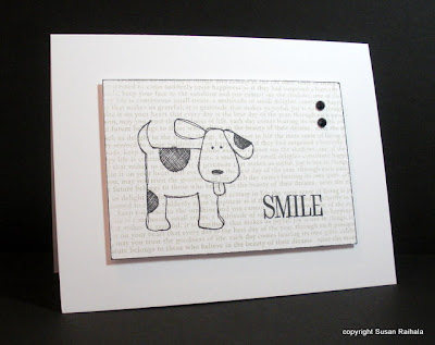
These cute cat and dog stamps from Hero Arts seemed perfect for layering over PTI's Text Style. First, I stamped Text Style in SU sahara sand ink on PTI white cardstock. Then, the animals and words went down in Palette Noir. A few black Hero Arts gemstones completed the triangle of black. I lightly ran the edges of the stamped panel over the ink pad and voila!
These cute cards really do make me smile. They are also a bit outside my usual box. It's fun to play with trends to get a feel for them and how you might make them your own.
Simplicity Tip: By arranging the black elements on the card in a visual triangle, I unified the design and then anchored it with more black on the edges. Creating that sort of stability in a design lets you work with a bit busier background and still keep everything feeling simple. Also, the smaller type and light color for the text background keep the focus on the main images for an overall cleaner feel than the more artsy inspiration cards.
Supplies
stamps: Hero Arts
ink: SU sahara sand, Palette noir
paper: PTI white
accessories: dimensionals, black gems (Hero Arts)
Friday, March 12, 2010
Day 10 Winner!
The lucky winner of the LAST Rainbow Mojo Give-Away is number 56, Natalie Winterstein, who wrote,
I say - keep doing what're you're doing! :) I am one who LOVES chatter, personal stories, etc. So I never have a problem reading about what is going on in someone's day to day along with a fab card or scrapbook layout!
March 10, 2010 1:04 PM
Congratulations, Natalie! Please send me an email at susanraihala at woh dot rr dot com with your address!
Note Day 6-10 winners: All your Mojo packages will go out today if I get Natalie's address soon enough, and on Monday if not.
THANK YOU ALL for your comments on the Day 10 give-away. They were a balm to my soul this week and gave me something other than my dog's cancer to focus on. Many of you gave answers that were variations of "if it ain't broke, don't fix it" or "give us more of the same!" Most of you seem to think there's a good balance of humor, stamping, and personal stuff. There were, however, a few recurring requests:
1. More CASification make-overs (which I was missing, too!)
2. More tutorials (including video...ACK! Then you'd hear my voice, and I'm not sure our friendship is ready for that 'cause I sound like a prissy, know-it-all prude)
3. More pears (you folks have dirty minds, and I love you for it)
4. More kraft cardstock (I'm cooking up something with a kraft queen and will get back to you on this)
5. More tips and tricks
And for some reason, Erin K requested more octopus action, saying there just weren't enough octopuses on the blog. I'll see what I can do to rectify this unfortunate and highly unintentional cephalopod discrimination, which (gosh darn it) will require shopping. Lots of shopping.
Cracking the Code: CAS-ifying Vintage Style
When I first started stamping eight-ish years ago, I read Rubber Stamp Madness, Rubber Stamper Magazine, and a few others. Most of the magazines back then were full of what I call "artsy" stamping: collage or mixed media cards with lots of brown. A lot of the stamp images were vintage, such as men in bowler hats with the letter D on their foreheads, Mona Lisa, court jesters, paper dolls, and such. There were also a lot of natural leaves, trees, and scenes.
Now way back then, I didn't know about a clean-and-simple card style (didn't seem like anyone was doing CAS except maybe StampinUp, but I hadn't heard of them yet, and I'm not creative enough to come up with it on my own). But I'd worked with a graphic design artist named Liz who DID do clean and simple, and I wanted to BE Liz.
Since all I saw in the magazines were vintage-style stamps, I bought a bunch of them, though I'm happy to say I never bought the man in a bowler hat with a D on his head. (No offense to anyone who did; I'm sure someone who isn't I could make a lovely card with him.) Then, armed with these vintage stamps, I set about trying to make cards like Liz's graphic designs and failed spectacularly.
As I learned about CAS stamping from SU and Julie Ebersole and other talented stampers at SCS, I started buying stamps that lent themselves to a cleaner look and miracle of miracles, I liked what I made with them.
But now I have drawers full of stamps that I bought years ago (though I did give a lot of them away), and they sit, unused, like the lost boys languishing in Never-Never Land, just awaiting the day I dump them in a box and take them to Goodwill.
Isn't that just the saddest thing you ever heard?
Then, a few days ago, I saw this card by Teresa Abajo in the Spring issue of Take Ten (which still publishes cards made with the man in a bowler hat with the letter D on his forehead):
This card, which is both balanced and interesting visually, has soooo much going on, including a lot of brown. There are seven different patterns and at least three different scripts. Never in a million years could I pull this card off like Teresa has. But I decided, what the hey!, I'll see what I can do with it as a springboard to CAS.
GO, ME! I'm cracking the code, folks.
How did this happen? Well, it started with a color scheme. Of course there's brown, but the original card has (if you squint sideways and use your imagination) hints of pink and blue. So I punched Martha Stewart butterflies in blush blossom, bordering blue, and close to cocoa. Then I stamped the text stamp on white with close to cocoa ink and cut out the panel. It looked better to work light to dark from top to bottom.
The original three butterflies are all linked by a reverse-printed word under each. I ditched that design element in the interest of CAS but still needed to unify the butterflies somehow. I tried coloring white pearls with Bic Mark-It markers in matches to blush, bordering and cocoa, but couldn't get a good cocoa. Then I figured all-white pearls would unify them better anyway.
The cocoa matte grounds it nicely, but the white card base keeps the whole thing from being too dark.
So what do you think of my vintage CAS card? It totally works for me, but does it work for YOU? What vintage-style stamps do you have lying around that you could make into a CAS card? If you take up this challenge, let us know by posting a link to your card.
Up tomorrow, more artsy-inspired CAS in cards suitable for kids!
Thursday, March 11, 2010
Day 9 Winner!
Ribbon. I love ribbon. Can't get enough of it. I'm lousy at tying bows but I can do a decent knot.
March 9, 2010 10:03 AM
Congratulations, Jackie! Please send me an email at susanraihala at woh dot rr dot com with your snail mail address.
Given all your answers to the question about favorite embellishments, it's pretty clear that ribbon is a BIG winner. For a while, I couldn't make a card without it, and then I quit using it for a bit, and now I'm back at it. Isn't that how things go in papercrafting?
Only one more Rainbow Mojo drawing! This has been so much fun, and I truly hope that even those who have not won have felt the Mojo and been inspired to make something CAS with a little extra bit of something to kick it up a notch.
Back to Business with Inspiration from Sue Berker
Sue Berker was inspired by my ribbon-wrapped strip cards here, and then she suggested that another possibility would be to wrap ribbon around punched shapes. Oh. My. Gosh. Brilliant! I had to try it.
Isn't this just the sweetest little card!?! Of course, flush with success bringing Sue's idea to pink and green perfection, I got cocky and tried to do a long three-square version in oranges and, well, let's just say it looked deeply weird. I'll spare your eyes.
You're welcome.
There's a lot of serendipity involved in these ribbon scrap cards. My feeling is that if you're really good at matching the scraps AND you have a nice selection of coordinating scraps, you can make beautiful art. If you've got a bunch of scraps, give it a try, because it's hugely fun and satisfying to use those little bits of fabulousness!
Supplies
stamps: PTI Mega Mixed Messages
cardstock: PTI white
ink: close to cocoa
accessories: square punch, ribbon scraps
Wednesday, March 10, 2010
Day 8 Winner!
Anything by Robert Parker, Robert Crais, Lee Child or Pat Conroy! But I can only take one? A Place to Call Home by Deborah Smith....
March 8, 2010 2:29 PM
Congratulations, Linda! Please email me your snail mail address at susanraihala at woh dot rr dot com!
It was so much fun reading everyone's vacation book choices! I saw some of my favorite vacation-book authors (Diana Gabaldon, Jan Karon, J.K. Rowling) and got some ideas for new reading. Thanks for sharing!
Rainbow Mojo Give-Away: Day 10 of 10
Here we are, at Day 10 of 10! Whew. This has been so much fun! *giggle*
Of course, we're out of rainbow colors, and all that's left is Neutrals: Cream and Brown. Now, these are colors I just don't use that often (unless pairing brown with a pastel...yummy!), which is a shame because they really are amazingly rich and rustic, elegant and warm...well, let's just say versatile. They had to be part of the give-away, if only so I can share PTI's twine in cream and natural with someone because I LOVE this stuff. See.
Isn't that bow the CUTEST!!!! I've seen a lot of these in the new Hero Arts catalog and on blogs, so I just had to try tying one for myself. Totally cool! PTI's twine is a dream to work with compared to the other icky stuff from Hobby Lobby I've used in the past. If you don't have some PTI twine, get some!
I colored in the row of flowers with Prismacolor pencils. Then, I accented the centers of the flowers with brown half-pearls, which sadly don't show up well in the picture. Of course I had to add a pack to the Cream-And-Brown Mojo!
Contents
1. Six lengths of ribbon
2. Two lengths of PTI twine
3. Brown and cream PTI buttons
4. Craft floss (for less rustic looks)
5. Brads
6. Light brown flock
7. Reflections self-adhesive half-pearls
The Last Rainbow Mojo Give-Away Question: What would you like to see more of/less of on Simplicity? More CASification make-overs? More Simplicity Tips? Less chatter? More chatter? More techniques used simply? More pears? Whaddaya want?
After 344 posts, over 91,500 hits, and over 170,000 page views, and nearly 600 subscribers in just under a year, I guess the message I started with...simplicity is the ultimate sophisication...means something to you. I'd like to continue putting that message out here in fresh and fun ways. Thanks ever so much for embracing the message and providing so much encouragement and support for this little blog I thought no one would read.
Tuesday, March 9, 2010
A Reminder and a Thank You
suzydirl, please email me with your contact information! If you don't contact me by tomorrow morning at 7:00 EST, I will draw another name for the Day 6 give-away!
Many thanks to those of you who have sent congratulations cards to Darien Hammett on the occasion of his promotion to Lt. Colonel. I've received cards from Sue B., Sue C., Mary M., and Bahb. Thank you all so very much!
ALSO, I sent out the first five packages of Rainbow Mojo to the winners yesterday. Keep an eye out for your goodies!
Day 7 Winner!
Ooh, you do ask the tough questions Susan! :P
Weirdest thing... Hmm...
I think we recieve inspiration from all around us... Whatever we do with our day we might see something and subconciously think "Hmm, that'd be great on a card" and not know where that particular idea has come from ;)
That is my view :)
March 7, 2010 9:08 AM
Congratulations to you, Hannah! Please email me at susanraihala at woh dot rr dot com with your snail mail address so I can mail out your blue goodies!
It was so much fun reading the weird inspirations! My weirdest inspiration, which isn't so weird, really, has been a stack of washcloths at Target. They were ballet blue, certainly celery, bashful blue, and white.
Rainbow Mojo Give-Away: Day 9 of 10
Today is a PINK sort of day. Pink is a particularly bling-y color, don't you think? I did, when I made this card:
The border is from PTI's Retro Borders, and it's accented with Hero Arts rhinestones. The sentiment is from PTI's Simple Little Things, which was their first anniversary set. Golly, I love the sentiments in that set!
Now for the yummy pink mojo! Check out all this cotton candy lusciousness!
Contents
1. Four lengths of ribbon
2. Two shades of Maya Road velvet flowers
3. PTI buttons
4. Flower Soft (heather)
5. Small safety pins
6. Rhinestone brads
7. Small hot pink brads
8. Hero Arts self-adhesive pink pearls
9. Hero Arts self-adhesive pink rhinestones
10. Iridescent gold/pink half beads (more from twinkletoes!)
Today's Rainbow Mojo Question: What is your go-to embellishment for cards?
Monday, March 8, 2010
Day 6 Winner!--edited
I love yellow! It's so cheery!
I have been blessed with the greatest best friend and sister, ever. These two lovely ladies planned my 30th birthday party (which was last week) at a local steakhouse. Lots of my friends and family gathered for a great dinner, cake, drinks and my favorite... karaoke! Everyone had such a fun time. They put so much thought into every little detail (including decorating my car while I was eating!).
I never had parties growing up. But my best friend and my sister made sure my 30th went down in the history books as one to remember. I love them so very much.
Suzanne
March 6, 2010 9:57 PM
Congratulations, Suzanne, and a belated happy birthday! Please email me at susanraihala at woh dot rr dot com with your snail mail address so I can send you your prize!
And many, many thanks to you all who posted blessings for the last week. It was so uplifting to read all the goodness that happened (much better and in many ways more important than the evening news). My biggest blessing for the past week was three days in a row of sunshine. Haven't seen that in FOREVER, and it was so uplifting and soul-warming!
Edited to Add: Okay, Joyce, I changed the color to mustard. You're right, yellow is hard to read, but on my screen it was at least read-able. All screens show color differently, though, and hopefully this is dark enough for everyone!
Rainbow Mojo Give-Away: Day 8 of 10
Today is a RED sort of day. Red is a hot and powerful color, one that can carry a LOT of weight in a clean-and-simple design. A little can go a long way, as in this card:
This card uses a stamp from StampinUp's Seeing Spots. The sentiment is also from SU, I think Pocket Silhouettes. (Note: I store sentiment stamps separately from images so sometimes I can't remember exactly which set a sentiment came from. Sorry about that.) The centers of the dotty circles are accented with red brads, which are part of today's Red Mojo Give-Away.
And a bit of advice: don't ever use just two of these brad-accented circles side by side on a card. Dirty-minded English majors might see something you don't intend!
Contents
1. Six lengths of ribbon, including VELVET!!!!
2. One package of Recollections bling, which I recently discovered at Michael's and love because it has three sizes...those tiny ones are really tiny!
3. Small safety pins
4. SEI buttons
5. Maya Road velvet flowers
6. Rhinestone brads
7. Iridescent red flat-back rhinestones
8. Red swarovski crystals
9. Small red brads
That's a HOT, HOT, HOT give-away!
Today's Rainbow Mojo Give-Away Question crosses the streams with my Questioning my Intelligence blog. Last week's essay over there was about books. So today's question is a silly little one about books: if you went on vacation and could only take one book with you, what book would it be? (Please note that I'm not asking what your favorite book is...just what book makes great vacation reading for you!)
For me, it would be The Guernsey Literary and Potato Peel Pie Society by Mary Ann Shaffer and Annie Barrows. And if you want to read my essay about books, you can click here.
Sunday, March 7, 2010
Day 5 Winner!
What a beautiful card, aqua isn't one of my 'go to' colours but it always works so perfectly on your cards.
Rainbow's; I normally see part rainbows, but nevertheless they are always a gentle reminder of God's amazing creative powers.
March 5, 2010 8:34 AM
Now, Heather, you'll have some aqua goodness to play around with, and I bet it'll become a great color for you! Congratulations! Email me at susanraihala at woh dot rr dot com as soon as you can!
Happy Sunday, everyone!
Rainbow Mojo Give-Away: Day 7 of 10
Today, I'm feeling BLUE! And BLUE is beautiful! Blue was my favorite color as a child, and while it's given way to green in my grown-up years, it's still a staple in my wardrobe. I love how it ranges in so many shades, although I am partial to Duke blue. *wink*
The Blue Mojo includes a bag of blue Flower Soft, which I bought (along with five or six other colors) and promptly started ruining paper using it. Sad sigh. Determination paid off, however, and I'm feeling much more flower-soft competent. Am I right?
It's all in the stamp choice. Use this stuff with the wrong stamp, and it'll look silly. Pick something more conducive to its use, and it's hard to go wrong. This card uses Stem Silhouettes and Sincere Salutaions from StampinUp, and a bit of satin ribbon for the knot.
Contents
1. Six lengths of ribbon
2. One package bling
3. Small brads
4. Small safety pins
5. SEI buttons
6. Flower Soft
7. Maya Road velvet flowers
8. Length of craft floss
Yummy! That's enough to make anyone happy to be blue!
Today's Rainbow Mojo Question: What's the weirdest thing you've ever used for inspiration in your paper crafting?
Saturday, March 6, 2010
Day 4 Winner!
I am new to the game of stamping I have been at it for only 7months. I really love making home made cards. It all started when I decided to make my own Christmas cards for 2009. Thanks for inspiration. Geraldine
March 4, 2010 3:55 PM
Enjoy your goodies, Geraldine. And welcome to our diabolical world full of new releases, hoarding, and a whole new understanding of "storage"!
Rainbow Mojo Give-Away: Day 6 of 10
Today is a YELLOW sort of day! Such a versatile color...soft and pretty or bright and sunny. Today, we're going soft and pretty with Prima flowers and soft green leaves.
This card uses Turning a New Leaf and Signature Greatings from PTI. The inks are VersaMagic chalk inks to keep the card extra soft. And of course there's a bit of bling on the flowers. Just because my Yellow Mojo would be incomplete without a little bling.
Contents:
1. Five lengths of ribbon, including rick rack, sheer, and grosgrain
2. Maya Road velvet flowers
3. Prima flowers
4. PTI buttons in two shades (one sort of greenish yellow)
5. Small brads in two shades
6. One package Hero Arts rhinestones
7. Two sizes of flat-back iridescent gems (thanks to twinkletoes' generosity; these are perfect for poinsettia centers on Christmas cards!)
Doesn't that look so happy and sunny and FUN!?!? Someone's going to have a great time playing with this goodness.
I have enjoyed reading all the answers to the rainbow question. Some of you have beautiful stories associated with them. I've seen a number of them myself, but two stand out as extra special: my first, which was over a bay near Charleston, South Carolina, when I was 16 years old, and another years later over the Buffalo Bill Scenic Highway on the way to the east gate of Yellowstone National Park. We pulled over so George could take a picture, and Nick, who was not yet four, said, "I slid down a rainbow once. It was kinda scary." I love that kid!
Today's Rainbow Mojo Question: What is a blessing you experienced in the last week?
Friday, March 5, 2010
Day 3 Winner!
My new Florishes set, From The Garden, definitely reminds me of spring. I love it!
March 3, 2010 3:57 PM
Congratulations, Anita M! You have won the Purple Mojo package! Please send me an email at susanraihala at woh dot rr dot com with your address!
Rainbow Mojo Give-Away: Day 5 of 10
Today, I'm feeling AQUA. It's funny, but when I first started stamping about 8 years ago, I didn't really like aqua. Now, however, it's one of my favorites and an amazing color for clean-and-simple cards. Like this one:
Happy sigh. (The picture looks pink, but it is really white and aqua...the ink is versamagic.) This is my favorite card for the whole give-away. The rhinestone was clear and is colored with a Bic Mark-It. Love it! And how perfect with the Dot Spot set that came with my last PTI order. And satin ribbon.
Today's give-away is small but fabulous. I tried initially to work these aqua/turquoise/teal embellishments in with the blues and greens, but they simply didn't belong with either. Here, on Day 5 of Rainbow Mojo Give-Away, they belong all by themselves beautifully!
Aqua Mojo Contents
1. Four lengths of ribbon, including satin-and-sheer, grosgrain, satin, and SU dotted
2. PTI buttons
3. Flatback teal rhinestones (part of the bounty twinkletoes gave me)
4. One package Hero Arts self-adhesive rhinestones
5. Rhinestone brads
6. Prima flowers
Look at all that bling! Oh my goodness!
Today's Rainbow Mojo Question: Have you ever seen a full-arch rainbow in the sky? If so, tell us where you saw it. If you've seen more than one, tell us about the most memorable one.
Thursday, March 4, 2010
Day 2 Winner!
Susan, Amuse MICRO Twinklers are very small - I use them all the time - they are my favorite.
My go to ribbon is satin - any width. I find I can tie a much better bow with it and it lays flatter for mailing purposes.
This year I have come to love orange - never have before!! Could it be your creations that inspire me?? I think so!
March 2, 2010 11:28 AM
Harriet, you've enabled me on previous occasions, and this is no exception. Gonna place an order for the A Muse twinklers soon. And I used to positively despise orange, too. Now, it makes me happy. Funny how we outgrow color prejudices, isn't it?
Thanks to everyone who offered up suggestions about blinging up the umbrella. I used SU only orange on that card, which made using Stickles impossible. Every time I use stickles over SU classic ink, the ink bleeds into the glue and looks messy. A glitter pen, which several people suggested, would probably work best. I have a bunch and didn't even think about them, so thanks so much for the suggestion!
Rainbow Mojo Give-Away: Day 4 of 10
The Rainbow Mojo Give-Away is off to a great start. Right after this post goes up, I'll announce the winner of DAY 2. Oh, I just love doing this!
Today, I'm feeling GREEN, but not with envy. Green is my favorite color, the color I love in many shades, whether a luscious lime or an ab-fab apple or a fantastic forest or an obstreperous olive. (Okay, olive isn't obstreperous, but I love that word because it has four consonants in a row. I know. I'm weird.)
Today's GREEN card gets back to some of my favorite things to do with clean-and-simple style: white-on-white, bling, and that GAWGEOUS Martha Stewart butterfly punch.
Doesn't the Fiskar's bracket punch work well with the butterfly? And that Signature Greeting sentiment (PTI) using Dawn McVey's handwriting totally rocks. I wish my handwriting were that cool. Or should I pretend I'm young and hip and call it kewl? Whatever. I like it. Lots.
Here's the Green Mojo for some random lucky person!
Contents:
1. Six lengths of ribbon, including skinny and fat rick rack
2. Two lengths of craft floss
3. Large Prima flowers
4. Two shades of green Flower Soft (YES, Flower Soft!!!!! I'm finally getting the hang of this stuff!)
5. Two shades of small square brads
6. Small round brads
7. Small safety pins
8. SEI and PTI buttons
9. One package of Hero Arts rhinestones
Are you totally pumped? I'm crazy pumped!
Today's Rainbow Mojo Question: How long have you been stamping?
Wednesday, March 3, 2010
Day 1 Winner!
Terry B said...
I love purple, and I love your blog. Thanks for the opportunity to win.
March 1, 2010 10:46 AM
How appropriate that Terry's win is announced on Purple Day!
Terry, you must contact me within 48 hours to receive your Black and White Mojo goodness or another winner will be chosen at random. Email me at susanraihala at woh dot rr dot com!
Rainbow Mojo Give-Away: Day 3 of 10
Violet, orchid, lavender, grape. Whatever shade you prefer, PURPLE is our color for Day 3 of the Rainbow Mojo Give-Away! As you can tell, we're jumping around the color wheel in random fashion rather than tidily circling around it. For deets about this 10-day give-away, see this post.
Purple is a color I rarely use in papercrafting, but I have a lavender winter coat my sister gave me that restores my faith that spring will come eventually. So I made a very spring-inspired card for today using Out on a Limb, a fabulous PTI set, and wide lavender gingham ribbon. (FYI-in real life, the colors match better. Not sure what was going on with my camera to make the picture look so blue!)
Yesterday, Hannah Aitken asked how I attach ribbon to cards, especially to yesterday's Orange Card. Well, this ribbon is attached just as yesterday's ribbon using the one-hole knot technique. It's a technique I learned from LeAnne's tutorial here, and it is soooo easy and makes much flatter knots than the standard "wrap it around and double-knot it." It's what I use almost all the time. (Note: I have an anywhere hole punch with interchangeable tips for different sizes of hole. This comes in very handy for ribbon when you want the hole further from the edge than a standard punch will reach.)
Now for the Purple Mojo Give-away. It's a tad smaller than the others because I just don't have that much purple in my stash. Also, there WILL be Hero Arts bling in this give-away, but I ran out and have more being shipped as I type, so no worries there!
Contents
1. Two lengths of ribbon
2. One length of craft floss
3. Light purple prima flowers
4. Grape bling (twinkletoes sent me a hugely generous batch of all sorts of rhinestones and swarovski crystals that I couldn't possibly use in my lifetime...the purple ones are a reddish grape color included here; you'll see other colors in upcoming give-aways...thanks to twinkletoes!)
5. Spiral clips and safety pins
6. Plain small brads
7. Rhinestone brads
8. One package Hero Arts self-adhesive rhinestones (not shown
9. SEI buttons (also not shown)
Today's Rainbow Mojo Question: What stamp or stamp set in your collection makes you most think of spring?
For me, it's a toss-up between PTI's Out on a Limb blossoms that I used here and PTI's Everyday Blessings with its pretty crosses.
Tuesday, March 2, 2010
Rainbow Mojo Give-Away: Day 2 of 10
Orange is the color of happiness, and I find myself particularly drawn to it in the cold, gray, winter months. In its darker shades, it's the color of warmth and coziness and pumpkin pie. Yum. For today's card, I went bright and cheerful, using SU Only Orange. This set from PTI hasn't seen enough action in my craft room yet, so I pulled it out and made a happy card!
Not sure you can tell, but there are embossed lines above and below the ribbon. I ran out of orange 3/8" ribbon a few months back and totally panicked. Nothing else would do but to run right out and buy not one but TWO spools. I'm good on orange grosgrain ribbon for a long time. What a relief!
Personally, I think there need to be teeny, tiny blings small enough for centers for these flowers, don't you? Does anyone know if the A Muse tiny twinkles are small enough? Just wondering. The Hero small bling is just too big. Sigh. Bling makes almost anything better.
And now to today's Orange Mojo Give-away! Which, of course, includes bling.
Contents
1. Four lengths of ribbon, including the rick-rack I used on this card
2. One length of craft floss (oh, I had so much fun with this the other day but haven't photographed the card yet!)
3. Maya Road velvet flowers...so gorgeous and tactile but not bulky!
4. PTI buttons
5. Tiny safety pins
6. Small brads
7. Hero Arts orange self-adhesive rhinestones
Today's Rainbow Mojo Give-away Question: What's your favorite type of ribbon to use on a card? Satin? Sheer? Rick-rack? Grosgrain? Skinny or fat or in between?
Note: I totally understand that it's hard to choose favorites, but maybe you can think of what you simply couldn't LIVE without or what you think of as your "go-to" ribbon. Or maybe you don't like ribbon at all, in which case I feel sorry for you. For me, my go-to is probably 3/8" grosgrain in all colors imaginable. A close second would be the satin-and-sheer I've found at Michaels.
As for yesterday's question, while I love all colors in the right context, my can't-live-without color is green (lime, apple, olive, sage, forest).
Monday, March 1, 2010
Rainbow Mojo Give-Away: Day 1 of 10
To celebrate your kindness and support, I am sharing the Rainbow Mojo. You all know how important that extra little "something something" on a card takes it from blah to beautifully CAS. Over the years, I've tried so much stuff, some of which worked beautifully for me and some of which didn't. I've already given away almost all the stuff that didn't work, and now my embellishment drawers floweth over with bountiful beauty that warms my heart and inspires my creativity.
So I went through each of my embellishment drawers (which are organized by color) and pulled out some of my favorite embellishments to share with you, my fabulous readers: ten bubble envelopes of delight going to ten lucky readers!
The amount in each give-away will vary from day to day, depending on what's in my stash. Most of these items will be familiar to you since you've seen them on my cards before. Each lucky winner will also receive the card I made using some embellishment in the give-away.
Here are the rules:
1. Each day, I will ask a question for you to answer: a question with no right answer! See how easy? No posting links or such. One comment per reader per post. Please do NOT comment via email; come to the website and leave a public comment for inclusion in the drawings. You may enter all the give-aways (or just the ones for colors you like, LOL!). Comments will be open for 48 hours, and then a winner will be selected at random and announced on the blog.
2. If a winner does not leave contact information or respond within 48 hours of her/his name being announced, another winner will be selected.
3. No one may win more than once. That way, we can spread the love around! You can continue commenting throughout the give-away, though. Your number just won't count in the later drawings.
4. As many as three winners may live outside the United States. I'm sorry to limit this because of customs forms and international postage, and I sincerely hope my international readers will understand.
So, let's get started, shall we! Today's colors aren't technically in the rainbow, but I have lots of embellies dedicated to them. BLACK and WHITE are basics of stamping, so here's the give-away:
Contents:
1. Six lengths of ribbon, including gingham, grosgrain, and a satin-and-sheer stripe (Yummy!).
2. Two lengths of craft thread (black and white)
3. Black PTI buttons
4. Maya Road white velvet flowers
5. Black and white small brads
6. Googlie eyes (the last card I used these on got next to no comments, but I loved it and so did the child who received it!)
7. Clear rhinestone brads
8. A baggie of black flock
9. A baggie of fun glittery white flakes (I made a shaker ornament this Christmas using this stuff as snow....fun, fun, fun!)
10. My absolute favorite of today's give-away: a package of Hero Arts Half Pearls in black
Whew! Look at all that fun! And here's a card using the black flock for flower centers.
I hadn't used the flock in a while, so it called to me. It's such a fun way to add texture to a card and can work cute or elegant, depending on the images used. Red sticky tape is the easiest way I've found to use flock...glue is too messy.
Today's give-away question is this:
If you HAD to pick a favorite, what is your favorite color?