Pages

Sunday, February 28, 2010

Promotion Congratulations and a Call for Cards

This card is going to an officer who just pinned on Lt. Col. in the USAF.


After twenty years as a military wife, I got to know a significant number of officers and was consistently impressed with the quality of men and women serving in our armed forces. In the Air Force, if you do a really good job as an officer, you'll likely get promoted on through Major. To make Lt. Colonel, however, takes more than just "doing a really good job." It takes serious commitment to excellence, superior performance, and a significant contribution above and beyond the call of duty. Not everyone makes it to Lt. Colonel, and even some who deserve the rank don't get it because of the limited number of slots available.

When I read that Darien Hammett had his promotion ceremony at Children's Hospital so he could be close to his 14-month-old son who is intensive care there, it tore at my heart. This family has been through so much: years of service to their country, with all the sacrifice inherent in that, plus eleven months of fighting a dreadful form of leukemia in their baby boy.

If any of you would like to send Darien a card of congratulations, email me at susanraihala at woh dot rr dot com. Their whole life for the last eleven months has been turned over to fighting Lincoln's cancer, and they have received amazing support during that battle. But something like the wonderful achievement of Darien's promotion can easily get set aside by other priorities. With help from even just a few of you, I'd like to keep that from happening.

Saturday, February 27, 2010

I Got Nothin'

Disclaimer: when I compose posts before my morning mocha has set in, you can expect a bit of silliness and lots of wordiness. It's not my fault. Or it is. I don't know. I'm too tired to make sense.

Today's card was not made by me. In fact, I wouldn't even know how to begin to make something like this because my skillz don't float in the ponds of gardening or paper-making. They sink like my firstborn seeing how long he can hold his breath at the bottom of the pool until I start hyperventilating with the certain knowledge that I will have to actually jump in the cold, chlorinated water and rescue him. Lordy, it's been years since that infant-and-child first aide class. I need a refresher. Plus, my hair would get wet. I hate that.

Anyway, I got nothin' to show you today from my own craft room. Lest you think I've been lazy, know that I have been making the cards to go with the SU stamp sets I'm selling and for the RAINBOW Base-Ten Give-Away that starts on Monday. Woo-whee, it's exciting!

But today isn't Monday. It's Saturday. So here's a card made by Lois, the mother of my dear friend Liz who made this card for me. Liz comes by her talent naturally. Lois and Liz are both master gardeners, and Lois takes flowers she grows and puts them in paper she makes. Then she turns her paper into fun things like cards and bookmarks and such.


The only part of this card I could duplicate would be folding the paper. Okay, yes, I am capable of wielding deco scissors, probably as well as Lois did here (and that's hard, folks!). But I don't have these deco scissors. Hard to believe, but it's true.

I just love how Lois chose flowers with shades of purple and lined the parchment-style paper with a mint green. Purple and green together are one of my favorite combos.

I've never met Lois. Liz and I worked together every business day for three years, and I heard a lot about her librarian mother and farmer father. Then, I moved away ten years ago and haven't seen Liz since. But we are always communicating via email and the occasional card. Then, a few years ago, Liz sent me a prayer request. Her mother had breast cancer. I hate cancer. So I started praying every day and sending cards to Lois every week or so. When Lois was through with treatment and happily doing well, she started sending me cards. And a daily devotional. And a handmade book mark. And she started praying for Jack.

And aren't cards a wonderful force for good in the galaxy? They are tangible representations of our prayers for each other. I'm sure the Lord approves. And so would Obi-wan Kenobi. If he were real. Which he isn't.

I'm going to fix another mocha. Right now.

Lincoln Update: Okay, the mocha has to wait a minute. The new CaringBridge update for Lincoln is up. When I read the paragraph about Darien, Lincoln's daddy, having his promotion ceremony at Children's Hospital, I started to cry. I remember what a big deal and happy day that was when George pinned on Lt. Col. Our boys and his parents were there. The auditorium at the squadron was full, and George's commander, Rich Clark, told really funny and embarrassing stories about George's stupid drunken days as a young Captain at McConnell AFB (where we first met Rich) and when they shared a tent in the big, dry desert in 2003. George's big day was full of family, friends, laughter, and celebration. It's easy to celebrate in the good times. The strength of character and faith exhibited by the Hammett family humbles me. Please continue to keep them all in your prayers.

Now, I'm off for another tissue and a second mocha.

Friday, February 26, 2010

What to Do with the Crossword Stamp, Part 2

In this post, I showed how to use strips of the whole Hero Arts crossword stamp to make CAS cards, but today, we're using much smaller cut-outs from the large stamp to make even cleaner and simpler cards. Yippy!

First up is a very simple card I'm sending to my husband's nephew who just won all sorts of competitions in college forensics. All I did was cut out one word from the puzzle stamp.


The next card kicks the same design up a notch with a huge rhinestone. I popped the crossword rather than the sun. How do you cut out a dotty sun like that? Just thinking about it makes my brain hurt. I love using the "warm wishes" sentiment with the image of the sun, and the bling soooo makes this card!


Finally, I cut out two words and used them as a frame for a fun little flower. The stem is from a Hero Arts clear set, and I just punched the flower and added, you guessed it, bling.


As you can see, I used three different alphabets on these three cards. I have an embarrassing number of rubber stamp alphabets, most of which haven't seen use lately since I haven't been scrapbooking. It was so much fun to haul those babies out and ink them up.

Supplies
stamps: All Hero Arts
ink: Memories soft leaf and blue; Palette noir and dark chocolate; SU summer sun
paper: PTI white; SU pomegranate
accessories: bling, dimensionals, flower punch

Thursday, February 25, 2010

What to Do with the Crossword Stamp, Part 1

Several people have requested that I play around with the Hero Arts Crossword background stamp. Apparently, it's intimidating to more people than just me! I love this stamp, but my initial playing around didn't yield much to be happy about, so I have tackled it again.

1. Using it as a whole image does NOT, in my frustrated experience, work for my clean style. I tried using shadow inks (very light), black, and bright colors, but every card I made, no matter how simple, definitely did NOT look clean. If someone out there makes a clean card with the whole image, please share it with the rest of us. 'Cause I cry uncle. For those of you who enjoy making more elaborate, embellished cards, the whole image may prove quite useful, though.

2. Cutting parts of the image works much better for a clean-and-simple style so that's where I concentrated my efforts. I had some success with strips of the image, creating a sort of border/focal point/sentiment all in one.

All the straight lines and right angles made me want to soften the image with some swirls, so I combined the crossword stamp with SU's Baroque Motif. This first card is very flat for easy mailing. Because the three flowers are stamped in a triangle around the words, the eye moves across the strip more easily, but without the added bulk of the next card.


The second card isn't as clean, but it is happy and fun. The colors are so cheerful, don't you think?


This technique works great for any short saying. Happy birthday; wishing you well; a word for you; an apple a day (with tiny apples insead of flowers!); make love not war; frankly, my dear...; Mr. Darcy Lives! Okay, I'm getting silly, but you get the idea. You could really personalize your message for a close friend or loved one with inside jokes, word association, favorite book or movie titles, favorite flowers, a Bible verse, etc. The possibilities are endless. *giggle*

Tomorrow, I'll show you my favorite use of this stamp so far. It's clean and versatile and--dare I say it?--EASY.

Footnote: ChristineM asked if I would sell stamps overseas. The answer, sadly, is no; I will only ship in the US via USPS. I will, however, be doing some give-aways starting next week for ten days in a row. Hee, hee! Can't wait for a base-ten love-fest! I will ship up to three of those packages overseas.

Wednesday, February 24, 2010

I Feel Weak

...because I bought these at Michael's the other day:


Okay, so I don't feel bad about the orange marker. But the punches? Do I need more? Oh, no. I don't NEED more. In fact, I recently had to expand my punch storage to accommodate my growing collection. But I saw THIS CARD on Julie Ebersole's blog and ran right out that very day and bought the grass punch. Then I saw that the heart-and-key punch was ON SALE for about $4. How could I NOT buy it? Seriously.

I knew you would agree. I'm so grateful I can always count on your kind support.

And on that note, I'm getting organized for a fun give-away--a rainbow of a give-away--to celebrate the fact that so many of you visit Simplicity and comment regularly. Y'all give me so much love; it's time to give some back! Deets coming next week.

And on an entirely different note, I will be posting a bunch of SU stamp sets (about 15) for sale soon. I'm making a new CAS card using each set, a fond farewell to much loved sets. If you purchase a set, you also get the matching card for inspiration.

Here's a quick and punchy little card for today. Martha may have spent time in the Big House, but she sure puts out absolutely fabulous punches.


The icing is punched from some sparkly paper I picked up at Hobby Lobby for Christmas ornaments. Love it!

For those who pray: Please keep little Lincoln Hammett and his family in your prayers. Lincoln is a 14-month-old who's been fighting very aggressive leukemia since he was three months old. He's in intensive care right now dealing with a nasty infection following a final, last-chance round of chemo. His CaringBridge website is here.


Supplies
stamps: PTI Birthday Basics
paper: sparkly paper from Hobby Lobby, PTI white, SU close to cocoa
ink: Close to Cocoa
accessories: MS cupcake punch, dimensional

Tuesday, February 23, 2010

Cleaning out a Drawer: You Never Know What You'll Find

I had a drawer on my desk that held bits and pieces of half-finished cards. (Note: I'm a card half-finished rather than card half-UNfinished girl.) In need of another drawer for ink (please don't ask; I haven't been really bad...yet), I cleaned out the odds-and-ends drawer and found a couple of stamped panels using PTI's Spiral Bouquet that were stamped, oh, six months ago. One of them was frightfully ugly (sometimes rockin' and rollin' just does not work), but the image of the outline flowers worked well.

So I made it into a white-on-white-layer card.


Love this! For anyone trying to duplicate it, it's sized a bit odd at 4 1/4" x 4 7/8" to have an even border around the panel.

Anyway, I used half of my fifth-to-the-last piece of Papertrey Stampers Select White Cardstock to make this card. I'm getting the shakes, folks. Oh! My! Gosh! What if I run out before the Man in Brown delivers my order? There are only three new packs coming. WHAT WAS I THINKING!?!?! Next order, I'm buying ten packs and will breathe easier.

For a month or two.

No, I don't have a problem. What makes you suggest such a thing?

Supplies
stamps: PTI Spiral Bouquet, Mega Mixed Messages
ink: VersaColor cinnamon (?), brown
paper: PTI
accessories: half-pearls, dimensionals

Monday, February 22, 2010

More Bright Colors on a Dreary Monday

In keeping with my user status (for background, please see this post), I used every felt flower that came with my "What's the Scoop?" clear stamp set from Hero Arts. There were only five flowers, so don't be too impressed.


I love embellishments like these. They are colorful and can stand all by their lonesomes on one-layer cards: no need for background stamps, patterned paper, or other embellishments.


Clean and simple never had it so easy.

And they make me so happy on this cold, gray, soggy day.


Supplies:
stamps: PTI simple little things sentiments
ink: Palette Noir
paper: 4.25" square white cards
accessories: Hero Arts self-adhesive felt flowers

Sunday, February 21, 2010

RAK: You Are Neat

My friend Lisa over at Flat Fish Paper Arts sent me a card that speaks to me. OMGosh, I may need to buy a label maker!

How totally cool is this? She got the idea from a card she saw on Etsy, and thought of me, though I can't imagine why. *snort* If you have a label maker, why not make one for your closest AR/OC friend. He or she will love it just like I do!

Lisa is such a sweet online friend. She's an urban bee keeper who sent me a jar of honey for my Honey, who eats honey-and-peanut-butter sandwiches in preparation for his Ironman races. See why she's sweet? Check out her BLOG for more pictures of her art and her adorable new puppy, Annie.

Thanks so much, Lisa!

PS I'm considering selling off a bunch of stamps to make room (and money!) for more. Would anyone be interested if I posted them here? Otherwise, I'm taking them to a brick-and-mortar ebay seller.

Saturday, February 20, 2010

Just Call Me a User

How many of you are guilty of doing the following? You buy some really cool embellishment and hoard it, without using it, for months or years. Then you discover it hiding in a drawer one day and ask yourself, "Huh, why did I buy this?"

If you say, "Oh, no! I never do this!" what in the heck are you doing here? Go away and don't come back until you spend several hundred dollars on crap you will never use. Then, the rest of us will happily be your friends. Because you will be one of us.

I found these hot pink gemstone flowers in my tin of pink bling a few days ago and thought, "Huh, why did I buy these?" Instead of putting them back, I decided to USE THEM ALL UP! AT ONE TIME!

Are you shocked? I sure was. I feel like such a radical. Here are the happy results.


This sentiment always appealed to me as a military spouse who lived in nine states in 17 years. Bloom where you're planted, indeed.

Yes, I know this is essentially the same card as the Bloom card, but hey, it's pretty, don't you think?

Awwww. Look at all that white space.


I blinged (or blang) seven times on one card. Is that legal? It's more fun if it isn't.

The stamps are both from Papertrey: Turning a New Leaf and Spiral Bouquet. The sentiments in Spiral Bouquet are large and complement Turning a New Leaf beautifully, don't you think? The ink is Brilliance Iridescent Lime, which is so shimmery, and Palette Noir, which is so, um, noir and makes a nice contrast to the perky colors of the leaves and gemstones.

So there. We CAN use our stash, use it all up, and feel good about it at the same time. I challenge you to go forth and use something that's been hanging out in your stash for a while. Use it all up. And then tell us about it. Because the rest of us are nosey nellies and we want to see you break the law of hoarding.

Trust me. It's fun.

Friday, February 19, 2010

When Everything Goes Sideways

This card did not turn out as expected. At all. Sometimes, everything just goes sideways and you just have to throw the card away. Sometimes, as here, you can salvage a decent card anyway.

I started with a heart punched out of a sticky-tape sheet, which I adhered to white cardstock and punched out a second time before peeling the other side off and adding pink Doodlebug glitter. By backing the heart with cardstock, I could pop it up. The popping part actually worked.

Let me just go on record as saying that sticky-tape sheets are awesome...until they turn yellow. The first one I tried had turned on me. Pink glitter over yellowed sticky tape looks vile. Urgh. Fortunately, I had a fresh sheet of another brand. I've also noticed that page pebbles turn yellow eventually, too. Sigh. If anyone knows of a brand that doesn't yellow, please, please, please tell me.

This card, as planned, was going to have a pink base. Didn't work. It was also going to have black gingham ribbon. Looked weird. Finally, it was just pink. Whatever.


While it's nowhere near what I had in mind, I'll take it because what I had in mind--what looked lovely in my mind--didn't translate to reality. Happens all the time, and it. is. o. kay.

Funny Kid Story: A few years ago, we bought the DVD for the movie Sideways . Nick, our firstborn, was about 6 or 7. He was fascinated with the fact the movie was rated R and he wasn't allowed to watch it. Anyway, we were driving back from vacation in North Carolina. He was getting bored and started horsing around in the back seat. "Mom, guess what! I'm Rated R!" I glanced back and saw him lying sideways over the arm rest. "See! I'm Sideways. Get it?"

That's my boy.

Thursday, February 18, 2010

Ribbon Scraps

What can you do with this?


Perhaps something pink like this:


Or bold and bright like this:


Or green:


To make these, I used a 1"-high strip of heavy white cardstock, wide red sticky tape, and 2" strips of ribbon. After laying them out in a pleasing pattern, I wrapped each ribbon around the strip, with the ends stuck to the tape on back. Then, I put another strip of tape on the card base below the sentiment, and stuck the whole ribbon panel right on the card.

It's easy, versatile, and thrifty. What's not to like!?!? Okay, some of my combinations turned out a bit weird or just didn't photograph well, but I made 8 cards in about half an hour and used up more than half my ribbon scraps. I'd say that's a good use of time and supplies!

Supplies
stamps: PTI Simple Little Things, St. Pat's sentiment unknown
ink: Palette noir, Versacolor evergreen
paper: PTI white
accessories: ribbon scraps, red sticky tape

Wednesday, February 17, 2010

StampinUp's Font of You

Font of You had to come live with me, despite its entirely stupid name. First, I love type, even if using it on CAS cards is very challenging. Second, this set is just so innovative and cool and creative, despite its entirely stupid name. (I said that already, didn't I?) I HAD to get it.

But it's very hard to use. Sigh.

The bracket border punch I bought recently (because of Ann) seemed appropriate with Font of You, especially with the umbrella. Both cards use essentially the same layout, with the border opposite the sentiment. The colors are from this year's in colors, which I only have the markers for. Never doing THAT again.


For the second card, I wish I'd made the Thanks Dusty Durango to match the border and flowers. As it is, the emphasis is thrown on the very much. Oh, well.


Supplies

stamps: SU Font of You, Clear and Simple Stamps Thank You

ink: dusty durango, bermuda bay, soft suede (all markers)

paper: PTI white, dusty durango, bermuda bay

accessories: bracket border punch, dimensionals

Tuesday, February 16, 2010

CAS54 Wishing for Spring

Before I get to this week's CAS Challenge, I have two bits of business to communicate.

1. To those who do not live in the U.S. and thus must pay outrageous shipping for Papertrey: I pity you. Deeply and sincerely. We can only hope that PTI will grow large enough to open stores overseas (and in Canada, which isn't overseas but might as well be 'cause I spent over $30 shipping a package of blog candy there once). But the insanity of international business law isn't something I would wish on any company I love. Sigh.

2. If you haven't checked out the CAS Design Team selection this time around, click the link after you read my post. The Olympic theme is pretty exciting! Lots of awesomely CAS applicants (as usual!) and I'm so glad I'm not making any decisions this time.

Back to the post at hand. CAS54 couldn't have come at a better time...as we received our third winter storm in two weeks. Sigh. I want spring.

Using spring colors on one-layer cards with Everyday Button Bits (PTI) made me very, very happy today. The first two here use BUTTONS! Yes! Finally tapping into the stash I amassed when I participated in Krystie Lee's PTI button share.


The sentiments include a single word enlarged and in a cursive font, which makes it easy to include a dash of color in the sentiment. That's such a great way to help unify a card.


I'm not sure how I feel about rounding just two corners on the blue balloon card. What do you think?

The final card (actually the first I made) totally makes me smile. No buttons. Plus, it combines Everyday Button Bits with Honey Bees...two PTI sets, one lovely card! Putting some black with the pastels helps anchor them and really pops nicely, doesn't it?


Supplies for Balloon Cards
stamps: Everyday Button Bits
ink: VersaMagic sahara sand, sea breeze, pink petunia
paper: PTI white
accessories: buttons, twine

Supplies for Floral Card
stamps: Everyday Button Bits, Honey Bees
ink: VersaMagic mango madness, aloe vera; Palette noir
paper: PTI white
accessories: black half-pearls, gingham ribbon

Monday, February 15, 2010

CASE-ing Rose Ann--Edited

As soon as I saw Rose Ann's one-layer friend card last Friday, I knew I HAD to make my own version of it. The colors and clean lines really called to me. The closest I could get was using PTI's Friends 'Til the End, rather than In Bloom, which she used. Here's my best attempt.


I prefer Rose Ann's, but mine is fine, too. Instead of enbossed lines around the edges, I used a large clear gem in the center of my flower because that hole in the middle (which her flower does not have) really bothered me. My sentiment also doesn't quite balance as well as Rose Ann's does. But that's okay. I got close, and it makes me very happy!

Thanks for the inspiration, Rose Ann!

Edited to add: I did place an order this morning at Papertrey. The only stamp set I bought was Dot Spot, though. It struck me immediately as incredibly easy to use and versatile, and even a good set for scrapbook backgrounds for boy pages...which makes it extra appealing. I'm mighty tempted by the Asian set and the violet set, but want to wait and see how my initial love of them plays out.

The rest of my order was paper (a couple of sample packs of the colored cardstock, three packs of white [I wish I'd made that 4]), the cream twine, and three packs of the clear card boxes.

Here are my feelings about Papertrey. What a quality company with GREAT ideas! They take coordinating product to a whole new level. The plan to release a flower set for each month of the year is brilliant, although I won't be investing $180 in outline flower images. I can't wait for pansies and daisies, though. They are my all-time favorite flowers. Packaging products like the clear card boxes and templates are genius (and affordable). The monthly releases are exciting but hard on the wallet. I've gotten to the point in my stamp collecting where impulse purchases are very, very rare. I love that things don't get discontinued (at least not yet) at Papertrey, and that makes me feel like I can be more sensible and take time with purchases. Still, because I want to be Nichole when I grow up, there are often sets that scream at me to buy immediately, such as Through the Trees, Turning a New Leaf, and Dot Spot. Not once have I regretted those impulse buys.

I guess you could say I'm a Papertrey fan!

Supplies
stamps: PTI Friends 'Til the End
ink: Palette Noir, VersaColor Split Pea
paper: PTI white
accessories: gemstone

Saturday, February 13, 2010

Happy Valentine's Day

I hope you have a clean and simple day full of love and friendship!


Supplies
stamps: Hero Arts
ink: Palette Noir
paper: SU real red, PTI white
accessories: Martha Stewart small hearts punch, glue pen, Scor-Pal

Resistance Is Futile...and Pretty

If you don't have PTI's Through the Trees yet, resistance is futile. And once you have it, resistance is fun...not to mention, pretty.

The birch trees were stamped in VersaMark ink (first time I used it in a year, actually!) and embossed with clear embossing powder. Then, I masked the edges of the image with post-its, sponged on bashful blue ink, and wiped the excess off the embossing with a tissue. I stamped the sentiment and birds in Palette Noir.

See. Resistance is both futile and pretty!

Supplies
stamps: PTI Through the Trees
paper: PTI white
ink: VersaMark, Palette noir, SU bashful blue
accessories: clear embossing powder

Friday, February 12, 2010

It Started with a Mistake

It started with a MISTAKE, folks. The shadow stamp--which is four blocks on one stamp from Hero Arts (discontinued)--inked up funny. I was trying to make a card for the CAS53 challenge. I needed a nice, smooth aqua background, but the Ancient Page ink pad, which is sort of wet, was leaving edge lines on the stamp. So I tried swirling the pad on the stamp and stamped it. OH. MY. GOSH!!!! Swirly underwatery look! AND I WENT WITH IT!!!!


I grabbed my fish punch, the A Muse coral stamp designed by JulieHRR herself, and the sentiment that fit best space-wise and font-wise (PTI's Friends 'til the End). How fun is this?!?!

But please, please, please tell me I'm not the only human of the AR/OC grammarian type to be bothered by missing punctuation in sentiments. Adding a comma by hand would look just weird here and it bothers me.

Once I finished this card, I used SU's cool caribbean with the shadow stamp, which inked up beautifully, and made the second card on this post. I really like both cards for different reasons.

Mistakes can pay off if you turn your head sideways and squint.

That's Simplicity Wisdom. So go out and make some mistakes and see what happens.

Thursday, February 11, 2010

Through the Trees in One Layer

For once, I suspect that I blinged where I ought not to have blinged at all. But I still like this clean, one-layer card.

And the sentiment is utterly wonderful, don't you think?


Supplies
stamps: Through the Trees (PTI)
paper: PTI white
ink: versamagic
accessories: rhinestones (Hero ARts), Scor-Pal

Wednesday, February 10, 2010

CAS53 Candyland Inspiration Challenge

I didn't think I would be able to do this week's challenge, but since Tuesday turned into a snow day, I dove right in! The inspiration was CandyCrate Retro Candy's website. Yummy!

My first card was inspired by Cinnamon Red Hearts. As soon as I saw them, I thought about Martha Stewart's mini-hearts punch. I punched it out in white, then punched the negative out with a circle punch. Matted on a red scalloped circle, it's adorable! The sentiment is Hero Arts, and I used my Scor-Pal to score a few lines.


For card #2, I took my colors from Lucy's Predic-a-Mints. Such a fun, retro combination! The shadow stamp and sentiment are from Hero Arts. I just had to add a bit of stickles to the flowers, which were punched out of pretty in pink cardstock.


Finally, a Shamrock Taffy card using PTI's Limitless Labels and the Martha Stewart small scalloped circle punch. And a little bling. Of course.

Such a fun and flexible challenge! Jen always does such a great job week in and week out. The world of CAS is very fortunate to have her providing us with so much inspiration!

It's another snow day today, and my craft room is set to order, so I'll be making stuff while the children build a snow fort outside my window. Yeah!

Monday, February 8, 2010

Another Thank You Note

Yesterday, I started re-arranging my craft room. Sometimes my OCD is really annoying.

Anyway, today's card makes me happy. That shadow stamp (part of a discontinued set from Hero Arts) is PERFECT for grounding images like trees. I particularly like how the "grass" establishes an imaginary margin of white on the card but the big tree spills over that line and off the card.


Thank you for visiting my blog, and special thanks to those who take time to leave a comment. Your kindness really motivates me!

Have a great Tuesday!

Supplies
stamps: PTI (Through the Trees, A Day at the Beach), Hero Arts (shadow), Clear and Simple Stamps (sentiment)
ink: river rock, old olive, chocolate chip, summer sun
paper: PTI white, summer sun
accessories: circle punch

Thank You Note Set Using Hero Arts Three Ferns

These one-layer cards are 4.25" square and super simple. My thank you card stash was depleted by the holidays, and I needed some quick and pretty cards. This stamp by Hero Arts begged to be used, and who am I to argue with a stamp? They are tenacious, as anyone who's tried not to buy one can attest.

I used SU's soft subtles and cool caribbean to create the color assortment. Here's another case for having tons of bling lying around, but obviously you could just buy clear bling and color with Sharpies or Bics or Copics if you want. The sentiment is from my complimentary Thank You set from the nice folks at Clear and Simple Stamps.

Simplicity Tip: Don't be afraid to be a MOTO. MOTO is an acronym from my husband's Air Force days and stands for Master of the Obvious. The term is used as an insult in the military aviator world, but it deserves better. Too many times, I stare at a stamp and wonder how to make it look special or creative. When I try to force the image to do something other than the obvious, sometimes I just waste a bunch of paper. Cards like those in today's set use the stamp in a very obvious way. But if you get good impressions, make smart color choices, and embellish just a bit, obvious can be special and creative, too. Embrace your inner MOTO, and make something obvious yet beautiful. You have my permission.

Here's cool caribbean.


And pale plum.


Apricot appeal.


Blush blossom.


Barely banana.


Almost amethyst.


See. Channeling your inner MOTO can result in something beautiful.

Make Monday a great day!

Sunday, February 7, 2010

Someone Remembers

PTI's Everyday Blessings is my favorite religious set. The crosses are so pretty, and the sentiments useful and heartfelt.


Today's card was inspired by similar cards I've seen recently in magazines and on blogs that use a popped matte over a stamped image. In particular, check out this sweet card by Maile Belles.

For my card, I used the Creative Memories oval cutting system to cut a matte in PTI's white cardstock. To position the cross properly, I lay the matte flat on the card and stamped the cross in black. After stamping the sentiment on the matte, I popped it on the card, and then finished the card by adding brilliant blue gemstones to the cross (they look a bit darker in the photo...sorry about that).

Have a blessed Sunday!

Saturday, February 6, 2010

Look, Ma! No Buttons!

The rebel in me wanted to use PTI's Everyday Button Bits without, you know, buttons. Don't get me wrong. I love the look of buttons on cards, and I bought the set to use up all the buttons in my stash, but mailing cards with buttons--especially the big ones--is awkward. So here's an easily mailable card!


The blossoms were created using a tiny flower from Hero Arts stamped repeatedly in pretty in pink and pixie pink. Then I used a Sakura stardust pen to add a little bling to the center of each flower.

On a completely unrelated note, PTI announced that they are going to offer their own dies and texture plates. Sigh. This was inevitable, but it makes me sad. I really cannot justify the expense of a die-cut machine or buying new dies every month (you know I would, don't you?...it's a disease, I say!). Shoot. Sometimes standing on principle really stinks. But I stand on my principle that paper, ink, and bit of embellishment are all you really need to make lovely cards. More is nice, if you can afford it, but sadly, this blog will stay die-cut free for the time being. At least until I win the lottery....

Supplies
stamps: PTI (Everyday Button Bits, Simple Little Things); Hero Arts (flower)
ink: SU close to cocoa, green galore, pretty in pink, pixie pink
paper: pixie pink, white
accessories: Sakura stardust pen, dimensionals

Friday, February 5, 2010

Clean and Simple Fishy Scene

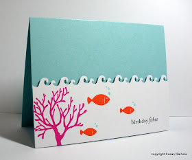
It's amazing how long my showers get in the depths of winter; all that hot water is so comforting. So here's a little tropical scene that represents my longing for warm water. Please excuse the pun. I had it so it used it.


I bought the ocean wave border punch (Martha Stewart) because Krystie Lee has one and I want to be cool like she is. The white panel is popped on dimensionals, but everything else is flat, flat, flat. The colors are bright and cheerful, and carry the design well enough without bling or other embellishment. At least I think so because every time I look at this card, I feel warm and have to smile.

Supplies
stamps: A Muse (coral), PTI (fish, sentiment)
ink: SU passion pink, only orange; Palette noir
paper: SU cool caribbean, PTI white
accessories: dimensionals

Thursday, February 4, 2010

Bitty Birthday and an Absent-Minded Mystery

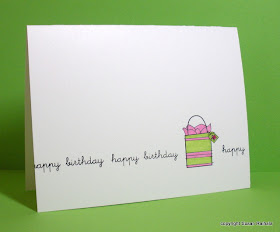
SU's Bitty Birthday is such a cute set. I like how easy and quick it is to color because, as you all know, I'm lazy that way. I chose a fun, preppy color scheme for these two cards and added a bit of bling (rhinestone on the first, glitter on the second) as a little something to spruce up these very clean one-layer cards.


I love how the Gina K Deluxe cardstock doesn't let the Bic mark-it markers bleed through. Thanks again, Bahb!


Now to the absent-minded mystery. I remember emailing someone to tell them I would send them a card they really liked if they sent me their snail-mail address. I remember that the someone replied with her address. I DON'T remember who the someone was, which card it was, or if I actually did send the card. Sigh. It's not that I don't love each and every one of you, but I'm the queen of absentmindedness. Plus, I'm really lame.

Of course I've cleaned out email and my recycle bin in the last week, so a search of sent, received, and deleted emails came up empty. Sigh.

If you're the person, please let me know so I can punish myself appropriately and get your card to you (if I didn't do it already). Go to my profile page for the email link.

Sigh.


Supplies
stamps: SU Bitty Birthday, PTI Birthday Basics
ink: palette noir
paper: Gina K
accessories: Bic Mark-It markers, glitter, glue, rhinestone

Wednesday, February 3, 2010

Bwwaaaahaaaahaaaa!

I have nothing to say. I'm laughing too hard.


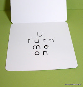
Geeks need valentines, too.


Supplies
stamps: Clear and Simple Stamps, Hero Arts (alphabet)
ink: Palette noir
paper: PTI white
accessories: not a one