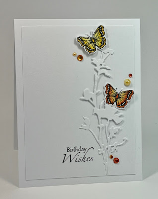
Today’s card, like the card from day 5, uses two butterflies, but the design concept is completely different. Instead of restricting the space and letting the relationship of the butterflies stand on its own (with a little bling), I put these two into context, with a die cut flower to flit around.
Today’s question is this: what colors do you avoid or neglect in your crafting?
For me, it’s yellows, oranges, and purples, generally. But over the past few years, I’ve challenged myself to explore them more, and now I can honestly say I embrace all colors.
So how about you? And remember, comments on the blog will be eligible for the drawing for the $25 gift card to Simon Says.
Mercy, grace, peace, and love,
Susan

Your butterfly cards are all amazing!
ReplyDeleteA great design Susan, I don't use many yellows or oranges
ReplyDeleteJust love the pop of color against the white! I rarely use pinks
ReplyDeleteThis is my favorite (so far) of the series. Freedom for flitting butterflies!! I love all the colors, but find myself challenged with some of the more muted tones of all the colors. I so admire the works of artists like Debbie Hughes. She uses more muted or grey-toned colors regularly.
ReplyDeleteI don't think I avoid any colors in my cards...what I use depends on the card. Love this...and all your cards!
ReplyDeletelove the white only branch. hmm. I avoid green. Which is why I have 70 pounds of green cardstock in every shade possible!!
ReplyDeleteLove that you used so many shades of the yellows in the butterflies and in the bling!
ReplyDeleteWhite die cut on white with pops of color........stunning! I love this card.
ReplyDeleteAs for colors.......I do not avoid any color, but I do find myself using blues, greens and reds quite a bit.
Priya Venkat