Pages

Thursday, July 28, 2016

Bold Christmas and a Little Break

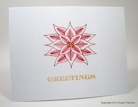
Today's card is a simple yet bold Christmas card suitable for mass production. A single, gorgeous, largish image can carry a card nicely, don't you think?


Click on the photo to see it bigger...the gold shimmer
of the sentiment is so pretty and looks great with the
gold Stickles.

And that Delicata gold is perfect. Just perfect.

I'm taking a short break from blogging to spend some time with the family. Blessings until the middle of next week or so.

Supplies
stamps: Clearly Besotted Christmas Poinsettia
ink: Hero Arts red royal, Delicata gold
paper: Papertrey white
accessories: gold Stickles

Wednesday, July 27, 2016

A Little Askew That Works for Me, and a Placement Point

Today's card is a little askew...just enough to add interest, not enough to disturb me. And seriously, check out all that white space!!!! Does my heart good.


Here are a few points to note.

1. uncbballfan commented that the askew inspiration card reflects its message...grief makes everything feel askew. Christmas, as I said in my first askew post, isn't askew. Today's card is destined for my former pastor, who is "moving up" in the United Methodist Church. She's a beautiful soul with a heart of gold. So the red poppy with the gold center on an upward incline seems very, very appropriate.

2. I've put a gold center on this exact flower image before but used real gold leaf. It was gorgeous but time-consuming, and this time I used a gold Gelly Roll pen, let the ink dry, and love the look! So very, very easy and with a $1.99 tool. Yay!


3. The above card is actually the second version I made of the card. Below is the first version. I liked it, but notice how high up the poppy is on the stamped panel. It looks like it'll tip over and fall off the panel or roll backward off the panel. (That's not exactly the message I was aiming to send my pastor!) It's completely unstable. The second card places the poppy lower on the panel, with a larger spread across the edge. It's grounded, secure, strongly placed.


Placement matters. What do you think?

Supplies
stamps: Concord & 9th Wild Flowers, Clearly Besotted A Little Sentimental
ink: Hero Arts red royal, black
paper: Papertrey white
accessories: craft foam, glue, gold metallic Gelly Roll pen

Tuesday, July 26, 2016

All is "Right" Except One Corner

After making yesterday's skewed card, I wanted to try the same layout with proper right angles. The holly card had lots of movement from the shape of the holly branches. This card relies on fun color and whimsical images. And bling!


I decided to round that one corner because it looked sort of dangerous, like it wanted to poke the flowers in their bloomers. But one of my readers (yes, you, Bev) is likely twitching right now.

While the border on this card makes me very happy, I'm not so sure about the offset sentiment panel. It's sort of strange how much I love the card that inspired this whole series, yet I can't seem to make skewed design or the asymmetry work for me. I guess I'm just too obsessive-compulsive.

Still, I wanted to share both yesterday's and today's cards to illustrate creative exploration of an idea. You learn when you play, and in the immortal words of Adam Savage (of Mythbusters), failure is always an option. Sometimes, "failure" can still be quite lovely! Some of you really liked yesterday's card, and I hope some of you feel the same about today's.

Tomorrow's card takes a different tack on the idea altogether, and I like it much better!

Supplies
stamps: Papertrey Doodlie-Do, Keep It Simple Thank You
ink: Fresh Ink tangerine, basil; Memento Moroccan, espresso truffle
paper: Papertrey white
accessories: corner rounder, craft foam, glue, rhinestones

Monday, July 25, 2016

Askew

Have you ever Googled the word "askew"? Give it a go in another tab and come back.

Isn't that just fabulous?!?! It makes the whole internet worthwhile, I think.

Anyway, I've noticed lots of cards with a layer lined up on two edges (usually top and left) but askew on the card. Like this beautiful card here.

So I decided to give it a try with my new Christmas set from Clearly Besotted. What do you think?


While I love the white space and the movement of the border, I can't love the panel being askew. A search page on Google...that's a fine visual joke. But for me, Christmas isn't askew. So for the next few days, I will share a few cards that riff off this idea without going so askew. The results made me happier because I'm just a tiny bit obsessive-compulsive.

Do you do askew on your cards?

Supplies
stamps: Clearly Besotted
ink: Fresh Ink mojito, Memento Luxe love letter
paper: Papertrey white
accessories: craft foam, glue

Sunday, July 24, 2016

Woe and Whoa!

Today was the last Sunday for our pastor at our church. In a month, our new pastor will be here, and I'm certain she will be a blessing to us all as Suzanne has been. In the interim, we have many gifted lay persons who will preach. But woe is the word for today. I spoke at both services, sharing what I've learned from Pastor Suzanne in nine years of Bible study...and embarrassed myself in front of everyone.

Some very wise, compassionate person made sure we had boxes of tissues in every pew. I wasn't the only one crying. That comforts me.

Grieving for someone who is alive, well, and moving up in the church feels right. After all, she's been a beloved fixture in my life for nearly a decade. I'm grieving, and yet I'm thrilled God has put her in a position to grow and use other gifts.

So woe is me, but go, God!

When I got back from church, I checked the Inspiration Challenge at SCS and found some wonderful fun to distract me from my woe. The challenge is Bowls...and whoa! There are some amazing bowls out there. My inspiration came from THIS PIN. This card was the result:


From the inspiration bowl, I took the color scheme (at least the dark shade looks navy on my iPad...on my computer it looks black, though), the combination of outline and block image, the leaf theme, and the glorious abundance of white space.

I love the combination of outline and block image, and the handwritten cursive script of the sentiment, not to mention its French-ness, make me very happy.

Merci for reading my blog, for putting up with maudlin mood, and for all the comments and emails.

Supplies
stamps: Concord & 9th Wild Flowers, Clear and Simple sentiment
ink: Hero Arts navy, lime
paper: Papertrey white
accessories: craft foam, glue

Friday, July 22, 2016

Inspired Butterflies

Have you ever looked at a card on a blog or Pinterest and thought, "I want to make that! It's perfect!"? And then have you realized that making this delightfully perfect card requires special tools or stamps that you don't have? Have you put your thinking cap on and tried to troubleshoot the shortcomings in your stash and realized that your second-tier measures will look, well, second tier? Have you ever then thought, "Meh. I'll move on"?

Well, don't.

Even if you can't get exactly the same look as the delightfully perfect card, you CAN improvise in creative ways that lead to a bit different, yet still wonderful, card.

I saw THIS CARD by Yana Smakula on Pinterest. Everything about Yana's card is perfect: the white-on-light-gray layering; the bright, happy colors; the fresh layout; the gobs and gobs of white space; the placement of bling; the bubbles. Those stamps, new this summer from Hero Arts, are also perfect.

But if you'll notice, Yana uses the coordinating dies for her project. Ahem. Stymied. No way on earth could I fussy cut any images well enough to make my layered pieces look as perfect as Yana's. And we all know that with clean-and-simple designs, any little imperfection is glaringly obvious.

Yana's card made me waver in my resolve to never go down the very expensive path paved with the ghosts of dies bought and unused (which would be my path, I assure you!). Then, I got to thinking.

And tinkering.

And messing around.

And feeling my way forward.

And then, this card happened.


Now, my card lacks some of what makes Yana's so perfect: the artfully stacked layers, the perfectly placed blue shell that creates perfect asymmetry, the bubbles. But I compensated for the lack with a few touches of my own that add interest and design goodness.

First, I simplified to two images of butterflies rather than attempt the layering, while still incorporating Hero Arts layering stamps (butterflies instead of sea creatures).

Second, since I couldn't add dimension with layering, I trimmed my stamped panel smaller and left the tips of the wings for fussy cutting. The clumsiness of my fussy cutting isn't nearly so obvious when there's so little of it on the card! To leave those wing tips overhanging, I used a quilting ruler and craft knife, cutting up to the wing on either side, and then using the knife free-hand to fussy-cut the wing tips.

Third, I used two shades of pink for bling instead of the clear Yana used. On her card, clear gems made sense, but I needed the gems to carry more design weight and thus used two sizes and twho colors to add interest.

Fourth, stamping the butterfly bodies in black subtly unifies the whole design, pulling together the images and the sentiment. It also creates some fun lines and movement, don't you think?

Fifth, rounding two opposite corners implies more movement.

Sixth, the white is layered on white. Because I made it, and that's just what I do.

The end result...a flattish card that compensates with movement, line breaks, color, and bling.

Thank you, Yana, for a wonderful inspiration card!

Supplies
stamps: Hero Arts Color-Layering Butterflies
ink: Hero Arts, Ancient Page
paper: Papertrey white
accessories: rhinestones, corner rounder, quilting ruler, craft foam, glue

Thursday, July 21, 2016

Scraplet, Versions 3.0 and 3.1

The first Scraplet card is here, and 2.0 is here

My third variation on the inspiration piece changed the color scheme again and incorporated the metallic marker border (just in silver this time). This Christmas card is vaguely patriotic with a blue snowflake and red sentiment.


Now, as I looked at the card, it seemed that something was missing. The silver border seemed festive enough, but that snowflake looks a tad flat, with a matte finish no real snowflake ever had. Of course, that stamp doesn't show a "real" snowflake, nor have I ever seen blue snowflakes, so verisimilitude isn't exactly my goal. Bling seemed to be in order.


One rhinestone perks this card up nicely!

Never underestimate the power of bling.

So now you've seen three different versions of a single layout. Which was your favorite?

Supplies
stamps: Papertrey Snowflake Serenade, Side by Side Sentiments
ink: Hero Arts pool, red royal
paper: Papertrey white
accessories: rhinestone, silver Prismacolor metallic marker, craft foam, glue


Wednesday, July 20, 2016

Scraplet, Version 2.0

It's so much fun to play around with a layout and see what sort of different looks you can get from it. Today's card riffs on yesterday's card for a completely different, autumnal feel.


Yesterday's lime card was monochromatic, and today's incorporates complementary colors of red (orangish) and green (olive-ish) with dark brown and a copper border. Adding the border defines the space much more clearly...without it, the open wreath looked odd. But the effect creates a completely different feel from the borderless lime card.

Same layout, but different feel. Tomorrow, Scraplet, Version 3.0.

Supplies
stamps: Hero Arts
ink: Memento bamboo, Ancient Page henna, VersaMagic jumbo java
paper: Papertrey white
accessories: craft foam, glue, copper metallic marker, ruler

Tuesday, July 19, 2016

Scraplet Card Says Be Happy

Wow. Christmas spirit is thin on the ground right now for some of you, isn't it? I've got more Christmas cards to post, but today, you Scrooges will get a break with a card appropriate for the northern hemisphere in July.

Citrus summer, icy margaritas, key lime pie...yummy thoughts evoked by this simple card made from a scrap.


This was inspired by a pin of a business card...as so many of my scraplet cards are.

Limes and love to you in the hot, humid, lazy days of summer.

Supplies
stamps: Concord & 9th Layers of Love, Papertrey Fruitful
ink: Hero Arts lime, Memento new sprout
paper: Papertrey white
accessories: craft foam, glue

Monday, July 18, 2016

Delicata Silver Ink and Premature Picture Taking

So, I have encouraged you to get the Delicata golden glitz ink because, you know, it's AWESOME. Now that I've tried the Delicata silver shimmer ink, I can say that it's VERY GOOD.

Not quite as awesome as the golden glitz, but close.


As you can see in the close-up, there's a nice shimmer to the Delicata, but it's not quite as impressive as the bright golden glitz. It registers silver-gray at a distance, and the shimmer isn't as obvious. Still, it shows up well and looks lovely!

It dries as quickly as the gold, too.

Definitely recommended!

Now, I've typed this post and just noticed I'd completely forgotten to draw silver lines to "hang" the ornaments, which means they are magically floating in space. It's Christmas magic, folks!

Are you buying that?

Reader Beth S. requested my opinion on the silver ink, so I'll just leave this post as is. It's been a long day, I'm tired, and I don't trust myself to draw those lines tonight.

*sigh*

Premature picture-taking.

How embarrassing.

Supplies
stamps: Clearly Besotted Ornamental Style, Papertrey Keep It Simple Christmas
paper: Papertrey white
ink: Memento Luxe love letter, Delicata silver shimmer
accessories: rhinestones

Sunday, July 17, 2016

A Different Thought for Christmas

The word Christmas conjures images of candy canes, bells, poinsettias, trees, ornaments, and holly, and gold, silver, red, and green. It's often a joyful, jolly, frantic, and consumerist sort of holiday.

Sadly, too many people simply aren't in a position to feel the holly, jolly fun. Maybe they are dealing with job loss, financial woes, grief, health concerns...any number of crises that happen in life. But feeling alienated at Christmas is an all too common experience.

We can, with our cards, respond sensitively to these situations. Instead of sending Merry Christmas greetings to someone who's anything but merry, how about a wish of peace?


A wish of peace is always appropriate. Changing up the colors from traditional red and green helps convey a message that says, "I know you're not jolly this year but want you to know you are on my mind this Christmas, and I wish you peace, comfort, and love."


As you make Christmas cards this year, think about making a few that offer peace to those who suffer. A poinsettia in pool blue, a sentiment in celery, and a bling in teal acknowledges that this Christmas isn't holly jolly, but the peace of a holy day can make a huge difference.

Just something to think about.

Supplies
stamps: Clearly Besotted Christmas Poinsettia
ink: Fresh Ink pool, celery
paper: Papertrey white
accessories: rhinestone

Saturday, July 16, 2016

OLS29: Diagonal Christmas

When I first tried to make a card for OLS29, Christmas in July, I struggled. You see, my urge to purge left me with fewer Christmas sets and, oddly, less motivation to make Christmas cards. But given the length of my personal Christmas card list and my need to contribute to our church's card shop and holiday bazaar, my Christmas mojo simply had to return. I'm running out of time.

A little retail therapy was in order.


Isn't it great how we justify shopping?

Anyway, my favorite of all these sets is Clearly Besotted's Christmas Poinsettia (pictured far left). This classic set provides rather formal yet very interesting images of holly and poinsettias, combined with a similar and wonderfully traditional font.

The holly branch has some wonderful movement to it, and I wanted to take advantage of that on a one-layer card. Largish stamps like that present a placement problem for one-layer CAS cards...they take over a lot of white space, which limits how they can be used. (Consider yesterday's card, which used that huge palm leaf stamp from Hero Arts...not much white space!) In this case, I decided to play around with horizontal and diagonal placement to see which I preferred.

First up, the horizontal placement. This design takes advantage of the rule of thirds by placing everything over the bottom third line of the card. The curves of the branch add movement, and the overlap of the sentiment and holly creates unity.


But I don't like it. The overlap makes the design look cluttered and crowded, and the horizontal design feels forced and awkward. I don't think that opening up the sentiment will rescue this layout at all; forcing the holly into this horizontal position just doesn't feel natural.


So let's look at the diagonal version. Note how open the design is...the elements can breathe. There's plenty of space to use the whole branch without the need to truncate it awkwardly. Also, note how natural the diagonal placement looks. Your eye moves easily and naturally from upper left to lower right. The holly points at the sentiment from the left and leads you into the card on the right. The sentiment is the focal point, easily read and placed in the lower right sweet spot.


Ahhh. This is more like it!


Now, large stamps like this holly branch can be used on CAS cards lots of different ways...but for one-layer cards, it pays to work with the image, not against it. Straight images generally make great horizontal or vertical designs, but loose and flowing images need a loose and flowing layout.

And thus endeth the lesson.

Now, please go play along with the OLS Challenge. Otherwise, come October/November, you'll be panicking!

Supplies
stamps: Clearly Besotted Christmas Poinsettias
ink: Fresh Ink mojito, merlot
paper: Papertrey
accessories: none

Friday, July 15, 2016

Recovery

Have you ever finished making a card, set it up on your desk to admire it, and found you hated it? Maybe it wasn't necessarily a bad card, but it didn't look like you made it. Or maybe it was pure bad ugly. Anyway, this is the card I made to recover from just such a failure, using the same large Hero Arts palm leaf stamp as on the epic failure, but with a totally different layout, color scheme, and technique.


First, I masked the center area with a piece of copy paper and temporary adhesive and positioned it in the center with the help of my quilting ruler. Then, I stamped the palm leaves in Impress Ink grass. After removing the mask, I stamped the sentiment in Memento Luxe espresso truffle. Finally, using a metal ruler, I drew the silver lines with a metallic ink marker by Prismacolor.


Not a bad recovery, eh?

And a perfect card for us all in these very troubled times.

Supplies
stamps: Papertrey, Hero Arts
ink: Impress Fresh ink, Memento Luxe
paper: Papertrey white
accessories: silver metallic pen, ruler, copy paper, temporary adhesive


Thursday, July 14, 2016

IC553 Again: Lucky Stars

Now, black and white together generally make a formal, elegant, or dramatic statement. But the Pile of Love card shows the combination can be soft and subtle, and today's card shows the loose, fun side of these two opposites.


Here, the stars are scattered randomly, guiding your eye all over the card until it settles on the sentiment. There's energy, but it's not dramatic, and it's certainly not elegant or formal.

And here's the inspiration photo I used:

Source


I'm so grateful for Audrie's challenge because it's opened my eyes about a color combo that I'd pigeonholed into wedding or New Year's Eve cards.

Supplies
stamps: Papertrey Star Scribbles, Hero Arts Shoot for the Moon
ink: Memento Luxe black
paper: Papertrey white
accessories: none

Wednesday, July 13, 2016

IC553: B&W Thanks

Here's the Inspiration Challenge photo I chose:

Source


Here's the card I made:


So very glad I bought Papertrey's Wet Paint set. 

Please, please, please play with black and white sometime soon. This truly has been an amazingly fun challenge!

Supplies
stamps: Papertrey Wet Paint
ink: Memento Luxe tuxedo black
paper: Papertrey white, black
accessories: none

Tuesday, July 12, 2016

IC553: Subtle Black and White

Yesterday's card showed lots of drama in the stark black-and-white contrast, but what happens when you just put a tiny bit of black on a whole lot of white?

Softness and subtlety.


This card was inspired by this pin on the Pinterest board for this week's IC553 at Splitcoast. Here's the inspiration photo:


Note that the black backdrop in the photo adds drama, but I wanted to combine the lightness and calm of yesterday's photo (below) with the texture and sentiment of today's inspiration photo and see what happened.


EEEEP! I'm happy with the results. After all, I'm giving this card to my husband, and after 30 years of marriage, we've learned that drama is over-rated and lots of love creates peace and harmony. (Well, most of the time!)


I continued the theme on the inside with a strip explaining the pile of love on the front.


I used the StampinUp Rotary Alphabet stamp and some light-weight card stock to make tearing easier. To give the card more texture, I used a glue pen to add glue only to the centers of the torn strips. That way, the edges stay wavy.

See what I mean about getting wildly different looks from black and white?

*happy sigh*

Supplies
stamps: StampinUp rotary alphabet
ink: Memento tuxedo black 
paper: Papertrey white base, 80lb Neenah Solar white for strips
accessories: glue pen

Monday, July 11, 2016

IC553: Yes, I Used a Black Card Base

We'd likely have to go back months in Simplicity's archives to find a card with a colored card base. With me, it's always white, white, white.

But today, white simply would not do. No sirree, it would not do.


This card was inspired by this pin:


These three white-framed pieces are, of course, on a white backdrop, which might make you think it would be a natural for my favorite white card base. When translating home decor to a small piece of card stock, however, sometimes you have to make modifications.

First, my card repeats the same word in three different sizes and fonts, while the original uses three different words in the same calligraphic style; while a card could use philosophical words, I like mine to be unified in their message, generally speaking, and three hellos send a clearer message than creativity, personality, and curiosity. Second, my card has a black "wall" to give the raised panels some pop (on a white base, they looked blah). Third, my panels have no frames because I wanted to see what would happen if I used a black base rather than repeating yesterday's layout with the black mat.

We can't get too crazy with the layers on a blog titled Simplicity, now, can we?

Note that the contrast created by the black base adds drama that's lacking in the inspiration photo. Please also note that I would never paint a wall black just to create drama. In my personal home decor, I'm a fan of peace and tranquility, not drama, and I love this dining room as pictured. I would live there in a heartbeat. Besides, dramatic black-and-white decor always takes me back to the Gross Chemistry Building at Duke University...a place full of memories I don't care to revisit.

Anyway, while my home decor isn't dramatic at all, drama is generally preferred on cards, especially if number of comments are any indication. Check out any gallery at Splitcoast. The cards with the most comments are usually pretty dramatic, high-contrast or very colorful cards.

Audrie's IC553 invites drama. I encourage you to play along!

Supplies
stamps: Hero Arts, Papertrey
ink: Memento Luxe tuxedo black
paper: Papertrey white and black
accessories: craft foam and glue

Sunday, July 10, 2016

IC553 Black and White Flow

oh, me.

oh, my.

oh, heaven.

oh, me.

oh, my.

oh, so much fun!


I'm lovin' Audrie's Inspiration Challenge IC553 this week. It's Black & White, based on this pinterest board. In just a few hours, I made SEVEN cards and love them all...for very different reasons.

In the process of doing this challenge, a few things occurred to me. First, black and white can be bold and dramatic or soft and subtle; fun and whimsical or elegant and formal. Second, that level of diversity really, really, really appeals to my creativity and gets my flow going.

Let's just say my flow has been dammed up this past week. But it's flowing again, thanks to Audrie and IC553. I'll share the results over the next few days.

Today's two cards show the more formal, elegant appeal of black and white.


Inspiration Source

First up, a very simple, straight-forward square design with a round focal point. Remember that angles love curves. Or curves love angles. Anyway, the dramatic tension between the roundness and squareness adds interest to this super-simple card. It hits the bullseye of symmetry and balance.

Sort of literally.

Next, we take the same basic idea up a level of complexity and give it a funky twist.

Inspired by a number of feather pins like THIS and
art displays like THIS

Here, I've stamped the three smaller feathers from Waltzingmouse's Funky Feathers and punched them out with different positions on the squares: offset to the left, centered, and offset to the right. There's still horizontal symmetry, of course, around the line of the center feather, but it's thrown ever so slightly off by the denser feather on the left and the open feather on the right.

Also, the tri-panel strip is placed low on the card, creating vertical asymmetry. Note that the strip has equal white margins on the left, right, and bottom, but there's lots of glorious white space above it. Ahhh.


These cards are made possible by Memento Luxe tuxedo black ink. Having a super-thick black ink makes all the difference. The key is giving each stamped image a few minutes to dry completely. I start a new card while the previous one dries, and there's a wonderful rhythm to the creative flow.

Flow, baby. Flow!

Supplies
Top Card
stamps: Papertrey Mendhi Medallions

Bottom Card
stamps: Waltzingmouse Funky Feathers

Both Cards
ink: Memento Luxe black
paper: Papertrey white, black
accessories: craft foam, glue, square punches


Saturday, July 9, 2016

God Loves You

The world sometimes feels like it's gone crazy. Bad crap is happening, and boy do we hear all about it...on social media, the news, the radio. We're bombarded with the hard and bloody parts of reality. In the midst of this misery, I read these wise words shared on Facebook: "Don't hate evil more than you love good."

In the midst of negative media bombardment, don't despair and don't fill up with the hate. Don't forget that there's more good in the world than evil. We just don't hear about it as much because good stuff doesn't sell clicks online or make you tune in on television. Fear and anger and hate are stronger motivators and have more powerful marketers.

Another quotation making the rounds on social media this weekend comes from Martin Luther King, Jr. "Darkness cannot drive out darkness; only light can do that. Hate cannot drive out hate; only love can do that."

Yep.

If you're a Christian, you call the source of love in the world by the name of God and likely believe (as I do) that we love because He first loved us. From the very beginning of time to all eternity, with a love that we cannot even comprehend.

In times of darkness, however, we sometimes forget that God loves us. Each one of us. And everyone around us. Whether we believe in Him or not, He loves us.

So this is for each of us right now, to remind us that all is not wrong in the world.


He loves us, and His heart breaks with ours. He is present and accounted for in each of these recent tragedies, in the outpouring of love and support for victims and families and friends and communities.

Don't hate evil more than you love good. Don't get sucked into the darkness.

Instead, reflect love all over the darkness, people. Shine it bright and clear and strong. Darkness gives way before light. It can't do anything else.

Amen.

Supplies
stamps: Paper Smooches, Papertrey
ink: Memento, Memento Luxe, Impress Fresh Ink
paper: Papertrey
accessories: not a one needed


Thursday, July 7, 2016

Father Knows Best Goes Girly

While staring at the funky circle-leaves for the tree in Papertrey's Father Knows Best set, I thought, "PINK!"

And here it is.


Pink and gray with a border of silver and bling...a fun and feminine thinking-of-you card from an image originally designed for a Father's Day set. That's versatile. And shows the power of color in our gender stereotypes.


Experiment with color changes to take masculine sets girly, and girly sets masculine. See what happens!


Supplies
stamps: Papertrey Father Knows Best, Keep It Simple Thinking of You
paper: Papertrey white
ink: Memento Luxe rose bud, London fog
accessories: craft foam, rhinestones, silver metallic marker, glue


Wednesday, July 6, 2016

Christmas Layers and Distress Ink

Today's card won't work for the OLS Challenge this month (too many layers) but I still love the design and the matting here.


The inks are Tim Holtz distress inks...brushed corduroy and aged mahogany. The corduroy is greenish khaki (reminds me a bit of Brilliance pearlescent olive), and the mahogany is a very dark red with lots of brown in it (or brown with a lot of red in it, if you prefer). Both create a lovely pop of rich color on crisp, white card stock.


Yes, I'm very much behind the trend with Tim Holtz Distress Inks, but you have to admit, when you have dozens scores hundreds lots of ink pads, you need to be careful about trying more. I picked brushed corduroy, aged mahogany, and weathered wood (a soft blue) as my three starter colors in the cubes because I thought they'd make interesting Christmas cards. This card isn't classic Christmas shades of red and green, and that makes it interesting.

At least, I think so.

My card, however, doesn't take advantage of the versatility of these inks. What are your favorite things to do with distress inks? I am looking forward to sprinkling water on them for that lovely mottled look, but what else do you suggest?

Thanks in advance!

Supplies
stamps: Papertrey Wet Paint Holiday
ink: Tim Holtz distress brushed corduroy, aged mahogany
paper: Papertrey
accessories: glue