Tuesday, June 30, 2020

Twinkling H2Os--Oh, My!

Okay, so today's card isn't the best design in the world (feels sort of squat and clunky to me--kind of like me, actually, after so many days of quarantine eating), but two things about this card send me over the moon: the Subtle Textile embossing folder and the Twinkling H2Os, which I'd practically forgotten about. 


I randomly splodged three shades of Twinklings (two greens and a blue) onto a piece of watercolor paper and let them dry. The branch is a die from the Forever Fern bundle from StampinUp. 

Check out that shimmer!


*swoon*

The Subtle Textile embossing folder makes the perfect, subtle (surprise!) backdrop, and I am so looking forward to playing with it more. 

If you, like I, have a half-forgotten stash of Twinkling H2Os (or similar shimmery watercolor), you might enjoy, as I have, taking them out and playing with them again. They really are swoon-worthy. 

Mercy, grace, peace, love, and kindness,
Susan

Monday, June 29, 2020

Coloring Die Cuts

While surfing on Pinterest, I saw a picture of someone watercoloring a die cut and thought, huh. That looks smart. 

And it is not only smart, but it's easy.


For this technique, I used watercolor paper for the die cuts (Tim Holtz dies, by the way), a water brush, and distress inks. I smooshed the ink cubes onto a spare piece of transparency, picked up the ink with the brush, and colored the die cuts, letting each color dry before adding the other colors. 


The iridescent pearls on the Healing Wishes card are beautiful!


The spatters on the sympathy card were made with a regular watercolor brush. 

Bottom line, this technique is easy and fun, and I'm probably the last to discover it. ;-)

I have a tiny, little mini-rant. Can we please stop parent shaming? I witnessed an incident of parent shaming yesterday (not aimed at me). It caught me totally off guard, came from an unexpected source, and took me a while to process. Did I hear correctly? (Yep.) Seriously? (Yep.) At church? (Yep.) Was it necessary? (Nope.) Absolutely not. Did it upset the parents who were targeted? You bet it did.

Brene Brown recently posted a video in which she promoted the idea of assuming everyone is doing their best. The vast majority of us are...and we're doing fine. Just like these parents who were just living their lives. 

Assume everyone is doing their best.

Let's go with that, shall we? 

Thank you for listening. 

Mercy, grace, peace, love, and KINDNESS, 
Susan 


Sunday, June 28, 2020

Summer Silhouettes


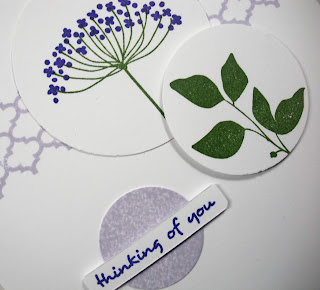
While I revisited old stamps a few weeks ago, StampinUp's Summer Silhouettes begged to be used again. ("Use me, please! I'm so thirsty for ink! Come on. You know you want to....")

It's such a swell set, with the two-step Queen Anne's lace image, so I decided to use some circles (grounded with the pretty lattice border stamp from the set). 


Since I didn't have cardstock to match the soft lilac ink (Hero Arts), I inked up a largish shadow stamp, stamped some white cardstock, and then punched out the lilac circle. 

Shadow stamps are awesome!

And so is purple. I really don't use it enough. 


Last post had some really fun comments! Thanks to all who left them. Several people emailed regarding my StampinUp order. Here you go:


Basically, I needed a cherry cobbler reinker and got a little carried away. 

The die set goes with Forever Fern, and the embossing folder is Subtle Textile...which is A-MAZING! I'll be posting pictures of a few cards with Forever Fern soon. 

Survival strategy for this week: temporary news black-out. Will pick back up in a few days. Need to get sane again. I'm also reading a Lady Darby mystery, teaching a Zoom class on listening tomorrow morning, scheduling my younger son's sports physical for marching band, scheduling myself an eye appointment, and planning a Facebook Live devotional for Friday. 

What survival strategy are you employing this week?

Mercy, grace, peace, love, and kindness,
Susan


Thursday, June 25, 2020

Perfect Beer Can Birthday Cake

This darling little birthday cake on a platter is from The Stamping Village Happy Birthday set and is Pink Fresh Studio's contribution to the set. It's the perfect dainty size for me, and the darling tiny sprig of leaves is just perfect.


Honestly, I think my matting here is too clunky for the image, but I love the colors and the fact the DMC floss matched the ink perfectly. That just doesn't happen often enough in my world. 


The colors are a repeat of the beer can colors from yesterday's post. If you get a pop up asking for your birthday, just put a year in that gets you to the legal drinking age in the U.S. (21). So basically, any year before 1999.

My use of "Bob's your uncle" provoked some comments. I had no idea that the phrase wasn't widely known because it's been in my lexicon for forever. I googled it to find out where it came from, and it's common in Ireland, Great Britain, and the Commonwealth. Hmm. I distinctly remember my very southern grandmother using it. It means "there you have it," a concluding phrase that's humorously satisfying. 

I love English. I sure hope I get to teach it this fall. At the moment, it's not looking too good. 

What are some phrases you use that make you giggle? Inquiring minds, and all that.  

Mercy, grace, peace, love, and kindness,
Susan

Wednesday, June 24, 2020

Beer Can Inspiration

Last week, my husband opened a can of beer, poured his glass, and set the can down in front of me. I squealed, "This color combination is AMAZING!"

Yes. Yes, it is.


This stamp comes from The Stamping Village set called Happy Birthday and was Avery Elle's contribution to the set. I colored it by scribbling watercolor crayon onto a scrap of transparency and painting it onto the balloons. The card looked okay but really needed something to ground the stamped panel. Since there was quite a bit of color left on my transparency, I painted the lines onto a random strip, trimmed it down, and Bob's your uncle!


What a satisfyingly simple card. 

Tomorrow, my first order from StampinUp in years will arrive. Can't wait to play! What new crafty item have you bought lately that have you itching to play? OR what old item (like watercolor crayons!) have you taken out to play lately? OR answer both!

See Mary Stamp commented on my last post with the suggestion of adding kindness to my tag line. I love this! So here it is.

Mercy, grace, peace, love, and kindness,
Susan

Tuesday, June 23, 2020

Live Simply

For years, I've studied minimalism...in design and in life. I'm not a minimalist because, well, craft supplies and books. Plus, I'm married to a maximalist and birthed two maximalists as well. 

But I do have a minimalist wardrobe and design sense. The New Hero Arts sentiment set called Zen Messages has this lovely Live Simply sentiment that speaks to my soul!


The window was made with a Hero Arts square die and then trimmed evenly on three sides. It's raised on dimensional tape. The background colors are Distress shabby shutters and tumbled glass. The branch is from a Tim Holtz die and the butterfly is from a Tim Holtz punch. 


I shared with my beautiful friend (from yesterday's post) that I had hit a wall today. So sad, frustrated, angry, depressed! She texted back: "The world is crazy and I've made the decision to just worry about my corner of it. It helped me." Her words helped me, too. And maybe you need to read them as well. 

Do you try to live simply? If so, how? If not, what do you love about your complicated, messy life?

Mercy, grace, peace, and love,
Susan


Monday, June 22, 2020

Beautiful

I love this sentiment. For several years at the Special Olympics bowling tournament in our area, a particular bowler was assigned to a lane near Jack. Every time he bowled, he would yell, "Beautiful!" Didn't matter if it was a gutter ball or a strike, he thought it was beautiful. 

And he was right. 

We have missed him at the tournament the past few years, but George and I still randomly yell "Beautiful!" when we see something good...and smile at each other.

Today's poppy card is destined for a friend of mine who embodies beautiful. Not only is she beautiful inside and out, but her mission in life is to make the world more beautiful for her family and friends. She's an inspiration. 


The poppies (stamped in Archival poppy ink) are from Concord and 9th's Wild Flowers set, and the sentiment is (I think) from an Altenew set. The stamens of the top image and the center of the bottom image were colored with a Sakura Stardust gold pen, and the gold ink is Delicata. 

The mat was distressed by repeatedly running it through a crimper, flattening with the Cuttlebug, and roughing the edges with a scissors blade. 


What beautiful people have you noticed in the past few weeks? 

And try shouting "Beautiful" randomly throughout the day. It's a lovely way to smile!

Mercy, grace, peace, and love,
Susan

Sunday, June 21, 2020

Summertime

In honor of the summer solstice...and the delightful opportunity to watch (online) the sun set at Stonehenge yesterday, as my many times great ancestors might have done. 


These stamps are extremely elderly mature wood-mounted rubber from Hero Arts. The ink is a Hero Arts ombre ink pad and provides excellent, bright, strong, and very warm color. 


Originally, I left the tree image as inked but decided that it looked a bit, well, lackluster. Out came the clear Wink of Stella pen, and BAM! Luster. Here's a copy of the before image:


This has been the weirdest spring of my life, and summer may not be much better. It's all very strange and unsettling, and I'm finding myself struggling to concentrate. Even reading has become difficult, and I'm a dedicated reader!

What are you struggling with most right now? Have you learned of any new strategies for coping that you might try? 

Mercy, grace, peace, love, and safety,
Susan

Friday, June 19, 2020

Sea Shells by the Sea Shore

Here's the next installment in my continuing effort to use old, wood-mounted stamps. These are from Hero Arts.


The inks are also from Hero Arts, their ombre inks, which I don't use enough. The card is largish...7 1/4" by 3 3/4" and fits into a standard envelope available at Marco's.


I love the beach. It's definitely a happy place for me. My husband...not so much. He's more a mountain or lake person. I love those, too. I'm flexible that way.

He's been researching places to retire (all near mountains or lakes), and out of the blue he asked me recently if I wanted to live near the beach. My emphatic no surprised him. Just because I love the beach doesn't mean I want to live there. Visiting periodically works just fine for me, and with global warming, living there doesn't seem like such a good idea for the long term. I'm practical that way.

But it's been years since I got sandy toes at Rehoboth Beach. YEARS! I feel like having some vitamin sea next time I am able to visit my sister and mom in Maryland, COVID permitting.

This card reminds me how long it has been.

How about you? Are you a mountain, lake, or beach person? Which location fills your soul? Or do all of them fill different needs?

Mercy, grace, peace, and love,
Susan

PS I've "devoted" again at First United Methodist Church of Springboro's Facebook page. If you're looking for a mercy message today, please check it out!

Tuesday, June 16, 2020

More Fun with Lovely as a Tree


Y'all. The past few weeks have been crazy, and my heart and brain have been preoccupied, as, I imagine, yours have been. The last few days, I've been on a break from the news to process and pray. I've started reading So You Want to Talk about Race by Ijeoma Oluo. It seems a good place to start. 

For now, however, let's escape back in time to this lovely old set and see my new takes on it for Christmas. 


Yes, I used a green card base. Woohoo!!!!


BTW, I used circle punches for this card, but a few days ago, I received my Hero Arts order that contains their Infinity Circle dies, which will yield smoother circles for future cards. Oh, how fun!

From bare branches to evergreen....


The watercolor effect comes from Arteza brush pens applied directly to the stamp, spritzed, and pressed to paper. The star is from an old PTI set and is stamped in Delicata silver. 


Peace on earth. Oh, how I long for it. 

Mercy, grace, peace, and love,
Susan

Tuesday, June 9, 2020

Vintage Hero Arts Birthday

My instinct was to title this post "Old Hero Arts Birthday," but vintage sounds so much better. This wood-mounted stamp is pretty old (2000), but with the happy colors and white layers, I think it looks fresh and fun!


Colored with Copics in complementary orange and blue...happy, fun, energetic!


I noticed that yesterday's post didn't include links to the inspiration piece or the church Facebook page. So let me correct that now. 


Do you ever pull out vintage stamps from your hoard collection? How do they work for you if you do? I've mostly had fun with this, but several older stamps that I love haven't yielded fresh results...in fact, they've been rather frustrating. I'm wondering if I should get rid of them. 

But they're so pretty, and I'm torn!

Mercy, grace, peace, and love,
Susan

Monday, June 8, 2020

Sending Hugs

Life's gotten pretty weird/tragic/scary around this country lately. We could all use a hug and encouragement, because out of all this mess...hope. So here you go.

Card Size: 6.25" x 3.5"

Further adventures into really old, wood-mounted stamps, this one a Delta stamp with copyright date of 2002. I colored the stamp with Arteza brush markers (two purples and a green) and spritzed with water. The bold, bright colors made me so happy!


The mat layer is distressed (inspired by this PIN) by running it repeatedly through a crimper (Fisksars) horizontally and vertically, and then through the Cuttlebug so it didn't look so crimped. Then, I ran a scissor blade across the edges. The texture reinforces the torn vellum nicely, I think. 

So hugs to you!

If you're interested in a daily devotion, check out ours at First United Methodist Church of Springboro on Facebook. I'll be giving another tomorrow, but it's well worth checking out the other church leaders and members who have given devotionals. You'll find them all on the link provided. (I hope!)

Mercy, grace, peace, love, and virtual hugs,
Susan


Wednesday, June 3, 2020

Imperfectly Pretty


Today's card demonstrates that I'm not as good with Copics as I'd like, but wow, do I love this card!


At a distance, this coloring is fine; it's not until you look at the close-up that you can see I colored outside the lines in a few places. Nevertheless, this gorgeous PSX stamp fills me with joy!


I colored scraps of paper with the warm gray and cream colors, and then punched the solids to add some interest to the circles. The sentiment comes from Papertrey's Traveler's Journal: Field Notes set. While at first I wasn't sure about the colon at the end, I decided it's a lovely invitation to open the card to find out what the summer observations are! 

Many thanks to all of you who weighed in on the issue of StampinUp larger embossing folders in the Cuttlebug. I truly appreciate the help!

Finally, on Friday, I'll be doing another devotional through Facebook Live. I will share the recording on my Simplicity Facebook page if you are interested, or click in at 9:30 EDST Friday to watch live at First United Methodist Church of Springboro. This Friday's devotional theme will be listening and will be based on Acts 6:1-6 and James 1:19.

If you're looking for a daily devotion, check out the church's link. All the previous devotions are available for you to watch, and they come from many different, Spirit-led perspectives. Wednesday, June 3, was particularly touching to me.

Stay healthy, safe, and inky!

Mercy, grace, peace, and love,
Susan

Monday, June 1, 2020

Father's Day in Trees and a Question

So my visit to older stamps continues in today's post with a VERY old stamp set...Lovely as a Tree, by StampinUp. The copyright date on my set says 2001, and I probably bought it in 2003 or 2004. It's perfect for Father's Day cards, so here's my father-in-law's card. 


The two images were colored with watercolor crayons, which I scribbled on a transparency and then painted onto the images. I purposefully made the full tree brighter and more colorful than the leaves and acorn. And that tiny little punched leaf adds a bit of interest. 


Timeless sets like this are precious, and I love how the circles give it a fresh, fun look!

George liked this card for his dad, so I fished around in my wood-mounted tree stamp box and found this old stamp (2003) from Rubber Monger, which a friend gave to me, to make his Father's Day card. 

George loves both aspens and birch trees, and because the two are so similar, I don't mind mixing species on this card. The trees on the stamp are aspens (probably, given how they are growing together like that) and the background embossing folder is Sizzix (Tim Holtz) Birch. I really like how the two trees seem to hug each other. The fir in the background is kinda weirdly placed, though. Dead center would not be my design choice. Nevertheless, I really like this card and know George will, too. 


This image was colored with Copics. Very simple and easy. And that birch embossing folder is the BOMB!


So now for my question. I fell in love with the Subtle embossing folder from StampinUp's catalog, but I only have a Cuttlebug. I suspect it won't fit. Anyone have experience with this? If it won't fit, does anyone know of a similar embossing folder that might fit in my Cuttlebug?

Thanks in advance for the help!

Stay safe, make an effort to hear others' stories with compassion and curiosity, and be part of the love in the world!

Mercy, grace, peace, and LOVE,
Susan