Thursday, January 31, 2013

Trapped White Space Defined

Last week, I posted a card and complained that I had to offset the sentiment so it wouldn't trap white space. Several people asked me to explain what trapped white space is, so here goes.

Trapped white space is white space that is trapped in a design, boxed in by design elements, thus creating an unattractive hole in the design. It is much more common on scrapbook pages, where elements can overlap and create trapped empty space that draws the eye where you don't want it to go.

Properly used, white space opens up designs and allows the artist to direct the viewer's eye to focal points and create visually interesting layouts, but when white space gets trapped unattractively by a poorly planned design, the eye goes to the trap, not the focal point.

Here's an example of trapped white space:


Notice how your eye is drawn to the hole in the middle, trapped between the two butterflies and the sentiment. The white space can't escape to the edges of the design...it is trapped.

What NOT to do!


Rearranging the elements so the white space can flow to the edge of the design opens up that space...and also creates more movement in the design.


Same picture, with arrows

Notice how easy it would be to create trapped white space if the blue antenna overlapped the pink butterfly wing. Boom. Trapped space...perhaps not terrible, but not ideal either.

Now, not all trapped white space is bad. In fact, it's sometimes quite necessary in a design. Think about the insides of handles on coffee mugs or tea cups, or outline polka dots. Yep, the white space is, technically, trapped because it can't escape to the edge of the space, but it's integral to the design and doesn't distract from the main image.

Consider this lovely image from Hero Arts. There are tiny areas of trapped space, but they don't draw the eye.


Check out the flow of white space as I marked it. The small trapped areas are marked with green x's and the open areas marked with pink arrows.


You can bet those pink arrows were planned, not accidents, and those areas of green x's were kept small on purpose. They create depth in the design without pulling the eye away from the dogwood flowers.

This image from Papertrey's Through the Trees is another good example of white space trapped for a reason. The rectangle boxes in all the white space quite literally, as if we're looking through a window into the woods. The so-called "trapped" white space is integral to the design and pulls your eye through the window. Stamp a red bird on a branch in this image, and you have a gorgeous, framed scene...not an ugly hole.


I hope that clarifies trapped white space.


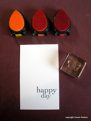
Now, let's revisit the stamps from my original card. I tried stamping a sentiment directly under the three leaves, just to see if I was right to offset the sentiment in the original.


Definitely trapped, and not very attractive. If I stamped the word farther below the leaves, it would just float in space, and any sense of unity would be lost.


While the "fix" below wouldn't have worked on my original card, it's a perfect way to use that little trio of leaves to highlight a sentiment. The tiny triangle of trapped white space doesn't draw the eye...it anchors the sentiment to the image, creating a stronger sense of unity and balance.


And that's what I know about trapped white space.

Wednesday, January 30, 2013

OLW125

First, I want to apologize to Karen for dropping the ball on OLW124 last week. Her doodling challenge was adorable!

Second, I want to jump on Ardyth's OLW125 before my brain farts again.

Oh, I'm sorry. Was that vulgar? Sometimes I type inappropriate things.

Anyway, on to Ardyth's OLW Challenge, which is to make a card that represents your perfect day. In a sense, this is a really hard challenge because what constitutes a perfect day for you? Maybe it's an easy question for you, but my brain is all over the place. So much makes me happy that fitting it all on a 4.25" x 5.5" card seems impossible, especially if I want to leave some white space. Ardyth solved that problem beautifully on her card, with a fabulous graphic representation of 12 things she loves.

I went in a little different direction and came up with a rather wild card for me. You see, my brain, despite its occasional flatulence, is a good brain, and I'm rather fond of it. It has a hard time going to sleep at night because the world is such an interesting place and there are so many wonderful, beautiful people and things to think about. As much as I crave simplicity and white space, my brain will have none of them.

Which is why I'm just a little bit weirdly contradictory, you know.

In all honesty, my perfect day is messy and busy and full.

So here is a messy and busy and full card.


Please note that there is some order in the chaos: the triangle created by the pink, fuschia, and orange elements;  the straight lines of the beaded bars and sentiment; the trios of orange and lavender.

Doesn't the jagged line of beaded bars look like a heartbeat? Irregular, of course, just like me.

Uh-oh. Instead of irregular, let's say atypical. Yeah, that's better.

Click on over to OLW125 and play along! I look forward to checking out your perfect day!

Supplies
stamps: Papertrey Ink Grunge Me, Birthday Basics
ink: Memento
paper: PTI white
accessories: none...good grief, where would I put them?!?!

Tuesday, January 29, 2013

Summer Silhouettes -- Edited

Reader Kelly caught that Summer Silhouettes is actually from SU, not AMuse. I've edited the post accordingly, and my apologies for the mistake.

I'm glad y'all are enjoying my new format (for lack of a better word) in which I take a set and show multiple uses of it over a few days. It's part of my plan for going through all my stamps to decide which are keepers and which are not for me. Summer Silhouettes from StampinUp is a keeper, although I did pull off the index stickers so they would stick better to the block.

A common complaint about unmounted, cling-style rubber stamps is that the vinyl index stickers don't actually cling to acrylic blocks. The foam on StampinUp clear-mount stamps clings okay, but the vinyl doesn't. In fact, the first card I made with this set last week was ruined when the inked stamp fell off the block entirely and onto the card. Oh, bother.

Fortunately, the vinyl peels off easily and cleanly, so the set was saved. It really has some wonderful images!

Today's card is intended for a friend who has experienced a major upheaval in her life, very stressful and difficult. She needs a little encouragement, and as a woman of faith, she'll appreciate the Bible verse.


While I don't have a door stamp to go with this verse, I thought the random-looking placement of the leaves and scattered flowers might reflect the chaos my friend feels in life right now, and the straight lines of text reflect the hope she has in God to make the crooked ways straight.

Of course, there is nothing random about the placement of the leaves or flowers. It took a while to place everything to my satisfaction, and a couple of pieces of card stock got recycled in the process.

I loved this color combination so much, I made a coordinating bookmark for her. I opted for the larger flower because the tiny one didn't have enough visual weight to balance the tassel.


The colors are VersaColor lime, tea green, and scarlet. The scarlet has just a hint of orange to it, and it's such a brilliant, happy color!

And no, I've not forgotten about the unhappiness series finale or trapped-white-space tutorial. I've just been feeling under the weather (and what weird weather it has been!). When I have my brain back, I'll get those posts written.

Today's card hints to a new activity I'm embarking on which might interest some of you. My pastor has asked me to write daily devotionals for our congregation during Lent. All our readings for Lent will come from Exodus. If all goes well, I might continue these throughout the year. I'll post the project on my Transforming Common Days blog starting February 18.

Supplies
stamps: SU Summer Silhouettes, Papertrey All Booked Up (bookmark stamp), Stampabilities (verse)
ink: VersaColor tea green, lime, scarlet
paper: Papertrey white
accessories: craft floss, half pearls, small circle punch, scallop scissors (for rounding the corners on the bookmark)

Sunday, January 27, 2013

Another Modern Basics Flower Card

Modern Basics + a square punch + corner rounder + bling = happy fun!


What a relief to know I'm not the only person who avoids colors (such as purples) on cards for no good reason. The Memento inks have made me a huge fan of orange...a color that I previously avoided because I just didn't like it. But with the bright, happy graduated shades Memento offers, orange has won my heart.

Memento purples just aren't as appealing. They are growing on me, though.

But really, all colors are wonderful when used right. We might have preferences or prejudices, but they all serve a purpose. Isn't it great that we have such a varied selection?


Supplies
stamps: Papertrey Modern Basics, Simple Little Things
ink: Memento
paper: Papertrey white
accessories: rhinestone, square punch (1"), Corner Chomper, dimensionals

Saturday, January 26, 2013

Cards from Audrie

My blogging friend Audrie is a StampinUp demo who is incredibly generous. (You will find her blog here, and she's girlgeek101 at Splitcoast.) Audrie periodically sends me a box full of goodness and beauty. This year's box included an assortment of her very own absolutely drop-dead gorgeous work, and she gave me permission to share it with you.

I know you'll be as inspired by her talent as I am!

love the placement of bling and sharp black sentiment

aren't those colors amazing?

fab colors and oh that popped up lacy mat!

one-layer fabulousness

lovely pearls and piercing

adorable beyond belief!

Audrie put the Glimmer Mist monkey on my back, and what the photos don't show is the lovely shimmer she gives to her watercolor-effect stamping. I love how she's rockin' the big image stamps in this collection, too.

But my favorite is, of course, the last one. Oh. My. Gosh. It was at the bottom of the stack when I opened her box, and when I got to it, I melted on the spot. My son had to retrieve the magic top hat so I could coalesce again!

Thank you, Audrie. Thank you so much!

Thursday, January 24, 2013

Flower Power

Peace, love, and purple.


Although I really enjoy being creative with Modern Basics, this very basic flower is the reason I bought the set in the first place. It's is so very flexible. I've made poinsettias for Christmas cards, Easter cards, get well cards, thinking of you cards, etc. All you have to do is vary the colors and sentiment. It's a quick, go-to design that I will go to again and again and again.

But I think this is the first time I stamped the smaller petals inside the larger ones. At least, it felt like the first time, the very first time.

So to speak.

Now, I've been trying to use more purple. I don't have anything against purple, but I rarely use it in stamping. I have no idea why. Do you have a color you rarely use? Do you have a reason for not using it?

Inquiring minds and all that....

Supplies
stamps: Papertrey Modern Basics, Birthday Basics
ink: Memento
paper: PTI white
accessories: rhinestone, sharpies to color the rhinestone


Wednesday, January 23, 2013

Basically, Lots of Butterflies

My apologies in advance to whoever doesn't like butterflies, because here I am posting butterflies two days in a row.

I'm rather fond of butterflies.

"Why couldn't it be, 'Follow the butterflies'?"

*giggle* Bet you can't even think that line without giving it Ron Weasley's voice.

Anyway, here's today's card, which is just full of butterflies.


I have no brilliant design observations about this card except that the solid and outline butterflies both form triangles with different angles, and that this card is two layers because I stamped the butterflies too far to the right on the original one-layer card. It was visually unpleasantly asymmetrical, so I cut it out so they were centered better, and layered white on white.

You'd never have known if I hadn't told you!

Anywho, I love combining outline and solid images this way.

Several of you expressed confusion over my reference to trapped white space, so I'll try to do a tutorial on it soon. I'm also contemplating Part 3 of What Makes You Unhappy. Ah, so much going on in this little stamping blog!!!!

Thank you for motivating me.


Supplies
stamps: Papertrey Birthday Basics, Modern Basics
ink: Memento
paper: Papertrey white
accessories: dimensionals

Tuesday, January 22, 2013

Moving on with Modern Basics

After playing around with Papertrey's Peaceful Garden, an oh-so-natural set, I pulled out Modern Basics, an oh-so-mod set. I cannot tell you how much I madly, passionately adore this set, which Maile Belles clearly designed just for me.

Just. For. Me.

Thanks, Maile!


The Thanks sentiment is off-center on purpose, so as not to trap white space in the flower, but in retrospect, I suspect that breaking that rule might have been better.

Trapped white space is space that can't move off an edge. Generally speaking, it creates unsightly holes in designs. Avoiding it in this case means a sort of awkward sentiment placement. But I stamped the sentiment and flower first, then the rest of the card. I love everything else--especially the two-toned green sprigs of grass--so I'll deal with a little awkward.

Supplies
stamps: Papertrey Modern Basics
ink: Memento
paper: Papertrey Ink
accessories: rhinestones


Monday, January 21, 2013

Odds and Ends

Comments on Color...and a Retraction
As several readers pointed out, my feelings about using somber colors on missing you cards are not universal. I was only thinking about how I felt and not taking into consideration that my somber feelings of missing my hubby when he was deployed are not the only feelings that can surround that card-giving situation.

The great thing about our hobby is how we can customize for individual situations. So I will continue to make my somber missing you cards, but others may certainly make more cheerfully colored missing you cards without feeling any judgment from me. I'm hugely a fan of individuality!

Today's Cards
And now let's take a look at some very cheerful colors on very white cards using Papertrey's Peaceful Garden set...the same set that provided the somber missing you cards. Color really does change the feel of a card, doesn't it?


Hot pink and silver marker pop on all that white. Edging stamped panels in metallic markers is so easy and really dresses them up. In fact, when I made my list of things that make me happy about stamping, metallic markers were on there.


These fancy grasses in a bright lime green (called Fresh Green by VersaColor), make the egregious exclamation point on the sentiment look less egregious. But only a bit.

Didn't Papertrey get the memo that I am the only person allowed to use egregious exclamation points?

Seriously!!!!!!!!!

*wink*


Instead of outlining the panel for a little sparkle, I added some Sakura Stardust green pen to the grasses.


Some Comments on White Space
Now, both of today's cards contain LOTS of white space, which in these instances is, indeed, white. But someone commented that my card on this post didn't look like I had made it because it didn't have white space. Well, technically, it DOES have "white" space, but it's orange.

In design, "white" space is really just "empty" space, and not necessarily white at all.

I do, in fact, generally use white for my "white" space, but with that card, the stamped panel looked odd on a white base, so I flexxed to the orange, which made the whole thing look cheerful.

But I take the commenter's point: an orange base is unusual for me. And to be honest, I felt weird using it.

Which is weird in and of itself. Why ever would a stamper feel weird using colored card stock?

Supplies
stamps: Papertrey Peaceful Garden
ink: VersaColor
paper: Papertrey Ink white
accessories: dimensionals, metallic silver pen, Sakura Stardust pen


Friday, January 18, 2013

Miss You

The troops really appreciate being able to send Miss You cards, but they are hard to make, sort of like sympathy cards. They can't be happy, with cheerful colors and images, not if you want them to feel unified and true (although I did use hot pink and red on OWH Valentine's Day cards that used miss you sentiments). For these two cards, I used rather dull, muted colors, natural images, and LOTS of white space to convey the emptiness of missing someone you love.


This particular image looked a bit plain, so I added the little white embroidery-thread bow. I like how it draws attention to all the white space.


The bamboo image needed nothing. Did you know that bamboo can grow up to two feet in one day? Yep. That bamboo is reaching up into all that white space...an idea I really liked for a miss you card.

The white-on-white layering also gives a sense of fragmentation or separation that feels right, don't you think?

Our troops miss their families and friends when they are deployed or serving overseas. Their families and friends miss them. Let's remember that, and offer up a grateful prayer that people are willing to serve.

Supplies
stamps: Peaceful Garden (Papertrey)
ink: VersaColor
paper: Papertrey
accessories: embroidery thread, dimensionals

Thursday, January 17, 2013

Tutorial on Random Stamping

Random stamping is anything but. It sounds like it would be easy, but getting a pleasing random arrangement of images takes practice and can be rather challenging. Here's a tutorial on pulling it off.

1. Start with your sentiment, if you're using one. Put it in a "sweet spot" on your card or stamped panel. If you're not starting with a sentiment, put whatever you want to be the focal point in a sweet spot (usually the largest image you're stamping). Remember that the sweet spots are the points where lines dividing the space into thirds intersect.


2. Start with the largest random image. Stamp three of them in a triangle. I try to position the first one in a way that draws the eye to the focal point, and then add the next two corners of the triangle. Remember to stamp some images off the edges of the paper occasionally.  If your large image is huge for the space, you might only stamp it once.


3. Pick another image and add another triangle. Notice that the angles and sides of the triangles are different. If you use all equilateral triangles, you won't end up with a random look. Mix up those acute and obtuse triangles. (And yes, I took geometry in high school and still remember some of it. Thank you, Dr. Collins!) 


4. Keep going...


5. ...and going...


6. ...and going until you are either satisfied or you have messed it up beyond repair, in which case you turn the paper over and try again. Like I said at the beginning, this takes practice. I mess random stamping up frequently, but not as frequently as I did early on.


Also note that I could have stopped at step 4...that looks pretty good. But I wanted to really flood this panel with colors and images to make it extra happy!


7. Dress your randomly-stamped panel up and make a card of it!


I hope that helps you plan your own random stamping with a little bit more confidence!

Supplies
stamps: Hero Arts (retired clear set)
ink: Memento
paper: Papertrey Ink
accessories: rhinestones in assorted colors and sizes, dimensionals


Wednesday, January 16, 2013

What Makes You Unhappy? Part 2

For Part 1 of What Makes You Unhappy?, please read THIS.

The second major theme of unhappiness in stamping--as represented by your answers to my sleepy-time question--is the business of stamping. Here are your major complaints:
  • having to shop online or through consultants (presumably a preference for brick-and-mortar stores that are struggling now)
  • cost of shipping/free shipping requirements
  • design team members pushing product too hard on their blogs
  • retired product
  • off-season promotion

Let's face it. There's a lot to annoy us in our less-than-ideal world, but the realities of capitalism are the price we pay for the rich, abundant selection we enjoy in our hobby. Mostly, our complaints with businesses are minor, little niggling things we can shrug off with just a little effort. Other times, we get more emotional about them (oh, the passionate attacks on shipping costs I've read at SCS!!!), and occasionally there is a truly serious problem that crops up. Our complaints--large and small--are certainly valid, but it can be helpful to take a step back, look at the big picture, and refocus.

Here are a few ways to reframe the business of stamping that might help with some issues.

1. Accept that you're not in control. If you really need that new Hero Arts stamp that's not available at stores near you, or you want that new SU set, you may not have a choice. You may HAVE to go online or contact a consultant to get what you want. Ask for a vendor or consultant referral at Splitcoast or on your blog (people love to share their happy stories and warn you of vendors to avoid). A quick google search can show you if a vendor has issues. Then order, say a prayer, and hope. Focus on the end result. You're getting what you want.

You might even get a pleasant surprise. There are some extremely good online vendors, and you can shop in your jammies at midnight if you like!

If you're worried about credit card safety, ask your bank if they have a free secondary checking account with a debit card you can use just for online transactions. Keep only what you need in that account. If the card number gets stolen, damage can be limited. I did this years ago when I first started buying online. Now, my regular credit card has fraud protection, so I don't worry about it. Much.

2. Shop your local stores as often as you can. If you want small local businesses to stay in business, support them whenever possible. Ask if they special order supplies they don't stock; they often will! Accept that you'll probably pay a little more for the product since you're not benefiting from a volume discount provided by big box stores or large online vendors, but consider the trade-off in shipping costs as a bonus.

3. Shipping is a necessary evil...nothing is really free, including "free" shipping. Combining orders with friends can get you free shipping at some vendors, as can waiting to make several large orders a year rather than lots of small orders. That sort of planning and waiting might be annoying but will save you money.

I used to chase free shipping but gave it up about two years ago. I'll order a single stamp or set without batting an eye now, and pay whatever the shipping costs. Fact is, I try not to look too closely at it because it still makes me cringe to think I paid $12 for an $8 stamp. But that's so much more affordable than spending $60 for an $8 stamp plus $52 of stuff I don't need anyway.

Partly, it's easier to digest a few extra dollars of expense because I buy less these days and I'm well within my comfort zone with my budget. If you've been in this hobby for ten years, as I have, you've probably got a huge stash. I sure do, and I'm not afraid to use it!

And think about this: one of the biggest complaints about our hobby is feeling overwhelmed by too much product. Buying less product is one very good solution to that problem!

If your stash is small and your budget so limited that shipping really is a barrier and not just an annoyance, please read Part 3 of this series. I will have some words to say about your situation.

4. A blogger's gonna do what a blogger's gonna do. When someone starts a blog, she/he has free rein to do whatever with it. I've stopped following a number of blogs for a number of different reasons...even occasionally because the blogger started pushing a company whose product I found uninspiring. It's a little sad when I enjoyed the blog before, but I respect that blogger's right to do whatever she/he wants to do.

Unless that blogger is Joan B or Sue B, in which case I fall on the floor and pitch a fit that alarms my dog. When they walked away from their crafting blogs, it almost drove me to drink. Joan at least had the common courtesy to start another delightful blog. @Sue, I'm still waiting, girlfriend! And how sad was it when Jennifer Styles up and got a job instead of working on her blog and the One-Layer Wednesday Challenge? So, so sad!

But, my desire to follow certain people is NOT more important than their freedom to do what they want or need to do personally, creatively, or financially. I might mourn a bit, but I wish them well in their endeavors and life, and I move on as I need to move on. Remember, there are thousands of papercrafting blogs on the interwebs. Go fishing, and I bet you'll find new surprises to inspire you!

5. When a product retires, I let it go. Used to be, I'd stalk the SU retirement list and place a big order immediately of all the retiring sets on my wish list (or as many as I could afford). After a few years, I discovered that I actually regretted most of those purchases. Now, I ignore the retirement list and just wait for the new catalog.

If you've been stamping for while, you've probably noticed that things have a way of trending out and then back again. Just because it's not available now doesn't mean the new release won't have something similar (perhaps better!). If not, well, there's always new stuff to look at...that's the biggest advantage that capitalism gives our hobby: lots of choices!

Consultants for companies have it harder. When retirement lists come out and a consultant loses half her stock, that's tough to take no matter how you frame it.

6. Off-season promotion is sometimes necessary. Companies need to promote Valentine's Day sets in December so people have a chance to order early enough to use them for mailing in February. In December, pushing Christmas sets is sort of a waste of time and money...people have mostly bought what they need for the year.

If you find a company pushing stuff way too early for your pleasure (say, Valentine's Day before Halloween, for instance), send them an email or just stop buying from them.

I have started looking at this a little differently since I started sending cards to Operation Write Home. If I were making St. Patrick's Day cards (which I don't), I'd have to make them now to meet the deadline for shipping. Since there's not much lag time between when I make a card and when it gets posted on the blog, y'all might see cards for events that are still a few months away.

Also, I make 200+ Christmas cards every year, so I start in March or April, and post as I make them. Some people like seeing Christmas in April (it reminds them to get going on their own Christmas stash!), and others don't like it at all. I can't please everyone, so I'm gonna please myself. So to speak.

7. Communication is always an option. Any time a company does something you don't like, send an email of complaint to get it off your chest and perhaps do some good. (You can also send emails of thanks when they get it right!) All good companies take letters of complaint very seriously. They know if you took the time to type angrily at them, plenty of other customers feel the same but are just walking silently away. If you still don't get satisfaction, sharing your negative experience on an internet forum or your blog may at least help you feel better. Definitely avoid bashing individuals or companies unfairly just because you're angry. That could get you into trouble.

You may, of course, communicate with bloggers who make you unhappy, but please be very, very careful when doing so. You have no idea what is going on with that person, what demons she's wrestling, either creatively or in her personal life. I know several bloggers who have been deeply hurt by critical comments (even when the comments may have been good-intentioned). I've received a few comments that were hard to shake off, and I'm pretty thick-skinned.

Keep in mind that bloggers generally don't get paid for blogging (you're sure not paying to read them), and they don't actually owe you anything. If you do feel the need to complain about something, please be kind. Consider the good example set by kegbo recently. Her request that I bring Labels back to Simplicity was very polite and respectful, letting me know that she missed them and used them frequently. Thank you, kegbo. I'm thinking about it.

8. It is what it is. A friend of mine uses this sentence in all sorts of life situations. So much of what bothers us is outside our control, and such is the case with how companies run their businesses and how bloggers blog and what products we have available at any given time. When something upsets you, acknowledge that feeling and then step back. Ask yourself how important the issue really is in the grand scheme and what you can do about it. If the answers are "not very" and "not much," whine to a sympathetic ear to get it out of your system, and then let it go. It is what it is.

If it is important (a company ripped you off, a blogger did something you can't forgive, a shipping company lost your package), then you should act in your best interests.

Please share in the comments your own tips for moving past those stamping industry issues that bother you.

Tuesday, January 15, 2013

Mendhi in Shades of Pink and Purple

Still working on that What Makes You Unhappy? post. It's turning into a bear for some reason. I'll wrestle it to the ground eventually.

In the meantime, enjoy some more Mendhi Medallions in shades of pink and purple.


So, if you don't already have Mendhi Medallions, are you poised to get it yet? *wink*

Also, tomorrow's One-Layer Wednesday will be on Heather's blog!

Supplies
stamps: Papertrey Mendhi Medallions, Birthday Basics
ink: VersaColor
paper: Papertrey White
accessories: purple rhinestones

Monday, January 14, 2013

More Mendhi

I've been so wrapped up in writing the What Makes You Happy/Unhappy? series that I realized you don't know about part of my very loose plan for 2013. Years ago, I resolved to use every single image stamp I had (too many silly sentiments to include them), and the resolution took over two years to complete. It was an amazing journey that taught me a LOT about what stamps work for me and what stamps don't. I purged a lot, and my buying actually slowed down.

For 2013, I didn't want a resolution per se. My One Little Word for 2013 is Intentional, and I decided to use sets and stamps intentionally in multiple ways. Notice I didn't say all stamp sets...just whichever ones I feel like using. As I finish playing with each set, I make an intentional decision to put it back in my stash or in a "sell" box.

I'm keepin' Mendhi Medallions for sure.

Here's another card with the set for your viewing pleasure.


Blue and green make one of my favorite color combinations, but I usually go for brighter hues. These are VersaMagic Ocean Depth and Tea Leaves. VersaMagic and VersaColor inks work so very well with highly detailed stamps like these. With the silver marker stripe, the colors make an elegant statement, yet there's still some whimsy in the random placement.

Someone asked me to do a tutorial on random placement. I'm working on it. But let me say here that visual triangles help. Notice how strong the two triangles are here? Notice how the angles of the two triangles are different? That helps.

Blessings and sunshine to each of you this Monday Morning!

Supplies
stamps: Papertrey Mendhi Medallions, Simple Little Things
ink: VersaMagic ocean depth, tea leaves
paper: Papertrey white
accessories: silver metallic marker (Prisma), metal ruler, post-its for masking


Saturday, January 12, 2013

Mendhi Medallion Fun

Here are a couple of cards using Papertrey's Mendhi Medallion set...such a fun and easy set to use! I chose to experiment with two different color schemes, both pretty harmonious.

Monochromatic Scheme


Analogous Scheme

An analogous scheme takes colors that are adjacent to each other on the color wheel (like canteloupe, tangelo, and lady bug Memento inks). While bright colors can look cheerful in an analogous scheme, the combination lack the energy of complementary or primary color schemes.

Personally, I think there's quite enough going on in these medallions without adding more energy from a kicky color combo. But that's just my taste. You are certainly entitled to get as kicky as you want.

A Word about Card Orientation
You may or may not notice that I'm making portrait cards with the fold on the side now rather than the top. I actually prefer the top fold, but Operation Write Home's preference is the side fold because it can be tucked halfway in the envelope with the front hanging out for display. Cards folded on the short side have to be tucked into the envelope completely, which makes it hard for the troops to search for a card they want.

I'm working on the next What Makes You Unhappy? post. Thank you all so much for your encouragement and enthusiasm for the series. It's nice to know that my words resonate with many of you.

Supplies
stamps: Papertrey Ink Mendhi Medallions, Birthday Basics
ink: Memento
paper: PTI white
accessories: dimensionals, circle punches (1 3/4" and 3/4"...I think, but don't quote me on it), rhinestones


Friday, January 11, 2013

What Makes You Unhappy? Part 1

Now that we've explored what makes you happy about papercrafting, let's take a look at what makes you unhappy. I found this list particularly interesting because it falls essentially into four categories: feeling overwhelmed, the business of stamping, life, and the stamping process. The first two are pretty big topics, so I'll deal with each in separate posts, then a third post will cover the last two.

Today's Topic: Feeling Overwhelmed
  1. messy craft area
  2. too much product, too many tools
  3. too many techniques and ideas
  4. pressure to produce (Christmas, birthdays, design team)


1 and 2. Oh, yeah. I don't know ANYTHING about messy craft areas. *snort* This hobby has a way of overwhelming even the most even-keeled and placid personalities. There's just so much stuff, especially if you're frequently trying new techniques, just getting started and trying lots of different things, keeping up with trends, or varying your style a lot.

It's hard to organize all that stuff, and it's even harder to organize in such a way that you don't forget what you have. Once you get it organized, you have to keep it organized. That's called cleaning, and who wants to do that?

When mess equals stress, there are things you can do to lessen it. I'm a tiny bit AR/OC...not enough to require medicine and therapy, but just enough to enjoy (well, mostly) the process of organizing and "setting right" my stuff. But even I was overwhelmed by the task early on simply because the sheer quantity of papercrafting supplies made organizing and reorganizing a serious time-sink. After several huge purges of stuff over a period of two years, I feel much lighter, and my latest reorganization took only an hour or two.

Sometimes, less is more.

I've found purging in stages to feel more comfortable than trying to get rid of everything all at once. Start by filling boxes with tools or product you haven't used in a while and suspect you might not use again. Pick a future date to write on the box...say, six months or a year in the future. Store the box away from your craft area. After the date, if you haven't retrieved anything, you don't need it anyway. Sell or donate the stuff.

The only times I have EVER regretted getting rid of something were when I was doing challenges. The oddest random things come in handy when you're doing lots of challenges. But I ALWAYS found a way around the missing craft item.

If you love having more, more, more, then just bless that mess and do your best not to fret about it.

I know, I know. Useless advice is worse than no advice.

If you're dealing with a room full o' chaos, it might take days or weeks to dig out from under it, and days or weeks a year later, and days a year after that, and hours every year after that. Don't fall into the trap of believing that if you organize right, you'll only have to do it once. It's helpful to accept that organization is an ongoing, never-ending process.

There are huge advantages to regular organization: 1) it's easier to remember what you have, 2) it's a great way to get inspired when you're in a slump...there's so much cool stuff hiding in our stashes, 3) it's a break after a huge project (like making 200 Christmas cards or decorating a baby shower), 4) you can readily identify stuff in your stash that you're no longer in love with and can donate or sell, thus clearing space for new stuff, 5) the satisfaction of finishing the organizing and sitting down to a clean desk to work.

Those are all good reasons to embrace the never-ending process of organization.

If you can reach a point of mostly organized, cleaning up after big projects is easier. I make giant messes when I work, but when I finish making a few cards or a whole project, I tidy my work area completely. Since my purges, that tidying takes a minute or two and isn't at all intimidating or overwhelming...it's just time well spent.

There are lots of websites and television shows about organizing, so I won't spend time here telling you what you can learn from other places. There's also a special edition from Creating Keepsakes on newsstands showing people's craft spaces...lots of great ideas in there!

I will say that the most sensible organizational change I ever made was to sort my embellishments by color. Best. Idea. Ever.

3 and 4. When you're feeling overwhelmed by techniques or ideas, it can be helpful to ask why you're trying the techniques or how you can organize your ideas. Sometimes, we try things just because we can. Nothing wrong with that.

But if you're trying a product or technique because So-and-So used it on her video clip on YouTube or What's-His-Name put a tutorial on his blog, is that good enough? Do you really like the results? Does it fit your style? If it's overwhelming you, why are you even trying it?

I don't do many techniques at all, so you might think I never have. How wrong you would be! The first five years or so of papercrafting, I tried every technique under the sun EXCEPT heat-embossing with sweetened condensed milk. That was my line in the sand. I made paste paper, pounded flowers onto paper with a hammer, brayered, resisted, made salt paper and bubble paper, pressure embossed, heat-embossed brads to change their color, yadda, yadda, yadda.

Yawn.

I just didn't enjoy doing any of that...and amassed a huge stash of crap in the process. Slow learner that I am, after years of eh results, I gave up most techniques in favor of clean-and-simple stamping. Yay, me!

I'm happier without the techniques, but you may love experimenting, especially if you're new to the hobby or are more artistically inclined than I am. Try stuff if it looks like fun to you, but never, never, never let techniques become a burden or bother.

Give yourself permission to not try something or to quit if it isn't working for you.

Keeping track of ideas can be challenging. For years, I kept Idea Journals...pretty blank books filled with sketches, ideas, taped-in articles or photos cut from magazines. Eventually, I gained enough confidence in papercrafting to let go of these journals and just play, but many experienced artists and papercrafters keep their journals going.

Whenever you're feeling overwhelmed by ideas, a news blackout can help. Quit looking at magazines, blogs (except mine, of course), and SCS. Pick one appealing idea and do it. Just. Do. It. Then pick another. And another. Gradually, as your heart-rate goes down to normal levels, pick up a magazine. Check out a blog. Surf a gallery on SCS. Monitor your heart rate, and don't let it get so high panic sets in.

You cannot do every cool idea you see. This does not make you weak or untalented or stupid. It makes you human.   

As for feeling pressured to produce, this is something we very much do to ourselves. No one will shoot you if you send them a *gasp* store-bought Christmas or birthday card. I know crafters--talented, wonderful women who are so kind and generous--who beat themselves up trying to get onto design teams or get their work published. I wish I could crawl through the internet and hug them and squeeze them and tell them they are beautiful. I understand wanting to be popular, to be able to measure your success in worldly form. Oh, do I understand it.

But when it comes to crafting, I'm all about having fun. I do this on my own terms in my own way, and no one is more surprised than I that lots of people seem to like what I do. Rarely, I get an email from a reader ordering me to change something about the blog (don't use so much of this company's product, do more collage, post links to the products you use, use more designer paper, etc.). Um. No. I do seriously and respectfully consider polite requests, but often say no to those, too.

I tried the design team gig when one fell in my lap, and did not enjoy producing on demand, even though I was given great lead times and total creative license. I tried blog hops and learned that I don't enjoy them. I tried challenges and half the time ended up banging my head on my table like Dobby the House Elf.  I tried getting cards published, and they were, but it was a special circumstance (I was annoyed and wanted to prove a point) and not something I feel compelled to do again any time soon.

My point here is that I tried all these things to see if they would be fun, paid careful attention to how they made me feel and work, and decided they weren't for me. As a result, they've all been positive, wonderful experiences I don't regret in the least. Each one helped me grow as a crafter and person. I am grateful for that.

If you want to try any of these things for yourself, I suggest you know good and well WHY you want to do them. Seeing your work in PaperCrafts Magazine or Take Ten is awesome, but will you need medication if your work is rejected? Julie Ebersole once said that for every card of hers published she submits plenty that aren't. If Julie gets rejected, well, you shouldn't feel so bad, eh? Design teams can be fraught with pressure, quick turn-around, and high time commitments. Does that sound exciting to you, or does it raise your blood pressure?

Your feelings are real and important...so pay attention to them. Take care of your creative self, nurture her/him, treat her/him with respect and care. A little pressure or a little push can be good for us, but when we're overwhelmed and stressed, we need to take a step back and re-evaluate. Do what's right for you and the rest will fall into place.

Cross my heart.


Wow, if you made it this far, I'm seriously impressed and thank you! The second post of the What Makes You Unhappy? series will cover my reflections on the business of stamping (which raises a lot of people's hackles). The third post will cover life issues as they relate to papercrafting, which will come back to this idea of putting too much pressure on ourselves, and also frustrations in stamping.

Thursday, January 10, 2013

Oh, Look! A Family Tree! With Hearts for OLW122!

After yesterday's wordy post, I thought you might appreciate a card. But I have words to say about what makes us unhappy in stamping, too. Still processing, though.

This older flourished tree image from Hero Arts is just so gosh darn pretty, and it's a great size for one-layer cards.


I gave it "family roots" (though I wish I had the word family in a script font...that would be cool!) and decorated it with Hero heart gems in red, pink, and clear. The gems are arranged in triangles...all with different angles to appear random but in fact they were carefully planned and positioned.

Well, that's not OC.

Perhaps you should click over to Cheryl's Blog for the One-Layer Wednesday Challenge. Because the theme is HEARTS, and who doesn't love hearts?

Happy, heart-filled stampin'!

Supplies
stamps: Hero Arts (flourish tree), unknown clear sentiment
ink: Memento gray flannel, SU real red
paper: Papertrey Ink
accessories: Hero Arts gems, Corner Chomper

Wednesday, January 9, 2013

What Makes You Happy?

Oh, man. Y'all are awesome. I thoroughly enjoyed reading the comments on my sleepy-time post asking what in papercrafting makes you happy and what does not. A great big thank you to everyone who posted!

The main reason I asked the questions of you was that I've been asking myself. It's important, I think, to reassess what we're doing in life periodically. Are we living the life we want? Are we doing things because we've always done them or because we still want to do them? Where's our joy coming from? Do we need to do something new?

Hobbies are not work. They're supposed to be fun, relaxing, energizing, HAPPY. If they're not all those things, something is wrong, very wrong. Re-evaluating and refocusing can help us out of the doldrums.

I was in the doldrums. I made a simple list of what makes me happy in crafting and what doesn't. Now, there's a stiff breeze of enthusiasm blowing through me (so to speak). Yippee!

So, since I never miss an opportunity to analyze data and make banal fascinating observations, let's reflect on your lists. Today, I'll focus on what makes you happy (because this post got long fast!). My hope is that these observations help you if you're flagging in enthusiasm or just need a jolt of fresh perspective on what we do.

First of all, here's the summary of the top things (with a significant omission explored further on) that make you happy about papercrafting.

  1. Making a card that "looks like the one in my head"
  2. Getting inspired by blogs, nature, anything
  3. Playing, especially with paper but also with any supplies, tools, products
  4. Learning new things (color combos, techniques, etc.)
  5. Growing as a stamper/artist
  6. Having plenty of tools and supplies to play with
  7. Using computers to craft
  8. Finding your own style
  9. Shopping
The first five are, I think, shockingly uncontroversial and focus on the creative process.

Frankly, number 1 surprised me though. It was by far the most cited thing that makes you happy, and yet my creative process is completely different. (I've always known I was weird...here's the proof!) I'm going to share it here mainly because anyone who's weird like me might have read all the comments and felt like a weirdo. Well, we are weirdos, but that's okay. Really, it's totally okay!

I almost never have a picture in my head when I sit down to stamp; I feel my way to something that looks like I made it. Obiwan whispers in my ear, "Use the Force, Susan!" For me, the creative process is summed up by number 3: playing. I pick up inspiration from lots of places. Remember that design book I checked out at the library? Heaven above, that was fun! But what inspiration I find (color combo, layout, theme, image, etc.) comes to me in pieces, not a whole.

"Hmm, what can I do with that color combo? It says birthday to me!"

"How would that bag layout translate to a card? I have no idea. Let's find out!"

"So-and-so used glitter in a cool way on that collage card. How can I adapt that to my style?"

And then I play until it works. Or doesn't and ends up in the trash. Whatever happens, it's a surprise to me, and even the failures work to my advantage...at least I learned something NOT to do!

But whatever our specific creative process might be, we're all just so happy to make pretty stuff, be inspired, play, learn, and grow. If you're struggling in one of these areas, it might be time to challenge yourself.

Items 6, 7, and 8 are more ambivalent. They appeared frequently on people's happy list, but also on people's unhappy list. Some people like computers, some don't. Having lots of tools and supplies to play with makes us happy; having too many makes us unhappy. And shopping. Well, what girl doesn't love to shop? Duh. But lots of unhappiness comes from over-shopping. We are finicky critters, aren't we?

I could write a whole week of posts on finding your own style. For some people, I think it's over-rated and limiting. For others, like myself, it was incredibly liberating. You have my permission to belong to either group. I love you no matter.

Now, the above list focuses on our experience stamping, but a massive overall theme of your happy comments was connection with other people. Here are some of the things that make you happy about connecting with other people through crafting.

  1. Giving away what you made, and having it be appreciated
  2. Showing love to your family and friends in a personalized, special way
  3. Connecting with the awesome papercrafting community online and in person
  4. Crafting with loved ones (especially our kids) or strangers (nursing homes, schools)
  5. Sending and receiving cards
  6. Receiving comments on your work online
  7. Finding generous people online who share their time and talent and product
  8. Supporting the troops through Operation Write Home

I honestly don't think this list is an accident...more of a self-fulfilling prophesy. People who create want to connect...to listen and to be heard, to give and to love. People who embrace their creative selves recognize generosity because they are generous, and they embrace community because none of us wants to be alone.

I know only two people in my real life who are at all crafty, neither of whom I see on a regular basis. But all I have to do is turn on my computer and dozens of you are right here with me. I'm right here with you. We're together, sharing this crazy obsession hobby, sharing and encouraging and generally acting like best friends for life.

How could that not make us happy?

Tuesday, January 8, 2013

More Coffee

A Muse stamps are sometimes a tad on the smallish side, and it can be challenging to use them on a standard 4.25" x 5.5" card. One way to help smaller stamps stand out is to ground them somehow and pop them up a bit. For example, these little coffee cups stand out more when placed on a large oval "table" and popped up with a dimensional.


I love the color contrast in these two cards. The first is so bright and fun, and the second is more masculine (in keeping with the sentiment). Both are destined for Operation Write Home.

The cups were colored with Copic and Bic markers, and when you know you're going to cut out an image, you don't have to stay in the lines. This makes coloring much faster and easier, although you'll notice I did a better job on the turquoise cup than the brown one. My selection of browns isn't good.

If you haven't checked out my tutorial on coloring with Bics and Sharpies (which are just about but not quite the same as Copics), you can find it HERE. Copics really do blend a bit better, but whether they are worth the cost depends on your budget and how much you like coloring.

Supplies
stamps: A Muse large oval, The Perfect Blend
ink: Memento
paper: PTI white
accessories: Copic and Bic markers, dimensionals, Cutterbee scissors

Monday, January 7, 2013

Caffeine

Oh. My. Gosh.

There wasn't enough coffee in the world this morning to wake me up. Sometimes, Mondays are just hard, you know?

Anyway, I bought the coffee set from A Muse a while ago, and while I was purging my collection recently, I pulled it out to play. This card is for a friend of mine who does the work of three women...largely with the help of coffee.


I asked y'all to share what makes you happy in stamping, and your answers are fascinating. I'm ruminating on my response (moo, moo) and will share in the next few days.

But if you want to know what makes me happy, this is it. Paper and ink. This card makes me happy. It's clean, simple. It has a strong focal point with good placement, flawless stamping, and a sentiment that makes me laugh.

Yep. This is all it takes to make me giggle with glee.

And you might get a hint about my decision on the Cuttlebug if you click on over to my Questioning blog.

Supplies
stamps: A Muse
ink: Memento
paper: Papertrey white
accessories: Memento markers

Sunday, January 6, 2013

Another Classic CAS Layout...Great for Larger Stamps

Last week, I shared my most favoritest layout with you, and this week, I'm sharing another awesome--and classic--layout...but this one works great with larger stamps.


The raised panel gives a nice, big canvas for those large stamps (think Papertrey's Mistletoe and Holly stamps...can't believe I didn't think to use it this past Christmas!).

I used an older Hero Arts stamp called Three Ferns, discontinued last year. After inking it with bamboo and olive Memento inks (rocked and rolled the olive on the edges), I sprayed the stamp with Glimmer Mist and stamped it on a half-card I'd cut from a failed card. The Glimmer Mist gives it such an awesomely subtle shimmer! Then, after trimming it to a 3.5" square, I mounted it using dimensionals. The sentiment is from Papertrey's Birthday Basics.

Why not search through your stamp stash for some larger, neglected stamps and give this layout a try?

Supplies
stamps: Hero Arts Three Ferns, Papertrey Birthday Basics
ink: Memento
paper: PTI white
accessories: Hero Arts olive rhinestones, SU dimensionals, Glimmer Mist

Saturday, January 5, 2013

This and That

This
As for this, I'm LOVIN' the responses on my previous post. If you haven't added your two cents, please do so. I promise I'm going to do more with this idea of likes/dislikes relating to papercrafting, and I hope whatever I do will be helpful not only to me but to some of you as well.

That
And on such an ambiguous note, here's a little of that.


One of my goals is to experiment with different sizes and shapes of card, and this oblong card measures 8.5" x 3.5", so it will fit in a standard business envelope. I love these fun tree stamps from Hero Arts (from a very old and discontinued set) but couldn't fit the summer tree on this card. I thought since we're in the middle of winter in the northern hemisphere, it might be good to think about spring being just around the corner.

So far, winter in Ohio has been fine, but by February, I may feel very gray!

I've done a minor rearranging and purging of my craft area and continue to hem and haw on the possibility of buying a Cuttlebug. Not sure if that's going to happen. Indecision may or may not be my problem. Feel free to advise me on the issue, but know that I'm ever so stubborn about investing in product that will require me to spend more money buying more stuff that has to be stored, and I resolutely refuse to go electronic. So there.

Supplies
stamps: Hero Arts, all discontinued
ink: Memento
paper: PTI white
accessories: dimensionals, rhinestones

Friday, January 4, 2013

Too Tired to Post...

so something to think about instead.

What makes you happy in papercrafting? What doesn't make you happy in papercrafting...other than bloggers who don't post pictures?

Discuss.

Good night.

Thursday, January 3, 2013

A Third Use of the Large Background

So, I have shown two clean-and-simple ways to use a large background stamp: 1) as a, well, background all over the card, and 2) as a trio in my favoritest layout ever. Now, let's see how it can be used as a border for a REALLY BIG sentiment.


After I'd punched the three squares from the scrap I stamped with the Looped Flower Pattern stamp from Hero Arts, I still had a lot of the scrap left. Using it to make a border provided just the right graphic interest when paired with the big birthday sentiment from Papertrey (don't know the name...sorry!). Carrying the hot pink over to the sentiment helps unify the two parts of the card and was easy enough to do with post-its on the sentiment.


Supplies
stamps: Hero Arts, Papertrey
ink: Memento
paper: Papertrey
accessories: glue, post-it notes (for masking the sentiment)

Wednesday, January 2, 2013

Classic CAS Layout: Most Favoritest Ever


This is the second post for today. Please scroll down to see an announcement about comments.


If you go back to the very first post on this blog, nearly four years ago, you'll see this basic layout...a line of three items on roughly the 1/3 line from the top of the card (rule of thirds) and a sentiment underneath to provide a little ground, if you will, for the trio of images.


It's hard to screw this layout up (though I have managed to blow it a few times and filed the results in the trash). Whenever you've got to whip something up fast, use this layout, and you probably won't go wrong.

I just love how my new Hero Arts background (Looped Flower Pattern) looks punched out with the 1" square punch. Remember, curves love lines...and all those curves of the image work great with the right angles of the squares and the rectangular card. I even picked a very linear and clean sentiment to go with those curves (Papertrey Ink's Birthday Basics).

Notice that the squares were not punched randomly. The two outer ones have a dot in the center, and the center square has an open space in the center. That little variation adds interest, and it's easy to do if you turn the punch upside down and center the stamped image through the hole.

And if that little tip is new to you, don't feel bad. I'd been punching for years before reading it on Splitcoast, slapping my forehead, and feeling stupid for not thinking of it myself. It's so obvious...and I never would have figured it out myself.

Anywho.

Lueyes asked about the cardinal stamp on the OLW post. It's A2541E Cardinal from Rubber Stampede. It's old...probably purchased in 2002 or 2003.

Supplies
stamps: Hero Arts Looped Flower Pattern, Papertrey Birthday Basics
ink: Memento
paper: Papertrey white
accessories: SU dimensionals, 1" square punch