Monday, March 30, 2015

Sometimes, All You Need is Heart Bling

Y'all know that the most minimalist cards make me happiest.

Can something be "most minimalist"? I'm not sure about that.

But I'm sure I love this card because there just isn't much to it. But what there is, is cool.


Won't this be a great card for Operation Write Home?

This card uses Memento Luxe ink. When I first got espresso truffle in the Memento dye inks, I wasn't sure about it. The dye ink stamps blotchy for me, and the results weren't making me happy. Still, I was sure that the color itself would be grand if only it would give good coverage. The Luxe ink, being pigment ink, gives excellent coverage, and having a really dark, neutral option other than tuxedo black is really useful. Paired with love letter, espresso truffle is particularly fabulous. When black might be too harsh or stark, think espresso truffle!

Supplies
stamps: Papertrey Happy News, GinaK (sentiment)
ink: Memento Luxe espresso truffle, love letter
paper: Papertrey
accessories: heart-shaped rhinestones


Sunday, March 29, 2015

Happy Notes, Happy Coincidence

For those of us who opt out of the coordinating die trend, finding out that a stamp works with an old-fashioned punch we already own is pretty darn exciting. That happened to me after I tried cutting out the flower from Papertrey's Happy Notes.

At first, I thought cutting it out would be easy, but then I realized that my cutting skills are fading with my eyesight. It looked like a preschooler cut it out! Then, it popped into my mind that I had a six-petal flower punch that looked like the stamp.

Sure enough, it was an almost perfect fit.


As George used to say when he was flying, "I'd rather be lucky than good any day."

Love how the border stamp creates a feeling of movement and points quite literally from the flower to the sentiment. And the white space. Glorious white space!

Speaking of George, the boys and I left him and Daisy at home while we headed off to visit my mom and sister in Maryland. So. Much. Fun. Just wish George could have come with us. I should be able to post most of this week, but when I run out of photos, you'll know there's nothing wrong except I'm in one state and my craft supplies are in another!

Supplies
stamps: Papertrey Happy Notes, Bitty Bouquets
ink: Memento Luxe, Fresh Ink
paper: Papertrey white
accessories: dimensional, tiny black pearl, glue, punch

Thursday, March 26, 2015

What I Know about Watercolor Paper

After Sue C. asked about watercolor paper, I thought it would be pretty easy to write a post on the subject, but it's not been easy at all. This post might just confuse you with too much information. Sorry about that. If you don't care about watercolor paper, scroll to the bottom of the post to see today's cards.

1. You get what you pay for, and there's a reason good watercolor paper is expensive. For our purposes in paper crafting and card making, quality may or may not matter quite as much as it does for fine artists like my mother, who only uses Arches brand for her watercolor paintings. It really depends on what you're doing and how finicky you are.

I've used very fine, professional-grade watercolor paper, and it's shocking how much better it is than the student-grade stuff. If you want to start cheap, fine. But don't be surprised if pigments don't move well or paper starts to pill when worked too much. If results don't satisfy with the cheap stuff, upgrade.

2. Watercolor paper comes in different weights: 90lb, 140lb, and 300lb are the most common.

3. Watercolor paper comes in three different textures: rough, cold press, and hot press. Rough is, well, rough. Hot press is very smooth. Cold press is somewhere in between.  You'll get better stamp impressions (I find) with hot press. Paper from different manufacturers will vary, so don't expect a cold-press paper from one company to look the same as cold-press paper from another. Colors will vary as well...it's amazing how many shades of white there are!

4. Watercolor sheets come in pads or individual sheets. You can find the single sheets (generally 22" x 30") in large paper racks or drawers at art supply stores or big box craft stores. Pads, which come in various sizes, are either spiral bound or glue bound, and you just tear a sheet out to use it. Pads are probably handier for most paper-crafters, but I usually prefer the individual sheets. You can try different brands/weights/finishes for less money that way, but they are difficult to store and cut unless you have a large cutting mat and large rulers.

5. To minimize buckling of the paper, buy a watercolor block instead of individual sheets. Blocks have sheets of watercolor paper bound together in a block with glue or rubber edging almost all the way around to create a rigid painting surface. I've used 140lb hot-press Arches blocks and been very pleased. Just let everything dry before removing the sheet from the block. There might be some buckling, but it's generally not too bad. To remove the dried sheet from the block, I use a butter knife and follow the instructions from Cheap Joe on this short video.

6. If you really want to use a lot of water without any buckling, get 300lb paper. It's really rigid. Because of the heavy weight, it's no good for folding into cards, but it's great for making single-panel cards.

7. You get what you pay for. Oh, yeah. I already said that. But it bears repeating. For stampers like myself, the expense of high-quality paper is occasionally justified. I bought 2 blocks of 9" x 12" Arches at Hobby Lobby when they were on sale years ago for about $17 each. I've used them both up, and when I went looking for more, I discovered Hobby Lobby isn't carrying the blocks anymore. Neither is Michael's. Bummer. Given how rarely I use these (the two blocks lasted me about 12 years!), I'm having a hard time justifying $38 on sale for a new block from Cheap Joe's.

8. I've met Joe of Cheap Joe's and he's a dear man. My mom takes classes at their North Carolina mountain studio every year. His company does good things for artists, too. I highly recommend them.

Now, are you thoroughly confused? Let me give you my bottom-line, best advice on watercolor paper:


  • Buy a little bit and play. If you have fun, buy some more. Experiment with different weights and textures and brands. Go in with friends to share pads or large sheets. If you're feeling really adventurous and also determined to prevent warping, watch this video on stretching paper and play around with that. Play, play, play. You'll make mistakes and that's okay. Just play. 


Whew.

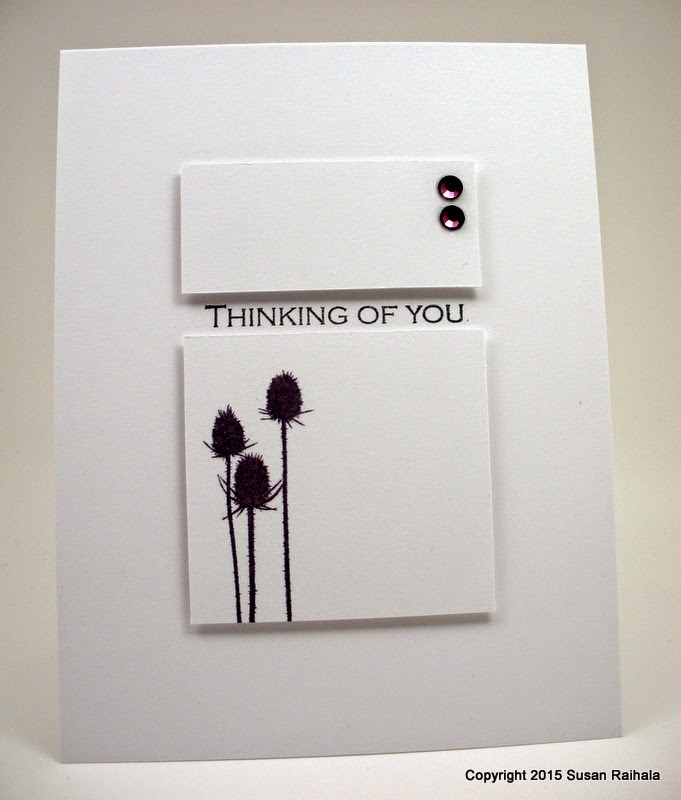
Finally, I present today's cards, which use completely random, unlabeled scraps of watercolor paper from my stash. All I know is that it isn't Arches, but it worked for these cards nevertheless.


These scraps were really rough (and I don't ever remember buying rough watercolor paper, so that's weird), and with some colors of the crayons, the pigment simply wouldn't spread no matter how much water I put down. I suspect the paper is cheap stuff 'cause the crayons aren't.

To get good impressions from the stamp, I inked it well with Memento Luxe pigment ink. Not all the panels stamped out well because of the rough texture of the paper, but I got four usable out of six, which isn't bad.

When the watercolor pieces were mostly dry, I put them between two sheets of waxed paper, then between two squares of good-one-side plywood, and then I put an eight-pound dumb-bell on top. The next day, I had mostly flat panels to put on cards.

Adding glue might have caused additional warping, and my tape runner wouldn't have held this together well at all. So after gluing the cards together, I put them under the weight to dry, and they came out just fine.

Whew, again.

I hope this post was useful and not too confusing. Feel free to leave questions in the comments, and I'll answer them as I can. Those of you who are fine artists and know more than I do...please feel free to weigh in!

Supplies 
stamps: Papertrey
ink: Memento Luxe 
paper: unknown watercolor, SU black, cool Caribbean, pretty in pink
accessories: watercolor crayons, paintbrush, glue

Wednesday, March 25, 2015

Citrus Birthday

The idea of visual triangles floated around in my head, and this card just sort of popped out.


The colors are cheerful and summery, as befits a cold March in Ohio. It's so uplifting to use summer colors at the butt-end of winter! Anyway, by using dye inks (in this case, Memento), the overlap of green and yellow adds a bit of interest to the design. If you use pigment, chalk, or other opaque inks, the overlap will look mostly like the top color rather than a blend.

Hee, hee. She said, "Blend." Oh, yeah. You blend.*

*snort*

This layout is a great way to use those larger sentiments. Too often, mine languish. But this time, the sentiment is front and center!

And Now for Something Completely Different...
Just for fun, I'm going to provide a link to an article on the cutest little animal I'd never heard of...the Ili pika of China. It's extremely endangered, and the awwww factor is epic. George and I saw a lot of pikas while backpacking in the Colorado Rockies years ago, but none of them was anywhere near as cute as this darling creature.

You're welcome!

Supplies
stamps: Papertrey 
ink: Memento
paper: Papertrey
accessories: rhinestones

*If you don't get the joke, watch the movie My Cousin Vinny. It's hysterical!

Tuesday, March 24, 2015

Complementary Colors

Complementary colors are colors that are opposite each other on the color wheel. Yellow and purple. Red and green. Orange and blue....


Complementary colors create high-energy designs, and this can be particularly useful if you want to make something very simple that really pops...like my card above. The sun, a single word, and POP! All because of the complementary colors.

I don't recommend dressing hyper five-year-old boys in complementary colors. Choose a soothing monochromatic or analogous color scheme in muted tones. Because, you know, kids get color theory, right?

You're not buying it. I can tell.

By the way, analogous color schemes are made of three colors side-by-side on the color wheel (a primary or secondary color plus the colors on either side). They create lovely harmony and depending on the tones and color saturation, they can be incredibly soothing or nice and peppy, but they lack the contrast and high energy of complementary schemes.

I'm no expert on color theory, but it's worth reading around on the interwebs for the basics. Color Matters and TigerColor are two good places to start. I refer to my color wheel frequently and consider it to be an indispensable tool for paper crafting. Mine rests in easy reach on my cork board over my craft desk. They are inexpensive and readily available in the art sections of Michael's, Hobby Lobby, or JoAnn's.

In the words of Woody the Cowboy doll...if you don't have one, get one!

Or not. It's really up to you.

Supplies
stamps: Papertrey Hello There
ink: Hero Arts orange soda, Memento Bahama blue
paper: Papertrey
accessories: circle punch, dimensional

Monday, March 23, 2015

When the Focal Point Just Needs a Little Something

When a well-designed stamp is already dramatic and eye-catching, it often just needs a little something to complete it. Such is the case with the heart from Hello There by Papertrey.


I love this sentiment with a heart that's missing its middle, and by adding a small rhinestone heart (colored with Bic/Sharpies to match the SU cherry cobbler ink), your eye is drawn to the center. I chose to put the sentiment toward the bottom of the card to create a little more movement for the eye...and thus adding a bit more interest to a static design.

So as you can see, sometimes just a little something makes all the difference.

Supplies
stamps: Papertrey Hello There
ink: SU cherry cobbler, Memento black
paper: Papertrey white
accessories: rhinestone heart, alcohol marker

Sunday, March 22, 2015

A Spectrum of Happiness


More playing around with Hero Arts inks in a spectrum of yummy colors. You might suspect that this card has three layers, but it's just two white layers with the popped panel outlined using a black Sharpie.

And bling. Because bling is good.

This post has been brought to you literally by Chrome, which magically started working on my computer today. IE still isn't letting me add pictures to Blogger. I swear my computer is possessed and messin' with my head. Who knows what will work or not work tomorrow!?!?!?

Supplies
stamps: Papertrey
ink: Hero Arts, Memento Luxe black
paper: Papertrey
accessories: dimensionals, rhinestones, black Sharpie

Saturday, March 21, 2015

Blue, Blue, and More Blue

It's just sad when we have so much powerful technology at our fingertips and it doesn't work. I'm still using awkward work-arounds to blog.

Thank heaven for awkward work-arounds.

Still can't print anything, though.

*sigh*

Enough complaining. Today's card comes courtesy of inspiration by Pinterest. The inspiration piece is much lighter and more delicately colored than my card, but so what? Inspiration is just the starting point, and we stampers have to make do with what we have...in this case, Ombre Builders from Papertrey. I came up with a dramatic blue, geometric card that makes me so very, very happy!


I actually cut about seven or eight panels using most of the stamps in the set, and then experimented with which ones looked best together. These three were by far the most dramatic and effective together...at least with the shading and colors I used from the Kaleidacolor all-blue pad.

The panels are 2.5" x 0.75".

The sentiment works because, really, what would you say goes with this sort of abstract, geometric design?

Supplies
stamps: Papertrey Ombre Builders
ink: Kaleidacolor
paper: Papertrey
accessories: none, unless you count the glue and cutting tools

Thursday, March 19, 2015

Playing with Little X's


When I was growing up, all the women in my life made little X's...in other words, they did cross stitch. My mom was the best at it, only because the backs of her projects looked just as good as the fronts (everyone hated her for that!), but one of my aunts at least made her fronts look as good as mom's, even if her backs were a mess. She and mom took stitch classes at various conferences back in the day before people got "psychotic" about stitching.

BTW, I have no idea what that means. I'm just quoting my aunt. Apparently, stitch teachers started taking the whole thing way too seriously and charging too much for classes. If I remember correctly, my aunt drew the line at paying $100 for one class to learn one stitch. That might not be technically psychotic, but it sure is crazy. When I think of how some paper crafters take what we do way too seriously, I guess I kind of understand.

These are HOBBIES, people. They're supposed to be fun...not a competition or a lead-up to bankruptcy court.

Anyway, my last cross stitch project happened in 1987, and I vowed never again to stitch another stitch. My project may or may not have been tossed at the wall a few times in frustration, which may or may not have helped it look better.

Whatever. I quit stitching because it was not fun for me and haven't once regretted it!

Anyway (again), that particular aunt is having surgery tomorrow. This card is for her. She will laugh, and laughter is the best medicine.

The idea for the card was pretty basic...I saw a lot of happy colors on Pinterest one day and decided to make a few spectrum cards with all those yummy bright Hero Arts inks I have. I love how the ascender of the "d" in "mend" sticks up around the bottom corner of the raised panel. That visually connects the sentiment and panel nicely, don't you think?

Follow-up on the last post's rant:
My computer is still driving me crazy. Turns out I CAN upload photos in Blogger on IE on the Administrator account, but not in my profile account. Weird. Chrome works just fine on the Admin account but not on my profile. Also weird. After uninstalling and reinstalling Norton antivirus, my Outlook account is working for now...though that has happened before and then it's gone wonky again because of the Norton Anti-Spam plugin. Oy vey. Finally, my computer can't find my wireless printer, so I can't print anything.

When George has me committed to the loony bin, you'll all know why.

To those of you who are also having tech problems, my deepest sympathy.

Supplies
stamps: Papertrey
ink: Hero Arts
paper: Papertrey
accessories: dimensionals

Tuesday, March 17, 2015

Card Set Inspired by Maile Belles and a Rant

Y'all have got to know by now that one of my stamping heroes is Maile Belles. Her clean-and-simple style is a win. Every. Single. Time.


She's amazing.


So when I visited my Cards Pinterest board and saw THIS card by Maile, I got an idea using Bitty Bouquets from Papertrey.


Note how I changed the sentiment font to go with the images. The light stems and flowers of the third card get a smaller, lighter font, while the heavy stem and flowers of the second card get a thick, heavy sentiment. The medium weight of the top stem and flowers gets a medium weight font. Go, me!!!


The corners of the sentiment strips were snipped with scallop deco scissors to give them a more finished look.


Now for the rant.


I'm having major issues with the latest Windows updates on my computer. Nothing is working properly. Chrome won't work at all. IE at least lets me browse, but that's all. I can't upload photos in Blogger AT ALL, and the Compose view of the post looks all messed up, while the HTML view looks fine. At least, I think it looks fine...I'm no HTML expert! Heaven only knows what this post will look like when it goes live.


Can someone tell me why Blogger isn't compatible with IE11? Seriously?


BTW, I logged onto my husband's computer to get the pictures onto this post. These updates don't ever affect HIS laptop's performance. I'd really like to know what sort of demon has possessed my computer. It really, really, really enjoys screwing with me.


My email isn't working, either, so if you email me, I can't receive or send, except through web mail. To fix that problem, I have to uninstall Norton Antivirus and reinstall it as a custom install so I can turn off the Norton Anti-Spam Plugin that keeps messing up my email because it's not compatible with Outlook.


This chaos happens every time there's a windows update, but this is the worst one yet. All the fixes I've used in the past are not working. Can you tell I'm frustrated?


Knew you could. Thank you for listening. I'm going to drink wine and eat pizza and contemplate the good ol' days before PCs until my desire to throw my laptop to the floor and jump up and down on it passes.


Y'all might not hear from me for a few days.


What a mess.

Monday, March 16, 2015

When Something Pops into Your Head

Have you ever had a layout or other card idea pop into your head and immediately felt absolutely compelled to follow through?

Yeah.

That.


Supplies
stamps: Papertrey Note Niblets
ink: Hero Arts
paper: Papertrey
accessories: dimensionals

Sunday, March 15, 2015

Hello, Sunshine!

I have not forgotten about my promise to write about watercolor paper, but it's taking longer than expected to get everything together. Hopefully, a little shopping tomorrow will put me on track!

My last order from Papertrey included the set Hello There, which has quite a lot of different stamps in it...hearts, flowers, stems, a sun, words, and some elements that I'm honestly not quite sure what to do with. Tonight's card, however, reflects the glorious sunshine of my weekend here in Ohio. It was so good to see the sun!!!


The sun shines through a punched-out circle (1 3/8") on the edge of the card, and the sun's center (3/4" circle punch) is popped up on a dimensional. The inks are Memento Bahama Blue and Hero Arts Orange Soda.

I'm certain our sun is teasing us and will go back under cover of wintery clouds soon enough. Some of the worst snow storms we've ever had here in Ohio were in late March or April. But this weekend's lovely blue skies are a herald of things to come. We'll get there...eventually.

And yes, indeed, I am bothered by the missing period comma. But I'm mailing this card to my mom, and she won't care.

I hope the sun is shining on you...in spirit, if not literally!

Supplies
stamps: Papertrey Hello There
ink: Hero Arts orange soda, Memento Bahama blue
paper: Papertrey
accessories: 3/4" and 1 3/8" circle punches, dimensional

Friday, March 13, 2015

Hugs All Around

My day included lunch in the excellent company of Leslie Hanna, a.k.a. the Crooked Stamper. I so love having a stampy-bloggy person living in my town.

While we were at lunch, however, we learned that our high school was evacuated because of a bomb threat. My elder son attends the high school!

Our school officials and the police handled this threat with extreme caution and followed their preparedness plan for such events, evacuating students to other buildings and communicating the situation to concerned parents through our one-call system, Facebook, and the district's web page. I admire the calm and cautious way the district handled everything, and the way they kept parents informed about what was going on as it happened.

All was resolved without incident, so yay! But that pit in my stomach will take a while to fill in.

In the meantime, enjoy a big hug and wishes for a most excellent, bomb-threat-free weekend!

4.25" square


Supplies
stamps: Papertrey Big Hugs
ink: Kaleidacolor
paper: Papertrey
accessories: not a one...my favorite kind!

Thursday, March 12, 2015

Pinterest Quilt Inspiration


Quilts often provide amazing inspiration for card makers. The geometric designs, the colors, and the patterns give lots of food for the imagination.

Take this quilt, for instance.


I know this is a quilt and NOT crochet but it is crochet inspiration.  I think a granny square afghan made like this would be really cool and actually pretty easy to do.
Source


I really, really love the spectrum colors and the movement of this quilt, but the stamping required to pull a true copy of this off made my brain hurt. Plus, the stamps I had in 3 sizes were just too big to make a full rainbow on a CAS card...not enough white space. That's when I came up with the idea of taking one line and making a small set of cards with coordinating envelopes.


I didn't have black gemstones in three sizes, so I used gray ones instead. So pretty! I stamped the envelope flaps and used gray ink for the flower centers since bling on an envelope isn't practical.

Here's how I made stamping these a little easier. Note that the center of the biggest flower is lined up on the center register mark of the block's grid lines. That's important!


To get the biggest flower in the exact middle of the card, I placed a ruler across the top of the card and aligned the middle grid line with the 2.75" mark on the ruler.

Once I'd stamped the three flowers on one side, I removed the large flower from the block, flipped the block, inked, and stamped. It was super easy to line everything up by positioning the center register mark in the exact center of the already-stamped biggest flower. Two impressions, and the stamping is done!


What a fun inspiration!

Supplies
stamps: Papertrey Beautiful Blooms II
ink: Fresh Ink (tangerine, grass), Memento Luxe (dandelion and London fog)
paper: Papertrey
accessories: gray rhinestones

Wednesday, March 11, 2015

Out of This World

Last year's Hero Arts catalog had a bunch of star/galaxy/astronomy stamps, and I'm just now getting around to trying them. The set I got is Shoot for the Moon. It's perfect for Brilliance Iridescent Inks, in this case Ice Blue for the planet and Starlite Silver for the stars.


Y'all have no idea how hard it was for me to type "starlite," which is wrong. Just wrong. It should be "starlight." There. I typed it correctly and feel better.

A little trick on this card...the larger star is an individual stamp, but the two smaller stars are part of a larger cluster of stars. I just needed two of them, so I used a post-it note on the stamp to mask the unnecessary ones when I inked up. Just remember to remove the post-it note before actually stamping.

Just a suggestion. *whistles innocently*

Might give this card to my son on opening night of Shrek, the high-school musical. Nick is Knight #1 and a Guard. He has lines. I'm so proud!!!

Supplies
stamps: Hero Arts Shoot for the Moon clear set
ink: Brilliance Ice Blue, Starlight Silver; Memento Luxe black
paper: Papertrey
accessories: not a one!

Tuesday, March 10, 2015

Inspired by Bottle Design

I may not have been able to locate yesterday's inspiration piece, but today's was right near the top of my Pure Inspiration Board, so yay! My panties match my outfit today, too. Can you tell I feel on top of things?

You'll find the inspiration HERE.

You'll find my card, well, right below this sentence.


Don't you love these colors together? Dark teal and an avocado-ish green. Yum. This little scrap of card stock was hanging around my table, just waiting to be used.

On an entirely different subject,  Sue C. asked me a question about watercolor paper, and she was so appreciative of my answer I wondered if the rest of you might like me to share. A quickie tutorial on the subject will be coming soon...just passing on what Mother the Fine Artist has taught me.

All hail my mom...the woman who kept her fine art gene to herself when making me. It's all her fault I can't draw stick figures. And get this...she was baffled when I got into rubber stamping. "If you want a flower picture, Susan,why not just draw it?"

Bwaahaaahaaa! She has a great sense of humor, my mother.

Not much else to say, except Happy Tuesday!

Supplies
stamps: Papertrey
ink: VersaMagic ocean depth, tea leaves
paper: Papertrey white
accessories: dimensionals

Monday, March 9, 2015

This Idea Came from Somewhere

Have you ever made something from an inspiration piece and then lost the link or pin from which you took the ideas?

Well, I did, with this card. No idea where the source idea is...can't find it on my Pinterest boards (could have sworn it was there!), although it might be like those times I can't find my sunglasses because they are on my head or my car keys because they are in my hand.

I'd blame old age for this, but frankly, I've always been absent-minded. Plus, I'm not old. I'm just prematurely gray.

Anywho, here's my card, which turned out cool because of someone else's packaging design out there on the great wide interwebs. Whoever you are, out there in cyber-land, I really, really appreciate the inspiration. Please forgive my doofus-ness.


The thistles looked a little flat, so I touched them up with a little Wink of Stella. The subtle shimmer helps!

Supplies
stamps: Gina K sentiment, Technique Tuesday thistles
ink: Memento elderberry, black
paper: Papertrey white
accessories: dimensionals, Swarovski crystals colored with alcohol markers, Wink of Stella clear brush pen

Sunday, March 8, 2015

Use My Hoard: Water-based Markers

In my very early days of stamping, dozens of Marvy water-based markers filled a storage bin in my craft area because, ohmygosh, I need to be able to put multiple colors of ink on a single stamp, right?!?

Only every time I did this, the results were less than satisfactory. The multicolored images never looked as crisp and smooth and perfect as inking with a single inkpad did. The obsessive-compulsive neat freak detail-oriented person in me never felt satisfied. Also, these markers left brushstrokes when used to color an outline image on paper, and once I discovered alcohol markers for stroke-less coloring, the water-based markers became even more useless. Eventually, I gave away all my Marvy markers and didn't miss them.

This didn't stop me from buying the giant box o' markers from StampinUp for my 40th birthday, of course, or from buying the markers to match Memento inks when I went gaga for them.

This hobby turns us all stupid when it comes to hoarding stuff, doesn't it?

Eventually, I downsized my marker hoard again, keeping only a few of the SU markers and all the Memento ones, and storing them out of my immediate work area so they wouldn't be in the way.

While contemplating them for the Use-Your-Stash Challenge, however, I remembered one tried-and-true technique that I simply ADORE using markers for: thumping.

Thumping involves putting a light color all over a stamp and then tapping a darker marker over it in random pats. Then, you can either 1) huff on the stamp (exhale onto it) to dampen the inks, or 2) spritz lightly with water, which will blend the ink colors to create a lovely watercolor effect.


I hope you'll agree that thumping justifies keeping markers around. This lovely stamp (a very old Stampabilities one, I believe) is perfect for thumping. This image was colored first with SU Almost Amethyst, then Memento Bamboo was added to the stem and leaves, and then Memento Grape Jelly was thumped onto the Amethyst. A light spritz with water, and yay! A pretty, watercolor-y image!

After the image was completely dry, I stamped the sentiment in Memento Luxe Tuxedo Black...the dense and crisp ink contrasts nicely with the soft flower stem and is easy to read over it. Three rhinestones colored to match with alcohol markers finish the card nicely.

Not all stamps work so well with this technique, but it's my favorite with floral stamps for adding dimension and interest, even to very simple images.

Needless to say, I'm keeping the markers I have.

Do you like and use your markers? Are there markers that work better for you than others? What other techniques do you like to do with markers? Inquiring minds, you know....

Supplies
stamps: Stampabilities (discontinued)
ink: Memento Luxe black
paper: Papertrey white
accessories: SU and Memento markers, spritz bottle filled with plain water, rhinestones, alcohol markers for coloring the rhinestones

Friday, March 6, 2015

Gift Set with Stickles

I wanted to make a small gift set for my cousin for her birthday, AND I wanted to use black Stickles, sent to me by Christine, who has given my loose glitter a loving home.

These simple CAS cards resulted.


I love Floral Frenzy from Papertrey...it's an older set, but perfectly designed! And I checked; it's not in the vault.

My Stickles bottles are definitely on the keeper list of my Use My Hoard Challenge.

Have a delightful weekend!

Supplies
stamps: Papertrey Floral Frenzy
ink: Hero Arts bubble gum, Memento tuxedo black
paper: Papertrey white
accessories: Black Stickles

Thursday, March 5, 2015

The Essential Glue Pad Review and Using My Hoard: Flock

Some of you were eager to hear my report on the Essential Glue Pad when you saw it pictured in my recent order. This is my second pad...the first dried up and became unusable.


The fact I bought another indicates that I think they are worth having...conditionally.

The EGP won't hold loose glitter very well, at least in my experience. Rubbing with fingers is enough to pull most of the glitter off, even after the glue is completely dry. But I don't have loose glitter anymore because I mailed it to Christine, who mailed me her stash of Stickles.

We are both happier! I actually used some of the Stickles she sent me on tomorrow's cards. Yay!! Thanks for the trade, Christine!

Truth be told, I bought a second EGP for flock and only for flock. I like the stuff, and the EGP holds it fairly well. Of course the flock won't stand up to vigorous rubbing, but it's good enough for everyday use on a card.

Here's how to use it.

1. Coat the Essential Glue Pad with the glue. I add a bit every time I use it, but the first application is the thickest. Don't overload the pad. It isn't necessary.

2. Press the stamp into the pad until it's well coated. It should look thickly applied on the stamp, not smooth and even like ink. Then press the stamp onto the paper.

3. Sprinkle the flock all over the stamped image. Use your fingers to press the flock firmly into the glue.


4. Shake the excess flock off the paper. Don't worry if a few stragglers are hanging off the edge of the image, as on the descender of the "g" below. If you touch the flock while the glue is still wet, you'll really mess it up. Ask me how I know this. *sigh*


5. Set the paper aside until fully dry...I give it at least a few hours. You may then gently rub off any stragglers. If you shake the excess flock onto a scrap of copy paper, you can then return it to the bottle.


Sorry the lighting on the photo is so uneven. I'm experimenting with my make-shift light box (boy, is it a primitive affair!) and though I have two Ott light table lamps shining down on this, one lamp gives more light than the other. Weird, as they have the exact same bulbs.

Anywho, I like flock, and I particularly like it with this stamp...a warm, fuzzy hug for someone I love!

Supplies
stamps: Papertrey Big Hugs
ink: none
paper: Papertrey white
accessories: Essential glue pad, flock (Doodlebug), scrap paper for collecting the excess flock

Wednesday, March 4, 2015

Out of Season

I'm glad so many of you enjoyed yesterday's rather, ahem, crazy post. Some days are just like that...ADD rabbit trails and earworms.

Have you noticed how Target already has swimsuits out? Seriously? We're currently getting four inches of snow and have a low of 12 degrees tonight. Out of season, indeed.

This tendency to do things out of season can be good, though, and can keep you from going crazy by reminding you that the seasons DO pass! My favorite season is fall, so when I saw this color combo on Pinterest, I knew I needed to make a Thanksgiving card with it, even though it's winter and Thanksgiving is so very far away.

I even kinda sorta kept the style of the original piece, which is really lovely.


There's a lot going on here, especially for me. But I love these colors, and it's hard for me to work with so many in a CAS design. They're just so pleasing to the eye! And I never would have put them together without the inspiration piece.

And yes, this was my second attempt at getting that random stamping so nicely balanced. First attempt was appalling.

Thanksgiving Blessings to each of you.


Supplies
stamps: Papertrey Autumn Adornments (sentiment), Embellished Elegance
ink: various
paper: Papertrey
accessories: none

Tuesday, March 3, 2015

Peace and Joy in March

Well, March sure roared into Ohio like a lion on steroids. Snow, snow, freezing rain, snow, fog, freezing rain. Forecast calls for another 4-8 inches of snow on Thursday.

Brrrr.

I ordered this Hero Arts stamp because it, like the postage set from yesterday's post, was on sale at JoAnn's. It's pretty close to another winter scene stamp in my stash, but it's a bit smaller, and that means bigger white borders, which makes me happy because, you know, I like big borders and I cannot lie....


I'm sorry. That was uncalled for.

But my 12-year-old keeps singing that song (about butts, not borders) and asking me why he can't sing it at school. For the same reason he can't call blue gemstones "blubies" at school and he can't call his friend Sophie "foxy" ever or anywhere, no matter that Manny calls Queen Latifah "foxy" in Ice Age 2.

Because it's inappropriate.

Autism causes my son to repeat movie lines or bits of music over and over and over (which is why I will be singing the songs from Blue's Clues in the dementia ward of the nursing home because ohmygosh, here's the mail it never fails it makes me want to wag my tail....). Autism also makes him ask the same questions over and over and over because it's comforting when the answer doesn't change.

It's lots of fun when the movie lines or music or questions are socially inappropriate, don't you think? Sure you do because you said "blubies" out loud several times, and it is fun to say! Inappropriate, of course, but how correct is it that we call red gemstones "rubies" and blue ones "sapphires"? That can't be right!!!

"Excuse me, ma'am, but how big are your blubies?"

Oh, I did it again. So sorry.

This is a stamping blog so perhaps I should say something about stamping this pretty card with its big white  border.

Hmmm....

Errrr....

I got nothing.

Check back tomorrow. Maybe then my brain will be thawed. I sure hope so, because right now that earworm of a song is all I can think of.

Peace and joy to you.

Supplies
stamps: Hero Arts, Papertrey Peaceful Pinecone
ink: Hero Arts
paper: Papertrey
accessories: silver metallic marker, dimensionals

Monday, March 2, 2015

Adaptation...for the Cost of Postage

Y'all know I enjoy looking at vintage/shabby chic designs...looking but not making. There's so much wonderful beauty and inspiration in those rich, layered, embellished styles. And that's why I've always loved Hero Arts postage stamp sets. Like this one.


Of course, using them effectively in my simple style presents a challenge, which is why I've been reluctant to spend money on them. Until they went of massive sale at JoAnn's.

Of course!

So I started playing around with them and am embarrassed to admit how much paper I wasted finding which inks work best with them and how I might use them CAS style.

It took a while to crack the code, but I finally realized that the jagged borders on the stamps were getting in my way...they're just too irregular for my particular brand of CAS. That's when I broke out these delightfully old-school scissors:


After trimming the jagged borders off the stamped images for London and Paris, I made these two cards.


LOVE!!! The scissors give a larger stamp edge for the mat of white on white. It's subtle, but cleaner. London is stamped in Memento espresso truffle, which looks better to my eye than the grey flannel I used on Paris. While smiling happily at these two cards, I wondered what would happen if I kicked these up a notch and added color. Some ink pads were too juicy and made runny images, some pads were too dry and left blotchy images, and some pads were juuuuuust right.

Like I said, I wasted a lot of paper playing around. Here are my favorite results:


Greece gets Memento Bahama Blue.

Love the dimensionals here.

Stonehenge in SU Old Olive

The Pyramids in Memento potter's clay...not quite as crisp
as I'd like it to be, but that's okay.

Italy gets the Memento rhubarb stalk treatment. Love this!
Though I do wish someone would straighten the leaning
Tower of Pisa. Seriously, doesn't that bother you?

The Great Wall goes with Ancient Page Henna. This image
is hard to work with...the level of detail is blurry on the stamp
itself, so the tower within the wall looks like a blob without
clear definition. Not my favorite.

To cut out the images, I used my quilting ruler and craft knife. If you haven't done this before, just remember to keep your fingers away from the knife when you slide it down the edge of the ruler! This has been my preferred trimming method for over 12 years now, but I still remind myself to be careful every time.

Now that I've typed that for the whole interwebs to see, I'm bound to cut off a fingertip. *sigh*

Anyway, I'm so glad these stamps were on sale because they were so much fun to play with! I can see framed art with the whole set of stamps, cards with a selection of stamps (esp. long, thin cards!), and all sorts of fun with colors.

PLUS, I used a pair of my deco scissors, which are definitely keepers on the Use My Hoard Challenge.

Yay, me!

Supplies
stamps: Hero Arts
ink: various listed above
paper: Papertrey white
accessories: deco stamp scissors, dimensionals, glue

Sunday, March 1, 2015

I'm an Idiot Sometimes, Pretending to be "Loose" with Limited Success, and Always Happy with OLS

I'm an idiot sometimes. Bet you are, too. 'Cause I know I am not alone.

Here are the goodies I ordered recently:


See that Delicata pad? Oh, yeah, I ordered one just about two months ago and totally forgot. I'm not that old, people! Now I have two. Yay! Whatever.

Anyway, I'm having fun playing with these new goodies and will have stuff to show you later this week.

*awkward non sequitur*

Have you noticed on Pinterest the number of cool crafty things with unevenly-typed quotations or sentiments? That sort of "loose" style appeals to me so much, but I have a hard time pulling it off, as today's cards demonstrate!

Feel free to laugh at me. I'm laughing at me, too.

This card is for my sister, who loves this quote from The Adventures of Buckaroo Bansai across the 8th Dimension. She could use a laugh about now, and boy will she!


And this card is for my husband. He never gives me candy, but he does pour wine for me.


Can you believe I don't currently have any candy stamps or wine bottle stamps? I must correct this immediately.

And now for the happy. Here's my card for the One-Layer Simplicity Challenge #14: Words, Words, Words. Feel free to click on over and play along!


To make this collage, I started with the giant happy in the bottom right corner, and then kept adding. I LOVE this card. It's so pinky-purple-y, and HAPPY! What a great way to use those word stamps!

Supplies
stamps: Various
ink: Hero Arts and Memento and Ancient Page
paper: Papertrey
accessories: gridded acrylic block