Wow. For those of my readers who use Hero Arts stamps and like to submit work for publication, check out this post on the Hero Arts blog. Very cool.
I don't ever try to get my cards published, but if I did, I'd be all over this!
Saturday, July 30, 2011
Friday, July 29, 2011
Starry, Starry Night
The blue of this specialty paper from my stash is gorgeous, is it not?

Something about this card really appeals to me, but for the life of me, I can't articulate what it is. The design isn't particularly good...in fact, the spray of silver cord strikes part of me--the logical, sensible part--as distinctly odd.
But another part of me--the symbolic, artsy, vague part--loves the intimation of a comet or shooting star contrasted with the stable, very traditional star (which is made of wood painted with a silver metallic pen). Stable and transient. Movement and stasis.
Wow. Those last two statements illustrate the rhetorical trope of chiasmus. A and B. B and A. That transposition of the order of meaning in two pairs is something Alexander Pope uses in one of his poems...probably Essay on Man, but I'm not sure about that. It's been a while, but every time I think of chiasmus, I think of Pope. Shakespeare, too. (Okay, I checked. Pope did use chiasmus in Essay on Man, though he certainly might have used it in other places.)
Oh good grief. I can hear you unsubscribing from Simplicity. Ayyyeeeeee! Run screaming from the weird English Lit freak spouting classical rhetoric!
Don't worry. Tomorrow's card will be sensible and down to earth. But for tonight, I'm feeling very starry and rhetorical.
And I swear I only had one small glass of wine.
Wednesday, July 27, 2011
A Brief Note, Times Three
I made these cards before my unexpected vacation while trying to use up some pre-cut card bases...colored card bases, no less. The stamps are from A Muse. In fact, I bought this whole set because of the brief stamp. Too cute!


When using a darker color for a card base, I add a white panel on the inside. Of course, you can write on dark cardstock with a white gel pen, but I always find those diabolical white gel pens choose to start skipping in the middle of my note and make a blotchy mess. Hence, the white panel.
Supplies
stamps: A Muse
ink: Memento
paper: SU real red, brilliant blue, pumpkin pie, black; Mark's Finest Papers 110lb white
accessories: Bic and Sharpie markers, dimensionals
Tuesday, July 26, 2011
Botanical Silhouettes, Erin Lincoln, and Variations
I sat down to use all the images from Botanical Silhouettes, the PTI anniversary set that my friend Linda sent me. This was the second card I made:

This card was inspired TOTALLY by a card in PTI's DT gallery made by the amazing Erin Lincoln. This turned out so well, I wondered.
what
would
happen
if
I
varied
Erin's
layout
with
the
other
stamps
in
the
set?
Yes, I've been reading weird poetry again. What of it?
Not really. I'm just feeling weird tonight. Perhaps I should try to write some weird poetry.
Anyway, I started playing with Erin's design (hope she doesn't mind) and couldn't stop because it was just sooooo inspiring. So I made this by stamping the dandelions and poufs into the stems.

And then this happened. Love how easily the flower stamp lines up with the grass stamp. I was skeptical at first, but it's seriously easy.

Finally, I made this. At first, I tried grounding the dandelion as I grounded the previous two plants. It looked, well, awkward. So I redid it like this and I like it so much better.

Hope you do, too!
Supplies
stamps: Botanical Silhouettes, Text Style
ink: Memento
paper: PTI
accessories: rhinestones
Sunday, July 24, 2011
Some Pretty Cards People Have Sent
Last week was a great week for receiving cards. I got four lovely ones I thought I'd share with you because they are so very lovely. Many thanks to Nicole, Lori, Joan, and Linda for brightening my week!
 |
| From Nicole P. Check out that cutting inside the wreath!!! |
 |
| From Lori M. That glitter is beyond gorgeous! |
 |
| From Joan L. Her folding of the two-sided paper for the flower is STUNNING! |
 |
| From Linda E. Kraft and aqua are fab, and so is the way she used that label stamp. |
Friday, July 22, 2011
Just the After, and a Thank You
Easing back into blogging here; not sure how often I'll post over the next week or so, but I can't stay away completely. I want to thank you all for your wonderful words of encouragement...y'all are the best!!!
I was going to make this a before-and-after post, because I made an "meh" card first, then this one. But once I edited the photo of the "meh" card, I decided it was actually a "blech" card. You're spared the disaster.
You're welcome. Seriously.

This card's color scheme was inspired by a tea display at Barnes and Noble, with gorgeous gold and green tins alternated on a shelf. The colors just looked so summery I had to put them on paper.
I inked the grass from PTI's anniversary set for this year using the summer sun marker from StampinUp, then I streaked green galore over it. Before stamping, I huffed it a couple of times (heavy breathing and stamping go together so well). The watercolor effect is so pretty!
On the blech card, I inked the sentiment with a pad, and it looked too crisp for the watercolors of the grass, so here I used the rich cocoa Memento marker. To stamp the butterflies I used a set called Spring Garden from Leave Memories and inked them with the green galore marker, huffed, and got a bit of watercolor effect. Love the crispness of the white with the bright watercolors!
I didn't actually earn the PTI anniversary set this year. I bought eleven sets (ARRGGHHH!!!) instead of the required twelve last year, so no set for me. UNTIL my friend Linda E offered to send me her extra! So, in addition to the card, here's a big
THANK YOU, LINDA!!!!
Wednesday, July 20, 2011
Skip on over to Questioning my Intelligence...
It's the three-year anniversary of my other blog, Questioning my Intelligence. Go to this post for details on a wee little give-away.
Tuesday, July 19, 2011
Announcement Regarding OLW
Jennifer and I decided that, given everything the two of us have going on in the next month, we're putting the OLW on hold until September 7. Don't worry...we'll come back with something extra-special!
Still not crafting or writing anything longer than the occasional FB status comment, but I can't stand it and will try to make something Thursday.
Many, many thanks to all who have left such sweet comments and sent such sweet emails. Really, your kind words mean a LOT to me.
Be back as soon as I can.
*mwah*
Thursday, July 14, 2011
Forced Blogging Vacation
I have no idea how I'll do this, but I have to take a little break from typing. Sordid details are HERE.
Will be back as soon as I can. Promise!
Will be back as soon as I can. Promise!
Wednesday, July 13, 2011
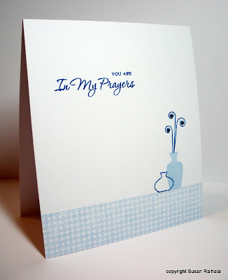
Gracious Vases, Part 3
Sometimes, I have nothing witty to say, and this is one of those times. Perhaps tomorrow my brain will wake up. In the meantime, please enjoy the following card. I do.
supplies
stamps: Papertrey Gracious Vases, Faux Ribbon
ink: Memento
paper: white, SU banana and saffron
accessories: markers, rhinestones, dimensionals

supplies
stamps: Papertrey Gracious Vases, Faux Ribbon
ink: Memento
paper: white, SU banana and saffron
accessories: markers, rhinestones, dimensionals
Tuesday, July 12, 2011
One-Layer Wednesday 62: Make It Personal--Edited
Edited to Add: Several people asked where I got the state map stamp. It's from Rubber Stampede, USA Map, A17576. I think I picked mine up at Hobby Lobby.
This week's One-Layer Wednesday Challenge is to Make It Personal. In other words, make a card for a particular person that is custom designed for him or her. You might use the person's favorite colors or a favorite image (such as a frog card for a friend who collects frogs, or an iris because it's your mother's favorite flower). Perhaps your brother's birthday is coming up. Whatever you do, make it personal for someone special...and then send them the card!
My card is for my husband. He was in the USAF for twenty years, which means we've lived all over the United States. I decided to use this map of the States and color all the states in which we lived. The sentiment, from Mark's Finest Papers, sums up how I feel about all that shuffling around.

My, that's a lot of ground covered! And by the way, George loved the card.
OLW62 Rules
1. A one-layer card is defined as a single piece of cardstock folded in half. No other layers allowed.
2. Make a personalized card for a specific individual in your life. Remember to keep embellishments to a minimum.
3. Post your card online and link to it using the InLinkz button on the sidebar of Simplicity. Make sure to share who your card is for and what makes it personal. If you post on SplitcoastStampers, please use the keyword OLW62.
4. Most important rule of all: HAVE FUN!!!
Monday, July 11, 2011
CASification of a Card by Michelle Woerner
CASification (if you're new to Simplicity) is my made-up word for "taking a gorgeous layered and embellished card, and simplifying it." Sometimes, when I encounter a particularly well-designed card, I just have to make it my own, and that's how I felt when I saw Michelle Woerner's card on page 12 of Take Ten's summer issue.
*swoon*
I totally love her design: balanced, fresh, and just begging me to make one myself.
Michelle (who's known as sf9erfan on SCS) doesn't have the exact card posted online, but she did make a whole set of similar cards and put them on her blog HERE. The card in Take Ten is almost identical to the first card on her post.
Here's my version:

As you can see, to simplify the design, I replaced Michelle's strips of patterned paper with a stamp (Text Style, Papertrey). It gives a ground to the circles, even though I'm not using ribbon or patterned paper at all. Instead of using patterned paper for my circles, I stamped two Hero Arts backgrounds in red and blue and punched them out. Then, I stamped the sentiment (Limitless Labels, Papertrey), added a Maya Road velvet flower with brad in place of Michelle's pretty yet bulky Prima flowers. Plus, I needed a spot of red near the flower since I hadn't used the ribbon...gotta complete that visual triangle of red! The red brad is a bit lumpy, but the whole thing is mailable with regular postage.
Michelle's version has an elegance the simplified version can't match (the rose and twine and ribbon and DP really are perfect on her card!). But her overall design...using three different circles and a red-white-blue color scheme and a background to anchor it all...is such an inspiration.
Thanks, Michelle!
Sunday, July 10, 2011
Gracious Vases...Part 2
As promised, today I'm showing my latest attempt at coloring with markers. Before I get to the card, however, let's talk about the markers.
Y'all know that I'm not a big colorer. The drive to keep things simple lives strong in me, and coloring isn't simple. It takes practice, skill, and time...much more time than inking a block image up and stamping it and being d-o-n-e, done.
Not coloring much hasn't kept me from experimenting with and buying just about every coloring medium known to stamping. I have watercolor pencils and crayons, Prismacolor pencils, Twinkling H2Os, chalks, SU reinkers, SU markers, Memento markers, and Bic and Sharpie markers. I can honestly say I've not gotten my money's worth out of any of these, but at least most of them don't go bad, so eventually, if I live to be a hundred, I might actually use some of them half up.
Can you say "conspicuous consumption"?
Knew you could.
Anyway, I deliberately didn't buy Copics, figuring Bics and Sharpies were adequate to my very simple need, and until Wednesday, I only had seven Copics: six of them I'd won as blog candy, and the seventh was the light cool gray I bought with the expectation of outlining images. All the cool stampers outline, you know.
There's a reason you've never seen an image with a marker by me. Seriously.
Anyway (again), when I started coloring the outline vases from Gracious Vases, I discovered that they look really nifty with monochromatic shading. Which made me go through all my markers to see what colors I could use. Which made me realize that the Bic and Sharpie markers are sadly lacking in light colors. Which made me want to supplement my stash with some light Copics.
In addition, the cap colors on the Bics and Sharpies aren't entirely accurate. Which was annoying when colors didn't turn out like I wanted. Which made me get all AR/OC at 11:00 Tuesday night. Which made me make a chart so I'd really know what sort of monochromatic shading I could do. Which made me really tired the next day. Which weakened my resolve to stay away from Copics. Which made me spend an undisclosed amount of money at Marco's Paper and Hobby Lobby.
Hey, I used a coupon at Hobby Lobby.
Oh, Lordy. I'm so very crazy.
So here's the chart. I stamped a bunch of the vases on a spare sheet of paper and then colored them all in. The ones I liked, I cut out and glued onto this chart. That way, I didn't have to be neat coloring (you try staying in the lines after midnight while completely manic!) and those combos that didn't work too well could easily get pitched in the trash.

Now, finally--I'm sure you thought I'd never shut up and get here--the card:

The shelf is a ribbon stamp from Faux Ribbon (Papertrey), and the sentiment is from some set by StampinUp. The colors make me think of the 1970s. The vases are stamped on scrap paper, colored, and cut out...because I ran out of Gina K cardstock and couldn't color on a one-layer card without the marker bleeding through.
Yes, I got my shipment of Gina K cardstock yesterday so I can once again make one-layer cards colored with markers.
The end.
Supplies
stamps: Papertrey Gracious Vases, Faux Ribbon; SU sentiment
ink: Palette dark chocolate
paper: PTI vintage cream
accessories: Bic/Sharpie markers
Saturday, July 9, 2011
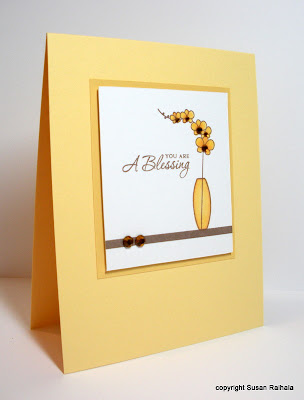
Papertrey Gracious Vases...Part 1
Oh. My. Goodness. This set.... This set....
Did Maile Belles design it for lil ol' me?
Because it fits me like a glove. Or my skinny capri jeans.
I love those skinny capri jeans, people.
And this stamp set. See.
I can make girly, gingham, sweet cards like the one above. Or simple dude cards like the one below.

I turned that solid vase sideways and made a border of it. And used browns. Dude. DUDE!!!!
I've got more. Lots more. I even colored.
And had so much fun I went out and added a few more Copics to my marker collection. I'll tell you all about it tomorrow.
Happy Sunday!
PS If you enjoy reading fiction and haven't read The Help yet, please consider picking it up. I don't think I've had a novel touch me this deeply in a long time and sure hope they don't botch it with the movie.
Did Maile Belles design it for lil ol' me?
Because it fits me like a glove. Or my skinny capri jeans.
I love those skinny capri jeans, people.
And this stamp set. See.

I can make girly, gingham, sweet cards like the one above. Or simple dude cards like the one below.

I turned that solid vase sideways and made a border of it. And used browns. Dude. DUDE!!!!
I've got more. Lots more. I even colored.
And had so much fun I went out and added a few more Copics to my marker collection. I'll tell you all about it tomorrow.
Happy Sunday!
PS If you enjoy reading fiction and haven't read The Help yet, please consider picking it up. I don't think I've had a novel touch me this deeply in a long time and sure hope they don't botch it with the movie.
Friday, July 8, 2011
Christmas Tags in July
Can I confess something? I ordered the Mehndi Medallions set from Papertrey for one reason and one reason only: to make Christmas tags.

These tags are old, old, old from StampinUp. Remember when SU had the tag sets? You know, 12x12 pages of die cut shapes (tags, library pockets, slides, etc.) that you could punch out and use? Yeah, sounded like a great idea, but mine just sat, largely unused. I eventually threw a bunch of them away in frustration, but I kept these fairly standard tags with the expectation of using them for the holidays but just never got around to it. Until now.
This weekend, see if there's something lying around your craft room unused...just waiting to be given a purpose. Then use it. Use it up. The world won't end, and you just might get a head start on your Christmas gift packaging!
Don't forget to check out the sets I've already posted for sale. And Darla, please send me an email with a valid address.
Supplies
stamps: Papertrey mehndi medallions; Hero Arts sentiment
ink: Memento
paper: SU die cuts
accessories: DMC floss
Help Me, Darla
Darla, you sent me an email asking about the paper for sale, and when I replied your email got bumped back to me as undeliverable. Please email me again at susanraihala at woh dot rr dot com. I have one box of paper left.
Thanks!
Thanks!
Thursday, July 7, 2011
Tea Party
If you're reading in email, please scroll down to see my For Sale post!
One of the CAS challenges for the 4th of July Holiday was hosted by my friend fionna51 (aka Diane). Her theme was to make a tea-themed card in memory of the Boston Tea Party. Here's my card.

Diane's tea challenge is #10. If you're interested.
I used a scrap of red trim (given me my a sweet blog reader) and dressed up the tea pot with a bit of bling. Care to join me for a cup?
Supplies
stamps: Papertrey
ink: Memento
paper: Papertrey
accessories: trim, rhinestones, scor tape (to adhere trim)
For Sale
All prices include shipping in the United States. Sorry, no international mail. To purchase, please email me at susanraihala at woh dot rr dot com. Paypal sales only. Will ship within three business days of purchase.
Note: ALL stamps have been used, so there may be ink stains on the rubber and/or wood block.
I'll have more SU sets and a bunch of other stamps for sale soon.
Note: ALL stamps have been used, so there may be ink stains on the rubber and/or wood block.
I'll have more SU sets and a bunch of other stamps for sale soon.
 |
| 2 stacks StampinUp cardstock, approx 90+ sheets each, a few cut pieces...$20 each |
 |
| Blooming with Happiness $10 |
 |
| Natural Beauty $12--SOLD |
 |
| Friendship Blooms $8--Sold |
 |
| Frosty $10 |
 |
| Darling Dots $8 |
 |
| Birthday Whimsy and coordinating UM wheel on EZ Mount, $10--Sold |
 |
| Kindred Spirit side 1 |
 |
| Kindred Spirit, side 2, double mount, $10--SOLD |
 |
| Fall Whimsy, $12 |
Wednesday, July 6, 2011
Postage Stamp Punch Meets Hero Arts Designer Alphabet
Today's card made me so very happy, but then, soft, beachy colors always make me happy. So does using a tool that has languished in my stash, in this case the postage stamp punch. Can't remember using it before, although my memory isn't what it used to be. Or perhaps I just have too many supplies to keep mental track of them all.
Whatever.

Design Discussion: This is a super way to spotlight small accent stamps that come with alphabets. The tiny sentiment is from an old, discontinued Hero Arts set. I arranged the colors very deliberately, giving the darkest color to the sentiment (those letters are pretty thin and needed the deeper color), and balancing the two blues diagonally and the two greens (well, baja is greenish blue) on the other diagonal. The butterfly is flying into the composition.
Jennifer has posted the OLW for this week, and it's awesome: Clouds! Click on over for the full scoop and to link up your creation!
Thursday afternoon, I will post my first batch of stuff for sale, including the SU paper stacks and some SU stamp sets. I've got some other stamps (lots of Hero Arts) to organize for sale as well.
Supplies
stamps: Hero Arts
ink: SU celery, marina mist, baja breeze, bashful blue
paper: SU celery, marina mist, baja breeze, bashful blue; white
accessories: postage stamp punch
Tuesday, July 5, 2011
Getting Jiggy with Layers--Edited
Edited to add: Alert reader Debbie from the UK just informed me that on her side of the pond, getting jiggy is a euphemism for sex. I assure you, I didn't get jiggy in that sense at all on the day I made this card (for all you know), although if I read the sentiment with that in mind, I suppose I should only give this card to my dear husband. Thanks, Debbie. I'll add that one to my list of naughty fun language facts!
The CAS Holiday Challenges included a sketch challenge I just had to try. The colors--cream, tan, and red--have been appearing all over the place lately. Oh how cool they are together!

There is still plenty of time to play along with the CAS Holiday Challenges. Click on over and see if any of them sparks your creativity!
Supplies
stamps: Hero Arts, Rubber Stampede
ink: Memento desert sand, SU real red
paper: PTI cream
accessories: sponge, dimensionals
Monday, July 4, 2011
CAS Holiday Challenge 11:00 AM: Flag Fun
The first challenge I'm hosting at the SCS CAS Holiday Challenge is Flag Fun. Be inspired by any state or national flag!
I have two cards to share, both inspired by state flags.
First up, many state flags have a blue background with a central image, which I thought would make a lovely Christmas card, especially using a solid white image a la South Carolina's flag.

Next, Rhode Island provided the layout for this card: white background, banner, and central image. I skipped the stars and made the card a rectangle rather than a square. I also changed the color scheme.

Why is it that no state flags feature pink as the predominant color?
Can't wait to see what everyone else makes with Flag Fun! To play along with the challenges, go to THIS THREAD in the Challenges Forum at Splitcoast. Fresh challenges are being posted all day long, on every hour.
Supplies
Christmas Card
stamps: PSX, Papertrey
ink: SU white craft ink
paper: PTI white, SU ballet blue
accessories: white embossing powder
Hope Card
stamps: Clear and Simple Stamps (banner), Hero Arts (alphabet)
ink: Palette Noir, SU pixie pink
paper: PTI white
accessories: aqua painter, ribbon, rhinestone, glue dots
Sunday, July 3, 2011
July 4th CAS Holiday Challenges at Splitcoast

Tomorrow is an awesomely fun series of Clean and Simple (CAS) challenges in celebration of Independence Day and also Canada Day! I'll be hosting two of the MANY challenges tomorrow and will post cards for them around 11:00 AM and 4:00 PM, so please check back during the day both here and at SCS.
Participants will have four days, until July 8, to complete all the challenges. Two winners will be selected as guest designers for the CAS design team in August. Totally cool! Of course, you can just play the challenges just for fun, too.
I hope you all can play along!
Happy Fourth of July!
Saturday, July 2, 2011
One Layout, Two Ways, and Some Miscellaneous Chatter
Today's cards use Happy Trails, a recent release from Papertrey. There are a lot of different images in this set, and I think it's going to be hugely fun and versatile.
I started making a whole set of this one-layer card, just varying the colors.

Then, I wondered how it would look on a colored card base. I pulled out my Fiskar's label template and shape cutter UFO thingamabob and went to work trying to use up some colored card bases I'd already cut. That's why the blue of the card below is softer than the dark blue ink above (it's not your computer screen...it really is different).

So which do you prefer: one layer or two? I am totally on the fence. They both work for me.
Now, on the issue of photos and x's and weird looking computer screens....
1. If you ever have a problem viewing a web page (i.e., there are red x's where photos belong), try clicking the torn page icon next to the url box at the top of Internet Explorer. It might fix your problem. Thanks to Lorrinda for sharing this bit of enlightenment.
2. I'm loading the pictures into Blogger's edit mode, and that SEEMS to have fixed the problem for most of you. If you are still having trouble, it's likely your email program's security settings blocking the photos.
3. In the next few days, I'm going to post some pictures on my other blog of our hike yesterday in the Hocking Hills of Ohio. If you live anywhere around here and haven't been, get off your butt and go. The Old Man's Cave hike is totally amazing, and as with so many natural wonders, photos can't do it justice--although George got some good ones. Water sculpts rock in beautiful ways, and these hills are an awe-inspiring example of water's artistry.
Friday, July 1, 2011
Would Someone Please Push the Pause Button?
I don't know why my life sped up this week, but I feel like someone pushed the fast forward button on it. It's been fun but exhausting.
Anyway. Today's card is the last I'll post with Grunge Me for a while...maybe. This one isn't grungy, though. It's crisp and clean, and as soon as I saw the stamp I knew I wanted to make a stylized flower with it.

Okay, the sentiment is grungy. But the card isn't. Pear Tart and Bahama Blue. A Memento Ink match made in heaven. To do this, I placed the stamp very carefully with the central point at the center of my gridded acrylic block. I placed a pencil dot in the exact center of the card and lined that up with the central circle on the gridded block, rotating the card for each stamp! So very easy to get precise placement with that FAB PTI gridded acrylic block!!!
And now for a non sequitur.
Happy Canada Day to my friends to the north! Y'all rock!!!!
And speaking of Canada, check out this ever so relevant little button the Canadian Jennifer Styles sent to me. Oh, she knows me so well! I'll bet y'all didn't know that the reason I have posted three OLWs in a row is because I don't want to get stuck with the odd numbers again. That really bothered me.

And yes, the lack of punctuation and capitalization on the button bothers me. "I have CDO. It's like OCD, but all the letters are in alphabetical order as they should be."
Now, I'm happy.
And tired.
I'm going to bed.
Subscribe to:
Posts (Atom)