Thursday, September 29, 2016

Cool New Product: Nuvo Crystal Drops

While poking around at Marco's Paper a few weeks ago, I stumbled across what looked like a display of Stickles and liquid pearls, but the bottles looked a bit different. An employee was passing, so I asked about the product, called Nuvo Crystal Drops.

"Oh, yeah. Those are cool stuff! You know how Stickles dries rather flat? Well, these dry with dimension."

"So if I used the red glittery one for holly berries, they'd stay dimensional?"

"Yep."

Wow.


I experimented on scrap paper first and discovered that this stuff does, indeed, dry exactly as big and dimensional as you make it. My experiments were big enough that they would have poked a hole in the envelope, too. When making this card, however, I wanted slightly raised, not envelope-poking, berries. It was easy to get the amount of dimension I wanted, and the berries dried exactly as I wanted.


As you can see, the berries still look wet, even though they are dry. I love this because it adds to the sparkle! I noticed that thicker berries I made on the scrap weren't quite as sparkly though.

In the display at Marco's, there were two versions of this product...pearlescent and glitter. I don't know how many more bottles I'll buy, but the red glitter for holly berries was perfect. A pearlescent white might be lovely for mistletoe berries and a brown glitter for sunflower centers. My recommendation is to get a bottle or two in colors you have a need for, and then if you love it, expand.

Because as the employee at Marco's said, it's cool stuff.

Supplies
stamps: Clearly Besotted Holiday Sentiments
ink: Impress Fresh Ink celery, mojito; Hero Arts red royal
paper: Papertrey white
accessories: Nuvo crystal drops


Wednesday, September 28, 2016

Harmony, with a Color Twist

Playing around with unexpected color schemes is so much fun! Every year I make a dozen or so Christmas cards in unusual colors just for the fun of it, and some of you get inspired while others shudder at the heresy.

Isn't it grand how we all can follow our own Muse wherever we want? I think so.

When I saw a dark gray and pink Christmas card in a magazine, I jumped up and down and decided to make my own. My version looks completely different from the inspiration, which is often my favorite outcome of playing around.


Now, I know that gray mistletoe with pink berries does not exist in nature, but it sure is fun on a greeting card.

The berries are highlighted with a pink Sakura Stardust pen for a little sparkle, and the mistletoe twig seemed naked without a small bow. It needed something to anchor it. And a few extra berries by the sentiment unite the raised panel and the base of the card.

Ah, harmony. With a color twist.

Supplies
stamps: Wplus9 Silver Bells
ink: Memento Luxe 
paper: Papertrey
accessories: satin ribbon, Sakura Stardust pen, craft foam, glue

Tuesday, September 27, 2016

When a Single Embellishment Is All You Need

Karen's Card Shop at our church needed some get-well cards, so I whipped up a few quick ones using an old Papertrey set. Cutting was quick and easy, so I made several of the same card.

With clean-and-simple designs, it often only takes one little detail to make a card fun...in this case, a single heart-shaped rhinestone.


This red ink is so crisp; it's Memento Luxe love letter.


Don't you just love finding the right embellishment for a card? Justifies our hoards collections, doesn't it?

Sure it does.

Supplies
stamps: Papertrey
ink: Memento Luxe
paper: Papertrey white
accessories: heart-shaped rhinestone, craft foam, glue


Monday, September 26, 2016

Go Bold or Go Home

Sometimes, it's fun to play with really, really rich and bold color...while still keeping things extremely clean and simple. Today's three cards demonstrate this type of play in action.


All three cards are colored with Tim Holtz distress inks in two shades to add some depth over a clear-embossed sentiment and holly. For a finishing touch, each panel was then outlined with gold or silver Prismacolor markers.

Simple. Bold. Festive.

Give it a try!

Supplies
stamps: Papertrey Keep It Simple Christmas, Holly Jolly
ink: embossing ink, Tim Holtz distress ink
paper: Papertrey white
accessories: clear embossing powder, heat gun, gold and silver Prismacolor pens, craft foam, glue

Sunday, September 25, 2016

Feeling My Way toward Balance

Balance used to be quite the buzzword, as was minimalism. Not sure what the popular buzzwords are today. I lost the bubble on buzzwords.

For us stampers, balance refers to design, and it can be a tricky thing to accomplish. Today's post shows how feeling your way to balance in a design can work.

How the Idea Got Started:

I wanted to do a word collage using Winnie and Walter's The Big, the Bold, and the Merry, but in the process of laying it out, I realized using words that are all the same font and size wouldn't make a pleasing design, so I decided to take three words and, after much fretting and searching through my stash, three snowflakes.

First Effort:

Here's the first--extremely disappointing--effort.

UNBALANCED!!!

The joy stamp was first, and then I worked my way up the card. The problems with placement include that the largest snowflake is too close to the loop of the j; the medium snowflake is too far from christmas; and the small snowflake is both too low and too close to merry. There's an ugly white hole (same as a black hole, only white!) in the middle between christmas and the medium snowflake. Ugh.

Balanced Design:

Here's the balanced version, which began with stamping joy lower and progressed by leaving more space around each element and shifting things around a bit.

BALANCED!!!


A few points to notice. First, the merry and christmas now have about half the vertical space between them as christmas and joy, if you discount the dot over the j. This follows the rule of thirds and creates an irregular triangle between the words. In the first version, there's about equal spacing, and the symmetry doesn't work so well, creating a crowded, awkward feel.

Second, horizontally, there's slightly more overlap of the beginning of merry, the end of Christmas, and the beginning of joy. The imaginary line down the middle in the first design disappears in the second, and this encourages smoother eye movement around the design.

Third, there are two triangles overlapping here: a triangle of words and a triangle of snowflakes. Both triangles are irregular (and thus more pleasing to the eye than equilateral triangles) and  make the whole design feel more organic and random. Though, of course, we know there's nothing random about random designs.

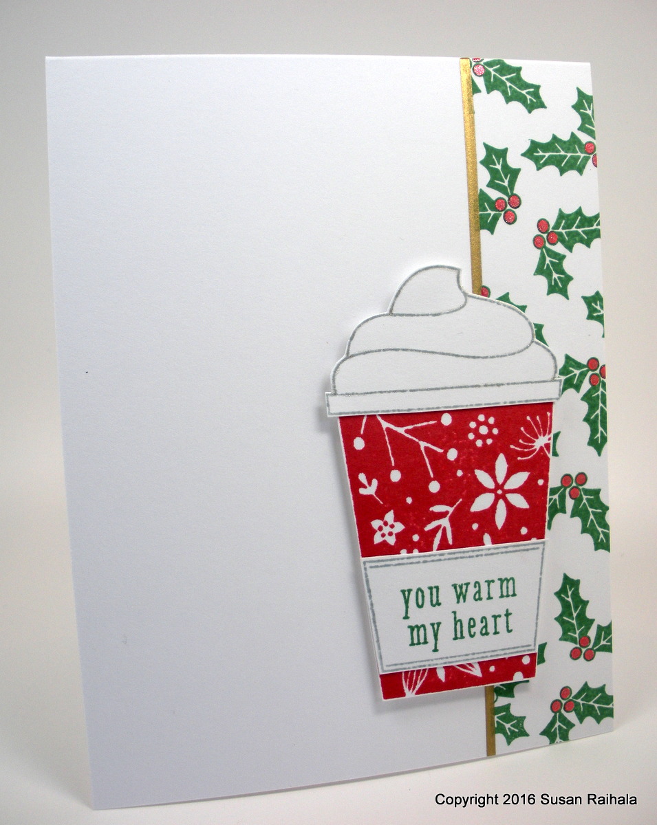
Third, giving those snowflakes room to fall makes a world of difference! The whole card evokes the feel of snow falling, that wonderful winter image that calls to mind both chilly snowballs and warm cups of cocoa.

Or coffee, if you prefer.

The balanced version was bling-worthy, and the bling adds just the right detail.

If you make a card that feels unbalanced to you, consider shifting the elements around a bit, thinking about the rule of thirds (which often helps, but not always) and how each element relates to the other. Feel your way to a good design.

It's extremely satisfying!

Supplies
stamps: Winnie and Walter The Big, the Bold, and the Merry; Papertrey Ink (large snowflake), Clearly Besotted (medium and small snowflakes)
ink: Archival vermilion and leaf green; Delicata silvery shimmer
paper: Papertrey white
accessories: rhinestones

Saturday, September 24, 2016

Email Subscriber Update and a Layout from Maille Belles


If you just want to see today's card, please scroll down and ignore the verbiage. If you subscribe by email, please read the verbiage.


Email Subscriber Update

When Eva and I met up the other day, she mentioned difficulty replying to the emails she receives as a subscriber through my FeedBurner account. She's not the only person who's expressed difficulty with this.

Frankly, Feedburner is a pain in the patootie. Several years ago, it decided not to play nicely with a lot of major email providers, and about 800 of my subscribers stopped getting emails. When I explored other email subscriber services, it turned out to be prohibitively expensive (upwards of $50 per month, in fact). So we're stuck with Feedburner, and I'm really sorry about this.

I looked around and couldn't find any way to address this issue sensibly. There are a few things you can do to work around the problem.

1. Add Susan Raihala and the email susanraihala at roadrunner dot com to your email address book, and then forward the email to me rather than hitting reply. Once I'm in your contacts, this option will be almost as easy as simply replying and should solve the problem.

2. Go to Simplicity's website by clicking in the email on the post title, scroll down on the page, and leave a public comment. I'm going to enable anonymous commenting again, and as long as the spam stays minimal, it'll stay that way. If I start getting a bunch of comments for sexxy grrls and varicose vein surgery, anonymous commenting will, once again, go away because no. Just no.

3. Subscribe to Simplicity via another avenue. There's a full list of options on the Subscribe Tab at the top of the blog. If you read a number of blogs, a blog reading service like BlogLovin or Feedly might be a more efficient option than email anyway.

Also, if you're on Facebook, know that I link to every post on Simplicity by Lateblossom's page there, so new posts will show up in your feed automatically.

And if you're a Pinterest junkie, follow my Cards by Susan Raihala page, and all you have to do is click on the photo. It'll take you to the post and you can comment there.  


A Layout from Maille Belles

On to a more entertaining topic...the genius of Maille Belles. If you've not encountered her blog, go there. Scroll around. She's truly amazing. The card that inspired me is HERE.

My card's layout is almost exactly like hers...or as alike as it can be with a different focal point.


This cup of fabulousness makes me so happy! It's from a Hero Arts set called Coffee Cup Tags. It was extremely easy to cut out, so no worries about not having a die cut machine. The holly also comes from a Hero set. To add some sparkle, I used Sakura stardust pens in red for the holly and clear to outline the whipped cream.


This is a GREAT layout for spotlighting larger images while still maintaining plenty of white space.

Note that Maille's card uses an angel with a strong vertical element (wings) that pushes the angel away from the line at the edge of her border. I love how she placed the sentiment in a way that "fills" the space under the left wing. The sentiment's strong vertical feel also helps balance the layout.

My cup, shaped totally differently than Maille's angel, still has strong vertical elements, including the sleeve with the sentiment. Since my sentiment is on the large, blocky image, my cup straddles the line so that one third is over the border with two thirds over the white space...thus preserving the rule of thirds. If the line had bisected the cup, it would have looked weird.

I'm sure Maille would never do that.


Supplies
stamps: Hero Arts
ink: Hero Arts, Archival
paper: Papertrey Ink white
accessories: craft foam, Sakura stardust pens in red and clear, gold Prismcolor gold metallic pen, ruler

Thursday, September 22, 2016

Soft Thanks

First, a problem. A few of you who subscribe via email are hitting reply and sending emails, only to have them returned to you. Others reply with no difficulty at all. I have no idea what's going on here but will investigate and see what turns up.

Second, I want to thank reader Eva for meeting me today for coffee and a little shopping spree at Marco's Paper! What a fun way to spend the morning...so fun, in fact, that we're going to do it again! But it got me thinking, how many other readers are in the greater Dayton/northern Cincinnati area who might want to meet for coffee? I LOVE meeting people for coffee. If you live locally and are interested in coffee and stampy conversation, please shoot me an email at susanraihala at roadrunner dot com.

Last year, kind reader Sonya sent sent me a very generous batch of feather die cuts that match Waltzingmouse's Fine Feathers. Here I am using them again!


This soft thank you card will be perfect to send to a friend who recently did me a lovely, kind, and very comfortable good deed. She was present when I needed her. The value of that is inestimable.

The far right feather is glued down flat, but the other two are only glued at the bottom. After the glue dried, I lifted the tops of the die cuts and slipped dimensionals under them. What a neat way to add a bit of dimension to a very subtle, simple design.


The ink is Mama Elephant moonlight pigment, which doesn't dry well for me. After waiting just a minute, I dusted the stamped die cuts with my embossing buddy and then let them sit a little longer before gently wiping them with a tissue. The densely inked feather required a second coating with the embossing buddy, but that did the trick.

Merci to all of you for the comments and emails and lurking. It's lovely to know that my little corner of the internet makes some people happy!

Supplies
stamps: Waltzingmouse Fine Feathers, Clear and Simple Stamps Thank You
ink: Mama Elephant moonlight, Memento Luxe espresso truffle
paper: Papertrey white
accessories: die cuts, embossing buddy, silver cord, dimensionals


Wednesday, September 21, 2016

It's a Miracle!


I made a card with washi! Doesn't this little 1.5" strip justify the bazillion rolls of the stuff on my shelf?

Of course, it does. What a silly question.


The panel is just attached with the washi, although I suspect I need to add a little something to make it more permanent since washi isn't. But I love how the bottom of the panel sticks out from the card, as if it really were hanging there. I think I'll put a little glue on the top edge of the panel and leave it at that.

Isn't it great how the Hero Arts pale tomato ink perfectly matches the washi. Yay! And the fresh peach (also from Hero) gives a lighter tone to the center, solid heart.

Let's admire that sentiment as well. Oh, how I love the handwritten font. Love. Love. Love!!!!

What supply do you have a bazillion of that you could actually use a little of? Search your hoard and find something neglected, apply a little creativity, and see what happens!

Supplies
stamps: Papertrey (Keep It Simple Encouragement), October Afternoon
ink: Hero Arts pale tomato, fresh peach, soft sky; Memento Luxe tuxedo black
paper: Papertrey
accessories: washi

Tuesday, September 20, 2016

Thanksgiving Crusade Wreaths

For my Canadian readers, October 10 is Thanksgiving this year. This is partly why I start the Thanksgiving Crusade so early. If you've made your Thanksgiving cards or gratitude cards to thank the special people in your life, link to them on the Thanksgiving Crusade page.

There will be a $25 gift card in it for one lucky winner!

If you're looking for Thanksgiving inspiration, check out last year's entries, which are still up on the Crusade page.

Today's cards highlight two wreaths in the set Autumn Blessings from Simon Says Stamp.


Both of these cards have the benefit of easy mass production. Plus, they show the rich beauty of pigment inks and well-designed stamps!

Do you have a favorite thank-you or fall-themed stamp set? I have several, and this is one of them, but let's enable each other!

Supplies
stamps: Simon Says Stamps Autumn Blessings
ink: various pigment
paper: Papertrey white
accessories: Stickles 

Monday, September 19, 2016

CASEing a Layout, Part 2

Yesterday's card, which fits so nicely in the Thanksgiving Crusade Challenge, isn't the only one I made that was inspired by Tracy May's gorgeous card on Pinterest. Of course, since I don't have a die-cut machine, my punches did the work, but the results are soft and fresh and fun anyway!


The sand dollar punch is from Martha Stewart and the branch (which substitutes as seaweed) is from Tim Holtz. Rather than use colored card stock for the seaweed and centers of the sand dollars, I stamped large shapes with Mama Elephant moon light and Impress Fresh Ink grass, then punched. Being able to stamp and then punch gave me just the shades I wanted...my colored cardstock stash is, shall we say, not as robust as it used to be.

My ink stash, however, is growing by leaps and bounds. And yes, the embossing buddy made the moon light ink dry lickity-split.

The splashy background was made with Papertrey Grunge Me and My Favorite Things Jumbo Abstract Art stamps. The inks were Impress Fresh Sicilian blue and Avery Elle sea glass. I kept stamping until the coverage looked right.


Now, ordinarily, one might design this card with one or three sand dollars, following the rule that odd numbers typically are more pleasing to the eye. Tracy, for instance, uses one flower on her card. However, in the interests of unifying the sentiment and the focal point, I stuck with two sand dollars on a waterbed with pillows of seaweed.

Read into that what you will.

I recommend playing the soundtrack of From Here to Eternity while you do.


Supplies
stamps: Hero Arts, Papertrey, My Favorite Things
ink: Impress Fresh Ink, Memento Luxe, Avery Elle, Mama Elephant
paper: Papertrey white
accessories: punches from Tim Holtz and Martha Stewart, circle punch (behind the sand dollars), rhinestones, glue, dimensionals

Sunday, September 18, 2016

CASEing a Layout, Part 1

Let's face it. There are only so many layouts that truly work with clean-and-simple cards. The more layers you add, the more layout options there are, but if you're looking to keep things simple and minimalist AND follow the rules of good design, well, there's only so much you can do.

I've always found the layout Tracy May uses on this card very appealing for several reasons. First, the focal point is sort of in a sweet spot...the intersection of lines dividing the card into (roughly) thirds. The slight shift downward from the exact third (almost to a bottom quarter) works incredibly well, and it leaves a nearly obscene amount of glorious white space on the top of the card. Your eye has NOWHERE to go but to the focal point.

Isn't Tracy's card simply lovely?

Anyway, my version uses a shockingly different color palette from Tracy's soft blues and makes the sentiment the focal point, using the corner decoration as a backdrop only. I know I've probably used these colors together before, but seriously, even though I'm a "winter" through and through in my own personal wardrobe color scheme, warm fall colors make me feel so very, very happy and content.


For this backdrop, I went two-thirds the way up and almost all the way over the bottom. That bottom coverage (so to speak) grounds the design nicely, and proves nice pop for the sentiment panel.

The colors are Hero Arts butter bar and pumpkin pie, and Papertrey's terra cotta. So fiery and warm! To add some interest to the sentiment, I inked the whole stamp in butter bar and then rolled some terra cotta onto the bottom. If you look closely below, you'll see a bit of gradation, but you'll also notice I probably rolled a little too far with the terra cotta. Oh, well.


The corners of the raised panel are also snipped with scallop scissors for a little extra finished touch.

One of my many happy moments in fall is seeing a pile of multicolored leaves jumbled together. What are some of your favorite autumn images?

Supplies
stamps: Papertrey First Fruits
ink: Hero Arts butter bar, pumpkin pie; Papertrey terra cotta
paper: Gina K cream
accessories: dimensionals, scallop scissors

Autumn Blessings

Today's post highlights a very old set from Papertrey called First Fruits. It's a gorgeous set full of stylized, very classic fall images...and a fun pineapple, too.


It might be hard to tell on the screen, but the card stock is cream colored rather than white. Shocking, I know. But there you have it. White space doesn't have to be white. It can be cream, too! But for this card (and several other fall-themed cards I've made recently) the softness of cream worked better with the autumnal colors.

The raised panel was a scrap rescued from a failed card. I stamped the pineapple and sentiment, then edged the panel in with a copper paint marker. It still needed a little something-something, and a single small, brown bling was just the thing.

It's so fun to pull out sets from many years ago and play around with them. You just never know what you'll come up with. Well-designed sets are timeless. Tell me what old set you've played with recently.

Supplies
stamps: Papertrey First Fruits
ink: Memento Luxe peanut brittle, rich cocoa, olive grove
paper: Gina K cream
accessories: copper metallic paint pen, ruler, craft foam, rhinestone

Thursday, September 15, 2016

One Concept, Two Techniques, Completely Different Results


We will pick up on the Thanksgiving Crusade tomorrow, but for today, we're looking forward to Christmas. Remember there's an Altenew Ultimate Blog Hop Challenge and a One-Layer Simplicity Challenge going on right now as well. Have fun with them all!


For today's post, we'll take a look at two versions of one of my favorite layouts using the exact same stamps but two very different techniques.

First up. the super easy, clean-and-simple version.


Each stamp uses just one color, and the results turn natural sketch stamps into something more graphic and unexpected. There's a crispness to this version that really makes me happy.


But these stamps are vintage-looking and not intended to be used this way. So I decided to color. Y'all know that I lack mad coloring skillz, but here's how I approached it with an aqua painter and StampinUp ink.


The aqua brush is, in my opinion, the easiest way to watercolor images. I keep a folded Bounty paper towel in one hand to control the amount of water, but basically, it's pretty easy.

After punching, here's the result.


Honestly, this version looks better to my eyes, and it also feels truer to the spirit of the stamps, which are from Hero Arts' Vintage Christmas Post. The blue background for all four squares adds contrast with the background. The softness contrasts with the crisp squares and symmetry of the layout.


The mistletoe square looked a bit skimpy with the the other three more densely colored images, so I added a smidge of Stickles to the berries to add interest there.


The looks are so different that I can understand people having a strong preference. While I prefer the second card, the first still works for me, too, so my feelings aren't polarized.

What do you think?

Supplies
stamps: Hero Arts Vintage Christmas Post
ink: various
paper: Papertrey white
accessories: square punch (3/4"), dimensionals, aqua painter, Stickles

Wednesday, September 14, 2016

Thanksgiving Crusade Challenge 2016


Welcome to my annual quixotic crusade to save Thanksgiving. I hope you'll play along and make Thanksgiving or thank-you cards to send to friends, family, your favorite barista to let them know how much you appreciate them.

May I remind you that if you live in a country that doesn't formally celebrate Thanksgiving, you are still entirely welcome and encouraged to participate in the Thanksgiving Crusade. It doesn't take a government-sanctioned holiday to show gratitude, now, does it?

An InLinkz button will go up in the next few days on the Thanksgiving tab at the top of Simplicity's page for this year's entries. Before that, feel free to check out last year's beautiful entries. There will be a prize awarded in December.

I'm going to kick it off with this clean-and-simple card that makes me very happy.


These non-traditional colors add interest but also work really well with a crisp white background.


Pull out your Thanksgiving- or gratitude-themed stamps and show your gratitude. After all, what is card making about but showing love and appreciation for the awesome people in our lives?

Stamp grateful.


Supplies
stamps: Simon Says Stamp Autumn Blessings
ink: can't remember
paper: Papertrey white
accessories: rhinestones


Tuesday, September 13, 2016

Altenew Gets Challenging

We're back, I'm exhausted, and George is an Ironman...for the seventh time. Thanks to all who showed their support for him, and especially to Amy, Marcia, and Nicole who made me feel so welcome in Madison!


Altenew asked the One-Layer Simplicity Challenge to participate in their Ultimate Challenge Blog Hop, and I jumped at the chance. I encourage you to play along...you might win prizes! And orders will receive a free gift while supplies last.

So YAY!

Check to OLS post for details.

I posted on the OLS Blog with a one-layer card because, you know, OLS. But I made several others to share here. These two cards demonstrate the very different results you get with different techniques, even with just one layer.

First up, soft watercolor effects. The base of the card is watercolor paper, and the image comes from coloring the stamp with markers, spritzing fairly heavily with water, and stamping. The results are soft and soothing, yet still pink and sweet, too.


Next, softness and simplicity combined to make a crisp yet pretty card. The second card base is Papertrey white cardstock. After masking and sponging, I stamped the image in Memento Luxe pigment inks, drew the line with a silver Prismacolor metallic marker, and added the sentiment.


Blue and green are my favorites!

I hope you'll check out the Altenew Ultimate Challenge Blog Hop! 18 blogs are participating, and there's already amazing work on the link-up!

Supplies
stamps: Altenew Botanical Garden, Sentiments and Quotes
ink: Memento Luxe
paper: watercolor (top), Papertrey white (bottom)
accessories: Memento markers, water spritzer, silver Prismacolor marker, ruler, post-its, sponge

Saturday, September 10, 2016

Ironman Sunday


To follow the race, please check out my other blog at the link below. I'll be back on Simplicity Monday night or Tuesday.

Questioning my Intelligence

Blessings to you all!

Friday, September 9, 2016

Christmas Inspiration


Note: You can follow our weekend in Madison as my husband prepares to do Ironman Wisconsin on Questioning my Intelligence

Rita Perfater has a card in the latest issue of Take Ten that caught my eye.


I particularly liked the upper left corner of the card, with the postage cancellation stamped over text with a sentiment. It's just so soft and pretty and made me think it would make an excellent Christmas card.


My card started as one layer, but the lack of anything in the bottom right of the card looked far too bare, so I stamped the text again but put it too far toward the middle of the card so there was too much in the bottom right. Sadly, there was no recovering the balance of the card after that mistake.

Circular file and start over.

The second time, I used a scrap and got the placement and balance much better. Yay! The silver border adds just the right frame.

Thanks, Rita, for the inspiration!

And thanks, also, to Simplicity reader Amy Doyle, who saw me at Starbucks this morning and introduced herself to me and George. We only spoke briefly, but her kindness made my day!

Supplies
stamps: Hero Arts Vintage Christmas Post, sentiment from another Hero Arts set whose name I can't remember
ink: Hero Arts green, red royal, soft granite; Memento Luxe black
accessories: silver Prismacolor pen, craft foam


Thursday, September 8, 2016

Finding Joy


Note: Marcia Peck, please send me an email at susanraihala at roadrunner dot com. 

Today, I concentrated on finding joy...even if it wasn't an everyday sort of day. George and I traveled to Madison today, driving through some nasty rain and heavy traffic in the process.

But it's been a day full of blessings. Like seeing, inexplicably, a recliner set up on the side of I-74. Like arriving safely at our destination. Like finding our hotel freshly renovated and updated. Like eating a delicious meal filled with the laughter of friends.

Find your joy. Whether it's an everyday sort of day or out of the ordinary, find the joy.


What were your everyday blessings today?

Supplies
stamps: Altenew Botanical Garden, My Favorite Things Cheerful Blessings
ink: Impress Fresh Ink grass, Memento Luxe espresso truffle
paper: Papertrey Ink white
accessories: ribbon, circle punch, craft foam

Wednesday, September 7, 2016

Something Cheerful for Ironman Wisconsin

It's that time of year again. That's right. This Sunday, my insane husband will, for the tenth time, start an Ironman race. He's finished six and didn't finish three, and no one knows what Sunday will bring.

But, either way, I'll have fun because I'm an Ironmate, not an Ironman. Those folks are crazy.

In honor of the start of our Wisconsin journey, I'm posting two cheerful cards inspired by this pin.


If you're interested in following our adventure in Madison, I'll be blogging it on Questioning my Intelligence. Maybe it will jumpstart my writing over there. It's been a while since I posted.

Swim 2.4 miles. Bike 112 miles. Run 26.2 miles.

A whole bunch of crazy is about to happen.

Supplies
stamps: Hero Arts Borders and Arrows, My Favorite Things Party Patterns, Hero Arts discontinued sentiments
ink: Kaleidacolor (arrows); Hero, Memento, Archival (dots); Memento Luxe black (sentiments) 
paper: Papertrey
accessories: rhinestones, craft foam, glue

Tuesday, September 6, 2016

Thoughts on Sympathy Cards and Grief

Wow. I want to thank everyone who commented on or emailed regarding the two very different sympathy cards on this post. The replies are very perceptive and reveal one great truth about grief.

Everyone does it differently.

My two cards on that post both felt "grieving" to me, but some of you found the movement and energy of the many butterflies on the first card off-putting and too cheery. Others preferred that first card because it made them think their loved one had joined others who had gone before or that they weren't grieving alone.

Most of you preferred the second card, with just one butterfly (my personal favorite as well). Some of you thought that card would make you feel alone in your grief...it was too cold, perhaps, or barren.

Other readers wanted something in-between the many butterflies and the one. If that describes you, today's card might suit you.


This card started life as a one-layer card, but the placement was too low. Instead of starting over, I created this layered card. Butterflies represent transition and metamorphosis...life from death and resurrection. The upward movement of the three butterflies is nicely symbolic, but isn't it grand how the mat surrounds the stamped panel, anchoring it and giving a feeling of stability to the design? I find that tension comforting.

The color here is wonderfully neutral: Hero Arts' wet cement. It matches well with StampinUp's sahara sand cardstock. It has a completely different feel from the black of the first two cards. There's a drama and starkness to the black that (to me) seems to acknowledge the pain of grief honestly, but the softness of the wet cement is soothing to me.


There really are no "right" answers, are there? Everyone grieves differently. How lovely it is that we can make different cards for different people to share our sympathy and love with them in difficult times.

Blessings to you all!

Supplies
stamps: Hero Arts Antique Engravings, Gina K Elegant Florals
paper: Papertrey white, StampinUp sahara sand
ink: Hero Arts wet cement, Memento Luxe rich cocoa
accessories: none


Monday, September 5, 2016

Crowdsourcing Success and Two Cool Christmas Card


If you missed my very wordy post about "fast-dry" pigment inks that aren't drying for me, it's here. Two readers made suggestions that have proven to be extremely helpful, and I recommend you give them a try.

Solution #1

Julia's solution is hairspray. Donna warns that some hairspray can turn the card yellow in a short period of time, but Julia has never had that happen. I suggest experimenting with aerosol cans of cheap hairspray. Joan shared that she has used Aqua Net and Tresemme with success.

I had a pump bottle of Suave hairspray and tried it just to see. The bottle (of course) spat blotches of spray on the card, but once it dried, the ink didn't move. YAY! An aerosol can will spray a fine enough mist to avoid blotches and will be much less likely to warp the card than a standard spray bottle.

My conclusion is that, essentially, hairspray works like the fixative, only without the toxicity and need to go outside where there are kamikaze bugs intent on destroying your work.


Solution #2

Bev sent me an email suggesting that I use an Embossing Buddy to pre-treat the paper before stamping, with the idea that the chalk would pull the moisture from the ink and dry it. For those who don't know, an Embossing Buddy is a fabric bag filled with chalk. It's marketed to be used to prepare paper before heat embossing. You pounce or rub the bag on the paper before stamping, and the embossing powder will stick only to the ink, not the surrounding paper. It works great for that, by the way.

Sadly, pouncing before stamping didn't work to dry the ink, but when I pounced the Embossing Buddy over the image after stamping, it worked GREAT!!!!

Embossing Buddy helps ink dry!


Instead of rubbing, I did lightly pounce, with the suspicion that rubbing would cause the ink to smear before it had a chance to dry. After pouncing, I blew the dust off and then wiped gently with a tissue to remove any residual dust.  I've tried this on a number of cards, and it worked every single time. What a relief!

And for those of you who use these inks in scrapbooks, chalk is used to neutralize acid, so I suspect it's perfectly safe. It's certainly not acidic. But I'm no expert on archival matters, so you might want to consult one.


Many, many thanks to Bev and Julia for giving us two workable solutions to this pesky problem. But please remember, individual results will vary. Donna's experience proves that hairspray isn't always a workable option, so definitely experiment before using hairspray on anything important. And my experience with the Embossing Buddy may also not work under all circumstances.

Now for the Christmas cards. The problematic pigment inks used on both were successfully dried with the Embossing Buddy.

Fresh Ink Sicilian Blue and Island; Memento Luxe Teal Zeal
and Tuxedo Black

Avery Elle Sea Glass; Hero Arts Mint Julip; VersaMagic Turquoise Gem;
Memento Luxe Tuxedo Black


How lovely to have a problem solved!


Supplies
stamps: StampinUp Endless Wishes, Hero Arts Holly Days
ink: listed in captions
paper: Papertrey white
accessories: craft foam, glue, silver metallic marker

Sunday, September 4, 2016

Sympathy Butterflies Poll

Note: I've already started on a follow-up post about the ink issues discussed HERE. There may be several solutions, folks! Thanks to those who have weighed in on the problem.

As we've discussed before, making sympathy cards before they are needed is preferable to trying to whip one up at the last minute. So I made this card after seeing this pin.


I really like how the white space surrounds the sentiment, with the black border (which mimics mourning cards from Victorian times, which were always edged in black). The sentiment becomes a very strong focal point in that broad strip of white. The black-and-white color scheme reflects how colorless grief can feel. And butterflies...transformation and new life.

Y'all know that I prefer a minimalist style, and while I love this card, all those butterflies started to make me feel twitchy.

So I made this card, which will, no doubt, make some of you twitchy.


I can easily imagine people to whom I would send one or the other. The unique vibe of each makes them both useful to have in my stash.

Which of the two would you personally prefer to receive? I ask in the interests of market research. Karen's Card Shop (the one at my church) had a request for sympathy cards, and I'm wondering which sort the majority of people might prefer, the abundant butterflies or the single one, or something between.


Supplies
stamps: Gina K Elegant Florals (sentiment), Hero Arts Antique Engravings
ink: Hero Arts intense black
paper: Papertrey
accessories: black Sharpie


Saturday, September 3, 2016

Super-CAS Saturday and Digression on the Bard


If you've followed Simplicity for a while, you know how autumn speaks to my soul.

Oh, me.

Oh, my.

Oh, autumn!

And it's not just because I love pumpkin spice lattes immoderately.

We're not quite there yet officially, but when the calendar flipped over to September, our weather in southwest Ohio became much more pleasant...still summery, but no longer reminiscent of satan's humid furnace. The pleasant weather makes me anticipate autumn all that much more.

Here are three small, very clean, very simple note cards that speak to my autumn-loving Renaissance soul.

All three cards are 3 3/8" x 4 7/8". They fit
purchased envelopes.


This delightful trefoil vine evokes medieval book illumination and Renaissance ornament as well, which explains why combining it with autumnal shades makes my heart go pitter-patter. The inks are Kaleidacolor, and I used an aqua painter to fill in the color...so easy to add variations in the colors to make the image more interesting.

The stamp is from Hero Arts' new set called Shakespearean Poetry. *happy sigh* There should be an add-on with additional quotations from the Bard. "Out, damned spot!" "If music be the food of love, play on." "Better a witty fool than a foolish wit." "There is nothing either good or bad but thinking made it so." "No." Hamlet, Act III, Scene 1 (although properly, this should have an ellipsis, since Hamlet does continue after the no, but let's not quibble). "With mirth and laughter, let old wrinkles come." "Sweet mercy is nobility's true badge." "Get thee to a nunnery."

Maybe multiple add-on sets. Will had a great way with words, words, words. There could be a set for making cards for enemies with Shakespearean insults, one for lovers, one for parents and children, one for the meaning of life, one for pure comedy, one for politics, one for lyrical beauty, one for nature, one for Halloween (mostly Macbeth, of course).... So many possibilities!

The next logical question, though, is this: when will Hero come out with Chaucer's Poetry, which would need a pear image in it for sure, or Wordsworth's Poetry with daffodils and Tintern Abbey ruins?  What about Blake's Poetry with a lion, a lamb, and a spectacularly scary image of Satan? Oh, my.

What Shakespearean quote would you like to see in a stamp? What other poet deserves Hero's attention, in your opinion? Let's get literary today.

And if brevity is the soul of wit, I'm witless.

Farewell.

Supplies
stamps: Hero Arts Shakespearean Poetry
ink: Kaleidacolor
paper: Papertrey vintage cream
accessories: aqua painter