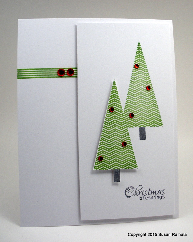
Today's card uses Clearly Besotted's Modern Christmas set, which, in addition to a number of modern-design Christmas trees, has some beautiful sentiments that will be quite versatile to use with lots of my other Christmas sets.
A stamper simply can't have too many holiday sentiments. Right?
So here's the finished card in its gloriously blinged state:
I snapped a picture of the card before I added bling, just to show how adding some contrast and sparkle really livens up a design.
Color unifies the un-blinged design, but crikey, it's blah. Adding red rhinestones spices things up from a color perspective (red and green are opposites on the color wheel...opposites add energy). Putting the red on all three green elements keeps the unity of the design strong.
And that's all I have to say about that.
Supplies:
stamps: Clearly Besotted, Papertrey
ink: Fresh Ink mojito, Memento Luxe gray flannel
paper: Papertrey White
accessories: rhinestones, dimensionals
Tuesday, June 16, 2015
Monday, June 15, 2015
Chemistry and Zoology
The Clearly Besotted set Scientifically Speaking jumped all by itself into my cart a few months back. Some of you may know I was, briefly, a chemistry major. (You can read about it here if you're interested.) My love of science drew this set to me, and oh how I love it.
Just a little fun in the lab of my creativity, so to speak.
Anyway, I mentioned yesterday that George and I have been married 29 years (talk about chemistry) and to celebrate, he took today off so we could go to the Indianapolis Zoo. George and I have enjoyed zoos for years...all over the country. Indianapolis has a dolphin exhibit and show, which drew us in like krill draws in a whale shark. Don't you love how dolphins always look happy? I mean, they are the golden retrievers of the ocean, spreading joy and happiness everywhere they blow, click, or squeee.
But with a lot less fur.
At the zoo today, I also learned that the Marabou stork is, to use George's words, "the biggest d*ck in the animal world." They fly ahead of brush fires and pick off small animals fleeing the flames. How horrible is that? We also heard gibbons vocalizing, saw a baby elephant playing in the water, witnessed quail mating (it was over very quickly, but he said he call her), and sweated practically to death in North-Carolina-worthy humidity.
Oh, and I took elephant butt pictures for my sister. So all in all, it was a great day for zoology!
Supplies
stamps: Clearly Besotted
ink: Memento Luxe
paper: Papertrey
accessories: corner rounder, dimensionals, Wink of Stella clear (on the love potion and hearts)
Just a little fun in the lab of my creativity, so to speak.
Anyway, I mentioned yesterday that George and I have been married 29 years (talk about chemistry) and to celebrate, he took today off so we could go to the Indianapolis Zoo. George and I have enjoyed zoos for years...all over the country. Indianapolis has a dolphin exhibit and show, which drew us in like krill draws in a whale shark. Don't you love how dolphins always look happy? I mean, they are the golden retrievers of the ocean, spreading joy and happiness everywhere they blow, click, or squeee.
But with a lot less fur.
At the zoo today, I also learned that the Marabou stork is, to use George's words, "the biggest d*ck in the animal world." They fly ahead of brush fires and pick off small animals fleeing the flames. How horrible is that? We also heard gibbons vocalizing, saw a baby elephant playing in the water, witnessed quail mating (it was over very quickly, but he said he call her), and sweated practically to death in North-Carolina-worthy humidity.
Oh, and I took elephant butt pictures for my sister. So all in all, it was a great day for zoology!
Supplies
stamps: Clearly Besotted
ink: Memento Luxe
paper: Papertrey
accessories: corner rounder, dimensionals, Wink of Stella clear (on the love potion and hearts)
Sunday, June 14, 2015
Ink Pics, a Card, and an Anniversary
A few weeks ago (or maybe longer), I promised to revisit my ink storage on this here blog because I know you all love seeing evidence of other people's mental illness obsession collections of crap stuff in pictures.
So here are my most current photos of my ink collection.
So there you have it. My inky craziness.
BTW, I like having my inks in plastic drawers stored on my desk within an easy arm's reach. I can pull out a drawer, stack them on my desk, put them back. It's light-weight, easy, and a cinch to straighten up afterwards.
I reflected yesterday, as I deep-cleaned my craft space, that ink is a necessary supply for me...lots of ink in lots of colors. It actually gets used all the time. While some of my supplies might have been over-bought in too many colors (Smooch, Stickles, baker's twine, ribbon, etc.), I don't feel I have too many colors of ink.
Which probably makes me certifiably crazy. But I don't care.
Anyway, today's card uses Memento black, VersaMagic jumbo java, and Avery Elle mango inks, along with a few Copic/Bic/Sharpie markers and some brown Stickles. That seems like a lot for such a simple, clean card, doesn't it?
Today, Flag Day, is my wedding anniversary. Twenty-nine years. This is odd, because that means we got married as infants. We. Are. Not. That. Old.
I'm still thirty. Right?
Denial is a river that runs deep and wide.
Supplies
stamps: Mama Elephant, Papertrey
ink: Memento, Avery Elle, VersaMagic
paper: Papertrey white
accessories: Stickles, alcohol markers
So here are my most current photos of my ink collection.
| Brilliance Inks have a lovely shimmer to them, and of course I need to add the silver Delicata to the collection. The gold is just scrumptious! |
| Yellow, orange, pink, red, and neutral pigment inks. I use happily Memento Luxe, VersaMagic, and Fresh Ink interchangeably for that thick, rich pigment look |
| Purple, blue, and green pigment inks |
| Kaleidacolor pads. These dye pads are so much fun! |
| What's left of my SU dye ink collection: all the old- style, flip-top pads. Great colors every one! |
| Miscellaneous pads that I hardly ever use. |
| Blue and green dye inks. My favorites are Hero Arts, Memento, and Ancient Page. The Memories inks are the same as Hero inks. |
| Pink, Red, and Purple dye inks. |
| Yellow, orange, and neutral dye inks. |
BTW, I like having my inks in plastic drawers stored on my desk within an easy arm's reach. I can pull out a drawer, stack them on my desk, put them back. It's light-weight, easy, and a cinch to straighten up afterwards.
I reflected yesterday, as I deep-cleaned my craft space, that ink is a necessary supply for me...lots of ink in lots of colors. It actually gets used all the time. While some of my supplies might have been over-bought in too many colors (Smooch, Stickles, baker's twine, ribbon, etc.), I don't feel I have too many colors of ink.
Which probably makes me certifiably crazy. But I don't care.
Anyway, today's card uses Memento black, VersaMagic jumbo java, and Avery Elle mango inks, along with a few Copic/Bic/Sharpie markers and some brown Stickles. That seems like a lot for such a simple, clean card, doesn't it?
Today, Flag Day, is my wedding anniversary. Twenty-nine years. This is odd, because that means we got married as infants. We. Are. Not. That. Old.
I'm still thirty. Right?
Denial is a river that runs deep and wide.
Supplies
stamps: Mama Elephant, Papertrey
ink: Memento, Avery Elle, VersaMagic
paper: Papertrey white
accessories: Stickles, alcohol markers
Thursday, June 11, 2015
Bunny Butts
My sister, who once upon a time lived every little girl's dream of becoming a professional ballet dancer, collects photos of animal butts. This may have started in high school when she attended the North Carolina School of the Arts, where she was thrown in with college students at far too tender an age.
Anyway, over the years, when my husband and I are at zoos, I try to get at least one animal butt shot because, you know, I'm a thoroughly supportive big sister and encourage Lisa in her hobbies.
So when I saw the bunny stamp in Clearly Besotted's Woodland Pals set, I knew who would get the first card I made with it.
Note that I grounded the bun-bun with a border-punched piece of lime green card stock and created a bunny butt with a 1/4" pom pom. This wouldn't fit through the regular mail, but I intend to hand it to her when I see her later this summer.
She will laugh and laugh and hang it on her fridge with the other animal butt pictures.
And speaking of laughing, tonight at the dinner table, my 15-year-old son said, "She was dressed prerogatively." George and I just about died laughing. I love that kid.
Supplies
stamps: Clearly Besotted
ink: Memento Luxe
paper: Papertrey Ink white, unknown lime green
accessories: Martha Stewart grass border punch, glue, pom pom
Anyway, over the years, when my husband and I are at zoos, I try to get at least one animal butt shot because, you know, I'm a thoroughly supportive big sister and encourage Lisa in her hobbies.
So when I saw the bunny stamp in Clearly Besotted's Woodland Pals set, I knew who would get the first card I made with it.
Note that I grounded the bun-bun with a border-punched piece of lime green card stock and created a bunny butt with a 1/4" pom pom. This wouldn't fit through the regular mail, but I intend to hand it to her when I see her later this summer.
She will laugh and laugh and hang it on her fridge with the other animal butt pictures.
And speaking of laughing, tonight at the dinner table, my 15-year-old son said, "She was dressed prerogatively." George and I just about died laughing. I love that kid.
Supplies
stamps: Clearly Besotted
ink: Memento Luxe
paper: Papertrey Ink white, unknown lime green
accessories: Martha Stewart grass border punch, glue, pom pom
Wednesday, June 10, 2015
A Bridge Too Far
In the summer of 1977, my father made our family go see A Bridge Too Far. I was not yet eleven years old.
Let's all agree right now that this constituted child abuse. I was a girly-girl who once (or twice) cried because my mom made me wear pants to school. Seriously. A war movie? People died! Violently! It was like Bambi, only worse, because it was based on real events, as my dad so thoughtfully made sure I understood.
I was scarred for life. Seven years later, I read Joseph Conrad's The Heart of Darkness. Remember when Kurtz utters the line, "The horror. The horror"? Well, I understood exactly what he meant.
Because of A Bridge Too Far.
Today's card series, oddly enough, reminded me of that experience. Instead of A Bridge Too Far, let's call it A Shade Too Many. Definitely not traumatic, but I bet every single stamper who reads this blog knows exactly what I'm talking about: the disappointment of taking an idea one step too far.
Yesterday, I showed how you can stamp outline flowers in a color and not bother actually, you know, coloring them. Today, I'll show you my first efforts at coloring the chrysanthemum in the Mama Elephant Freestyle Florals set.
Y'all know I'm not into time-consuming coloring techniques, but when I faced this stamp--with all those tiny petals--I decided it would look really lame if I only colored it one color. Two colors, however, sounded reasonable. It might take a little time, but not too much time. The result, using a very light shade and a medium shade of violet, was extremely satisfying.
All I did was color the entire flower quickly in the light shade and then added random petal of the medium shade, being careful to balance the placement of those darker petals. The results were so satisfying that I wondered if three shades would look even better. After searching my stash of alcohol markers for three shades of one color (I only had two of the violet), I settled on these mauve/burgundy shades.
That's when the wheels fell off. The bridge blew up. And I discovered mauve is not a good color for me. Seriously.
Ugh. The two lighter shades are too close to each other, and the dark is too dark. The results are unbalanced and rather ugly. More importantly, however, the quality of the coloring stinks. On the previous card, quickly coloring the light violet shade looked fine and gave a smooth base upon which to add the medium violet, but the light mauve (which wasn't as light as the violet) streaked and didn't give good coverage at all.
Instead of fixing that unevenness with another layer of color (which would have made the whole thing look even darker), I just pressed on. A bad base color and poor accent color placement resulted in visual chaos.
It looks messy. Untidy. Ugh.
At least it's not blood red, though. THAT would have been truly traumatic.
In the hands of someone with better coloring skills, this bridge could probably be taken. I, however, chose to surrender. Survive to fight another day, I always say.
After that time-consuming coloring craziness, perhaps we all need to cleanse our visual palate with a truly minimalist approach to this stamp. How about taking a gander at the first card I made with this stamp before I decided to get all jiggy with it.
One layer. A spot of color. Quick as a blink. Ahhhhh.
Much better.
But my favorite is the violet version. Push your boundaries, but don't go too far.
You might lose some card stock that way.
Supplies
stamps: Mama Elephant (Freestyle Florals); Papertrey (Keep It Simple: Thinking of You)
ink: Memento black
paper: Papertrey white
accessories: dimensionals, corner rounder, rhinestones
Let's all agree right now that this constituted child abuse. I was a girly-girl who once (or twice) cried because my mom made me wear pants to school. Seriously. A war movie? People died! Violently! It was like Bambi, only worse, because it was based on real events, as my dad so thoughtfully made sure I understood.
I was scarred for life. Seven years later, I read Joseph Conrad's The Heart of Darkness. Remember when Kurtz utters the line, "The horror. The horror"? Well, I understood exactly what he meant.
Because of A Bridge Too Far.
Today's card series, oddly enough, reminded me of that experience. Instead of A Bridge Too Far, let's call it A Shade Too Many. Definitely not traumatic, but I bet every single stamper who reads this blog knows exactly what I'm talking about: the disappointment of taking an idea one step too far.
Yesterday, I showed how you can stamp outline flowers in a color and not bother actually, you know, coloring them. Today, I'll show you my first efforts at coloring the chrysanthemum in the Mama Elephant Freestyle Florals set.
Y'all know I'm not into time-consuming coloring techniques, but when I faced this stamp--with all those tiny petals--I decided it would look really lame if I only colored it one color. Two colors, however, sounded reasonable. It might take a little time, but not too much time. The result, using a very light shade and a medium shade of violet, was extremely satisfying.
| Isn't that pretty? And note how balanced the placement of the darker petals. Go, me! |
All I did was color the entire flower quickly in the light shade and then added random petal of the medium shade, being careful to balance the placement of those darker petals. The results were so satisfying that I wondered if three shades would look even better. After searching my stash of alcohol markers for three shades of one color (I only had two of the violet), I settled on these mauve/burgundy shades.
That's when the wheels fell off. The bridge blew up. And I discovered mauve is not a good color for me. Seriously.
| WHAT NOT TO DO |
Ugh. The two lighter shades are too close to each other, and the dark is too dark. The results are unbalanced and rather ugly. More importantly, however, the quality of the coloring stinks. On the previous card, quickly coloring the light violet shade looked fine and gave a smooth base upon which to add the medium violet, but the light mauve (which wasn't as light as the violet) streaked and didn't give good coverage at all.
Instead of fixing that unevenness with another layer of color (which would have made the whole thing look even darker), I just pressed on. A bad base color and poor accent color placement resulted in visual chaos.
It looks messy. Untidy. Ugh.
At least it's not blood red, though. THAT would have been truly traumatic.
In the hands of someone with better coloring skills, this bridge could probably be taken. I, however, chose to surrender. Survive to fight another day, I always say.
After that time-consuming coloring craziness, perhaps we all need to cleanse our visual palate with a truly minimalist approach to this stamp. How about taking a gander at the first card I made with this stamp before I decided to get all jiggy with it.
One layer. A spot of color. Quick as a blink. Ahhhhh.
Much better.
But my favorite is the violet version. Push your boundaries, but don't go too far.
You might lose some card stock that way.
Supplies
stamps: Mama Elephant (Freestyle Florals); Papertrey (Keep It Simple: Thinking of You)
ink: Memento black
paper: Papertrey white
accessories: dimensionals, corner rounder, rhinestones
Tuesday, June 9, 2015
Pretty Flowers...or How to Cheat
While I am no longer quite as allergic to coloring as I used to be, it's still not my favorite stamp activity. So when I get a set of outline stamps, I always experiment to see if they'll work NOT colored. Such was the case with Mama Elephant's Freestyle Florals set.
As you can see, these flowers respond well to NOT being colored.
The first card is softer, with mostly light pink and a few darker red accents. That script happy really grabs your attention, but the softness of the pink tempers it nicely. Such a feminine card!
The birthday card is just cheerful. I love that green...it's Fresh Ink Grass. The black accents are bold and dramatic, and while it's a feminine card, you probably wouldn't send it to a girly-girlfriend. I know exactly who's getting this one...a friend who's a professor of computer engineering who also likes to garden.
Not sure yet who will get the pink card, but I have plenty of girly-girlfriends to whom I can send happy thoughts.
So if you spend most of your time coloring, why not cheat and play around with some colored inks instead? It's fun and the results can be so very lovely!
Supplies
stamps: Mama Elephant (Freestyle Florals), Clearly Besotted (Happy Days), Hero Arts (happy birthday)
paper: Papertrey Ink white
ink: Fresh Ink, Memento Luxe
accessories: dimensionals, corner rounder, rhinestones
As you can see, these flowers respond well to NOT being colored.
The first card is softer, with mostly light pink and a few darker red accents. That script happy really grabs your attention, but the softness of the pink tempers it nicely. Such a feminine card!
The birthday card is just cheerful. I love that green...it's Fresh Ink Grass. The black accents are bold and dramatic, and while it's a feminine card, you probably wouldn't send it to a girly-girlfriend. I know exactly who's getting this one...a friend who's a professor of computer engineering who also likes to garden.
Not sure yet who will get the pink card, but I have plenty of girly-girlfriends to whom I can send happy thoughts.
So if you spend most of your time coloring, why not cheat and play around with some colored inks instead? It's fun and the results can be so very lovely!
Supplies
stamps: Mama Elephant (Freestyle Florals), Clearly Besotted (Happy Days), Hero Arts (happy birthday)
paper: Papertrey Ink white
ink: Fresh Ink, Memento Luxe
accessories: dimensionals, corner rounder, rhinestones
Monday, June 8, 2015
A Heart Full of Love
It's always fun to play around with negative space because, you know, it's always fun to turn a negative into a positive!
Mwah!
Supplies
stamps: assorted hearts
ink: Memento Luxe
paper: Papertrey white
accessories: EK Success heart punch, dimensionals, corner rounder
Mwah!
Supplies
stamps: assorted hearts
ink: Memento Luxe
paper: Papertrey white
accessories: EK Success heart punch, dimensionals, corner rounder
Subscribe to:
Posts (Atom)