Showing posts with label Using Coloring Media. Show all posts

Thursday, August 11, 2011

A Cup of Good Wishes

Playing around with my coffee set from A Muse, I decided to do a one-layer card colored with Copics/Bics/Sharpies, executed on Gina K Deluxe cardstock, which will not let the markers bleed through. Can't remember which colors I used, but I love how the cup and saucer turned out.

I'm no coloring expert, but I think that cup is, as we say in our house, good enough for government work.


The gingham background (from Papertrey) was stamped over the masked cup with turquoise gem VersaMagic ink.

Design Discussion: This card is decidedly bottom-heavy (a little like me, actually). I first tried to put the red ribbon on the top of the card, the idea being to balance the design more. But that looked...odd. When I moved it to the bottom, it looked less odd., so there it stayed. Despite the uneven balance, I still really like this card, mainly because the colors make me happy.

Supplies
stamps: A Muse, Papertrey
ink: Versamagic, Memento
paper: Gina K deluxe cardstock
accessories: post-it (mask), ribbon, rhinestones, markers

Sunday, July 10, 2011

Gracious Vases...Part 2

As promised, today I'm showing my latest attempt at coloring with markers. Before I get to the card, however, let's talk about the markers.

Y'all know that I'm not a big colorer. The drive to keep things simple lives strong in me, and coloring isn't simple. It takes practice, skill, and time...much more time than inking a block image up and stamping it and being d-o-n-e, done.

Not coloring much hasn't kept me from experimenting with and buying just about every coloring medium known to stamping. I have watercolor pencils and crayons, Prismacolor pencils, Twinkling H2Os, chalks, SU reinkers, SU markers, Memento markers, and Bic and Sharpie markers. I can honestly say I've not gotten my money's worth out of any of these, but at least most of them don't go bad, so eventually, if I live to be a hundred, I might actually use some of them half up.

Can you say "conspicuous consumption"?

Knew you could.

Anyway, I deliberately didn't buy Copics, figuring Bics and Sharpies were adequate to my very simple need, and until Wednesday, I only had seven Copics: six of them I'd won as blog candy, and the seventh was the light cool gray I bought with the expectation of outlining images. All the cool stampers outline, you know.

There's a reason you've never seen an image with a marker by me. Seriously.

Anyway (again), when I started coloring the outline vases from Gracious Vases, I discovered that they look really nifty with monochromatic shading. Which made me go through all my markers to see what colors I could use. Which made me realize that the Bic and Sharpie markers are sadly lacking in light colors. Which made me want to supplement my stash with some light Copics.

In addition, the cap colors on the Bics and Sharpies aren't entirely accurate. Which was annoying when colors didn't turn out like I wanted. Which made me get all AR/OC at 11:00 Tuesday night. Which made me make a chart so I'd really know what sort of monochromatic shading I could do. Which made me really tired the next day. Which weakened my resolve to stay away from Copics. Which made me spend an undisclosed amount of money at Marco's Paper and Hobby Lobby.

Hey, I used a coupon at Hobby Lobby.

Oh, Lordy. I'm so very crazy.

So here's the chart. I stamped a bunch of the vases on a spare sheet of paper and then colored them all in. The ones I liked, I cut out and glued onto this chart. That way, I didn't have to be neat coloring (you try staying in the lines after midnight while completely manic!) and those combos that didn't work too well could easily get pitched in the trash.


Now, finally--I'm sure you thought I'd never shut up and get here--the card:


The shelf is a ribbon stamp from Faux Ribbon (Papertrey), and the sentiment is from some set by StampinUp. The colors make me think of the 1970s. The vases are stamped on scrap paper, colored, and cut out...because I ran out of Gina K cardstock and couldn't color on a one-layer card without the marker bleeding through.

Yes, I got my shipment of Gina K cardstock yesterday so I can once again make one-layer cards colored with markers.

The end.

Supplies
stamps: Papertrey Gracious Vases, Faux Ribbon; SU sentiment
ink: Palette dark chocolate
paper: PTI vintage cream
accessories: Bic/Sharpie markers

Monday, June 13, 2011

Carrot Smooch...I'm in Love!

Safely home from my trip, need to get resettled, so no chit-chat tonight. Just a fun little card using 1) a colored card base, 2) A Muse stamps, and 3) Carrot Smooch.


Th-, Th-, Th-That's All, Folks!

Supplies
stamps: A Muse
ink: Palette noir, SU bordering blue
paper: SU bordering blue, PTI white (for fish)
accessories: Smooch, Sharpie marker, dimensional

Wednesday, April 13, 2011

OLW49 New Rubber and Pink and Green

Jennifer's OLW this week is to use a stamp that's not seen ink AND the colors pink and green. Well, this wonderful little church stamp from A Muse had never seen ink, and you might not believe it, but the church has pink (pretty in pink tinted windows) and green (mellow moss door and sentiment) on it, as well as sahara sand for the stones. It's colored with an aqua painter and SU classic inks on PTI white cardstock.


I envisioned it as a baptism card for a baby girl. Or a wedding card. Seems like it would work for either occasion.

I may not be done with this challenge yet. Still have four more uninked rubber stamps from A Muse (ordered from their online store clearance and got them for $2 a piece! go, me!).

Supplies
stamps: A Muse chapel, Papertrey Sign Language sentiment
ink: Palette noir; SU mellow moss, pretty in pink, sahara sand
paper: Papertrey
accessories: aqua painter, scallop scissors to round the corners

Wednesday, February 23, 2011

Using Stuff: Colored Vellum

Today's card is flawed, but I have several reasons for showing it anyway. Well, reasons other than it's absolutely the only card I have photographed and ready to show you. It was this or nothing.

But today's card taught me several things. First, be careful what ink you use when you use colored pencils. I used Memento ink for this and when I was about half-way through coloring, I was shocked to find it smeared. Oh my. Not expecting that. Has anyone else had this problem?

Second, the light pink prisma colored pencil does not work well. This was my first time using it, and I now understand why people have complained about Prisma pencils. It wouldn't smooth out with a blender pencil at all, so the pink areas look sort of diseased. Perhaps using odorless mineral spirits would work, but I will not buy them. Sigh.

Third, blue vellum makes AWESOME water. I have had this sheet of blue vellum for at least eight years. You read that right: eight years. As part of my resolution to use or ditch old supplies, I decided to try it with the Martha Stewart wave border punch and see what happened. I LOVE this and will likely use the entire gawgeous sheet making ocean cards. But I won't use that pink prisma again.


Supplies
stamps: Hero Arts (whale is from Oceans of Joy, sentiment is from a discontinued WM set)
ink: Memento
paper: Papertrey white, blue vellum
accessories: Prisma color pencils

Tuesday, November 16, 2010

Shady Tree Holly Jolly Christmas Cards

Blogger is back at it. I scheduled this post and yesterday's correctly (triple-checked!) and they didn't post. Sorry about this, folks!

I have a bunch of premade cards (6.25" x 4.5") that have languished in my stash for a while. I decided to try using some of them for one-layer, completely FLAT cards using Shady Tree Studio's Holly Jolly set, which is so very pretty...and quite easy to color with colored pencils.

The first card was sort of for the CAS challenge at SCS last week, to use pink, blue, kraft, and green on a card. The berries are pink rather than red, something I would only have done for a challenge but it sure was fun to get wacky and violate nature's colors, LOL! I did add pink Stickles to the berries, just because. I guess I should upload this card to the CAS challenge gallery. I've fallen woefully behind on those challenges.


The next two cards use the same classic layout with images that are roughly the same size. Here's what I don't like about pre-made cards...you can't make the fold on the short edge. I'd much prefer that these two be folded at the top.


Why? I have no idea. I'm just weird.

This last card is a little more "original" in placement of the border. I actually trimmed about 0.5" off the left side of this card to make it more balanced because I couldn't extend the border just a little with stamping. It needed to cover 2/3 of the width of the card, and it fell just a bit short. If something doesn't quite balance, don't be afraid to trim your card to make it balance. This is actually my favorite of the four cards. Something about that border just hanging there in all that white space speaks to me of trust and faith.


I told you I was weird.

BTW, I know many of you don't follow my Questioning my Intelligence blog, but if you're interested, I wrote an essay a few weeks ago titled Craving White Space in a Carnival World. Since you like the cards here, you might like that essay, too.

Supplies
stamps: Shady Tree Studio
ink: Palette dark chocolate (first card), noir (the rest of them)
paper: pre-made cards from Marco's Paper
accessories: Prisma Colored Pencils, Stickles (only on the first card, though)

Sunday, October 31, 2010

One More Twinkling Card

Note: For those who read Simplicity in your email, you may need to scroll down for yesterday's post. I had problems earlier in the week with scheduling (NOT my fault!) but Saturday's was scheduled to post at the wrong time (entirely my fault). My apologies for being a dork.

Our town trick-or-treated last night. I wore a costume to a costume party. There is, however, no photographic evidence. I like it that way.

Halloween and the last week have kicked my butt. I'm whipped. Rode hard and put up wet. Drained to the last drop.

May I please have some cheese to go with that whine? Or perhaps just another fun-size Almond Joy?

Anyway, here's another (and the last for a while...I think) of the Twinkling H2O cards that came out of my last frenzy of play.


I love this bird-in-a-tree stamp from Penny Black. It's a tree. What's not to love? NOTHING. The sentiment is from PTI's Mixed Messages. I highlighted the berries or whatever you want to call them with a Sakura Stardust pen. Hopefully you can see that on the picture. It's just a little extra shimmer.

Can you have too much shimmer?

That was a rhetorical question.

Supplies
stamps: Penny Black, PTI
ink: Palette dark chocolate
paper: PTI aqua (whatever it's called), SU chocolate chip, Arches hot-press watercolor paper
accessories: Twinkling H2Os, Stardust pen

Thursday, October 28, 2010

Using Twinkling Paper in a CAS Layout: Part Three

This is the second day in a row that Blogger has not posted my scheduled post on time. My apologies to all who get Simplicity by email because this means a day's delay in delivery of the feed. Not sure what is going on since everything is scheduled correctly, but I am sorry.

Two questions came up in the comments from yesterday's post.

1. Susan asked if I stamped the images and then punched the squares, or punched and then stamped. Ordinarily, I do stamp first and then punch with the punch positioned upside down so I can see exactly where the image will be. This time, however, I punched first, expecting to leave the squares plain. Once I arranged them on the card (but before I glued them down), I decided the cards needed some random stamping to make them more interesting. As I stamped (over a piece of scrap paper), I thought about how the squares would be arranged and tried to place the images so they would look random and give a sense of movement when placed on the card together.

2. Sue asked why the Merry Christmas image looks better centered while the Happy Autumn looks better on the right. My best guess on this has to do with the fonts. Happy Autumn has initial caps (first letters capitalized) with very strong contrast in height from the caps to lower case, plus a descender of the letter y. By putting the sentiment off-center, that height variation is complemented by the asymmetry. If that sentiment were centered, I think it would look weird because the only "off" thing would be the capitalization because the squares are so evenly lined up.

I LOVE the font of that sentiment, BTW.

The Merry Christmas sentiment, on the other hand, is in all caps. Visually, it's very balanced, as are the squares. That makes it look better centered.

That's my theory, anyway.

Now to today's card....

I thought it would be helpful for new stampers to see a card as it develops, particularly how I place things and how I decide what to do next.

Let's start with the shimmery paper. I stamped my image (shown), then stamped the sentiment (not shown). I cut them out using a quilting ruler and craft knife. I like that because the quilting ruler is transparent with a grid. You can easily get even borders and make sure your stamping is straight if you cut this way.

I also make sure that the proportions of the cut panel will fit on a standard card. This stamped panel is 3" x 4.25"...leaving an even matte when you put it on a standard 4.25" x 5.5" card.


Here's the stamped and cut panel.


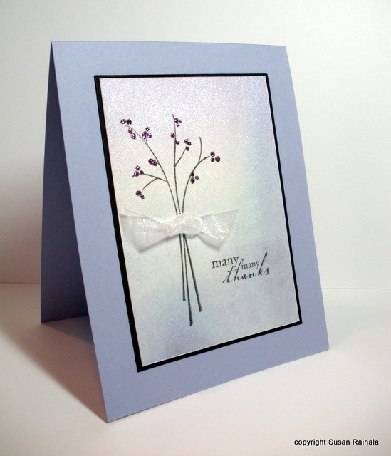
Next, I put the panel on an almost amethyst card, but it looked very blah. So I cut a black matte sized 1/8" bigger than the stamped panel (3 1/8" x 4 3/8"). The black really helps anchor the whole thing. So I glued it all down.


The card still looked a little plain, so he next step was to bling it up a bit. I added lavender Stickles to the berries on the branch and attached a sheer white ribbon knot with a glue dot. The shimmery sheer ribbon (from Michael's) is a perfect complement to the shimmery paper. And, well, Stickles doesn't need a reason, does it?


Congratulations to Simplicity reader Amanda B! She won 6 FREE STAMP SETS from Shady Tree Studio's new release. Dang, I wanted to win that one!

Tomorrow, I'm going to post my little chart for matting proportions. It's such a simple little thing to make yourself, but I use it all the time when I go more than one layer, so I thought I'd share.

Supplies
stamps: SU Garden Silhouettes, Hero Arts sentiment
ink: Memento black
paper: Arches hot press watercolor, SU black and almost amethyst
accessories: Twinkling H2Os, Stickles, sheer ribbon

Wednesday, October 27, 2010

Using Twinkling Paper in a CAS Layout: Part Two

Today's cards are a variation on yesterday's use of squares punched from shimmery paper colored with Twinkling H2Os. I used a slightly larger punch (1" rather than 3/4") and six squares rather than three. Each square was stamped with small images appropriate to the color scheme.

For the blue and lavender paper, I used Hero Arts snowflakes and sentiment stamped in Memories soft silver ink. The ink dried very quickly on the shimmery paper, too. I alternated blue and lavender squares to add interest here.


The red and gold paper became a fall card on a PTI vintage cream base. The leaves (Hero Arts) and sentiment (Mark's Finest Papers) were stamped in Palette dark chocolate, and as above, I alternated the colors.


I can't decide if I should have put the Happy Autumn sentiment in the center or not. I rather like it justified right with the edge of the squares. Perhaps I need to put a couple of brown pearls beside the upper left square to balance it, or perhaps the asymmetry works well enough alone. Indecision may or may not be my problem, but I usually err on the side of CAS in cases like this.

I do know that the Merry Christmas sentiment--with all the letters in caps--looks MUCH  better in the center.

Tomorrow's Twinkling card will be something completely different from yesterday's and today's cards. Not a punch in evidence, LOL!

Tuesday, October 26, 2010

Using Twinkling Paper in a CAS Layout: Part One

Painting an image with Twinkling H2Os (or any watercolor) like I did for yesterday's card is tons of fun but time-consuming. And 'cause y'all know I'm a quick-and-easy stamper at heart, I wanted to show how you can create shimmery paper and use it to make a variety of quick CAS cards. [Note that this technique would work with regular watercolor paints, reinkers, etc.]

I started with a watercolor paper block of Arches hot-press paper. Blocks are sealed on all four sides so all the pages are attached to each other. This means the paper wrinkles less than it would if it were a loose sheet. I use a butter knife to cut the paper off the block after it's totally dry.

Hot-press paper is smooth; cold press is textured. Hot press is MUCH easier to stamp on later, so I mostly use it.

First, I painted plain water on the area I wanted to paint. Then, I started with one color on one side, and while it was still wet, I painted the other color on the other, blending them together in the middle. As you can see on the red/gold side, I got some blooming of the paint, which isn't terribly pretty, but I just worked around that section when I started using the paper.


The two cards I'm sharing today are very minimalist...the CAS-est of the three days of Twinkling Paper I have planned. I used a 3/4" square punch to punch three squares of twinkling paper and stamped a single, small sentiment on the third square. Very shimmery. Very graphic. Very minimalist. *happy sigh*


The cool colors of the lavender and blue are so soft and required a clean, smooth, white base of PTI cardstock. You'll see the red/gold paper above shown on a card tomorrow, but below, I used squares punched from cold-press cardstock treated the same was as above. I used the same cold-press watercolor paper for the card base.


The close-up shows the texture. For stamping a small outline stamp like this, the cold press is okay. But these were scraps saved from a botched attempt to use the cold press with a large block stamp. Ick. Very splotchy and ugly, even though I used a stamping mat and lots of pressure. After salvaging the unstamped areas with a punch, I felt so much better about myself.


Aren't small square punches absolutely the BEST!?!?

Supplies
stamps: Hero Arts
ink: Palette Noir and Dark Chocolate
paper: PTI white, Cold Press and Hot Press watercolor paper
accessories: Twinkling H20s, square punch

Monday, October 25, 2010

Twinkling H2O Poinsettia and Free Stamp Alert

Painting images with Twinkling H2Os is worth the effort. My green Peace card made me happy, but this poinsettia makes me even happier.


I love how the petals, which were painted each separately, have varying amounts of paint for a variagated effect. It adds dimension to the rather stylized image.

How-To Tips: To get this effect, use a piece of Bounty paper towel (Bounty doesn't leave lint) and lots of water with the paint. Fill an embossed area with very wet paint, then touch a corner of the paper towel to the paint. The towel sucks up the excess water and leaves more pigment on the edges and less in the center. Each petal has its own intensity because basically it's impossible to get them all the same anyway. If one looks too light, add more paint, blot, and see what happens.


This poinsettia almost GLOWS with shimmer and warmth!

Free Stamp Alert!!! Shady Tree Studio is offering up to one lucky winner its entire October release of six new stamp sets!! Check it out HERE!

Supplies
stamps: Papertrey Peaceful Poinsettia
ink: VersaMark
paper: cold press watercolor paper
accessories: dimensionals, gold EP, Twinkling H2Os (hot cinnamon, gold)

Friday, October 22, 2010

Photography by Lateblossom

Disclaimer: I am not a photographer. At least not in the sense that my husband is a photographer...he's good and uses a Nikon D-90 SLR and keeps it set on manual and knows what all those knobs and symbols and settings actually mean. I don't use Photoshop, I don't have a light tent, and my camera is a digital point-and-shoot. But I think my photos look good enough for government work, so if you're interested, here's how I do it.

What I Have:

1. Nikon Cool-Pix 10.0 Megapixels, 5X optical zoom

2. Table-top Ott Light, which gives full-spectrum light for (mostly) true colors

3. Two pieces of cardstock in a color to compliment the card being photographed

4. Picasa 3 photo-editing software, downloaded for free HERE


What I Do:

1. Select cardstock to match the card I'm photographing.

2. Set up the cardstock, Ott light, and card as shown in this photograph:


This is what a low-budget set looks like.

3. Make sure the camera is set to Macro (the Tulip icon). This setting allows you to take close-up pictures that are much clearer than if you leave the camera on the default setting. Also, make sure the flash is suppressed (the icon of the slash through the lightning bolt). The flash creates harsh shadows that are hard to edit out, and the Ott light gives plenty of light when aimed at the card as shown.

4. Snap the photo. I rarely zoom all the way into the card. Here's the unedited photo for this card.


5. Download the photo to your computer and open it in Picasa to the Edit function.

6. First, crop your photo so there's a pleasing margin around it. Cropping is the first option under the "Basic Fixes" tab to the left of the photo.

7. Then, click on the "Auto Contrast" function (also under the "Basic Fixes" tab). About half the time, this will give you fine results with no further tinkering. The other half of the time, you'll need to undo the "Auto Contrast" because it will make the card look over-exposed or too dark. If that's the case, click the "Undo Auto Contrast" button and then click the "Tuning" tab.

8. Under "Tuning," you can slide bars for fill light, high lights, shadows, and color temperature. I just dink around with each until the photo looks bright and the colors are as accurate to real life as I can make them.

9. Once everything is as good as it's going to get, I export the photo to a folder I titled Resized Photos. (To Export, just click the Export button under the photo.) When you use the Export function in Picasa, a box called Export to Folder pops up that allows you to choose the folder to export to and gives you the option of resizing. I size mine to 640 pixels, which seems to give good clarity on the blog without being so big that it takes forever to upload. The Export to Folder box also has a watermark option. This is NOT a fancy watermark function. I just add a simple "copyright Susan Raihala" line. (Watermarks are a whole 'nuther kettle of fish!)

10. Click "export" and your photo is ready to upload to your blog or to SCS or to wherever in the World Wide Web you want to upload it. Here's the final result:


This card, which I LOVE!, was embossed with gold EP on cold-press watercolor paper and painted using Douglas Fir Twinkling H2Os. The stamp, by Rubber Stampede (c 2003), is lovely embossed and left alone, but the colors and shimmer of the Twinkling H2Os really make it festive.

I hope this tutorial helps those of you struggling to get decent photos. For those who want outstanding photos (and not just of cards), I encourage you to study Pioneer Woman's photography blog. That woman has the magic touch for Photoshop, plus you get to see her photos of ranch life. It's enough to make this city slicker want to run away from home and become a cowgirl.

Tuesday, September 14, 2010

Flirting with Colored Pencils

Not only is this a colored background card with a die cut on it (thanks again, Angela!), but the image is colored with colored pencils.

Miracles DO happen!


How-To Tips: Colored pencils are fun to use, and especially on this image because of its fairly small coloring areas. I colored lightly with several shades of each color, and then used a blender pencil to blend the shades smoothly.

Colors are a little bit off in the photo. The base is SU's Almost Amethyst, and the book plate was inked with Memento Grape Jelly. The whole thing is a bit more purple than blue as it shows on my screen.

I love the colors on this card. It just makes me so happy. But of course, tomorrow, we'll be back to lots of white space that's actually white and just one layer.

Thank you for tuning in to my little flirtation with color!

Wednesday, July 14, 2010

One-Layer Wednesday 12: Watercolor

This week's One-Layer Wednesday challenge is to use some form of watercolor on your card. You may use watercolor crayons, pencils, paints, or inks painted with watercolor, or water-based markers colored onto a stamp and spritzed with water.

My samples were made using Hero Arts Three Ferns stamp and a clear set of large sentiments, also from Hero Arts. The cards are Strathmore Watercolor cards that have languished in my hoard collection for many years. They are cut down a bit to 6.25" x 4.5" to fit the design.


The orange card is so cheerful, and the green card is so serene. Amazing how a change of color affects the mood of a card so dramatically!


I experimented with lots of color combinations.


How-To Tips: I colored the Three Ferns stamp with watercolor crayon using two shades (one light, one dark) of the same color. After laying a bunch of color onto the rubber, I spritzed the stamp with water and let it sit for about thirty seconds while the pigments dissolved. Then I stamped, spritzed, and stamped again on a second card. Often, you can push stamps prepared this way for a third impression, but I liked the more intense colors.

Rules for OLW12

1. A one-layer card is defined as a single piece of cardstock folded in half.

2. Use watercolor in some way to make the card. Embellishments must be kept to a minimum.

3. Remember to share your creations by posting your card online and then using the InLinkz button in the sidebar of Simplicity to link to it.

4. Most important of all...HAVE FUN!

Monday, October 19, 2009

Peaceful Poinsettia, Take One

I played around with Papertrey's Peaceful Poinsettia for the first time last week and made a bunch of cards with it.

Does anyone else buy a set on impulse, and then stare at it for weeks wondering, "Well, now what? Why the heck did I buy this set?" Then, do you work with it and realize, "Wow, I am so smart to have bought this"? That's what happened with me and this set. Temporary buyer's remorse, followed by great joy.

Here's the first card, and my first with Copic coloring on it.


That's right, I used COPICS! Yes, yes, I hear you shouting: "OH MY GOSH SHE SAID SHE WOULD NEVER BUY THEM!!!! SHE LIED!"

No, I didn't lie. I won these three as blog candy, and it would be morally wrong not to use them. I could probably have blended a bit better in places, but oh well, I'm hopelessly lazy. I got it good enough for government work and quit.


Government work isn't so bad, is it?

I'll say that the Copics do work better than the Sharpies and Bic Mark-Its for blending, perhaps because that is what they are made to do. So for those of you who have more patience than I do, Copics might actually be worth the money. But DH has informed me that he would kill me if I spent hundreds of dollars on markers.

Given our fiscal priorities at this time, it'd be justifiable homicide. I'd do the same to him if he spent $1,000 on handlebars for his triathlon bike. Fair is fair.

Anywho, I really, really like this card. A lot. I stamped the large outline poinsettia on scrap PTI white in palette noir and colored it with the Copics using the "I don't know what I'm doing but I'll keep adding color until it looks okay" method, which was remarkably successful, all things considered.

Then I cut it out, which was easier after I started using a craft knife rather than scissors. Next, I tried stamping a sentiment on the twill, which is a rather stiff nylon that lays nicely and cuts cleanly but does NOT take ink well. After trying three different inks, I gave up and went sentiment-less.

The half-beads in the center of the poinsettia are totally fab and fit perfectly in the circles of the image. Yeah!

The poinsettia is popped with dimensionals.

Do you like it? Do you have your own feelings about Copics? Care to share them in the comments, please? I'm dying to hear if I'm the only person strong enough to resist these beauties. 'Cause I am resisting, and it isn't even hard.

Supplies
stamps: PTI Peaceful Poinsettia
ink: Palette noir
cardstock: PTI white
accessories: green twill, dimensionals, small gold half-beads (Hobby Lobby)


Tuesday, July 14, 2009

Picasso and Me


The CAS23 challenge is totally kicking my creativity into high gear. Is it creative to steal ideas from fine art and adapt them for stamping? YOU BET!

Sorry the photo is a bit dark. I tried twenty ways to Sunday to brighten it up, but this was the best I could do. IRL, the cardstock is really white, which makes the colors pop so well. Sigh.

This card was inspired by a colorful Picasso sketch of a rooster. I used SU markers directly on the stamp to mimic Picasso's look, and changed the image to a flower from Hampton Arts. This is pretty much the only loosely sketched image in my huge stamp collection, but I'm so glad I have it. I tried putting a not quite navy matte under the image, but it was too heavy, so I skipped the matte and popped the white panel on white. The sentiment balances the flower...without it, the image is too top-heavy.

I NEVER would have thought to color it with all three primary colors on one flower, if not for having seen the Picasso sketch. Thanks, oh great and mighty Pablo!

Simplicity Tip: When coloring on a stamp with markers, start with the lightest color first, then gradually add the darker colors. In this case, the yellow went on first. Because there is some overlap of colors, you'll see bits of green where the blue went over the yellow. At first, this annoyed me, but then I realized that it was pretty cool. Once the stamp is fully colored, huff on it (breathe heavily...who said stamping isn't sexy?) and stamp.

Supplies
stamps: Hampton Arts, PTI Birthday Basics
cardstock: PTI white
ink: SU markers in summer sun, ruby red, not quite navy, garden green
accessories: dimensionals

Monday, March 30, 2009

CAS08 Challenge

Head over to Splitcoast for this week's Clean and Simple Challenge...It's a sketch! The sketch was inspired by this beautifully CAS card by StampGroover.

Here are my cards.


The duck has lived in a drawer in my craft room for years waiting for the perfect project...and now he gets to go swimming. I am so happy for him!


Hero Arts mushroom sets are so adorable. I colored this in with Bic Mark-It markers on Papertrey Ink's heavy white cardstock.

Simplicity Tip: If you can't afford/don't want to spend hundreds on Copic markers, get the Bic Mark-Its and Sharpies. For about $50 you can have a huge selection of colors. It's not just like having copics, mind you, but the marker strokes don't show, so you can get really smooth, even color over large areas, and with a little practice, you can do shading (though I didn't on this card...just keepin' it simple!).


This card has little layers...more than I usually use, LOL! But they were punched out (so very simple), and the layering gives "punch" (sorry for the pun) and weight to the very small image.

Thanks for stopping by!

I'm heading on over to the CAS08 Gallery to see what everyone else is making! Why don't you join me?