Sunday, October 31, 2010

One More Twinkling Card

Note: For those who read Simplicity in your email, you may need to scroll down for yesterday's post. I had problems earlier in the week with scheduling (NOT my fault!) but Saturday's was scheduled to post at the wrong time (entirely my fault). My apologies for being a dork.

Our town trick-or-treated last night. I wore a costume to a costume party. There is, however, no photographic evidence. I like it that way.

Halloween and the last week have kicked my butt. I'm whipped. Rode hard and put up wet. Drained to the last drop.

May I please have some cheese to go with that whine? Or perhaps just another fun-size Almond Joy?

Anyway, here's another (and the last for a while...I think) of the Twinkling H2O cards that came out of my last frenzy of play.


I love this bird-in-a-tree stamp from Penny Black. It's a tree. What's not to love? NOTHING. The sentiment is from PTI's Mixed Messages. I highlighted the berries or whatever you want to call them with a Sakura Stardust pen. Hopefully you can see that on the picture. It's just a little extra shimmer.

Can you have too much shimmer?

That was a rhetorical question.

Supplies
stamps: Penny Black, PTI
ink: Palette dark chocolate
paper: PTI aqua (whatever it's called), SU chocolate chip, Arches hot-press watercolor paper
accessories: Twinkling H2Os, Stardust pen

Friday, October 29, 2010

Proportional Matting

Question from Yesterday: DonnaK asked where I buy Twinkling H2Os. I bought mine at Marco's Paper, a brick and mortar store in the Dayton area. But you can find them at the big craft stores (Michael's, Hobby Lobby, JoAnn's) and buy with a coupon!

Now on to today's post, which hopefully Blogger will post in a timely fashion....

Today's Tip is one of those that, on the one hand, seems like a no-brainer, but, on the other hand, makes life so much easier!

After getting sick of doing the same math over and over, I made a simple, handwritten index card, which I posted on my bulletin board right over my workspace, with a list of dimensions for cutting stamped panels to matte evenly on a standard 5 1/2" x 4 1/4" card. It lists the sizes for cutting panels in quarter-inch increments. (Those of you who live in countries where "standard" is different can easily adapt this idea for yourselves.)

I typed it up for those of you using American measures. Hopefully, you can save it and print it for your own use.


If I cut a 4 1/4" x 3" stamped, panel, for instance, all I have to do is move up a quarter inch to get the measurements for a 1/8" matte all the way around the stamped panel. For a thinner 1/16" matte (as on yesterday's card), it's easy enough to just add 1/8" to the dimensions of the stamped panel.

I hope this makes sense.

And here is a happy CAS card that utilized this little chart.


Design Discussion: Please note how I rooted the flowers in the open space provided by the sentiment. I just love the way that looks!!!!
Supplies
stamps: Shady Tree Studio
ink: Memento
paper: PTI white, SU brilliant blue
accessories: dimensionals.

Personal News: My son Jack, who has high-functioning autism, was released from private occupational therapy Wednesday! After four years, he's finally functionally appropriate for fine motor and hand-eye coordination! YIPPYYYYY! He continues to receive OT through our school district, but this is a wonderful milestone for him to meet...and one less regular therapy session to cart him to! His developmental pediatrician saw Jack yesterday and is blown away by his progress. Jack truly has blossomed in the past six months. He's even one of the best readers in his regular 2nd grade class! Needless to say, we're on Cloud 9 around here right now, and I just had to share!!!

Thursday, October 28, 2010

Using Twinkling Paper in a CAS Layout: Part Three

This is the second day in a row that Blogger has not posted my scheduled post on time. My apologies to all who get Simplicity by email because this means a day's delay in delivery of the feed. Not sure what is going on since everything is scheduled correctly, but I am sorry.

Two questions came up in the comments from yesterday's post.

1. Susan asked if I stamped the images and then punched the squares, or punched and then stamped. Ordinarily, I do stamp first and then punch with the punch positioned upside down so I can see exactly where the image will be. This time, however, I punched first, expecting to leave the squares plain. Once I arranged them on the card (but before I glued them down), I decided the cards needed some random stamping to make them more interesting. As I stamped (over a piece of scrap paper), I thought about how the squares would be arranged and tried to place the images so they would look random and give a sense of movement when placed on the card together.

2. Sue asked why the Merry Christmas image looks better centered while the Happy Autumn looks better on the right. My best guess on this has to do with the fonts. Happy Autumn has initial caps (first letters capitalized) with very strong contrast in height from the caps to lower case, plus a descender of the letter y. By putting the sentiment off-center, that height variation is complemented by the asymmetry. If that sentiment were centered, I think it would look weird because the only "off" thing would be the capitalization because the squares are so evenly lined up.

I LOVE the font of that sentiment, BTW.

The Merry Christmas sentiment, on the other hand, is in all caps. Visually, it's very balanced, as are the squares. That makes it look better centered.

That's my theory, anyway.

Now to today's card....

I thought it would be helpful for new stampers to see a card as it develops, particularly how I place things and how I decide what to do next.

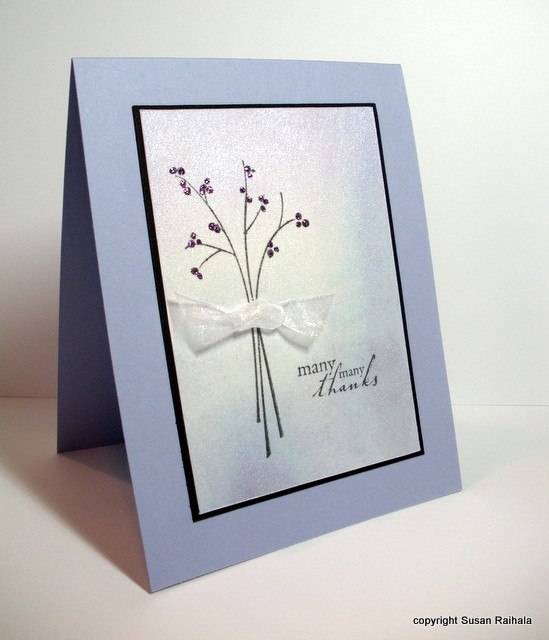
Let's start with the shimmery paper. I stamped my image (shown), then stamped the sentiment (not shown). I cut them out using a quilting ruler and craft knife. I like that because the quilting ruler is transparent with a grid. You can easily get even borders and make sure your stamping is straight if you cut this way.

I also make sure that the proportions of the cut panel will fit on a standard card. This stamped panel is 3" x 4.25"...leaving an even matte when you put it on a standard 4.25" x 5.5" card.


Here's the stamped and cut panel.


Next, I put the panel on an almost amethyst card, but it looked very blah. So I cut a black matte sized 1/8" bigger than the stamped panel (3 1/8" x 4 3/8"). The black really helps anchor the whole thing. So I glued it all down.


The card still looked a little plain, so he next step was to bling it up a bit. I added lavender Stickles to the berries on the branch and attached a sheer white ribbon knot with a glue dot. The shimmery sheer ribbon (from Michael's) is a perfect complement to the shimmery paper. And, well, Stickles doesn't need a reason, does it?


Congratulations to Simplicity reader Amanda B! She won 6 FREE STAMP SETS from Shady Tree Studio's new release. Dang, I wanted to win that one!

Tomorrow, I'm going to post my little chart for matting proportions. It's such a simple little thing to make yourself, but I use it all the time when I go more than one layer, so I thought I'd share.

Supplies
stamps: SU Garden Silhouettes, Hero Arts sentiment
ink: Memento black
paper: Arches hot press watercolor, SU black and almost amethyst
accessories: Twinkling H2Os, Stickles, sheer ribbon

Wednesday, October 27, 2010

OLW Widget

Please scroll down to see today's card post.

To make it easier for you to find the OLW for the week (whether it's on Simplicity or Styles Ink!), I added a widget at the top of my sidebar with a direct link to the current challenge. Jennifer came up with a great one this week, so be sure to check it out!

Using Twinkling Paper in a CAS Layout: Part Two

Today's cards are a variation on yesterday's use of squares punched from shimmery paper colored with Twinkling H2Os. I used a slightly larger punch (1" rather than 3/4") and six squares rather than three. Each square was stamped with small images appropriate to the color scheme.

For the blue and lavender paper, I used Hero Arts snowflakes and sentiment stamped in Memories soft silver ink. The ink dried very quickly on the shimmery paper, too. I alternated blue and lavender squares to add interest here.


The red and gold paper became a fall card on a PTI vintage cream base. The leaves (Hero Arts) and sentiment (Mark's Finest Papers) were stamped in Palette dark chocolate, and as above, I alternated the colors.


I can't decide if I should have put the Happy Autumn sentiment in the center or not. I rather like it justified right with the edge of the squares. Perhaps I need to put a couple of brown pearls beside the upper left square to balance it, or perhaps the asymmetry works well enough alone. Indecision may or may not be my problem, but I usually err on the side of CAS in cases like this.

I do know that the Merry Christmas sentiment--with all the letters in caps--looks MUCH  better in the center.

Tomorrow's Twinkling card will be something completely different from yesterday's and today's cards. Not a punch in evidence, LOL!

Tuesday, October 26, 2010

Using Twinkling Paper in a CAS Layout: Part One

Painting an image with Twinkling H2Os (or any watercolor) like I did for yesterday's card is tons of fun but time-consuming. And 'cause y'all know I'm a quick-and-easy stamper at heart, I wanted to show how you can create shimmery paper and use it to make a variety of quick CAS cards. [Note that this technique would work with regular watercolor paints, reinkers, etc.]

I started with a watercolor paper block of Arches hot-press paper. Blocks are sealed on all four sides so all the pages are attached to each other. This means the paper wrinkles less than it would if it were a loose sheet. I use a butter knife to cut the paper off the block after it's totally dry.

Hot-press paper is smooth; cold press is textured. Hot press is MUCH easier to stamp on later, so I mostly use it.

First, I painted plain water on the area I wanted to paint. Then, I started with one color on one side, and while it was still wet, I painted the other color on the other, blending them together in the middle. As you can see on the red/gold side, I got some blooming of the paint, which isn't terribly pretty, but I just worked around that section when I started using the paper.


The two cards I'm sharing today are very minimalist...the CAS-est of the three days of Twinkling Paper I have planned. I used a 3/4" square punch to punch three squares of twinkling paper and stamped a single, small sentiment on the third square. Very shimmery. Very graphic. Very minimalist. *happy sigh*


The cool colors of the lavender and blue are so soft and required a clean, smooth, white base of PTI cardstock. You'll see the red/gold paper above shown on a card tomorrow, but below, I used squares punched from cold-press cardstock treated the same was as above. I used the same cold-press watercolor paper for the card base.


The close-up shows the texture. For stamping a small outline stamp like this, the cold press is okay. But these were scraps saved from a botched attempt to use the cold press with a large block stamp. Ick. Very splotchy and ugly, even though I used a stamping mat and lots of pressure. After salvaging the unstamped areas with a punch, I felt so much better about myself.


Aren't small square punches absolutely the BEST!?!?

Supplies
stamps: Hero Arts
ink: Palette Noir and Dark Chocolate
paper: PTI white, Cold Press and Hot Press watercolor paper
accessories: Twinkling H20s, square punch

Monday, October 25, 2010

Twinkling H2O Poinsettia and Free Stamp Alert

Painting images with Twinkling H2Os is worth the effort. My green Peace card made me happy, but this poinsettia makes me even happier.


I love how the petals, which were painted each separately, have varying amounts of paint for a variagated effect. It adds dimension to the rather stylized image.

How-To Tips: To get this effect, use a piece of Bounty paper towel (Bounty doesn't leave lint) and lots of water with the paint. Fill an embossed area with very wet paint, then touch a corner of the paper towel to the paint. The towel sucks up the excess water and leaves more pigment on the edges and less in the center. Each petal has its own intensity because basically it's impossible to get them all the same anyway. If one looks too light, add more paint, blot, and see what happens.


This poinsettia almost GLOWS with shimmer and warmth!

Free Stamp Alert!!! Shady Tree Studio is offering up to one lucky winner its entire October release of six new stamp sets!! Check it out HERE!

Supplies
stamps: Papertrey Peaceful Poinsettia
ink: VersaMark
paper: cold press watercolor paper
accessories: dimensionals, gold EP, Twinkling H2Os (hot cinnamon, gold)