IC576
Audrie's choice of a Pinterest board of ceramics is absolutely inspiring this week over at the SCS Inspiration Challenge. Here are the two cards I made for it today.
First up, a card inspired by an ugly pin (to my eye, at least, the pot looks diseased) and a fabulous one. Together they gave me this card:
 |
| Inks: Archival red geranium, Delicata gold |
The lines come from Papertrey's Faux Ribbon, the circles from Background Basics: Circles, and the sentiment from Clearly Besotted's Holiday Sentiments. Obviously, the horizontal red beads were inspired by the ugly pot, and the fabulous pot gave me the idea of lines linking geometric shapes. I considered making the lines vertical as in the fabulous pots, but the horizontal arrangement allowed the perfect space for the sentiment.
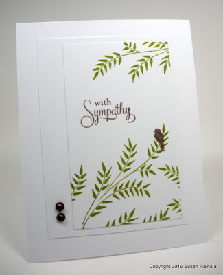
The second card was inspired by this gorgeous pot, with its curvy branch and bird. The style of the pot is obviously very vintage-y (not my style, usually), so I wondered if I could make it over with a cleaner, more stylized feel. It took an inordinate amount of time to choose my stamps here, but I love the effect!
 |
| Inks: Archival Fern, Memento Luxe rich cocoa |
The branch stamp is an old Hero Arts wood-mounted stamp, the bird came from PTI's Love Birds, and the sentiment from PTI's Birds of a Feather. I cut the stamped panel tall and thin like the vase and added an asymmetrical mat to give space for the half pearls, which complete the visual triangle of brown...which was necessary when my bird took up so much less space than the bird on the vase. It can't be the focal point because it's so small, so I arranged it so it's looking at the sentiment, making that the focal point. Adding the two pearls moves the eye around much more than just two spots of brown did.
Such fun inspiration at the Inspiration Challenge...as always! I hope you'll give it a go. There's quite a huge diversity on the ceramics board, and there are even some pots by an artist who hired me to babysit her child when I was a teen. As soon as I saw them, I thought, "Hey, I know that artist!" Too cool!
Hope, peace, joy, and love,
Susan
Supplies listed above in text and captions
Always an inspiration you are!
ReplyDeleteThose diseased looking pots are rather disturbing. Your card, however, is not. Both cards are fabulous.
ReplyDelete