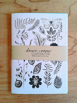
The inspiration photo is this lovely book cover from Dawn Cooper:
 |
| Source |
Now, you might have noticed that this cover has mostly solid images, and that's what I used on yesterday's Christmas-themed green-and-red card. But the black-and-white card from two days ago used outline images. This lead me to search my stash for some block images to use in a black-and-white literal take on the inspiration piece. The closest I got was these flowers from Papertrey, and as you can see for yourself, the stamped panel didn't exactly turn out nicely at all:
 |
| UGLY!!! |
I scratched my head for a bit, decided what these heavier stamps need is color, and checked out a new color scheme from Pinterest. Then this happy card happened:
Oh, YAY!!!! These colors are so fresh and full of energy, and even though there's a lot going on, it's balanced by a broad white mat, a small and simple sentiment, and the crisp line.
This made me very happy...despite just how far we've strayed from the inspiration piece. I could NEVER have made this without Dawn's gorgeous cover pushing me forward.
You just never know where inspiration will take you!!!
Supplies
stamps: Papertrey (can't remember the flower set name and I'm not at home to check!), Faux Ribbon; Clearly Besotted A Little Sentimental
ink: various Memento and Hero Arts inks
paper: Papertrey white
accessories: dimensionals

LOVE the bold colors!
ReplyDeleteStunning! The colours really make the solid shapes pop - and what a lovely colour scheme.
ReplyDeleteI do think the black piece could be rescued though with the introduction of a single bold colour like deep fuchsia - maybe as centres for the flowers and one or two tiny leaves in among the other shapes, then cut out the panel and layer it with card in the same bright colour
Jane
Love it with the colors and the rearrangement!
ReplyDeleteLove your card; beautiful colors. I do have to say, though, I don't see the art from Dawn as "mostly solid". I see it as mostly light and airy. Tee hee - to each his own! :-)
ReplyDeleteThis one is a WINNER! This design and those beautiful colors are delightful!
ReplyDeleteOh, my. This is delightful! I adore this color combo.
ReplyDeleteGorgeous ... and thanks for sharing your process.
ReplyDelete