Saturday, October 10, 2015

One Stamp, Two Ways


It's always fun to experiment with getting different looks from one stamp, and when that stamp has a VERY distinctive style, doing this can be a real challenge. Here's one I worked with today:
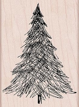


The pen and ink tree from Hero Arts has an extremely distinctive, fun style, My first run at it today uses standard Christmas colors of red, green, and gold.


The sentiment is an old one from Hero Arts, and the star comes from some random clear set, also Hero. The rich, shiny gold is Delicata ink, and the green and red are both Brilliance Pearlescent shades. The Brilliance Thyme green and Poppy are lovely colors for the holidays! To make the banner, I used the corner of a square punch on either end.

After making this card, I felt satisfied, but as I stared at my ink swatches, the Sicilian Blue from Impress Fresh Ink caught my eye. Hmmm. What would happen if the tree were stamped in that very, very pale gray-blue?

Perhaps something like this:


Eeeeep!!! The soft, serene colors, the trees falling gently down the card, the white space.... Happy sigh!

Don't be afraid to experiment using unexpected colors with stamps. Sometimes, the results will be utterly enchanting!

Supplies
stamps: Hero Arts
ink: Brilliance, Delicata, Memento Luxe, Impress Fresh Ink
paper: Papertrey Ink
accessories: dimensionals and square punch on first card

Friday, October 9, 2015

Tools: Ink Color Charts

Have you ever noticed that the colors on lids of ink, caps of pens, and skins of colored pencils rarely match the color as it appears on paper?

Sure you have.

That's why we stampers need color charts. If you're really obsessive about organizing color swatches, check out Jennifer McGuire's ink swatch book. It's lovely and easy to update, and for someone like Jennifer, who's a professional stamper, I imagine keeping her swatch book current is critical.

If you're like me, however, and only play a stamper on the internet, you might be only mildly obsessive about organizing ink swatches in a useful way. My method might work for you. It's not as easy to update as Jennifer's, but it works pretty well and uses standard stuff you already have lying around: card stock, ring clips, and a standard hole punch.


A few things to note...

1. If I have the reinker for a color, I underline the color name.
2. These are organized as they are stored in my drawers...by color and ink type.
3. Colors are so pretty and make us happy!!!! Thank you, God, for color.
4. I have a LOT of dye inks and fast-drying pigment/chalk inks, but even so, there are gaps in some of the color collections. When oh when will someone come out with good Christmas green and darker oranges in fast-drying pigment ink formulas, or a pink dye ink that's neither too light nor too dark?

Recommendations?

The swatch collection also includes other inks on separate pages (Kaleidacolor, Brilliance, SU, etc.) as well as colored pencils, Copic/Sharpie/Bic markers, and watercolor pencils, but the charts pictured above were freshly re-stamped yesterday and today. I'd gotten rid of quite a few inks (mostly into the trash as the pads dried out and I chose not to replace them), so the old chart looked a mess.

My color-swatch booklet gets used every single time I sit down to craft. Every single time! So it's truly a useful tool in my stamping supply.

Feel free to share about your swatch method in the comments!


Thursday, October 8, 2015

Jazz Up a Christmas Card

Regular readers know that one of my favorite things to do with a two-layer, white-on-white card--when it needs a little something extra--is to outline the top layer with a metallic marker. So easy, so pretty!

When I made today's card, however, outlining the top layer wasn't enough, and there's a good design reason why. First, let's look at the card.


The central panel has a LOT going on...dark colors, no white space, random placement. When I put the panel on the plain card base, the whole thing looked...incomplete. Framing it with an additional outline of gold seemed like a good idea in my head.

And it was in real life, too.

That's something to celebrate, people!

Sort of like I'm celebrating the fact they found the escaped cobra in Florida. Not so happy they gave the thing back to the guy who let it escape in the first place, though. But thrilled the woman who found it in her dryer didn't get bitten.

Back to the card. It seems that when the stamped panel is so very, very dark and busy, a simple white mat may not be quite enough. Uniting the white base with the panel by outlining it the same way brings the whole thing together well.

By the way, I'm never doing laundry again.

Supplies
stamps: Papertrey Peaceful Pinecones
ink: pigment
paper: Papertrey white
accessories: gold metallic marker, dimensionals

Wednesday, October 7, 2015

Peace with Stipple Brush

After masking the edges of the card base with washi tape, I used a stipple brush to apply a very pale blue to the bottom of the card. Rather than pouncing the stipple brush, I brushed it firmly from the bottom of the card to the top. LOVE how soft and pretty this is!!!


Washi Tip: Always pat the tape on your jeans before putting it on the paper to take some of the sticky off, and then pull the tape off the paper toward the edge to prevent tearing the paper.

Here are some pictures of how the washi was adhered so precisely. Of course, I used a ruler!


And make sure you label the bottom of the card on your scrap sheet. I could see me going in the wrong direction, although that would have worked on this card's design given the simplicity...just flip the snowflake and sentiment. I liked the idea of peace falling DOWN from heaven, though, and blanketing the world.


Supplies
stamps: Hero Arts 
ink: Hero Arts soft blue, pool
paper: Papertrey Ink white
accessories: snowflake punch, rhinestone, stipple brush, washi tape, glue pen


Tuesday, October 6, 2015

Extreme White Space

After yesterday's cards with no white space, let's visit a little square card that is almost nothing BUT white space. It satisfies my soul, although I suspect it makes my friend Leslie itch a bit. Or a lot.

Card Size: 4.25" square

Supplies
stamps: Hero Arts Autumn Blessings, My Favorite Things Fall Florals
ink: Memento cocoa, Ancient Page henna
paper: Papertrey White
accessories: not a single one


Monday, October 5, 2015

Christmas Contrast

Yesterday's post provoked a big response. Lots of feels regarding buying stuff.

Lots. Of. Feels.

If you missed the post, check it out here. And make sure you read the comments. Good thoughts, different perspectives. Many thanks to all who chimed in the comments and in private emails.

I feel very good about the plan, and today's cards reflect that good feeling! I pulled out Everyday Christmas Wishes from Stampin'Up. After years of buying stamps, finding a really good one still happens more randomly than I'd like. This was a random, impulse purchase from last year, but I liked it so much I recently bought SU's birthday and thank-you versions of it. Perhaps it's the simplicity of the set that makes it so very, very easy to work with.

You see what I did there?

Anyway, here's the bold version of the card, using sky blue Brilliance and Memento Luxe Danube blue inks.


And then there's the subtle version (which was really hard to photograph!). It uses Avery Elle's pixie ink and Memento Luxe rhubarb stalk.


The hand-drawn snowflakes and handwritten sentiment are so very appealing! And yes, I filled all the space, but every now and then, I get a little carried away. The high energy of the blue card contrasts so nicely with the more peaceful, serene feel of the pink one.

Isn't color magnificent!!!!

These cards make me happy. I hope they make you happy, too!

Supplies
stamps: Stampin Up
ink: various pigment
paper: Papertrey
accessories: rhinestones, dimensionals, scallop scissors (for rounding two corners of the raised panel a bit), Sharpie for coloring the pink rhinestones (the blue came pre-colored ;-))

Sunday, October 4, 2015

Anger Management

Today, my pastor preached on the emptiness of consumer culture and how when we're unhappy, we buy new stuff, but the joy of having it wears off quickly and then we need more new stuff. It's an endless cycle that never permanently satisfies.

Oh, my! The truth will set you free, but first it ticks you off!

A few weeks ago, I pulled every winter/holiday stamp and set in my hoard out for my hard push on Christmas. Here's what I found.

Clear and unmounted rubber sets. About 33 sets. I have more sets
than years Jesus lived on earth. How did this happen?!?!

Random wood-mounted Christmas stamps. Several of these are
old Stampa Rosa stamps...maybe they can be put in my coffin with
me. Can we take stamps with us?

Trees suitable for holiday cards. Stampa Rosa here as well.

More trees and winter stamps. A few Stampa Rosa ones in here, too.

So the question is "What does one stamper possibly need with this many holiday stamps?"

Even more important is this question: "Where will she start?"

Honestly, I wanted to go take a nap after pulling all this stuff out. It took several days of feeling very angry at myself before I worked up a strategy for dealing with this embarrassment of riches. Here's what I learned....


  1. I still feel compelled to buy new holiday stamps and feel ashamed of myself.
  2. Some of these stamps (mostly some of the sets) do not excite me. At all.
  3. Some of these stamps do excite me, but I wonder how I will ever make anything with them that is different from what I've already made with them. 
  4. The sheer quantity of stamps here is intimidating and stifles my creativity.

And that makes me angry.

So what does a girl do to manage her anger? She comes up with a PLAN.

And here it is: I'm going to use as many of these stamps as I can, and if I don't have fun using a set or stamp, it's going into storage. Next year, if I make all my holiday cards without retrieving any from storage, those stored stamps will be sold off in grab boxes. Gone. Out of my hair. Into someone else's...where they might be appreciated and loved and whipped into something useful.

The first set I played with was Candy Cane Christmas, which yielded these two acceptable cards (and several other not-so-acceptable ones).


This set is a keeper. Not only were these two cards fun to make, but they didn't make me feel as though my creativity was exhausted for future use.

Yay!

Do you have a plan for dealing with the consequences of consumerism? Or do you just buy more storage?

Supplies
stamps: Candy Cane Christmas, Faux Ribbon
ink: assorted pigment inks
paper: Papertrey
accessories: circle punch, scallop circle punch, dimensionals, rhinestone