Wednesday, November 22, 2023

Thanksgiving Hello and an Update

Happy Thanksgiving! 

I wish our culture appreciated the spirit of Thanksgiving more. The holiday tends to get lost between Halloween and Christmas, with more emphasis on consumerism and Black Friday and football and stuffing our faces with delicious food than slowing down and appreciating our many blessings. 

Our Thanksgiving this year will be quiet (hopefully) and peaceful, with much reflection on how much better off I am now than I was in 2022. I certainly can be grateful for having hair!


I wish for you much joy in the holiday. If you’re not in the U.S., you can still take a moment to offer up thanks to God or the universe or whatever force you believe in. 

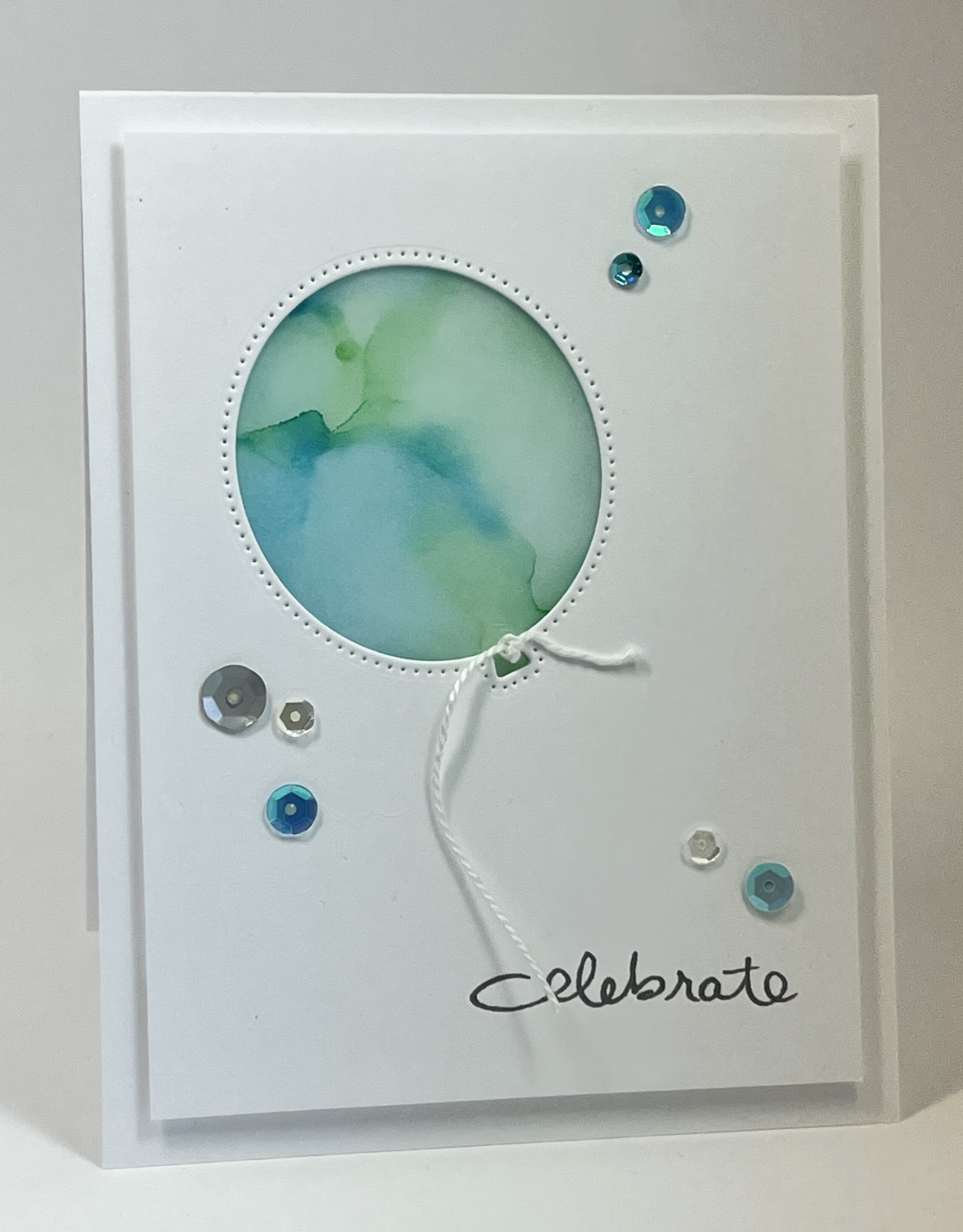
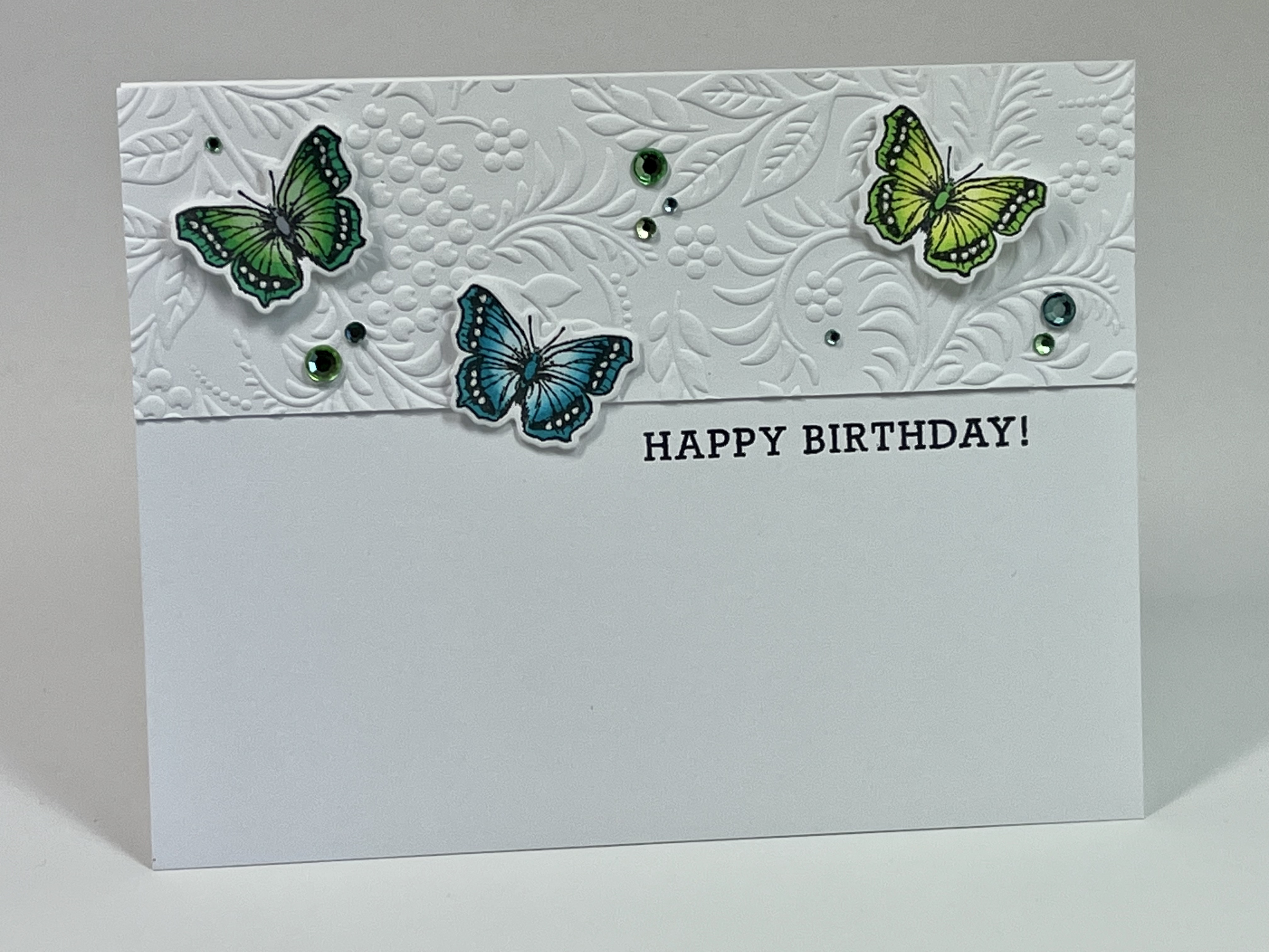
Today’s card uses a fun autumnal embossing folder, as well as an adorable stamp and die set by Julie Ebersole called Fallish from Ellen Hutson. The images were colored with Copics.


Update

The very kind Marilyn asked for an update. I’m doing much better. My mood has improved, I have more energy, and all the symptoms left over from chemo and radiation are about 85% better. So yay!!!! My semester is going extremely well, with my face-to-face class pure joy. The online teaching experience is better than I expected but still not as much fun as being in person with students.

Also, Karen’s Card Shop is thriving, with over $4,500 in sales since it started in 2016 (I think! The years are blurring a bit.). I’ve actually felt like making cards for the shop recently, but one person can’t keep this show going. So many of you have donated, and First United Methodist Church is incredibly grateful for your kindness and generosity. 


Here’s the shop itself, painted black a few years ago, and the cards just pop right off that black background. It’s in a very high-traffic area near the church offices. We also added a locked cash box on the wall when a few hundred dollars went missing in 2021. 


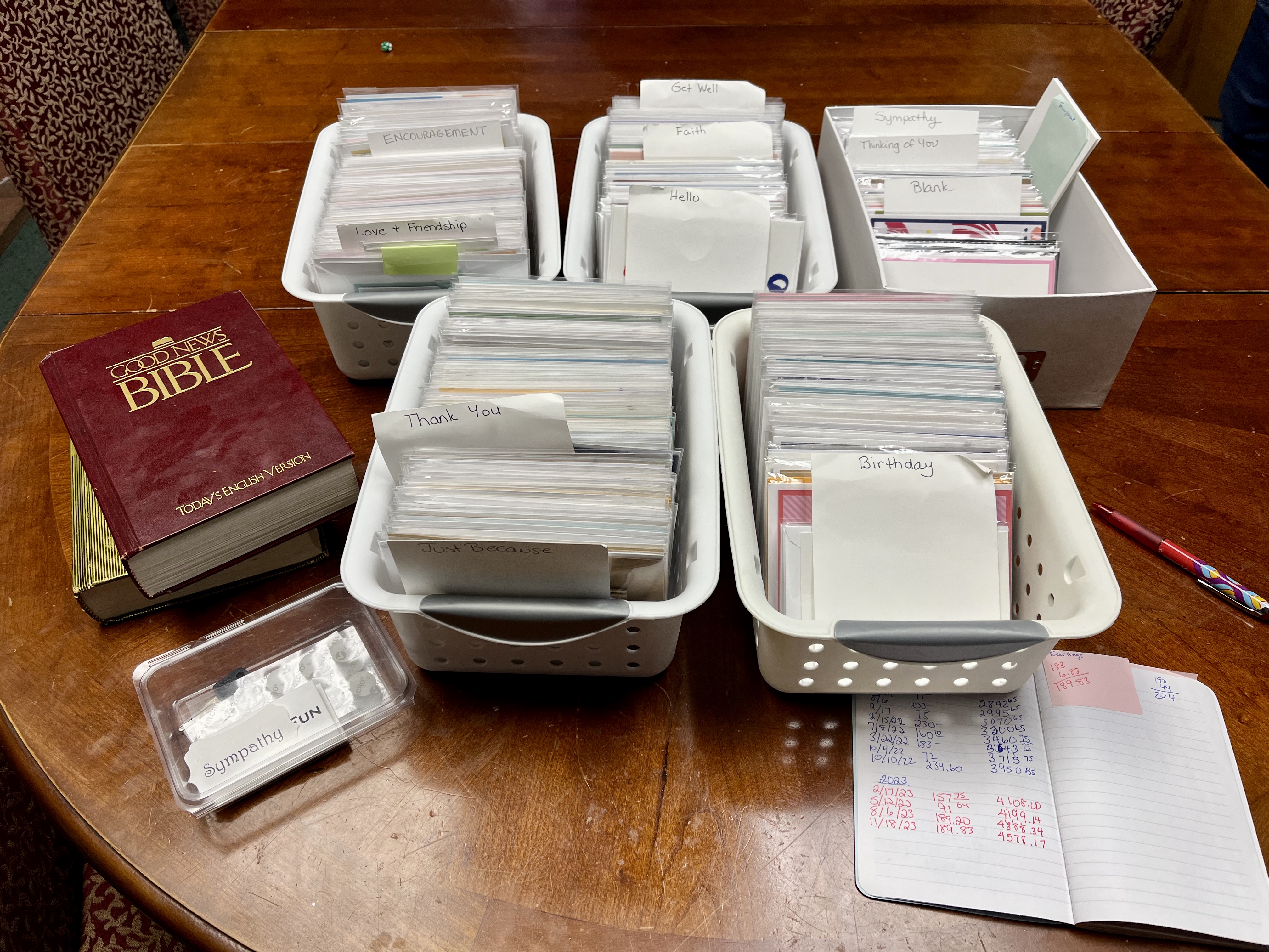
If you have cards and want to donate, please check out my page on Karen’s Card Shop. It’s been a while since I updated the page, so the pictures and some information are out of date. We are most in need of get well, thinking of you, and sympathy cards. We do not carry Christmas cards or other holidays…they just don’t sell. Please do not stamp sentiments inside the cards as I package the cards in clear bags so people can’t see the sentiment before buying. I will supply the envelopes. Email me at susanraihala at roadrunner.com for my address. And thanks in advance!

Mercy, grace, peace, love, and gratitude,

Susan

Thursday, November 16, 2023

Soft Blue-Green for Christmas

So I have a lot of fun making watercolor backgrounds for cards, but then I struggle to use them. Today's cards were made with Distress inks smooshed onto acrylic blocks, spritzed with water, and then pressed onto watercolor paper. I let the block sit on the paper until it's mostly dry, which gives a more intense color. 


Of the two, I prefer the first...it's cleaner and has a nice triangular design anchored by the straight lines. Plus, those poinsettia dies are to die for! The stag card is a bit busy for me, although I do like the ribbon base and bling, and how it contrasts with the matte finish of the watercolor square and die cuts.

Either way, using the watercolor backgrounds to create clean and simple cards with simple shapes definitely makes me happy!

Mercy, grace, peace, and love,

Susan

Tuesday, November 14, 2023

Texture, Texture, and More Texture

The BetterPress system gives a nice, deep impression of whatever image you're using, and these pine boughs are no exception. When combined with a 3D embossing folder of more pine boughs for a backdrop, we get some lovely textures!


One note about the BetterPress system...get the recommended paper, too. The paper makes a difference in how the final image looks. I've experimented with my Papertrey white and Neenah Solar, and the BetterPress paper just works better.

Mercy, grace, peace, and love,

Susan

Sunday, November 5, 2023

The Season of Thanks

The BetterPress is just so much fun, and these plates in the leaf set also come with dies. Obviously, the sentiment set also comes with dies. These make the plates so much more versatile!


And here's a close-up where you can see the letterpress effect pretty well! I water-colored the leaves using markers scrubbed onto an acrylic block. 


I hope you all had a lovely weekend (our weather in Ohio was PERFECT!). 

Mercy, grace, peace, and love,

Susan

Saturday, November 4, 2023

Be There

I'm currently working on our Stephen Ministry ornaments, which will be distributed the first Sunday in Advent. These ornaments (I will post after we hand them out) represent our congregation's annual reminder that not everyone is happy for the holidays. In fact, this year, after so much has happened over the last three years and worldwide (especially in the middle east), the medical community is seeing a spike in mental health problems. Big surprise. 

The holidays bring a lot of pressure and a lot of loneliness for many people. For some, it's the first Christmas after a loss (whether of a marriage, job, health, or life of a loved one), and those firsts can be especially hard. 

So today's card reminds us to be there for each other, however we can. And to let others be there for us, however we can. 


Whenever you get a chance to be with someone who's hurting or stressed, you're fulfilling the teaching not only of Christ but of so many other faith traditions around the world. We are social creatures...even the introverts! We need each other. And sometimes, just getting a card helps someone know they are not alone. 

Mercy, grace, peace, and love,

Susan

Friday, November 3, 2023

Sympathy and Old School

Karen's Card Shop always needs sympathy and get well cards, and when we ran completely out of sympathy cards this summer, I went to work. 

When I was grieving my grandmother, someone sent me a handmade card that looked like it should have been a new year's card...bright colors and glitter everywhere. It struck me as an odd choice and one I never wanted to make. Ever since, I've generally gone for soft looks, and the old-school technique of inking a stamp with markers and spritzing with water creates just that. 

For our first card, I had a spare piece of embossed lavender card stock and was going to put a simple 1/4" mat under the stamped panel. The mat, however, wasn't quite big enough, so I opted for an asymmetrical mat instead. This happy accident was gratifying because it sort of looks like the lavender panel is reaching out for a hug. 


Our second card uses an ancient wood-mounted stamp from Hero Arts that's designed to look like watercolor.

Note that both cards use a FABULOUSLY versatile embossing folder from Tim Holtz. You see me use this a lot because it just adds texture and softness without meaning much of anything. 

Sympathy cards are extremely hard to make when you actually need one, so it's a good idea to make a bunch to have on hand when needed. I sent these and a bunch of others to Karen's Card Shop, along with the ones sent by Kelli, Charlotte, and Eddie. My own stash needs restocking. Guess I'll pull out my markers and spritz bottle and get to work!

Mercy, grace, peace, and love,

Susan

Thursday, November 2, 2023

When the Sentiment Carries the Card

This fabulous sentiment from Simon Says Stamp just needs a little floral frame to be complete!


The flower dies are from Sizzix, and the blending in real life is much smoother out to the white than it looks in the photo. I used Copics to add just a bit of color to the flowers and leaves, but the card still needed something, so I took the chisel end of the lightest copic and edged the bottom mat. That anchored the card a bit!

And that's all I have to say about that. I'm off to buy new double wall ovens today. Hopefully they will be installed before thanksgiving. Fingers crossed.

Mercy, grace, peace, and love,

Susan


Wednesday, November 1, 2023

Birding Craze

For Christmas last year, I bought my husband a Birdfy birdfeeder with a built-in motion-sensor video camera. 

Best gift ever, IMHO.

I've now become an avid birder...something I never thought would happen. Yeah, yeah. Such a GenX thing to do. But how can I resist these little cuties who visit every day! 


Which led me to make this card with a stamp set and dies from Ellen Hutson. I'm sending it to my mom, who also likes birds and bought a Birdfy as well.


And now, my assimilation into middle age is complete. 

Mercy, grace, peace, and love, 
Susan


Tuesday, October 31, 2023

Muchas Gracias!

First of all, I want to thank Charlotte, Kelle, and Eddie for their generous and beautiful contributions to Karen's Card Shop. What amazing stampers!


The shop can still use more sympathy and get well cards, as well as thinking of you and encouragement, if you're interested in contributing!

Second, here's a card with a message for so many of my readers!


I'm not sure why there's such a shadow on the right side of the picture, but I hope this little rufus hummingbird brightens your day as you brighten mine! All images are pressed by the BetterPress, and the plates come from three different sets. You might get a better idea of the letterpress effect and the shimmery watercolors in a close-up.


Or not. Well, all I can say is that in real life, the letterpress effect is lovely!

Mercy, grace, peace, and love,
Susan

Saturday, September 23, 2023

A Little Too Clever

So for today's card, I love everything EXCEPT the color choices. You see, I made the flowers a different shade of pink from the bird's breast because I didn't want the card to be too matchy-matchy and in real life, there are differences. 

But my trademark style is matchy-matchy or monochrome. Ugh. And these stylized images don't need a dose of realism; they need coordination! 

At least that's the case in my matchy-matchy world.

Otherwise, I really do love everything about this card, from the Essentials by Ellen (Brandi) stamps and dies to the Spellbinders flower dies to the Copic markers. 

And look, ma! No squares at all!


Mercy, grace, peace, and love,

Susan

Friday, September 22, 2023

Well, I Guess There Is a Square...but Only One

Yesterday, I promised today's card wouldn't have squares, but I was wrong. Sorry about that.

Today's card uses a really fun 3D embossing folder (cut into a square) and a lovely die from Simon Says Stamp. I painted one of the die cuts with pink shimmer watercolor and added sequins for a bit more shine. 


Those shimmery watercolors are BOMB DIGGITY!

Mercy, grace, peace, and love,

Susan

Thursday, September 21, 2023

More Squares Plus Some Shimmer

In case you hadn't noticed, I adore cards with circles or squares as accents for the focal point. Like this butterfly backed by shimmery squares of goodness.


The butterfly and sentiment were heat embossed with gold detail embossing powder. I painted the butterfly with pink shimmer watercolors, which I shared a few posts back. For the squares, I painted a piece of watercolor paper with blue shimmer watercolors and, once it was dry, I die cut the squares. 

The next card I post doesn't have squares, I promise. But using a variety of shapes as a backdrop give us minimalist card makers a chance to leave plenty of white space on our cards while not letting them be boring. 

If you've not played around with this idea--so incredibly prevalent on Pinterest!--please give it a try. It's endlessly variable and makes great use of dies!

Mercy, grace, peace, and love,

Susan

Thursday, September 14, 2023

Hip to Be Square

Today's cards were inspired by THIS PIN by Cecile Ribon. As you can see, both cards follow her focal point layout pretty literally, but the second card adjusts the orientation. 

Both cards arose from an attempt to use older stamps, all from Hero Arts except for the sentiments, which are from MFT...or is it Mama Elephant? Pretty sure it's Mama Elephant. 


I LOVE squares...and my OCD loves them all squared up inside a square, so my favorite is the blue slimline card. Nevertheless, the green portrait card calls to me, too.

The sentiment strips are rather distressed, which is the way they are made, not a result of my over-inking them. I like the hint of distress on otherwise very crisp cards.

Which do you like best?

Mercy, grace, peace, and love,

Susan

Wednesday, September 13, 2023

Christmas in September

Today’s card moves us forward in time to Christmas, and it was super fun to make! 

The dies are from Hero Arts, the embossing folder is from Sizzix, the floral stamps for the peace and joy panels are from Altenew, and the love panel stamps come from Hero Arts. 


I didn’t send any handmade Christmas cards last year, and back in April when I made this card, I thought it might be the only Christmas card I made this year. But that was before the BetterPress. I have a few Christmas plates for that and am already playing around with them. So. Much. Fun.

Yippee!

For those interested in sending cards to Karen's Card Shop, we are desperately in need of sympathy and get well cards. We will, of course, gratefully accept thank you, birthday, thinking of you, and friendship/love cards as well. 

Mercy, grace, peace, and love,

Susan

Sunday, September 10, 2023

A Little Stamping Does a Heart Good…and So Does New Product!

I'm baaack!

Isn’t our little hobby the BEST? When you’re feeling down and have some funds, you can try something new and perk yourself up nicely!

My hubby agreed that I deserved a bit of a treat after the past year, so I bought the BetterPress system and a bunch of plates and dies. I’ve always wanted to try letterpress, but it seemed so finicky and fiddly and had a too-steep learning curve. The BetterPress is incredibly easy to use and produces amazing results first time!

Jennifer McGuire has some excellent videos on the new system from Spellbinders, and I’m happy to confirm that it’s every bit as wonderful as her videos make it out to be. 

Also, if you have Archival inks from Ranger, you can use those successfully with the BetterPress. The results are fractionally less crisp than with the Betterpress inks, but they are close. The BetterPress inks are only available in 8 colors right now, but that will be expanding in the future. Of course.

Many of the plates are quite large and therefore difficult for the white-space-lover to incorporate into her style. But I persevered and adore the results.


Close cropping of these three blooms gives plenty of room for white space, and coloring the image with metallic watercolors gives it a shimmer hard to capture fully on camera. 


The watercolors are also new. I’ve had a bunch of Twinkling H2Os for years, but the colors are somewhat strange and random. So I purchased this beautiful set:


Personal Update

For those of you interested in my cancer journey, I must say this has been quite a rollercoaster since chemo and radiation treatment ended. Just when it feels like the ride is over, all the sudden, something happens and you start chugging up another hill…only unlike a rollercoaster, it’s not fun at all. 

I’ve been moderately depressed, mainly because the recovery has been sooooo long. I had a leukemia scare (fortunately false!), but that showed me how bad the PTSD is. Sheesh. Those of you who’ve been through this probably know exactly what I’m writing about. It sucks. 

But despite it all, I am so incredibly grateful for all the love and support I’ve received, for the medical care, for the prayers and well wishes. I AM on the mend, but the healing process will take longer than I would wish. And it’s not a steady climb but a rollercoaster of uncertainty. 

New stamping toys help. Just sayin’.

Mercy, grace, peace, and love,

Susan


Tuesday, April 4, 2023

In Love with Coffee

Marilyn, please email me at susanraihala at roadrunner dot com.

Coffee is one of my favorite drinks, and I have several friends who share my addiction preference. This adorable little steaming cuppa and the accompanying beans come from Gina K (Perfect Blend). The sentiment comes from an old Papertrey set. Coloring is with Copics.


Circle cards just make me so happy! So do Copics!

Mercy, grace, peace, and love, 

Susan


Friday, March 31, 2023

Alcohol Ink Backgrounds

Several years ago, I watched a video about using Copic markers on vellum to create an alcohol background, gave it a try, and was very happy with the results. But I couldn’t think what to do with some of the backgrounds I made, so they sat in a drawer until recently. 

First up, I went nautical with the blue and green background and my favorite seahorse layering stamps from Papertrey.  The sentiment strip was a gift from my friend Joan.


The second card uses a balloon die that Joan also gifted me. The sentiment is from StampinUp. 


Both of these cards rely on some pretty vellum and sequins, and I was so grateful to have the sequins. Usually, I try sequins on a card and switch to rhinestones instead. For these two cards, the sequins are perfect!

What common embellishment do you struggle with most? 

Mercy, grace, peace, and love,

Susan

Tuesday, March 28, 2023

This Crazy Hobby

So last year, I ordered a set of Altenew cubes in four shades of aqua and a Simon Says Pawsitively Saturated ink set with three shades of blue. After playing around with both sets, I decided to invest heavily in the Simon Says inks. 

My decision was largely based on the type of ink pads. I liked the foam pads, and I already have quite a lot of inks with felt pads. 

My plan was to buy the colors I use most and not buy the colors I use least. But once I got the ones I liked, I wanted them ALL!!!! Because I had cancer and DESERVED the full set, I bought them. 

So there. Argue with that, universe!

But I quickly realized I didn’t have enough color-layering stamp sets to make the investment in all those colors worthwhile (duh!), so I ordered a smaller Altenew set with dies and had a BLAST playing with color!


Just a quick aside about Altenew. I love their stuff immoderately, but their stamps are often so large that they crowd out my love of white space. Their smaller sets, though they make fewer, are gorgeous and easy to layer accurately with a MISTI. 

Back to the post at hand. I also stamped a bunch of leaves in different shades of green, die cut them and the flowers, and started assembling cards with them.

First up, a 6.25” x 7” slim card stacked with flowers, leaves, and bling. The background is a Sizzix 3D embossing folder. Bling was colored with Copics and Sharpies to match, as on the next two cards.


Next, we have a trio of blossoms overflowing a smaller embossed background (source unknown). The sentiment is from Gina K


And finally, my favorite of the three, mainly because the colors are from the cooler side of the spectrum and because I adore that die-cut sentiment. 


These three cards were so much fun to put together! And I adore the inks, the stamps, and the dies. This may, indeed, be a crazy hobby, but what a blast it is!

Mercy, grace, peace, and love,
Susan

Thursday, March 23, 2023

The Dies Have It

Today’s card was a fun exploration of combining stamps and dies, with the dies as the focal point. The cherry blossom stamp set is from Hero Arts, and the dies are from Sizzix. 

Now, I have the dies that go with the stamps, but the die-cut branches are rather clunky looking, designed to leave a white border around the stamped branch. Well, the Sizzix dies cut nice, graceful, dainty branches and details for the flowers. 


You’ll notice I put a vellum wrap on the stamped panel, mainly because the panel was just too dark and busy to make a nice background for the delicate branch. The vellum tones it down perfectly, and the embossing folder (Tim Holtz) gives a lovely hint of texture.

This card must have been inspired by a card—I’d never come up with this layout on my own—but I can’t find it. My apologies to whomever I CASEed without acknowledgement. 

Today’s question: do you like vellum, and if so, what is your favorite way of using it?

Mercy, grace, peace, and love,

Susan

Wednesday, March 8, 2023

Bee-Day Bubbles

Today’s card uses one of my favorite bee sets from Hero Arts, Busy as a…. Colored with Copic markers, the bees and two ombré circles are just so much fun! The bees’ wings are highlighted with clear Wink of Stella. 


I’m enjoying my time visiting family in Maryland and am so glad I flew. Even with a layover in Atlanta, it was much easier with my current level of fatigue. 

A reminder to Marilyn to email me about the gift card, please. I don’t want to forget!

Mercy, grace, peace, and love,

Susan

Saturday, March 4, 2023

Winner, Winner! And Two Sea-Themed Cards

 Our winner in the Butterfly Challenge give away is Marilyn! 

Marilyn, please send me your snail-mail address at susanraihala at roadrunner dot com. I’ll send you the gift card to Simon Says Stamp ASAP!

And now for today’s cards. First up, one that’s full of texture and pattern, almost collage-like. 


To make this card, I used an ancient Hero Arts shadow stamp to create the circle background, a stamp/die set from Julie Ebersole for the shell, and Simon Says for the sentiment. The scrap of cheesecloth looks a bit like a net, and the bling echoes ocean bubbles (and adds shine to an otherwise matte card). 

It’s a glorious mess grounded in the triangle of bling and plenty of glorious white space.

The second card, which uses the same stamp set, is much cleaner, simpler, and modern in feel. Instead of rhinestones, I used dew drops


You’ve got one guess as to which is my favorite. Yep. Card #2. The cleanness and simplicity make me very, very happy. But I certainly like the first one; otherwise, I would not have showed it to you!

I’ve not had much chance to stamp this past week. Lots going on, including some not-so-happy stuff with my mom, who isn’t feeling well. I’m going to Maryland to see her this upcoming week. I was supposed to visit back in late July, but breast cancer had other plans. 

I did get a favorable check-up with the radiation oncologist. My boob is looking great. I’ll see the medical oncologist on Monday. I have lots of questions for him. For me, radiation was a piece of cake compared to chemo, and the symptoms that are lingering are definitely chemo related. 

And that’s all I have to say about that. 

A friend in her 50s told me last week that she got her first mammogram ever after my diagnosis. Please get your boobs squished regularly and get familiar with them in between so you can identify what does and does not belong. 

Mercy, grace, peace, and love,

Susan


Friday, February 24, 2023

A Butterfly Challenge—Day 7

This is the LAST post in our butterfly challenge series! If you’re just joining us, you can go back to the previous six posts, leave comments, and be entered for the $25 gift card from Simon Says Stamp. Each comment counts as one entry, so if you comment on all seven, you’ll maximize your chances to win. 

When you comment, have fun answering the daily questions on each post except the first. The deadline for commenting is midnight EST, Monday, February 27.

Now for today’s card, which has a shocking THREE butterflies on it. Can you believe I got that crazy? We revisit Gina K’s Tapestry embossing folder to add some context and intense texture to the card. Love that folder so very much!


The green and blue (my favorite color combo) butterflies are arranged in a triangle, and the bling adds to the sense of movement on the card.

I’ve combined birthday sentiments and so have no idea where this one comes from. Sorry about that.


And now for today’s question: which of the seven butterfly challenge cards is your favorite and why?

To help you, I’m reposting the cards here:

Day 1

Day 2

Day 3

Day 4

Day 5

Day 6

Day 7


If I had a gun to my head and had to choose one, it would be Day 2, just because it’s the most minimal design. Day 4 is the least minimal and also a favorite. Basically, I love them all! My style obviously uses a LOT of white, no matter what, but each one of the these feels authentic to me as a crafter. 

If your authentic self prefers more color or pattern, you could adapt these designs by coloring the die cuts, using colored card bases or mats, or integrating designer or specialty paper. You could also use bigger butterflies to give your designs more weight and color. 

Mercy, grace, peace, and love,

Susan


Thursday, February 23, 2023

A Butterfly Challenge—Day 6

Today’s card, like the card from day 5, uses two butterflies, but the design concept is completely different. Instead of restricting the space and letting the relationship of the butterflies stand on its own (with a little bling), I put these two into context, with a die cut flower to flit around.


Today’s question is this: what colors do you avoid or neglect in your crafting?

For me, it’s yellows, oranges, and purples, generally. But over the past few years, I’ve challenged myself to explore them more, and now I can honestly say I embrace all colors. 

So how about you? And remember, comments on the blog will be eligible for the drawing for the $25 gift card to Simon Says.

Mercy, grace, peace, and love,

Susan


Sunday, February 19, 2023

A Butterfly Challenge—Day 5

If you’re joining us late, we are in the midst of a series of cards made with Copic-colored butterflies. The first four cards (see previous posts) each used one butterfly die cut and explored various ways to let a single small image enhance a card…or carry it entirely. 

Today, we’ll get totally crazy and use TWO butterflies on one card. Wow. Really getting out of my box, am I not?

Regardless, one commenter from the seven posts in the series will win a $25 gift card to Simon Says Stamp. So get commenting! The drawing will happen 48 hours after the last post in the series.

Let’s dive in to Day 5!


These two butterflies were grayer shades of teal and yellow/orange, and they seemed to complement each other. Now that I see the photo on my screen, it seems that the sentiment is crooked. 

Darn it. 

For this design, I created a very small space for the focal point, keeping everything in close proximity and overlapping the butterflies. If the sentiment were straight, it would be perfect! 

Alas, rarely do we get perfection in real life. 


And now for today’s question: what is your strategy for purchasing/owning ink? Do you have pigment, dye, oxide, solvent, spectrum, distress, chalk, or some other kind I can’t think of right now? Or do you stick with good black inks to stamp outline images to color with markers or pencils or paints? Which ink or inks do you use the most and why? 

I’m an unrepentant ink whore. I’ve never met a quality ink pad I didn’t love, and I have at least a few pads of every single one I listed above. Dye inks are my most used. I’ve now got the entire collection of Simon Says Stamp pawsitively saturated inks, quite a few of the Ranger Archival permanent dye inks and the Hero Arts older inks, a dozen or so StampinUp old-school inks, and a bunch of Tim Holtz distress ink cubes. I’ve also got Kaleidacolor and Hero spectrum pads. Then there are the dozens of pigment and chalk inks…which rarely get used but are too pretty to get rid of. All the pretty colors of all the inks are too awesome for me to resist!

I might need an intervention. 

So, what’s your strategy for purchasing/owning ink?

Mercy, grace, peace, and love,

Susan