Friday, February 24, 2023

A Butterfly Challenge—Day 7

This is the LAST post in our butterfly challenge series! If you’re just joining us, you can go back to the previous six posts, leave comments, and be entered for the $25 gift card from Simon Says Stamp. Each comment counts as one entry, so if you comment on all seven, you’ll maximize your chances to win. 

When you comment, have fun answering the daily questions on each post except the first. The deadline for commenting is midnight EST, Monday, February 27.

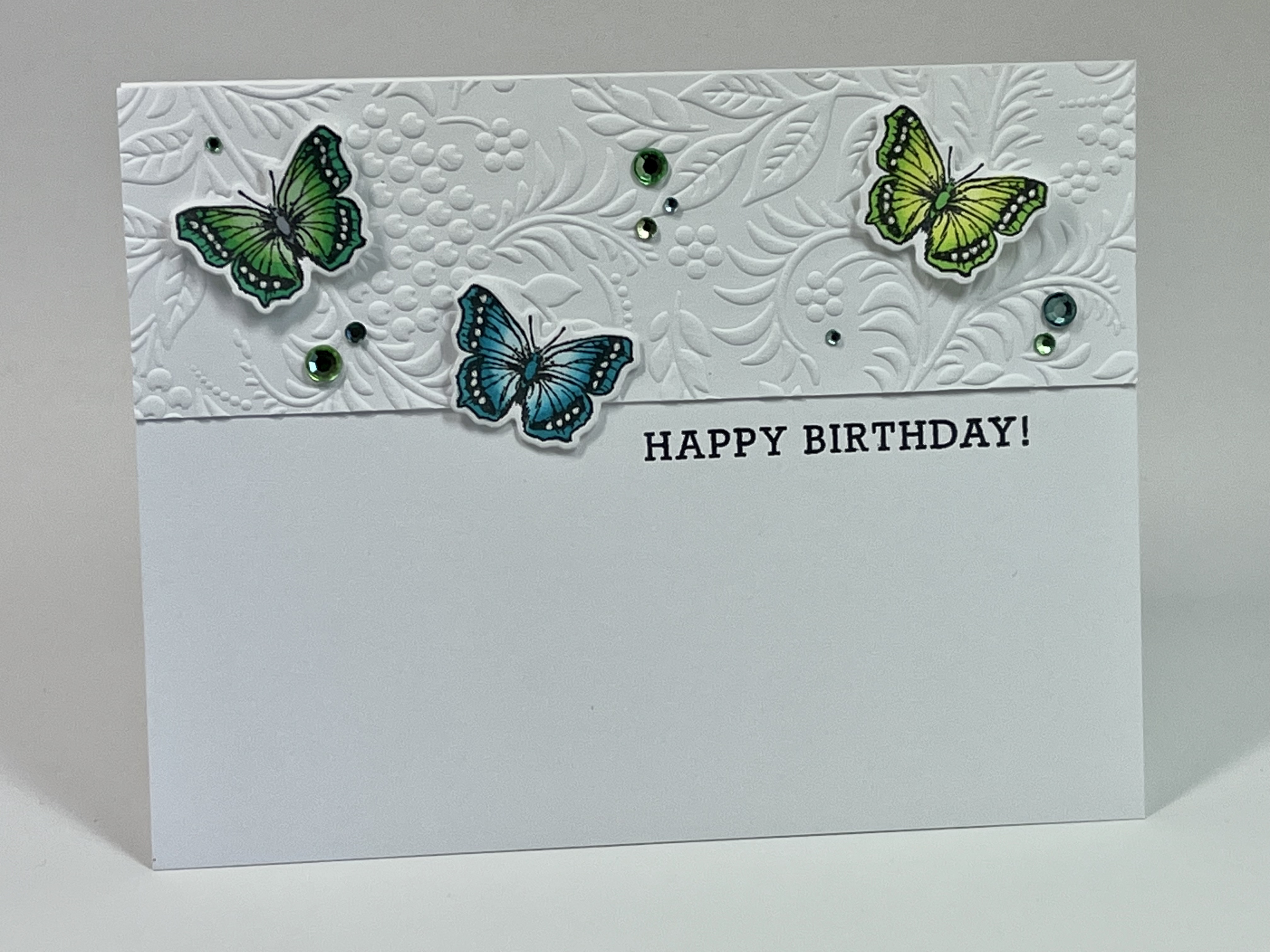
Now for today’s card, which has a shocking THREE butterflies on it. Can you believe I got that crazy? We revisit Gina K’s Tapestry embossing folder to add some context and intense texture to the card. Love that folder so very much!


The green and blue (my favorite color combo) butterflies are arranged in a triangle, and the bling adds to the sense of movement on the card.

I’ve combined birthday sentiments and so have no idea where this one comes from. Sorry about that.


And now for today’s question: which of the seven butterfly challenge cards is your favorite and why?

To help you, I’m reposting the cards here:

Day 1

Day 2

Day 3

Day 4

Day 5

Day 6

Day 7


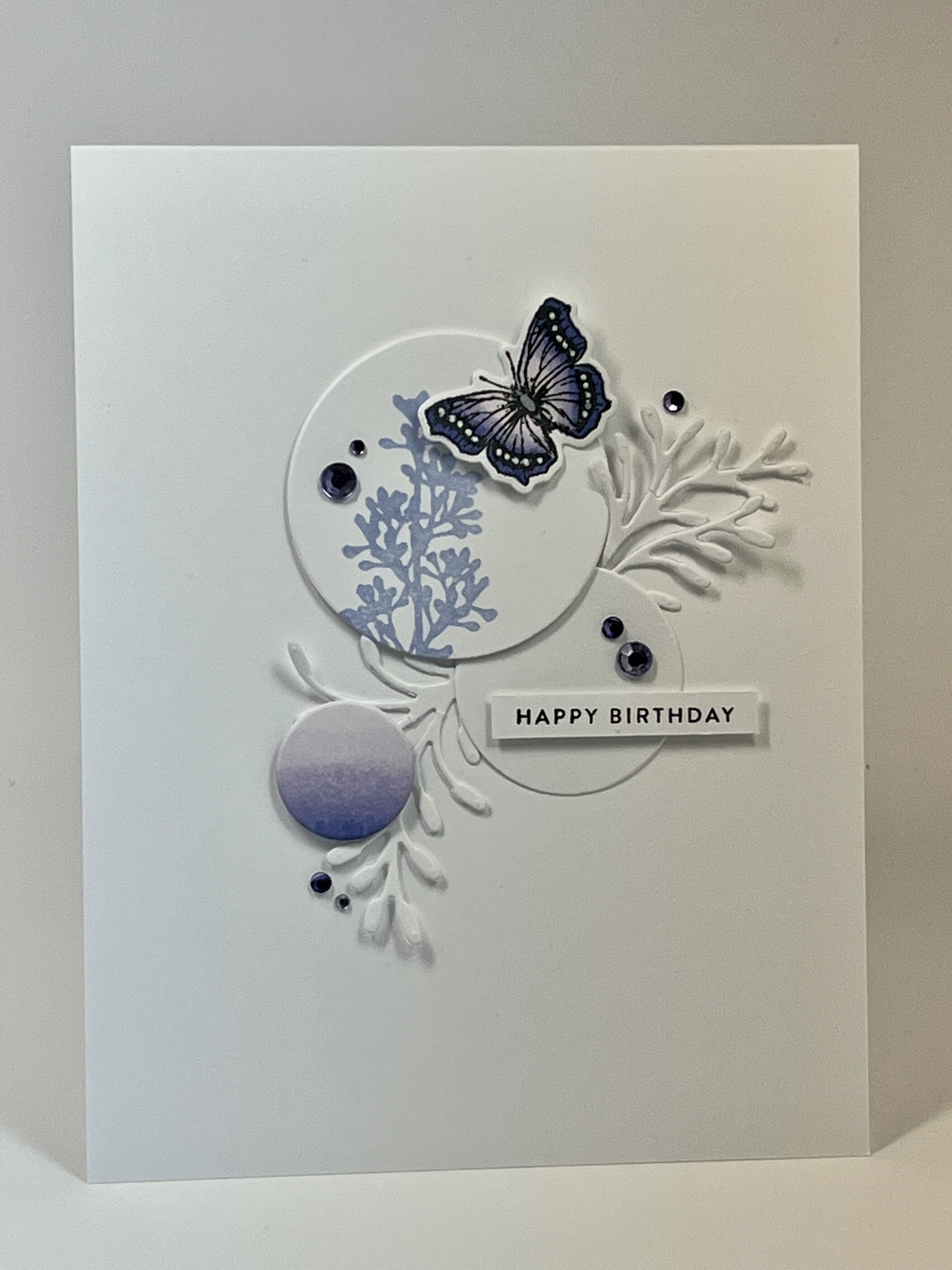
If I had a gun to my head and had to choose one, it would be Day 2, just because it’s the most minimal design. Day 4 is the least minimal and also a favorite. Basically, I love them all! My style obviously uses a LOT of white, no matter what, but each one of the these feels authentic to me as a crafter. 

If your authentic self prefers more color or pattern, you could adapt these designs by coloring the die cuts, using colored card bases or mats, or integrating designer or specialty paper. You could also use bigger butterflies to give your designs more weight and color. 

Mercy, grace, peace, and love,

Susan


Thursday, February 23, 2023

A Butterfly Challenge—Day 6

Today’s card, like the card from day 5, uses two butterflies, but the design concept is completely different. Instead of restricting the space and letting the relationship of the butterflies stand on its own (with a little bling), I put these two into context, with a die cut flower to flit around.


Today’s question is this: what colors do you avoid or neglect in your crafting?

For me, it’s yellows, oranges, and purples, generally. But over the past few years, I’ve challenged myself to explore them more, and now I can honestly say I embrace all colors. 

So how about you? And remember, comments on the blog will be eligible for the drawing for the $25 gift card to Simon Says.

Mercy, grace, peace, and love,

Susan


Sunday, February 19, 2023

A Butterfly Challenge—Day 5

If you’re joining us late, we are in the midst of a series of cards made with Copic-colored butterflies. The first four cards (see previous posts) each used one butterfly die cut and explored various ways to let a single small image enhance a card…or carry it entirely. 

Today, we’ll get totally crazy and use TWO butterflies on one card. Wow. Really getting out of my box, am I not?

Regardless, one commenter from the seven posts in the series will win a $25 gift card to Simon Says Stamp. So get commenting! The drawing will happen 48 hours after the last post in the series.

Let’s dive in to Day 5!


These two butterflies were grayer shades of teal and yellow/orange, and they seemed to complement each other. Now that I see the photo on my screen, it seems that the sentiment is crooked. 

Darn it. 

For this design, I created a very small space for the focal point, keeping everything in close proximity and overlapping the butterflies. If the sentiment were straight, it would be perfect! 

Alas, rarely do we get perfection in real life. 


And now for today’s question: what is your strategy for purchasing/owning ink? Do you have pigment, dye, oxide, solvent, spectrum, distress, chalk, or some other kind I can’t think of right now? Or do you stick with good black inks to stamp outline images to color with markers or pencils or paints? Which ink or inks do you use the most and why? 

I’m an unrepentant ink whore. I’ve never met a quality ink pad I didn’t love, and I have at least a few pads of every single one I listed above. Dye inks are my most used. I’ve now got the entire collection of Simon Says Stamp pawsitively saturated inks, quite a few of the Ranger Archival permanent dye inks and the Hero Arts older inks, a dozen or so StampinUp old-school inks, and a bunch of Tim Holtz distress ink cubes. I’ve also got Kaleidacolor and Hero spectrum pads. Then there are the dozens of pigment and chalk inks…which rarely get used but are too pretty to get rid of. All the pretty colors of all the inks are too awesome for me to resist!

I might need an intervention. 

So, what’s your strategy for purchasing/owning ink?

Mercy, grace, peace, and love,

Susan


Friday, February 17, 2023

A Butterfly Challenge—Day 4

Remember that each comment you make in this Butterfly Challenge series is an entry for a chance to win a $25 gift card to Simon Says Stamp! (Obviously, only one comment per post will count for the give away, but I love it when you reply to each other’s comments!)

Of the seven cards I made with the Copic-colored butterflies, four have only one butterfly on them. You’ve already seen three of those cards, and today we’re looking at the LEAST clean and simple of them all. The card was inspired by so many of the “circle” cards posted on Pinterest (mostly by European stampers) that have inspired me for quite a long time. 

For this card, I gave the butterfly more context, with a stamped sprig of lavender-ish plant and white-on-white fronds. The different sizes of circle and their arrangement create a sense of movement, and the ombré purple circle was colored with the same Copics used on the butterfly. The rhinestones were colored with Copics and/or Sharpies.


I adore these types of cards, as they are the closest I get these days to collage. The monochromatic color scheme—with lots of white—works great for keeping the busier design clean and simple for my CAS-lovin’ heart!

So now for today’s question: what’s a favorite storage product, strategy, or tool? 

For me, it’s my strategy for organizing embellishments by color, not type, an idea I got years ago from Stacey Julian’s book on scrapbooking. So all blue embellishments are in a drawer, all green and yellow in another drawer, all neutrals, and so forth. I also really appreciate Sterilite Storage drawers. They pull out easily, are light-weight, and stack on my desk. 

Your turn. What’s a favorite storage product, strategy, or tool you use and love?

Mercy, grace, peace, and love,

Susan

Thursday, February 16, 2023

A Butterfly Challenge—Day 3

Remember the Give Away!!!! One random comment on a post from this series will be chosen for a $25 gift card to Simon Says Stamp. I’m enjoying the answers to each day’s questions so much. This hobby is such a complex one!

Today’s Copic-colored butterfly card layout was inspired by a card on Pinterest that I cannot now find. Grrr. I’d love to give credit to the inspiration. 


The mat was colored with the same Copics as the butterfly, and the leafy branch (Hero Arts rubber) took three attempts to get it in the right spot. 

Oh, well. It’s only paper, right?

I like the design because there’s so much movement in it. The monochromatic colors keep things simple, but the eye has a lot to keep it occupied. 

And that butterfly is stinkin’ cute!

And now for today’s question: what’s a favorite embellishment? This question occurred to me when I was shopping at Marco’s the other day. So. Many. Embellishments. Glitter, glitter glue, Nuvo drops, mica, rhinestones, sequins, powders, ribbons and cords, mixed media stuff, Tim Holtz stuff, quilling, shaker card parts and filling, etc. 

You’ll notice through this butterfly series every single card has rhinestones on it. They’re mostly colored with Copics or Sharpies to coordinate with the rest of the card. I’ve tried hard to embrace sequins, but the colors or sizes don’t seem right half the time. I love the simplicity of rhinestones and the ability to customize the colors. 

What about you? What’s a favorite embellishment of yours?

Mercy, grace, peace, and love,

Susan


Tuesday, February 14, 2023

A Butterfly Challenge—Day 2

 Happy Valentine’s Day, y’all! Don’t forget about the give away! A $25 gift card to Simon Says Stamp to a randomly chosen comment from this 7-day series of posts. 

Today’s card fits with the the theme of the day…LOVE!


The butterfly is colored with dark pinks, as are the rhinestones. The heart die is from Hero Arts Infinity Dies, and the 3D embossing folder is my new favorite from Gina K called Tapestry.

It’s just perfect. 

That little butterfly can carry the design because she’s a bright pop of color on a richly textured and rather large white heart.  The white dots help unify her with the card, and the hot pink rhinestones balance her. The message is clear without a sentiment, so I didn’t add one here. It would have been a distraction, unlike yesterday’s card where the sentiment is the focal point.


Yesterday’s question asked about what supplies you rarely use and wish you used more often. Today’s question is this: what trend or supply have you consciously avoided?

Over the years, I’ve consciously avoided several products and trends for various reasons. First, I avoided clear stamps, and then I tried Papertrey and was a goner. Next, I avoided the MISTI, and now it’s within easy reach at all times. Next, I avoided Copic markers, and now I have 104 of them. Then it was dies, and Eva gave me a Cuttlebug, and we know how that turned out. Just look at today’s card.

I’ve figured out that we should never say never, but for me, right now, I’m consciously avoiding hot foiling. A number of STUNNING foiled cards have come into Karen’s Card Shop and have been sent to me in the past 6 months. But hot foiling requires quite an investment and seems to be a rather a finicky endeavor, and my life is complicated enough right now, not to mention expensive with two sons in college. So I will continue to appreciate other stampers’ efforts and skill, and keep pushing in other areas…like Copic coloring because 104 sketch markers are already an enormous investment that’s begging to be used.

Can you feel me?

Now it’s your turn. What trend or supply have you consciously avoided?

Mercy, grace, peace, and love,
Susan

Sunday, February 12, 2023

A Butterfly Challenge—Day 1

 Good day to you all!

I’ve been very productive craft-wise for the past two weeks but also very distracted from posting. So to kick off my sharing, I’m going to give a $25 Simon Says Stamp gift card to a random commenter on a post in this Butterfly Challenge series. Comment on one or all the posts as you feel motivated! The drawing will be held after the seventh (and last) post in the series. 

So I challenged my self to use my Copics because I’d bought more and felt guilty because I haven’t really gotten my money’s worth from the ones I already had. So I stamped multiple images of a little butterfly from Hero Arts From the Vault Bugs set and colored them. I have the coordinating dies and so cut all these out.


I didn’t like all of them, but most made their way onto cards using a variety of layouts, supplies, and inspiration. For today, we’ll take a look at this card in shades of green and teal:


The card uses the Blessings Stamp and Cut set from Hero Arts, the Kaleidacolor spectrum ink Caribbean Sea, and rhinestones colored with Copics and Sharpies. The card size is 6.25” x 3.5”. 

This is the only card in the series where the butterfly plays a supporting role. The lead actor here is that fabulous, bold, beautiful sentiment. I often forget that sentiments don’t have to be small and unobtrusive, so that was my lesson from this card. Many of us have SO. MANY. SUPPLIES. It’s hard to remember all we have and then actually use them.

So today’s question, should you choose to comment, is this: What stamping supply or type of stamp do you rarely use, but when you do, you realize you should use it more often? Fishing for ideas here!


________________

Sort of a Cancer Update

Radiation is finished, and my boob no longer looks angry. YAY! I was invited to ring the bell in church today. So fun! And if you want to hear an awesome sermon about focusing on Jesus things, check out the video on YouTube or Facebook. Search First United Methodist Church of Springboro. Pastor Joe was in rare form today. Start watching at 8:20 or so to skip all the announcement slides. 

I’m still not sure how to put this cancer experience into words. Honestly, I feel a little bit numb, a little bit raw, and mostly optimistic. Either all my support and coping strategies are working just fine, or I’m headed for a breakdown. Not sure which. If this had happened thirty years ago, it would definitely be breakdown time, but now, whether it’s my faith, my therapist, Zoloft, my friends and family and you all, my medical team, my inner strength from years of hard self-improvement, or a combination of all those things, I feel like I’m coming out of the furnace in a good mood. Only time will tell if the breakdown is going to happen. 

One thing I know with certainty. If I do break down, there will be so very many people and resources to help. I am blessed beyond deserving, and am so very, very grateful. 

Mercy, grace, peace, and love,

Susan

Wednesday, February 1, 2023

Blessings

Today's card is all about the blessings and continues my last post's technique of inking with markers and spritzing with water. This time, however, the stamp is an outline rather than block stamp. The effect is lovely.


The daisy stamp is from Papertrey, the sentiment is from Simon Says, and the script background is from Hero Arts. The deckle-edge dies are from Honey Bee. I'm finding the deckle-edge dies don't work with all images. There needs to be a "reason" for using them. In this case, the softness of the watercolor effect invites softer edges, along with the handwritten script. Unity of design is so important!

Mercy, grace, peace, and love,
Susan