Monday, September 30, 2013

A New Toy

A few weeks ago, I bought a new punch from EK Success. Oh how I love it! It's so very versatile. You can do all sorts of cool stuff with a nice, big punched shape to make wonderful clean-and-simple cards.

You can bling it up.


You can stamp a background on it.


Or you can stamp some birds on it.


I don't know why Picasa doesn't like the third card. It just wouldn't let me get the colors right. Trust me. The red is Memento love letter and the gray is Memento gray flannel. It's pretty in real life, I swear!

Anyway, tomorrow I'll show you a couple of other ways to dress up that tree punch with some shimmer and shine.

Supplies
stamps: various
ink: Memento
paper: Papertrey Ink white
accessories: Christmas tree punch by EK Success, dimensionals, rhinestones

Sunday, September 29, 2013

Well-Behaved Relationships: Before and After

Having different elements of a design relate to one another in a sensible fashion is key to successful card making. Anybody can slap images and embellishments and a sentiment onto a card, but if the different components don't relate well to each other, the result is visual chaos.

If you just want everyone on your card to play nicely, that's one thing. If, however, you want truly polished and refined cards on which everyone plays together with perfect manners, then you have to pay really close attention to placement.

Consider the first card, which is, well, not perfect, but definitely not rude either.

BEFORE


The three leaves (from Papertrey's Mighty Oak) are related to each other in a fan shape above the sentiment. BUT they are just a bit too far apart to be playing perfectly nicely and ever so slightly uneven in spacing, too.

Notice how close everything is in the sentiment (which is very well-behaved, by the way). To get along well with that sentiment, the leaves need to be closer together, too.

Closeness will make a nice, tight relationship and unify the design in harmony and goodness.

Compare the BEFORE card to my revised effort, which is much more unified. Notice how the curves of the leaves are a nice contrast to the lines and angles of the sentiment, but their more organized and unified layout feels so much more intentional than the first arrangement.

AFTER
Now, a perfectly acceptable alternative to the right angles of my after card would be to keep the fan concept but bring the three leaves closer to each other, with the right and left ones at equal angles. Getting the angles completely equal, however, would be hugely difficult. Not impossible, but very, very, very difficult. Right angles are very, very, very easy with a gridded acrylic block, which I used.

I'm all about easy.

But then, you already knew that, didn't you?

Supplies
stamps: Papertrey Might Oak (leaves), Mum's the Word (sentiment)
ink: Memento
paper: Papertrey white
accessories: gridded acrylic block

Thursday, September 26, 2013

Love Fruit

These stamps were given to me by Dare 2B Artzy, with no obligation on my part whatsoever. But I'm loving them and hope you are, too!

Today's card combines two different sets from Dare 2 B Artzy: Retro Pattern and Giving Spirit.


First, I stamped the stem of leaves from Retro Pattern repeatedly over the left third of the card in shimmery pearlescent thyme ink from Brilliance. LOVE this green! (You can see the shimmer at the top of the card pretty well.)

Then, I inked up the sentiment from Giving Spirit in pearlescent ivy (a much darker green) and stamped it in the "sweet spot."

For a sketch of the Rule of Thirds, scroll down a bit on THIS POST. The "sweet spots" in designs are the lower right and upper left intersections of the vertical and horizontal lines drawn to divide the card into thirds. When you follow the rules, designing a card like this one is easy as pie.

Mmmm. Pie.

The heart-shaped bling is the whipped cream on the pie slice.

Mmmm.

I think I need to eat breakfast.


Supplies
stamps: Dare 2B Artzy Retro Pattern, Giving Spirit
ink: Brilliance
paper: Papertrey White
accessories: heart-shaped rhinestones 

Tuesday, September 24, 2013

Two Treatments for Outline Stamps

Today's duo of cards shows two different ways of treating the exact same outline stamps...in this case from Dare 2B Artzy's Home Sweet Home set.

First up, stamp the outline stamps in colors. This is the simplest, easiest (and therefore my favorite!) treatment for outline stamps. Don't ever be afraid to try this because the results, as below, can be extremely satisfying. In this case, I chose colors that were rich and fairly dark so they would pop off the white card stock and show off the lovely swirly detail of the stamps.


Next, stamp the outline stamps in black and color them with Copics/Bics/Sharpies. I didn't do any fancy shading here, although stampers who enjoy coloring would find this easy. For coloring, I picked lighter shades that would highlight the swirls rather than over-power them. You still get great detail from the stamps that way. Keep in mind using colored pencils might dull the black details since there's no way not to color over those fine lines (at least I always found that to be the case).


Do you prefer to stamp in colored ink or color outline images?

Supplies
stamps: Dare2BArtzy Home Sweet Home
ink: VersaMagic (first card); Memento (second card)
paper: Papertrey white (first card); Gina K (second card)
accessories: Copic markers


Monday, September 23, 2013

Birdie Welcome

I'm tired, and this card is cute.


I just love those cute little birdies, the picket fence (border punches rock), and the Dare 2B Artzy set called Home Sweet Home.

This card is going to be in my in-laws' welcome basket when they visit in November. Not sure what else will be in the basket, except for some blank notecards because my MIL asked for some. But I'll find some other little things to put in it.

Suggestions?

Supplies
stamps: Dare 2B Artzy
ink: Memento, VersaMagic Rocket Red
paper: Papertrey White
accessories: Copic markers, dimensional, picket fence border punch (Martha Stewart), glue pen

Sunday, September 22, 2013

Two Techniques, One Stamp, Lots of Fun

Last week, I received an order from Gina K Designs that included the set Elegant Florals. Then I proceeded to go a little nuts. These were the first two cards I made, using the same stamps but two totally different techniques. The difference in feel of the two cards is pretty striking.

First up, FLOCK.
I stamped the stems in waterproof green ink, and after dabbing each leaf with a glue pen, I sprinkled on lavender flock. It's darker in the photo than real life (photo editing software limitations) but the close-up shows the fuzzy effect perfectly!


Next: THUMPING
I used SU markers in pumpkin, mustard, and summer sun...dabbing the pumpkin and mustard over the summer sun. Then, I spritzed the stamp with water to blend the colors and give this wonderfully autumnal watercolor effect!


The first card could be used for almost any situation. But the second one is absolutely perfect for the Thanksgiving Crusade. I just love how two different techniques can yield such different results with one stamp.

Cool Tip: To create the banners, I used a 3/4" square punch...just the corner of it. Hold the punch upside down so you can see where the paper is positioned, put thin edge of the strip into one corner of the punch at a 45-degree angle, and punch the divot out. You could use any size square punch, I imagine, but the smaller ones are easier to hold.

Supplies
stamps: Gina K Designs
ink: Memento bamboo, Versacolor Sahara Sand; SU markers
paper: PTI white
accessories: flock, Quickie glue pen, dimensionals, square punch; SU markers, water spray bottle, dimensionals, square punch

Thursday, September 19, 2013

A Reminder of the Thanksgiving Crusade

Today's card is a happy reminder to get crafting on those Thanksgiving Crusade cards!


This card demonstrates how you can cut off the bottom of a one-layer card when you place the image a little too high.

It also demonstrates the value of bling.

Don't forget about the OLW this week. It's over on Heather's blog, and it's Fly Away with Me. I'm hoping to play along tomorrow!

Hmmm, can you make a one-layer Thanksgiving Crusade card that ALSO has something with wings on it? Not necessary, of course, but turkeys count, I suppose!

Supplies
stamps: Waltzingmouse Blessed by You, Papertrey First Fruits
ink: Memento
paper: Papertrey White
accessories: rhinestones

Wednesday, September 18, 2013

Retro Color Play

Another of the sets I received from Dare 2B Artzy was Retro Pattern. These are the first two cards I made with it...a little playing around with different color schemes, one cool and one warm.


I adore this border stamp, which could be easily repeated for a complete border, but I wanted the whole design to be centered on the card. This outline version (there's a solid stamp to fill in the outlines as two-step stamping) is fabulously easy to color and you can create all sorts of color combinations. For these cards, I chose four colors and spaced them out carefully to create a balanced design.

The retro starbursts are separate stamps in the set. So much fun!

I used Gina K Deluxe white card stock since I was coloring on a one-layer card.

Which do you prefer? Cool colors or warm colors?

Supplies
stamps: Dare 2B Artzy Retro Pattern
ink: Memento
paper: GinaK Deluxe white 120lb
accessories: various copic, bic, and sharpie markers

Tuesday, September 17, 2013

OLW157, Under the Wire

I'm sliding in just in time for the OLW157 Challenge on Cheryl's blog...It's All about the Sentiment!

I think I nailed that.


This stamp (a single Celebrate that I stamped three times) comes from a Dare 2B Artzy set called More Cake. To get the spectrum effect, I used a Kaleidecolor pad, inking the stamp from different places on the pad and cleaning between inkings. The first image I stamped was the middle one, then top, then bottom. I added a matching spectrum of blue bling because bling makes everything better.

Duh.

The nice people at Dare 2B Artzy sent me a package of stamps to try for free, although I've already purchased from them and blogged about how wonderful their stamps and customer service are. You'll be seeing lots of creations with these sets in the coming weeks.


If you get a little time before midnight, play along with the OLW157. Last minute is better than never!!!

Supplies
stamps: Dare 2B Artzy
ink: Kaleidecolor
paper: Papertrey Ink white
accessories: rhinestones, Bic/Sharpies for coloring them

Monday, September 16, 2013

Everyday Miracles

Today's card:


A Few of Today's Miracles:

1. My son Jack happily went off to fifth-grade camp...his first time away from home without family. He will spend two nights there in a cabin with nine other boys.

2. Jack has autism, and his school has done an amazing job including Jack in typical classrooms despite the developmental differences between him and his typical peers. All of his teachers fully expect that Jack will do well at camp and were very encouraging to me this morning, just in case I was worried. I wasn't worried and know Jack will be just fine. And in the off chance he isn't fine, I can pick him up any time.

3. When one of his typical classmates found out Jack was going to be in his cabin, he shouted, "Yes!!!!!" and pumped his fist. This made Jack very happy, too.

4. Jack went for his first ever canoe trip. He's been out on kayaks with family before, but today it was a canoe with friends and teachers. He had fun.

5. I'm getting texts from Jack's aide and teacher keeping me updated. Technology is wonderful.

6. My firstborn Nick, who is in 8th grade, started show choir today. He had fun.

7. This momma is going to sleep with a smile on her face tonight.

What are a few of your miracles on Monday?

Supplies
stamps: Technique Tuesday, Papertrey Everyday Blessings
ink: Memento
paper: Papertrey white
accessories: Smooch, dimensionals

Sunday, September 15, 2013

Metallic Pens, a Chuckle, and Bling...Lots of Bling

Lots of you asked me what brand of metallic pen I used on THESE CARDS. Here are the brands I've used with success.


That's PrismaColor Premier, Sakura Pen-touch, Pilot, and Marvy Uchida.

I don't have a preference...all four have worked for me nicely. Each pen has a sturdy barrel with a metal ball in it. Each pen needs to be primed the first time you use it...the tip will be white, and you must shake the pen vigorously, then depress the tip on a thick scrap of paper repeatedly until the ink runs smoothly and all the white is replaced with the ink color.

Whenever the pen starts to skip, just shake vigorously and prime it again on a scrap. If you don't move your ruler, you can repeat the line and correct any skipping with a second or third pass.

By the way, I mistook the copper Marvy Uchida pen for bronze when I typed my last post. It's definitely copper.

And on a completely unrelated subject, I bought a new door mat for my front door that might give a few of you long-time readers a chuckle.


Yes, it's a pear. For wiping one's feet.

The dog won't walk on it. She's afraid.

I'm not. I just laugh at it.

Because I'm weird that way.

For those of you who are lost and not getting the joke, please read this post. You'll never look at pears the same way again.

And here's bling on a Christmas card. Lots of bling.


This card uses beautiful, shimmery Brilliance inks and a bunch of bling in multiple sizes.

Because you can never have too much bling.

But more than one pear at a time...let's just not go there.

Supplies
stamps: Papertrey Ink's Silent Night
ink: Brilliance
paper: Papertrey Ink white
accessories: rhinestones


Friday, September 13, 2013

Something Shiny and a Little Advice

Metallic pens.

You need them.

I need them.

They are good and wonderful and make shiny lines.

And if you have them in several widths, you can make shiny lines in several widths.


Be still, my heart. You can even accent the image with the metallic pen, thus increasing the unity of the design.

If you've never drawn lines like this and really really want to do it because it's way too cool, you need to know a few things.

First, DON'T PANIC. And always take your towel.

Second, it's helpful to shake your pen vigorously so the little ball in it rattles a lot, and then test the pen on a scrap of paper before using it on your project. You might need to depress the tip of the pen a few times to get the ink flowing smoothly. DO NOT do this on a scrap of card stock and then flip that scrap of card stock with its pool of ink upside down on your desk. That metallic ink is pretty permanent.

Just sayin'.

Third, use a ruler with a felt pad on the bottom to get good, clean lines. My metal ruler works great. The felt lifts it slightly above the paper so you don't get unsightly bleeding under the ruler. Unsightly bleeding is bad and might result in bad words slipping right out of your mouth and into the air where people can hear them and judge you. I won't judge you, though. Let the crafter who has not cussed throw the first stone.

Fourth, let the line dry completely (doesn't take long) before moving the ruler. It's safer that way.

Fifth, if you have crooked eyes and can't eyeball level lines, use a quilting ruler--they're see-through and have handy grids to make getting level lines a snap--to position your metal ruler. Get the quilting ruler lined up nicely, butt that metal ruler right up against the quilting ruler, then move the quilting ruler and draw your lines.

Easy peasy, lemon squeezy.

Please don't shoot me for typing that. Just extend mercy and grace, please. I couldn't help myself.

Oh, look! Another shiny line! It's bronze!


I only have one bronze pen that's sort of thin. You can bet your sweet patootie I'll be getting a thicker one soon because as cool as a single line is (and it's pretty cool), the double lines of varying width are even cooler. And the brown rhinestones blend perfectly with the bronze ink.

If you don't have metallic pens, run right out and buy yourself some. In multiple widths and colors. And pick up a metal ruler with a felt pad and a 6"-square quilting ruler while you're at it.

You need them.

Trust me.


Supplies
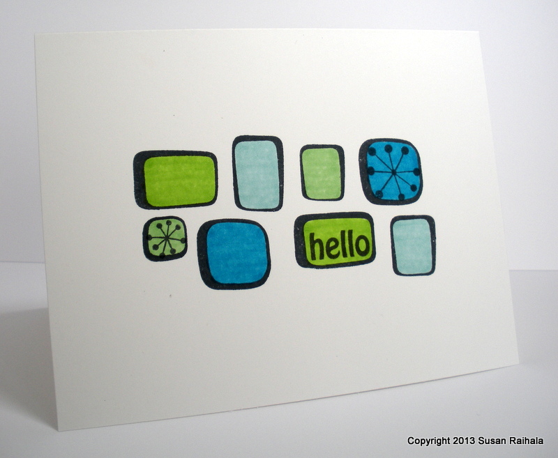
stamps: SU Pocket Silhouettes, Clean and Simple Stamps Thank You limited edition set
ink: no idea. can't remember.
paper: Papertrey Ink white
accessories: rhinestones, silver and bronze metallic pens

Thursday, September 12, 2013

Love Comes in All Colors

Sometimes, I like to play with color. When I hit upon this particular layout and theme (for OWH), I decided that it would be perfect for color experimentation.

You see, while troops send cards of love to their romantic interests (spouses and sweethearts), they also send them to siblings, parents, aunts and uncles, and such. For those non-romantic loves, a red love just doesn't seem appropriate, but sunshiny yellow or blue-green love might be just right!

Yellow, Marigold, Orange

Persimmon, Mango, Scarlet

Old Rose, Tea Leaves, Pinecone

Burgundy, Cardinal, Sahara Sand

Rocket red

Pacific Ocean, Aquatic Splash, Lime


What not-red love do you prefer?

Supplies: All ink colors are from VersaColor or VersaMagic. Stamps are Heart 2 Heart #11 from Papertrey Ink.


Tuesday, September 10, 2013

Water, The Easy Way

When I bought the owl stamp on Salt Spring Island, I also picked up a water bird image. It's not quite as detailed as the owl, but there's always the need to create a watery ground for the image, and that's intimidating.

Until I thought of Watercolor Wonders from Papertrey.

Put the two together, and this is what you get.


The Watercolor Wonders long stamp is inked with Soft Pool ink from Hero Arts and spritzed with water. Once the water was stamped, I added the bird (using a stamp positioner since it's wood mounted!), then the sentiment, then cut out the panel.

Note that the bird's beak points at the sentiment. That's on purpose.

As far as you know.

The stamped panel needed a little something, so I added a very thin black mat. I love how easy this was and how clean and fresh it looks.

What do you think?

Supplies
stamps: Papertrey (sentiment, water), Salt Springs Island (bird)
ink: Hero Arts, Memento
paper: Papertrey White, SU black
accessories: squirt bottle of water, dimensionals

Sunday, September 8, 2013

Wise Card

Quick note: Ironman Wisconsin is going on as I type this post. If you're reading it on Sunday and are interested, click over to my other blog for race day coverage!

Years ago, for our 20th wedding anniversary, George and I went to British Columbia and stayed at a resort on Pender Island. On one excursion, we took a water taxi to Salt Spring Island for a craft fair, where I bought two stamps from a company called Salt Spring Island Rubber Stamps.

This owl is one of those two stamps.


A bit different from the cutesy owls so popular right now, wouldn't you say?

This wise owl is gorgeous, but we CAS stampers can have a bit of trouble with such natural-style images. First of all, they generally look best colored in. Second, the level of detail wildly deviates from my usual clean and graphic style.

That doesn't mean I can't use these sorts of stamps, though. Some white-on-white layering adds interest (think of all those layers of feathers!!!), and the pine bough border punch gives Mr. Owl a lovely forest context without a complicated scene.

BTW, I used a glue pen to adhere all those little pine needles. Otherwise, the card might rip, which would be unsightly.

If you like CAS but have some natural images to work with, search your stash for punches or dies that relate to nature. See if they can work with your stamps.

I'll bet you can make something beautiful!

Supplies
stamps: Salt Spring Island Rubber Stamps
ink: Versacolor black
paper: Papertrey white
accessories: Martha Stewart pine bough border punch, glue pen

Friday, September 6, 2013

Operation Write Home and the Thanksgiving Crusade

Note: If you are interested in following our little Ironman adventure this weekend, please visit my other blog, Questioning my Intelligence. I'll be updating there all weekend!

Also note: The OLW for this week is on Ardyth's blog...and it's called Paintchip...use as many shades of a single color as you can. How fun is that!!!

And now for the real reason you're here...some cards.

Today's post shares three cards riffing on the same basic layout and sentiment, a sentiment that is absolutely, totally perfect for our heroes to send home to their family and friends at Thanksgiving. That means these cards are perfect for both OWH and for the Thanksgiving Crusade.


These fabulously clean and crisp images come from Waltzingmouse's Blessed by You set, as does the sentiment. This really is an amazing set, and the joy I've had stamping with it is encouraging me to order more stamps from that darling Irish company with the most excellent customer service.

And no, I'm not paid or compensated for saying that. It's my own unsolicited opinion. But I do have a bit of the Irish in me, so top o' the day to you!

Remember that you are allowed to link to all your Thanksgiving/gratitude cards on the Thanksgiving Crusade page until the end of November. If you're in search of Thanksgiving inspiration, click on the link and check out what's already been posted there for this year...and also last year's wonderful submissions!

From a design standpoint, today's cards are as simple as they can be, but I'd like to point out that to pull off such simple designs successfully, the stamping itself must be flawless. The first time I stamped the card with the house, I didn't ink the sentiment fully and it looked blotchy. That botched, blotchy effort got recycled, and I did it again...the right way.

If you have issues with perfectionism, CAS stamping can be enormously satisfying but perhaps not helpful in your recovery from that perfectionism.

Just sayin'.

Supplies
stamps: Waltzingmouse
ink: Memento
paper: Papertrey Ink white
accessories: not a blessed one

Thursday, September 5, 2013

We're Here!

We were there, at home, and now after 9 hours of driving, we're here, in Madison, Wisconsin, on a perfect September day. George has registered for the Ironman race, and I'm on line, sharing some recent cards with you.

Because, thanks to the glories of the interwebs, I can.

I made these cards for OWH and as part of my Use-Your-Stamps Challenge. These are about as cutesy as I ever get, but I love, love, love these stamps from Hero Arts!


For both cards, I added a simple horizon with a black pen and quilting ruler. The line anchors the image so it's not floating in space, and the simplicity works perfectly with the line images. Just little hints of color keep the whole thing interesting and super clean.

*swoon*

Don't you think a child of a soldier, sailor, airman, or marine would LOVE to receive one of these cards?

And now I'm going to freshen up for dinner.

Supplies
stamps: Hero Arts (discontinued Newton and kitty), Papertrey (Mega Mixed Messages)
ink: Memento
paper: Papertrey Ink white
accessories: markers, black micron pen, quilting ruler, corner rounder, dimensionals

Tuesday, September 3, 2013

Autumn Stripes

Autumn.

My favorite season of the year.

After an unseasonably cool summer, I'm starting to think autumn will never arrive. Temperatures here in Ohio are summery now, and the Wisconsin Ironman race this weekend is currently forecast to take place in the low 80s.

I want 50s and 60s. I want to wear sweaters and smell the fires of dry leaves burning. I want to drink hot cider and eat apple fritters. I want to put mums on my porch and see the exquisitely blue sky that only happens when it's chilly out.

I want autumn.


Isn't it ironic that a chilly time of year is made up of such incredibly warm colors?

Anyway, I made this homage to autumn card using the large stripe in Watercolor Wonders (Papertrey Ink), leaves from Fall Elegance (also Papertrey) and an old sentiment from Hero Arts. The design concept was to place the action in the horizontal middle of the card while placing the sentiment and leaves asymmetrically. I like how the leaves and sentiment create a sense of movement in a very stable design.

Supplies
stamps: Papertrey (Fall Elegance, Watercolor Wonders), Hero Arts (discontinued)
ink: Memento
paper: Papertrey Ink
accessories: rhinestones

Monday, September 2, 2013

Blogger Is Being Difficult...

Tried loading a card, but Blogger wouldn't let me do it. Will try again tomorrow!

Happy Labor Day!

Sunday, September 1, 2013

More Fresh Squeezed Fun

Here are some more cards using Fresh Squeezed Stamps' Everyday Expressions!

A visual triangle of flowers in an analogous color scheme, with black nail heads to reinforce the triangle:


A square sans sentiment, with Stickles in the centers of the flowers for fun:

4.25" square

A birthday blossom with greenery and Stickles:


It was incredibly easy to put together pretty CAS cards with this set. Customer service for my Fresh Squeezed order was quick, and the stamps are lovely high-quality photopolymer. If you're looking to try something new, check them out!

By the way, this post was unsolicited, and I paid for my stamps.

Supplies
stamps: Fresh Squeezed Everyday Expressions
ink: Memento
paper: Papertrey
accessories: nail heads, Stickles