Given how much white card stock I use, it's sort of big news when colored card stock shows up on my cards. These colored-base cards are the exception that proves the rule for me, I guess. But today's card absolutely needed StampinUp celery as the base.
Inspiration Challenge #579 is guest-hosted by SmilynStef at Splitcoast, and she chose a Tumblr page called I Don't Wear Dresses...which is all about dresses. Amazing photography and fashion! My inspiration came from this photo, which is certainly different.
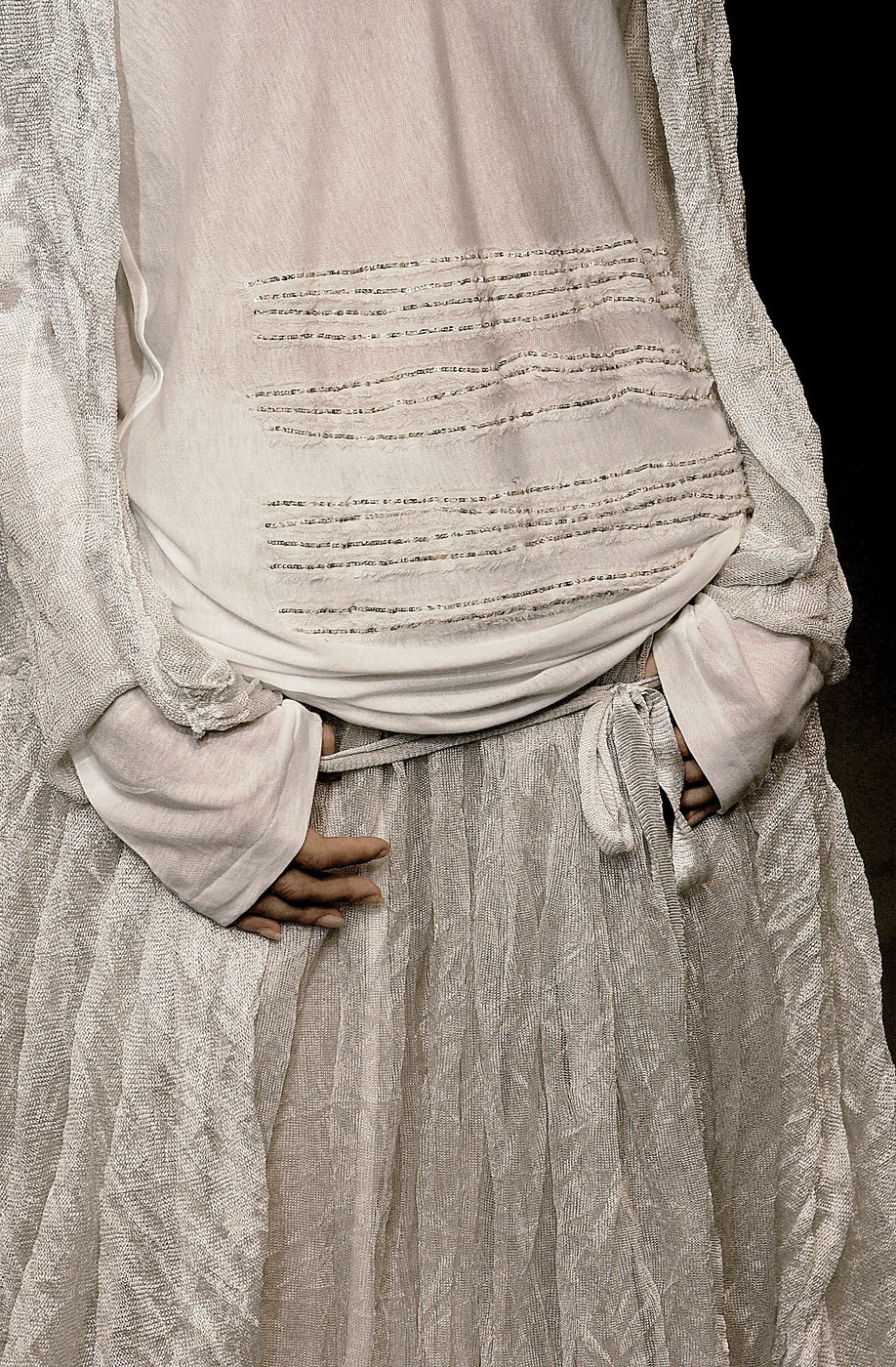
The lines of beads across the stomach of this top look for all the world to my eyes like lines of text, which gave me the idea for my card.
Color and focal point, however, are a problem with this inspiration photo. Carrying off this much white on a card is tough without tons of texture and a strong focal point. Texture is tough for me since I don't have a machine and embossing plates, so I decided the solution for translating the dress to a card was to add color. There's really no focal point here, but the droopy bow below the beaded stripes gave me an idea.
And of course, I wanted to use lines of text instead of beads. After checking out several stamps in my stash, I settled on a definition stamp of Christmas. The words and the Christmas theme dictated the colors, and I love how the definition describes giving wrapped gifts...which really unifies the text and bow, don't you think?
I chose to put a bow on my card in a high-contrast color, making it the true focal point. The text strips are simply copy paper that I inked with Distress Ink old paper (which has a greenish tinge lost in the photo, sadly), over-stamped with Memento Luxe espresso truffle, and wadded up repeatedly to create wrinkles. Once the strips were cut, I glued them on using a Quickie Glue Pen. The unevenness mimics the inspiration piece.
(Note that I used my quilting ruler and an exacto knife to cut the strips. Post coming up on this, as several people have asked about them.)
I've never really read this definition stamp before, but it uses alarmingly incorrect grammar. Fragments, "it's" when "its" was needed, etc. Seriously? I cut out the incorrect "it's" (it was at the end of a line, thankfully, but still). The poor grammar dulled my love of this card a bit.
When I placed the panel on a white card base, all I could see was the bow...everything else washed out. On the celery base, the paper strips stand out more because they have a greenish tinge. You'll just have to take my word for it because I couldn't get the photo to represent the true color at all.
And there you have it. Click on over to the
IC579 to play along. There are some incredible photos on the Tumblr page, especially if you click through about 15 pages like I did. Wow.
Mercy, grace, peace, and love,
Susan
Supplies
stamps: unknown
ink: Memento Luxe espresso truffle, Distress old paper
paper: Papertrey white, StampinUp certainly celery, white copy paper
accessories: blending tool, quilting ruler and craft knife, glue pen, craft foam, ribbon


