Tuesday, March 13, 2018

Distressed?

Y'all know how I feel about distressing. I prefer to de-stress, not cause distress. But when I saw this picture in GreenCraft, I simply had to make some distressed cards.

Lavender Dryer Pillows...so sweet and soft!

The fabric pillows look so soft and touchable, and by softening up the edges of my paper with a scissor blade, I was able to evoke a similar feel with my cards.


The stamped panels and colored mats are adhered using glue only in the middle, not along the edges. You can see the shadows cast by the slightly upturned edges. The effect is subtle, but adds that extra little something to a very simple design.


Slight imperfections in the stamping didn't bother me, either...they enhance the softness without drawing too much attention to themselves.

These cards make me feel so relaxed and calm. Who knew distressing could be so de-stressing!?!

Perhaps you did. But it's news to crisp-and-clean me.

Mercy, grace, peace, and love,
Susan

Supplies
stamps: Simon Says Stamp One With Nature, Clear and Simple thank you
paper: Papertrey white and various colors (also by Papertrey)
ink: Hero Arts charcoal, lime, soft leaf, soft olive
accessories: scissor blade, glue

Monday, March 12, 2018

Love...and Not Love

Many, many thanks to all who have commented on yesterday's post. You've given me a lot to think about, and I'm finding that very helpful. If you haven't commented yet, please do weigh in on my question of how you'd like to see me shake things up on Simplicity...or how you would like me to not shake things up.

At least we know that hardly anyone wants to see unicorns and fairy farts. That's a relief.

Today's two cards show two different techniques using an adorable little envelope stamp from Hero Arts' Love Notes set.

First up, a clean-and-simple faux collage inspired by many different real collage cards.


Y'all, this card makes my heart happy. So simple, so sweet, so heart-bling-y!


The second card didn't make my heart so happy. It started off as an attempt to use frisket...a resist liquid that, when it dries, keeps watercolor off the paper. After the paint dries, you can remove the dry frisket gently from the paper, leaving the white space free of paint.

Unfortunately, though I was gentle as can be, the Tim Holtz white watercolor paper peeled off with the frisket, leaving an unsightly mess. I quickly stamped the envelope on a scrap, cut it out, and glued it over the mess. I was quite disappointed, though, that the frisket damaged the paper.


So one version is crisp and clean and fresh, and the other is soft and sweet and romantic. They use essentially the exact same layout, but they certainly have different moods.

Which do you prefer?

Mercy, grace, peace, and love,
Susan

Supplies
stamps: Hero Arts Love Notes
ink: various
paper: Papertrey white, Tim Holtz watercolor paper
accessories: Arteza brush watercolor pen, brush, frisket, heart rhinestones

Sunday, March 11, 2018

Shaking Things Up

This here little blog is starting to feel a little stale and predictable to me, so it's time to shake things up. I have some ideas, but I wonder what YOU want from Simplicity.

Maybe unicorns and fairy farts?

Chatty posts about product? Organization? Design? How 18-year-olds are bat-crap crazy?

Series of posts using a single technique or product lots of different ways?

My husband's recipe for Asian chicken thighs?

Book recommendations from my alter-ego, Literature Lady?

Videos of my talking about stamping or life or why I can't leave Barnes & Noble without buying a book? (Video tutorials are a bit beyond my techie ability, but I think I could go live on Facebook pretty easily. But going live on Facebook also feels a bit narcissistic for me...oh, look at me, I'm so important! Ugh.)

Something else entirely?

Your input is greatly appreciated.

And now for a card project that isn't your ordinary card.


This book card was inspired by the following book in the Autumn 2017 issue of GreenCraft magazine (a Stampington & Co. publication) which I borrowed from the library yesterday.


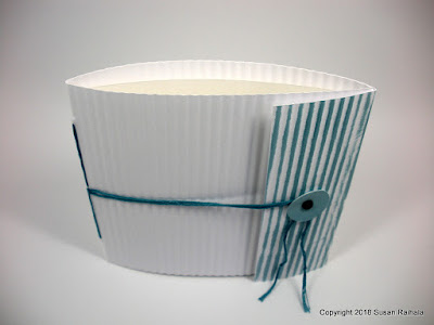
The inspiration book uses corrugated cardboard liberally smeared with gesso...an artsy technique that results in a more distressed look than I can pull off while staying true to my clean-and-simple style. So I opted to run a portrait-cut white card base through my paper crimper and go from there. 


My color scheme includes the Hero Arts robin's egg ink that came with the February My Monthly Hero kit for the cover. I rubbed it on the flap for contrast, and the distressed nature of the results pays homage to the inspiration piece.

Inside, the single-sheet page leaves ample white space and highlights an Emerson quotation and the fun leaves from Simon Says Stamp One With Nature. The green ink is also from the My Monthly Hero kit and is called feather.


The binding for the book was sewn through three holes punched with an awl through the page and cover. The thread is DMC floss that just so happened to match perfectly the robin's egg ink.

Let's pause for a moment to savor how spectacular it feels to have an embellishment in the perfect color for a project. Ahhhhhh.

That feels good.


The quotation is perfect for a graduation card, so this card will go to my son in May. He will appreciate it. I just hope he doesn't get drunk on the wild air.

I love that boy more than myself. And he's driving me batty with his teen-brain hijinx. Lord, grant me patience because if you give me strength, I'mma gonna need bail money to go with that. Amen. 


I left long tails on both ends of the binding thread and added a circle attached with a black fastener. The black fastener ties in with the black ink inside the card and lends gravitas to pastel-and-white cover.


Gravitas is a great word. Eighteen-year-olds think they have gravitas, but they don't. They just don't.

This project was enormously fun and satisfying, and it wouldn't have happened without seeing that little inspiring book in GreenCraft magazine. Yay, inspiration!

So what do you think? How can Simplicity shake things up and be a more satisfying place for you and for me to spend our time? Thank you in advance for your suggestions.

Mercy, grace, peace, and love,
Susan

Supplies
stamps: Simon Says Stamp One With Nature
ink: Hero Arts robin's egg, feather; Archival black
paper: Papertrey white, random lightweight white cardstock for inside page
accessories: black brad, 5/8" circle punch, Fiskars paper crimper, awl, needle, DMC floss

Tuesday, March 6, 2018

Sweet as Honey

One of my favorite cute sets is Hero Arts Busy As A. Despite its odd name, the set is adorable and has some great images in it. I ordered the coordinating die set and went to work. This was the second card I made...the first was pretty trash. I'll explain below.


The watercolor used on these images came from two different sources. The bees are painted with StampinUp summer sun and more mustard inks that were squished into the lids of the old-style cases. The hive is painted with an Arteza brown real brush marker that was squished onto an acrylic block.

There's a lot of squishing going on.

Anyway, I added Wink of Stella to the wings and flower, and a bling on the flower creates a visual triangle of yellow.


My first attempt at this card involved painting a large scrap with the summer sun ink. I stamped the bees and die cut them out of the painted scrap. Wow, that was ugly. Didn't think about how the wings would be yellow, too, and just no.

What are your favorite "cute" sets?

Mercy, grace, peace, and love,
Susan

Supplies
stamps: Hero Arts Busy As A
ink: Archival potting soil; StampinUp summer sun and more mustard
paper: Papertrey white
accessories: Wink of Stella (clear), dimensionals, coordinating dies, Arteza real brush marker in brown

Monday, March 5, 2018

Old Technique, New Stamps, Fresh Colors

Sometimes, it's fun to mix up old and new, and today's card gives a fresh example of just that. It combines and old, old technique with new stamps and a fresh color combination...with a bit of bling.

Yay!

That little birdy was inked with VersaMagic aquatic splash and then rock-and-rolled with VersaMagic turquoise gem on the wings and back, and Memento Luxe espresso truffle on the beak.


The the two-step-stamp flower was inked with Impress Fresh Ink persimmon and papaya. The contrast of the aqua bird and orange flower gives this card a bunch of energy and pop.


The rock-and-roll technique is one of my favorites for thick pigment and chalk inks. It's delightful and almost always yields good results, as long as the ink pads are juicy. If you've never rocked and rolled, here are the incredibly complicated, step-by-step instructions.

1. Ink the solid block stamp in a light shade of pigment or chalk ink.
2. Roll a portion of the stamp across a darker pigment or chalk pad. It might take a few rolls to get good coverage.
3. Press the stamp to paper.

That's it! Using small cubes or dew drop ink pads will give you better control, but full-size pads will work, too. If you're not sure, just practice a bit on scraps to see which colors work best together.

What's an old technique you've used lately with new stamps? Please share!

Mercy, grace, peace, and love,
Susan

Supplies
stamps: Hero Arts February kit, Happy Days Flowers
ink: Memento Luxe espresso truffle; VersaMagic aquatic splash, turquoise gem; Impress Fresh Ink persimmon, papaya
paper: Papertrey white
accessories: coordinating die, dimensionals, rhinestones, Copics to color the rhinestones 


Sunday, March 4, 2018

Four for One

The Genevieve layered butterfly dies are amazing, and they fit with my white-on-white style as well as color-with-white. Take a look at these two cards: one white and wonderful and the other cool Caribbean and wonderful, too.


This card is pretty, but it has one simple design flaw...lack of contrast.  The cool Caribbean from StampinUp is such an awesome color, but just using a few pops of that color--with some amazing sparkly bling--doesn't provide adequate contrast with all that white.


As you can see when you look at the second card, which has more color and spots of black, contrast truly enhances design. The second card fills more of the rules of good design...from contrast and color balance to scale.


This card makes me happier...even though it's got a colored card base. There's just so much harmony and bold color. The corners were rounded with old-school scallop scissors, and the pretty pearls come in two sizes for additional visual interest.


In the past few weeks, I received a couple of cards that I must share! First up, a Valentine from Michele K. Check out her excellent combination of colors and textures in a fabulous design.


Note how she brings the green into the stamped focal point, but then gives the card a pop of very bright pink/red. This complementary color combination gives the card so much energy to balance with the harmony of the monochromatic backdrop. Perfect!


Janet E. sent her card in response to my Wonderful World card...and included a stamp with the line from the song! Janet used this delightful floral designer paper that includes lots of labeled flowers for the background of the stamp sentiment, and then she picked out two complementary colors from the paper (purple and yellow) for the base and mat. The effect is harmonious and ever so pretty and feminine!


Janet embossed the sentiment on the designer paper in a lovely soft green color, and the effect is delightful on the black background!


Many thanks to Michele and Janet for thinking of me and sending cards. Many thanks to Joan for the butterfly (and other) dies and Janet for the stamp. All three of you are such sweet, generous people!

Mercy, grace, peace, and love,
Susan

Thursday, March 1, 2018

Graduating Golden Butterfly


Butterflies represent new life and transformation...from a humble caterpillar to the chrysalis to the beautiful, nectar-sipping bugs that delight us so. As such, they make a great image for all of life's transitions, from birth to death and all those changes in between.

This year, my elder son and niece both graduate from high school. Today's butterfly card will be my niece's graduation card as she makes that transition from home to college, childhood to almost adulthood.


The card uses an unlabeled rectangle die for the raised panel and Genevieve Butterfly layering dies from Birch Press Design...all come to my craft space courtesy of the kind and generous Joan B. Thanks, Joan!

These butterfly dies allow you to insert different colors of paper into the shape, creating lovely and interesting variations. I first die cut the butterfly in white cardstock and gold glitter paper, and then inserted the gold bits into the white butterfly frame, as it were.


Interestingly, I didn't like the reverse of this...glitter body and frame with white inserts. To my eye, it looked odd and rather garish, but the spots of gold glitter on this white beauty really made me happy!

The sentiment ink color posed a problem. Black would have been too harsh, and gray or gold too bland, but a nice coffee brown goes well with the gold and looks like it belongs. (It took me a shockingly long time to figure this out.)

The sequins and stars are from Hero Arts. Not sure what trick of the light makes the one star look so red and almost striped. It certainly doesn't look like that in real life. I'm sure a physicist could explain the properties of light moving through little bits of shiny plastic that make objects look odd in photos, but you'll have to settle for my saying the Hero Arts sequins in the ombre collections are absolutely gorgeous and may convert me to using more sequins.

I'll never give up my precious rhinestones, though.

Muchas gracias to Joan for making today's card possible!

Mercy, grace, peace, and love,
Susan

Supplies
stamps: Hero Arts
ink: Archival coffee
paper: gold glitter paper, Papertrey white
accessories: rectangle die (unknown), Genevieve Butterfly layering dies (Birch Press Design), sequins (Hero Arts), glue pen, craft foam, glue