First of all, Happy Thanksgiving!!!! I hope all my readers in the United States are enjoying a wonderful day relaxing with family and friends, eating way too much good food. And I wish all the rest of the world a Thursday of peace, joy, and gratitude, too.
And now, what better day to rant about stamp organization than Thanksgiving! After all, I'm incredibly grateful for all the many stamps I have to whine about organizing...more grateful than anyone who isn't a stamper could possibly understand.
Do you hear me squawking freedom? Of course, you do!
Anyway, those of us with mild OCD find plenty to irritate us in the stamping world. Take stamp storage, for instance. There is no way for an obsessively-organized stamper to use all different forms of stamps (clear, wood-mounted, cling) and have a truly consistent and satisfying storage system. Not. Possible.
I accepted years ago that there is no perfect system, so I've compromised over the years, trying to balance it all within reason and without spending gobs of money. It's hard, though. Surely, you can spot the problems--plural--with this picture?
Let's count all the first-world problems, shall we?
1. Papertrey provides printed labels for CD/DVD cases. But these labels, printed on clear stickers in black, are nearly impossible to read when stored this way, despite the fact that my craft space is extremely well lit. (And we won't even get into the fact that PTI switched from giving CD cases with stamp sets to suggesting you buy DVD cases instead. No way was I going to change my system that far down the road...too expensive and too big a job.)
2. Other companies do NOT provide printed labels for CD cases, which means we have to improvise if we're going to put clear stamps in CD cases. So we end up with two different kinds of labels, mixed willy-nilly together. Seriously? Aren't you getting itchy just looking at them?
3. At the very back of the picture, you will see stamp sets from other companies left in their original packaging of large transparency folders. How in the name of all that is good and wonderful and tidy can this work? It can't. It just can't!
4. Please don't mention the one set in front that was put away backwards. Because the labels are so hard to read, I didn't even notice it until I loaded the picture. Sigh.
What is a mildly OCD stamper to do?
Well, this is the place to start:
While I likely won't put my Hero Arts and Waltzingmouse and Clearly Besotted and Lily Bee and Dare 2 B Artzy stamps into jewel cases (I'd need more than 25 cases), I did get a largish order of Papertrey sets Tuesday that needed cases. So I bought more cases and a new pack of 2" x 4" address labels.
All my sets currently stored in CD cases got new labels today. I made these by cutting the labels into 1/4" strips with a craft knife and quilting ruler (if you cut so they stay attached to the full backing paper, they are easier to work with). I hand-wrote the names of sets, and now the whole collection is at least readable and consistent.
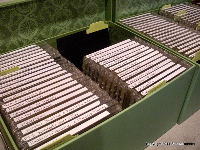
Even at a distance, you can read these labels. YAY! What's stored in these two green boxes is almost all Papertrey. (A few random sets from other companies are tucked in as well. I'm only mildly OCD, remember?)
I will put the other companies' stamps--the ones in transparency folders--in the storage boxes with my wood-mounted sets and deal with them another day. I've no idea how to handle them, but this is enough of a fix to satisfy me for the time being.
And because I know people will ask, the sets I bought are Fair Isle Motifs, Note Niblets, Doodlie-Do, Wet Paint, Keep It Simple: Christmas, and Polka-Dot Parade #12. My sister-in-law gave me a very generous gift card to Papertrey for my birthday. Bless her thoughtful little heart!
And now for a card, one destined for Operation Write Home:
I had Hero Arts' clear set called Oh, Snap! out (with the arrow) and Papertrey's Love Birds set out. The gray and red color combination from my winter/Christmas cards was fresh in my mind. And this was the result. It makes me smile!
Again, Happy Thanksgiving!
Supplies
stamps: Papertrey Love Birds, Hero Arts Oh, Snap
ink: Hero Arts
paper: Papertrey
accessories: none
Wednesday, November 26, 2014
Monday, November 24, 2014
Fun with Glimmer Mist
Inspiration often comes from magazines, and such is the case with this card. My husband was thumbing through his new batch of cooking magazines (he has an entire 5-shelf book case FULL of old cooking magazines!), and I caught sight of a graphic that inspired this card. It was the un-outlined shape of a wine bottle filled in with green and blue watercolor-y splotches, with just a few splotches going outside the (non-existent) lines.
As you can imagine, this inspired me to pull out watercolor-y products. For me, my go-to is a spritzer bottle full of Dazzling Diamonds Glimmer Mist spray by Tattered Angels. Ink up a stamp with a water-based ink, spritz with Glimmer Mist, and stamp. Doesn't get much easier.
Start by masking all but a 1.5" strip on the card with post-it notes. Then, using whatever solid stamps you have to hand, begin creating a background inside the unmasked area. It took lots of stamping with Papertrey's Watercolor Wonders and Grunge Me stamps and very light shades of green and blue Memento Ink to create this background. A few blotches went down after I'd removed the post-its, just to soften the edges.
After the background was completely dry, I switched to SU's Green Galore and Marina Mist for the balloons, still spritzing to stick with the soft effect. Then, using Memento Nautical Blue, I stamped the sentiment (also spritzed). A bit of bling finished the card!
Follow-Up on Red Birds Post:
Thanks for the responses on the Red Birds, Two Ways post. I'm sorry the cream card didn't photograph as well as I'd have liked, as many of you thought the stamped layer was white. It wasn't. It's most definitely cream, and the paper matches the base layer color much better in real life. You wouldn't believe the time I spent re-photographing that card trying to get it to look right in Picasa.
*sigh*
Anyway, while I'm glad that some of you preferred the cream card, I absolutely agree with the majority of you...the all-white card looks better to me than the cream one. Stamping on textured card stock is always an iffy proposition, and while I was fine with the results on that particular bird card, I really do prefer crisp, clean stamping that comes from a nice, smooth, high-quality card stock.
The deckle edge is lovely and a natural part of the paper, but I always find those one-edge deckles to be problematic, as you can't tear the paper on the other edges to duplicate the natural deckle (it WILL look different, even if you pre-fold and wet the paper before tearing it for a smoother tear). One edge being deckled can add interest, but I'm not sure it enhances the design on my particular card.
And really, I just prefer white card stock, even if it is fun to play around from time to time. ;-)
Supplies
stamps: Papertrey Grunge Me, Watercolor Wonder; Clearly Besotted
ink: Memento and SU
paper: Papertrey white
accessories: rhinestones, post-its, quilting ruler to align post-its, Glimmer Mist
As you can imagine, this inspired me to pull out watercolor-y products. For me, my go-to is a spritzer bottle full of Dazzling Diamonds Glimmer Mist spray by Tattered Angels. Ink up a stamp with a water-based ink, spritz with Glimmer Mist, and stamp. Doesn't get much easier.
Start by masking all but a 1.5" strip on the card with post-it notes. Then, using whatever solid stamps you have to hand, begin creating a background inside the unmasked area. It took lots of stamping with Papertrey's Watercolor Wonders and Grunge Me stamps and very light shades of green and blue Memento Ink to create this background. A few blotches went down after I'd removed the post-its, just to soften the edges.
After the background was completely dry, I switched to SU's Green Galore and Marina Mist for the balloons, still spritzing to stick with the soft effect. Then, using Memento Nautical Blue, I stamped the sentiment (also spritzed). A bit of bling finished the card!
Follow-Up on Red Birds Post:
Thanks for the responses on the Red Birds, Two Ways post. I'm sorry the cream card didn't photograph as well as I'd have liked, as many of you thought the stamped layer was white. It wasn't. It's most definitely cream, and the paper matches the base layer color much better in real life. You wouldn't believe the time I spent re-photographing that card trying to get it to look right in Picasa.
*sigh*
Anyway, while I'm glad that some of you preferred the cream card, I absolutely agree with the majority of you...the all-white card looks better to me than the cream one. Stamping on textured card stock is always an iffy proposition, and while I was fine with the results on that particular bird card, I really do prefer crisp, clean stamping that comes from a nice, smooth, high-quality card stock.
The deckle edge is lovely and a natural part of the paper, but I always find those one-edge deckles to be problematic, as you can't tear the paper on the other edges to duplicate the natural deckle (it WILL look different, even if you pre-fold and wet the paper before tearing it for a smoother tear). One edge being deckled can add interest, but I'm not sure it enhances the design on my particular card.
And really, I just prefer white card stock, even if it is fun to play around from time to time. ;-)
Supplies
stamps: Papertrey Grunge Me, Watercolor Wonder; Clearly Besotted
ink: Memento and SU
paper: Papertrey white
accessories: rhinestones, post-its, quilting ruler to align post-its, Glimmer Mist
Sunday, November 23, 2014
Unifying a Quotation with Images
When I pulled out my birthday stamp box, I found A Muse's Birthday Wishes set. In it is a quotation from Lucille Ball about birthdays, so I wondered what I could do with that on the front of a card.
The challenge here is to unify this text-heavy quotation with some sort of appropriate image. The first card uses line and logic to connect the image/border with the words.
The spectrum ink pad adds wonderful interest and nice, rich color. The numbers lead up to the sentiment, and the overlap providesunity. The rounded corners on the bottom tie in with the number dots.
The overall effect was fine, but the second attempt works a bit better in my opinion. Because BLING!
On this card, it's the bling placement that unites...and bling is always good, right? For this card, I randomly chose number stamps in different fonts and sizes, and used shades of pink and purple to make a rather girly card for a quote from the quintessential funny lady!
The idea, though, is to connect the sentiment/quote with the images in some way. What tips do you have for achieving this kind of unity?
Supplies
stamps: 1st card Clearly Besotted, A Muse; 2nd card lots of different alphas, A Muse
ink: Kaleidacolor, and assorted Hero Arts and Memento
paper: Papertrey white
accessories: corner rounder, bling
The challenge here is to unify this text-heavy quotation with some sort of appropriate image. The first card uses line and logic to connect the image/border with the words.
The spectrum ink pad adds wonderful interest and nice, rich color. The numbers lead up to the sentiment, and the overlap providesunity. The rounded corners on the bottom tie in with the number dots.
The overall effect was fine, but the second attempt works a bit better in my opinion. Because BLING!
On this card, it's the bling placement that unites...and bling is always good, right? For this card, I randomly chose number stamps in different fonts and sizes, and used shades of pink and purple to make a rather girly card for a quote from the quintessential funny lady!
The idea, though, is to connect the sentiment/quote with the images in some way. What tips do you have for achieving this kind of unity?
Supplies
stamps: 1st card Clearly Besotted, A Muse; 2nd card lots of different alphas, A Muse
ink: Kaleidacolor, and assorted Hero Arts and Memento
paper: Papertrey white
accessories: corner rounder, bling
Friday, November 21, 2014
Red Birds, Two Ways
Here are two versions of the same card, the first on all white card stock and the second on slightly textured, deckle-edge and cream card stock.
Which do you like best? Why?
Supplies
stamps: Through the Trees (Papertrey)
ink: Hero Arts soft silver, red royal
paper: Papertrey white, unknown cream and textured/deckled
accessories: dimensionals
| White-on-white crispness |
| Cream-on-cream warmth with a bit of texture |
Which do you like best? Why?
Supplies
stamps: Through the Trees (Papertrey)
ink: Hero Arts soft silver, red royal
paper: Papertrey white, unknown cream and textured/deckled
accessories: dimensionals
Thursday, November 20, 2014
More Joy...with RIBBON!
Insightful reader Marilyn pointed out another way in which the first card on yesterday's post failed...the tree isn't grounded. None of the trees are. They just leak off the card in a floaty mess. No wonder I don't like it.
I think "floatiness" is more tolerable on the second card because of the clearly defined silver border...what happens inside the border stays inside.
Today's card showcases the same Joy stamp as yesterday's card, along with some ribbon, which is shocking because I haven't used ribbon in a long time!
Note the placement of the red portion of the sentiment. This was tough. The descender of the "p" bumped into the "o" of Joy when I lined up the ampersand and the right edge of the "y." I would have had to place the "peace, love &" uncomfortably high to avoid trapped white space. Since I had to shift it to the right, I tried to align the slant of the "y" with the straight, upward movement of part of the ampersand. I think it worked rather well to relate the red and green portions of the sentiment to each other!
I'm trying to decide whether to round the bottom corners of the card. How do y'all feel about them? Should they be rounded? Should all four corners be rounded? Or should I leave them alone?
TIA!
Supplies
stamps: Papertrey Wonderful Words: Joy mini stamp set
ink: Brilliance Pearlescent Ivy; Hero Arts red royal
paper: Papertrey white
accessories: dimensionals, Corner Chomper, circle punch, ribbon
I think "floatiness" is more tolerable on the second card because of the clearly defined silver border...what happens inside the border stays inside.
Today's card showcases the same Joy stamp as yesterday's card, along with some ribbon, which is shocking because I haven't used ribbon in a long time!
Note the placement of the red portion of the sentiment. This was tough. The descender of the "p" bumped into the "o" of Joy when I lined up the ampersand and the right edge of the "y." I would have had to place the "peace, love &" uncomfortably high to avoid trapped white space. Since I had to shift it to the right, I tried to align the slant of the "y" with the straight, upward movement of part of the ampersand. I think it worked rather well to relate the red and green portions of the sentiment to each other!
I'm trying to decide whether to round the bottom corners of the card. How do y'all feel about them? Should they be rounded? Should all four corners be rounded? Or should I leave them alone?
TIA!
Supplies
stamps: Papertrey Wonderful Words: Joy mini stamp set
ink: Brilliance Pearlescent Ivy; Hero Arts red royal
paper: Papertrey white
accessories: dimensionals, Corner Chomper, circle punch, ribbon
Wednesday, November 19, 2014
Tweaking a Concept to Make It Work
A few weeks ago, I made a card that left me somewhat dissatisfied, although I'm not sure why. Here it is:
The card is okay, but there's just something not "me" about it...probably the fact that there's no real white space and that there are two spots of red with a black sentiment as the focal triangle...and the black sentiment just isn't doing it for me.
Whatever. I wasn't going to post this card but then, when I made this second one, based on the same random shadow stamping concept, I changed my mind. Because the second card wouldn't have happened without the first, and I like it very much indeed!
Now THIS one I love!!! The white border satisfies my need for restful space, and the silver border is lovely and defines the space nicely. The green and red are festive and work together better.
So YAY!
Supplies
stamps: Papertrey In the Meadow and Wonderful Words: Joy Mini Stamp Set
ink: Hero Arts, Memento
paper: Papertrey white
accessories: silver marker, dimensionals
| Not entirely satisfying for me. |
The card is okay, but there's just something not "me" about it...probably the fact that there's no real white space and that there are two spots of red with a black sentiment as the focal triangle...and the black sentiment just isn't doing it for me.
Whatever. I wasn't going to post this card but then, when I made this second one, based on the same random shadow stamping concept, I changed my mind. Because the second card wouldn't have happened without the first, and I like it very much indeed!
Now THIS one I love!!! The white border satisfies my need for restful space, and the silver border is lovely and defines the space nicely. The green and red are festive and work together better.
So YAY!
Supplies
stamps: Papertrey In the Meadow and Wonderful Words: Joy Mini Stamp Set
ink: Hero Arts, Memento
paper: Papertrey white
accessories: silver marker, dimensionals
Tuesday, November 18, 2014
Red? Read? Susan, Make Up Your Mind!
Sometimes, it's fun to do something...just because it's fun.
Ba, da, bum.
Supplies
stamps: Impression Obsession alphabet
ink: Hero Arts
paper: Papertrey white
accessories: eyelet, floss, 1/8" circle punch
Ba, da, bum.
Supplies
stamps: Impression Obsession alphabet
ink: Hero Arts
paper: Papertrey white
accessories: eyelet, floss, 1/8" circle punch
Subscribe to:
Posts (Atom)