Tuesday, January 8, 2013

More Coffee

A Muse stamps are sometimes a tad on the smallish side, and it can be challenging to use them on a standard 4.25" x 5.5" card. One way to help smaller stamps stand out is to ground them somehow and pop them up a bit. For example, these little coffee cups stand out more when placed on a large oval "table" and popped up with a dimensional.


I love the color contrast in these two cards. The first is so bright and fun, and the second is more masculine (in keeping with the sentiment). Both are destined for Operation Write Home.

The cups were colored with Copic and Bic markers, and when you know you're going to cut out an image, you don't have to stay in the lines. This makes coloring much faster and easier, although you'll notice I did a better job on the turquoise cup than the brown one. My selection of browns isn't good.

If you haven't checked out my tutorial on coloring with Bics and Sharpies (which are just about but not quite the same as Copics), you can find it HERE. Copics really do blend a bit better, but whether they are worth the cost depends on your budget and how much you like coloring.

Supplies
stamps: A Muse large oval, The Perfect Blend
ink: Memento
paper: PTI white
accessories: Copic and Bic markers, dimensionals, Cutterbee scissors

Monday, January 7, 2013

Caffeine

Oh. My. Gosh.

There wasn't enough coffee in the world this morning to wake me up. Sometimes, Mondays are just hard, you know?

Anyway, I bought the coffee set from A Muse a while ago, and while I was purging my collection recently, I pulled it out to play. This card is for a friend of mine who does the work of three women...largely with the help of coffee.


I asked y'all to share what makes you happy in stamping, and your answers are fascinating. I'm ruminating on my response (moo, moo) and will share in the next few days.

But if you want to know what makes me happy, this is it. Paper and ink. This card makes me happy. It's clean, simple. It has a strong focal point with good placement, flawless stamping, and a sentiment that makes me laugh.

Yep. This is all it takes to make me giggle with glee.

And you might get a hint about my decision on the Cuttlebug if you click on over to my Questioning blog.

Supplies
stamps: A Muse
ink: Memento
paper: Papertrey white
accessories: Memento markers

Sunday, January 6, 2013

Another Classic CAS Layout...Great for Larger Stamps

Last week, I shared my most favoritest layout with you, and this week, I'm sharing another awesome--and classic--layout...but this one works great with larger stamps.


The raised panel gives a nice, big canvas for those large stamps (think Papertrey's Mistletoe and Holly stamps...can't believe I didn't think to use it this past Christmas!).

I used an older Hero Arts stamp called Three Ferns, discontinued last year. After inking it with bamboo and olive Memento inks (rocked and rolled the olive on the edges), I sprayed the stamp with Glimmer Mist and stamped it on a half-card I'd cut from a failed card. The Glimmer Mist gives it such an awesomely subtle shimmer! Then, after trimming it to a 3.5" square, I mounted it using dimensionals. The sentiment is from Papertrey's Birthday Basics.

Why not search through your stamp stash for some larger, neglected stamps and give this layout a try?

Supplies
stamps: Hero Arts Three Ferns, Papertrey Birthday Basics
ink: Memento
paper: PTI white
accessories: Hero Arts olive rhinestones, SU dimensionals, Glimmer Mist

Saturday, January 5, 2013

This and That

This
As for this, I'm LOVIN' the responses on my previous post. If you haven't added your two cents, please do so. I promise I'm going to do more with this idea of likes/dislikes relating to papercrafting, and I hope whatever I do will be helpful not only to me but to some of you as well.

That
And on such an ambiguous note, here's a little of that.


One of my goals is to experiment with different sizes and shapes of card, and this oblong card measures 8.5" x 3.5", so it will fit in a standard business envelope. I love these fun tree stamps from Hero Arts (from a very old and discontinued set) but couldn't fit the summer tree on this card. I thought since we're in the middle of winter in the northern hemisphere, it might be good to think about spring being just around the corner.

So far, winter in Ohio has been fine, but by February, I may feel very gray!

I've done a minor rearranging and purging of my craft area and continue to hem and haw on the possibility of buying a Cuttlebug. Not sure if that's going to happen. Indecision may or may not be my problem. Feel free to advise me on the issue, but know that I'm ever so stubborn about investing in product that will require me to spend more money buying more stuff that has to be stored, and I resolutely refuse to go electronic. So there.

Supplies
stamps: Hero Arts, all discontinued
ink: Memento
paper: PTI white
accessories: dimensionals, rhinestones

Friday, January 4, 2013

Too Tired to Post...

so something to think about instead.

What makes you happy in papercrafting? What doesn't make you happy in papercrafting...other than bloggers who don't post pictures?

Discuss.

Good night.

Thursday, January 3, 2013

A Third Use of the Large Background

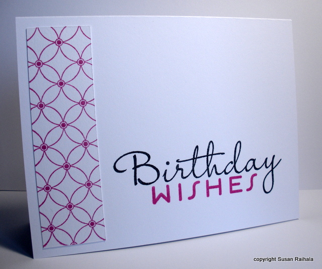
So, I have shown two clean-and-simple ways to use a large background stamp: 1) as a, well, background all over the card, and 2) as a trio in my favoritest layout ever. Now, let's see how it can be used as a border for a REALLY BIG sentiment.


After I'd punched the three squares from the scrap I stamped with the Looped Flower Pattern stamp from Hero Arts, I still had a lot of the scrap left. Using it to make a border provided just the right graphic interest when paired with the big birthday sentiment from Papertrey (don't know the name...sorry!). Carrying the hot pink over to the sentiment helps unify the two parts of the card and was easy enough to do with post-its on the sentiment.


Supplies
stamps: Hero Arts, Papertrey
ink: Memento
paper: Papertrey
accessories: glue, post-it notes (for masking the sentiment)

Wednesday, January 2, 2013

Classic CAS Layout: Most Favoritest Ever


This is the second post for today. Please scroll down to see an announcement about comments.


If you go back to the very first post on this blog, nearly four years ago, you'll see this basic layout...a line of three items on roughly the 1/3 line from the top of the card (rule of thirds) and a sentiment underneath to provide a little ground, if you will, for the trio of images.


It's hard to screw this layout up (though I have managed to blow it a few times and filed the results in the trash). Whenever you've got to whip something up fast, use this layout, and you probably won't go wrong.

I just love how my new Hero Arts background (Looped Flower Pattern) looks punched out with the 1" square punch. Remember, curves love lines...and all those curves of the image work great with the right angles of the squares and the rectangular card. I even picked a very linear and clean sentiment to go with those curves (Papertrey Ink's Birthday Basics).

Notice that the squares were not punched randomly. The two outer ones have a dot in the center, and the center square has an open space in the center. That little variation adds interest, and it's easy to do if you turn the punch upside down and center the stamped image through the hole.

And if that little tip is new to you, don't feel bad. I'd been punching for years before reading it on Splitcoast, slapping my forehead, and feeling stupid for not thinking of it myself. It's so obvious...and I never would have figured it out myself.

Anywho.

Lueyes asked about the cardinal stamp on the OLW post. It's A2541E Cardinal from Rubber Stampede. It's old...probably purchased in 2002 or 2003.

Supplies
stamps: Hero Arts Looped Flower Pattern, Papertrey Birthday Basics
ink: Memento
paper: Papertrey white
accessories: SU dimensionals, 1" square punch