It's always fun to experiment with getting different looks from one stamp, and when that stamp has a VERY distinctive style, doing this can be a real challenge. Here's one I worked with today:
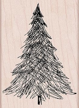
The pen and ink tree from Hero Arts has an extremely distinctive, fun style, My first run at it today uses standard Christmas colors of red, green, and gold.

The sentiment is an old one from Hero Arts, and the star comes from some random clear set, also Hero. The rich, shiny gold is Delicata ink, and the green and red are both Brilliance Pearlescent shades. The Brilliance Thyme green and Poppy are lovely colors for the holidays! To make the banner, I used the corner of a square punch on either end.
After making this card, I felt satisfied, but as I stared at my ink swatches, the Sicilian Blue from Impress Fresh Ink caught my eye. Hmmm. What would happen if the tree were stamped in that very, very pale gray-blue?
Perhaps something like this:

Eeeeep!!! The soft, serene colors, the trees falling gently down the card, the white space.... Happy sigh!
Don't be afraid to experiment using unexpected colors with stamps. Sometimes, the results will be utterly enchanting!
Supplies
stamps: Hero Arts
ink: Brilliance, Delicata, Memento Luxe, Impress Fresh Ink
paper: Papertrey Ink
accessories: dimensionals and square punch on first card
Love this stamp both ways! The traditional colors are fun and the soft gray blue is so peaceful!
ReplyDeleteI'm partial to non-traditional colors. Love the blue-grey card!
ReplyDeleteAh, the last card makes me feel peaceful and relaxed. It is so very lovely.
ReplyDeleteWow I loved the first one but then I caught sight of the second, perfection. The colour you used worked perfectly.
ReplyDeleteBoth beautiful cards but I have to admit, I absolutely love the softness of the second card. Such a peaceful looking card.
ReplyDeleteHappy sigh indeed. And such a fitting sentiment too.
ReplyDeleteBoth of your creations work so well and look lovely! I have a question. When I try to put a banner across an image I think it cuts it off or looks unbalanced. What is the key to getting it right please?
ReplyDeleteI absolutely love your second one. Beautifully done!
ReplyDeleteQuite lovely!!
ReplyDeleteThe gray-blue card is so peaceful. Beautiful placement of the trees and sentiment.
ReplyDelete