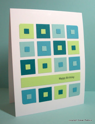
Oh how I love the colors, the layout, everything...except the scale of the sentiment. I thought the small sentiment (from PTI's Sign Language) would be perfectly understated, but instead, it's perfectly TOO LOST AND SMALL AND WIMPY!
So (after photographing it) I carefully removed the green strip (which I'd glued down) and replaced it with a larger sentiment from Simple Little Things (also by PTI). So much better!

Please note how I slightly rounded the four corners of the grid with scallop scissors. Oh, yeah. Deco scissors ARE cool.
Edited to Add: Lining everything up wasn't as hard as it looks. I just put the little squares on the big squares, glued the long strip down, then arranged the big squares on the card where I wanted them and started gluing them down using tweezers. No rulers involved.
Supplies
stamps: PTI
ink: Palette Noir
paper: SU cool caribbean, tempting turquoise, taken with teal, gable green
accessories: square punches, scallop scissors
love this!!!!
ReplyDeleteI can just see you with your quilting ruler and tweezers, grinning, loving all that symmetry that's taking precision to a new level. A new level of PAIN, that is, at least for folks like me. I could learn to fly a glider plane easier than I could make a card like this.
ReplyDeleteGorgeous colours and the precision, ah! you do these so well and of course the sentiment is much better larger, Have a lovely Sunday:D xx
ReplyDeleteThis just reminds me so much of a patchwork quilt! Love it, Jo x
ReplyDeleteGreat design. You are right - the larger sentiment looks better. Good way to use up scrap cardstock.
ReplyDeleteWhat possessed you to make such a card? LOL. But the end product is fasinating - I love it. :) Thank you for sharing.
ReplyDeleteMary Mac
Fantastic! Unsure if I have the patience to try, but I'd love to. Thanks again for the two photo comparisons!
ReplyDeletethe rounded corners finish the design well, as does the larger sentiment...seriously found and SUCCESSFULLY used scallop scissors to round the corner...yea me...are ya proud of me Ma? The scale of the scissors works so much better on this size square than the corner punch...as to the card itself...I think I'll get in line with BAHB!!!!
ReplyDeletelove ya
patti moffett
Neat card and layout and I really like the colors used. tfs
ReplyDeleteI have patterned paper very similar to this is color and pattern. I like seeing in in punches. The dimension makes is os interesting. I do agree that the larger sentiment looks more appropriate to the scale of the piece.
ReplyDeleteFantastic card!
ReplyDeletePetra
Love the before and after idea to demonstrate design principles. I saw some of my own cards in your "before" example and realized why I just wasn't happy with them. It's also given me a fabulous excuse to keep buying sentiment stamps! Obviously a couple of "Happy Birthday" stamps just won't give me the choice I need to suit different cards!
ReplyDeleteYOU ARE ENDLESS INSPIRATION AND RAW TALENT!!!!
ReplyDeleteLOVE.LOVE.LOVE this card.
thanks soo much, again!
marty
At first I thought, "Well gee, it looks just fine", then I scrolled down...and you're right, the bigger sentiment is better. That's why you're the queen! I love these kind of posts, as they teach me why mine don't look "right". Thank you!
ReplyDeleteBTW, how frustrated did you get lining all these teeny squares up?
Not so simple, I'm guessing. But definitely clean. Beautiful card!
Susan - I am so IMPRESSED with how level you get everything! This is just another FABULOUS card!! So great for the guys!
ReplyDeleteSusan .. yet another masterpiece! TFS. Like all the other posts .. how did you line it all up. You have that eye! The colors are perfect. Love it! Happy long weekend. ;-)
ReplyDeleteMaureen
NO RULER? Holy cats, you ARE the Queen. But I think "perfect-eye" must be like "perfect-pitch". ....you have it or you don't, and you MUST have it or those itty bitty squares woudln't end up being perfectly centered on the large squares. And that's to say nothing about all the other perfectness of your cards. Perfectness that you ratchet up one or two notches every day, I might add.
ReplyDeleteI love the colors and I really love this as such a great way to use scraps. The little squares could even easily be DP.
ReplyDeleteBut - as a girl who loves grids and symmetry - I'd probably still have to leave the corners square - LOL!!
You always provide such great inspiration!
Love this card! (I have a summer pitcher and glasses in these same colours...) Whenever I have to line things up like this (not that I've done anything on quite the scale of your card lol) I like using glue... gives you that extra half-second of adjustment that dble-sided tape doesn't! :P
ReplyDeleteAbsolutely Gorgeous!!...as always!
ReplyDeleteFinding your blog was the best thing to happen to my card making!!!!
You are a wonderful inspiration to us all!!Keep up the good work!
love this card!
ReplyDelete