Two questions came up in the comments from yesterday's post.
1. Susan asked if I stamped the images and then punched the squares, or punched and then stamped. Ordinarily, I do stamp first and then punch with the punch positioned upside down so I can see exactly where the image will be. This time, however, I punched first, expecting to leave the squares plain. Once I arranged them on the card (but before I glued them down), I decided the cards needed some random stamping to make them more interesting. As I stamped (over a piece of scrap paper), I thought about how the squares would be arranged and tried to place the images so they would look random and give a sense of movement when placed on the card together.
2. Sue asked why the Merry Christmas image looks better centered while the Happy Autumn looks better on the right. My best guess on this has to do with the fonts. Happy Autumn has initial caps (first letters capitalized) with very strong contrast in height from the caps to lower case, plus a descender of the letter y. By putting the sentiment off-center, that height variation is complemented by the asymmetry. If that sentiment were centered, I think it would look weird because the only "off" thing would be the capitalization because the squares are so evenly lined up.
I LOVE the font of that sentiment, BTW.
The Merry Christmas sentiment, on the other hand, is in all caps. Visually, it's very balanced, as are the squares. That makes it look better centered.
That's my theory, anyway.
Now to today's card....
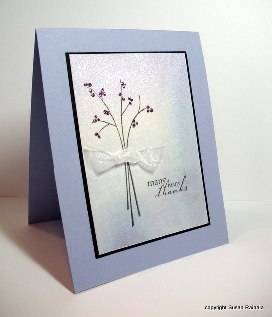
I thought it would be helpful for new stampers to see a card as it develops, particularly how I place things and how I decide what to do next.
Let's start with the shimmery paper. I stamped my image (shown), then stamped the sentiment (not shown). I cut them out using a quilting ruler and craft knife. I like that because the quilting ruler is transparent with a grid. You can easily get even borders and make sure your stamping is straight if you cut this way.
I also make sure that the proportions of the cut panel will fit on a standard card. This stamped panel is 3" x 4.25"...leaving an even matte when you put it on a standard 4.25" x 5.5" card.

Here's the stamped and cut panel.

Next, I put the panel on an almost amethyst card, but it looked very blah. So I cut a black matte sized 1/8" bigger than the stamped panel (3 1/8" x 4 3/8"). The black really helps anchor the whole thing. So I glued it all down.

The card still looked a little plain, so he next step was to bling it up a bit. I added lavender Stickles to the berries on the branch and attached a sheer white ribbon knot with a glue dot. The shimmery sheer ribbon (from Michael's) is a perfect complement to the shimmery paper. And, well, Stickles doesn't need a reason, does it?
Congratulations to Simplicity reader Amanda B! She won 6 FREE STAMP SETS from Shady Tree Studio's new release. Dang, I wanted to win that one!
Tomorrow, I'm going to post my little chart for matting proportions. It's such a simple little thing to make yourself, but I use it all the time when I go more than one layer, so I thought I'd share.
Supplies
stamps: SU Garden Silhouettes, Hero Arts sentiment
ink: Memento black
paper: Arches hot press watercolor, SU black and almost amethyst
accessories: Twinkling H2Os, Stickles, sheer ribbon
Great help and beautiful results.
ReplyDeleteHow kind of you to share this whole process with us. Looking forward to the mat sizes tomorrow!
ReplyDeleteWhat beautiful cards!!!
ReplyDeleteFabulous again, many thanks:0) xx
ReplyDeleteBeautifully done! Thanks for sharing the steps. Love the finished product...and can't wait to see your chart for matting proportions.
ReplyDeleteThank you for showing us the building process! It's a very beautiful card.
ReplyDeleteThis is oh, so pretty!
ReplyDeletelove all that shimmer and the layout is one of the best!!
ReplyDeleteOh Susan, what a softly beautiful card! It really is gorgeous. Thank you so much for taking us step-by-step, start to finish. The colors are so pretty on my computer I just know they're even more lovely IRL. I think the black thin mat really popped this card. You've really outdone yourself today. Thanks for explaining about the fonts from yesterday's cards --- it made perfect sense!
ReplyDeletewhere do you buy Twinkling H2O paints?
ReplyDeleteThanks for mentioning the quilting ruler + craft knife cutting combo. When I first read it on your blog, it was a light bulb moment. I was getting so frustrated by the crooked cutting of the fiskars paper trimmer.
ReplyDeleteThat background is really subtle but adds a lot to your simple image.
ReplyDeleteWhat a great observation about the sentiment placement. I never thought about it that way but I do tend to "audition" sentiment positions before stamping them - especially on a CAS layout - and I find that sometimes it looks good centered and sometimes it looks good to one side.
Happy sigh....I simply love this card.
ReplyDeleteBeautiful! I like how you "blinged it up". :)
ReplyDeleteI love all the twinkling cards but this is my absolute favorite! The black mat makes it so elegant. I'm looking forward to your chart on mat proportions. Thanks for the inspiration.
ReplyDeleteThanks for answering my question about stamping the squares and for the explanation about the sentiment placement (which I'm going to keep in mind as it makes total sense to me).
ReplyDeleteI love today's card - the colours are stunning. And it was so interesting to see your thought processes about adding the black mat and the stickles.