First, thank you so much for the kind comments and emails I've received on my last post. I'm surprised email subscribers are still receiving the blog as Feedburner was supposed to go inactive last summer.
Second, I started playing around with old Hero Arts (copyright 2006) wood-mounted stamps and trying to make them look fresher and more "in style"--but then I realized I have no idea what's in style and what's not. So I aimed to take old supplies and techniques and put them together in a way that felt fresh to me.
Anyway, I used a combination of SU and Memento markers (all at least 10 years old) with a spritzing technique to achieve a watercolor effect (very old school) and then used a StampinUp textured embossing folder to create a thin vellum mat...the only sort of "new" supply used. The textured, colored cardstock has been in my stash for about 17 years...purchased when a scrapbook store went out of business.
I really like the vellum layer with its wavy edges and texture.
Which color combination do you prefer: the warm yellows and oranges, or the cooler purples? I love them both myself and love especially how they feel so different in mood.
Finally, several people have commented that they miss seeing my puppy pictures, so here are a few recent ones to catch you up on our pups.
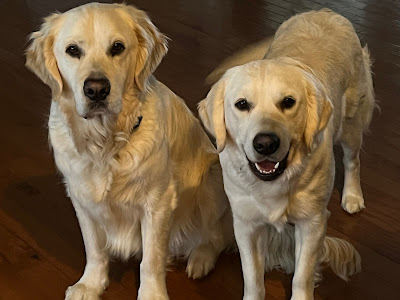 |
| Cooper and Lily |
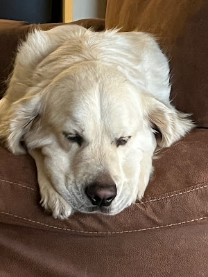 |
| Cooper's smooshy wooshy face |
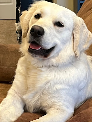 |
| Lily's happy face |
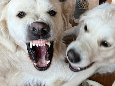 |
| Cooper's Cujo face. In his defense, Lily was biting his upper lip. I got a lucky photo. |
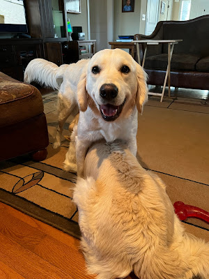 |
| Lily trying to be top dog. Cooper could not care less. He's just chewing his bone while she humps his head. |
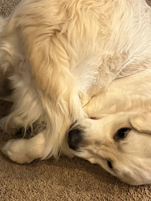 |
| "I finally caught it!" |
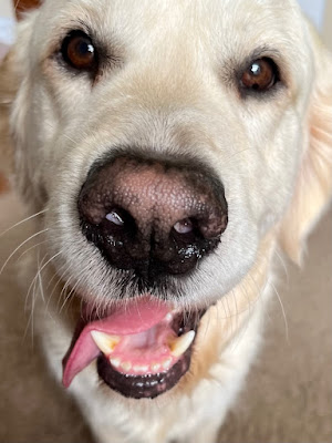 |
| Cooper's give-me-a-treat face |
 |
| Young man blessed with dogs. |
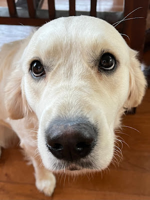 |
| "Please, may I have some chimkin?" |
Don't let that last picture fool you. Lily is a demon. She routinely chews on poor Cooper's face...so much so that his fur is becoming discolored on one side from the spit. But he loves her like a hen-pecked husband and can't stand when she goes anywhere without him.
She's the same way about him. After all, whom else would she torture!?
Mercy, grace, peace, and furry love,
Susan
.JPG)
.JPG)
.JPG)
.JPG)
Lovely “fresh” cards. Very trendy 😉. LOVE the dog photos. They are just beautiful dogs!
ReplyDeleteThanks, Vicki! Seeing your stuff on Instagram inspires me!
DeleteVery, very pretty cards. Love seeing your dogs. Thanks!
ReplyDeleteYou're welcome! The dogs do make everything better.
DeleteOh, and my favorite is the purple one.
ReplyDeleteI love both cards but I'll always go for purple first. The vellum layer really makes a difference. Thanks for sharing the dog photos. Always a day brightener.
ReplyDeleteYou're welcome!
DeleteSusan- beautiful CAS cards as always. The dogs are so fun. I read your last post about you anxiety. You might want to look into Zentangle. It is a form of meditative drawing that uses repetitive patterns to create a tiny piece of art. It has been found to decrease stress, promote mindfulness, decrease anxiety and many other things. I found it really helped me as a nurse during Covid. I love it so much, that I got my certification to teach. I am still a stamper, but I also am a Zentangler too!!
ReplyDeleteSue, I love Zentangles and have used them. Good on you for becoming a teacher! I took a class with my dear friend Leslie about a month before she died, and it's always had a warm place in my heart for that reason alone. It's also great for killing time on long flights.
DeleteSuch cute pups! We also have 2 that keep us entertained and grounded. Love both your cards for different reasons. They are so similar yet the colors evoke different energy. Reminds me of a Kandinsky quote: Color is a power which directly influences the soul. Thanks for sharing!
ReplyDeleteI agree about the different energies. It's fun to reproduce a design in a completely different color. Reminds us how important color choices can be! Thanks for sharing the Kandinsky quote...I'd not hear that one.
DeleteMore cards...yay! I'm partial to the warm yellows as yellow is just a happy color for me. I've got some older stamps too that I've never unmounted...some stamps just shouldn't be unmounted! Not sure why, but just seems wrong on some level...LOL!
ReplyDeleteLaughing along with you. We crafters tend to be "feelers" and let our instincts guide us. I'd never unmount my stamps either.
DeletePurple one is my fav! I LOVE purple! And I LOVED the dawg pictures! I'm a sucker for all animal pics! Thanks for including them!
ReplyDeleteYou're very welcome!
DeletePurple, always purple. I like how you embossed the vellum and I too have old textured cardstock! Thanks for sharing.
ReplyDeleteYou're welcome!
Delete