Sunday, February 15, 2015

Big Butterflies and Design Choices

After buying some new stuff, I just had to play. Sadly, I'm already regretting one of these purchases. I may or may not have gotten frustrated enough trying to work with it that buyer's remorse may or may not have made me say bad words.


The butterfly punch was NOT the problem. How can butterflies ever be a problem?


Those are Swarovski crystals on that there crackled butterfly. So sparkly and pretty! But there are five of them.


This butterfly has three half pearls. Am I weird for preferring the three pearls to five gems? Butterfly bodies have three parts, people. The rhinestones were so much smaller than the pearls, though, and only three looked weird. But bling. Always wonderful bling. I'm so torn!

Let's just call it a design choice and leave it at that.

Happy Presidents Day!

Supplies
stamps: Papertrey Peaceful Garden (sentiments); various backgrounds
ink: Versamagic, Kaleidacolor
paper: Papertrey white
accessories: half pearls, rhinestones by Swarovski

Saturday, February 14, 2015

Cascade of Hearts

Happy Valentine's Day!


Hope you all have a wonderful weekend!


Supplies
stamps: Love Birds (Papertrey)
ink: Memento
paper: SU pretty in pink, real red; Papertrey white
accessories: dimensionals, heart punches

Thursday, February 12, 2015

It's a Wrap!

Today, I played around with the wrap-around idea on these business cards, and had some fun results! To make the wrap for all three cards, I stamped the inside and outside portions and then scored in between. To give the panels a more finished look, I slightly rounded the corners with a pair of scallop scissors. There's no school like the old school.

I started pretty simple, with Papertrey's Wet Paint.


Love, love, love how the inside sentiment completes the idea and draws the reader into the card. But visually, there isn't anything connecting the outside and inside other than the color, so I tried this "sharp" idea. (I crack myself up!)


Now this heart-and-arrow card has both color and the arrow pointing the way to unify the inside and outside, plus it's cute! I just used a thin piece of post-it note to mask the center of the arrow to give the effect that it had pierced the heart.

Then, I made this fun birthday card.


The reason for the "happy happy birthday" panel on the inside...I had stamped the sentiment in the Kaleidacolor ink and didn't like it. The colors were too light, and it didn't really have enough visual weight on the page. It looked weird. So I covered the mistake and kept the inside of the card black and white.

I might send the birthday card to my sister and write something sarcastic like, "and it's a really BIG number!" She will laugh and then point out that I'll always be older than she is. But it might be worth it!

This wrap idea is brilliantly flexible and could be varied in all sorts of ways! You could die cut shapes, score down the middle, and wrap them around. You could "wrap" a large stamp around the card, and make it one layer. You could use stamp sets with outside/inside sentiments or divide long sentiments in two.

Go crazy and play!

Supplies
stamps: Papertrey Wet Paint, Heart Prints, one of the Heart to Heart sets, Birthday Bash Sentiments; Hero Arts arrow; Lily Bee numbers
ink: Hero Arts red royal, bubblegum pink; Memento black; Kaleidacolor
paper: Papertrey white
accessories: glue, Scor-Pal, scallop scissors

Wednesday, February 11, 2015

Birthday Blend

Sadly, this card has two layers and so doesn't qualify for the One-Layer Simplicity Challenge for February, which is to blend colors, but it's still pretty cool, don't you think?


This is my aunt's birthday card, made slightly early as her birthday isn't until July. But I made it and thought, "Dang, Aunt S. needs this card!" Do you ever do that? Make something and then realize that you just made the perfect thing for the perfect person?

It's not just me, is it?

Supplies
stamps: Papertrey Modern Basics, Clearly Besotted Happy Days
ink: Kaleidacolor, Memento Luxe black
paper: Papertrey white
accessories: rhinestones, dimensionals

Tuesday, February 10, 2015

Inspired by....Business Cards

I just love finding cool layout ideas from business items...logos, business stationery, signage, ads, and--of course--business cards. These cards caught my eye on Pinterest.

Source
I love the natural colors and patterns on the cards, but I'm "kraft-impaired." Every time I work with kraft paper, the results look like someone else made it. Oh, yes, I tried to make my card with a kraft tab and base, but it didn't work for me. It just didn't. So I made it this way instead, which looks just like something I would make:


Oh, frabjous day!

A few differences other than color: 1) I extended the tab beyond the border of the stamped "card." The business card design unifies the front and back by wrapping the tab around (which is BRILLIANT, by the way). Since I can't wrap in this situation*, I thought extending it a bit would make my version feel more unified, and the results are lovely. 2) Bling. Because, well, you already know. 3) The sentiment panel is popped to add some dimension that isn't necessarily appropriate on a business card.

Still, I love this design and want to experiment some more with it. It's so versatile!

*I really, really want to make a card that has a tab wrapped from the outside to the inside of the card...a scaled up version of the business card. Wouldn't that be awesome! Feel free to steal this idea and tell me about it. Life sure had gotten busy lately, and who knows when I'll have a chance to pull it off!

Supplies
stamps: Hero Arts (background, discontinued), Papertrey Mega Mixed Messages
ink: Impress Fresh Ink island, VersaMagic jumbo java
paper: Papertrey white
accessories: dimensionals, rhinestones

Monday, February 9, 2015

Chocolate Inspiration

Poking around on Pinterest can yield some pretty amazing visual inspiration, like this chocolate packaging:

Source

At first glance, I wondered why ANYONE would want lettuce-flavored chocolate, but that there leaf is mint...supersized. Yum.

But the packaging is as yummy as the chocolate no doubt is, so I decided to play around with it, adding my own CAS twists.


Note that I ditched the white-on-black label for the easier and cleaner black-on-white. The sentiment on the orange card has a loose feel that contrasts nicely with the crisp, tight order of the flowers. And I added bling. Because, you know. BLING!


The green butterfly card is a bit busier, so I went with a very classic, clean font, which I just adore, for the sentiment. The tiny butterfly on the raised panel actually caused me some inner debate.

Me: Should this little darling be flying into or out of the card?
Me: Into would be better. It would keep the eye in the card space.
Me: No, out of would be better. As if the sender's inner eye and thoughts were flying to the recipient....
Me: Hmmm. Which one will work better?
Me: Just pick one already, why don't ya'!

If you CASE this card, switch the butterfly if you want. I honestly don't think it matters! The point of the splash of color on the right side of the card is unity...bringing the whole card together, as the chocolate packaging does. The first card reinforces its design unity with the bling, but the tiny butterfly didn't have anyplace to put bling, really, so I left it bare. There are, however, three tiny butterflies arranged in a triangle, so that will have to suffice.

And that's all I have to say about that. I'm off to eat some chocolate.

Supplies
stamps: Card 1 (Gina K Hello Sunshine), Card 1 (Papertrey butterflies, Gina K sentiment)
ink: various Memento Luxe and Impress Fresh Inks
paper: Papertrey White
accessories: rhinestones, dimensionals

Sunday, February 8, 2015

CAS Matchbox Tutorial

Several of you asked for a photo tutorial for making matchboxes, but others wondered what in the world is the point of making matchboxes in the first place.

Well, I made these to get myself out of a creative funk, and not really for any purpose other than that. However, when I made a love-themed one (shown at the end of this post), I decided it would be my hubby's Valentine...no need to mail, and he can put it on his desk as a tiny reminder of the fact he's loved. When he's done with it, he can throw it away...because once you get the hang of making them, they really are a piece of cake. I can whip one of these up in a couple of minutes because mine are CAS, though obviously the more complicated you get, the more time it takes.

One of my readers who replies via email said she wants to make them to put in her granddaughter's lunch box "on days when she might need the feel of a little extra hug." What a wonderful idea!

Another possibility is to make a bunch that relate to each other in some way and assemble them on a mat and use it as wall art. Like this...

Source
Wouldn't this look cool as a spectrum of color? Or you could create a narrative through the boxes, especially if you're artistic and can draw or paint! Lots of options.

You could also hang matchboxes as Christmas tree ornaments. I'm contemplating doing a bunch of Christmas-themed ones later this year to add to my paper-ornament tree. You can add a string loop before gluing one end of the box or after the box is made by punching tiny holes in one end of a box and knotting string on the inside of the holes or looping string through the holes. And wouldn't it be neat to make 24 of them and put candy in them to make an unconventional Advent calendar? If I do any of this, I'll share the techniques.

But really, when we're playing around, does what we make have to be for a purpose? For some of us, perhaps. I'm certainly mostly purpose-driven in my crafting. But it's still fun to simply play.

For now, let's just make these fun little boxes. As the photo above shows, you can do all sorts of variations with paper, string, felt, feathers, rocks, buttons, dimensional past, mulberry paper, designer paper, etc. I stuck to CAS white, but let your imagination wander!

1. To make the box...

I used Neenah solar white 80# weight.
You could use designer paper (such as SU's)
as well. Just don't use too heavy-
 or too light-weight paper.
 

I scored the box on my ScorePal with a Teflon folder. This is better
for the box than for the cover, as you'll see below. 


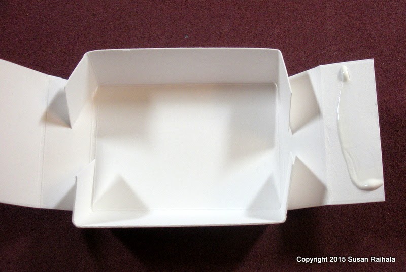
Pre-fold along the scores to make gluing easier. The
wider score lines from the ScorPal and Teflon or bone folder
work in your favor while folding
the flaps over because there's plenty of room
to accommodate the width of the paper.

I pre-fold the end without glue to make sure everything
will fit under the flap. Occasionally, you may need to
trim the hidden flaps a bit.

Use a little line of glue to hold things securely.

Repeat the process on the other flap.

The box is finished!

2. To make the cover...


I add 1/8" to the length here because getting it to fit exactly can
be a little tricky.

I tried using the ScorPal for the cover and ran into trouble getting the covers to fit...
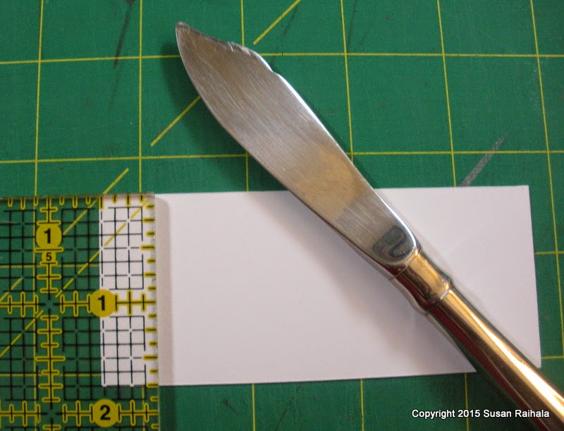
they were too small. The butter knife gives narrower scores than the Teflon folder
and the ScorPal.  This technique is easier for me but could be adapted to the ScorePal
if you don't have a quilting ruler and butter knife. The wider scores just need to be
accommodated in the measurements.

Note that the measurements have a + sign next to them. If you look
carefully at the previous picture, you'll see that the ruler is a little
past the 1/2" line on the paper. This allows for the thickness of the paper
as you wrap around the box.
You can see also how much narrower the score marks are when you use a butter knife.
 You might have to experiment a few times with the tools you have to figure out the fit.

Pre-fold the scores and make sure the cover fits snuggly but not too tightly
around the box. I had to throw away a few covers that simply didn't fit after scoring.
But it's only paper, right!?!?
 If you want to stamp on the cover, now is the time to do it...before
gluing it into shape but after you have the folds done so you can place your stamp
correctly.


Glue the lid with the box inside the cover. Carefully slide the box out and
pinch the glued flap on both sides for a secure seal.
 

And you're finished making your blank matchbox! Decorate as you wish.

Here are a few more examples of my CAS matchboxes.


To make this "Key to my Heart" box, I created a false bottom, sewed the key charm onto it, and attached it to the bottom of the box with dimensionals. These boxes are a half-inch thick, which gives you plenty of space for dimensional embellishments.


 The little wooden shapes were left unaltered and attached with dimensionals.


Wouldn't this "Peace" box make a lovely Christmas ornament?!?!?

So there you go. Matchboxes can be a fun way to play around because IT'S ONLY PAPER!!!