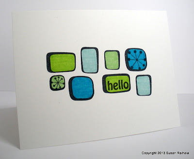
Another of the sets I received from Dare 2B Artzy was Retro Pattern. These are the first two cards I made with it...a little playing around with different color schemes, one cool and one warm.
I adore this border stamp, which could be easily repeated for a complete border, but I wanted the whole design to be centered on the card. This outline version (there's a solid stamp to fill in the outlines as two-step stamping) is fabulously easy to color and you can create all sorts of color combinations. For these cards, I chose four colors and spaced them out carefully to create a balanced design.
The retro starbursts are separate stamps in the set. So much fun!
I used Gina K Deluxe white card stock since I was coloring on a one-layer card.
Which do you prefer? Cool colors or warm colors?
Supplies
stamps: Dare 2B Artzy Retro Pattern
ink: Memento
paper: GinaK Deluxe white 120lb
accessories: various copic, bic, and sharpie markers


Both are nice, but the warm colors were my favorite.
ReplyDeleteI'm partial to the color blue so cool colors get my vote. These stamps are really neat. I'll have to check out the website.
ReplyDeleteCool cards - I like both. But the warm colors really speak to me.
ReplyDeleteBoth cards look wonderful. I do like the warm colours better though which is strange because I usually always go for cool colours.
ReplyDeleteOh I like both, but the warm really pops against the white!
ReplyDeleteI love them both. I love how color can send a different message. The blues are a more calming quite hello and the bright colors send a more energetic blast of HELLO! Thanks for putting them side by side.
ReplyDeleteIn this case I'm partial to the cool color scheme. It seems to make the shapes look like one design, where the warm colors draw my eye to the individual shapes more. But I like both cards. Thanks for showing the comparison!
ReplyDeleteThey're both fabulous, Susan, what a great set ... my fave is the blue hues ... cool, sophisticated and calm. Anita :)
ReplyDelete